‘The pink sofa was my starting point!’ says this first time buyer about her super-pretty new-build home
Adding pops of colour to a fresh white backdrop was the key to transforming this characterless new-build into a cosy colour-studded home

After renting for years and keen to buy her first home, moving back in with her parents over lockdown gave this young home owner the chance to get on to the property ladder as a first time home buyer.
‘I managed to save up extra cash by moving back in with my parents and taking on extra shifts at work until I finally managed to get a deposit together,’ she recalls.
'The main thing on my wish list was a garden. I didn’t care what size, but I think we’d all realised how important outside space was during the pandemic.'
The exterior
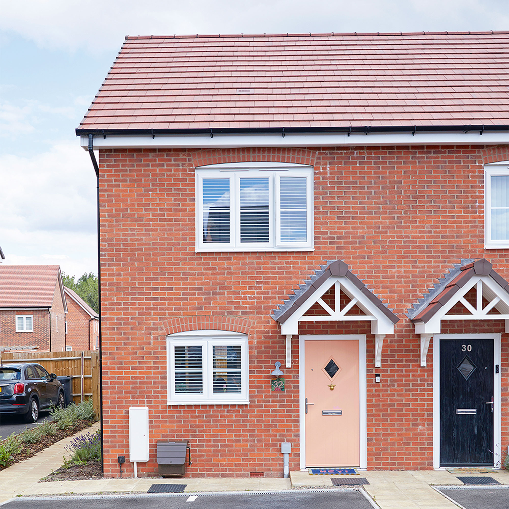
‘My friend had moved into a new build on this estate and I liked the open-plan feel of the houses and the fact that the properties came with parking, so I reserved this place off-plan with no idea how big or small the garden would be or what the layout would actually look like,’ says the home owner.
‘My moving-in date was delayed by nine months because of the hold-ups with delivering materials like glass and plaster during Covid. To be honest, though, this was a blessing as it gave me more time to build up an extra fund to buy furniture. I used to drive by and watch the house being built; at first it was a building site, and then a row of bricks appeared, and then the windows were put in, and it was really exciting seeing it gradually go up.’
The kitchen
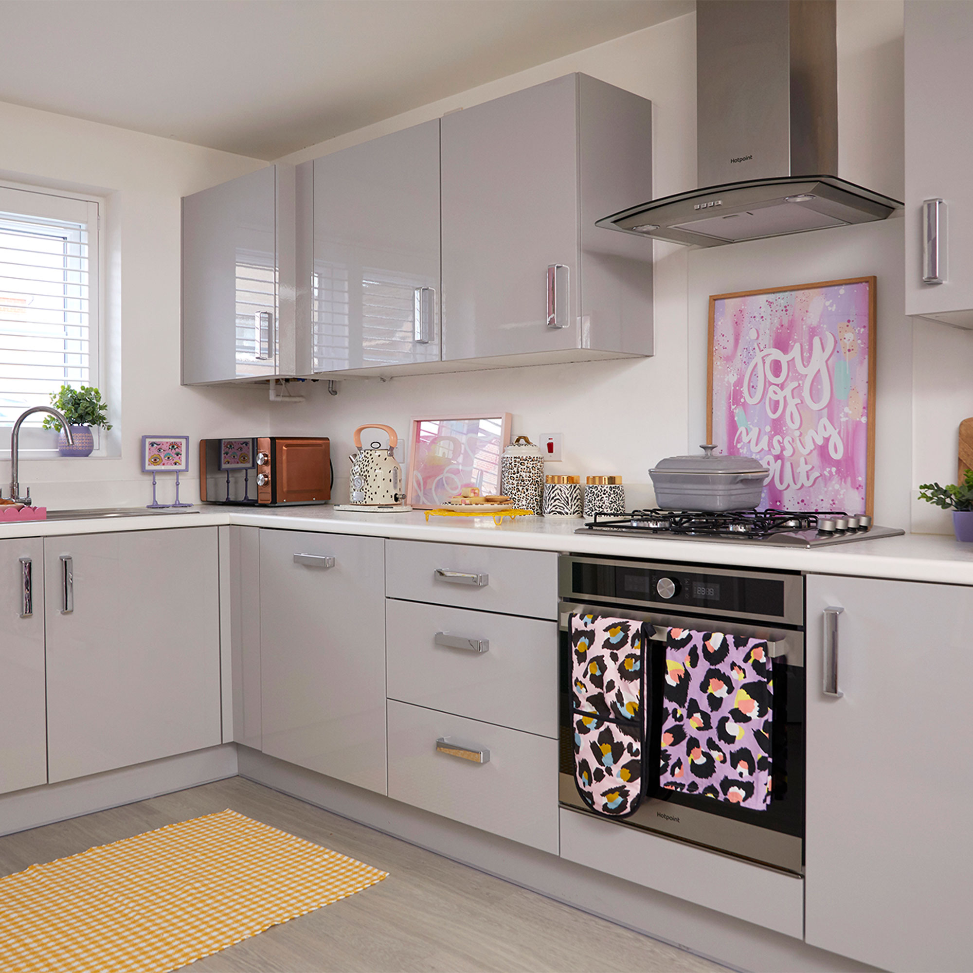
‘When it came to the interior of the new build, all the fixtures and fittings were extra, so I went for all the standard options to save money. I chose light-coloured flooring, integrated appliances and a light grey kitchen idea with white worktops because, as everything is on show in the open-plan ground floor, I wanted the functional pieces to feel as hidden and unnoticeable as possible.'
‘My aim was to keep the kitchen bright and neutral so that I could add any colour or pattern into the scheme without worrying about it competing with the units or flooring.’
Get the Ideal Home Newsletter
Sign up to our newsletter for style and decor inspiration, house makeovers, project advice and more.
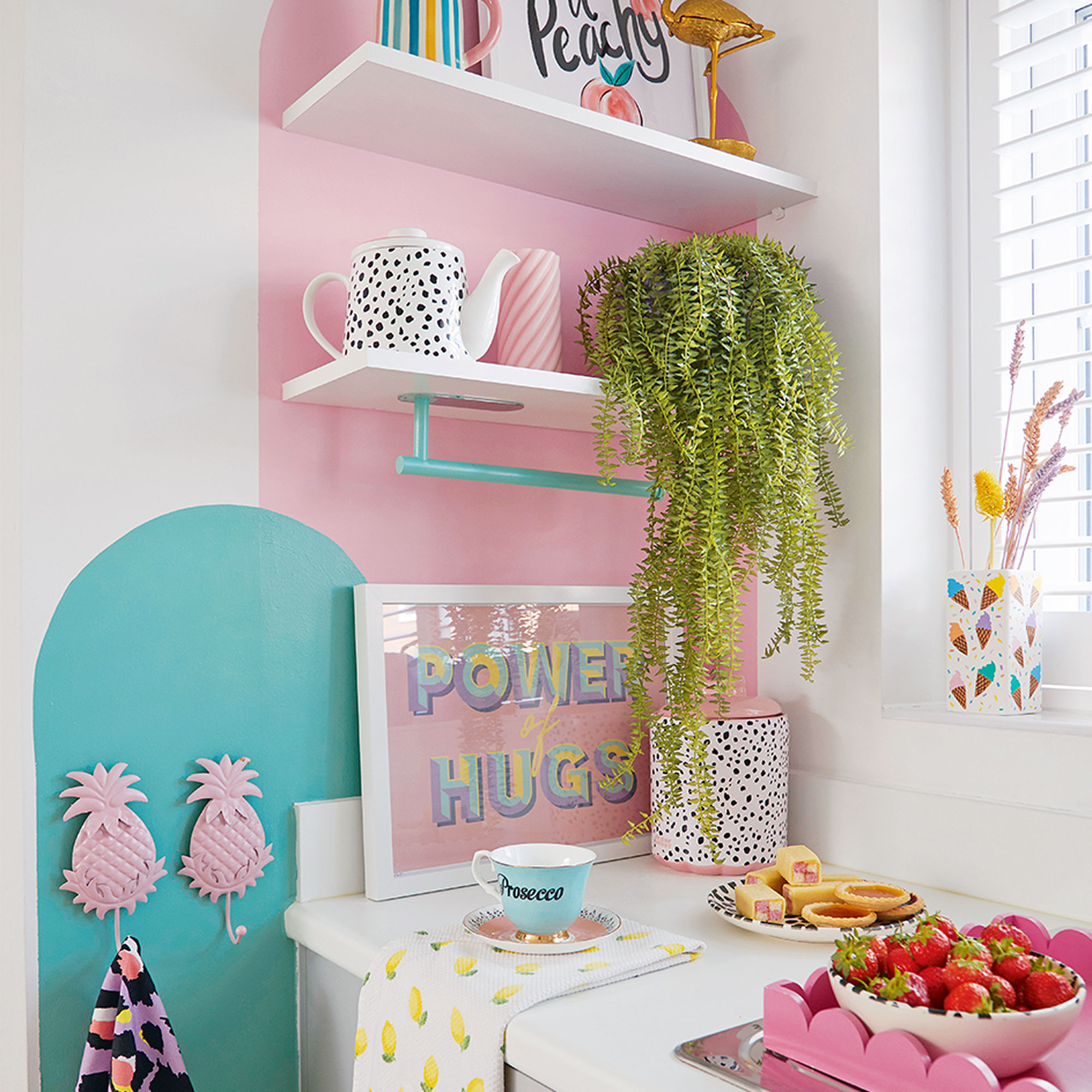
‘I use bright accessories and painted blocks of colour on the walls behind the kitchen shelving ideas to add the colour and pattern I crave.’
Living room
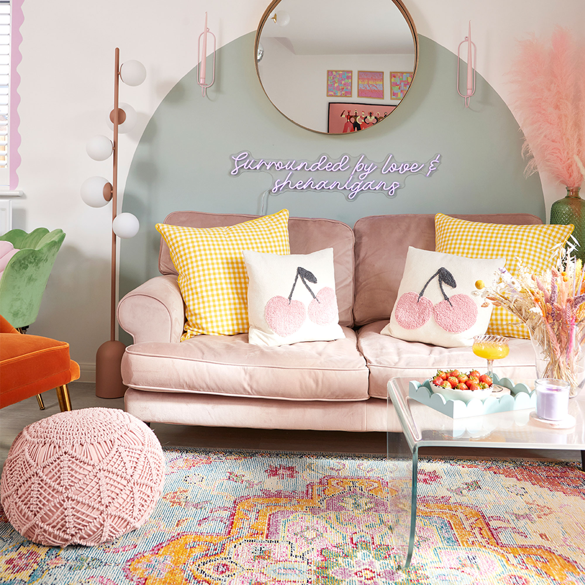
‘When it was finally time to get the keys to the place, I’d planned for the arrival of my new pink velvet sofa and button-backed bed to be delivered on moving-in day,’ recalls the home owner.
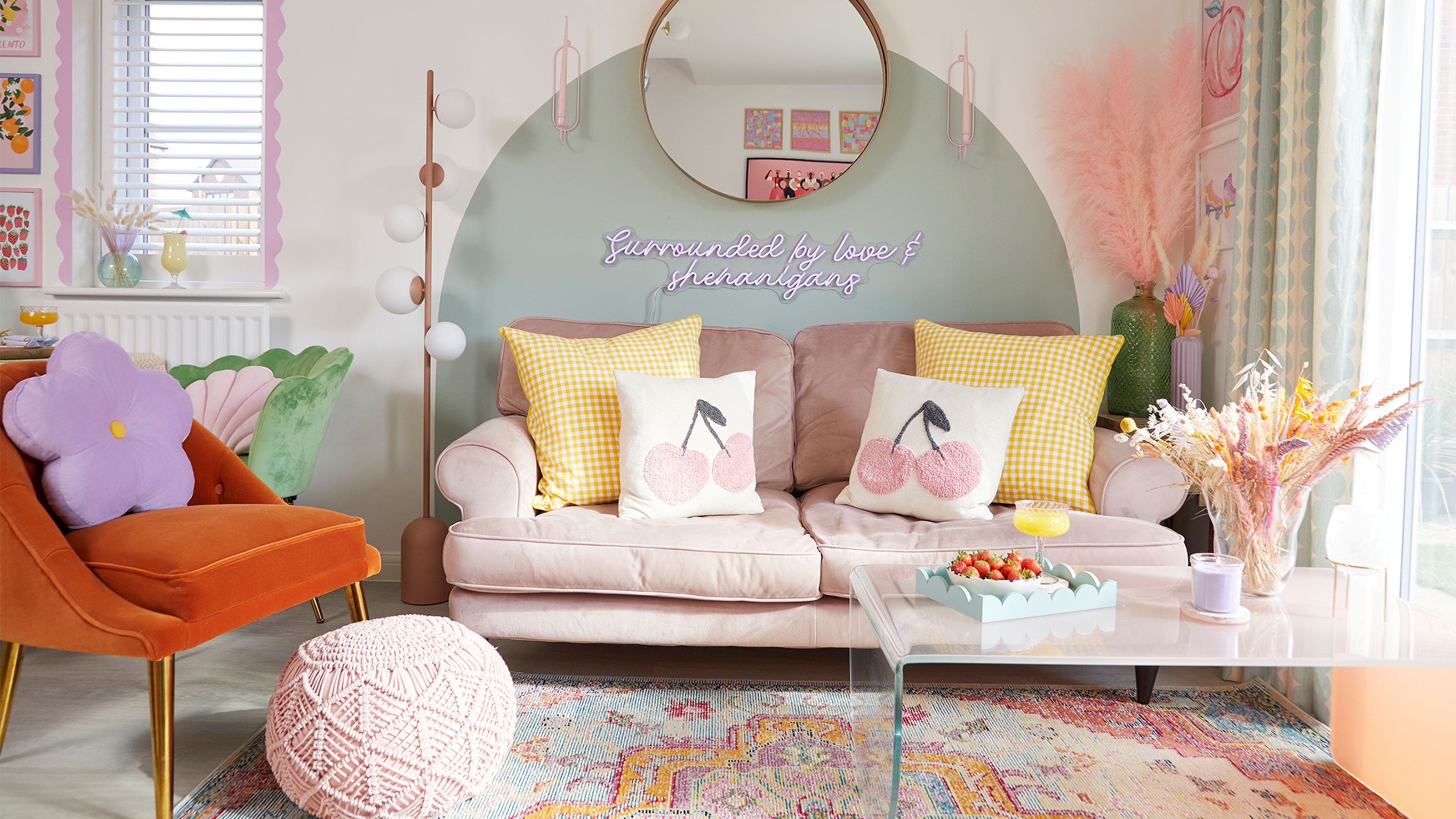
'I was excited to finally get started on personalising my new home and the first thing I did was paint the green arch behind the sofa in the living room. Pink and green is a classic colour combo that I love, but I also had the view that if the look didn’t work, I’d simply paint over it. I knew I’d be adding lots more colour to my home, and I wasn’t scared to experiment.’
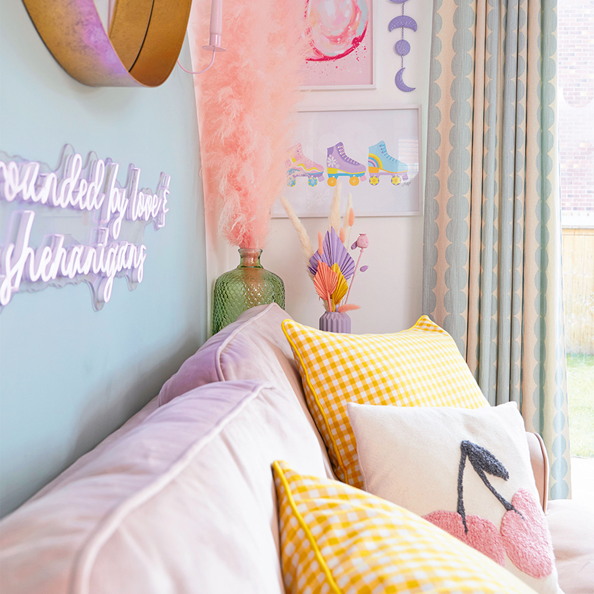
‘A rainbow of colours was always going to feature in my home, though I seem to err on the side of soft and muted rather than bright and bold. The pink velvet sofa, from DFS, became the starting point for my scheme.’
‘When it came to paint ideas I decided to decorate using mostly colour-blocking designs rather than painting or papering wall-to-wall, as I wanted the white to show and allow the colour to pop. I also think that whole walls are a big job whereas I can create a colour-block in an hour. Annoyingly I didn’t keep a record of the colours I chose as I used so many tester pots, so I’m not sure what most of the final shades I went for are!’
‘It took a while for me to think of the perfect slogan for my sign from Neon Beach, but this quote reflects me perfectly.’
Dining area
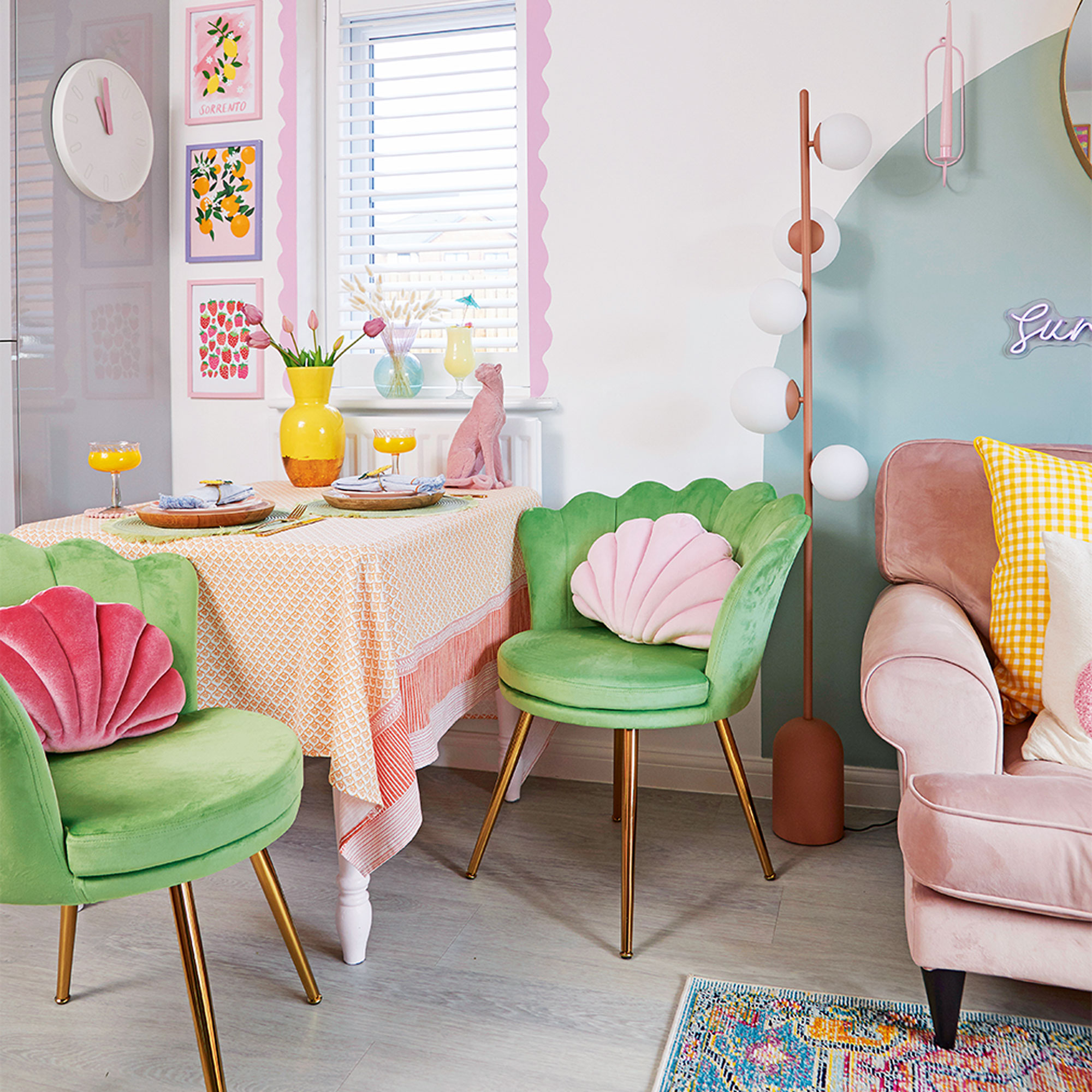
'I concentrated on decorating the ground floor first as I was living on my own and wanted a cosy space that would feel welcoming when I got home from work.'
'After looking at a few configurations for the dining area, including a drop-down table to save space, I finally decided to put one on the wall between the kitchen and the sofa as I didn’t want to have to walk around a large piece of furniture in the centre of the open-plan room. It was quite tricky trying to find a good quality table to fit, but I finally sourced a vintage one that was already upcycled.'
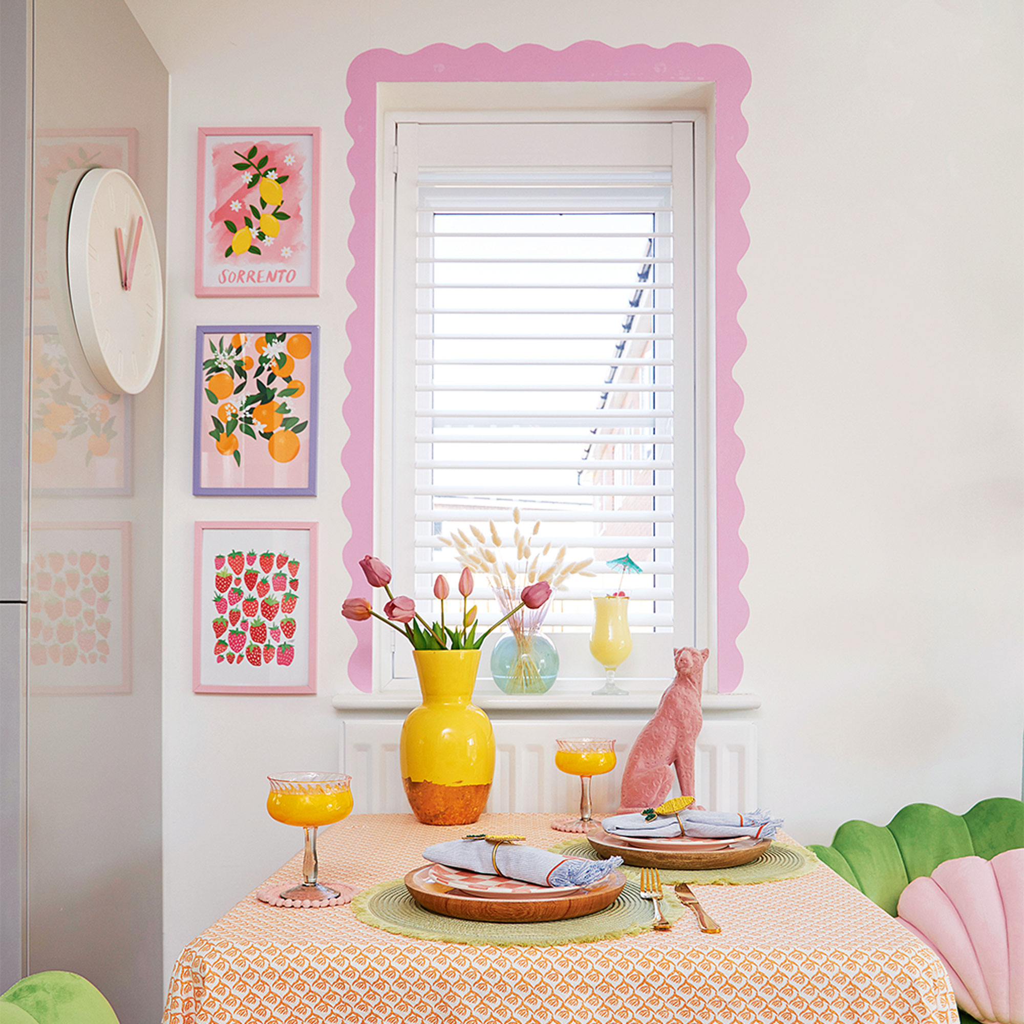
‘I specifically chose the paint effects to zone the space, using a circle for the living area and this fun scalloped square for the dining area. The velvet chairs, from The Range, add a sumptuous feel to the functional dining area.’
'While I’ve added easy colour to every room using fun paint tricks, I’ve also left lots of white on show to allow the colours to breathe and the space to feel fresh.’
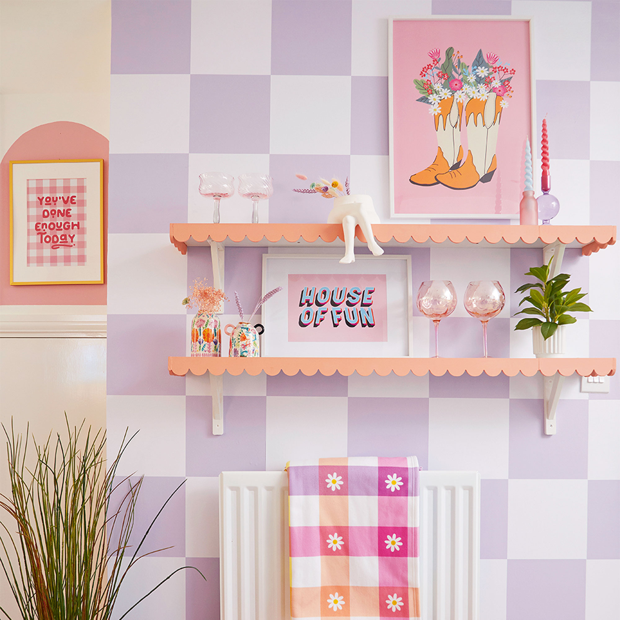
‘I did consider painting a checked design straight onto this wall, but then I discovered the self-adhesive, Livette's removable wallpaper instead, which seemed like a much easier option.’
Hallway
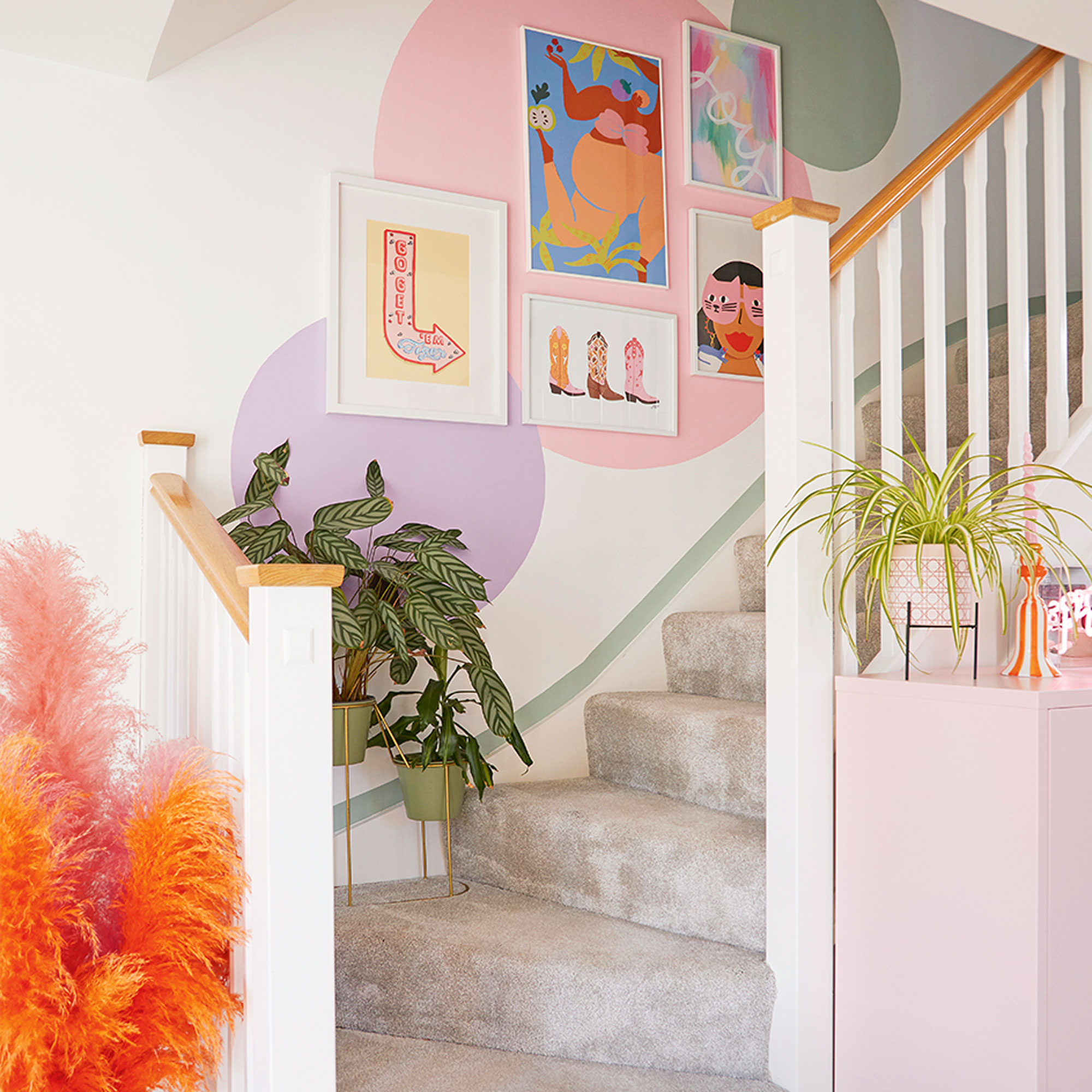
‘I had three colours left over from other projects and thought I might as well use them before they dried up so I painted the three circles as a background for my gallery wall idea on the staircase.’
‘I love a picture gallery but I didn’t want it to overwhelm the space as it needed to complement the rest of the open-plan space, so I just chose my favourite five.’
Master bedroom
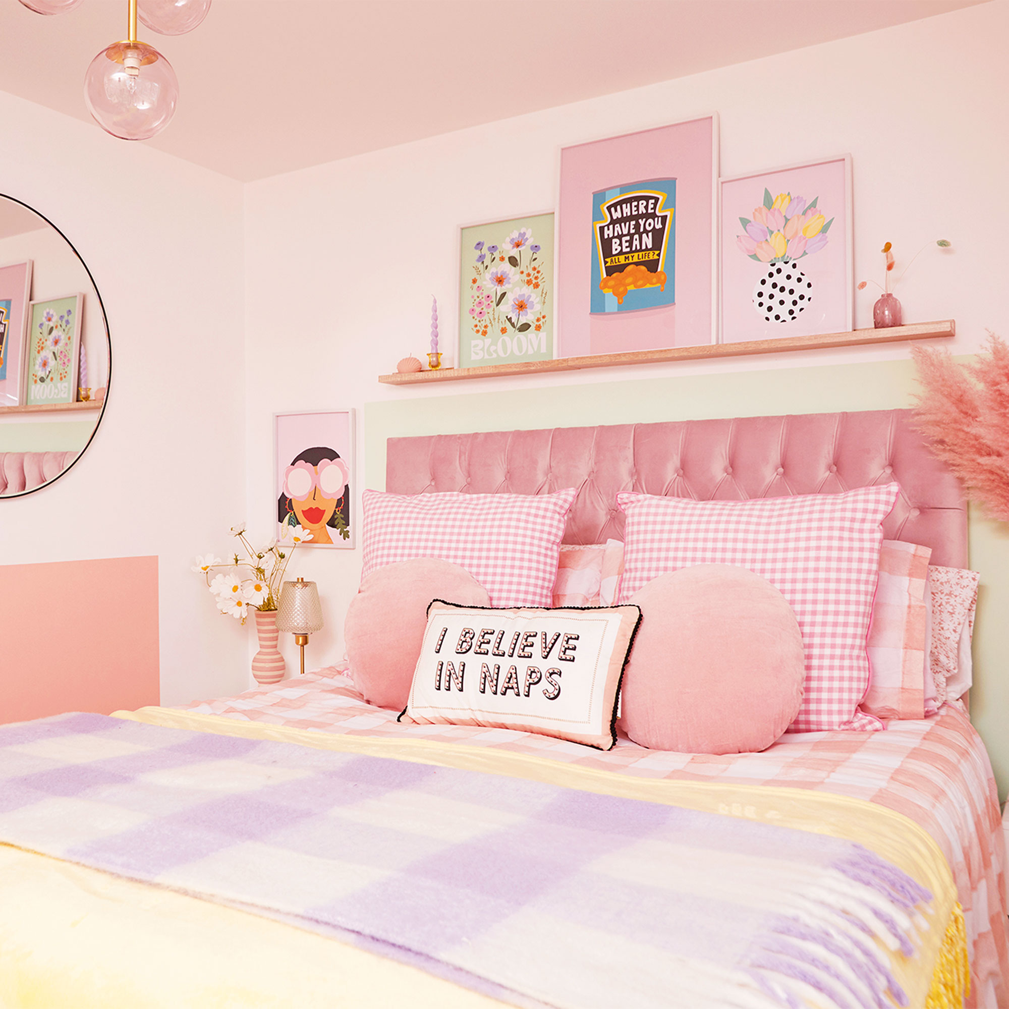
'With the downstairs finished, I moved onto the master pink bedroom design. The pink upholstered bed was another of my investment buys for the place and I painted a green ‘headboard’ shape around it. I then added a shelf with a selection of pretty prints to make the whole area more of a focal point.’
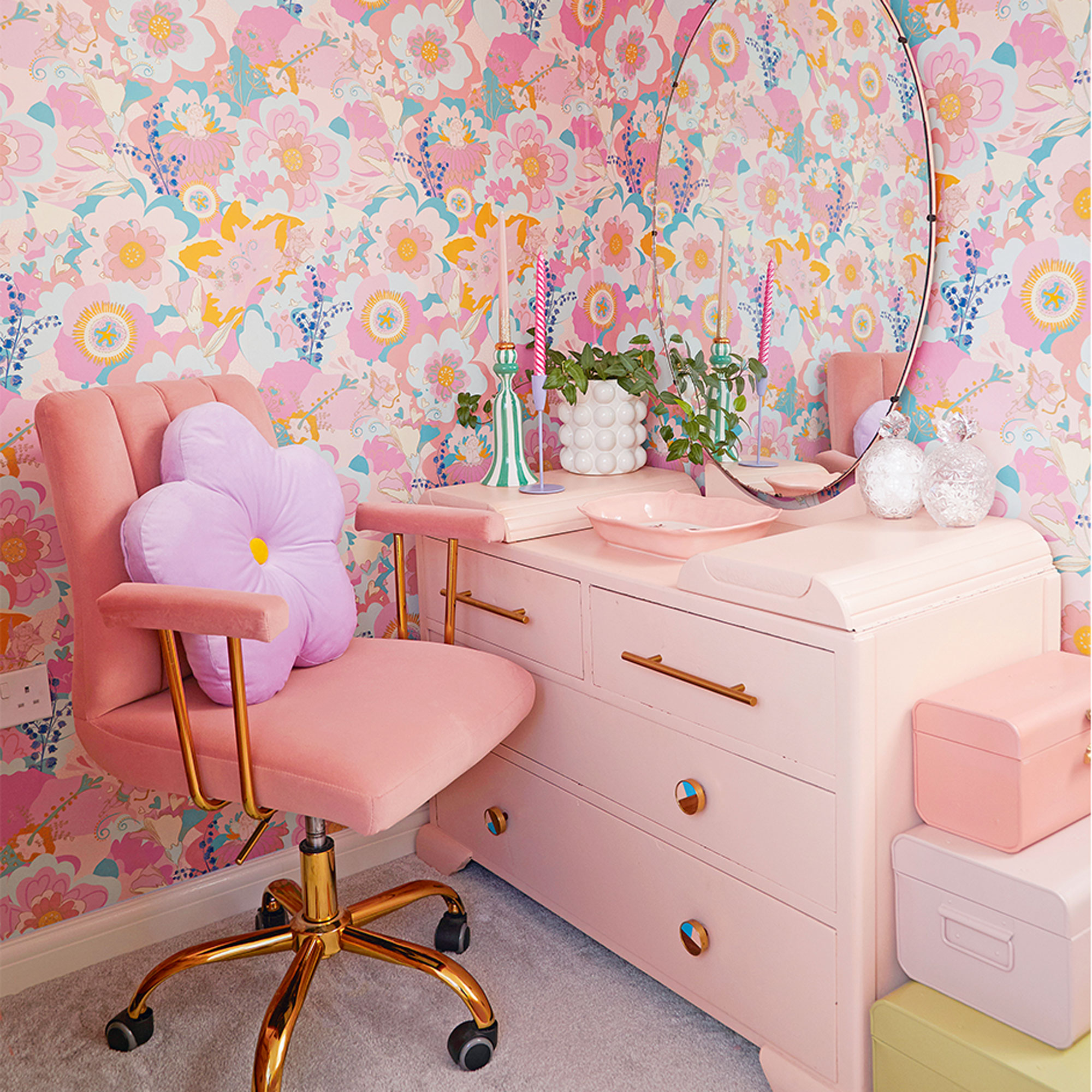
‘I didn’t want a wardrobe that was too overpowering in the alcove area, especially as I had the spare bedroom to use as a dressing room. So I defined the space with some patterned wallpaper and then upcycled a vintage dressing table as a place to do my make-up’
‘I also fitted a projector on the wall to replace an ugly TV and hid it behind some scallop-shaped wood.’
WFH space
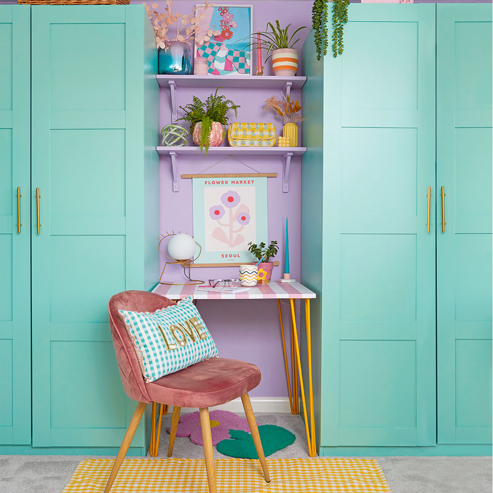
'Once the main rooms were finished I moved onto the spare room, as I needed to create more storage and an area to work. I was inspired to use the purple and green colour palette by an account I followed on Instagram, but I didn’t want to buy new wardrobes just to paint them.'
'I kept looking on Facebook Marketplace and eventually these second-hand Ikea Pax wardrobes came up at a fraction of the cost of new ones. I made a bespoke desk to fit in the gap for the perfect small home office idea.'
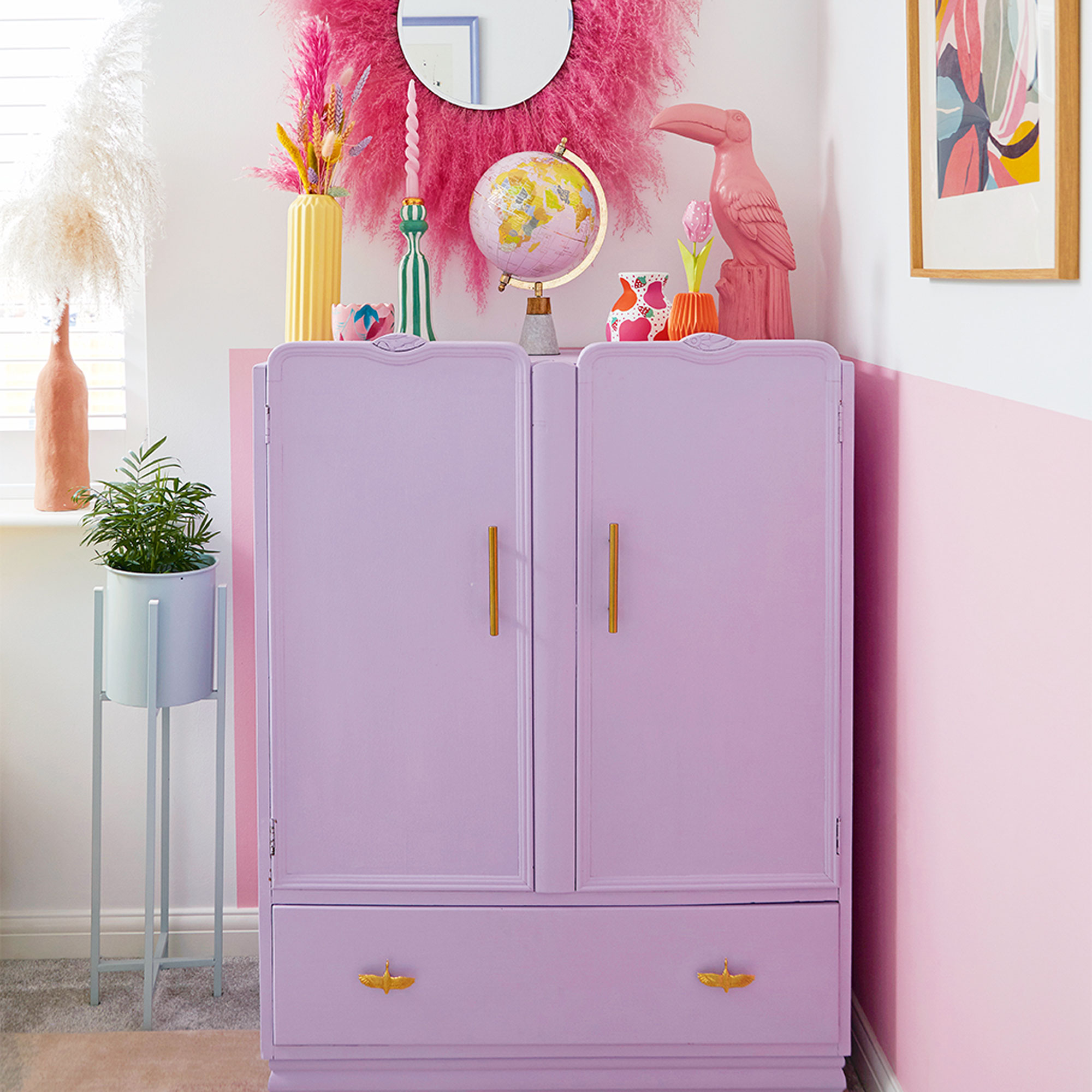
‘I’d been hunting for extra storage and I spotted this cabinet going for free on Facebook Marketplace so I painted it using paint from the wall and added £1.99 handles – it cost nothing really. I crafted the mirror myself by fixing pampas grass onto a Hobbycraft mirror.'
Bathroom
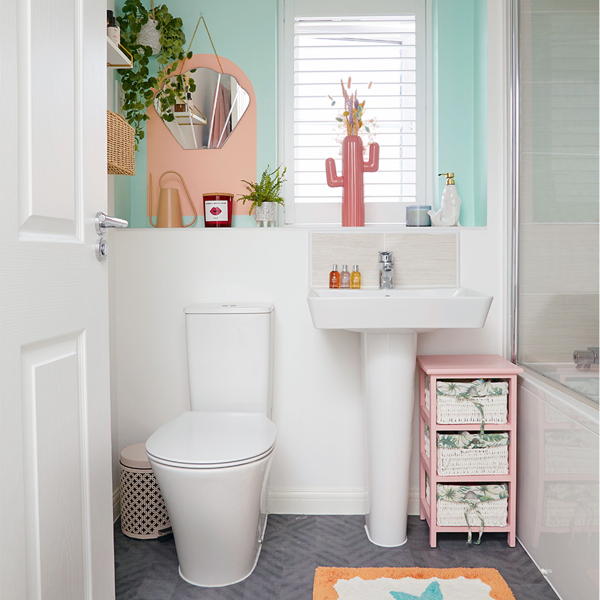
‘The bathroom was the last room to be tackled. With white tiles and fittings, all that was needed was a splash of bright colour, with a fresh, minty green paint that perks the space up completely.’
‘Now, although a home is never finished as far as I’m concerned, I feel like I’ve created my own little slice of paradise and I really wouldn’t change a thing.’

Lisa is Deputy Editor of Style at Home magazine and regularly contributes to sister title Ideal Home. She has written about interiors for more than 25 years and about pretty much every area of the home, from shopping and decorating, crafts and DIY to real home transformations and kitchen and bathroom makeovers. Homes and interiors have always been a passion and she never tires of nosying around gorgeous homes, whether on TV, online, in print or in person.
-
 Can I paint over old paint on a front door? Experts reveal when it's OK to skip this step
If you're repainting your front door this spring, here's what you should be doing with the old paint first
By Katie Sims
-
 What is a retrospective party wall agreement?
Experts explain what it is and when you need one
By Natasha Brinsmead
-
 Cleaning experts say you need a dust repellent spray to keep hay fever symptoms away – and it costs just 35p
It saves time on your cleaning schedule and alleviates symptoms
By Kezia Reynolds