Taking on a house that no one else wanted gave these homeowners their dream home
A vacant house that had been on the market for a long time due to its state of disrepair became this couple's dream family home

Amy Lockwood
When the homeowners began their search for a family home, properties in their search areas were selling fast. However, the house they took a chance on had been on the market for a comparatively long time on account of the state of disrepair. It had been vacant for a year, and prior to that had been a rental property.
‘The fact that it needed so much work appealed,’ says the homeowner. ‘The house had three floors instead of two, with a flat roof which would clearly accommodate a mansard roof extension. It was also wider than one of the other houses we had liked and it had enormous potential.’
The plan was to complete the project in two phases and the couple initially just redecorated the four-bedroom Victorian terrace whilst saving for the renovation and extension. ‘A few years later when we had accrued the funds we began the roof extension and the side return as well as extending the house out into the garden.'
‘We also had to rebuild the entire staircase as the existing one was dangerously steep with tiny treads. This involved a complete re-structure and re-levelling of all the floors.’
The homeowners had strong views on the look they wanted to achieve. ‘It needed to be a very contemporary scheme that was also sensitive to the period and design of the house yet also allowed colour and pattern to flourish. And all of this had to be done on a tight budget.’
The kitchen
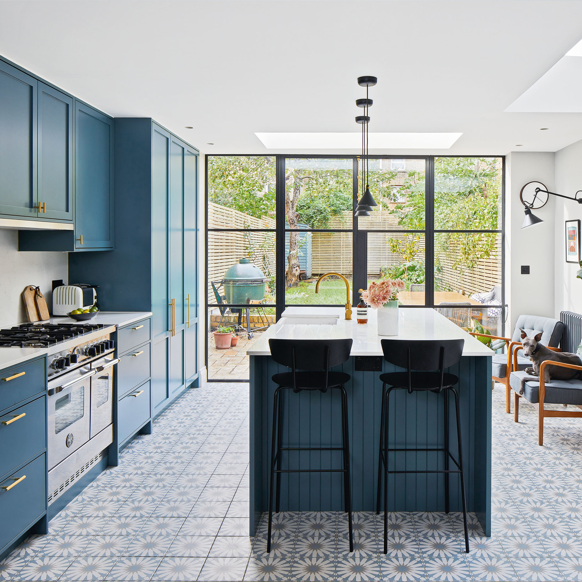
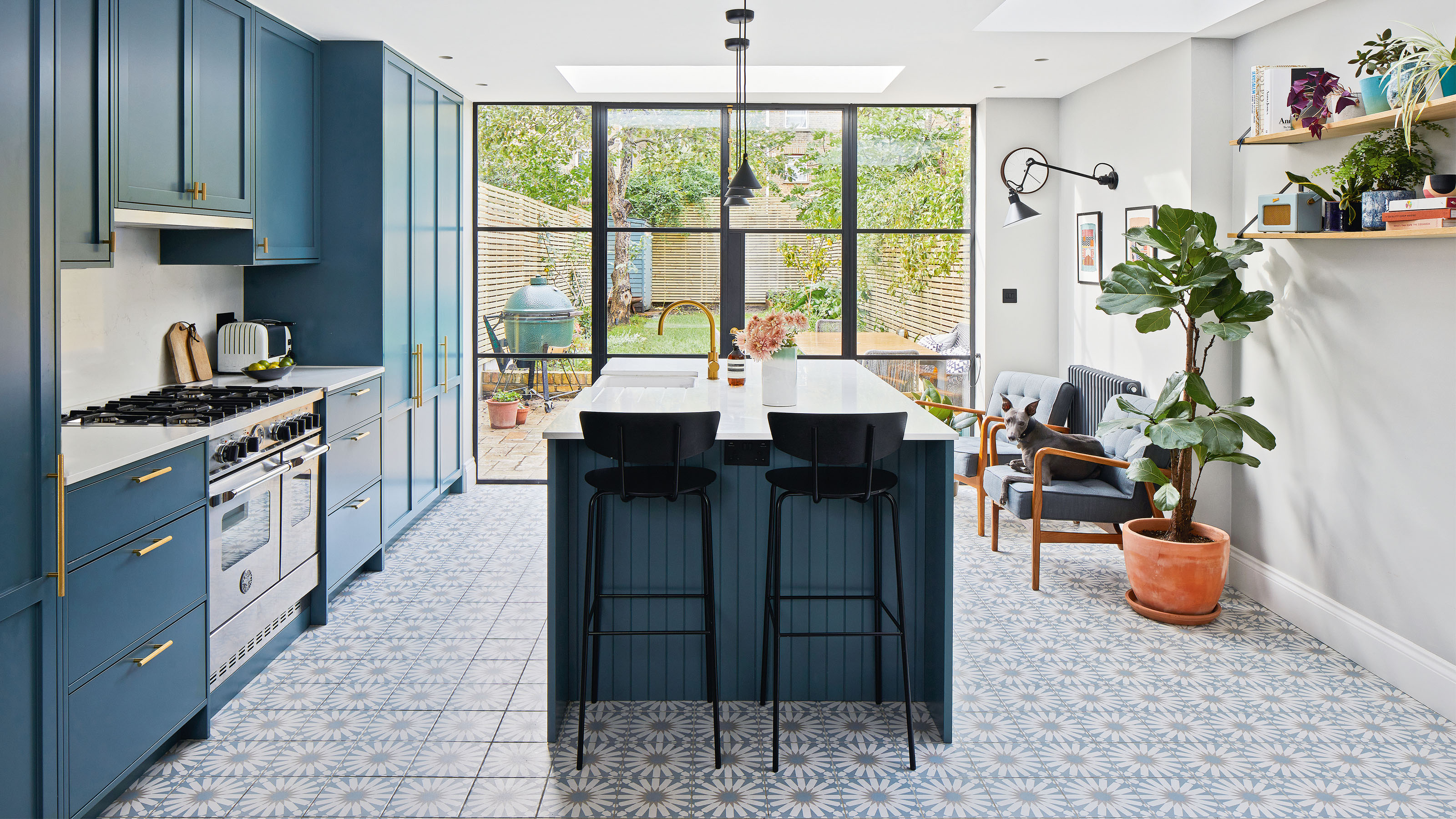
The four-story property now has a contemporary style lower ground floor with full width glass doors, allowing an open-plan family room and kitchen to flow into garden.
The new kitchen extension has been created by going into the former side return space. It benefits from top down lighting and a largely glazed rear wall.
Get the Ideal Home Newsletter
Sign up to our newsletter for style and decor inspiration, house makeovers, project advice and more.
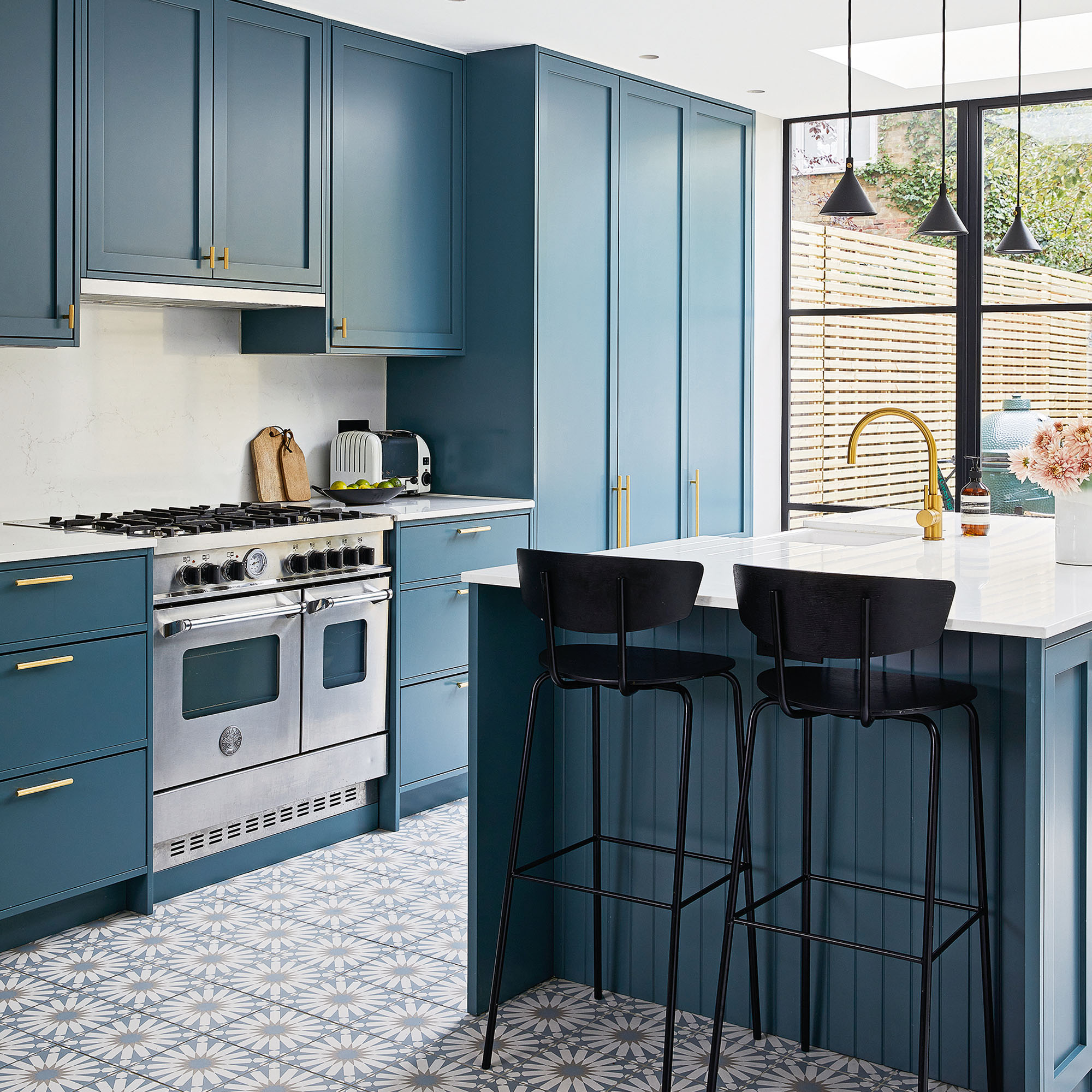
The dark kitchen units are complemented by black lighting and stools, yet the space looks bright due to the copious amount of light flooding through the openings.
Geometric tiles have been laid atop underfloor heating from comfort underfoot, while a central island provides space for practical tasks such as food prep.
The dining room
'We wanted to open out the basement level and make it a fully open plan space, removing any concrete support pillars so it could run as one flush space with views out to the garden.'
'‘However, we also wanted the option of shutting off the kitchen so the rooms could be divided when entertaining or if we wanted to use the two rooms for different purposes.'
To achieve this the homeowners have used Crittal-style glazing on both the inside and outside of their renovated home. The interior glazing allows them to cleverly partition the open-plan living area to create different zones, without compromising on light or space. As interior glass doesn't need to be double-glazed for insulation it usually works out cheaper than exterior windows.
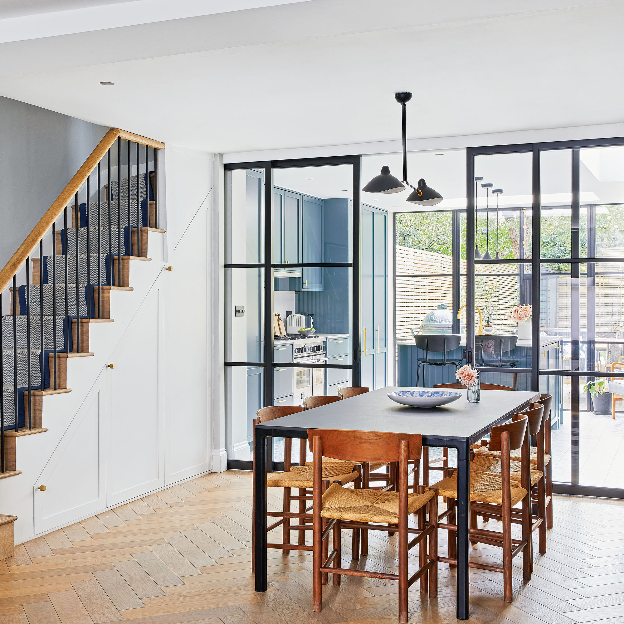
The dining area is great for the young family to be together and provides plenty of space for entertaining, too. The space is separated from the main kitchen area to create a formal eating area, which then flows onto a living room space. A bespoke sideboard designed by the homeowner provides extra storage space for fine china.
The living room
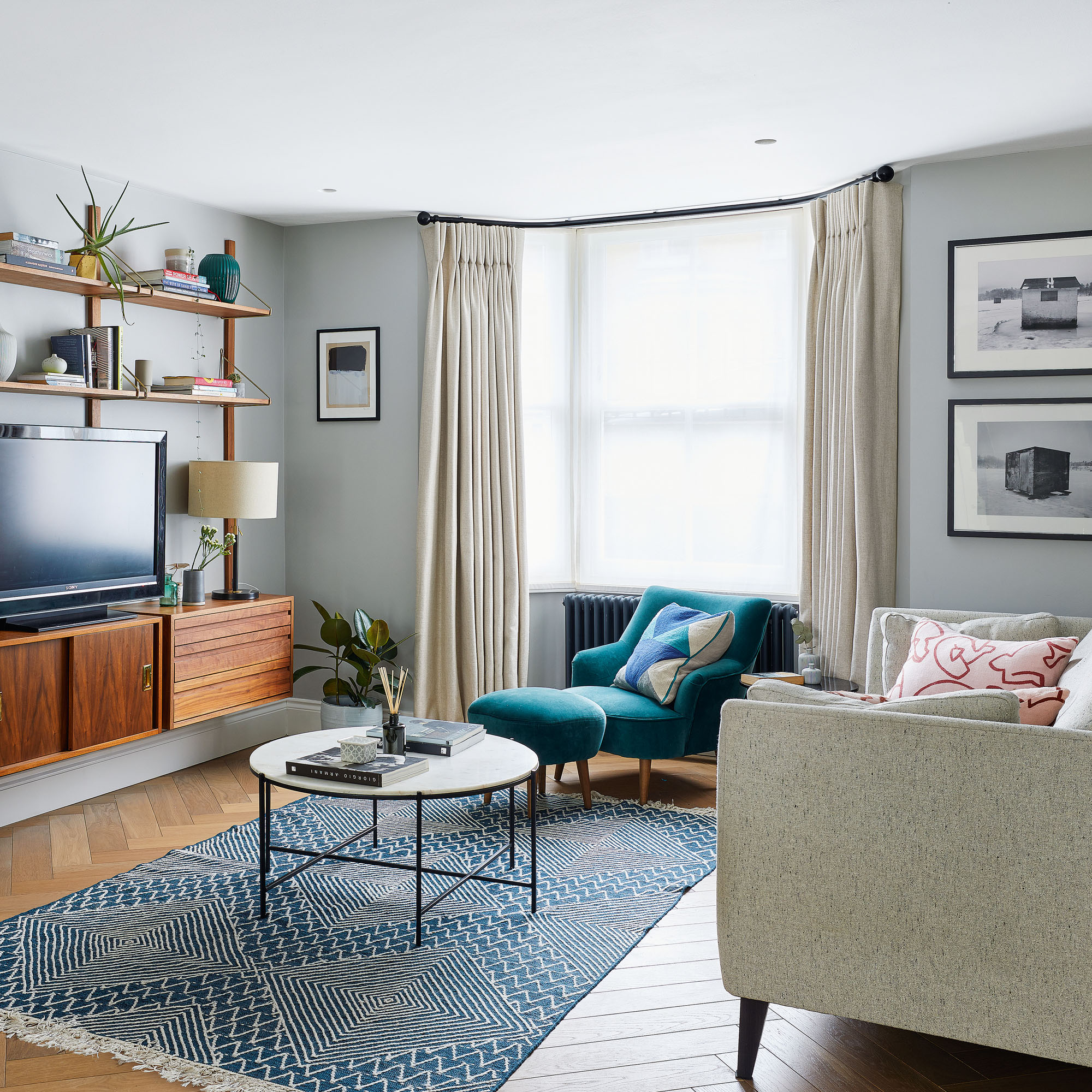
As part of the open plan space, the living room area, which one once dark and dingy is now flooded with light. The neutral theme running throughout the property allows the space to look considered. Mid-century style in the furniture and the shelving system designed by the homeowner and herringbone format wood floors contribute to creating a polished finish.
The bathroom
The upper floors follow more traditional Victorian proportions with the mansard roof extension space housing the third bedroom and bathroom.
'The addition of another floor has been an amazing luxury. As well as having a large master bathroom en-suite there’s also a dedicated properly functioning home office, where I now run my interior design studio from.'
When used between their master bedroom and ensuite, the homeowner's Crittal-style door ensures there still a feeling of flow. It provides both a sound barrier and some extra privacy without creating a light-blocking barrier.
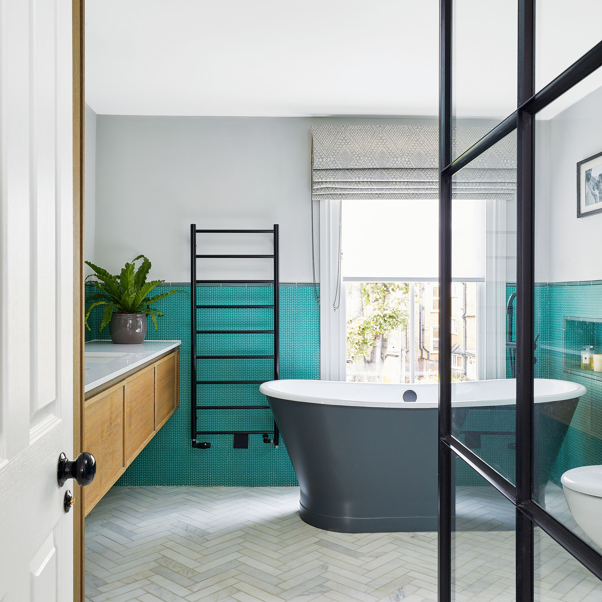
The dark grey freestanding bath is positioned by the large sash window offering views outside when relaxing in the bath. This is complemented by the floor-mounted black brassware. This set up maximises the use of space and allows amble room for the walk-in shower.
Homeowner Q&A
We sat down with the homeowners to gain a little more insight into their house renovation process.
Did you have any planning problems?
‘We had a vacant council house on one side which initially posed issues with the party wall agreement,’ says the homeowner. ‘It took a long time to get a response from the council.’
And although the couple sought advice at a pre-application meeting with the council, getting the planning permission wasn’t straightforward.
‘When we put the original planning application in it was rejected. There weren’t any houses on the street that had built a standard mansard that could be seen from street level – despite the adjacent and adjoining streets having plenty – and the council wanted to “protect the unbroken roofline”.’
Fortunately, the couple’s architect managed to overcome these issues. 'The mansard was designed with a steep angle, and we’ve used big dormer windows to overcome the issue of head height. It’s made the room feel double the size.’
What were the biggest challenges you faced?
'At the rear of the house the aim was to demolish the existing structure and build a simple London stock brick extension over three floors to match the existing Victorian style'.
‘The back of the house itself had been cheaply re-built after presumed subsidence in a really unappealing yellow brick with a poor quality of work, so the whole thing effectively needed to be taken down and rebuilt which was a big hit to our budget'.
‘Other than that, the pandemic was a huge challenge. We literally knocked the first brick down just as lockdown was announced.’
What was your biggest success?
The basement needed to have as much natural light as possible as it was previously a bit dark and dingy on account of the small windows. ‘We wanted to enlarge the space with the extension,’ says the homeowner.
‘The architect suggested dropping the floor level in the space by 100mm, which has made such a difference to the room. The foundations are shallow so we hadn’t thought this possible.’
What impact has the renovation had on your home life?
‘The works have improved our lives enormously; the increased light flooding in from the garden and the taller ceiling height has made the lower ground living area somewhere we love to be at all times, and being able to divide this space up has become essential - as our family has grown from two to four. We love entertaining and it's now somewhere that functions as it needs to.’
Ifeoluwa is a writer currently based in Milan, Italy. She speaks Italian, French and Yoruba. She grew up in London and has studied and lived in France and Nigeria.
Ifeoluwa is a regular contributor to leading UK homes and interior titles including Real Homes, Ideal Home and Period Living. She was the launch editor of the travel website Culture Trip and continues to write travel, beauty and lifestyle features. Ifeoluwa also works as a voiceover artist and as a copywriter, helping small companies improve their content offering.
- Amy LockwoodSleep Editor
-
 This £200 limited-time discount makes this Dyson vacuum cheaper than I’ve ever seen it - run don’t walk to Argos for this bargain
It's the most affordable Dyson on the market right now
By Lauren Bradbury
-
 Martin and Shirlie Kemp’s pastel flower beds has given their Victorian renovation a romantic look - how you can get the look
Their pastel garden is the cottage garden inspo you've been looking for
By Kezia Reynolds
-
 7 outdated rules to ignore when designing a small patio – experts say ditching them will transform your space
These are the traditional patio design rules you don’t always need to follow
By Rebecca Lawton