Old meets new in this idyllic Hamptons-style newbuild in Cornwall
‘There’s something calming about having a white scheme. It’s a blank canvas you can add to and change up whether it’s with cushions, plants and flowers'
Built on the site of the homeowner's grandparent’s bungalow, the interior of this lovely home combines reclamation finds with eclectic style and a nod to the Cornish coastal location, with charming coastal living room ideas.
Jess Alken-Theasby, owner of holiday properties near Padstow and occasional influencer @cornishwife.cornishlife, lives in the detached new-build with five bedrooms in Cornwall. Jess lives here with her husband Ash, who runs bespoke home construction company Alkenby (alkenby.com), their two young boys and cat Benjamin.
Jess's interior style is a wonderful combination of old meets new. She describes it herself as 'reclaimed coastal', heavily influenced by her Cornish surroundings. We were keen to find out more about her eclectic style, so we took a closer look at her dreamy home.
Old meets new
‘We built the house based on Hamptons beach house style', Jess says. 'We love old properties so we wanted it to feel as old as possible even though it’s a newbuild, so we’ve used a lot of reclaimed materials. It’s where old meets new.'
Each room of Jess's home reflect this old meets new approach, from the garden ideas to the nursery.
Outdoor seating area
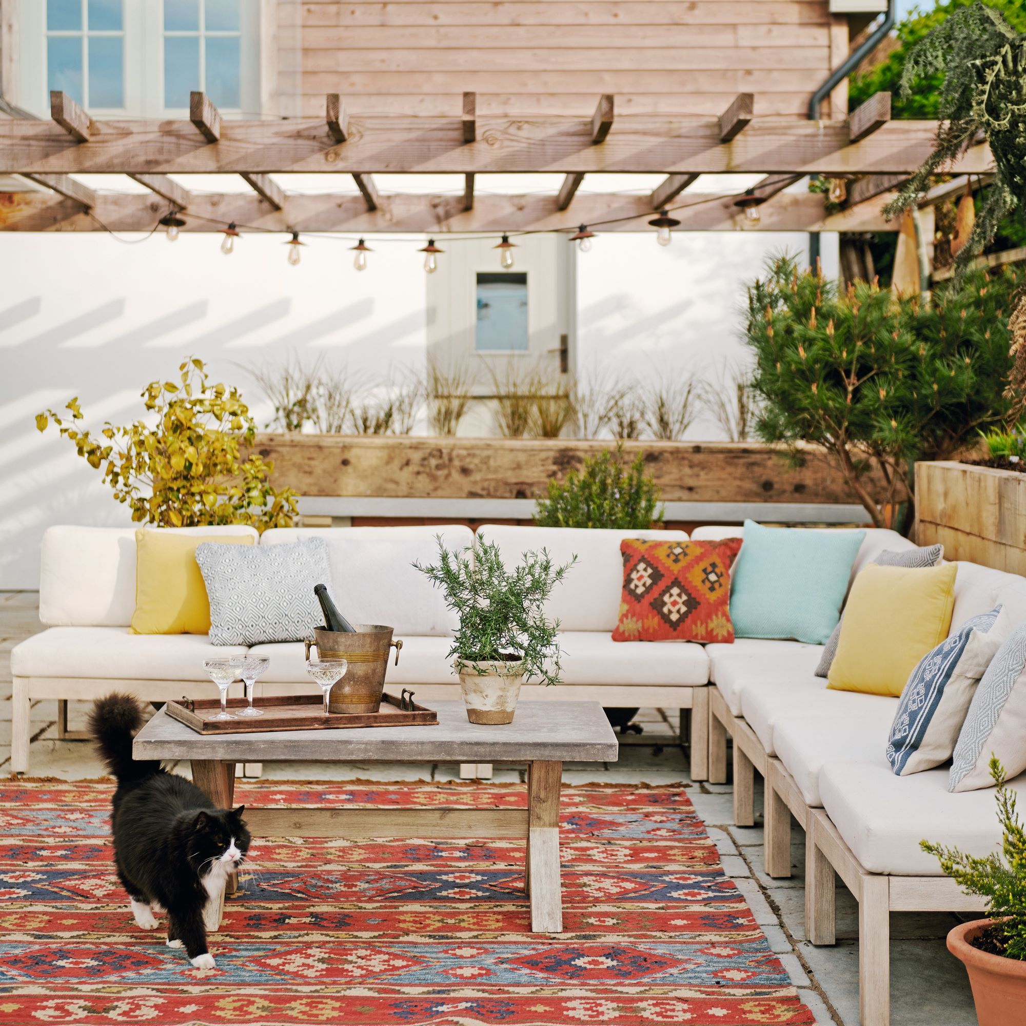
Creating beautiful garden seating ideas was top of the list of priorities for Jess and her husband Ash.
‘We use the pergola-covered courtyard, which is a sheltered space, as an extension of the house and I wanted it to feel coastal, with a bohemian vibe,' Jess says. 'The white corner sofa is covered in outdoor fabric so we leave the cushions out all summer. We brought in colour and an eclectic touch with accessories, such as the cushions and the rug.’
Get the Ideal Home Newsletter
Sign up to our newsletter for style and decor inspiration, house makeovers, project advice and more.
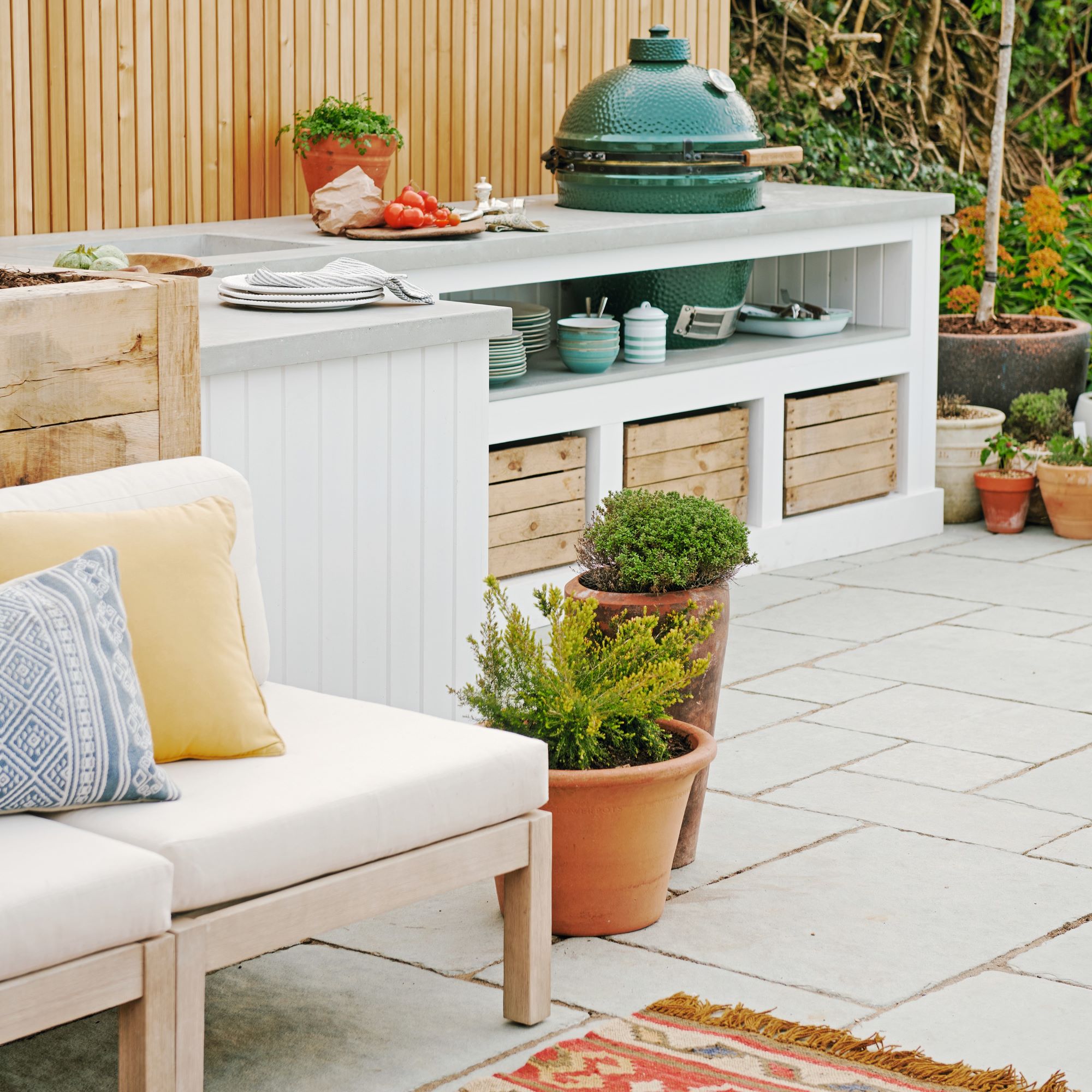
Choosing a practical all-weather rug for a garden seating area really enhances the indoor-outdoor feel. An on-trend practical concrete worksurface teams beautifully with weathered woods and a pale palette.
Kitchen
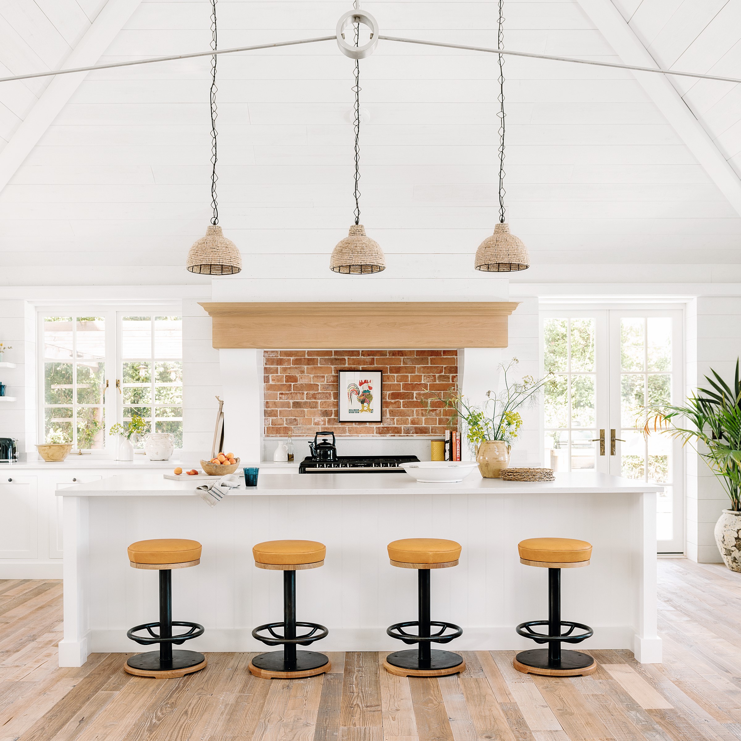
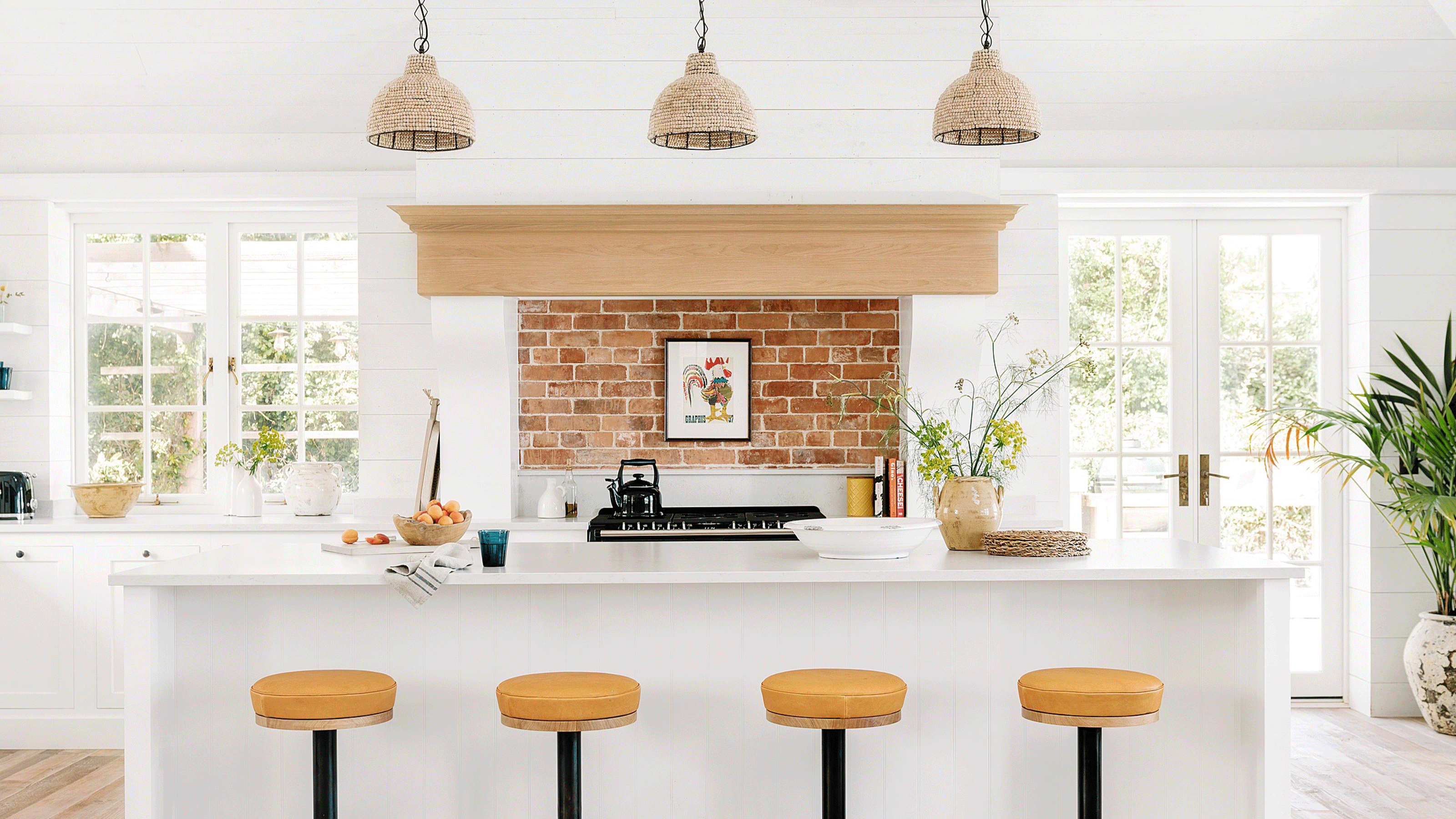
‘We wanted that Hamptons beach house look and also to accentuate the fabulous vaulted ceiling in the kitchen. I didn’t want plastered walls as they’re pristine and then it feels like a new build.'
Bold, industrial-style bar stools inject a pop of colour and add drama to a white scheme. The couple also chose to highlight their favourite artwork with wall lights in a finish that complements the frames - making a statement, especially when lit up.
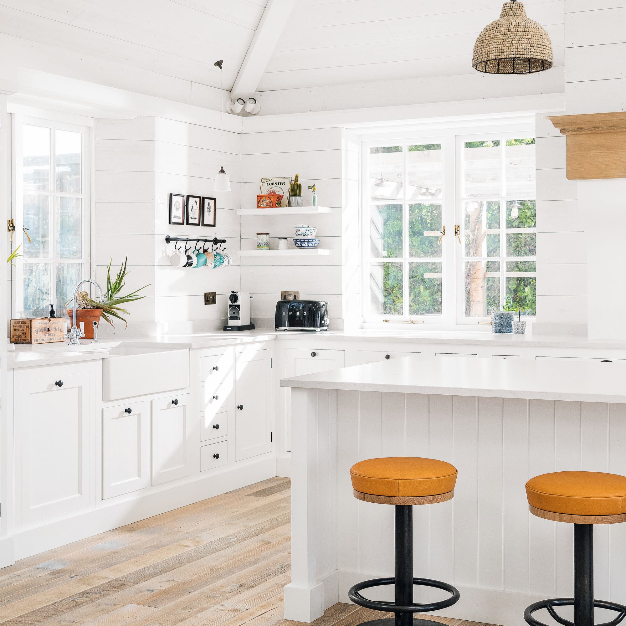
'I wanted to pull the kitchen back with some old character', Jess said. We dressed the walls top-to-toe with cladding for texture and warmth. We didn’t use a refined type of boarding so it doesn’t matter if it gets damaged a little, it just adds a bit of character to the space.’
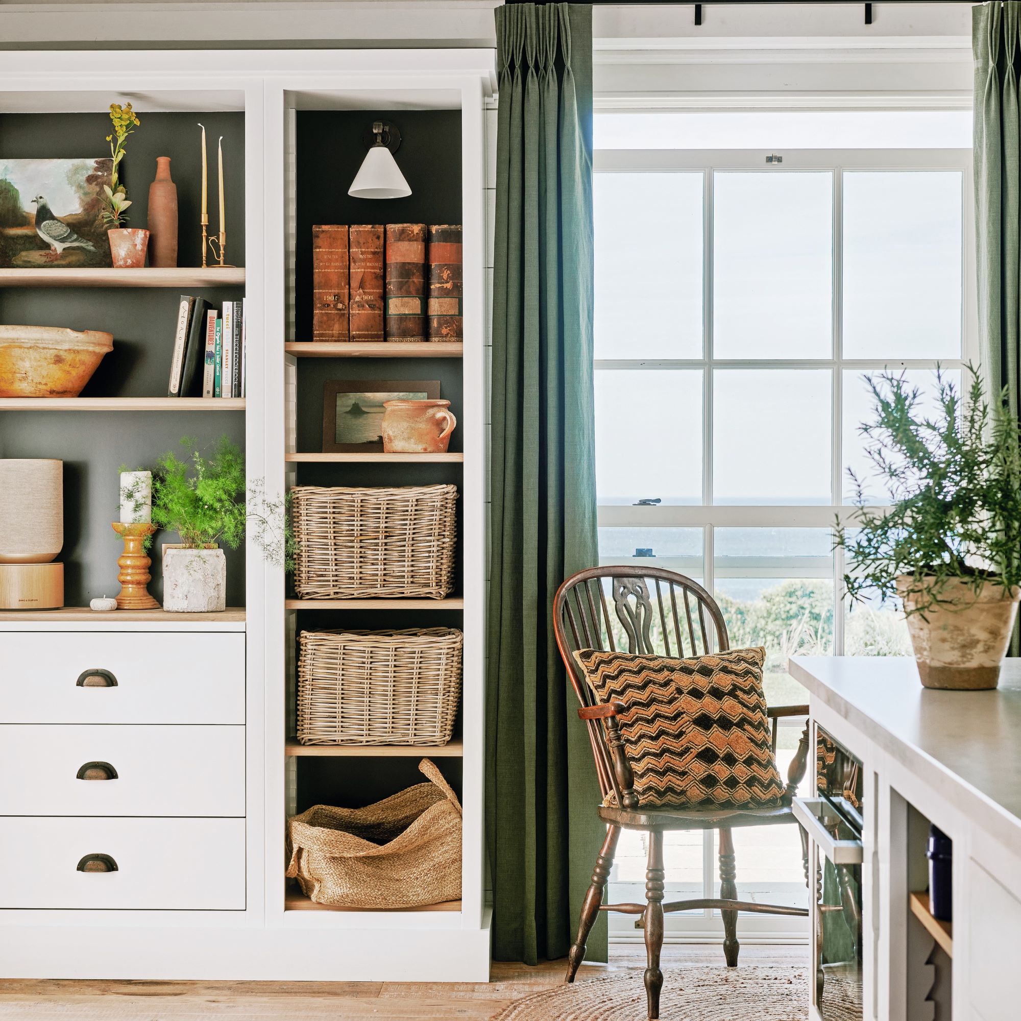
The couple really amped up their kitchen storage ideas too. ‘We realised we needed more storage space in the kitchen so the unit was a later addition. We opted for a storage unit with drawers and open shelves so we can display vintage finds, while the wicker baskets are great for providing textural concealed storage. We’ve carried through the natural fibres with a jute rug for a casual, beachy, laid-back aesthetic.’
The woven materials add natural textures to the kitchen which are perfect for the reclaimed coastal vibe. And open-shelved cabinetry painted in a contrasting shade provides accent colour and depth, giving the items on display a chance to shine.
"The lookout"
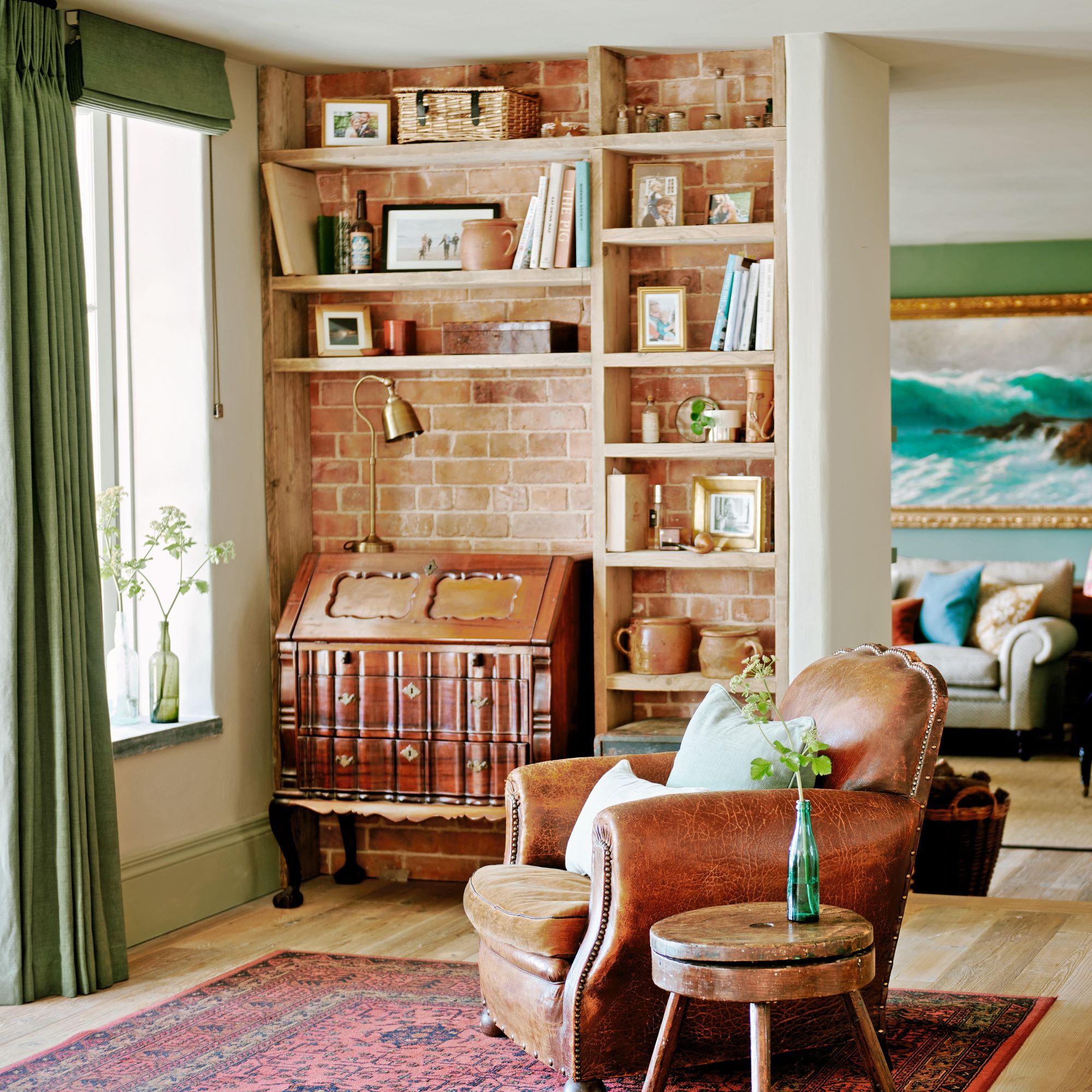
‘This lookout area is where we sit and admire the view. It has a ceiling with a bedroom above so it has a much cosier feel than the vaulted space', Jess explains.
'We reclaimed the red brick from my grandparents’ bungalow to honour the old character that was here before and added a vintage writer’s bureau with two vintage club leather chairs so there’s more of a study vibe. It’s a nice space to read or do work.’
The gentle curves of a club armchair soften a scheme and inject a timeless feel that suit any aesthetic.
Playroom
Reclamation finds were the starting point for the children's playroom. ‘The playroom is at the heart of the home in our open plan space. We incorporated a reclaimed sliding door from Retrouvius so the room could be closed off.
The wall is salvaged and comes from an Indonesian ship - it has lots of old paint on it so it’s colourful and has personality. We thought it was perfect for a feature wall as we wanted to use different materials on all the walls. Everything internally has rough tone to make it feel older.’
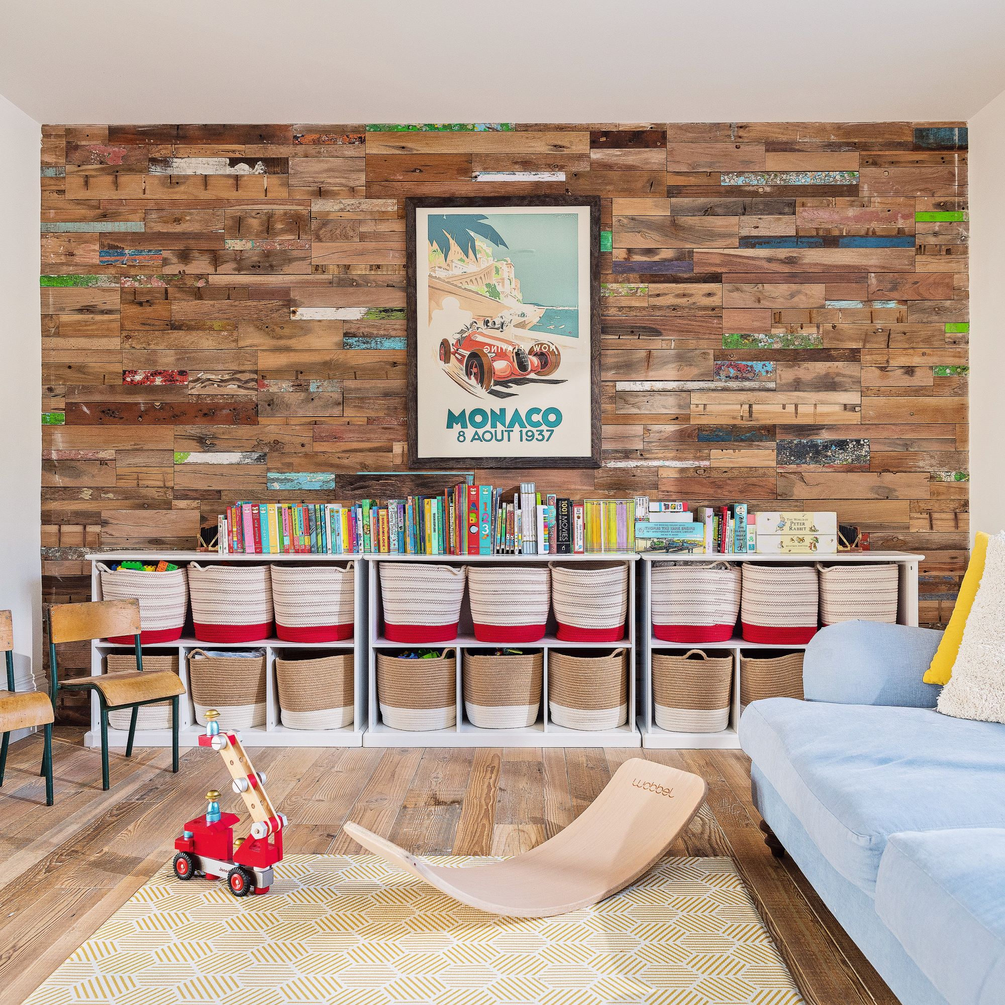
Two tone colours work to naturally draw the eye. 'I liked the idea of two bright colours with a clean line between them. I chose an aqua sea blue and a golden sand yellow. The built-in day bed, where the boys can sleep or where we read stories to them at night, continues the aqua colourway, while we added bright yellow cushions to pick up on the wall colour.'
Jess adds, 'There’s also super handy storage underneath. We built it around the Ikea baskets as they’re a great size to keep toys in - there are two back to back so it’s really good use of storage space. The aqua tongue and groove panelling covers large cupboards built into the eaves.'
Living area
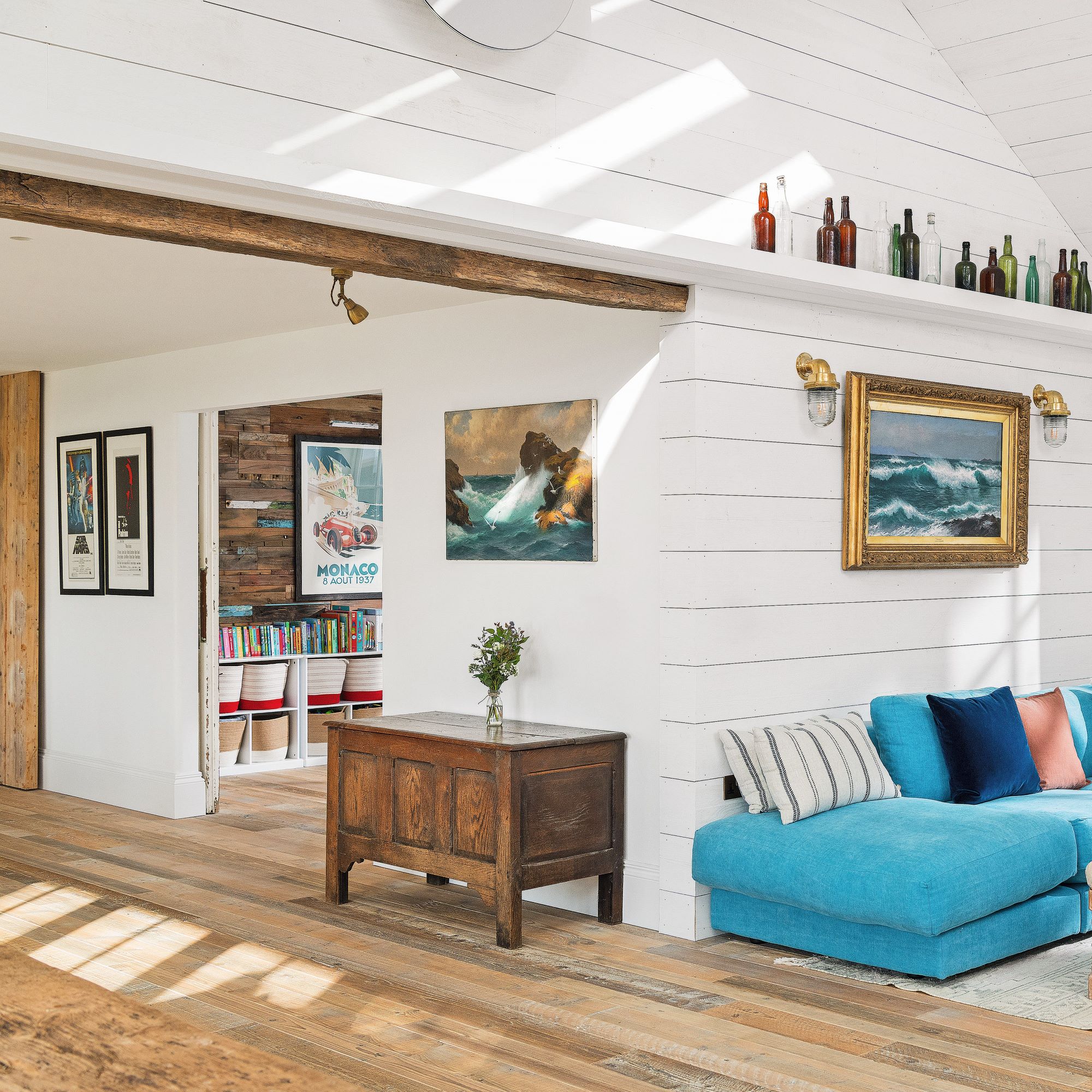
‘Everything is white in the open plan kitchen so we wanted to bring in pops of colour and some contemporary soft seating with washable covers,' Jess says. 'We pulled out the ocean blue shade of the modular sofa from the painting by my great grandfather JHC Millar to add some drama and carry through the coastal vibe, and it’s also a fun colour for the boys. We introduced more colour with the cushions.’
White acts as a blank canvas for accent colours, allowing Jess to incorporate blue living room ideas into her open-plan space. 'Ocean blue is my accent shade,' she explains.
Master bedroom
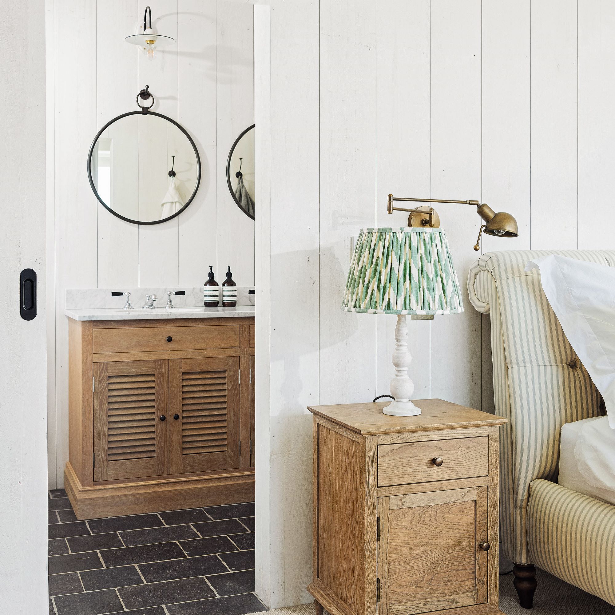
The couple continued the simple beach house theme of white, light and fresh in their bedroom.
'The sliding door is a reclamation yard find that saves space as it doesn’t open inwards and means we can have a chest of drawer in front of it it. I like the fact that it’s made up of characterful planks, echoing the white-wash cladding and the ticking on the bed, and layering the stripes.’
One of Jess's top tips is to save space with a wall-mounted brass vintage-style lamp. 'This injects an industrial touch and can be angled to where you need a pool of light.'
Children's bedroom
Architectural features add character to the children's bedroom. 'We built the house so that it has vaulted ceilings and interesting elevations, eaves and dormer ceilings that draw the eye. We’ve made clever use of these angled spaces,' Jess explains.
'In our son’s bedroom, we’ve built in a bunk bed, which fits neatly into the space under the pitched roof, while in the nursery next door we’ve used the space for a chest of drawers and tepee. We’ve created two very different spaces as our son’s bedroom has a fun aqua bed, while the nursery is predominantly white.’
Nursery
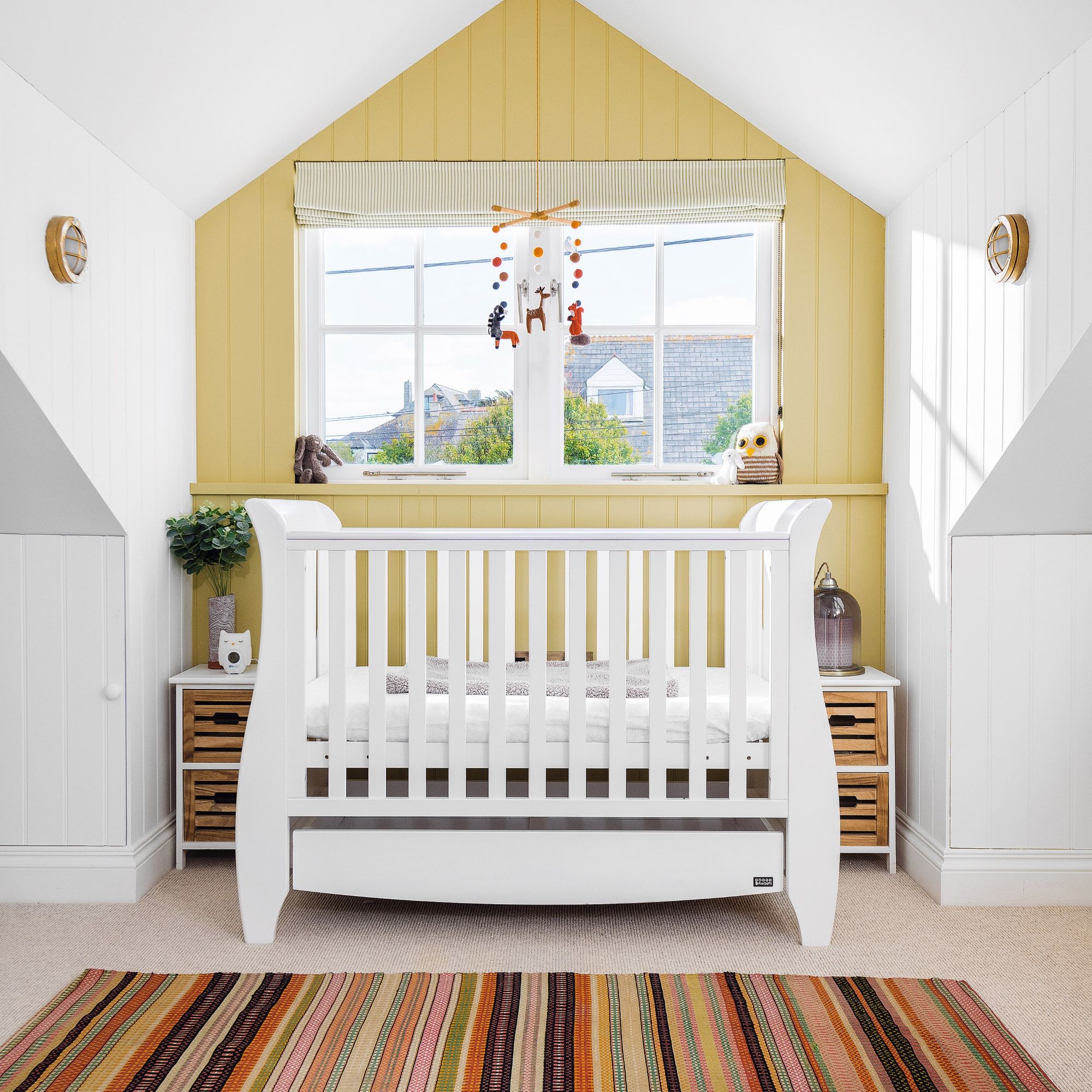
‘We wanted to create a fresh and calming backdrop but I was keen to add impact in the nursery,' Jess explains. 'We painted the tongue and groove feature wall in pale green first, then wanted to add some texture, tone and colour with the rug, which features the same shade.' A white cot creates a lighter look than a wooden design and its gentle contours soften the angular scheme
'I love the green colour - it reminds me of my granny’s garden in the spring, quaintly English meets Hamptons beach house.’
-
 Will a conservatory add value to your home and how can you maximise it?
This is what the pros say
By Amy Reeves
-
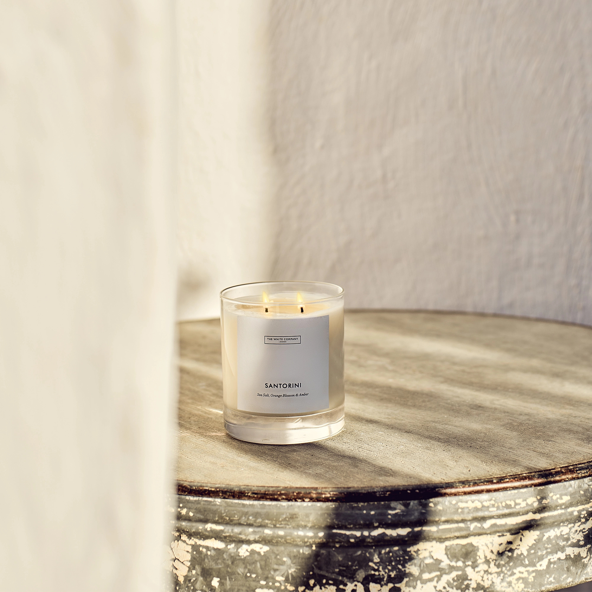 I’ve been looking for a new signature scent for my home and The White Company's new fragrance is the exact summer holiday smell I needed
Santorini smells fresh, summery and sophisticated
By Kezia Reynolds
-
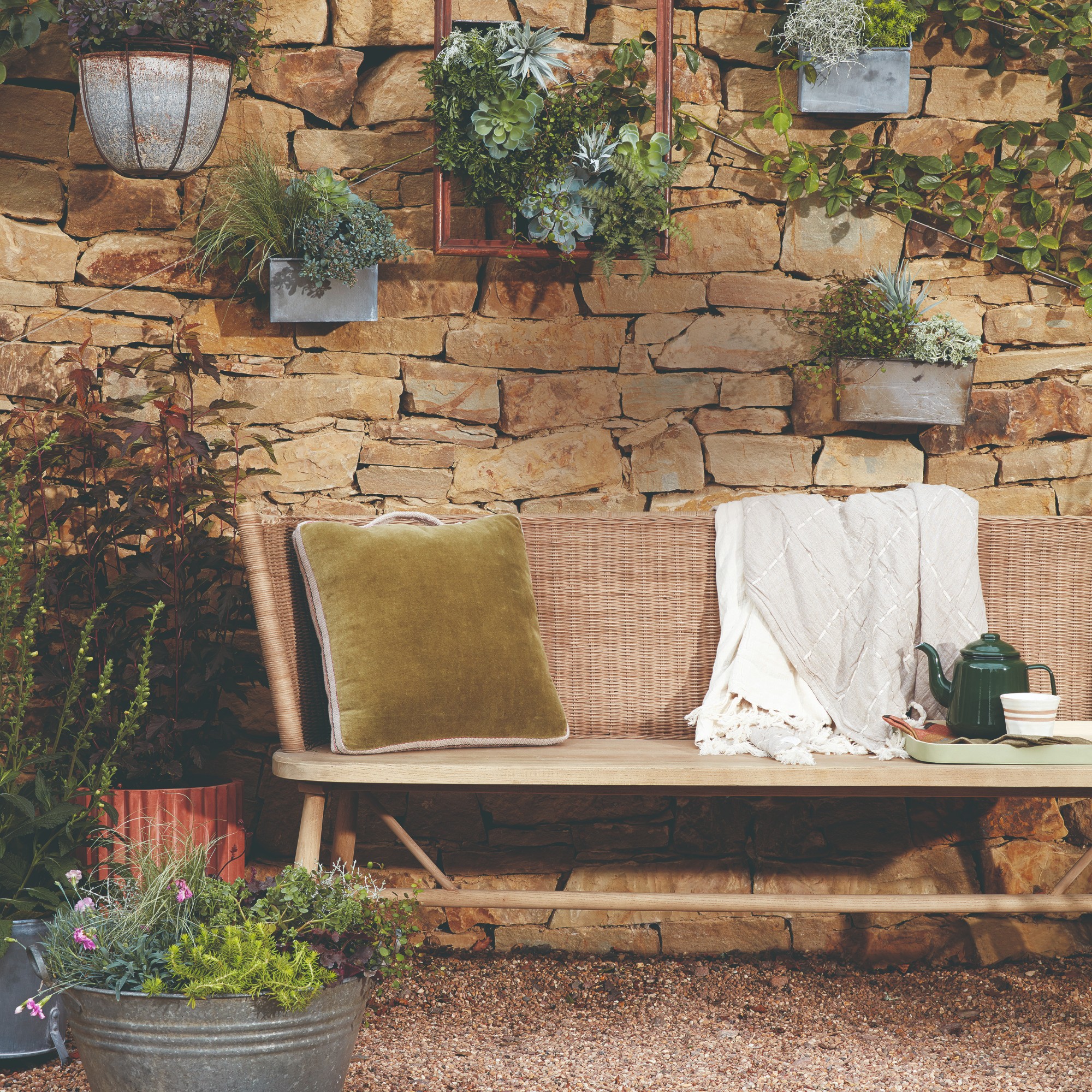 How to remove algae from garden walls in five steps – and the cleaning product experts rave about for tackling it fast
Experts share their top tips for getting garden walls algae-free
By Katie Sims