Mid-century and Scandi styles have inspired this Edwardian semi
The owners of this semi-detached period property home have extended at the rear to create a practical space over three levels

Sign up to our newsletter for style inspiration, real homes, project and garden advice and shopping know-how
You are now subscribed
Your newsletter sign-up was successful
When the owners of this three-bed, semi-detached Edwardian house in Surrey, the decor wasn't to their taste. They also found having the kitchen on a different floor to the living room was inconvenient for family life.
Since then, they've opened up and extending the downstairs, which means they can spend all their family time there. They have also gained a guest bedroom-cum-home office in the process.
The exterior
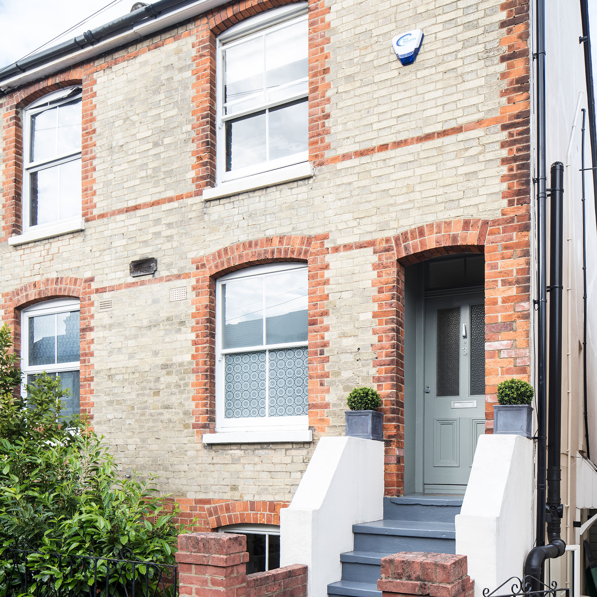
The owners had relocated from a flat in London and had always dreamed of a period property with a modern extension idea on the back, which this house had potential to achieve.
Article continues belowThere were two rooms on each of the three floors, which were all a good size and each had a fireplace – even the bathroom. However, the lower ground floor was damp and gloomy with a staircase separating the kitchen and dining room, and the only way into the garden was through a side door and along a passageway.
The split-level living became a practical problem when their daughter arrived the following year. 'We were reliant on using the side entrance for the buggy as it was at ground level, but we still had to carry her up and down the steep stairs between the kitchen and living room,' the owners explain. 'We began to think about how we could streamline the layout and make the garden more accessible.'
The extension
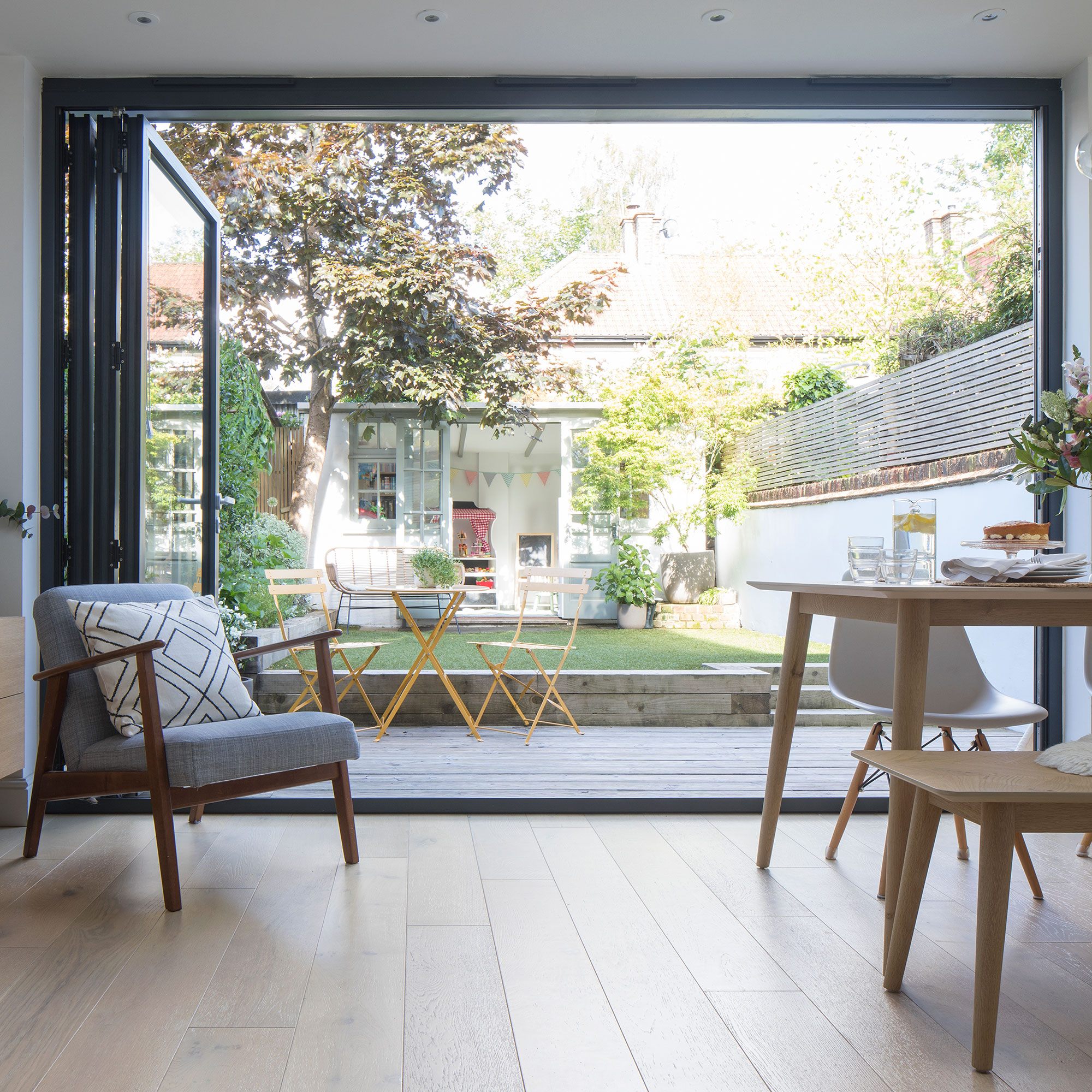
The owners had visualised one through-room with bi-fold doors onto the garden, so that’s where they started when briefing the architects.
'They [the architects] had some ideas about moving the staircase and building a larger extension, but we weren’t sure if we’d see our money back and didn’t want to lose any of the garden,' the couple told us.
Sign up to our newsletter for style inspiration, real homes, project and garden advice and shopping know-how
Instead, they knocked through the kitchen and dining room leaving the staircase as it was and extended 2.5 metres over where the concrete patio had been.
'We love the long roof window in the extension that marks the change between the old and new as it brings in lots of ambient light.'
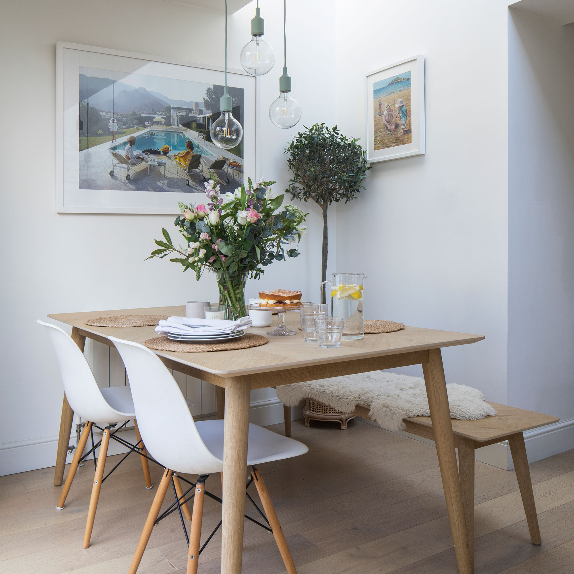
The couple also took the extension as wide as they could to the boundary line. This has made a big difference to the dining room idea, making space for a table that seats six. Cream tones in Farrow & Ball’s Wimborne White match the warmth of the blond wood and make the room light and bright.
Although the change meant the passageway was blocked off from the garden, this didn't matter as they didn’t need the access any longer.
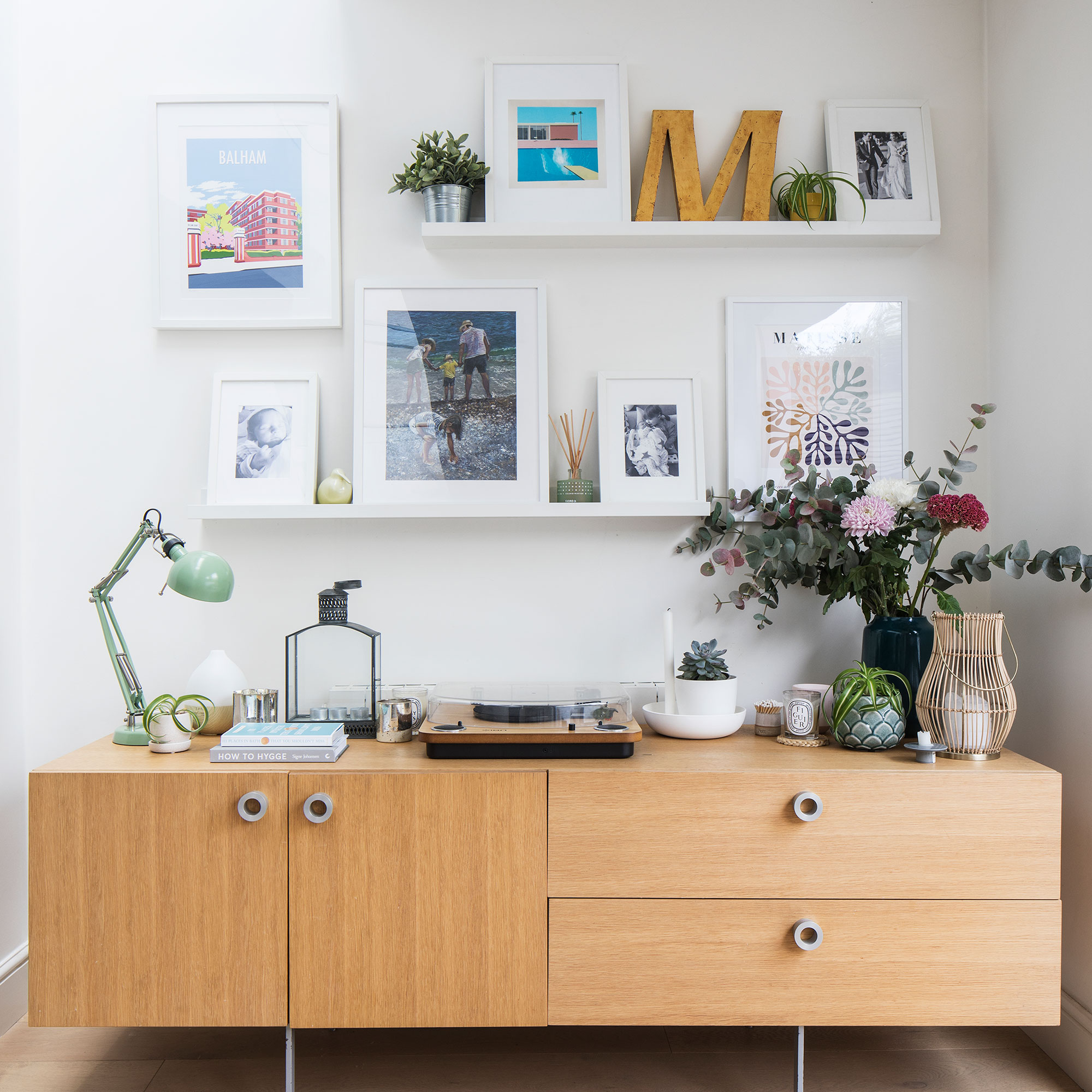
While the upper floors had lovely period details, downstairs had none so the owners wanted something to focus their design ideas on. A favourite piece of furniture is the bespoke mid-century sideboard that they won from a furniture designer in a raffle.
'We both love the clean lines of this era, it’s a flexible design classic that sits comfortably in our old house and works well with contemporary Scandi styles like the blond wood flooring, rattan accessories and furniture.'
Walls have been painted white to keep the space as light as possible, while interest and colour have been introduced with art and greenery.
The kitchen
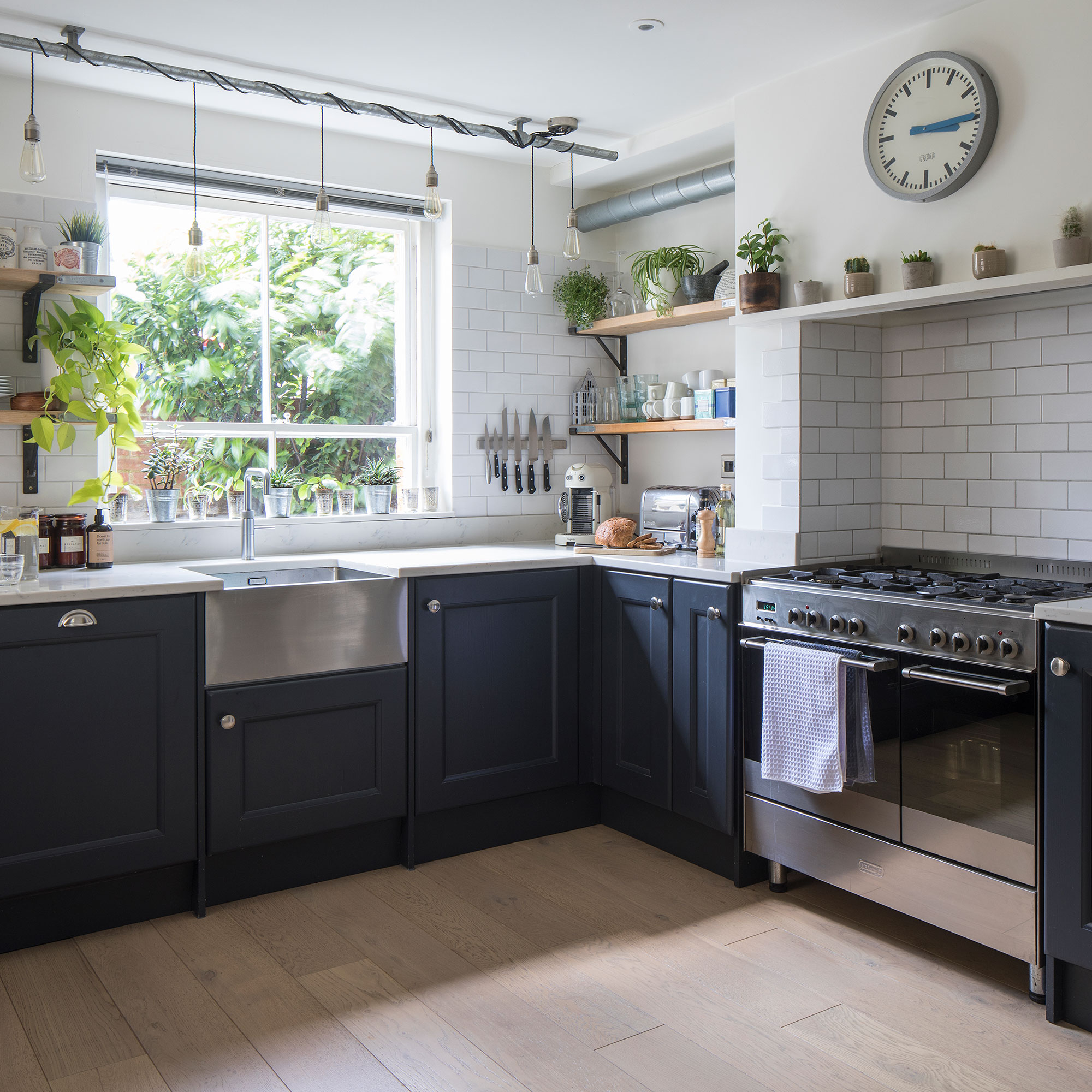
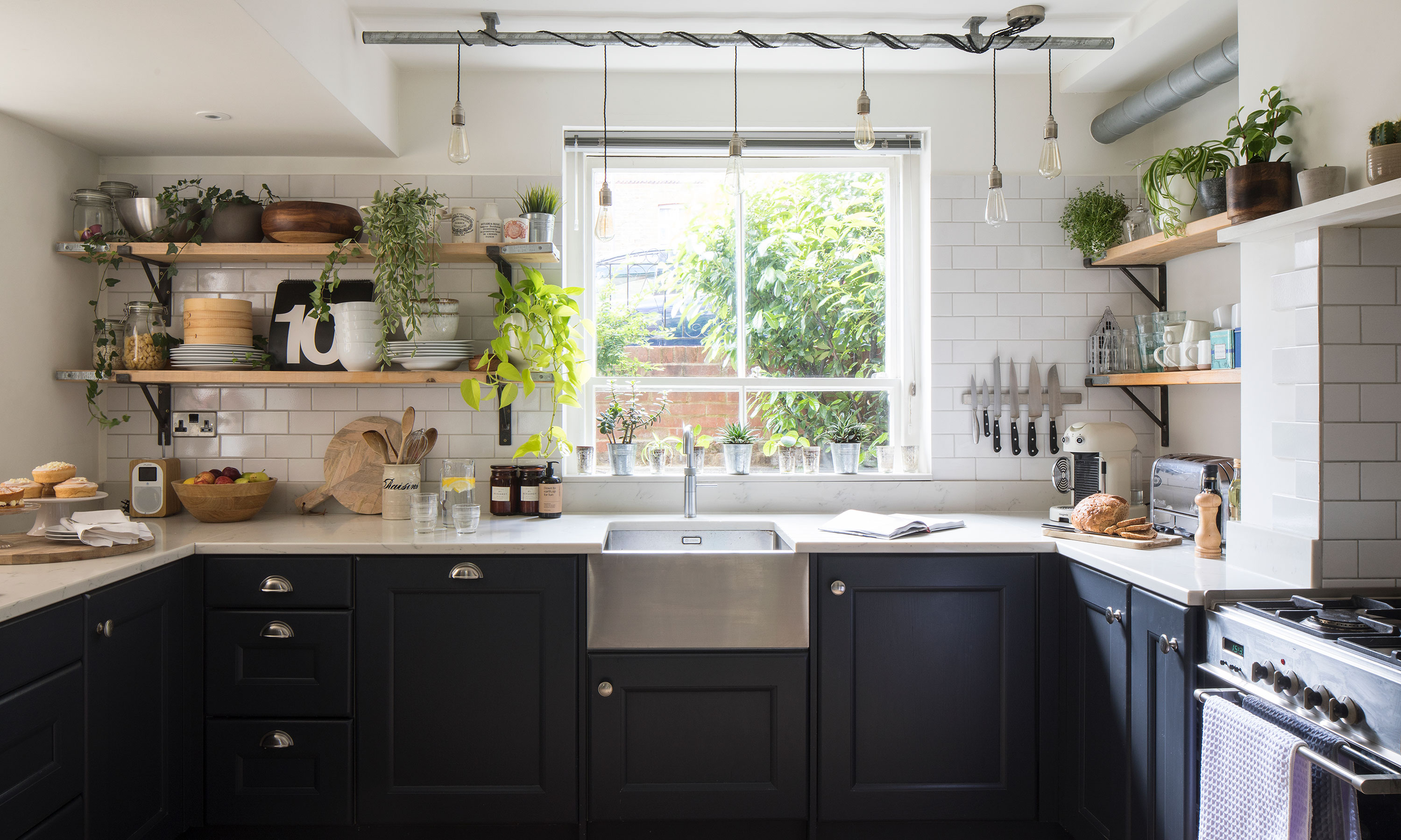
The industrial-style kitchen idea is inspired by the owners' favourite restaurants and boasts dark cupboards to ground the room. Lighter walls give the illusion of height and space.
Cupboards from Blok Design Kitchens have been painted in Farrow & Ball’s Railings, teamed with white metro tiles and a stainless-steel sink. The exposed metal extractor fan ducting pipe is another clever industrial touch.
Wall cupboards would’ve made the room feel enclosed and the owners loved the rustic look of open shelves so asked their builder to make some for them. He also made the chimney breast more symmetrical to fit in a range cooker and narrow cupboards on either side.
The living room
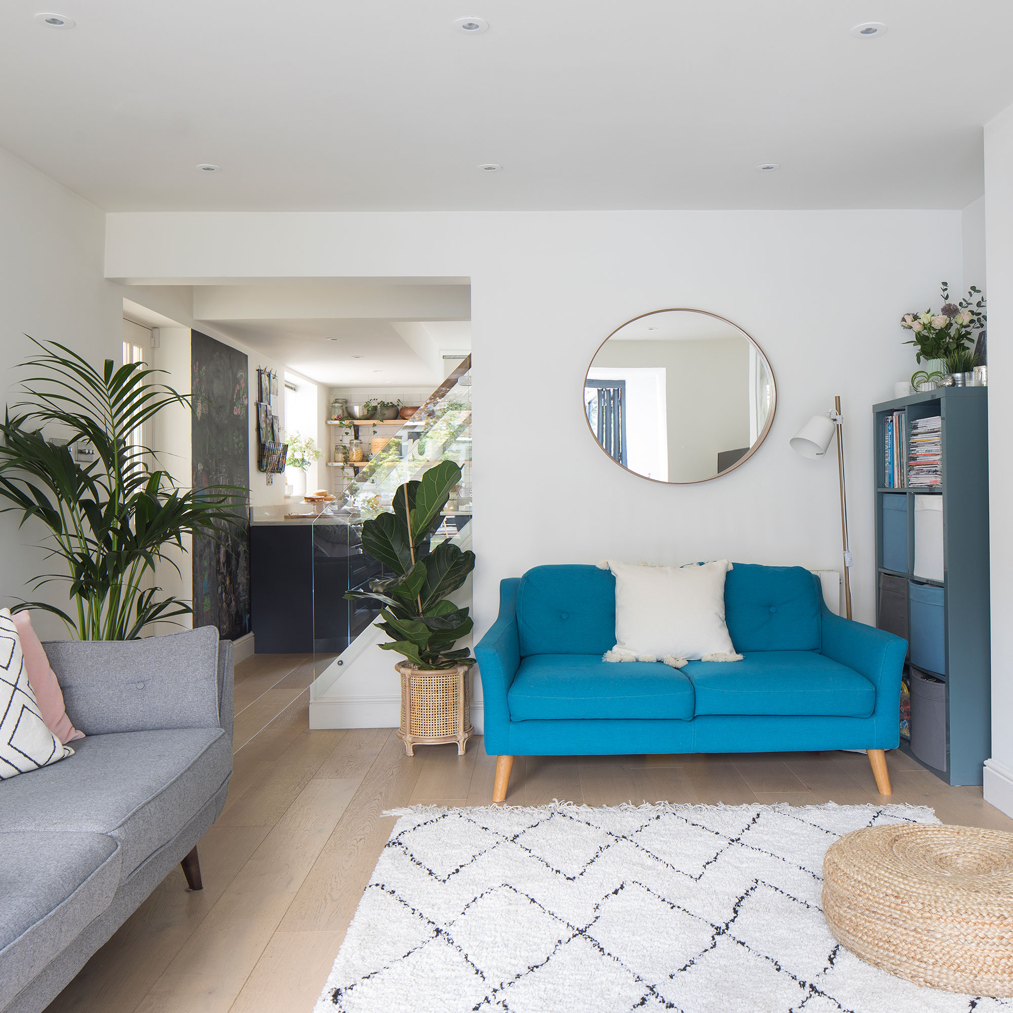
In the living room idea, the owners went for mid-century style sofas from Made.com and French Connection at DFS, accessorising with Scandi touches like the H&M bamboo plant pot and Ikea mirror. The framed aerial beach photo by Gray Malin was an anniversary gift.
The master bedroom
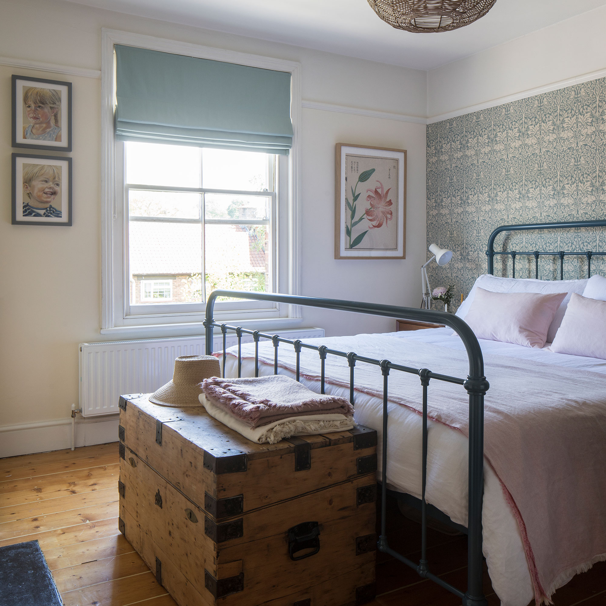
The owner grew up with William Morris wallpaper and felt the Brer Rabbit print in Slate had a calming tone that complemented Farrow & Ball’s Tallow on the walls.
'I love flower drawings and Japandi style – this is a King and McGaw print of a page in a 1500s Japanese botanical book.'
The guest room
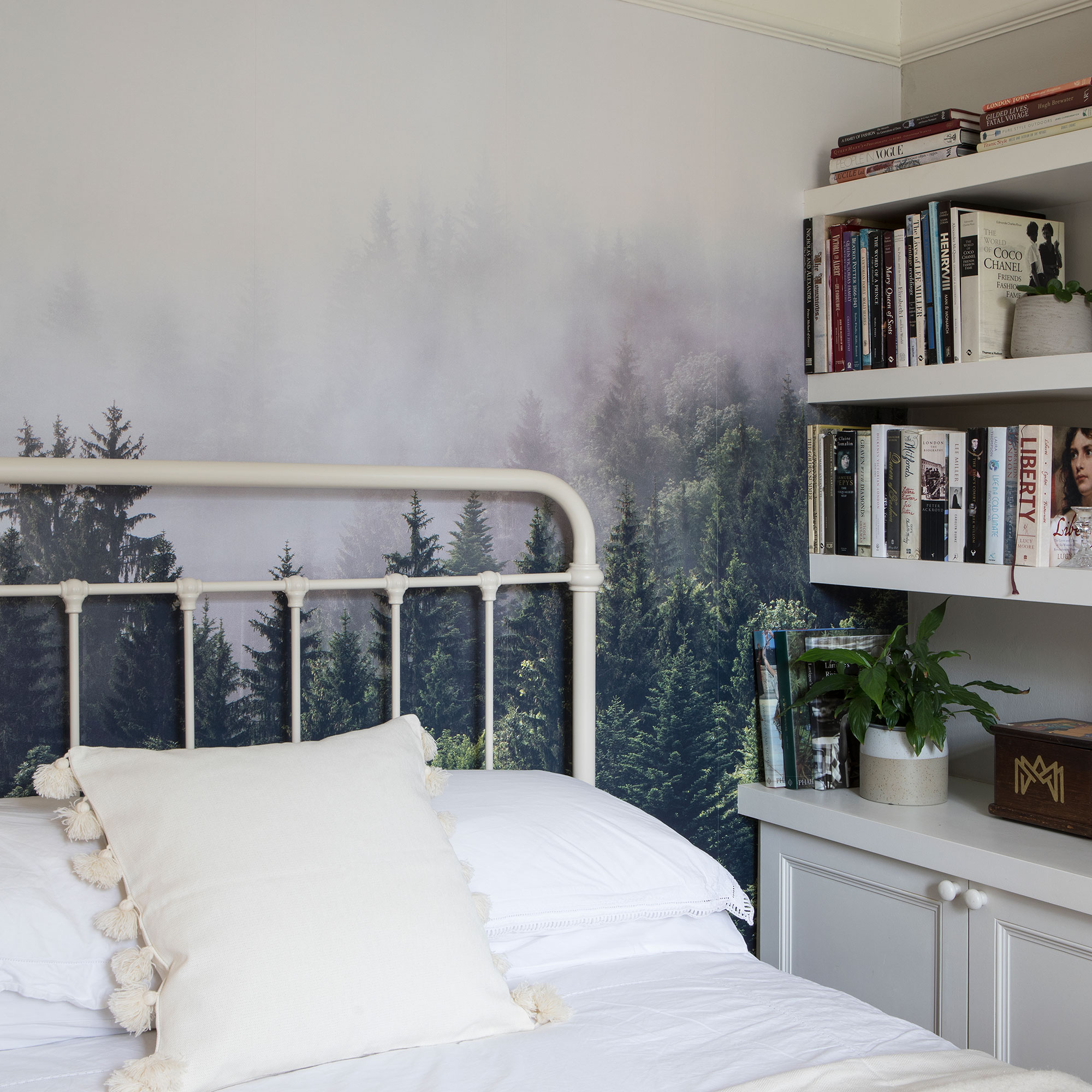
One of the biggest challenges the owners faced was making the spare room work. It started life as the living room, became a guest bedroom idea, then a home office during lockdown. Now it’s a room that achieves both!
'We toyed with having a sofa bed in here but as both sets of grandparents visit for longer stays we wanted them to feel comfortable,' they explain.
The forest mural by Rebel Walls ties in with the wooden desk and shelves, giving the room an identity suitable for both home-working and overnight guests.
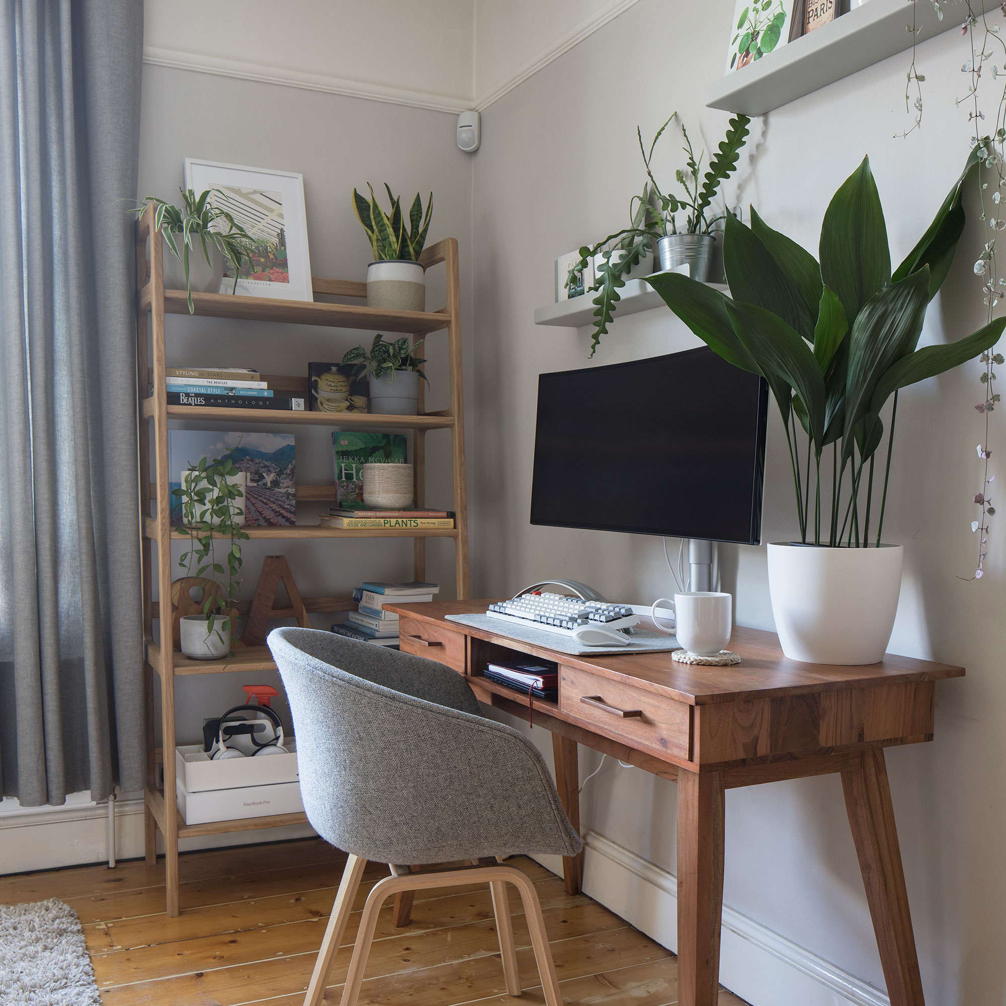
The Tikamoon desk echoes the mid-century style downstairs and displaying plants on the shelves bring the blank wall to life.
The kids' room
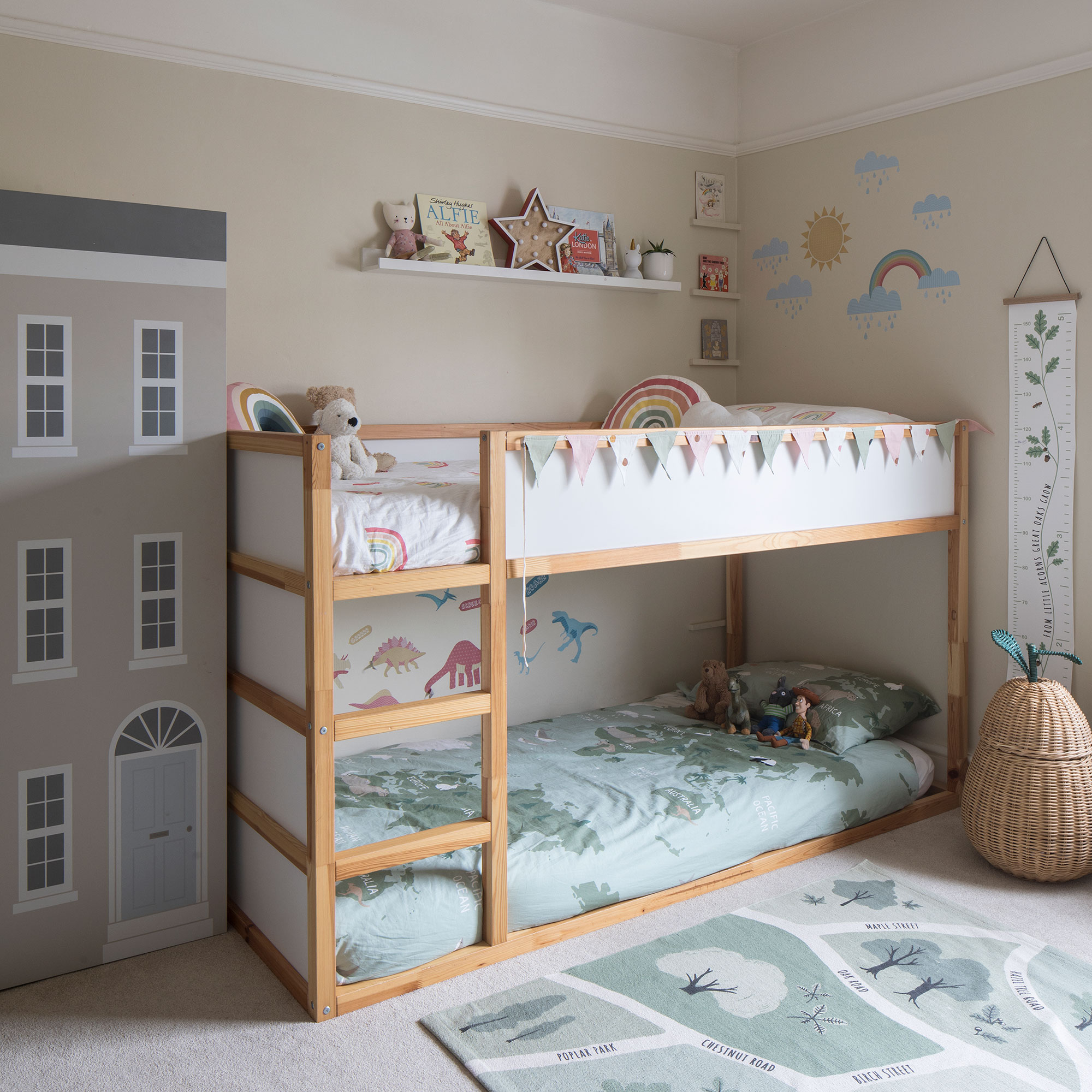
The children’s room idea is fun and colourful – bunk beds are customised with wall stickers from Decowall and the duvet covers are from H&M Home.
The bathroom
During the bathroom ideas renovation, they toyed with the idea of removing the chimney breast so they could have a separate shower and bath. However, they decided against it as the old fireplace was an important feature for them.
'Bath time in our house is a treasured routine and it’s nice to have the space to be in there together with the children.'
The splashback behind the basin matches the hexagons on the opposite wall above the bath. Siesta Cork Tiles’ flooring was a safer option than slippery porcelain and looks like the real thing. Niche shelving breaks up the expanse of wall and the small hexagon mosaics inside add interest.
The summer house
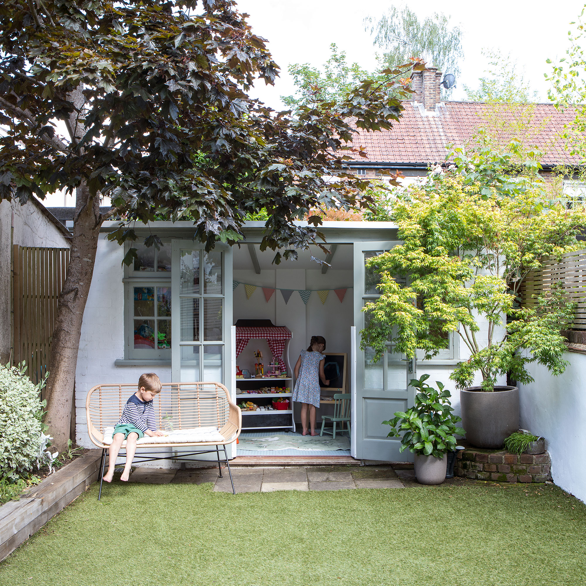
Instead of knocking the summer house idea down, the owners revamped it with bigger doors, windows and electrics – it became an invaluable extra room during lockdown.
‘The whole transformation was so rewarding and a surprise to friends and family as when they came into our spacious downstairs room it wasn’t what they were expecting from the outside. I love the contrast between the old period features and the new part we’ve created, especially when the sun is shining, the doors are open, and the kids are running in and out,' concludes the owners.

Steph Durrant is the Deputy Editor of Ideal Home’s sister magazine, Style at Home. Steph is an experienced journalist with more than 12 years under her belt working across the UK’s leading craft and interiors magazines. She first joined the team back in 2016 writing for both homes brands, specialising in all things craft, upcycling and DIY.