'My home is designed to last' – 9 design tricks to steal from this colourful and modern family home
This newly renovated home is decorated in a rich colour palette and packed with timeless ideas
Emer Gillespie's house renovation has been a labour of love, and the process from start to finish required resourcefulness, creativity, and perseverance.
Emer is the founder of lighting company Spark & Bell, and she lives with her husband Brad Guin, a product developer, their children, aged seven, and 21, and French bulldog Duke. When they first moved into a five-bedroom Victorian terraced house in Hove, East Sussex, there was work to do, but there's no doubt as to whether it was worth it.
We take a closer look at their gorgeous home, and find out all the details of how it came to be.
9 brilliant style ideas from Emer's home
1. 'We created a cosy diner'

Emer's vision of a stylish but homely dining area came together beautifully thanks to the natural textures and green elements she incorporated.
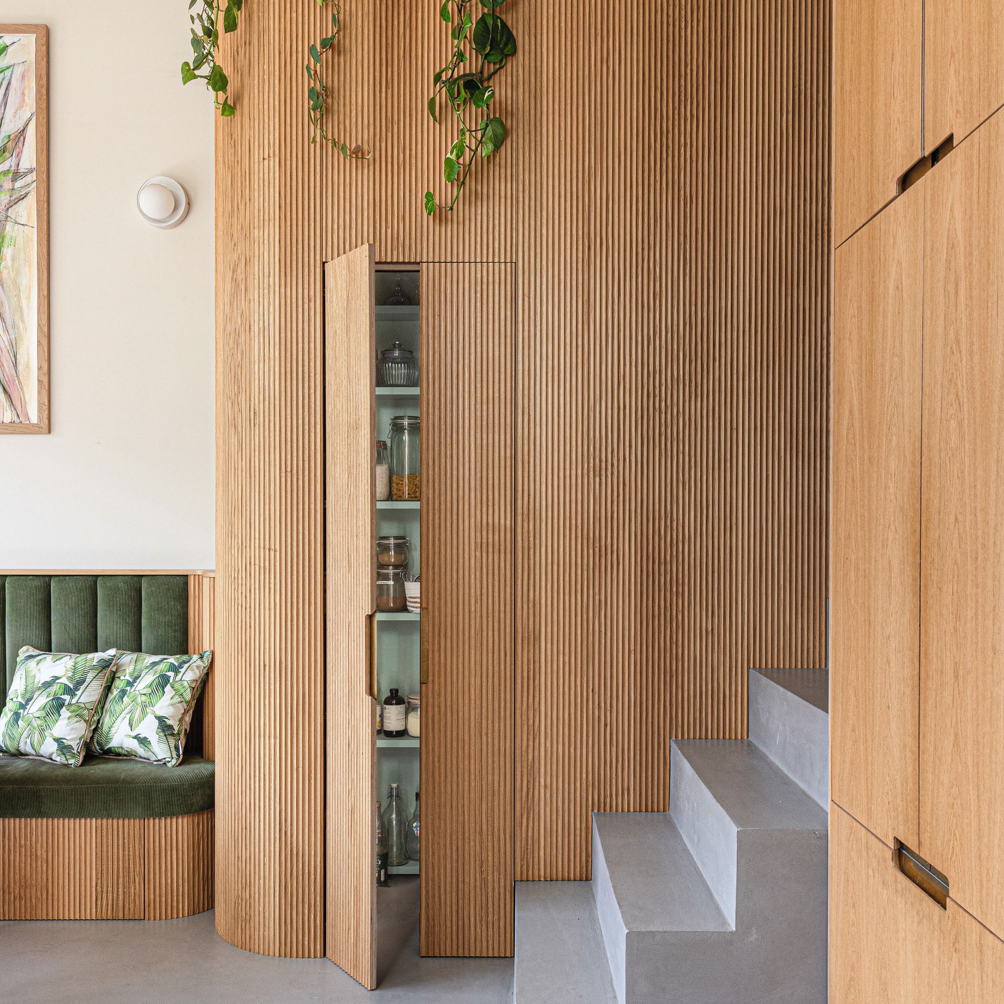
'In this dining space, our banquette seating is upholstered in dark green cord, a hard-wearing material with a texture that echoes the fluted wood in our kitchen,' Emer says. 'The artwork was created by Hove artist Shyama Ruffell, who happens to live on our street; our large collection of plants was her inspiration.'
And kitchen lighting ideas provided the finishing touches. 'The 3.8-metre high ceiling makes this the perfect spot for the trio of beautiful pendant lights made from spalted beech.’
2. 'We used local firms for a bespoke look'
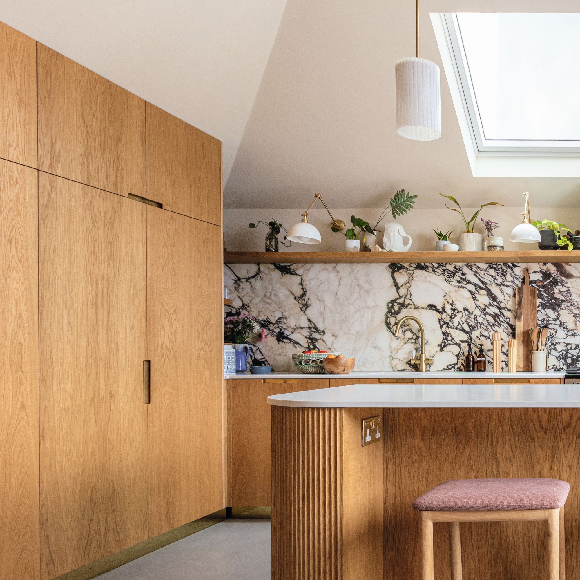
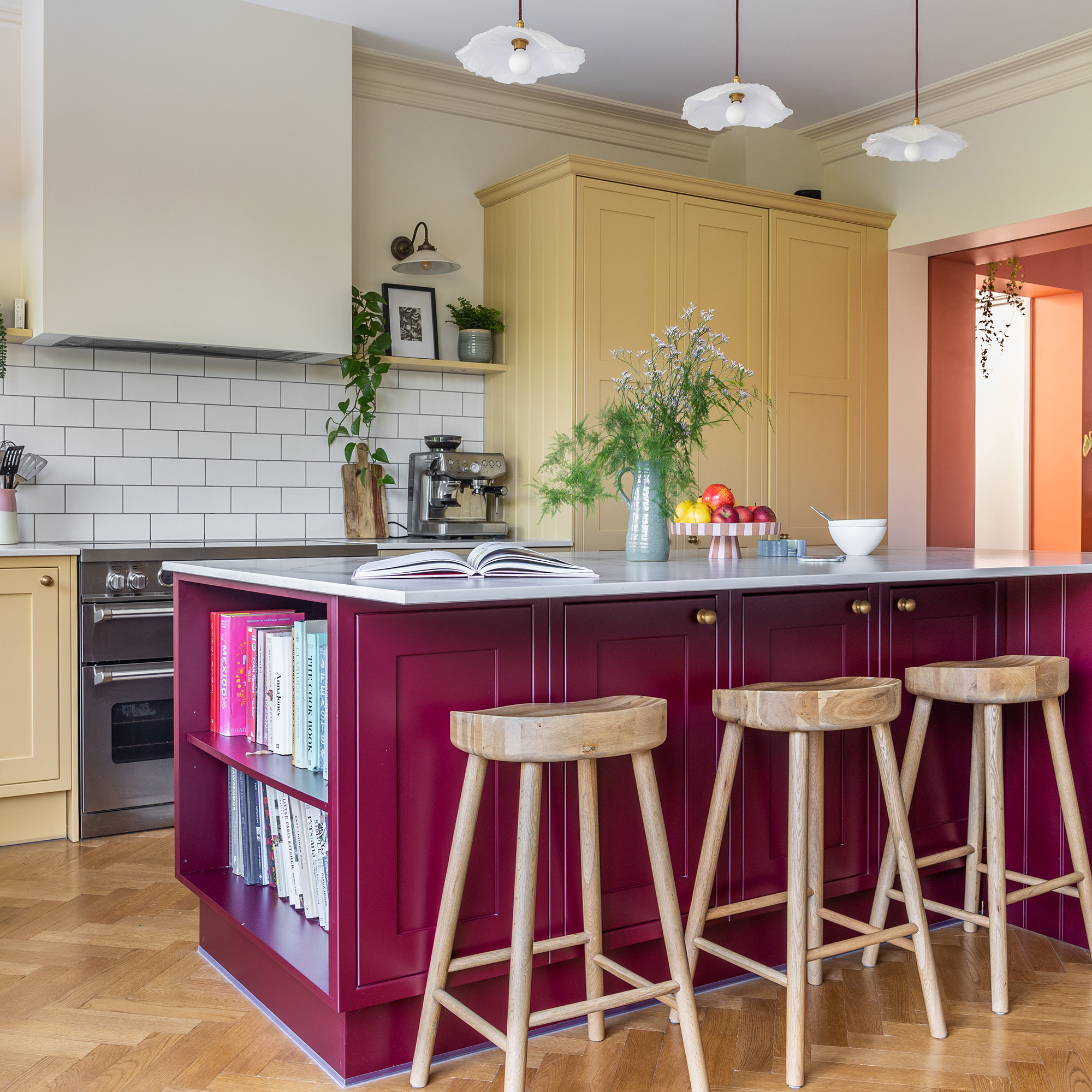
'As our kitchen had a tricky floor plan, we decided to go bespoke. Working with local small businesses allowed us to be more involved in the design process – we could visit the workshop to pick out materials and oversee the build.’
Get the Ideal Home Newsletter
Sign up to our newsletter for style and decor inspiration, house makeovers, project advice and more.
Bespoke joinery is ideal for unique spaces that don't follow a typical kitchen layout. Going bespoke with her culinary space allowed Emer to get creative in others ways too.
'My lighting business was actually started at my kitchen table – this is a special area, where creativity often strikes.'
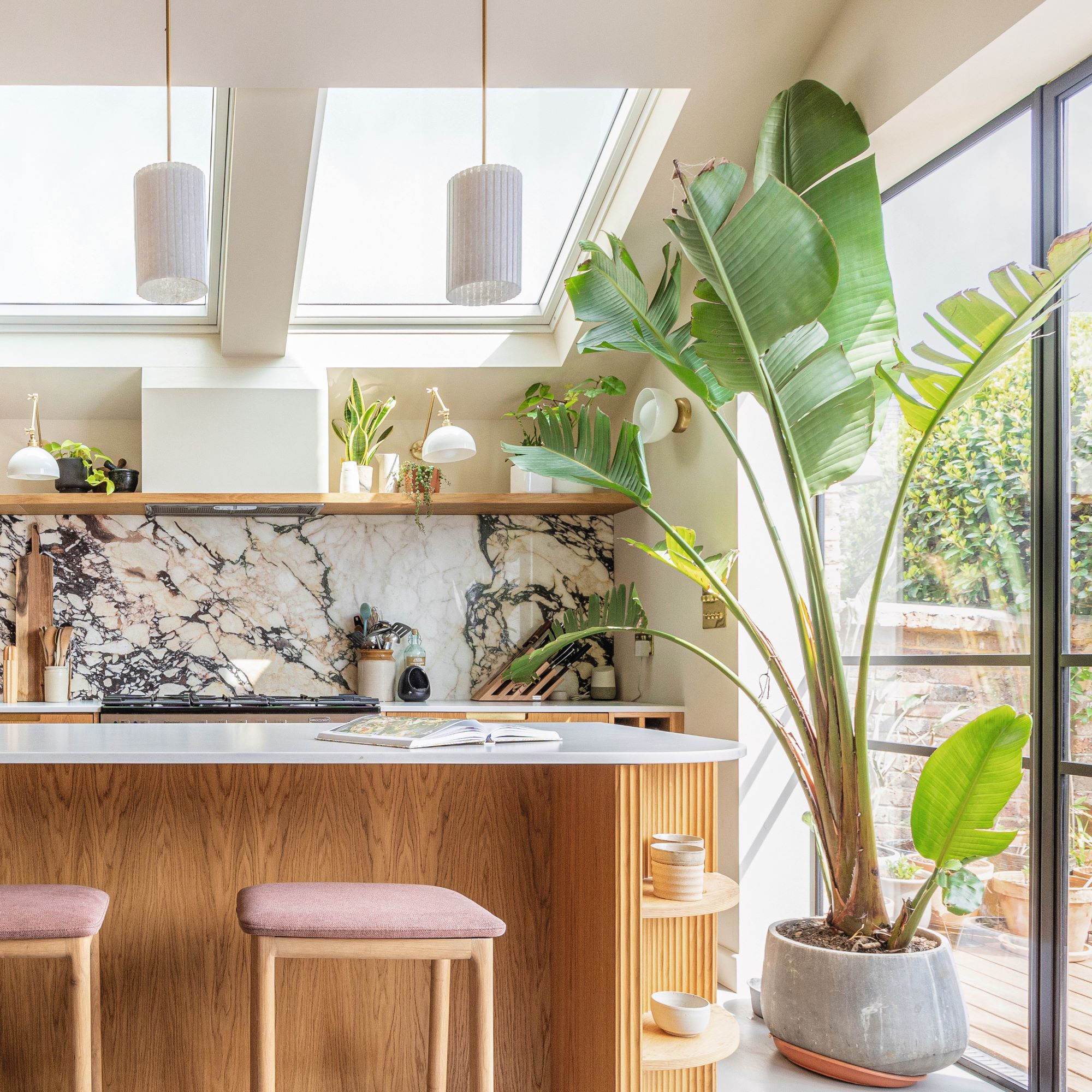
Ridged materials bring interesting texture to a functional space. Look out for surfaces, fabrics and even lighting with a fluted finish.
3. 'Earthy hues add drama'
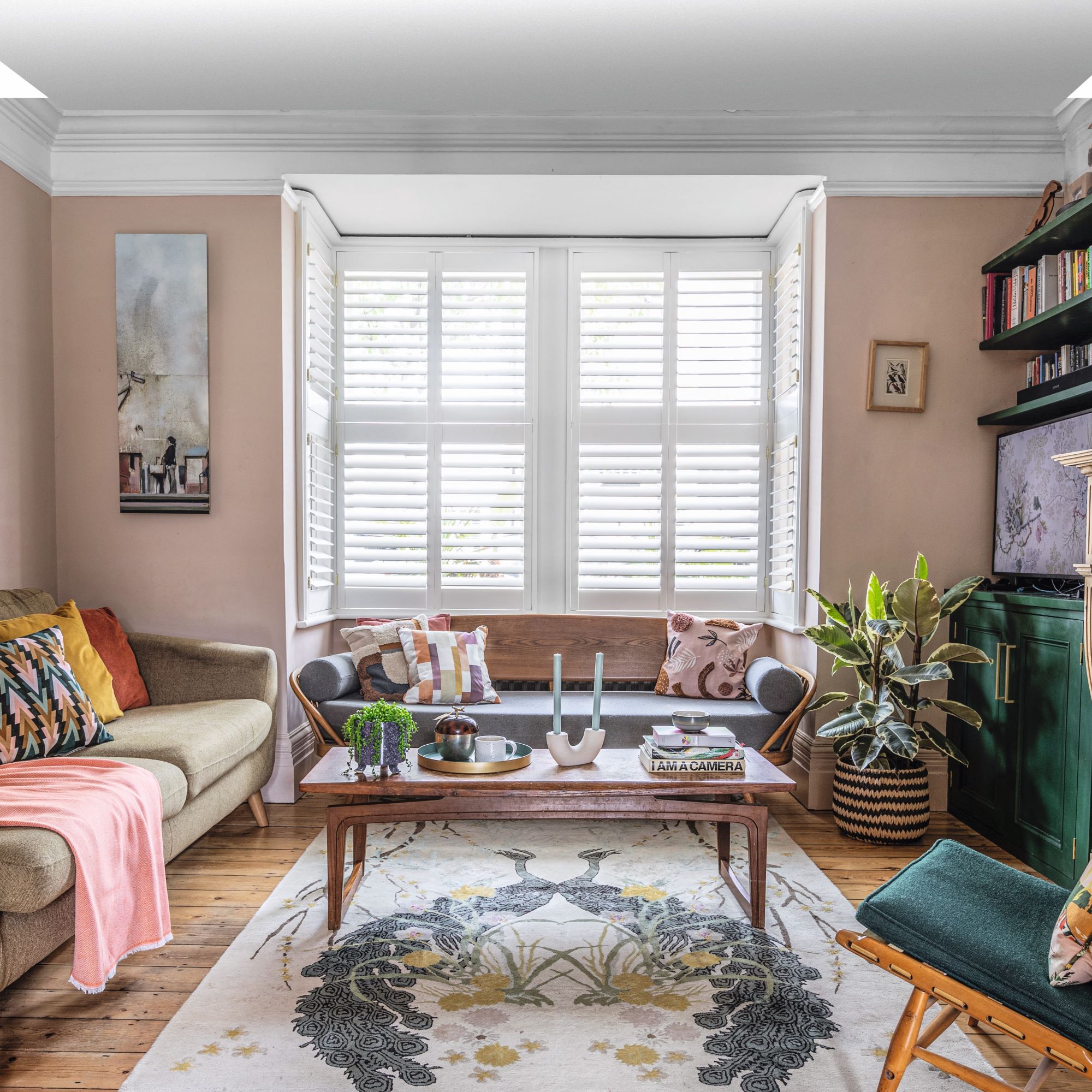
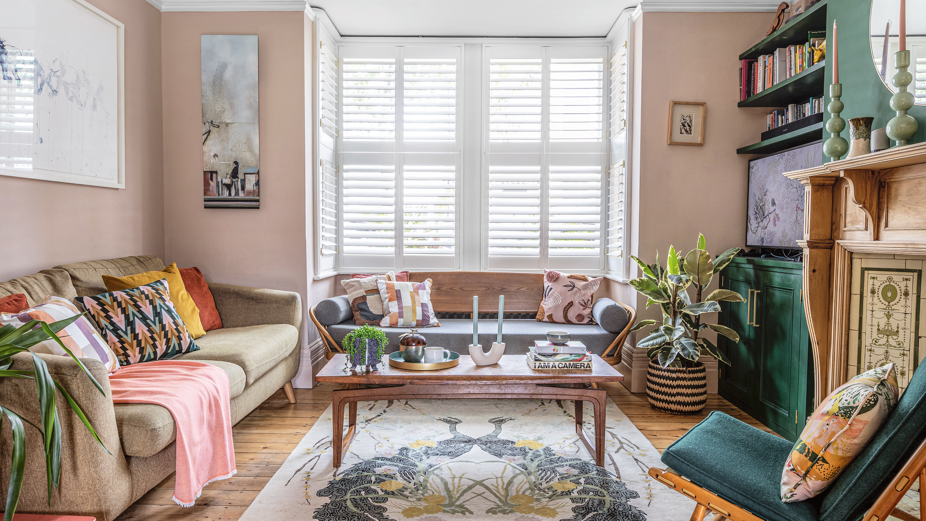
'As this is a north-facing living room, I had to be mindful when picking paint colours – I spent hours deliberating over a million samples,' Emer says. 'In the end, I chose a soft, earthy pink and a deep green. These highly pigmented paints change colour during the day, so the room never feels flat and dull.'
Living room paint colours should be chosen to complement the space, including how much light the room gets. For overlooked rooms, shutters are a great way to retain privacy while still allowing light to filter into your space.
'The finishing touch is the rug, which picks out all the colours of the room,' she adds.
4. 'Artwork reflects our personality'
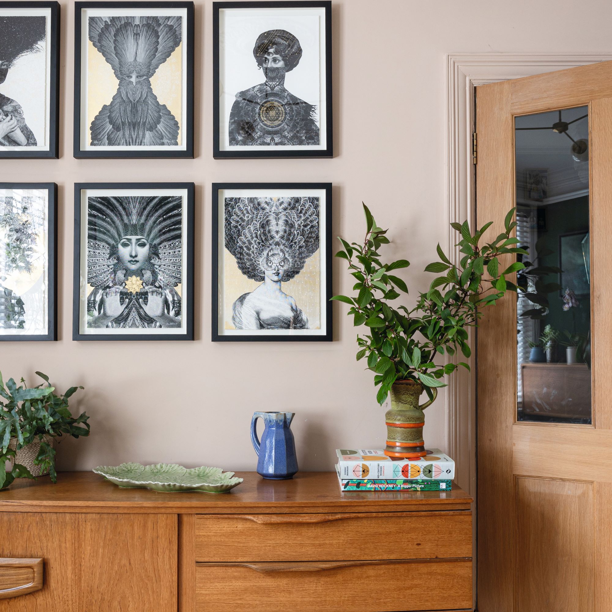
Emer's inspiration for her gallery wall is rooted in her previous vocation. ‘I was a photographer for years and I love collecting prints,' she explains. 'We found this box set of six prints by Dan Hillier in a Brighton gallery. I love the way the graphic colours and gold leaf detail add character to our blank walls.'
Underneath the drama-filled gallery wall is a contrastingly simple console table, which houses a select few decorative items. 'The 1970s sideboard is from Brighton’s North Laine. We invest in reclaimed furniture because it is always well made and durable and I look out for mid-century pieces in warmer woods.'
Emer adds, 'The mix of retro furniture within our Victorian house brings an edge to our decor, styled with colourful accessories.’
5. 'We filled the room with light'
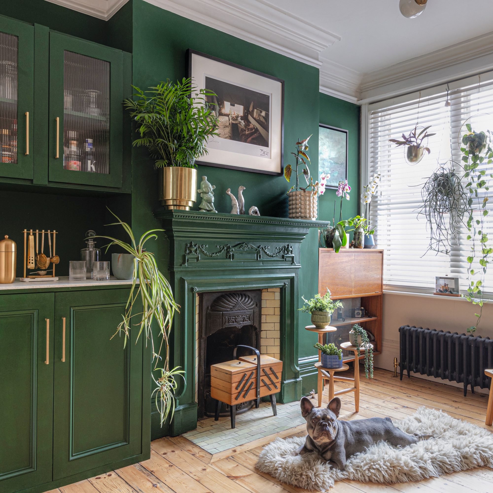
‘One of the first changes we made to our home was to knock down the wall between the two sitting rooms. Previously this was a guest bedroom but it had become a dumping ground.'
Emer transformed this overcrowded space into a perfectly cosy sitting area, with dark green walls, houseplants, and fluffy textures. She made use of the space with older pieces of furniture, which tend to have smaller proportions so they can slot into small alcoves or dead spaces.
'Now the large south-facing window floods the open-plan space with sunlight. For harmony, I painted the walls in the same colours as the living room – deep green and soft pink. Above the mantelpiece hangs a limited-edition print from the David Bowie photographic exhibition held in Brighton. We love to fill our walls with work by local artists or pieces that have a special connection.’
6. 'Smart ideas maximise a small room'
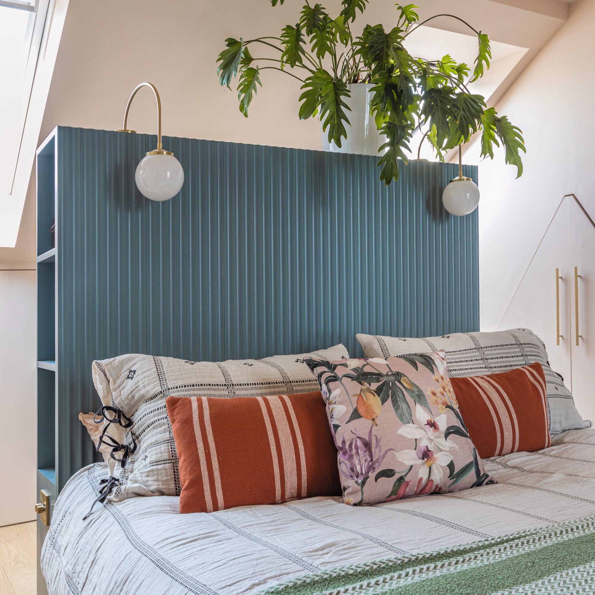
Emer was clever when working with small bedroom ideas, carefully placing furniture and creating multifunctional pieces to maximise space. The custom-made headboard incorporates storage, with shelving and cupboards at the sides.
'The bed was placed centrally to allow the room to flow,' she says. 'As space was limited, I had a headboard made with shelving, integrated plug sockets and overhead lighting. I painted the ceiling and walls in the same tone to blur the distinction, which makes the room look larger.'
7. 'I love natural materials in the bathroom'
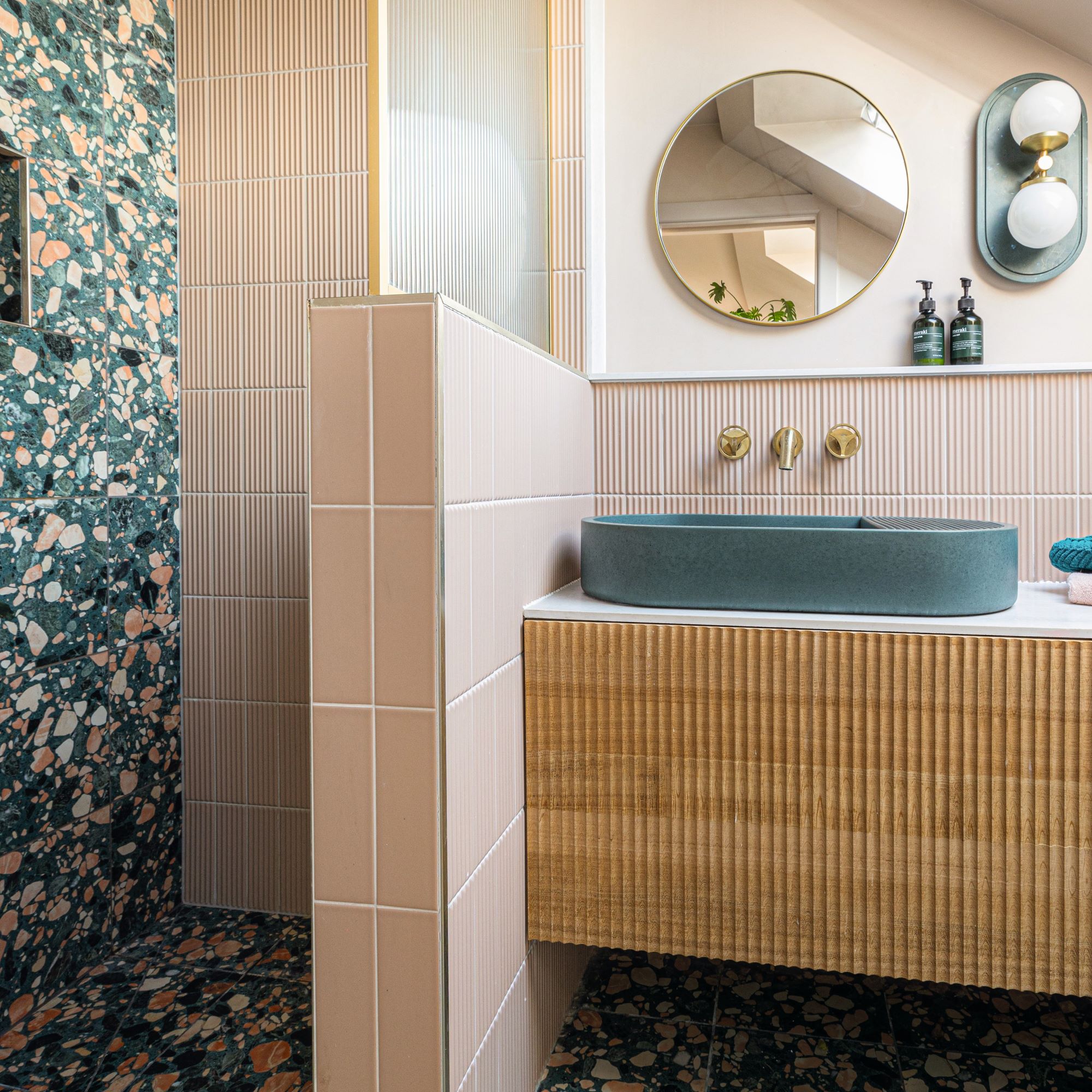
The gorgeous bathroom is both eclectic and modern. Emer introduced a bold pattern to a small en suite with on-trend terrazzo tiles.
'The en suite was kitted out with ornate terrazzo tiles. The basin is concrete, and of course we had to have some fluting on the oak vanity unit! I made the light fitting that matches the basin colour.’
8. 'Wallpapers with heavy patterns feel indulgent'
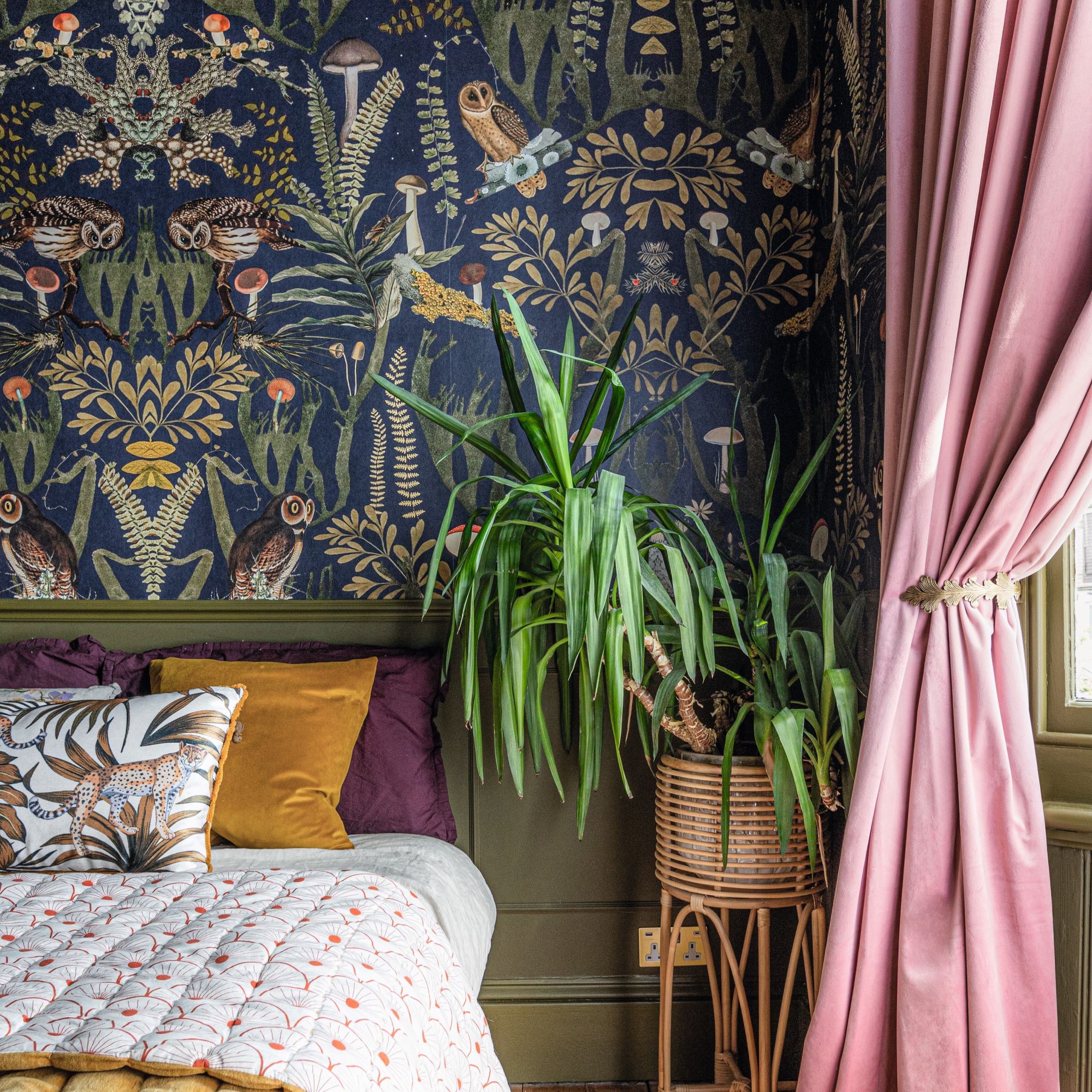
Emer created a showstopper guest bedroom with bold wallpaper and colourful accents. ‘This woodland wallpaper dictated the colour scheme in our guest bedroom. I brought in the curtains from my daughter’s old bedroom, then accessorised with touchy-feely fabrics on the bed.’
You can make a bedroom feel sumptuous with textiles that are soft to the touch such as velvet, silk and cotton.
'The mix of retro furniture within our Victorian house gives our decor an edge, especially when styled with colourful accessories,' Emer adds.
9. 'Small bathrooms have to work much harder'
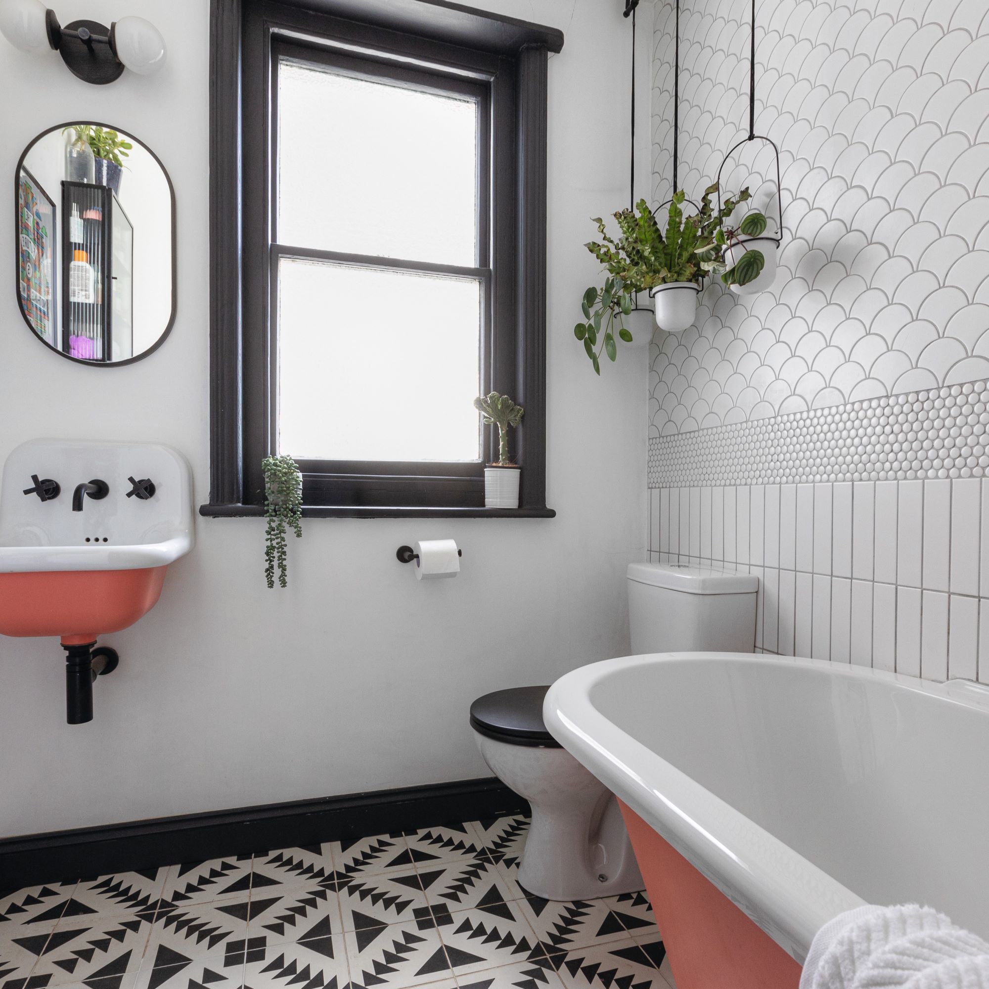
‘We inherited a small bathroom that felt cluttered with sanitaryware so we had to start from scratch,' says Emer. She used small bathroom tile ideas and pops of colour on the sink and bathtub to create a simply stunning space.
'Our new bath and metal French-style basin were painted in Orange Aurora by Little Greene. The pattern for the white wall tiles was inspired by a Victorian dado rail, with the penny tiles appearing halfway up the wall.
-
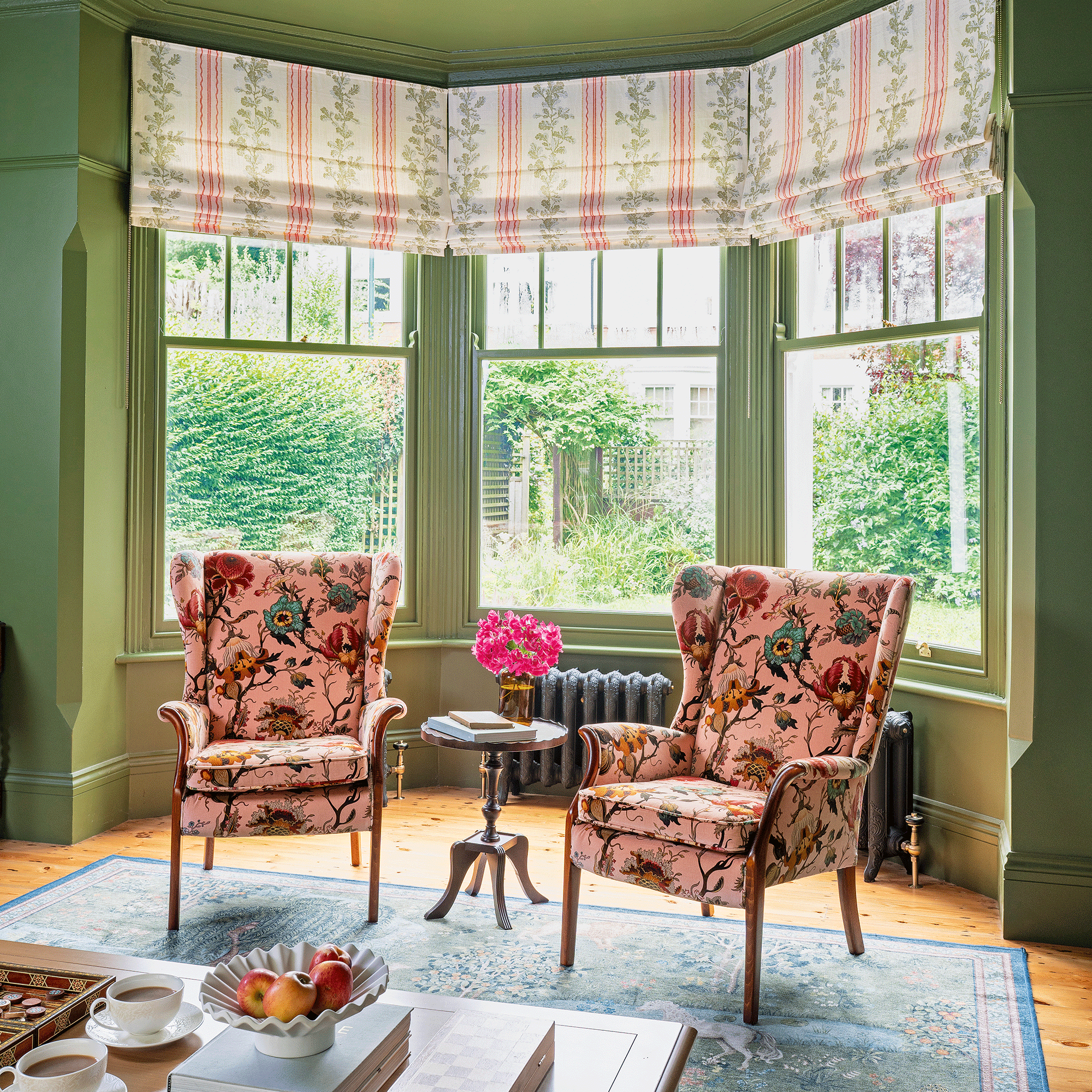 A strict colour palette and vintage finds have turned this semi-detached Edwardian house into an elegant family home
Sticking to a three-colour palette of green, pink and yellow and mixing in plenty of vintage furniture and art has created an authentic period feel
By Stephanie Smith
-
 A top-to-bottom renovation has turned this Edwardian house into a lovely family home
With a few considered structural changes, this period house has been turned into a family home and has created a sanctuary for years to come
By Maxine Brady
-
 How to heat a conservatory
7 practical options to consider for year-round comfort
By Amy Reeves