'I love a rustic Scandi look' – 12 style ideas that give this modern new-build home warmth and character
This modern home is sprinkled with textural seasonal details for a luxe festive look
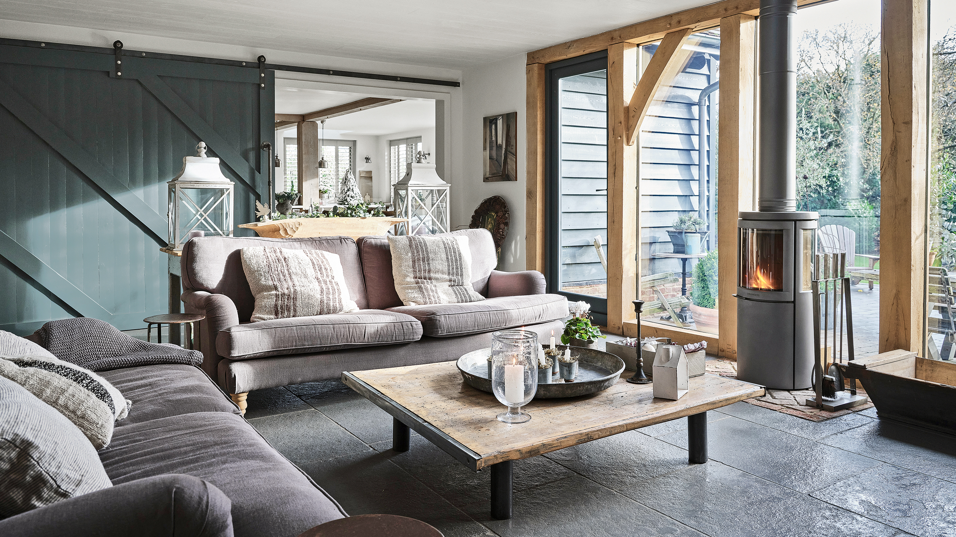
Tracy Head from @ottersbarninteriors, and her husband Steve live in a beautiful five-bedroom new-build house in Henley-on-Thames, Oxfordshire, along with their two sons.
Tracy is a lover of rustic, Scandi-style decor, and the rooms in her gorgeous home are full of earthy, neutral tones and clean lines. At Christmas, she incorporates seasonal textures and rustic touches to create a magically festive feeling.
'We put our heart and soul into building a home that suits the way we want to live,' Tracy says. 'And I love that we are all together at Christmas.'
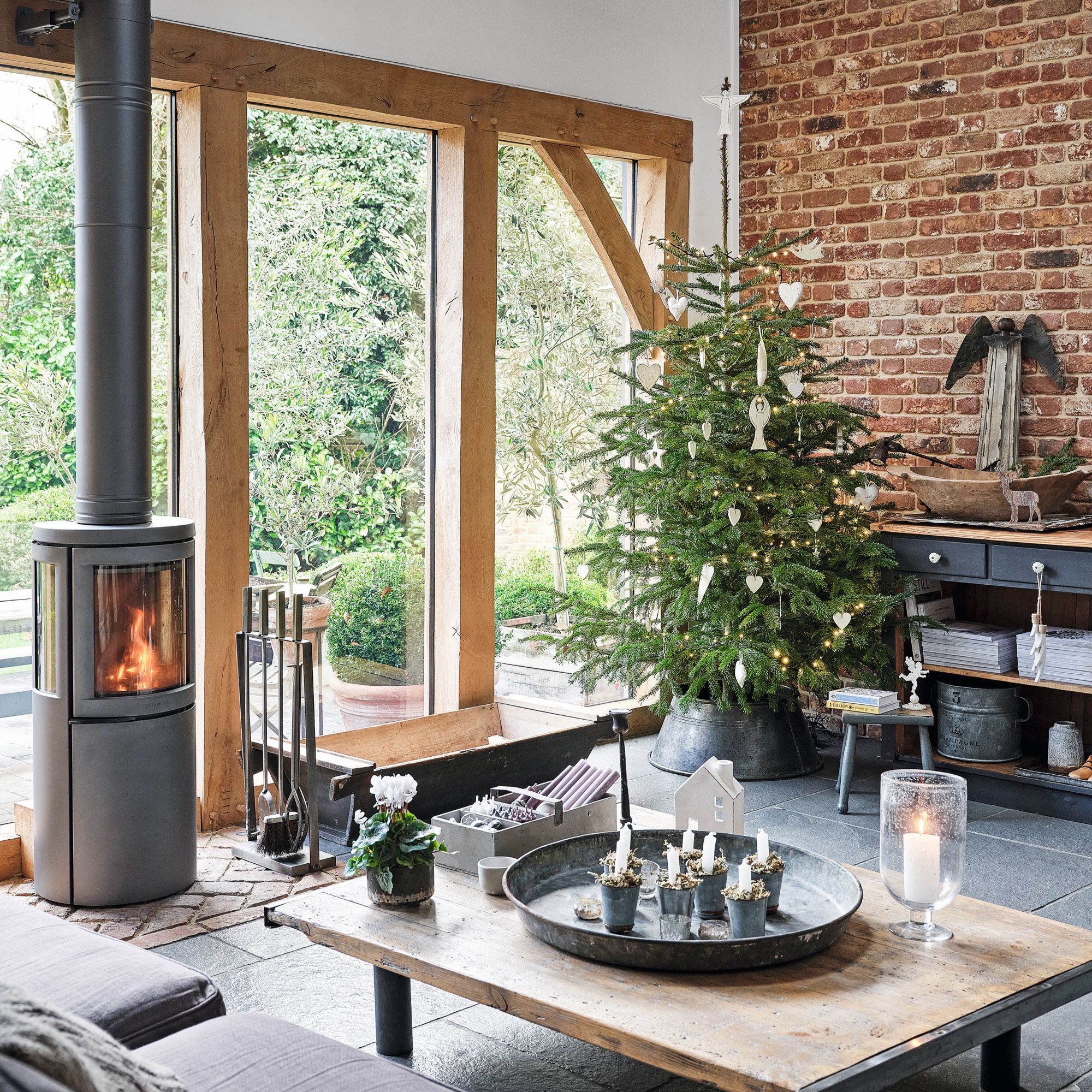
1. 'We love spending time together in this room'
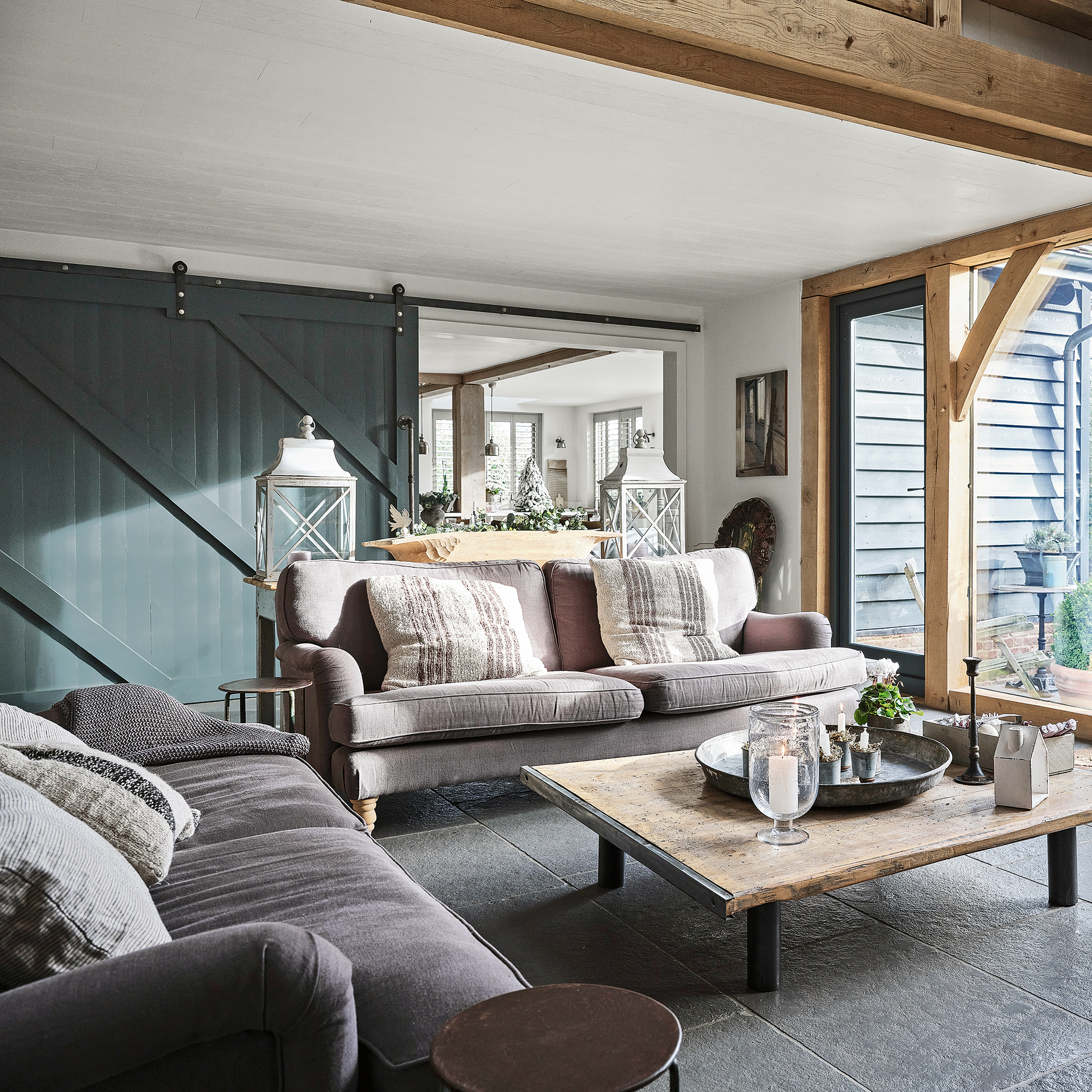
A room screen is great for creating flexibility in an open-plan living space, separating a cosy seating area from the kitchen. 'This family seating area adjoins the open-plan kitchen and dining room where, thanks to the sliding door, we each can have our own space but still be together,' Tracy says.
The architecture of this space is reflective of the house's rustic aesthetic. 'The exposed beams and trusses here set the style for the house. I balanced the warmth of the wood with a monochrome palette, green-grey slate flooring and weathered metals. The twinkle of candlelight is irresistible at Christmas.’
2. 'The simple flooring style works well'
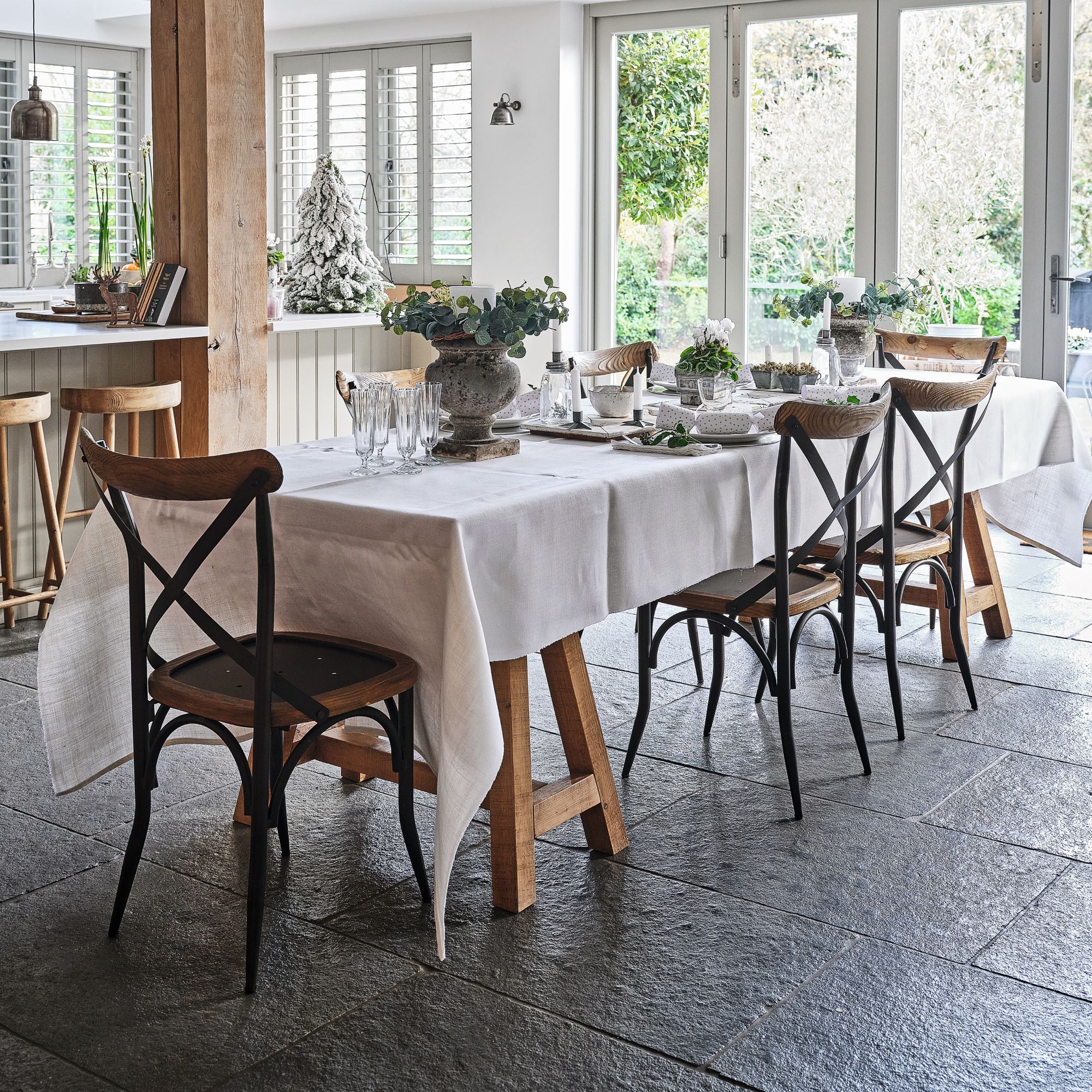
‘Creating schemes for different rooms can throw up a variety of flooring requirements but I wanted a seamless feel throughout,' Tracy explains.
'For the linked kitchen, dining and family room, I chose Taj Grey brushed-limestone flooring by Mandarin Stone as it was neither too dark nor too light and had a subtle matt texture, far cosier and more forgiving than a gloss surface. Stone flooring is also less slippy, making it perfect for our busy family rooms. And, at Christmas time when trees and foliage are brought into the house, falling needles and leaves aren’t a problem.’
Get the Ideal Home Newsletter
Sign up to our newsletter for style and decor inspiration, house makeovers, project advice and more.
3. 'I blended bespoke with vintage'
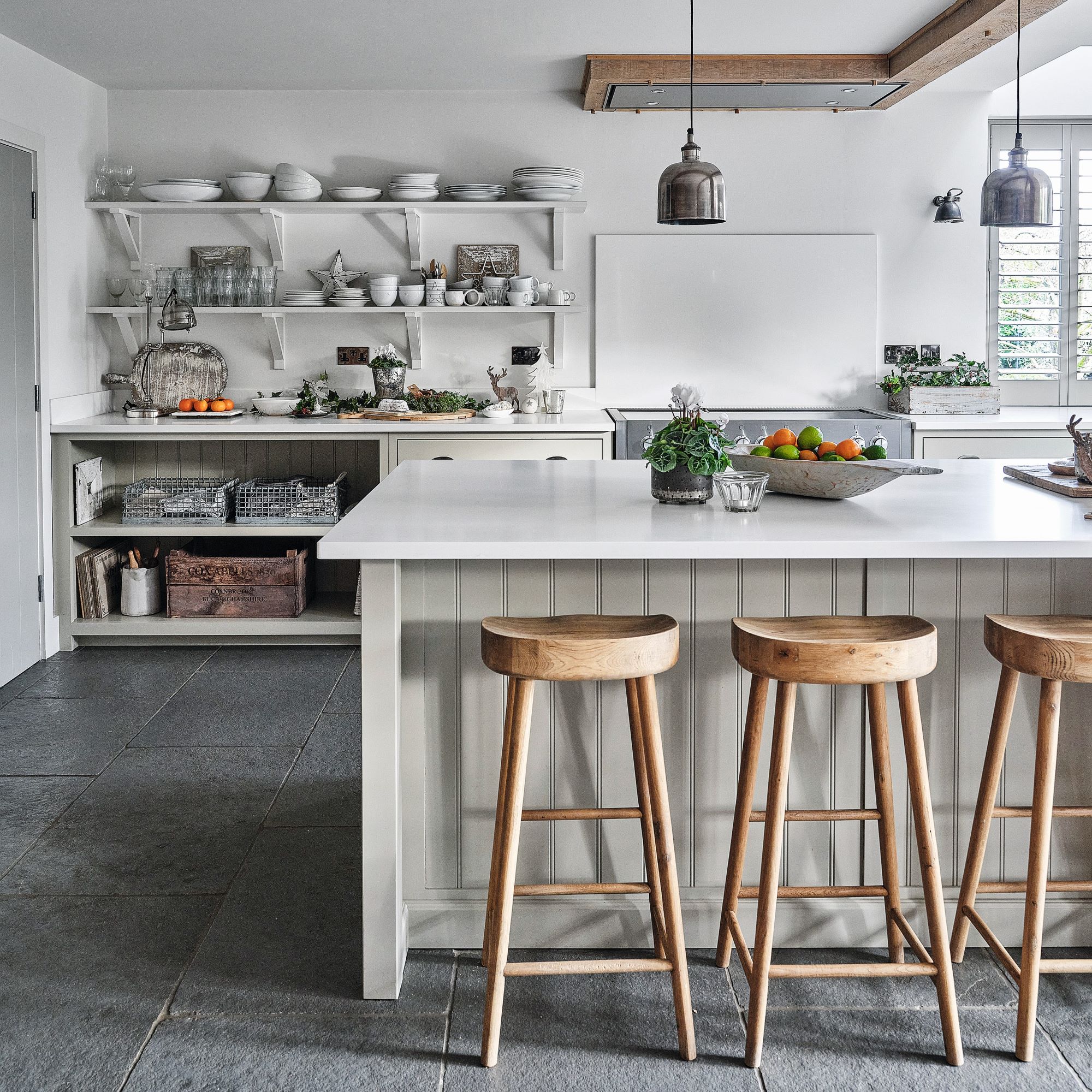
‘I was very keen to create a unique space for us but it was important that the kitchen was both beautiful and on budget. I went to deVOL for the cabinetry but I was able to source other elements to make it more “me”, such as the vintage dining table, which brings that unique one-off feel.'
Selecting a few vintage pieces is an effective way to make a kitchen look expensive on a budget, which is just what Tracy was aiming for. She also wasn't in a hurry to buy lots of new pieces, and instead chose to curate a meaningful collection over time.
'The accessories have been collected over the years so the combination of it all feels very considered and carefully put together, rather than all very new.’
4. 'Flexibility is important to our family'
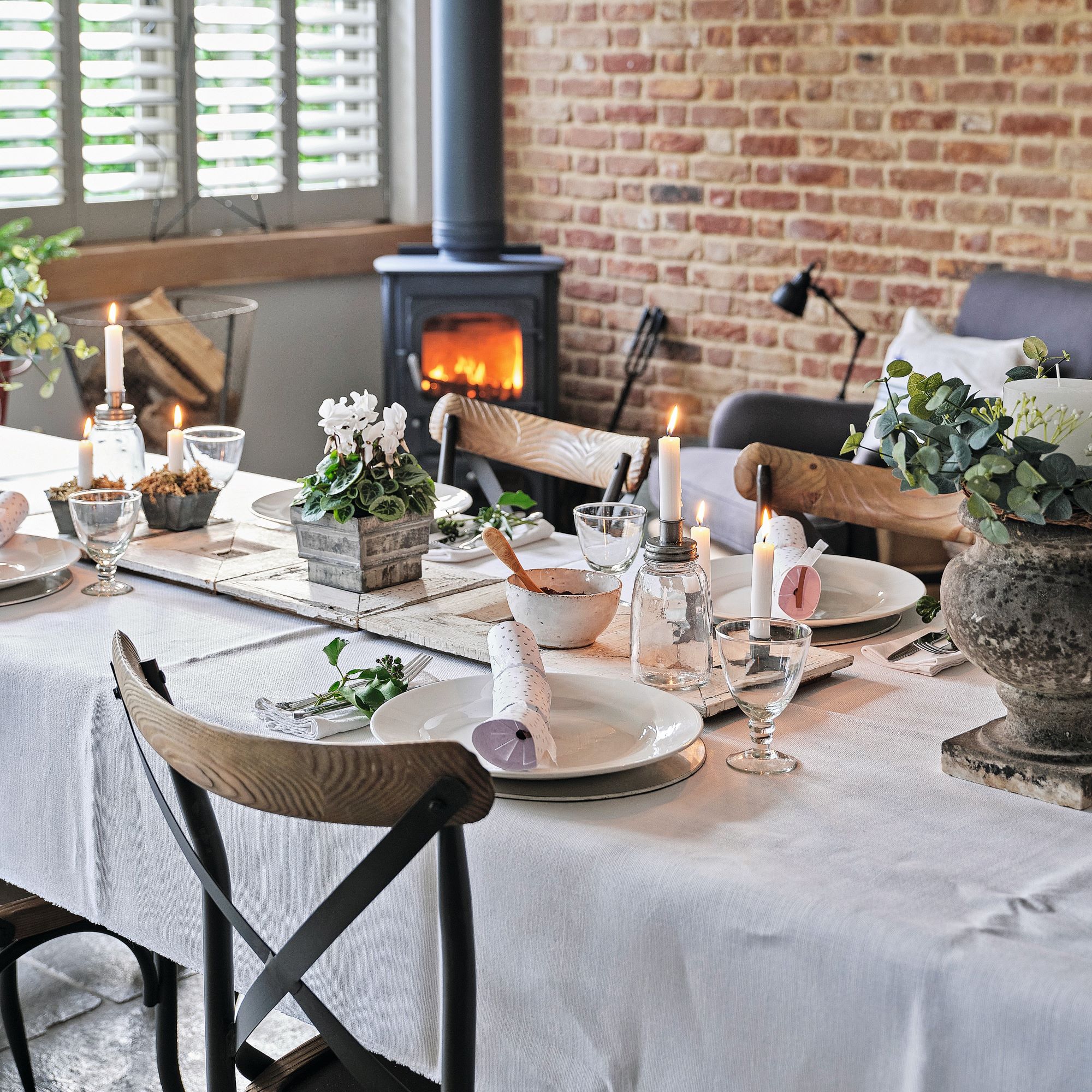
When it came to the dining room, Tracy wanted to create a space that suited the family's needs. 'A simple trestle table is perfect for relaxed everyday meal times, and it can also become an impromptu desk for working from home. Covered with a crisp white tablecloth and surrounded by rustic wooden chairs, it is elevated into a fabulous setting for formal Christmas dining.’
5. 'Colours and textures make it cosy'
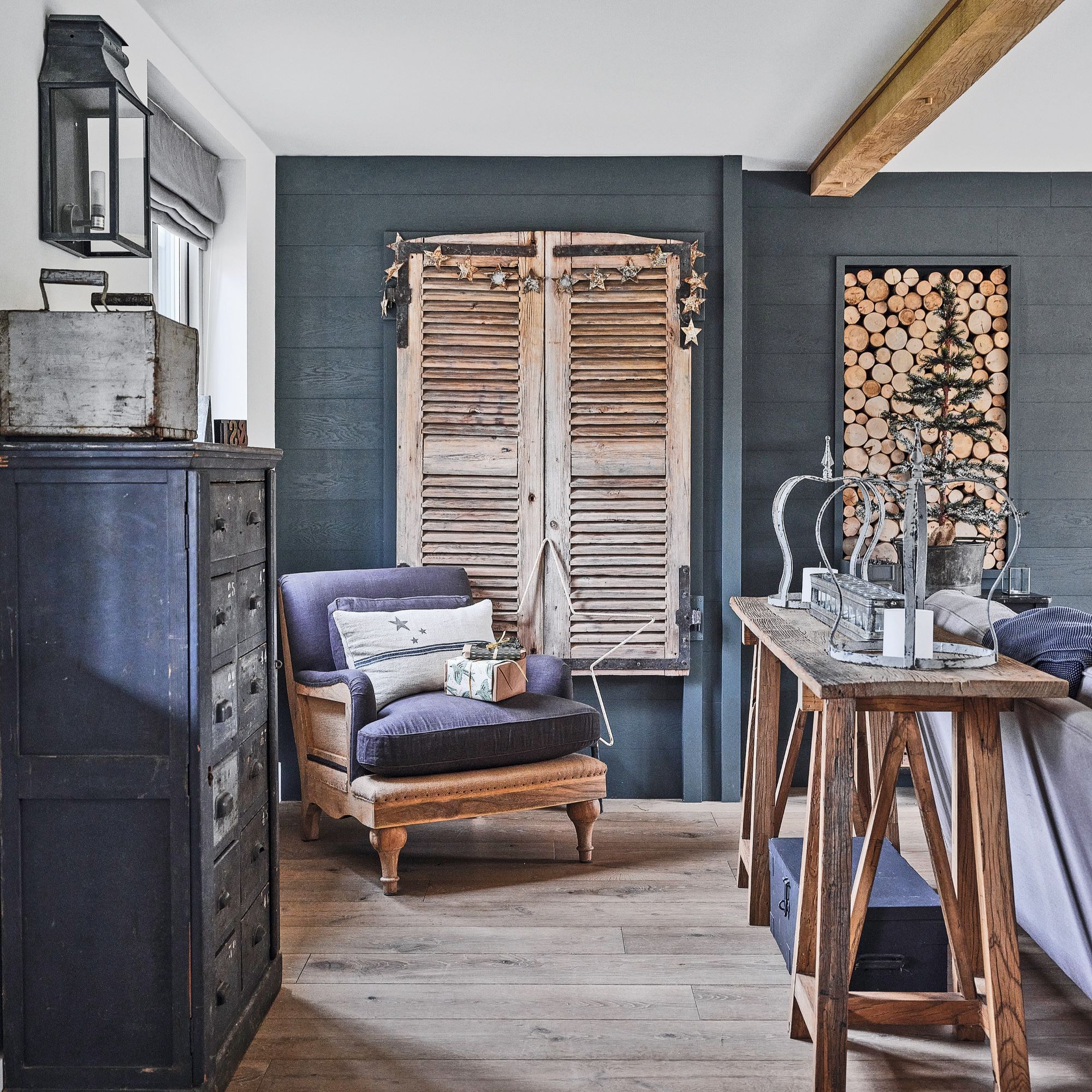
'With dark paint shades for the walls and a change from limestone tiles to timber flooring, the main living room feels incredibly warm and snug, whatever the weather,' Tracy says. 'I brought in a homely touch with a log wall feature and faux wooden shutters.'
When it comes to festive styling, Tracy loves using a mix of her favourite ornaments with foliage and nature-inspired elements. This budget-friendly Christmas decorating approach is simple but effective.
6. 'Two sofas are perfect in this space'
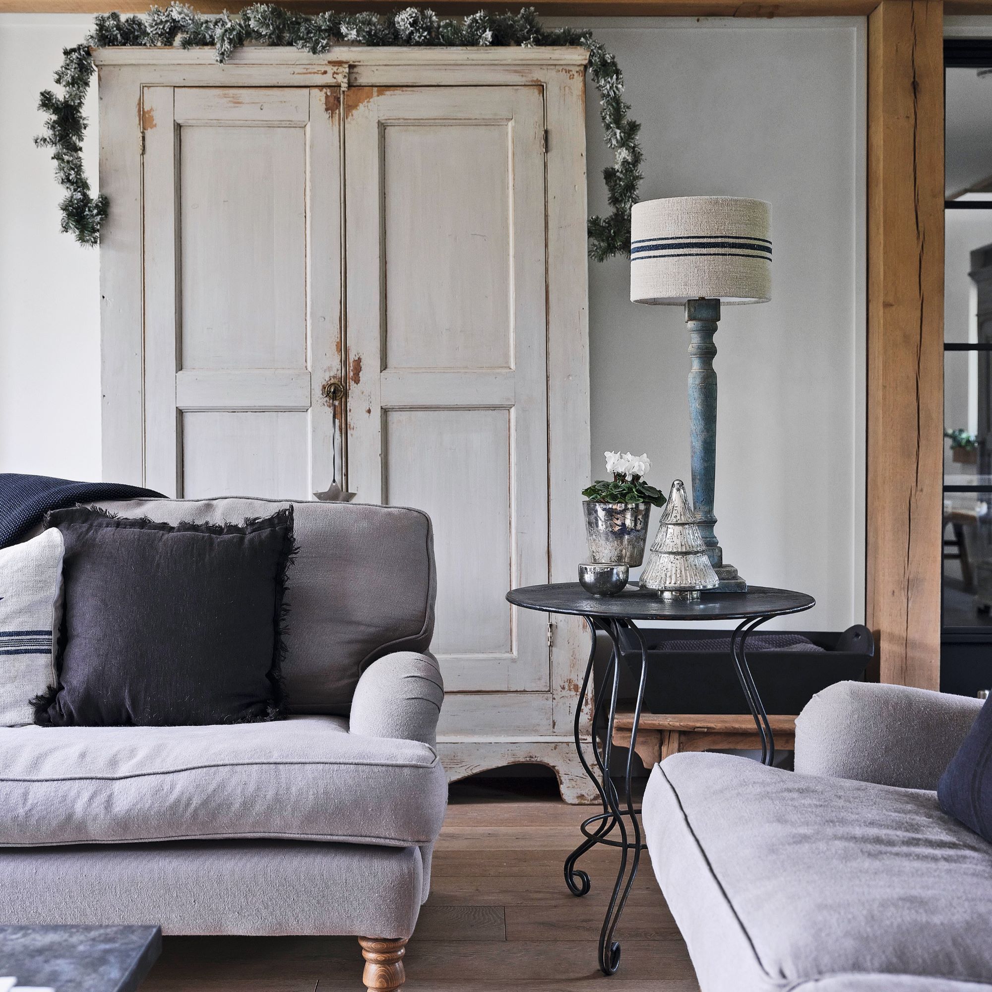
It was important for Tracy to have ample living room seating without cluttering up this area. ‘By choosing a pair of sofas in the same style, plus an armchair, there is lots of room for lounging,' she says. 'This furniture arrangement keeps the seating neat, and it’s easy to walk around.'
'I add lots of warm layers with throws and cushions throughout the winter season, and there’s always candles on the go for a festive atmosphere,’ Tracy adds.
7. 'Add some unexpected elements'
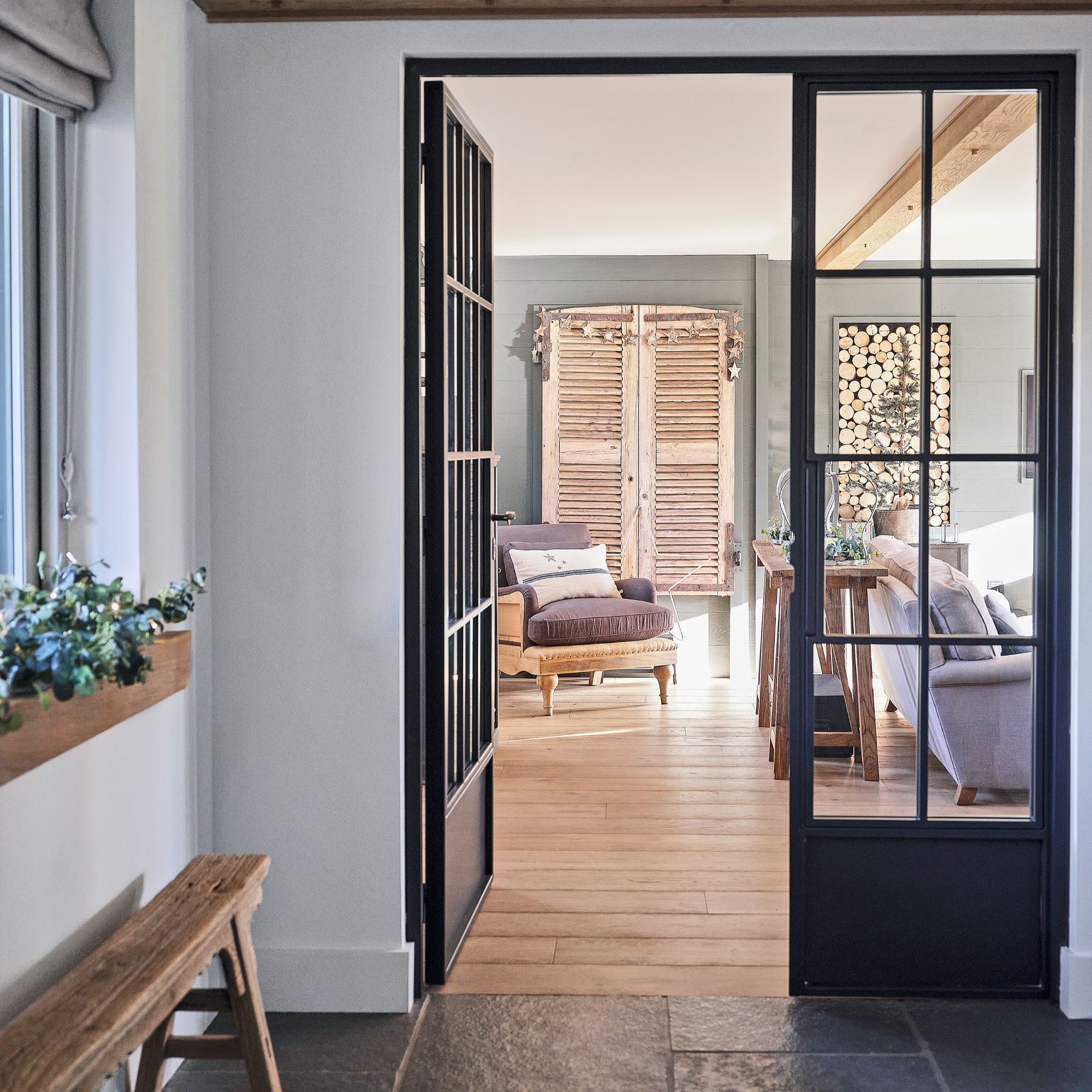
Tracy wanted to incorporate natural materials to avoid the house feeling too modern. ‘Creating interesting focal points on the walls was key for this space, to make our new-build home feel more established and add character.'
She used older or reclaimed elements, including pared-back wooden pieces for texture and authenticity. Adding comforting elements of nature was an important aspect of styling.
8. 'I enjoy playing with scale'
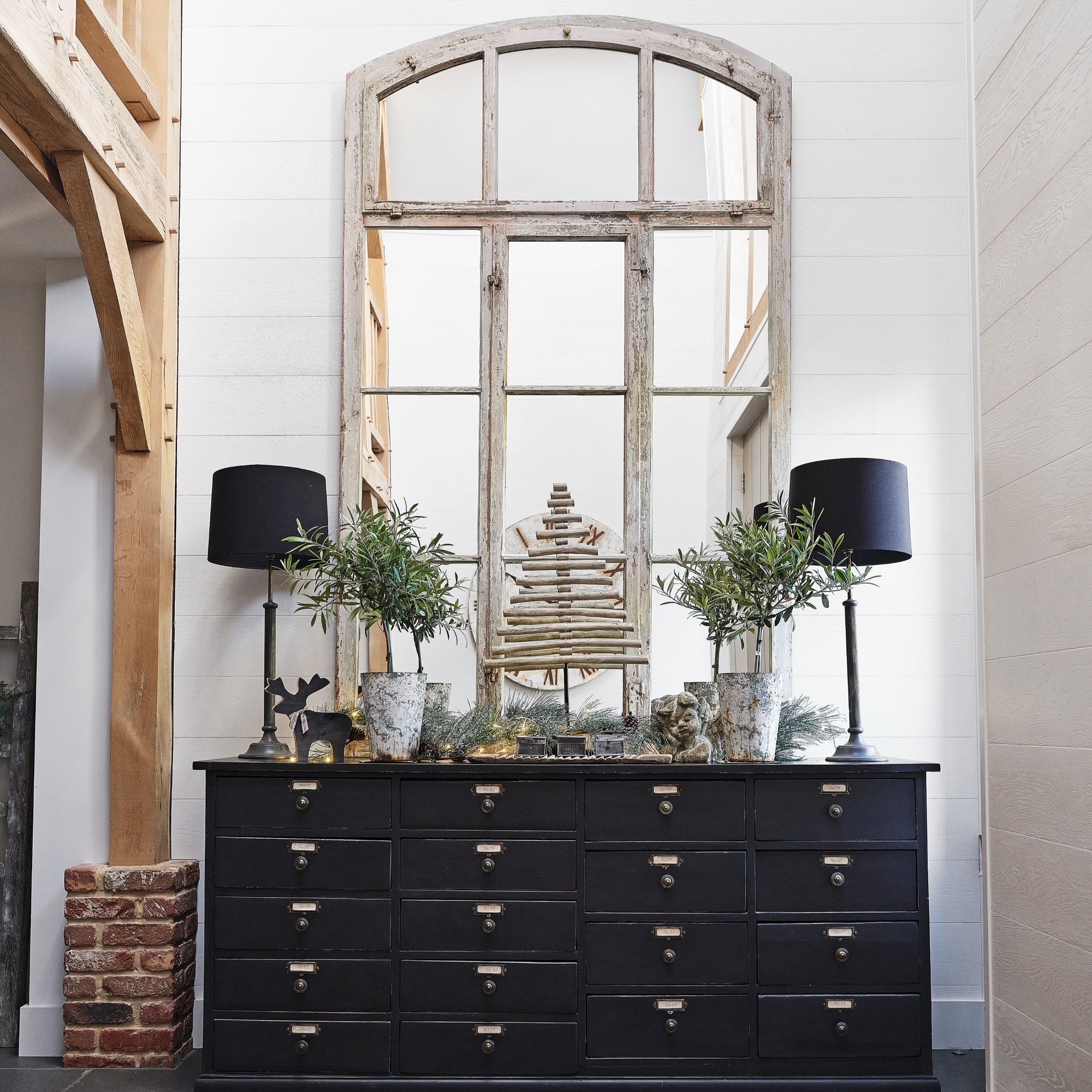
When it came to hallway ideas, Tracy wanted to make the most of the space she was working with. ‘Having a double-height entrance hall means we can have fun with the furnishings. Anything we chose needed to fill the space, otherwise it would have been dwarfed by the ceiling height.'
Following the theme of the rest of the house, Tracy thrifted the key pieces in the entryway second-hand. 'I found a cabinet I liked at Kempton Antiques Fair, which the dealer refurbished and painted black. When we brought it home, it was just as I imagined it would be, with loads of storage. The next task was to find the mirror to go above it.'
9. 'I love making cute seasonal displays'
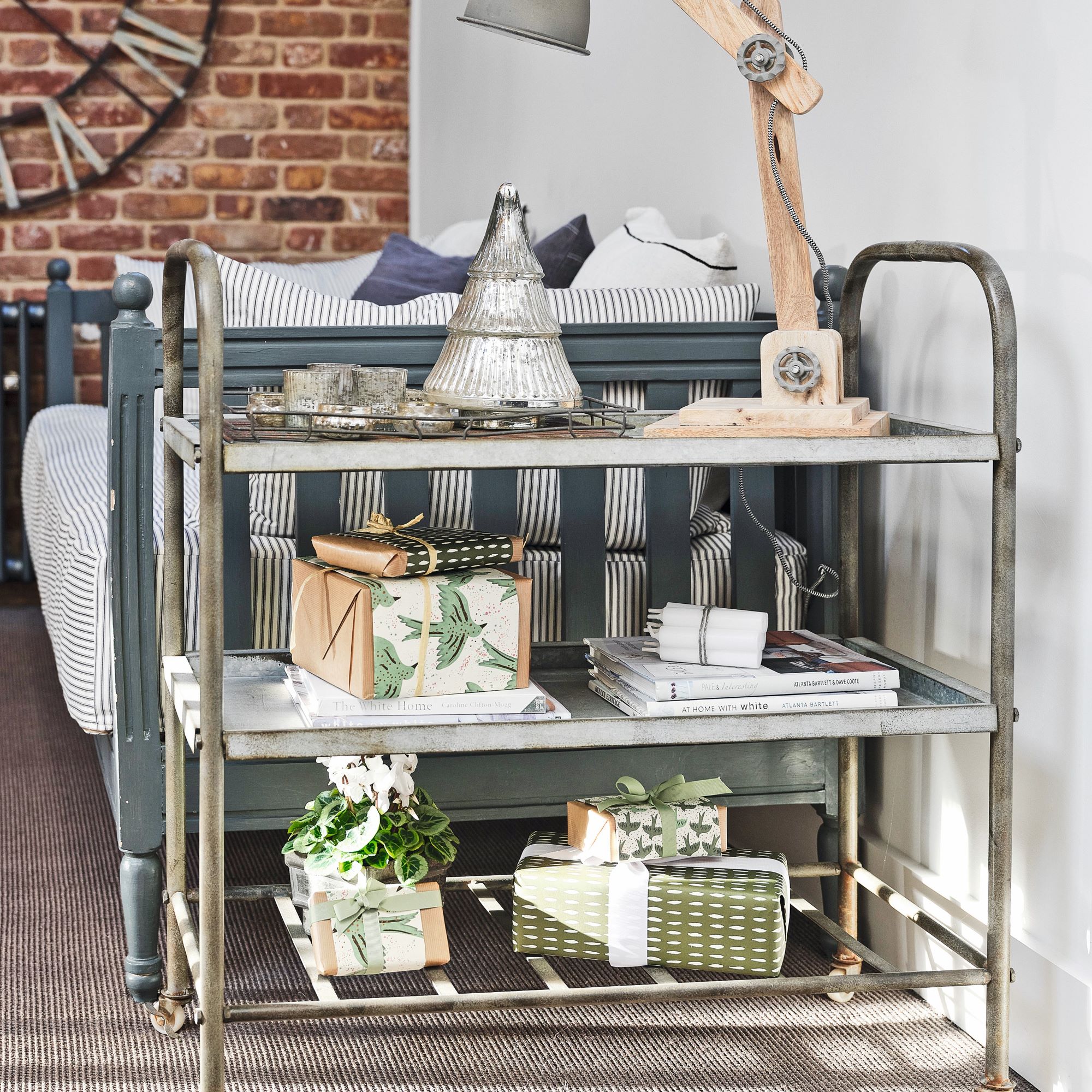
Rather than switching up the decor throughout the house with each season, Tracy focuses on this one area to display seasonal picks.
‘I use consoles and trolleys to showcase different finds and artwork, which change with the time of year. I feel it’s an organised way to display things rather than dot them around everywhere. In this case, it also gives a wonderful welcome to guests when they arrive in the hallway or on the landing. I’ve always got next month’s flowers and accessories in mind.’
10. 'The landing is multi-functional'
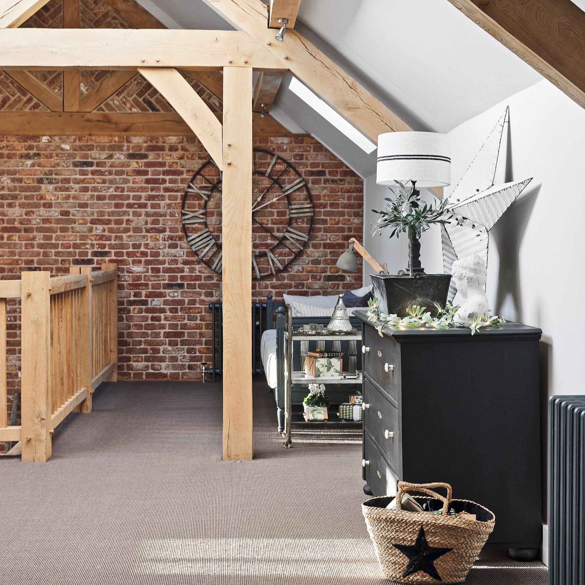
Tracy wanted the relaxed, cosy atmosphere to continue upstairs. ‘Up here, we wanted to create the same open feel as downstairs, so we have balcony areas and break-out spaces for doing exercise and relaxing. There are nooks with cushions under the dormer windows for curling up with a book.’
The colour scheme remains simple, which is the same in every room of the house. 'To create a calm, restful home, I have used only three paint shades,' Tracy explains. 'While bare brick and oak, and vintage furniture add interest and texture.'
11. 'We wake up to a lovely view'
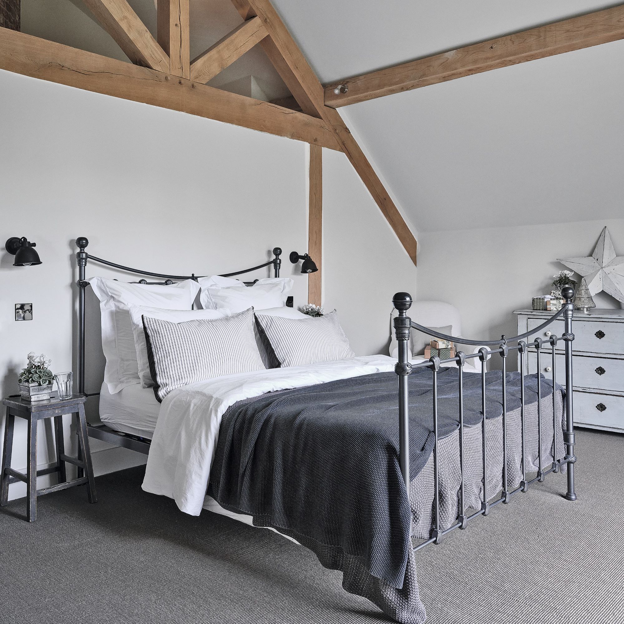
‘The luxury of designing your own home means you can have a wish list, and a bedroom balcony was on ours,' Tracy says. 'It looks out onto the garden and makes the room feel incredibly spacious.'
Waking up to a view of the garden each morning and having the option to go out on to the balcony is a dream come true for Tracy and Steve. And they created a calm bedroom through the bedroom colour scheme and decor. 'I’ve kept to a limited pale palette in this room to continue the light, bright feel.'
12. 'We created a bespoke bathroom'
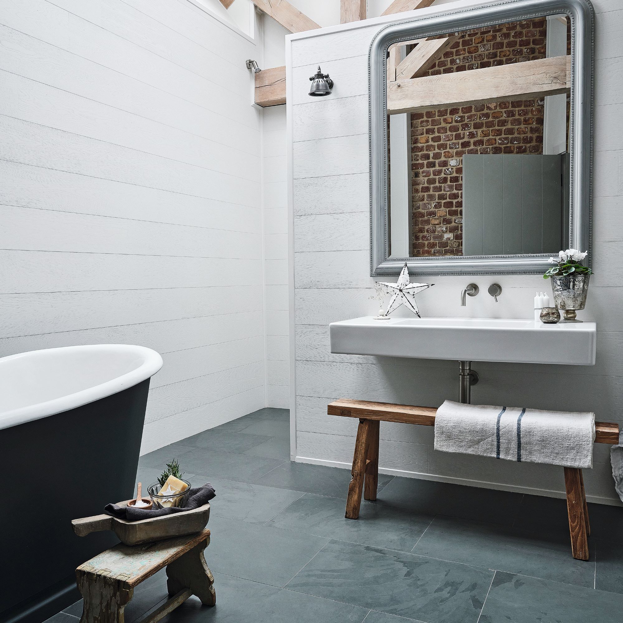
The minimal style continues in the bathroom, with plain walls which help features, such as wooden roof trusses and brickwork, to stand out. A monochrome bathroom palette also creates a soothing backdrop for a bathing space.
‘This space works incredibly hard, as it is also our dressing area with lots of wardrobe storage,' Tracy explains. 'Rooflights in the vaulted ceiling means it is flooded with daylight, which elevates the space and gives it a real sense of luxury. I have also added comfortable seating, to create a spa-like space to retreat to.’
-
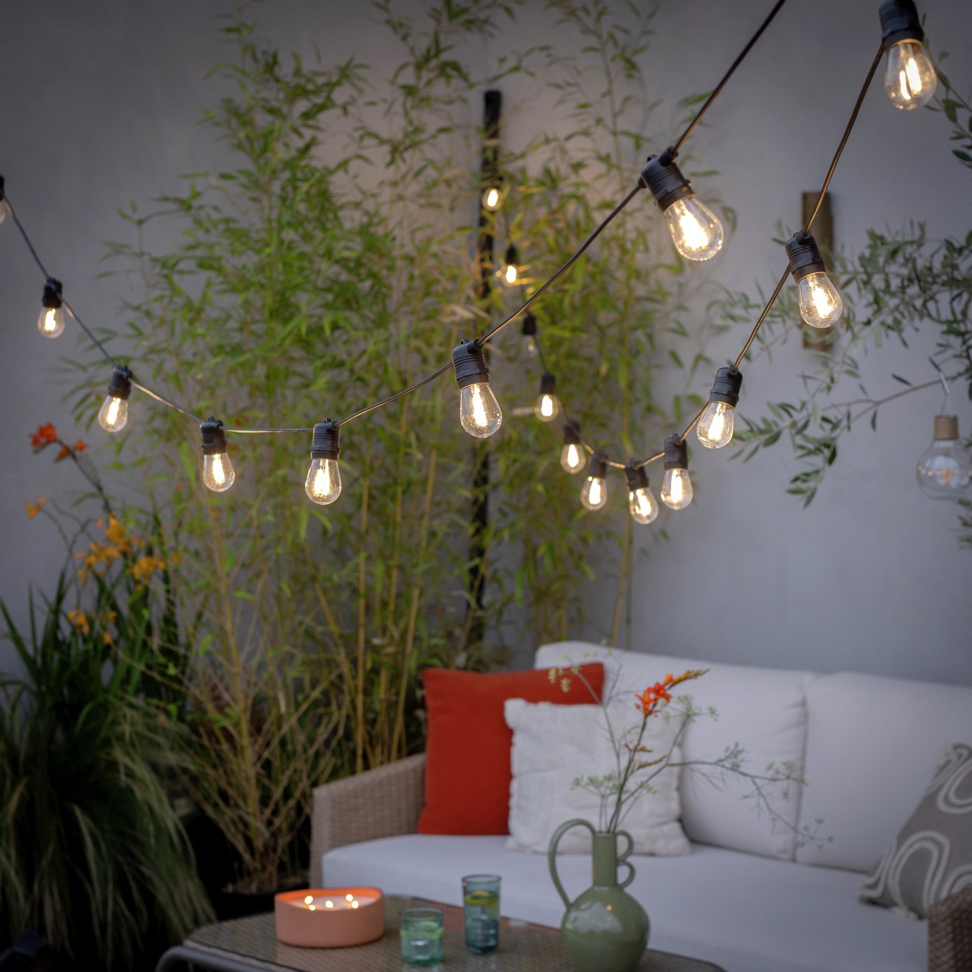 The 6 outdoor lights from Habitat that I'm choosing between to make my outdoor space look more expensive this summer
I couldn’t believe some of the prices
By Ellis Cochrane
-
 Joseph Joseph 3-piece Saucepan review – seriously space-saving
Small kitchen? I tested this innovative Joseph Joseph space-savvy set which has foldable handles — and I loved it
By Annie Collyer
-
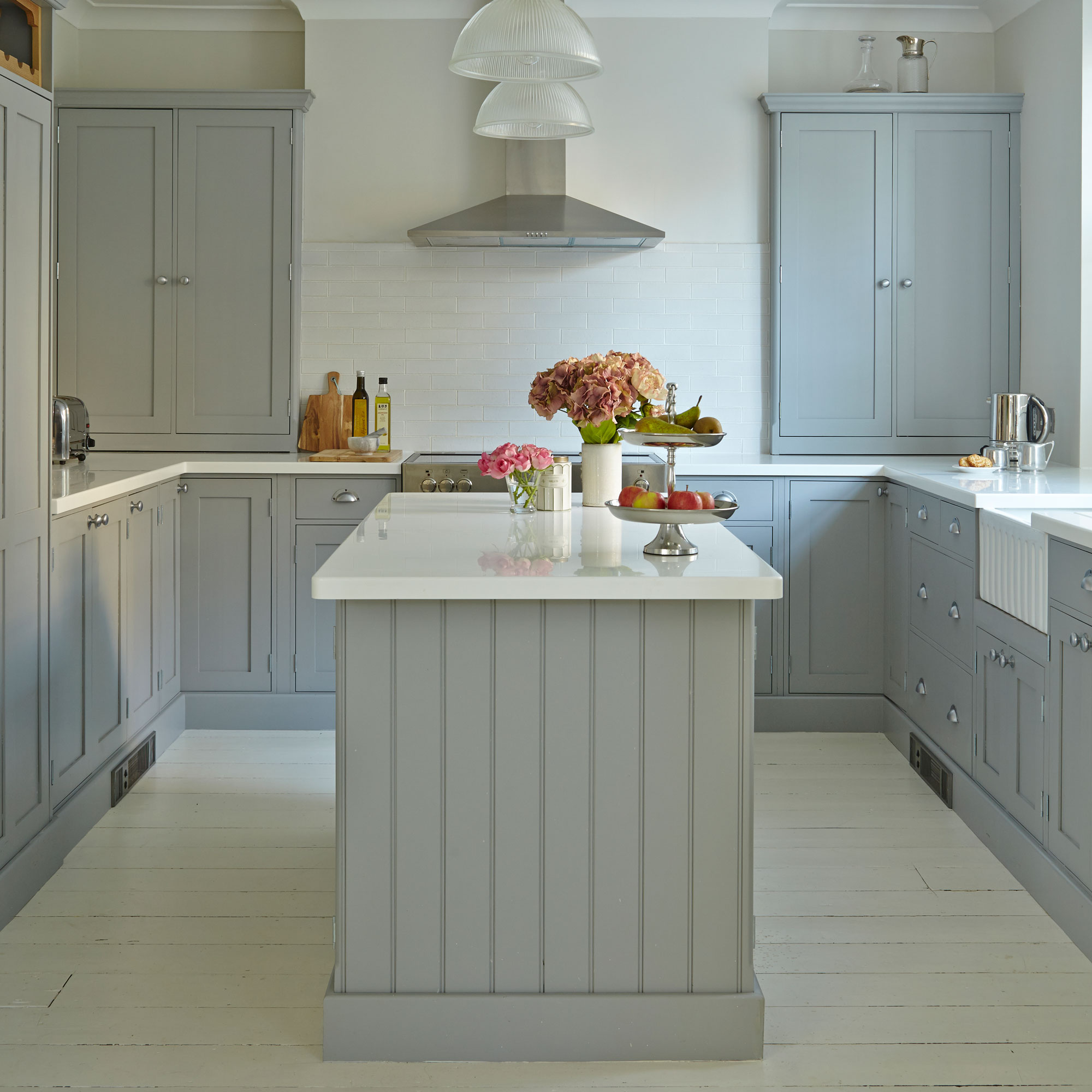 Forget seating, this is how you should be making the most out of your kitchen island in 2025
Seating doesn't always have to be a necessity on an island when you can choose these ideas instead
By Holly Cockburn