Vibrant colours and patterns have made this new-build feel like home
See how the owner of this townhouse has added impact with bold wallpapers, bright paint shades and upcycled furniture
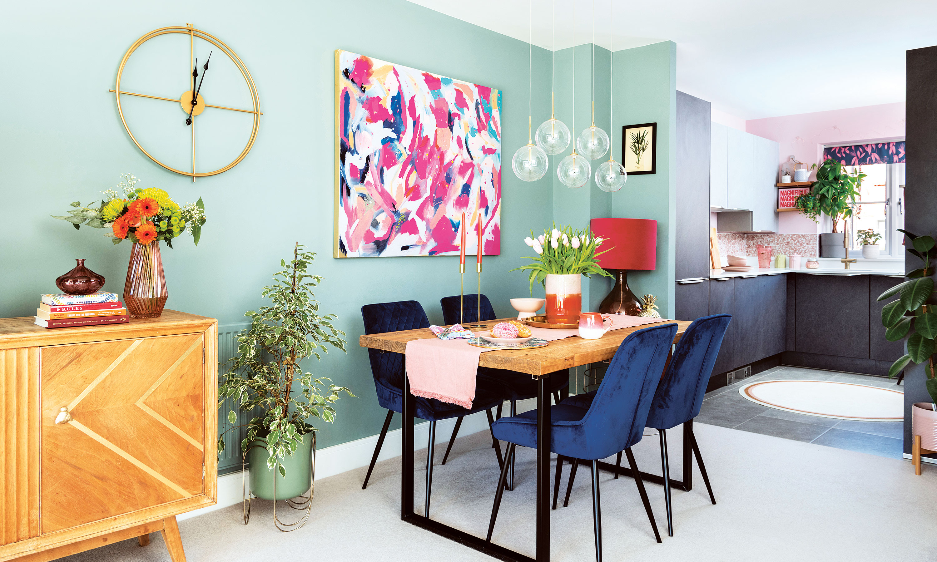

When the owner of this four-bedroom new-build townhouse in Surrey moved in, it boasted a brand-new kitchen and bathroom. However, the rooms were seriously lacking in colour or features.
Since then, it's been decorated from top-to-bottom in vibrant prints and soft colours to create a home that feels truly unique. The owner has stuck to a limited colour palette throughout her home to ensure it has a cohesive look.
The exterior
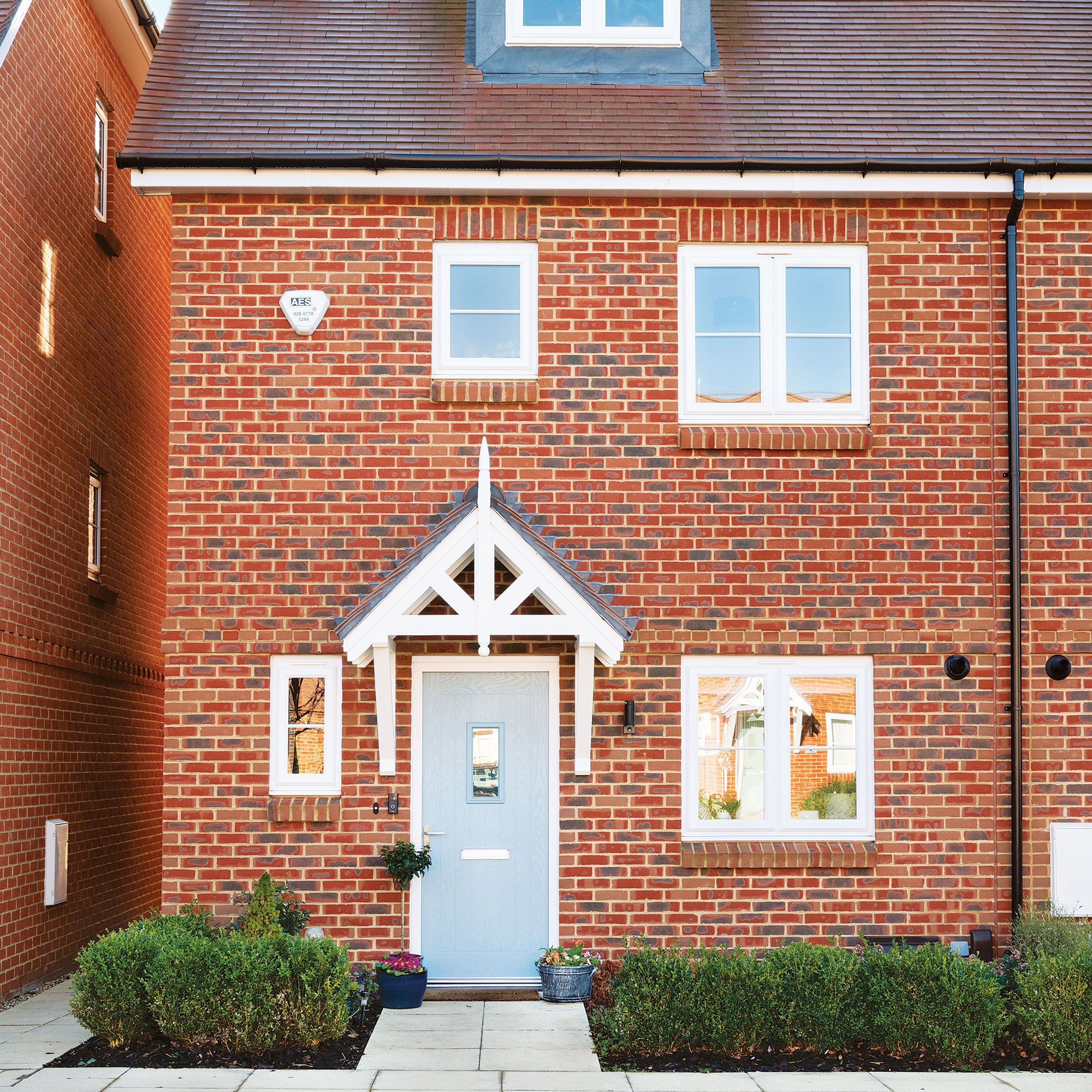
It was the owner's mum who convinced her to look at the nearby new-build development, but she admits she wasn’t keen:
'My perception of new-build properties was that they are poorly built, and the rooms can be ill-portioned. However, this house changed my opinion completely! Situated on a very pretty street in a little village with woodland nearby, the area felt peaceful and calm. I’d been living in a busy town centre, and this house offered me a different pace of life,' she explained.
The owner was pleasantly surprised that she couldn’t fault the building work or the interior. She loved the open plan kitchen ideas and living room layout, plus there was a huge attic master bedroom with a generous en-suite bathroom. But what really sold it was the south-facing garden.
'The house ticked so many boxes for me, including ones that I didn’t even know I needed ticking! Everything happened so quickly, and within 16 weeks I had moved in.'
The living room
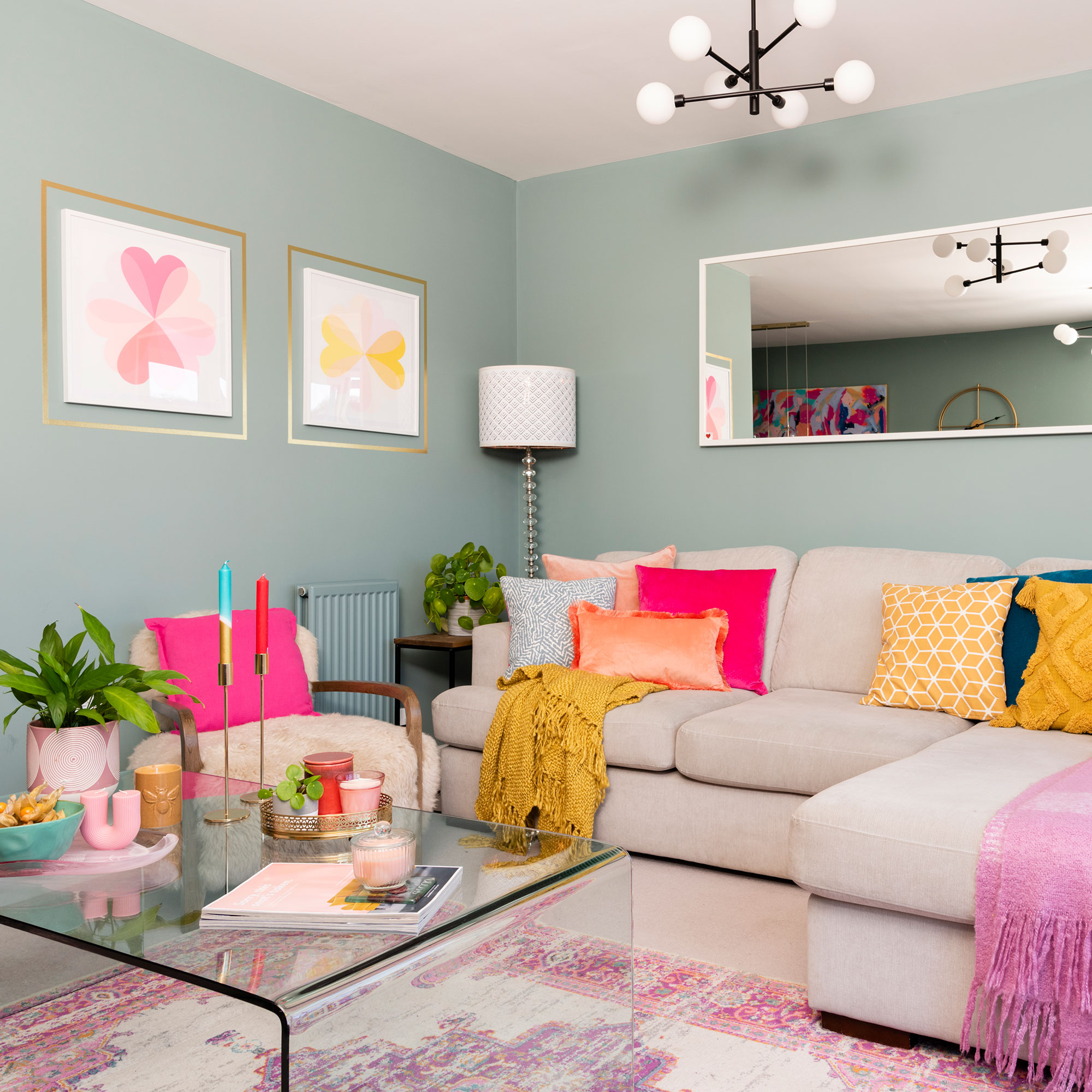
As the house didn’t need any renovation work, the owner could focus on the fun stuff, such as decorating and adding personality. Like most new-builds, it had been painted in a neutral colour scheme with beige carpets and walls and she was dying to decorate the rooms to reflect her love of colour.
Get the Ideal Home Newsletter
Sign up to our newsletter for style and decor inspiration, house makeovers, project advice and more.
To create a welcoming and cosy living room idea, her first big purchase was the floor-to-ceiling curtains, which were made bespoke by a local seamstress. The living room has large windows and doors that span the width of the room. To add a contemporary look, she chose pale blue animal print fabric with an electric pink edge for the drapes.
The cosy DFS sofa makes this open-plan living space feel inviting. The Swoon Editions living room shelving idea is filled with a collection of vases and accessories that the owner has collected over the years.
The kitchen
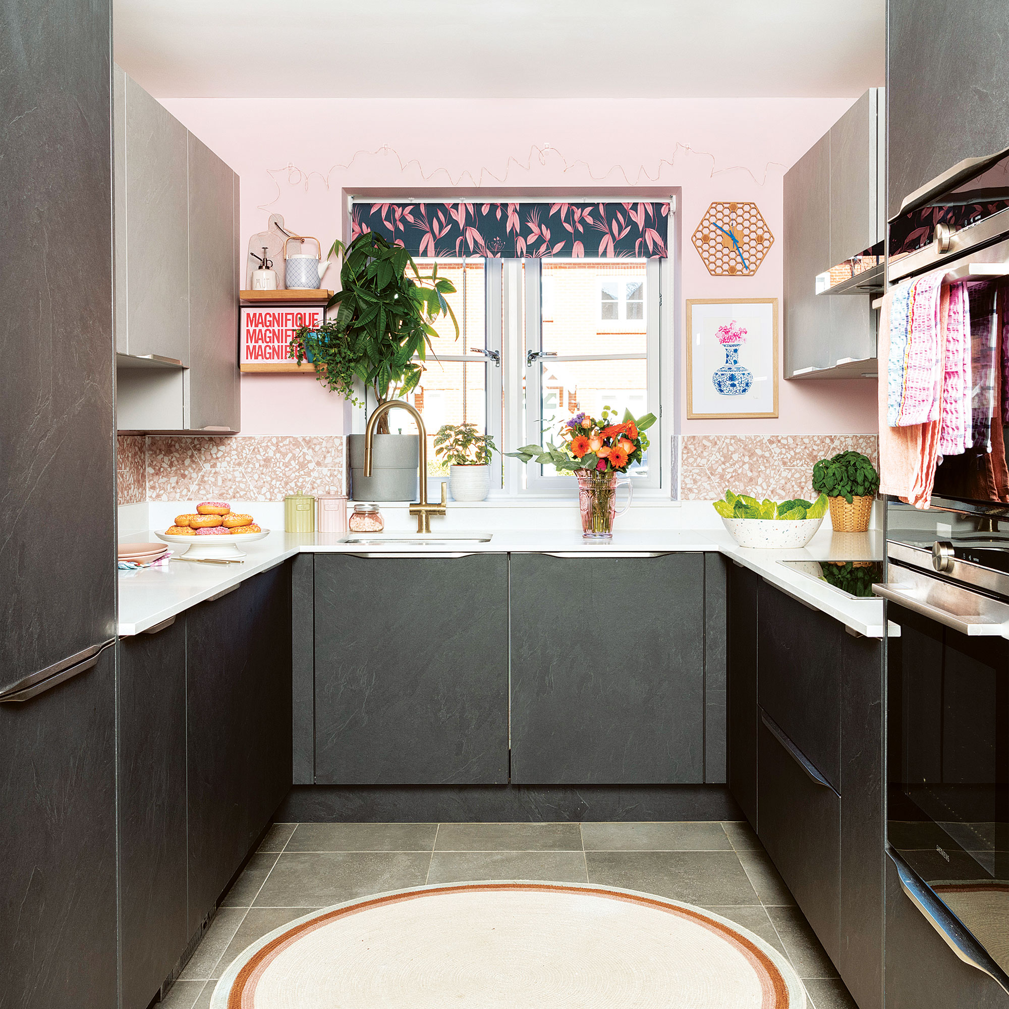
Despite saying she would never have chosen a dark grey kitchen idea, the owner has grown to love it. Her plan was to bring a warmer tone to the dark cabinetry, which resulted in a lot of research on what colours work well with charcoal. She eventually decided upon blush pink.
As the ground floor is open plan, adding pink into this space has created continuity and flow. The owner used leftover paint from her bedroom makeover, but as it is a north-facing room, the colour looks paler. On the walls, she added a row of hexagonal terrazzo porcelain tiles from Your Tiles to add texture and interest.
The colourful blue kitchen splashback idea complements the walls and adds warmth, while the ready-made blind from Very introduces a dash of pattern. The owner also swapped a chrome tap for a glam gold one.
The dining room
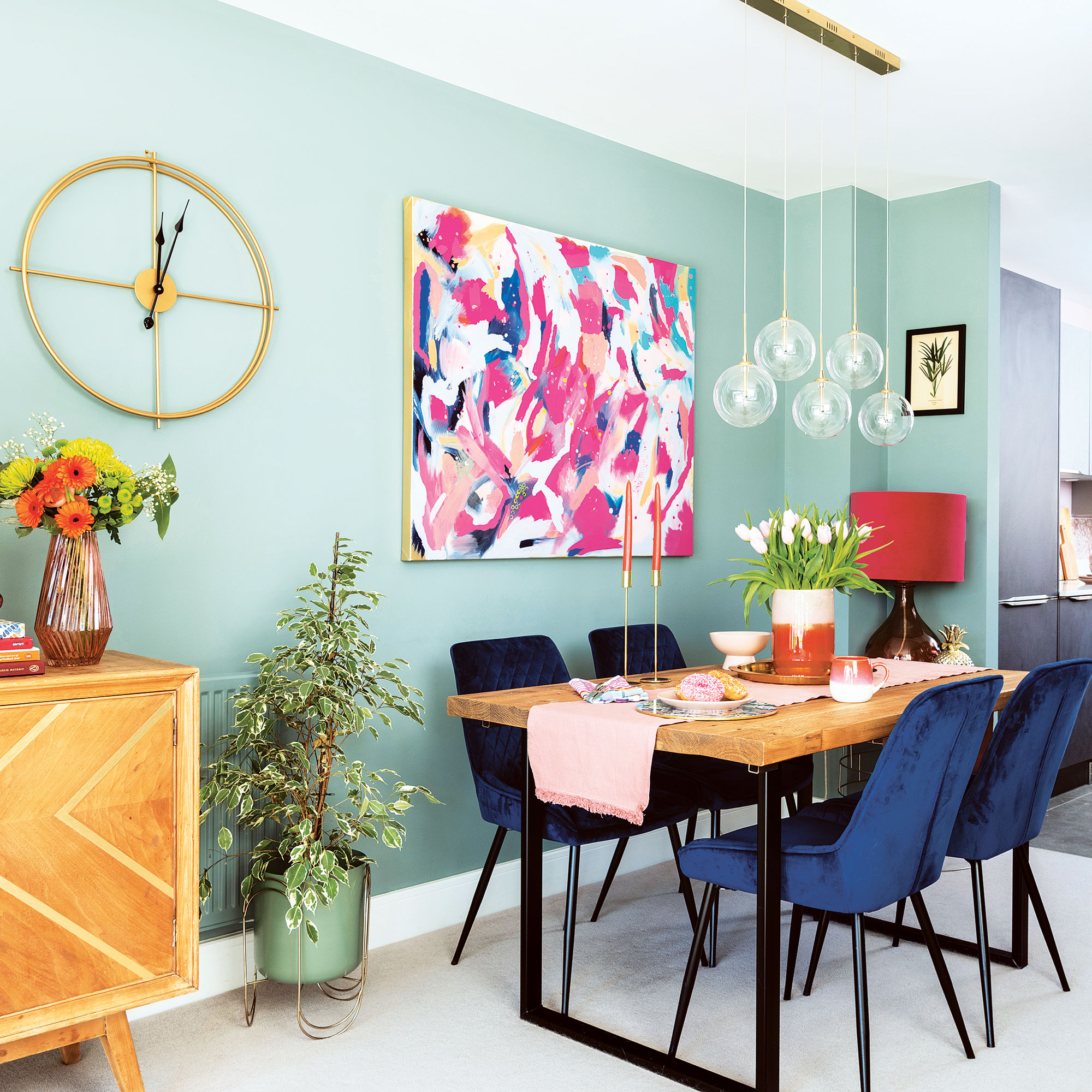
The owner found the 1950s sideboard on Facebook Marketplace for £100, which she then sanded and added gold washi tape to. The little handles are from Sainsbury’s Home. She uses the sideboard as an alternative TV cabinet.
The Matalan lighting above the Hemming & Willis wooden table draws attention to the Next velvet blue dining chairs.
The owner also wanted an abstract piece or artwork for her dining room, but she couldn’t find anything she could afford so she made it herself using acrylic paints.
The hallway
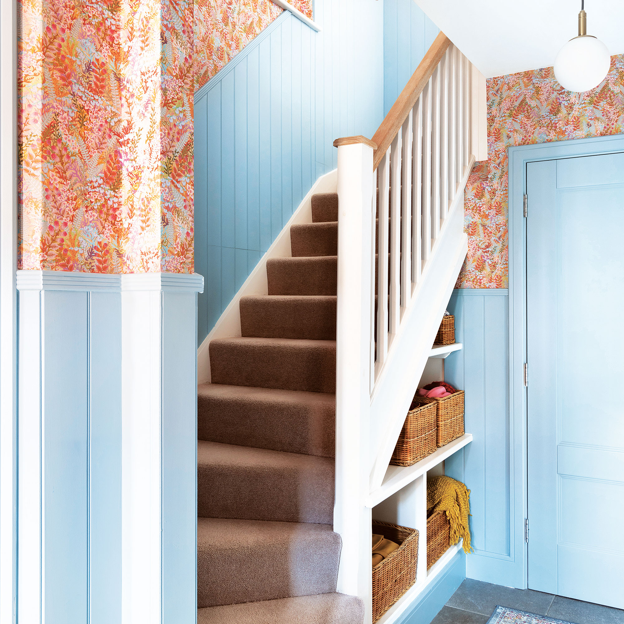
The front door idea was already painted baby blue, which inspired the owner to carry the tone into the hallway. She chose to paint the DIY wall panelling idea in Blue 04 by Lick and the wallpaper is by Studio Coverdale. However, decorating the hallway was no easy feat:
'My dad, who is a DIY wizard, helped me cut sheets of MDF to create a panel effect up the stairs,'the owner says. 'They were fiddly to install, especially around the sockets and up the stairs. The hallway transformation was dramatic though, and it has set the tone for the rest of my house.'
The master bedroom
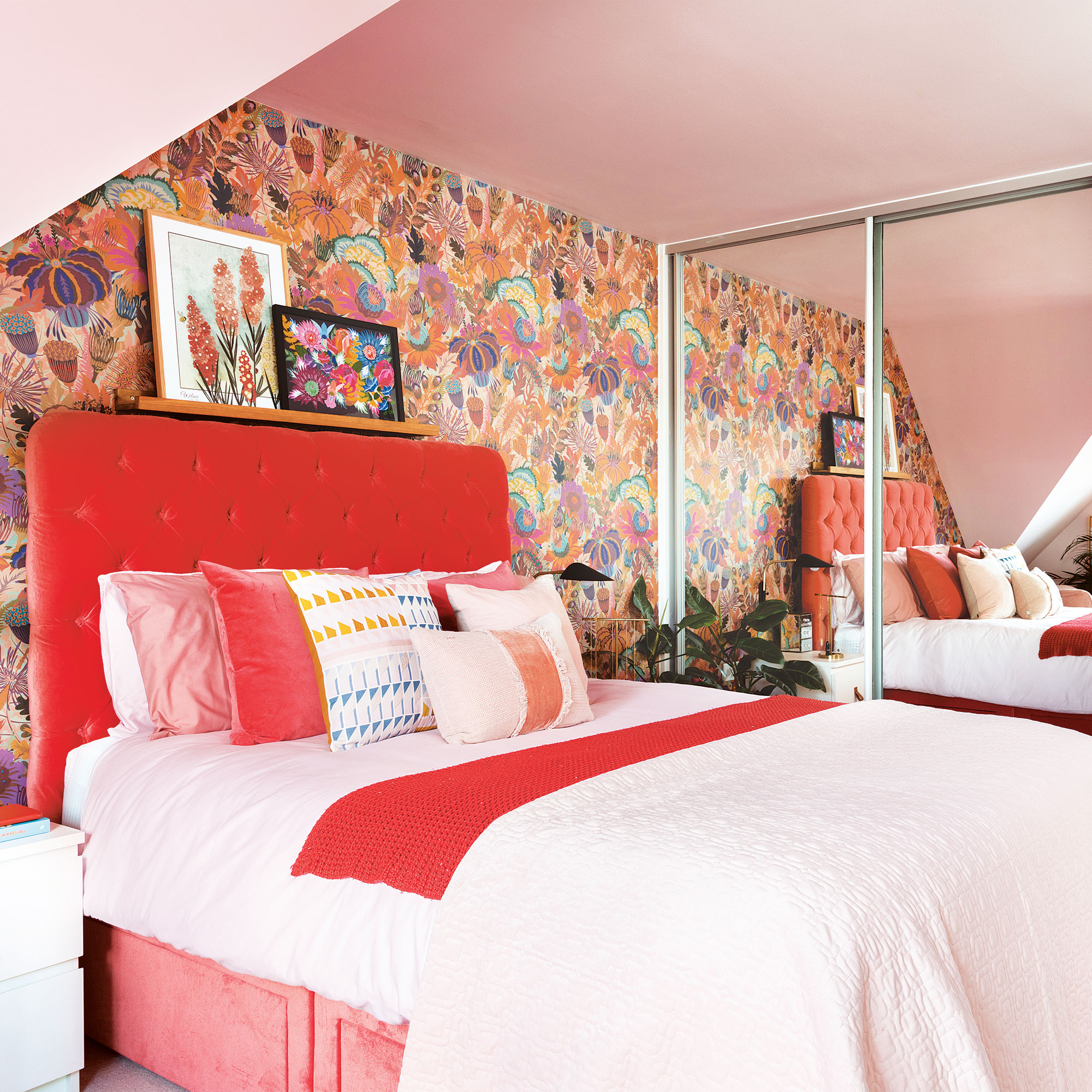
The master bedroom has been decorated to complement the sunny south-facing nature of the room. The owner painted the walls and the ceiling the same shade of pink to blend in the angles as it is an attic bedroom idea. The wallpaper is by artist Natasha Coverdale from Studio Coverdale.
'I’ve been a fan of her work for a long time and wanted to use her papers in my home somewhere. The mirrored wardrobes reflect the wallpaper, filling my bedroom with pattern,' the owner tells us.
Not everything ran smoothly, and the owner did have a bit of a hitch when decorating her bedroom. She tried to match an expensive paint colour to a high-street brand, but the pigments were off, and it looked lilac on the walls rather than the desired pink hue!
'I got halfway through decorating the room, before giving up and switching to Lick paint in Pink 03, which turned out to be the perfect shade of pink,' she says.
The Ikea bedside tables were an upcycled furniture idea using paint and leather handles from Etsy. The velvet headboard in a bold colour creates a luxurious feel.
The guest bedroom
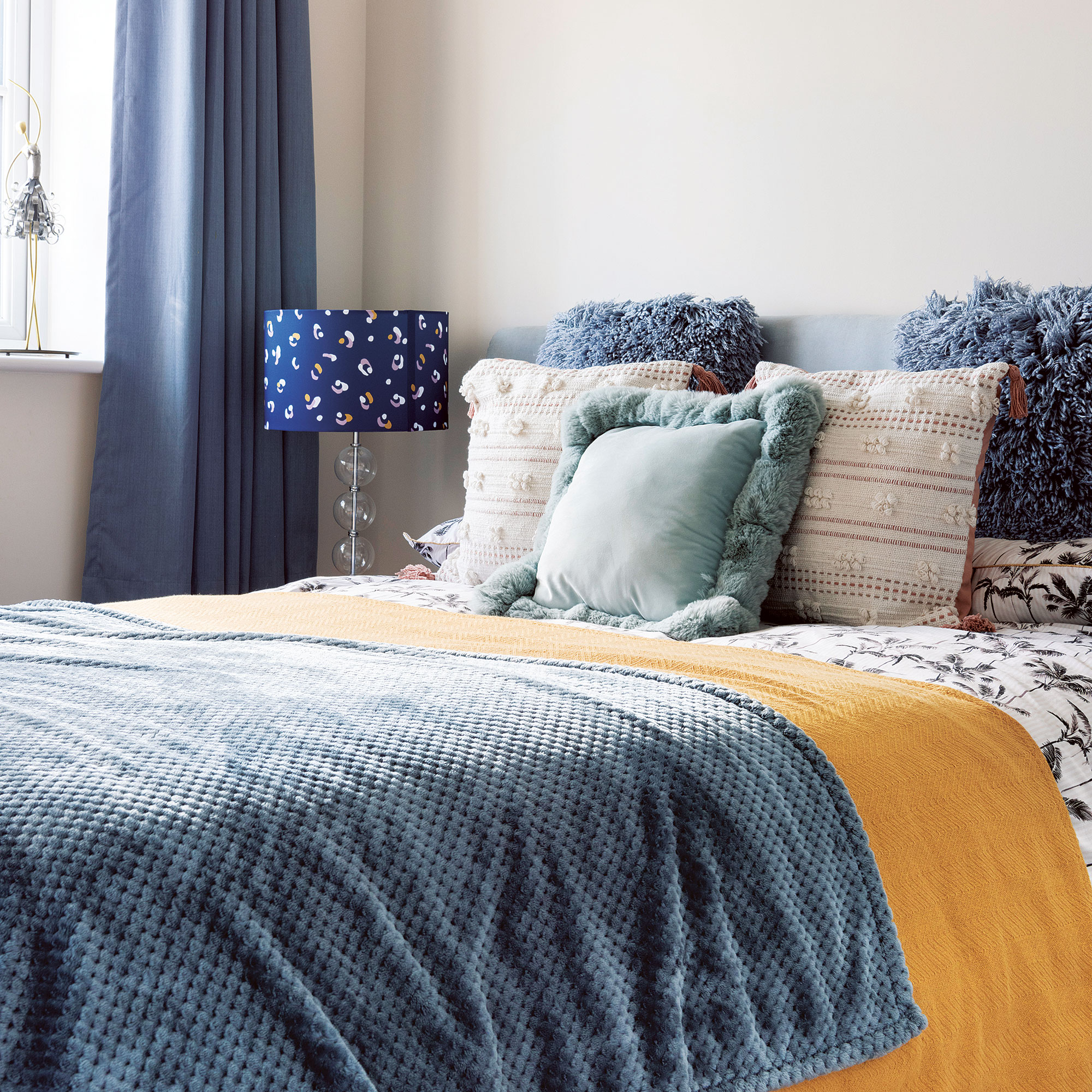
A naturally bright and sunny room, the owner plans to carry on with the baby blue theme to keep the guest room idea a relaxing space for her mum to stay in. The bed was an eBay purchase, the cushions are from Next and the curtains from Marks & Spencer.
The home office
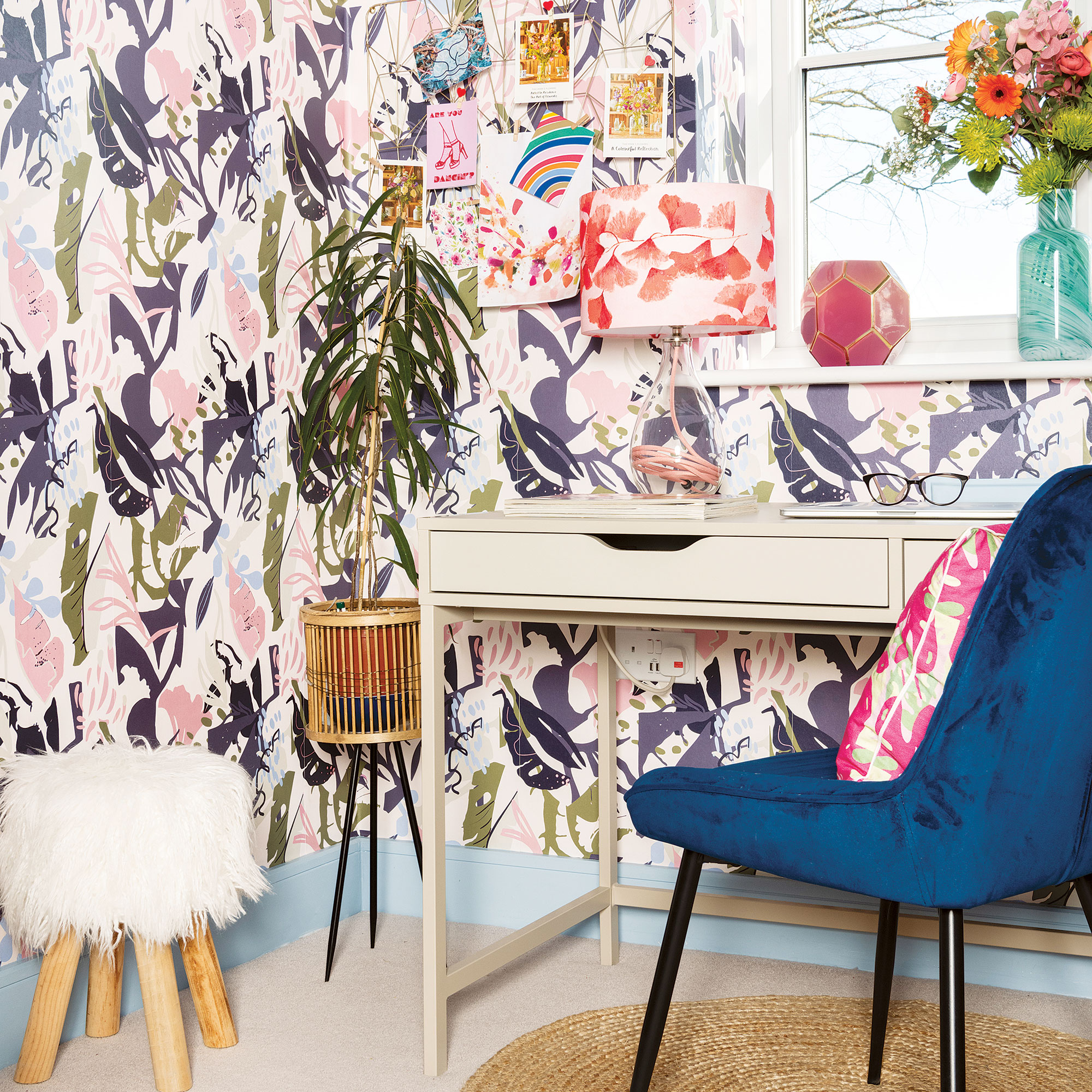
Working from home most of the time, the owner soon got fed up with the all-white home office idea, which she found draining and uninspiring. She wallpapered all four walls with a design from Lust Home and added a picture rail for a touch of character.
'Now my home office is a place that I’m happy to spend all day in,' she says. 'I’m a huge fan of wallpaper, too. People worry that wallpaper can become dated quickly but it’s reasonably priced and easy to install, so you can go as wild or as subtle as you want and make a huge impact.'
The bathroom
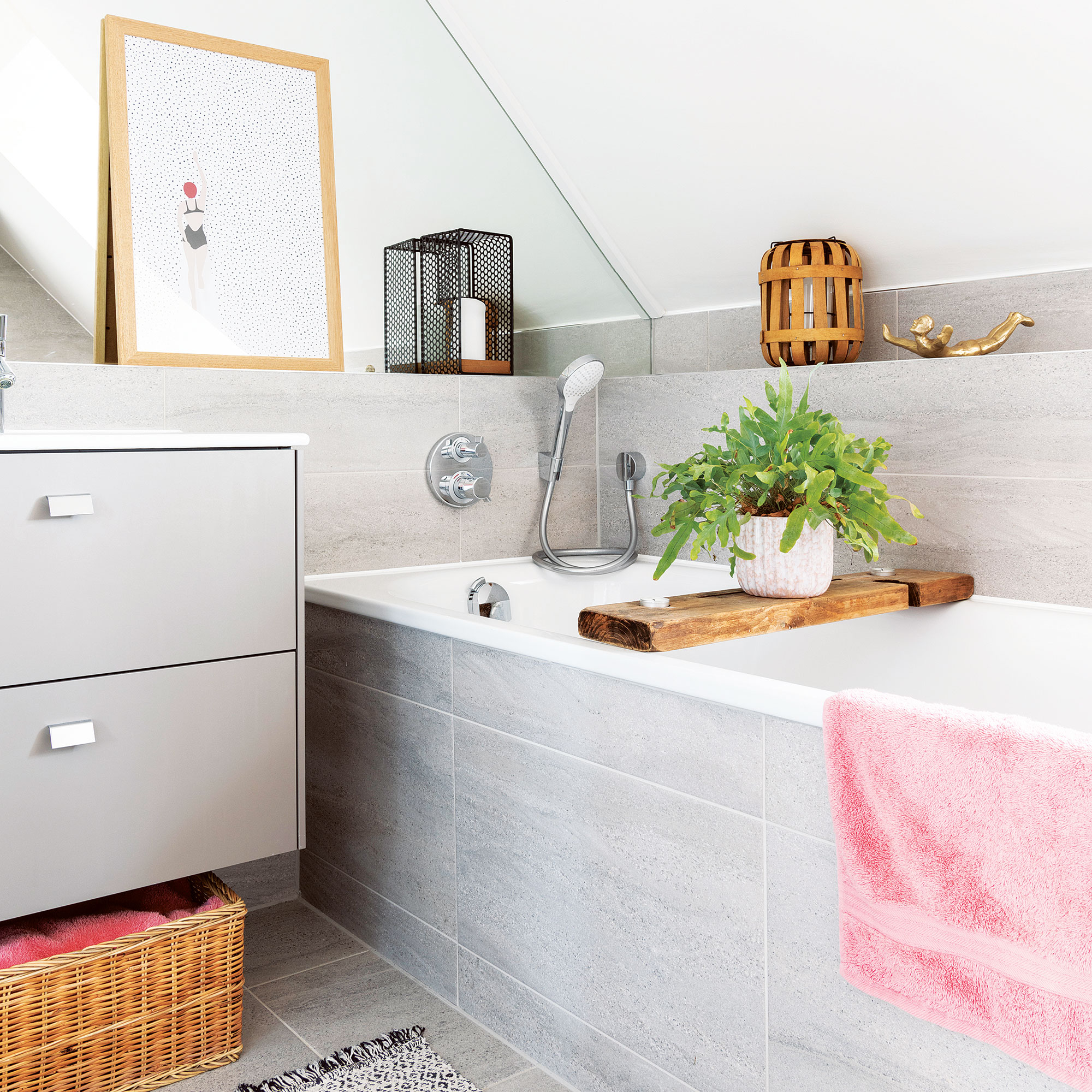
To add texture to her plain grey bathroom idea, the owner introduced wooden accessories like the bath rack from Etsy and artwork from Juniqe.
The garden
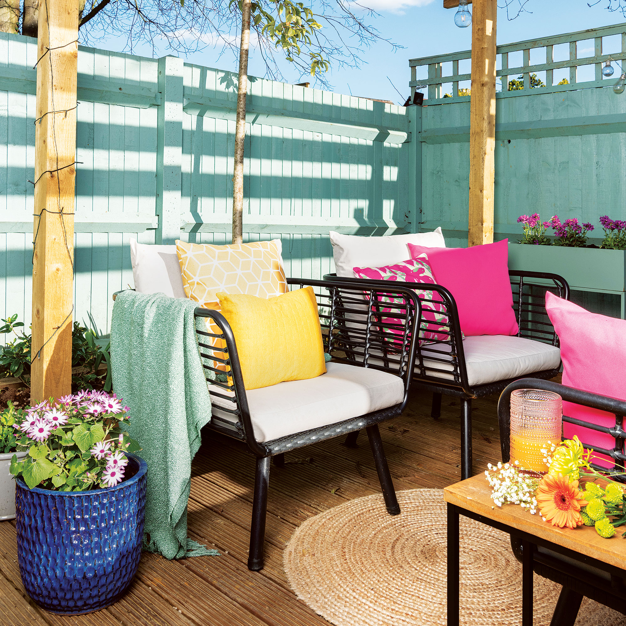
In the summer, the owner started the expensive work of making over the garden. The space was a boring square patch of grass with brown fences, which she wanted to turn into an outside room.
'I created three zones, including a decking area at the end of the garden where the sun sets last so I can make the most of it in the summer evenings. The existing patio is a great space for barbecues and is close to the house. When the fences were painted in a similar colour to the living room, it turned my garden into a space that complemented the rest of my house. It’s a great space to entertain in, too.' she explains.
Lastly, the owner shares, 'My home makes me feel very proud as I’ve done most of the work myself and the hallway always puts a smile on my face when I walk through the front door. The living room is really cosy in the winter, and my bedroom feels so calm. I love catching the last of the summer sun in my garden, too. I feel so lucky that I’ve created a beautiful space that is not only practical to use, but also great to relax and entertain in.'
Have you been inspired to get experimenting with paint and wallpaper?

Steph Durrant is the Deputy Editor of Ideal Home’s sister magazine, Style at Home. Steph is an experienced journalist with more than 12 years under her belt working across the UK’s leading craft and interiors magazines. She first joined the team back in 2016 writing for both homes brands, specialising in all things craft, upcycling and DIY.
-
 Will a conservatory add value to your home and how can you maximise it?
This is what the pros say
By Amy Reeves
-
 I’ve been looking for a new signature scent for my home and The White Company's new fragrance is the exact summer holiday smell I needed
Santorini smells fresh, summery and sophisticated
By Kezia Reynolds
-
 How to remove algae from garden walls in five steps – and the cleaning product experts rave about for tackling it fast
Experts share their top tips for getting garden walls algae-free
By Katie Sims