'My partner would be happy living in a white box, but I do think he appreciates my Scandi style!'
Determined to stick to their budget, this couple were hands on in renovating their rundown 1930s semi
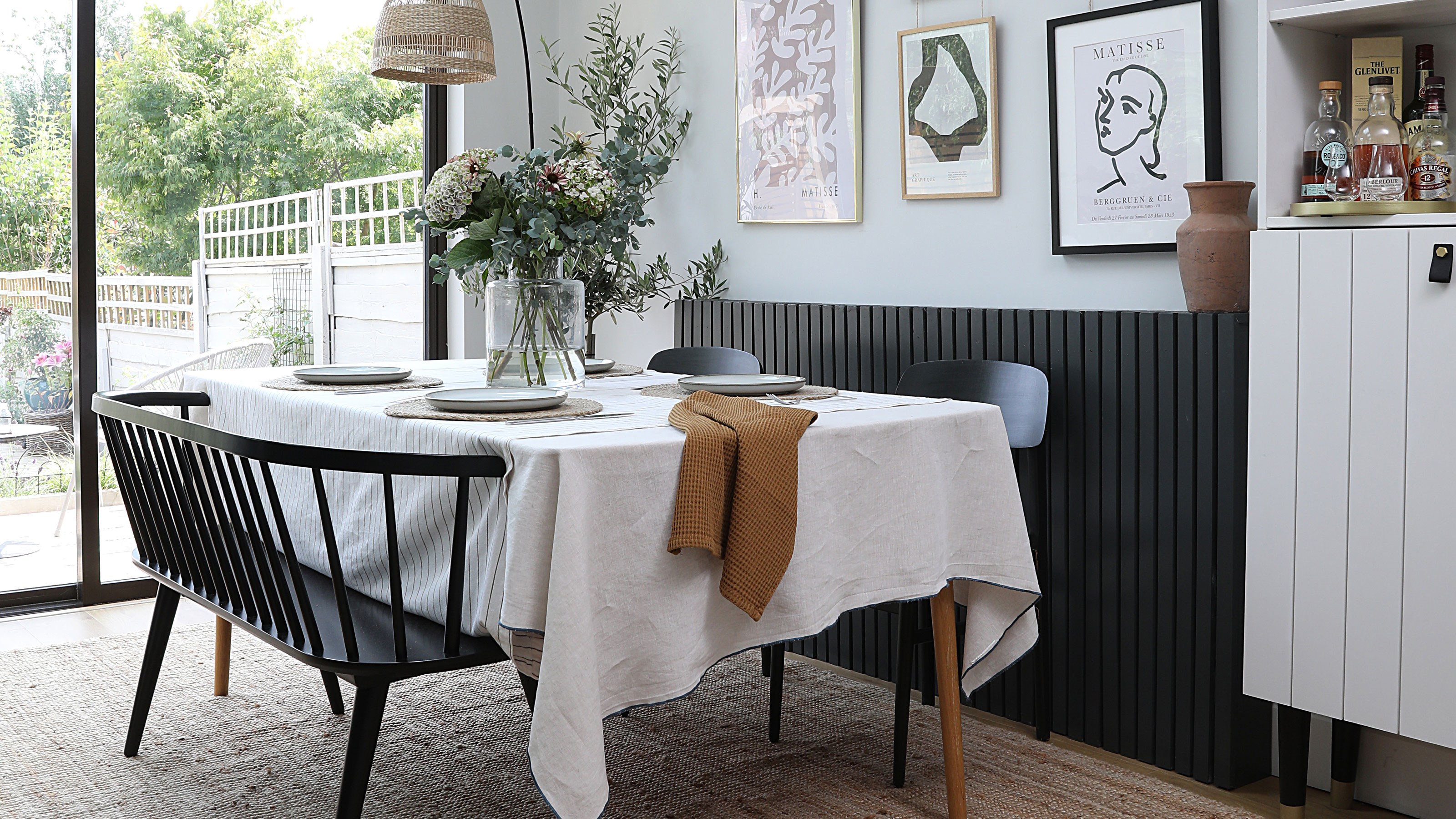
After renting a flat with friends in London for four years, the time was right for this couple to move to the NorthWest. Their friends were moving away from the capital, and they wanted to be closer to family.
To get a feel for the area before putting down roots, the couple rented a two-bedroom Victorian terraced house in Altrincham for a year. When they sadly both lost their dads within months of each other, they used their inheritance to purchase a three-bedroom semi in the area.
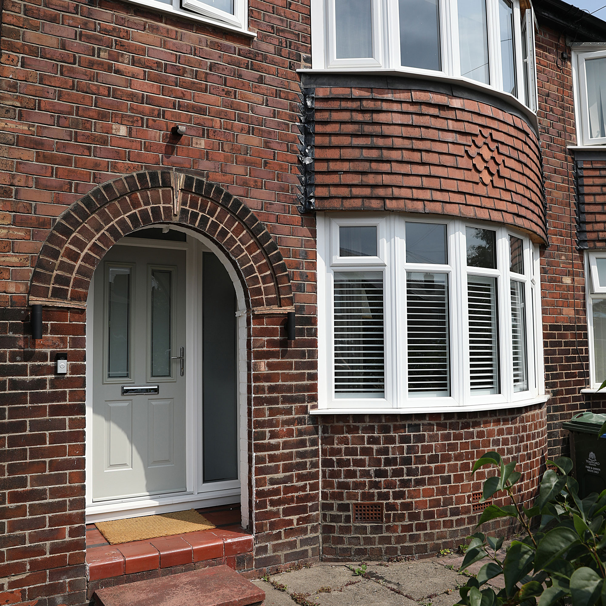
Built in the 1930s, it had bags of potential, and Covid lockdowns gave them time to start work on it. Discovering they had a builder living next door proved to be a major bonus.
The couple had met in Italy 10 years ago, when he was working as a guide on his gap year. She had grown up in small village in Italy, where her parents ran a restaurant, and was heavily influenced by the colours of the mountains, with shades of deep greens and warm neutrals.
The pair tell us how they turned this ugly duckling house, with its disjointed layout, into a beautiful home that connects with the garden and is perfect for entertaining.

‘When we viewed this place, it had a really good feel about it with so much light coming in, even though it had been empty for five years and the garden was overgrown,' she says. 'It had already been extended but wasn’t open plan, so there was a weird galley kitchen with a long L-shaped room to the side.
'We could see the opportunity to create a nice open space without having to extend and spend too much money. Although there were 10 other offers and ours wasn’t the highest, they accepted our bid as we were first-time buyers with no chain.'

‘Unlike my partner, I have no creative vision, so when we first walked round the house I thought “Oh my God, I’m going to spend my life savings on this dive!”,' he says. 'It was clearly a property you could do a lot with, though.
'The fact that the extension wasn’t utilised properly was a good selling point for me. She talked me through her vision for opening up the kitchen and showed me inspirational pictures. She’s so talented, it didn’t take much to persuade me.'
‘Despite going into this project with no experience whatsoever, we got lucky as our next-door-neighbour, Andy, was a builder,' she expIains. 'He was planning to retire but made this his last job.
'I didn’t get any other quotes as his daily rate seemed fair. As well as new electrics, plumbing, plastering and double glazing throughout, most of the budget went on the kitchen-diner.
'The two rear rooms were divided by a load-bearing wall so we needed three steel beams, and we created a vaulted ceiling with new skylights. There wasn’t as much to do upstairs – just knocking the bathroom and toilet together, redecorating the bedrooms and adding fitted wardrobes.'
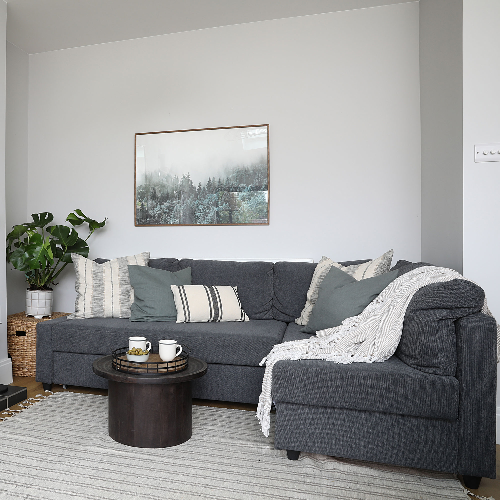
‘As much as I’m not creative, I am quite particular about the details when I take on a task – I made sure I did a good job with sanding back the stairs and painting,' he admits.
Get the Ideal Home Newsletter
Sign up to our newsletter for style and decor inspiration, house makeovers, project advice and more.
'My partner would direct where things were going and what paint to use, but we worked really well together. I’ve learned loads of new skills on the job, with a bit of help from YouTube. Style wise, I’m very anti clutter and neutral, so her timeless look with muted soft tones works really well for us.
'My favourite room is definitely the kitchen. I love the light in there, especially in summer, but ideally we’d like to replace the laminate flooring with wood. I also love the front lounge in winter as it’s more warm and cosy.'
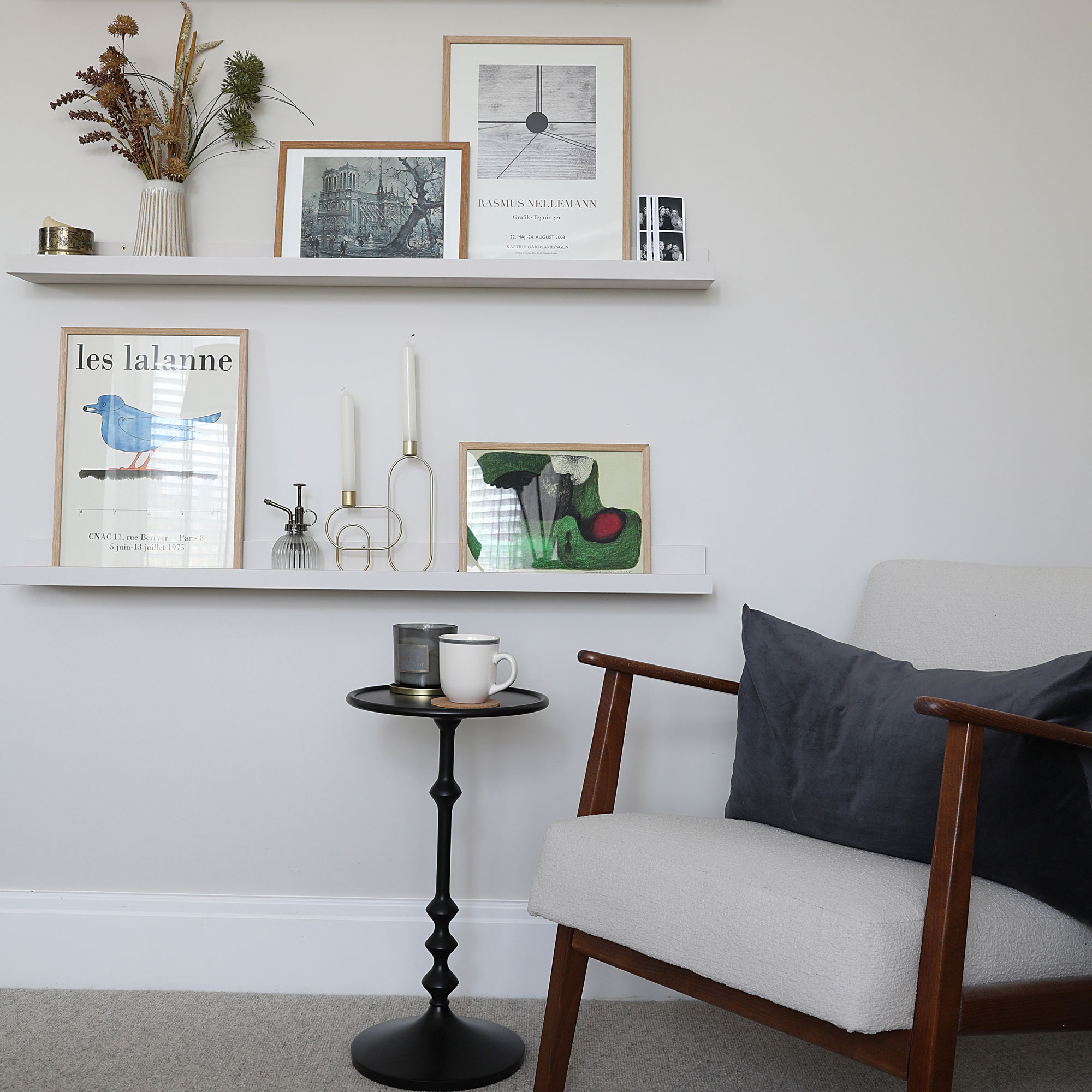
‘In the bathroom, the boiler cupboard and large blue bath took up too much space, and the sink was under the window, so you couldn’t have a mirror above it,' she says. 'We really wanted a separate bath and shower, which meant relocating the boiler to the kitchen and changing the layout.
‘When everything was stripped back to brick, we lived in the front lounge with a microwave and all our clothes. The garage was filled with all our stuff and we would shower at the gym. It was only when we had no toilet and windows that we moved in with a family friend for a few weeks.'
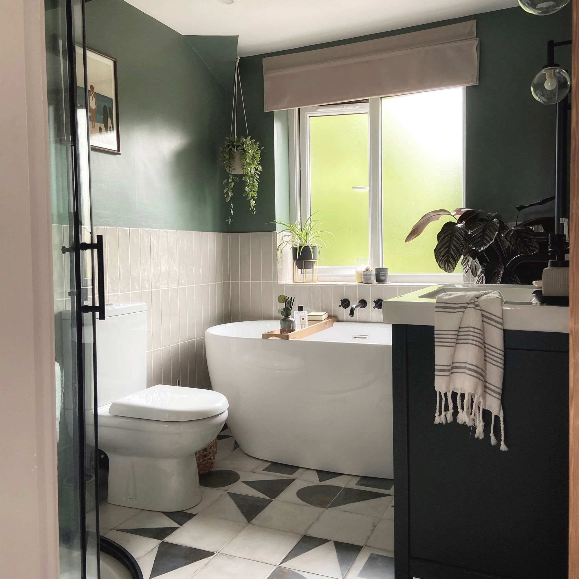
‘The only thing that caused delays was Covid. The downstairs was done but we couldn’t get supplies to finish it off,' he says.
'We also had a nightmare with the garden. Covid led to an influx of rogue traders and we had some terrible landscapers who left us in the lurch. Thankfully, even though our builder had moved house by that point, he came back and helped me finish it off.'

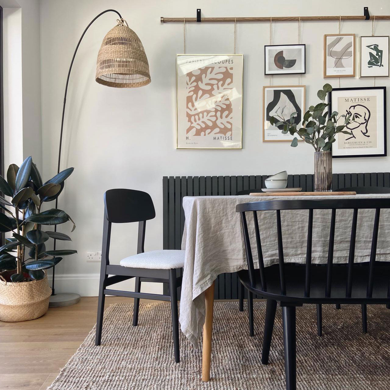
‘Although I always do mood boards for clients, here I went with the flow when planning the décor,' she says. 'I’m definitely influenced by the natural textures, soft hues and minimal styling used in Scandinavian design, and I’d describe my look as calm, minimal, understated and timeless.
‘It’s so easy to go over budget but we were very strict with ourselves and tackled as many things as we could; like stripping wallpaper and ripping out wardrobes. Although my partner would be happy living in a white box, I do think he appreciates my style!'
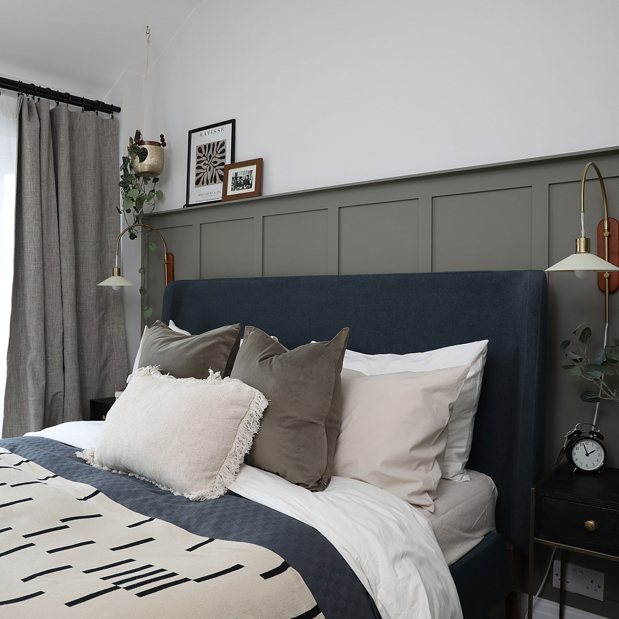
‘I’m really pleased we managed to more or less stick to our £50,000 budget. Having one builder is probably more cost-effective if you are willing to wait for them to start, and it also helped that my partner kept a spreadsheet,' he says.
'We haven’t splashed out on any extravagant furniture either, apart from the built-in wardrobes, which were a necessity. But she has done some great Ikea hacks elsewhere to keep us within budget.’
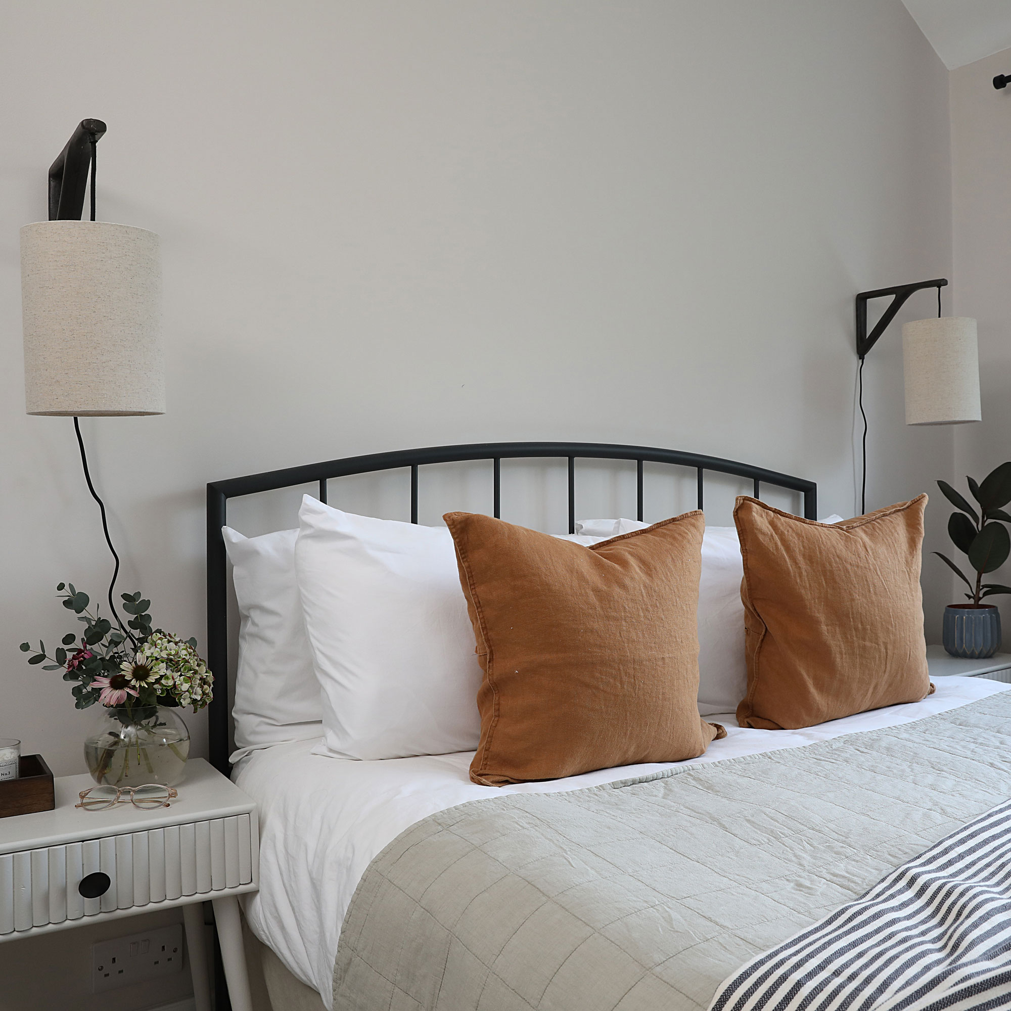
‘Next, we’re working on a garden studio for my interior design business, since the guest bed gets covered in fabric samples and mood boards which have to be cleared away when anyone stays over. It could suit both of us when we’re working from home – so then my partner's office could become a nursery in the future.’
-
 Will a conservatory add value to your home and how can you maximise it?
This is what the pros say
By Amy Reeves
-
 I’ve been looking for a new signature scent for my home and The White Company's new fragrance is the exact summer holiday smell I needed
Santorini smells fresh, summery and sophisticated
By Kezia Reynolds
-
 How to remove algae from garden walls in five steps – and the cleaning product experts rave about for tackling it fast
Experts share their top tips for getting garden walls algae-free
By Katie Sims