Visit this cleverly redesigned Victorian home, full of sustainable materials
Instead of moving house, this family's newly redesigned Victorian home is now a light and bright space

Rachel Leedham
Sign up to our newsletter for style inspiration, real homes, project and garden advice and shopping know-how
You are now subscribed
Your newsletter sign-up was successful
Wanting to move home for more space, the owners of this redesigned Victorian home in Bow in east London have instead transformed it to something so much better (and saved themselves a fortune in the process).
They undertook a renovation that favours eco-friendly solutions and sees modern additions sitting side-by-side with traditional Victorian features.
They had originally moved to Bow in 2013 from a flat in Clerkenwell as they wanted a family house. While their previous flat was very modern and white, they also liked the attributes of this Victorian property with its high ceilings and original mouldings, and they loved the area’s sense of community.
Article continues belowThe four-bedroom terraced house was reasonably big but it didn’t necessarily feel that way, as the kitchen wasn’t large enough to eat in, which meant that one half of the double reception space was a dining area; they also began to feel the need for a dedicated small home office idea.
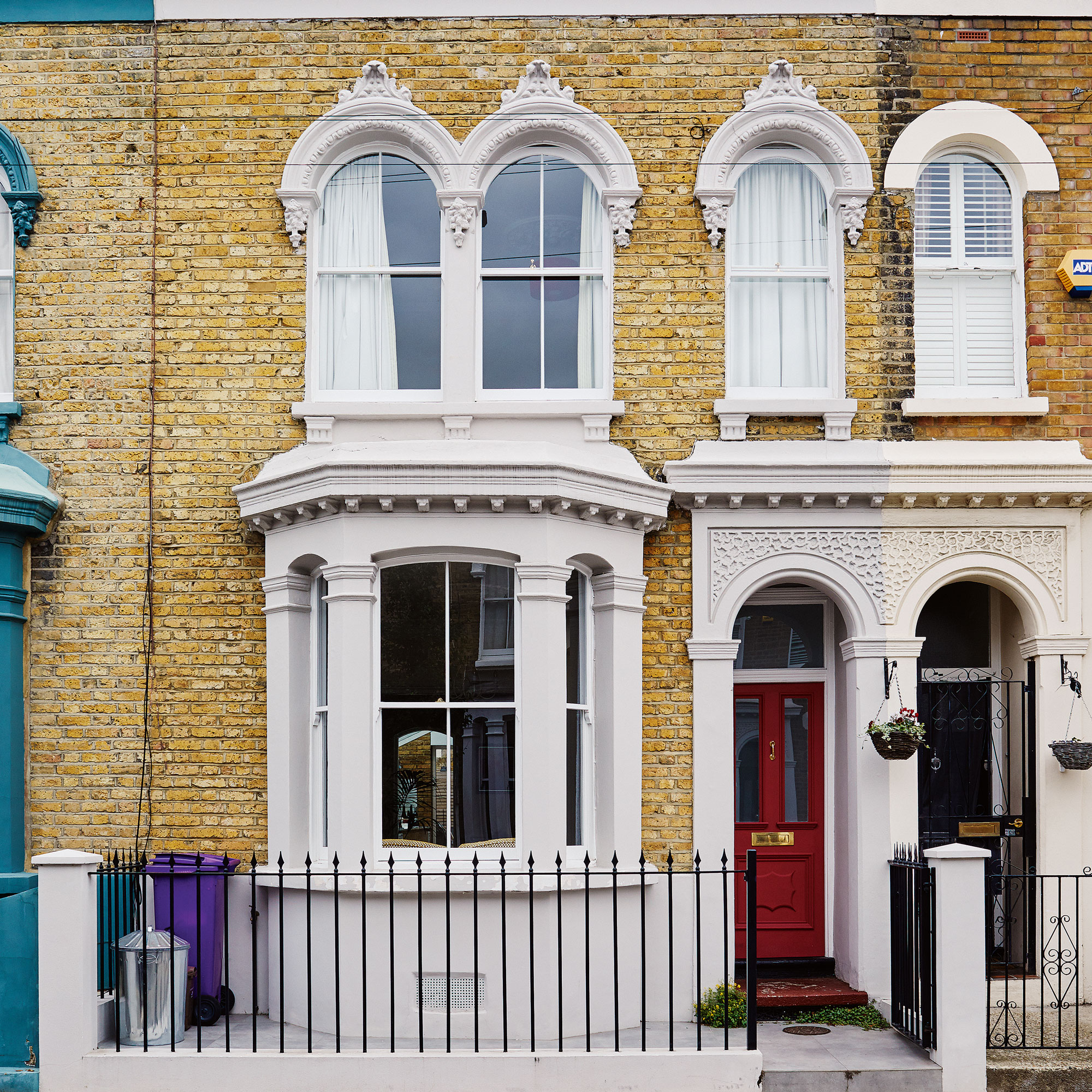
So in 2018, after the birth of their first child, they began looking for a bigger property further out of London. The couple asked Matthew Whittaker and Camilla Parsons of architectural firm Whittaker Parsons to visit a couple of houses with them.
In the process of their conversations, they talked about our current home and they offered to take a look at that, too. The ideas that the architect's came up with were so innovative that they persuaded the owners to stay put and remodel their home.
The architects came up with a small side return extension idea to widen the kitchen and bring in natural light. The fact that it doesn’t run the full length of the room allowed them to install bi-folding corner doors that let in the west light.
Sign up to our newsletter for style inspiration, real homes, project and garden advice and shopping know-how
A change in the law permitting loft extensions in their conservation area meant that they were able to design a conversion that added an extra bedroom and an en-suite bathroom.
This in turn freed up a room on the first floor which the couple transformed into a home office, which couldn't have been better timed as they moved back in when works finished in February 2020, just before the first lockdown.
Redesigned Victorian home - take the tour
All the spaces now feel incredibly connected: the owners love the fact that they can be in the kitchen and still supervise their children sitting at the table or playing outside, while the seamless polished concrete floor makes the garden feel part of the room in the summer.
Off the hallway is a double reception and at the end is the kitchen/dining space that opens onto a small patio garden. The first floor has three bedrooms (one of which is a study) and a family bathroom, while the new second floor houses the master suite.
The new home is filled with naturally lit spaces that use healthy, sustainable materials, that also celebrate both old and new design elements.
The kitchen diner
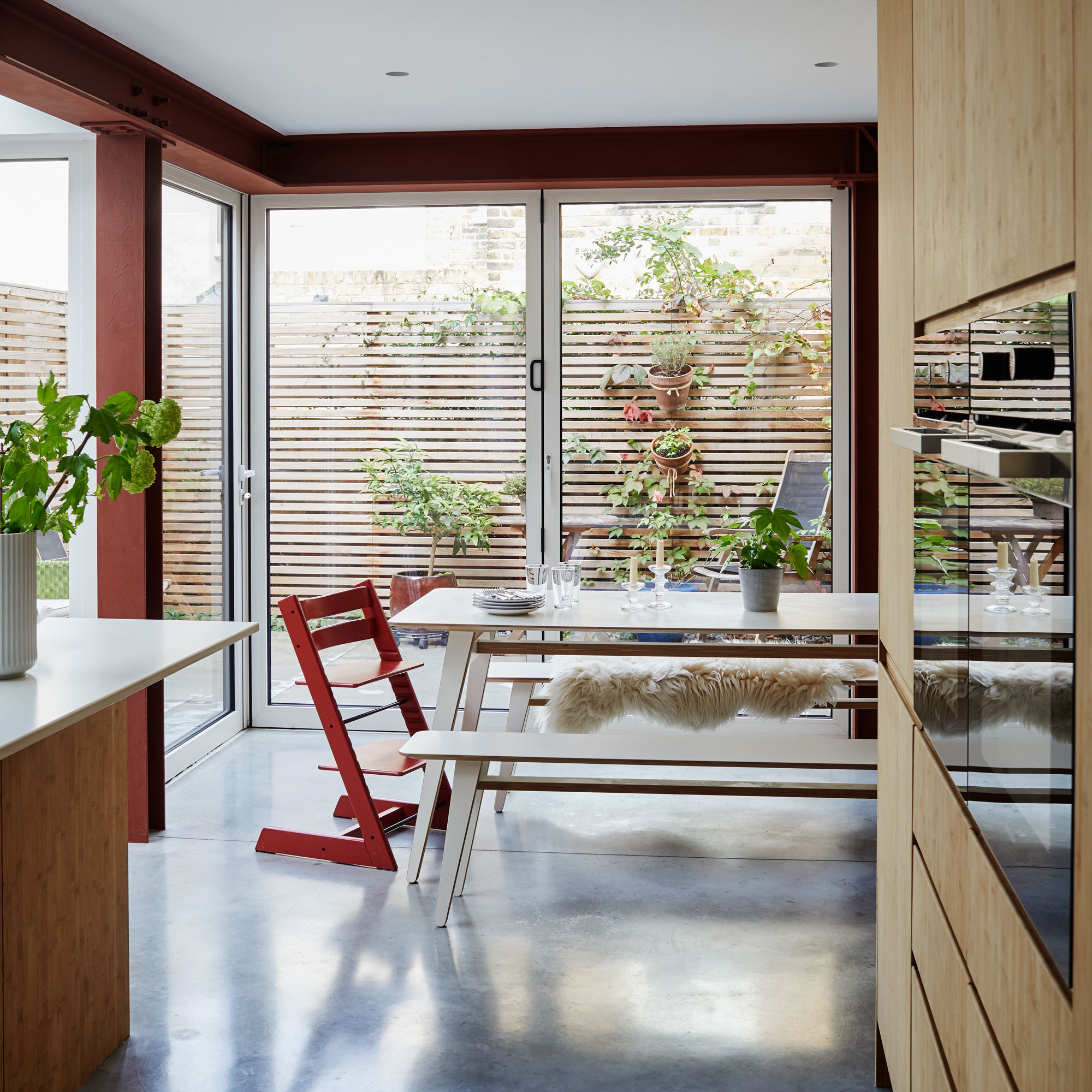
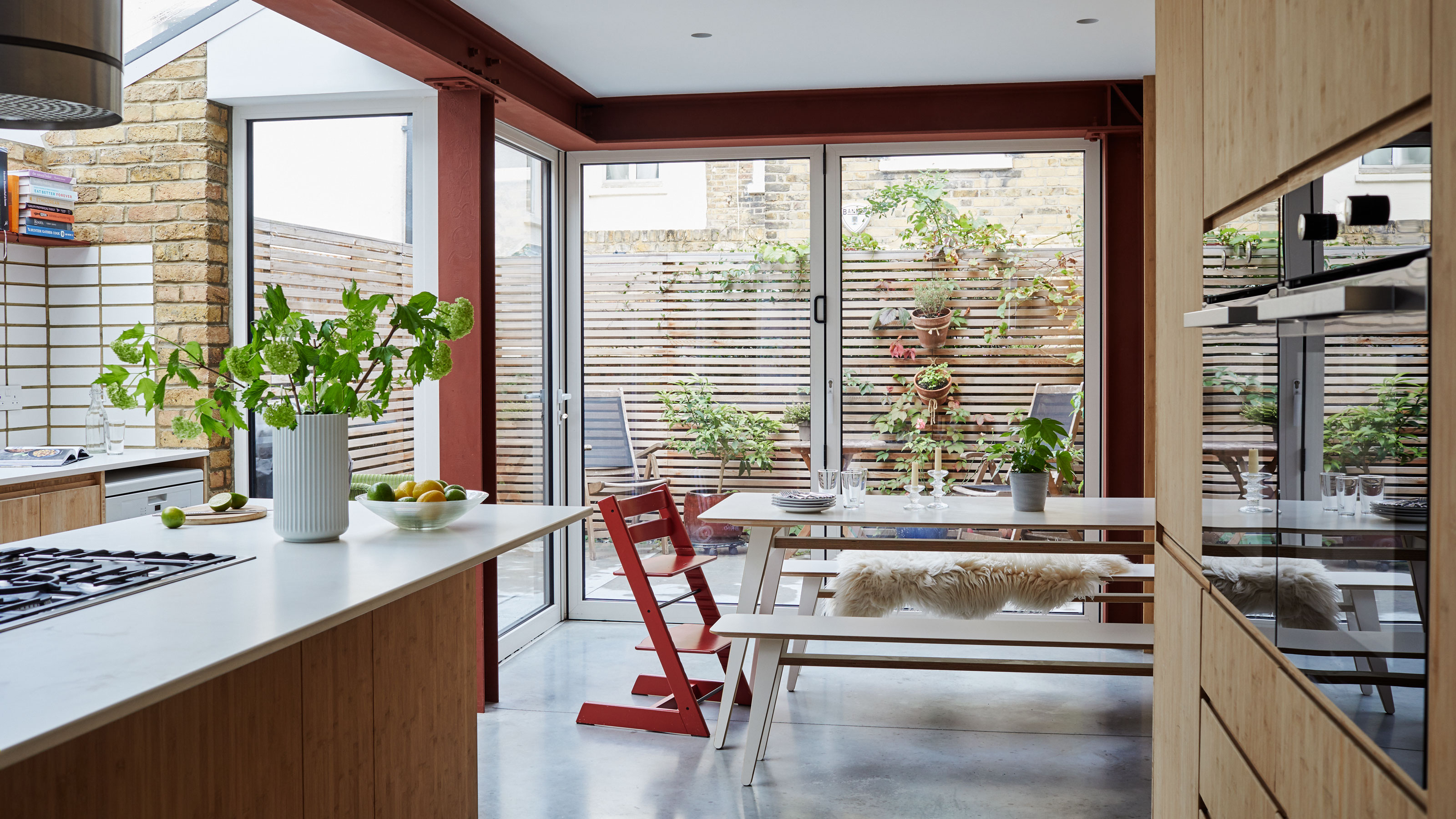
The architects designed the extension to allow for corner doors, which bring west light into the space. They left the steel structure exposed and had it painted ox-blood red to resemble the colour of steel in its raw state.
On a warm day they often open the bifold doors so that the garden really does become an extension of the kitchen.
The kitchen area
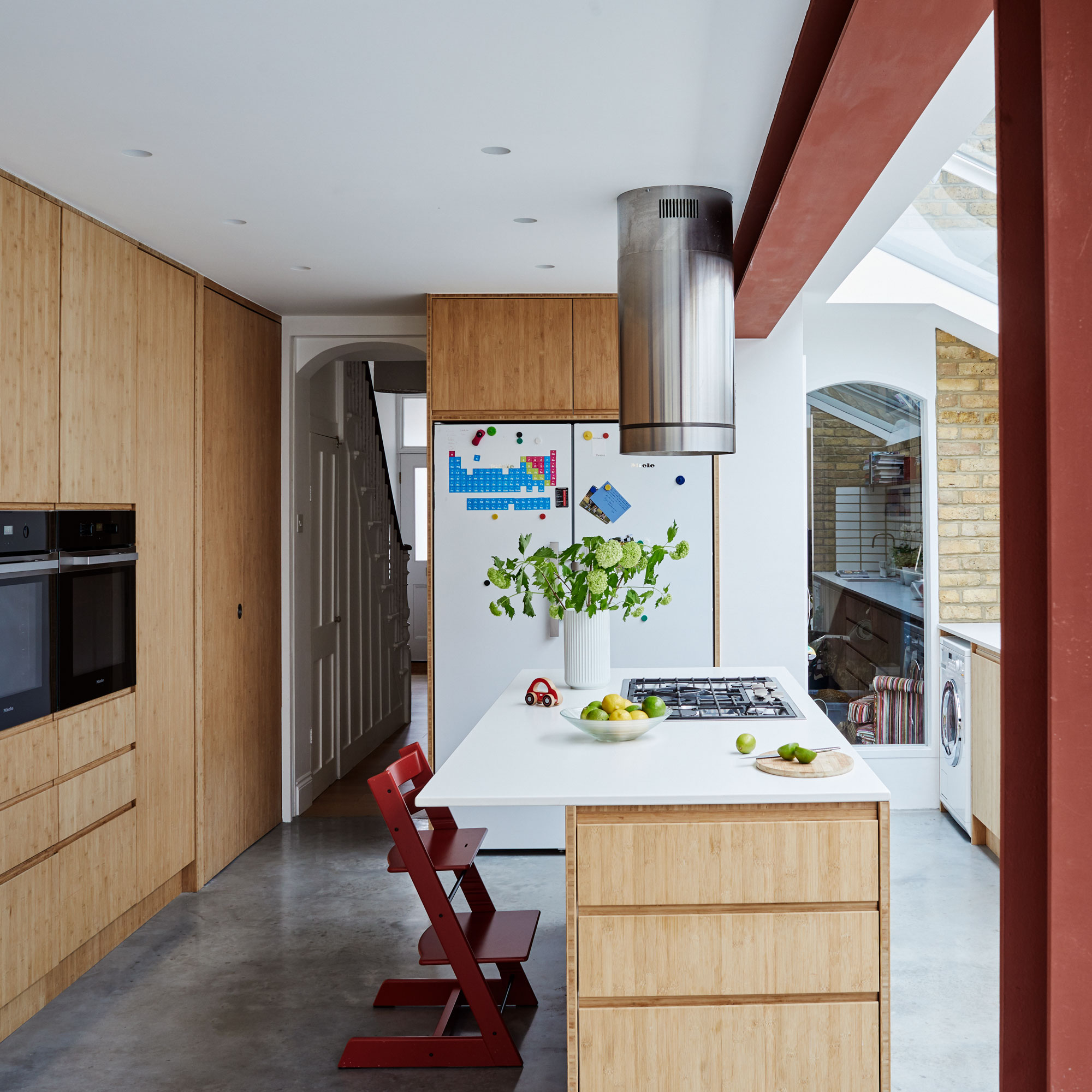
In this space, bamboo panels are a sustainable choice and good for a kitchen as the material resists moisture well.
The striking extractor fan has quite an industrial look to tie in with the exposed steel beams and concrete flooring.
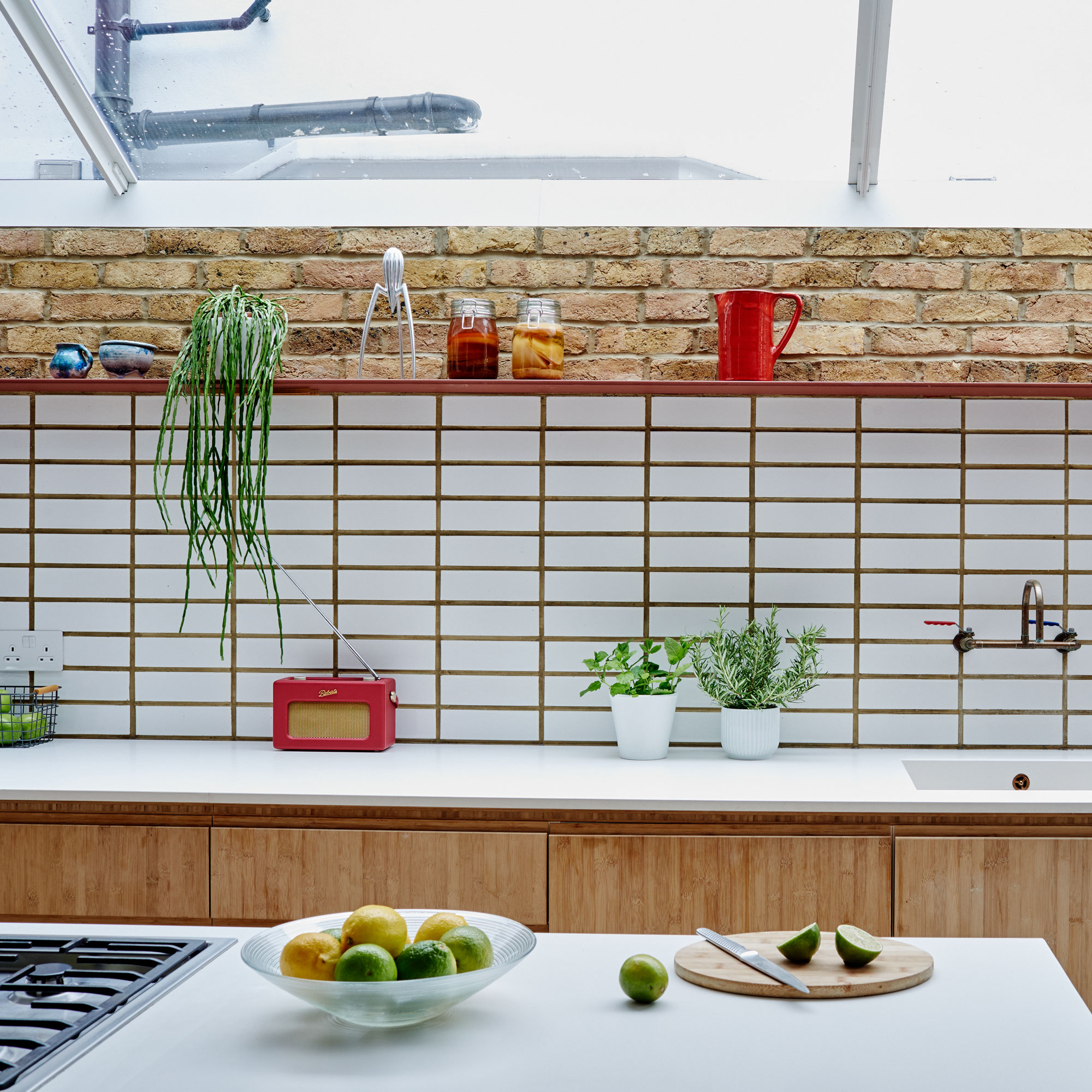
The white glazed bricks on the wall in the kitchen side return extension double as a smart splashback.
Dining area
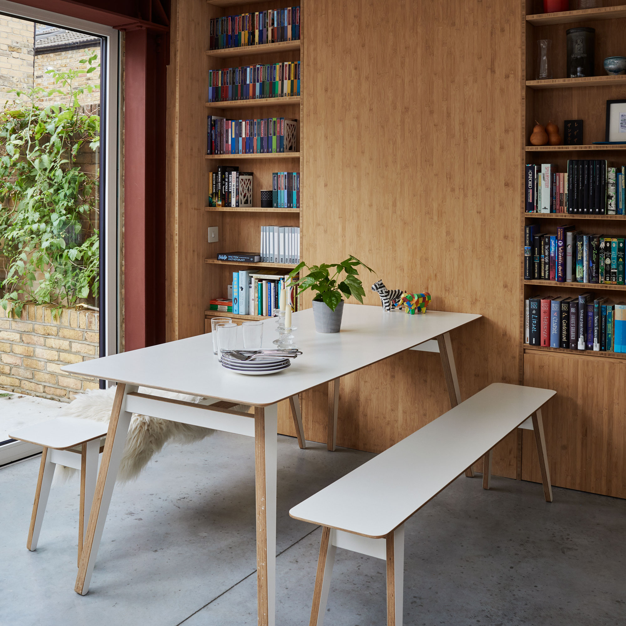
The dining furniture is made from birch plywood, a sustainable material whose simplicity works well with the clean lines of the architecture.
The owners opted for benches so that their seating could be more flexible.
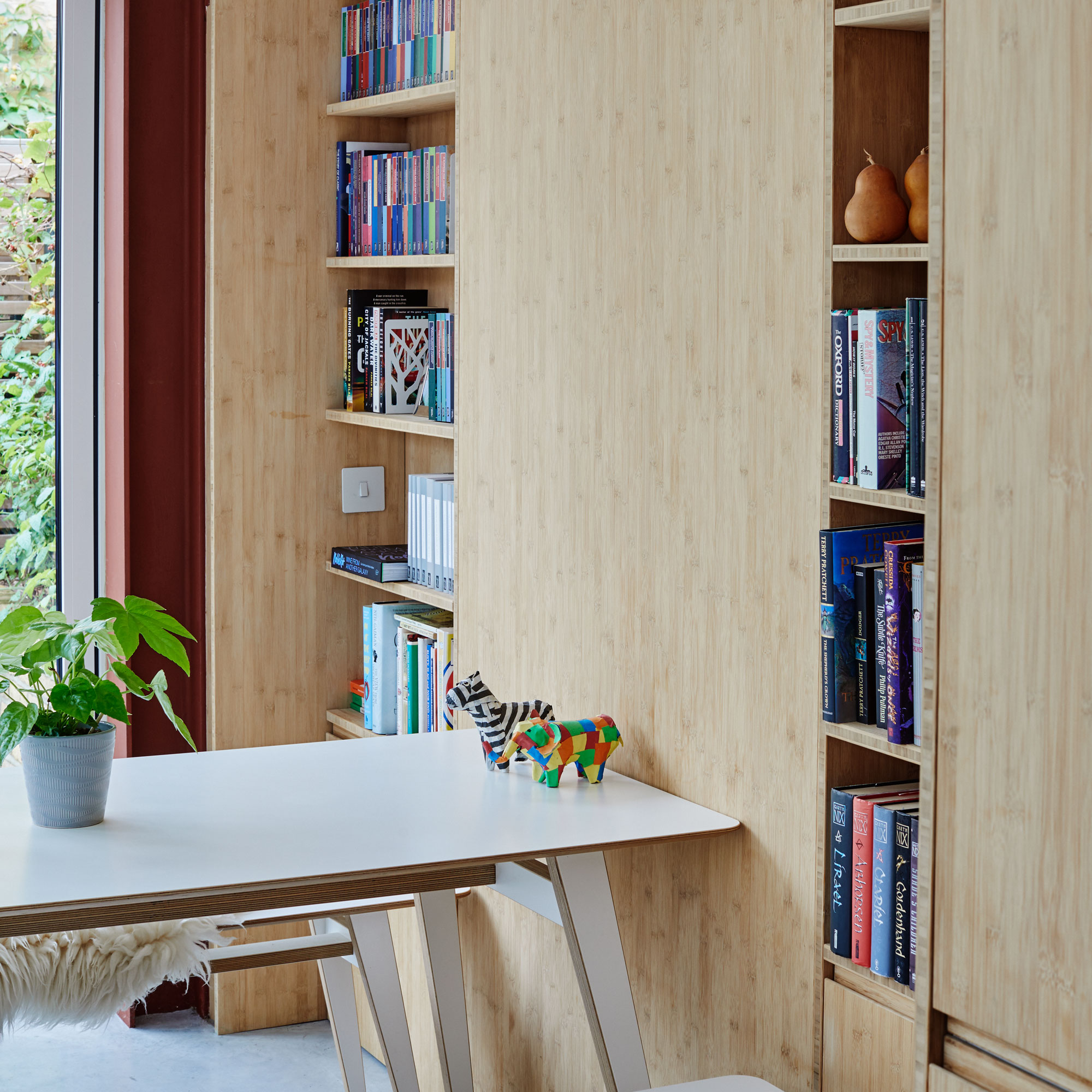
During the works, the owners uncovered two niches either side of what was once a chimney breast. This enabled them to design bookshelves with cupboards underneath. These alcove spaces provide plenty of useful storage in the dining space.
They were built using the same bamboo panels as the kitchen cabinetry. This wall of storage uses standard high street carcasses with bespoke bamboo door fronts.
Hallway
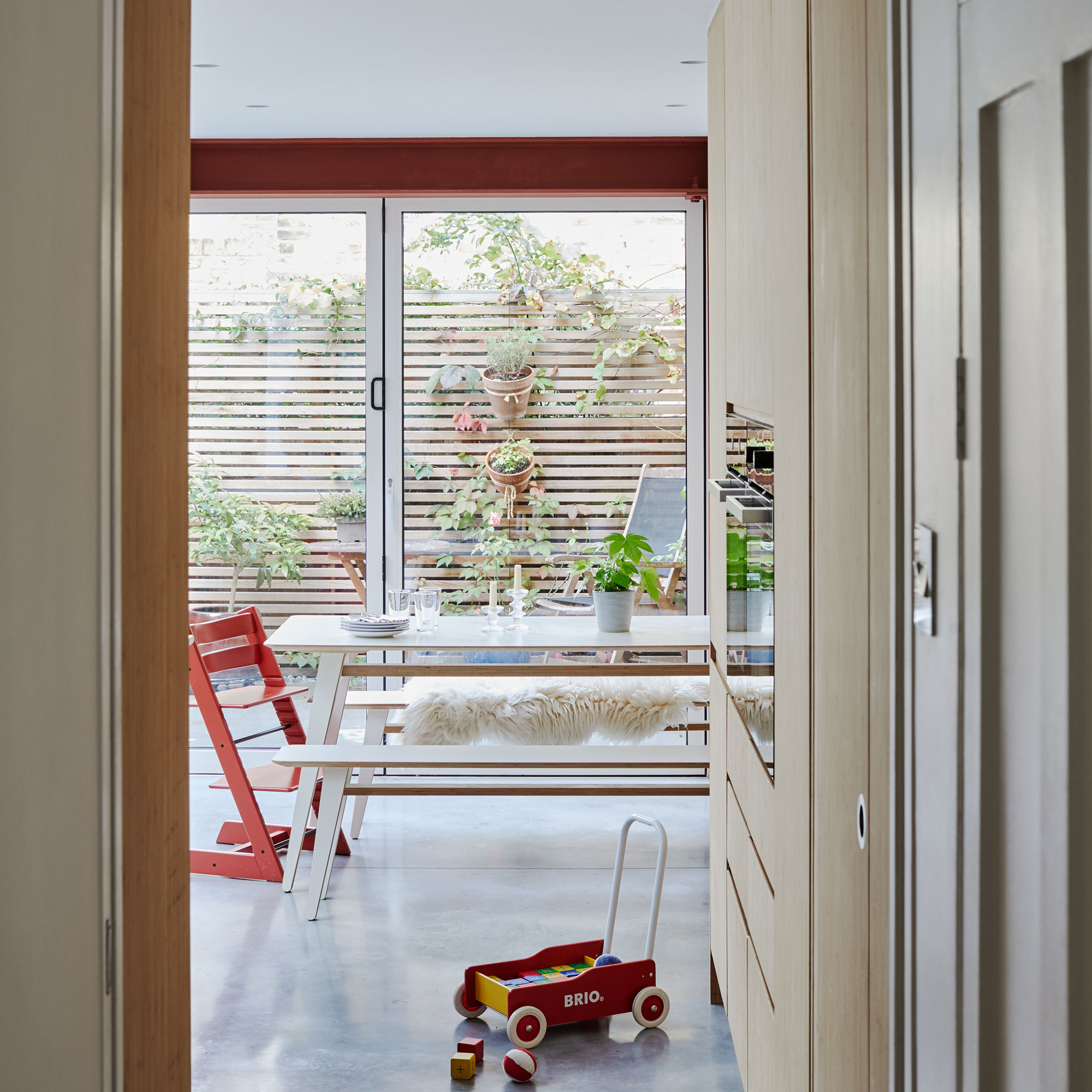
The hallway is bathed in light, thanks to the bifold doors that lead out from the kitchen to the rear of the property.
Living room
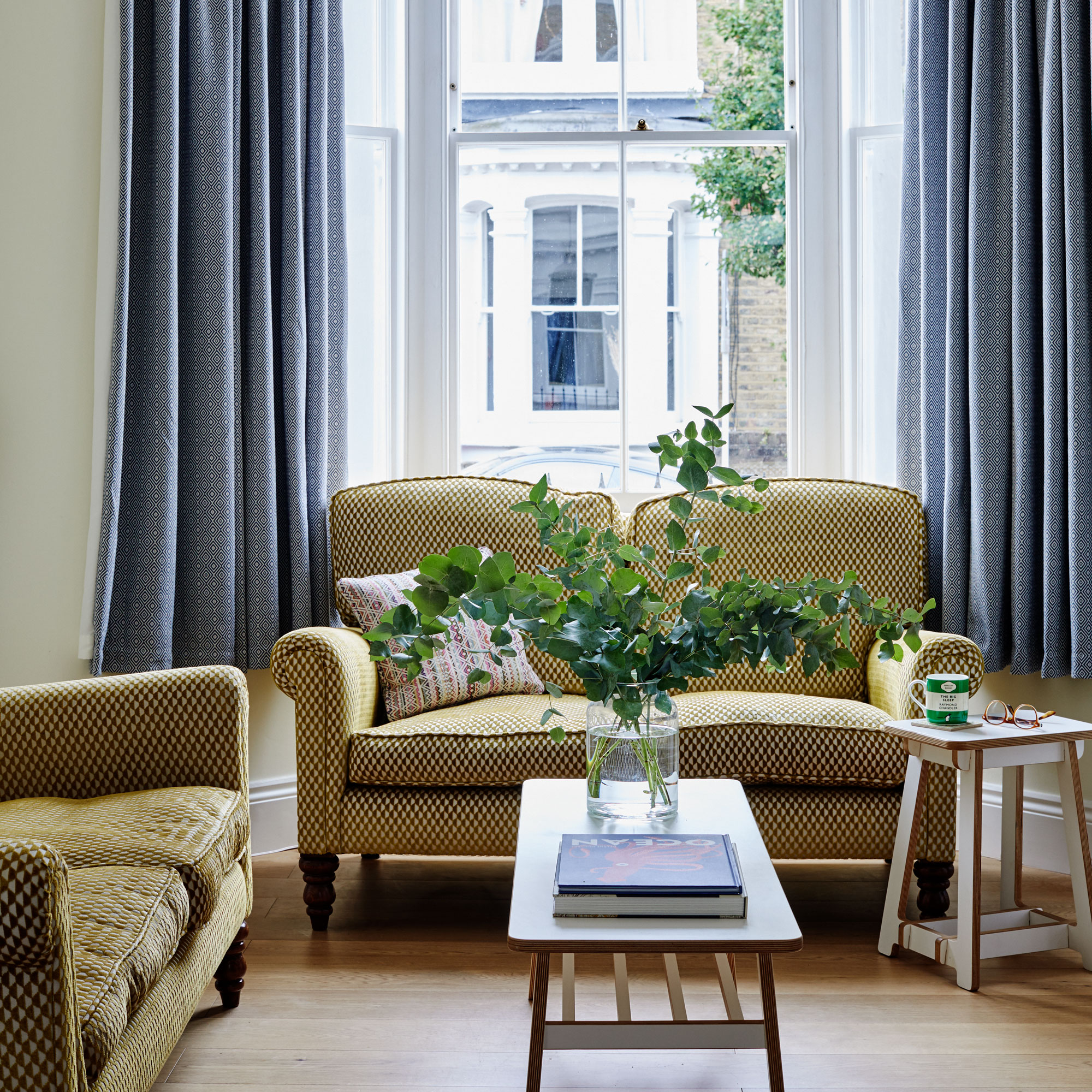
The sofas were upholstered with a subtle, retro inspired fabric. The heavy floor length curtains nod to the property's heritage.
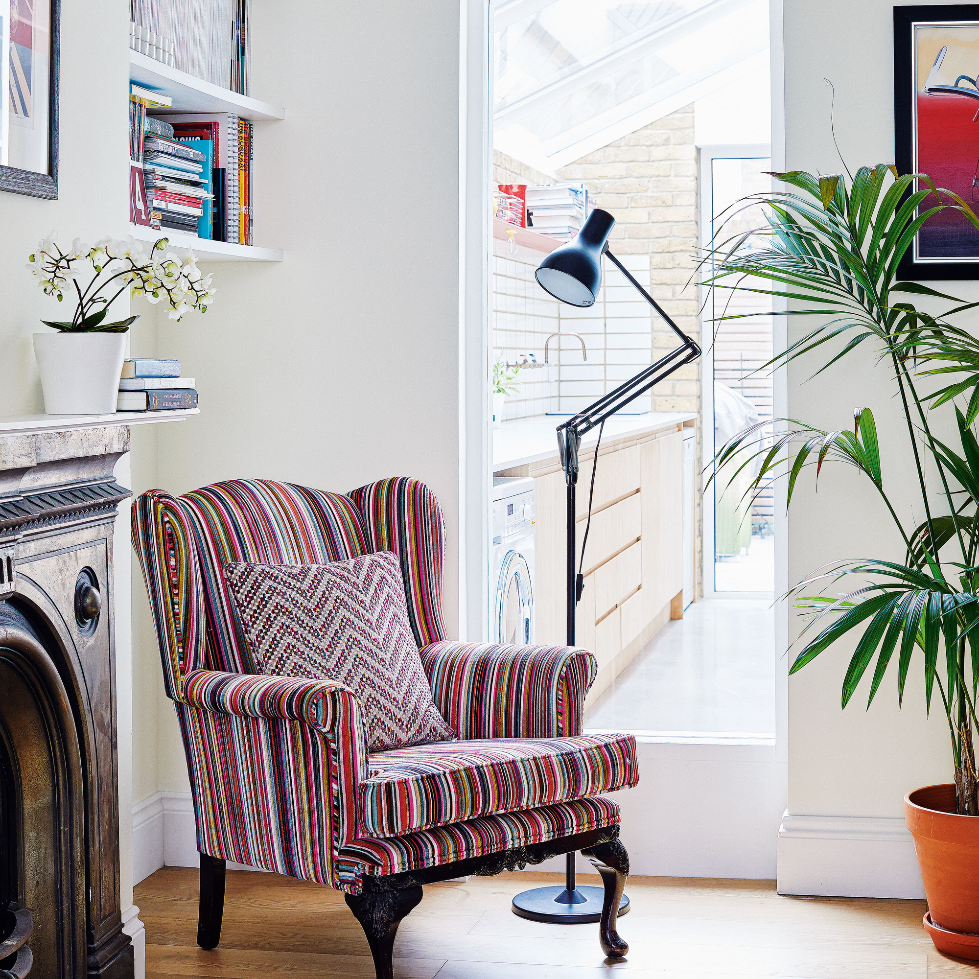
A tall internal window really helps to connect the old part of the house with the new. It's also an inspired way to bring light and views through the house.
The armchair is a family heirloom, which the owners had reupholstered in a colourful striped velvet.
Main bedroom
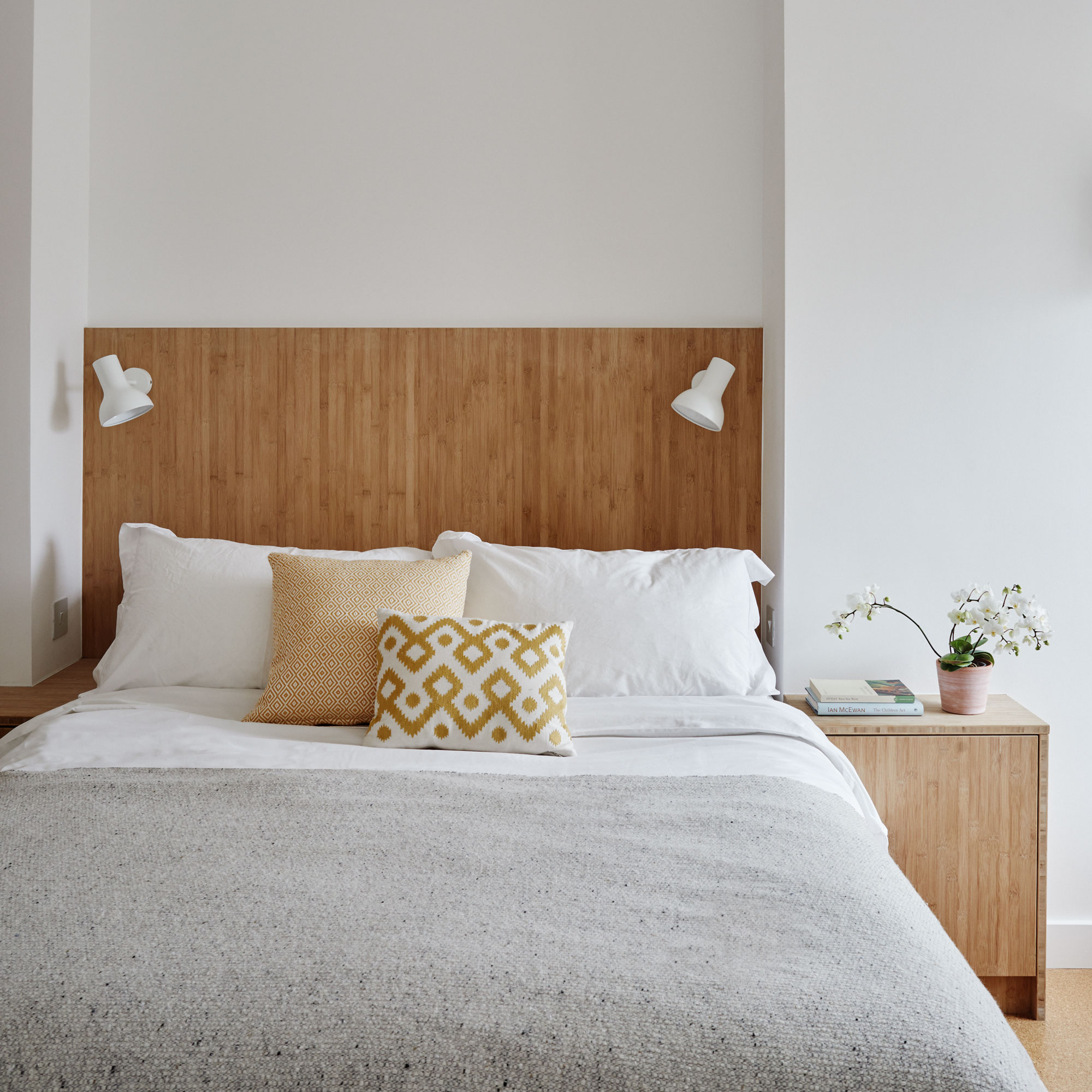
The same bamboo panels that create the cabinetry downstairs were used to make all this room’s fitted joinery, from the bespoke best headboard with integrated lighting to the clothes storage.
Between the wardrobes, the architects designed a fitted desk originally intended as a dressing table but can also be a work space.
Sustainability was important to the owners, so they focused on materials from renewable sources such as bamboo and cork.
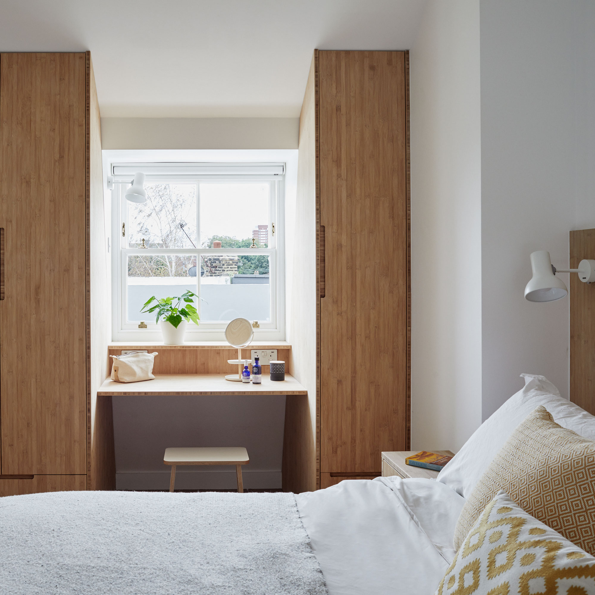
Fitted wardrobes make the most of the small space and the flexible design means this can also double as a work space.
The use of natural materials like bamboo and cork give the space a soothing and calming feel.
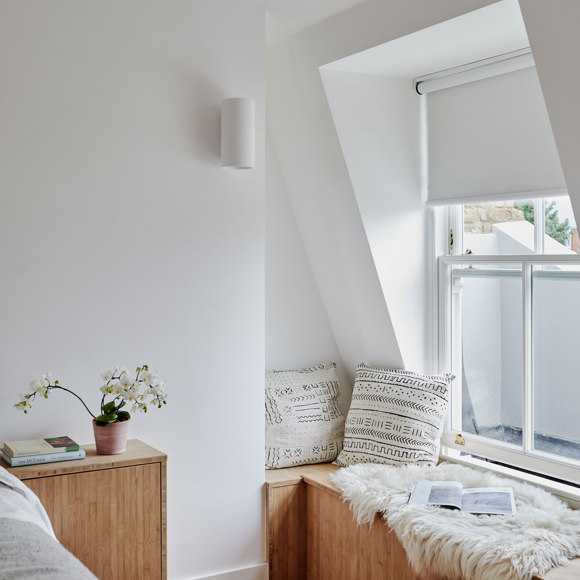
Extending into the roof meant that the family lost their attic space, so it was important for them to create as much new storage as possible.
This window seat cleverly incorporates a pull-up lid and is brilliant for housing things that the family don’t need day-to-day.
The addition of a few cushions transform the firm surface into a cosy window seat idea.
Children's room
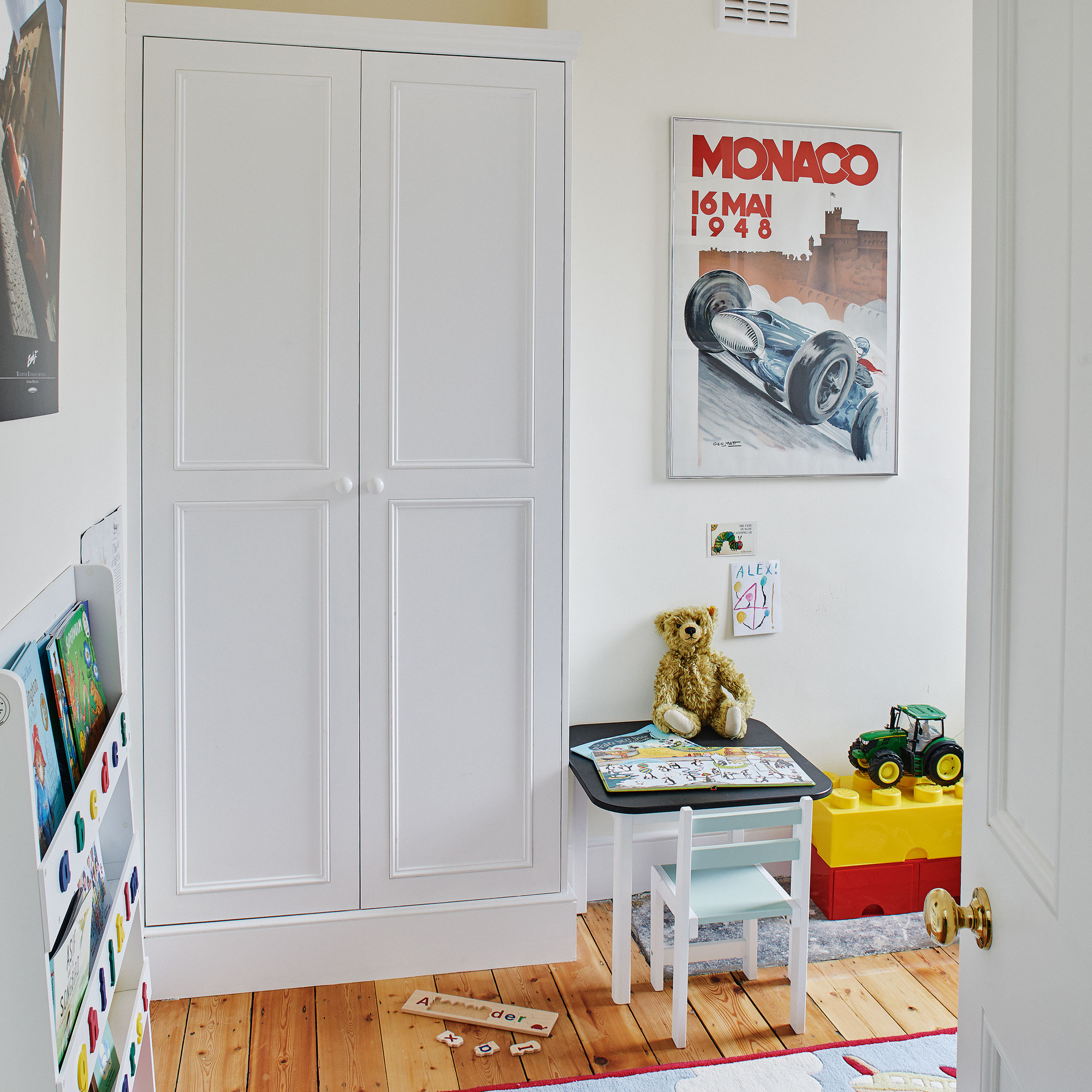
For joinery in the old parts of the house, the owners kept to more traditional Victorian designs. The original floorboards here were restored to their former beauty.
Family bathroom
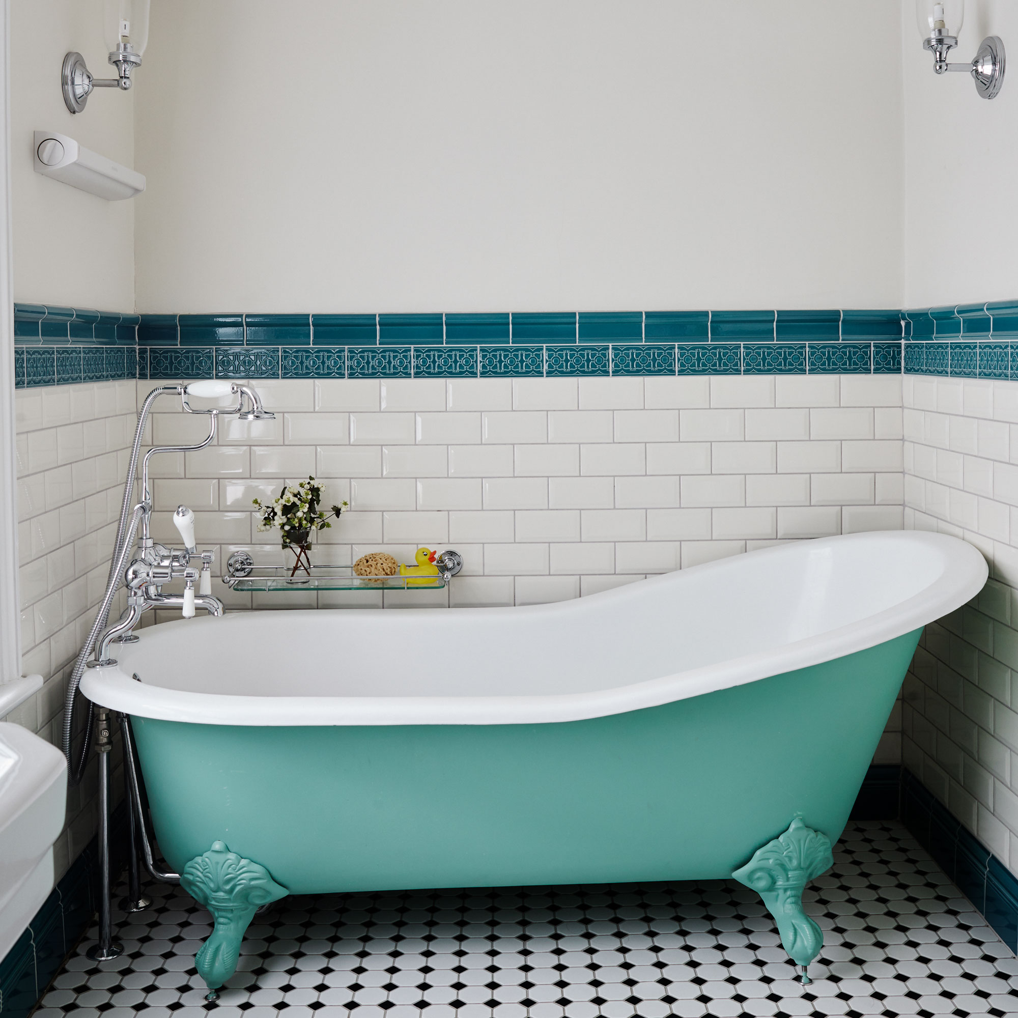
The owners opted for a traditional look in the family bathroom. The floor and wall tiles have a Victorian feel, as does the roll-top bath, which was painted mint green to introduce a touch of bold colour.

Ginevra Benedetti has been the Deputy Editor of Ideal Home magazine since 2021. With a career in magazines spanning nearly twenty years, she has worked for the majority of the UK’s interiors magazines, both as staff and as a freelancer. She first joined the Ideal Home team in 2011, initially as the Deputy Decorating Editor and has never left! She currently oversees the publication of the brand’s magazine each month, from planning through to publication, editing, writing or commissioning the majority of the content.