This 1930s semi has been restored to its former glory with vintage finds
See how the artistic homeowner has created a welcoming space that’s full of personality

Despite it being rundown, dated and with no heating or electrics, the home owner wasn’t put off when first visiting this 1930s semi-detached house on the South Wales coast - and decided on the spot at the first viewing that she was going to buy it.
‘Despite it being incredibly dated, I could see the potential immediately and fell in love with the chequered floor in the hallway,’ says the home owner. ‘I knew it was a huge project, but I was ready for the work ahead, and over the next five to six months it became a labour of love.’
The exterior
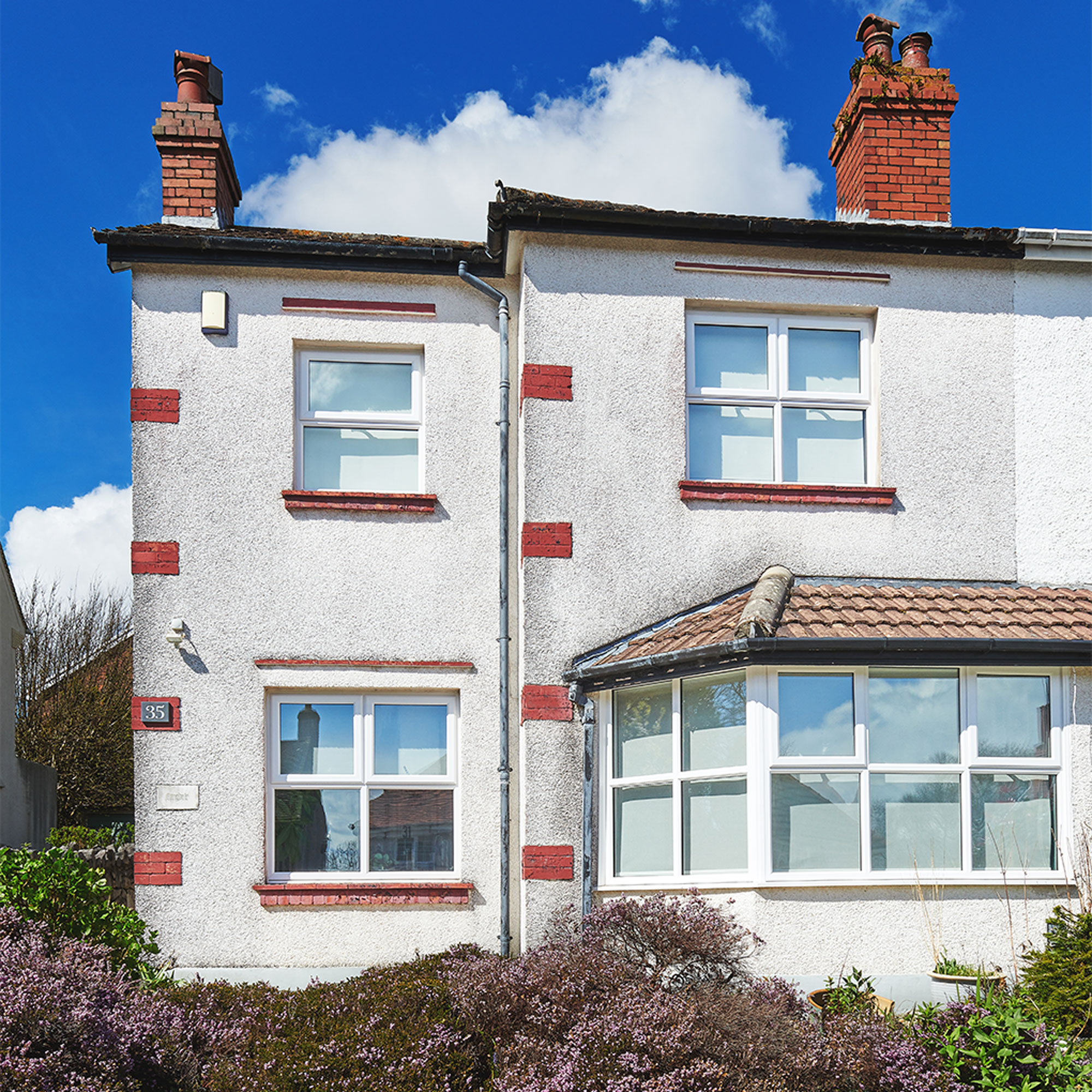
‘As soon as I got the keys, I pulled up the carpet in the living room to look at the floorboards, and decided the best way forward would be to have the whole place gutted, with every surface stripped back, so I could start with a blank canvas,’ explains the home owner.
‘I had a reasonable budget to carry out all the work and I called in the help of an old school friend, who’s a builder and someone I could trust, to do most of the building work while I would project manage the renovation. Because it was a whole house renovation, everything needed to be done in stages, so I devised a schedule to help me organise trades and keep track of timings so everything was co-ordinated.’
The living room
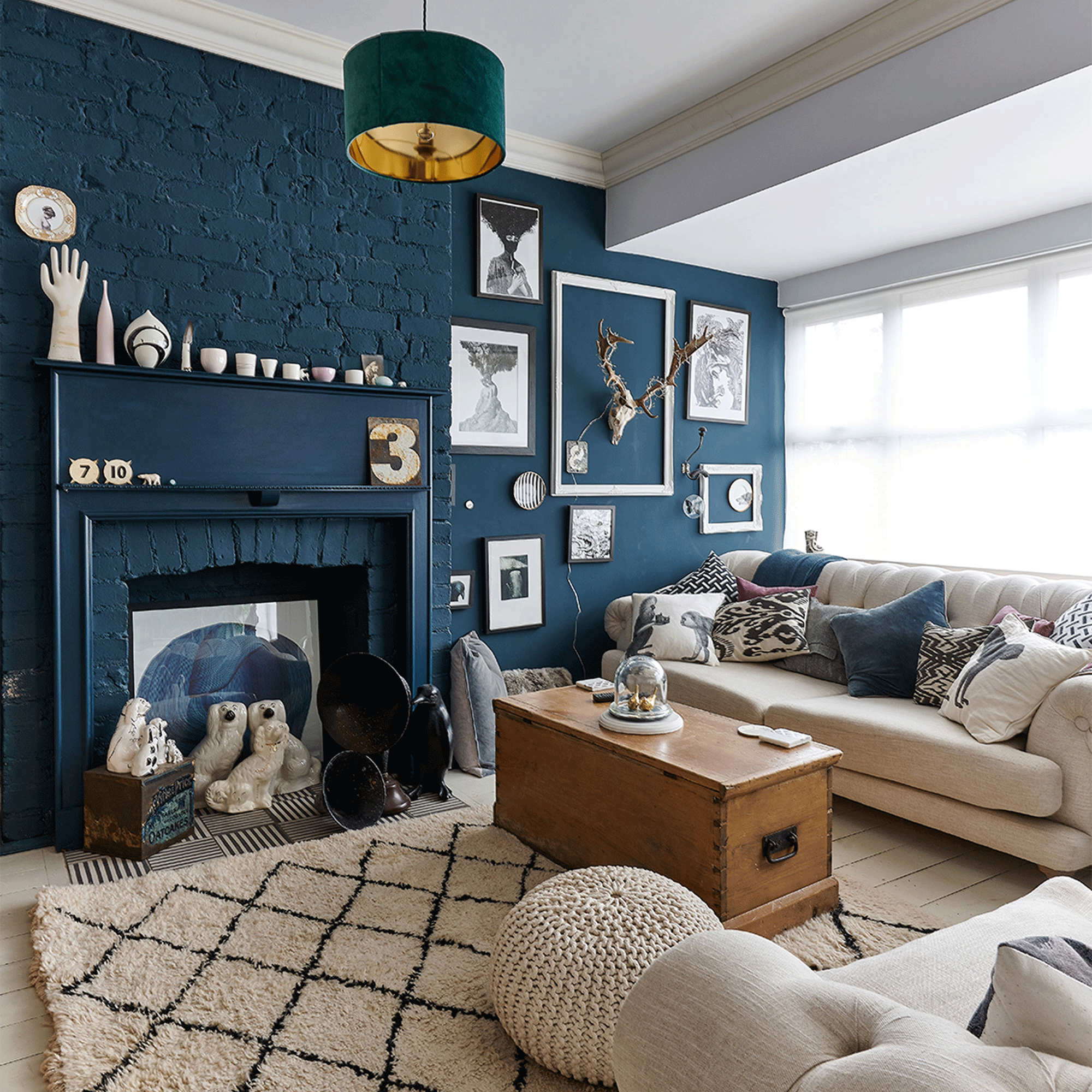
‘We started by taking the ceilings down, then chipped off plaster to expose old brick walls. Structurally the house was sound, but I decided to knock two rooms into one to create a larger living room,’ says the home owner.
‘I wanted to keep as many original features as I could, so sanded back the floorboards and restored the old fireplaces with reclaimed surrounds. I even moved the fire in the living room to make the space work better for me. If an original feature had been removed or broken, I tried to have it recreated, as I really love that nostalgic feeling and wanted my home to reflect my style and love of all things old.’
Bold paint colours
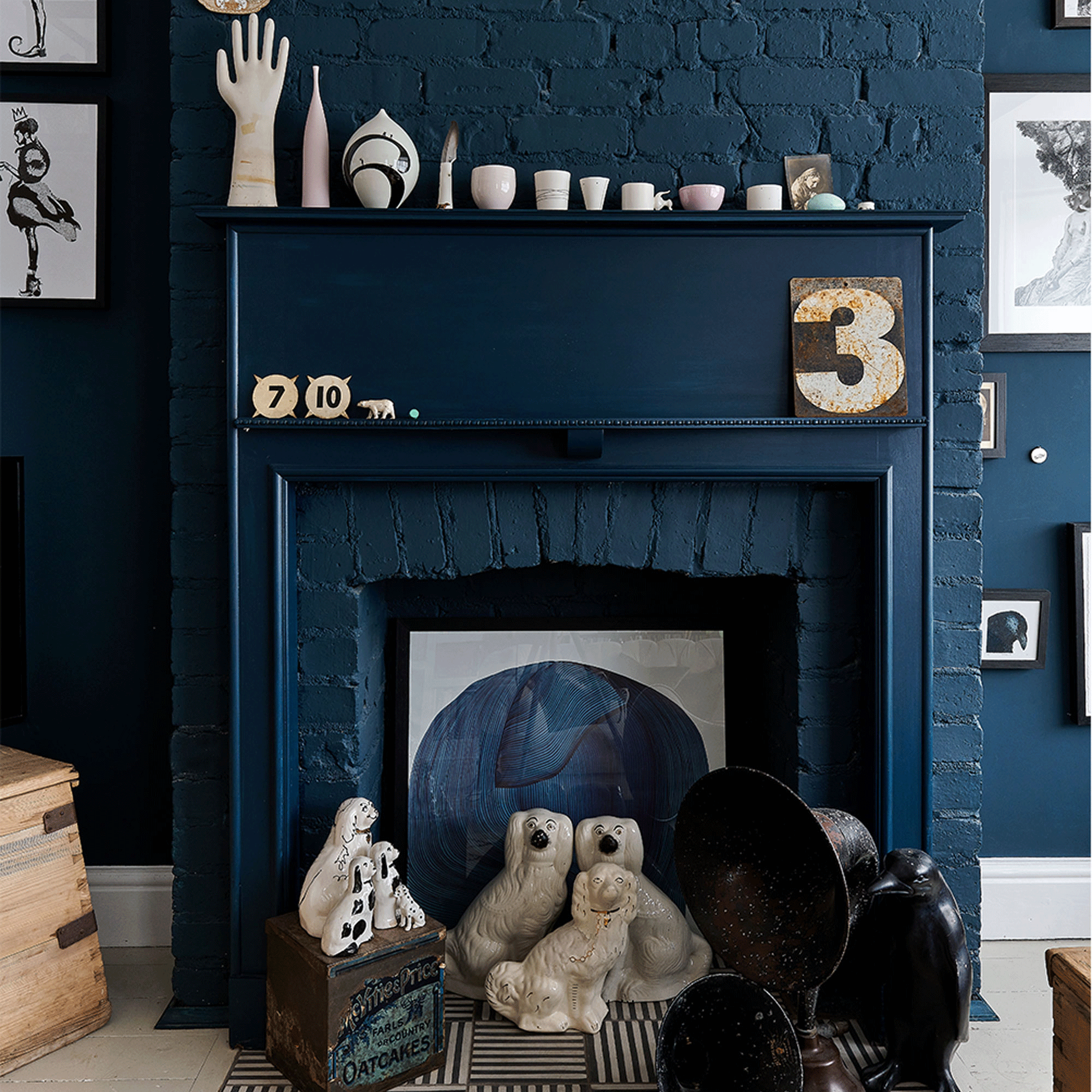
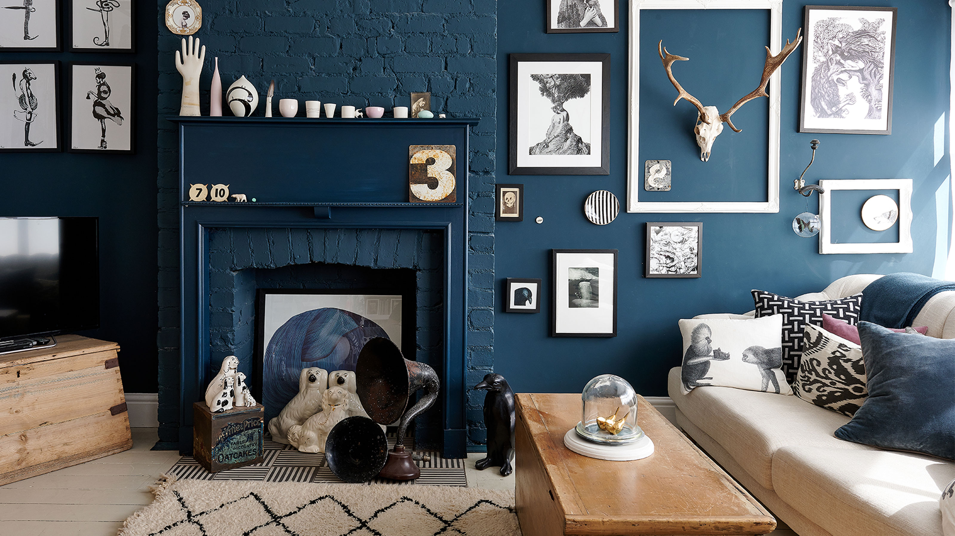
‘I’ve always known my style and felt very comfortable with how I’d decorate the house. I think zoning areas worked for me, but by painting the living room wall in Farrow & Ball’s Hague Blue it helped set the room in motion and made it my favourite space,’ says the home owner.
Get the Ideal Home Newsletter
Sign up to our newsletter for style and decor inspiration, house makeovers, project advice and more.
‘Another obsession is vintage finds, especially French objects, like my chandelier in the living room. I remember once going into a flea market and coming out with an oboe under my arm, which ended up having a plant growing out of it when I got home!’
The office space
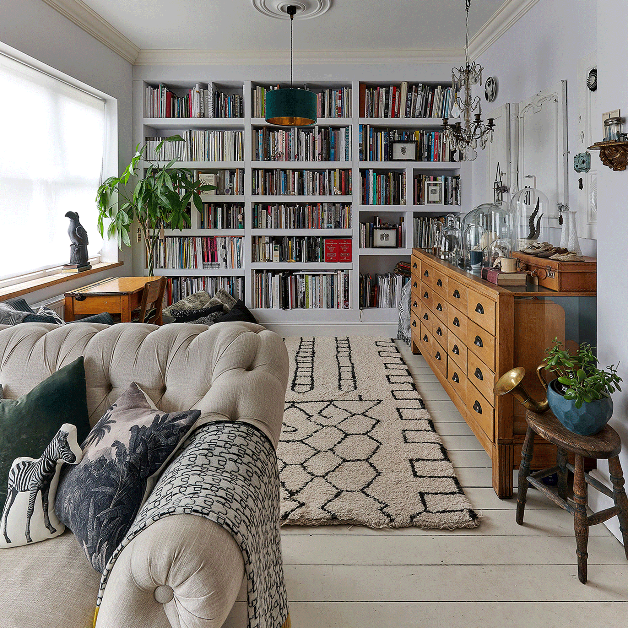
‘I have a huge collection of books, especially ones on art and design, which is my passion. I wanted an area where they could be stored, so I had the carpenter create a bespoke bookshelf that sits across one whole wall, which has become my office space too with an old retro-look school desk.’
Vintage finds
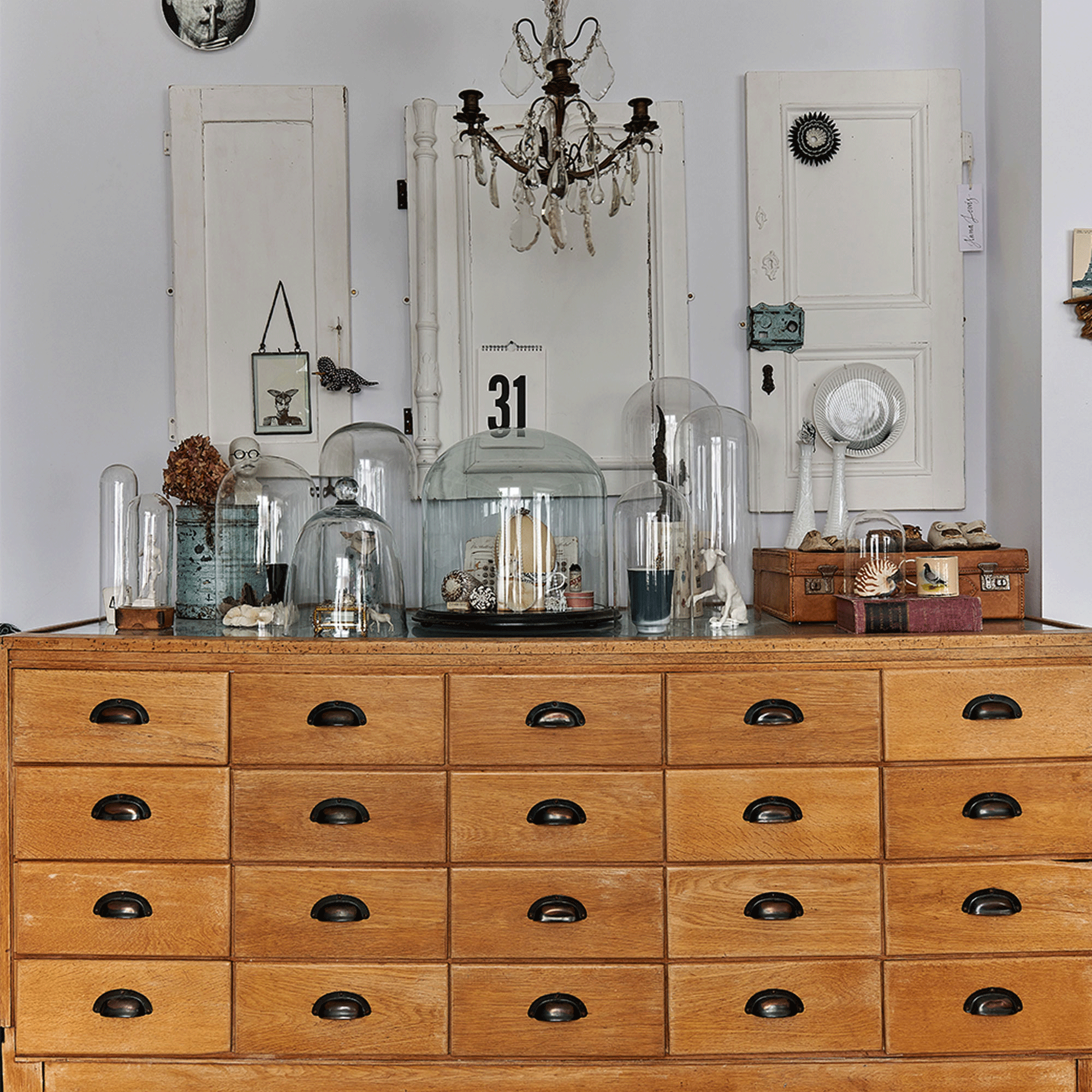
‘A beautiful old haberdashery shop cabinet sits behind my desk and you’d never know I found it in a scrapyard years ago! I’ve displayed all my finds that I’ve collected over the years from my travel adventures on it.’
‘In fact, my whole house is full of items that I love, including antiques that sit alongside crafts that have been made by family and friends. I also like to mix and match furniture and styles –sometimes I’ll paint something or update the walls with a new colour, but I think I’ve pretty much nailed my style and it’s important to treat each space as an extension of my sketch book or moodboard.’
The hallway
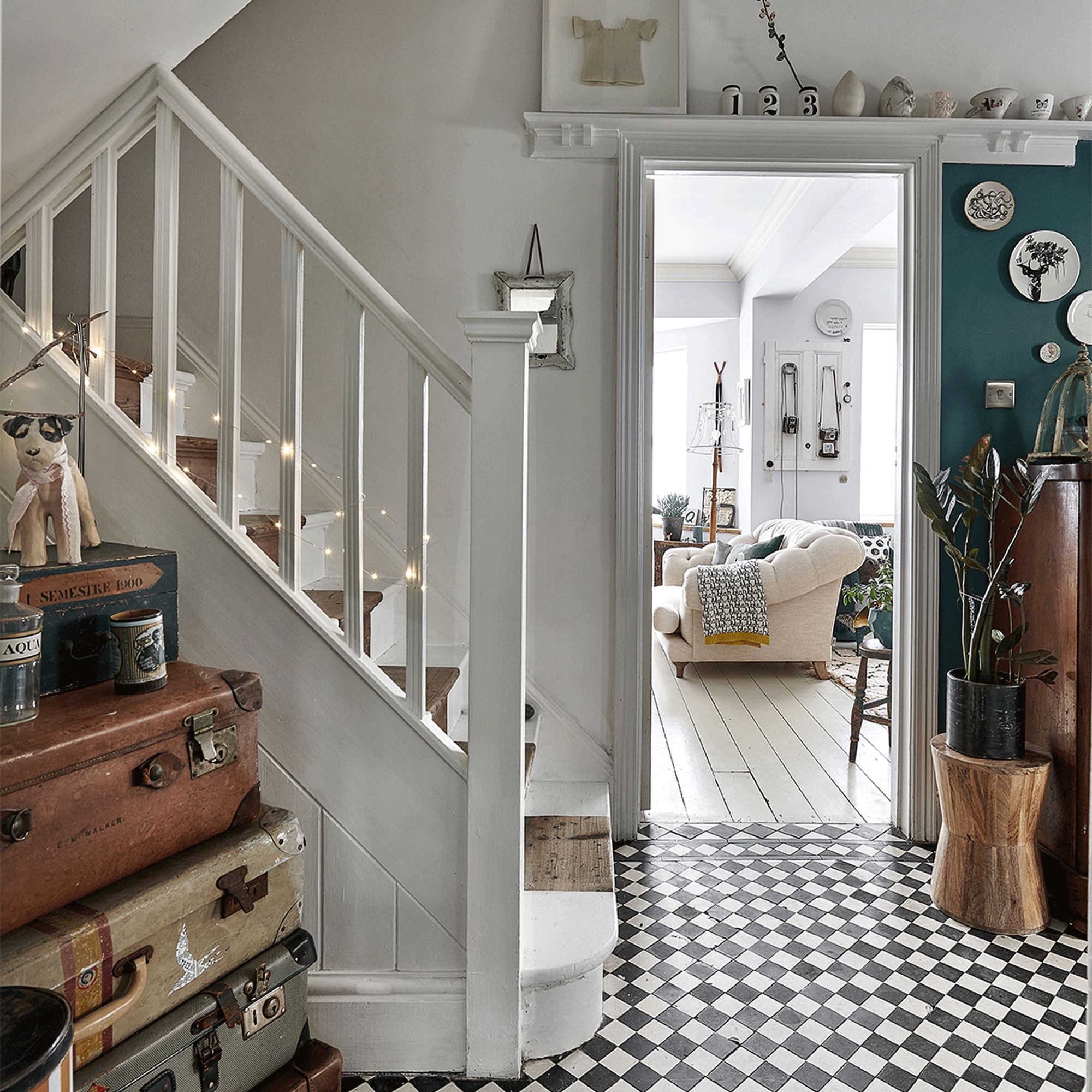
‘The hallway floor was the reason I bought the house and I love the fact it’s the first thing you see when you walk in. I painted a small area in a deep blue and then fixed some of my favourite ceramic plates to the wall. I’ve realised that anything pretty much goes on the walls in my home to create galleries and focal points.’
The kitchen-diner
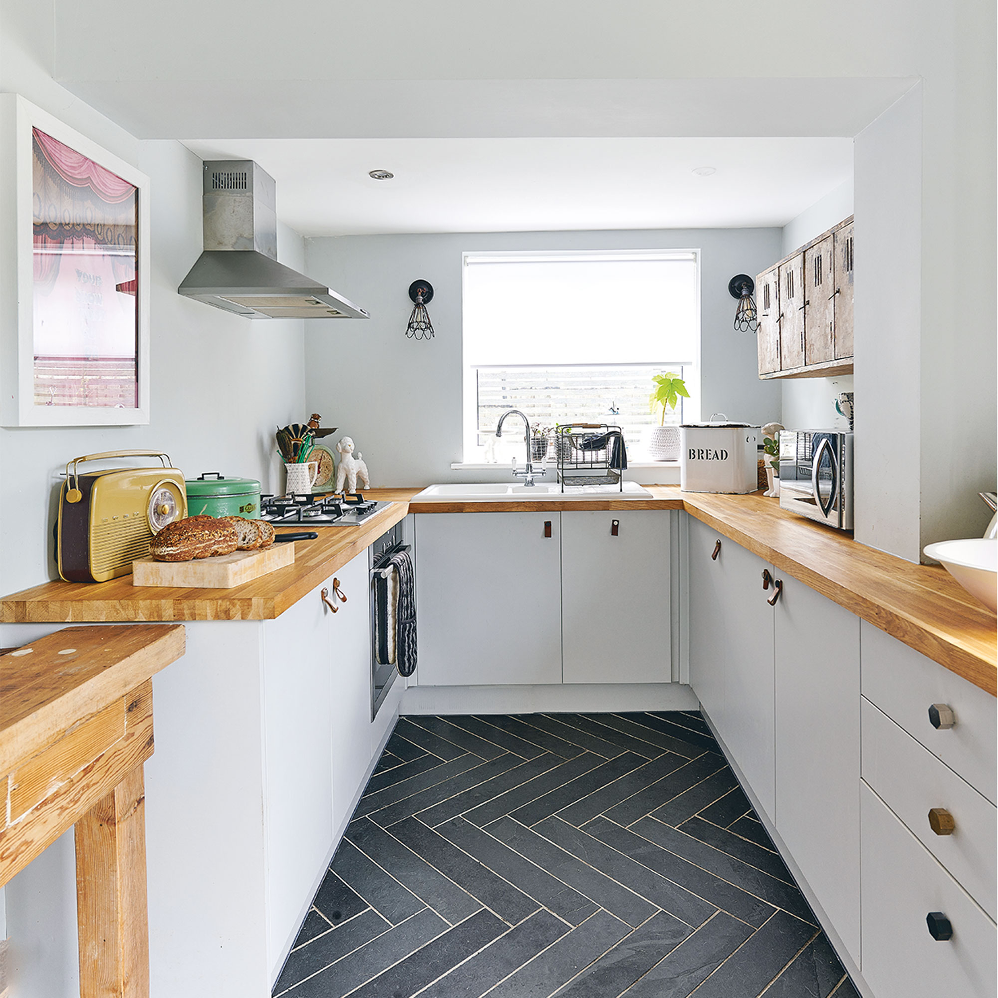
The kitchen units were a simple white design from Howdens, updated with leather handles a smart kitchen idea that the homeowner made herself.
‘I’ve kept the kitchen quite simple with low-level wall units and wooden worktops. I avoided matching top cabinets and instead bought a vintage wall unit that adds some character to the room. I wanted to keep the background as subtle as possible so all the vintage buys would stand out and be the focus of the room.’
Dining area
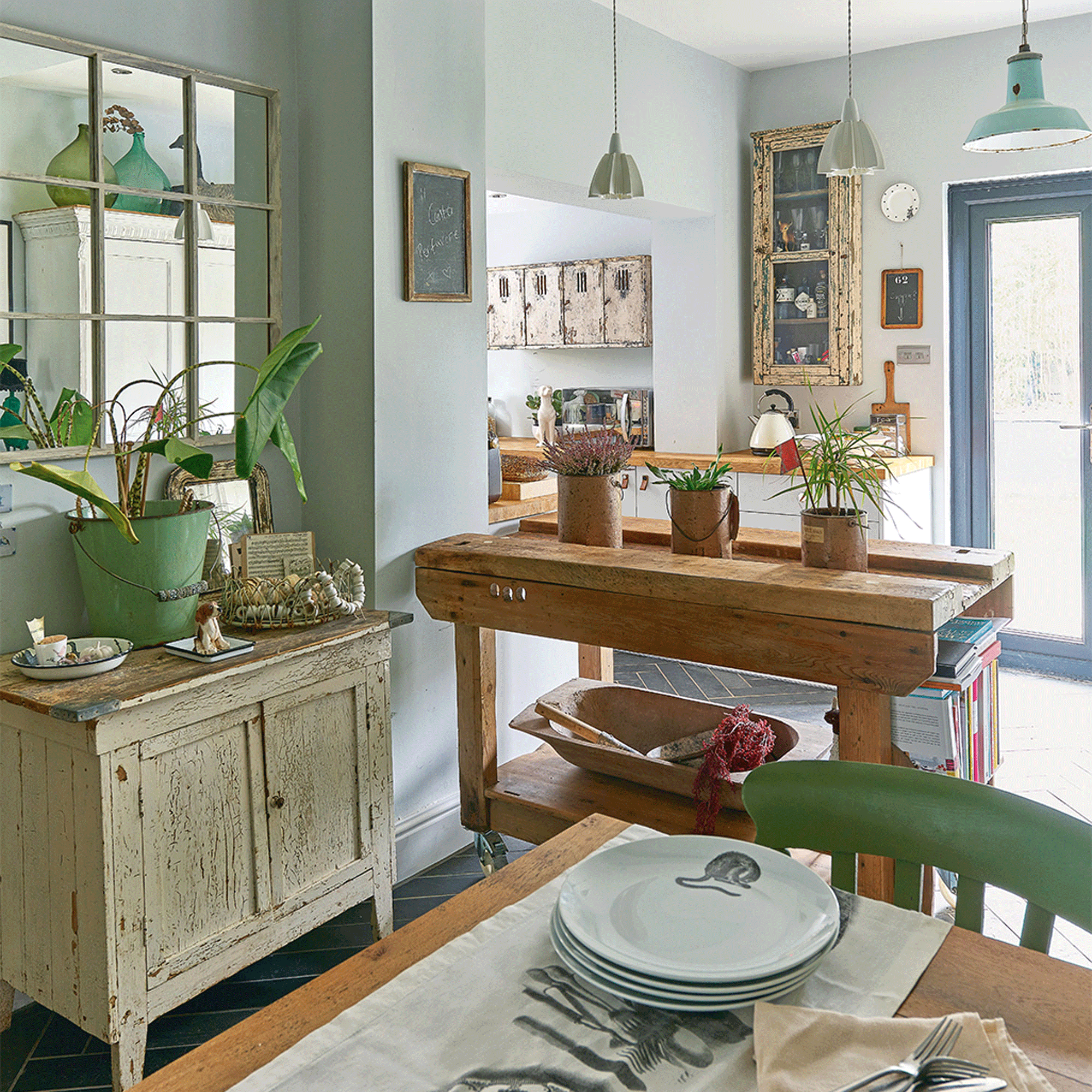
‘I went to town with the mix and match styles in my dining area. The table doesn’t match the chairs and an old workbench now has castors and can be moved around the room for any purpose.’
‘I zoned the lighting to accentuate each area of the dining room, from over the bench to the dining table. I’ve even added some ceiling spots as this room can sometimes lack natural light.’
Dining room layout
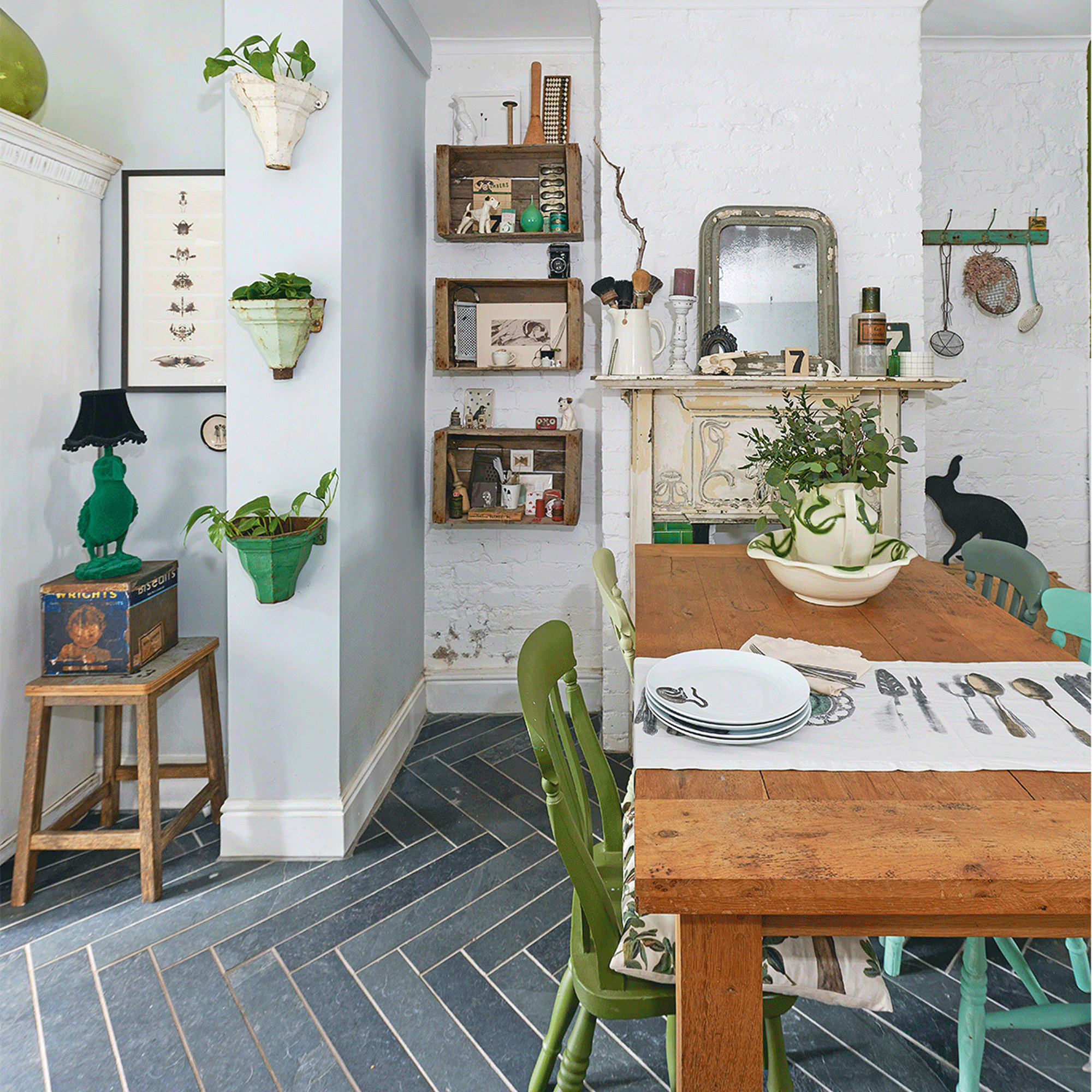
‘I’ve tried to create a sense of space with the layout of the flooring in the dining space. The vertical pattern makes the room feel longer and wider.’
‘I used some old apple crates on the walls as they make brilliant shelving and are an unusual alternative’
The Bathroom
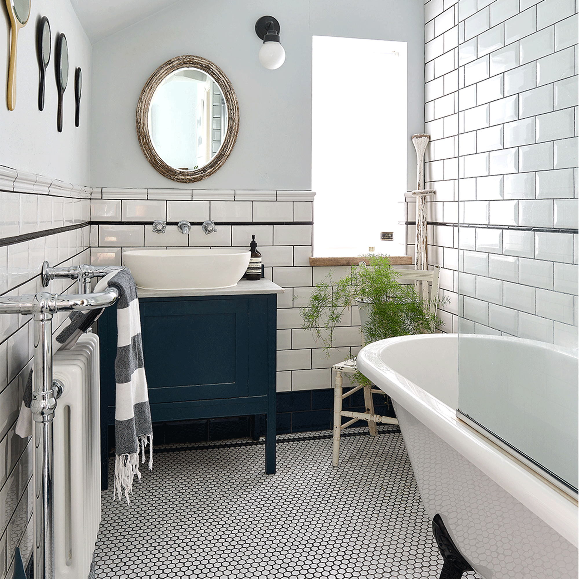
In the bathroom, the homeowner had the original boiler removed and the space reconfigured to make room for a roll-top bath, with a mini hexagonal floor tile idea to add some pattern.
‘I’ve definitely got an eye for a bargain,’ says the homeowner, ‘so I bought the basics for both the bathroom and kitchen from trade to save on money, but I searched flea markets, online shops and salvage yards to get pieces that would add interest to each room. The sink unit, for instance, was a junk shop find that I updated.'
Mix-and-match tiling
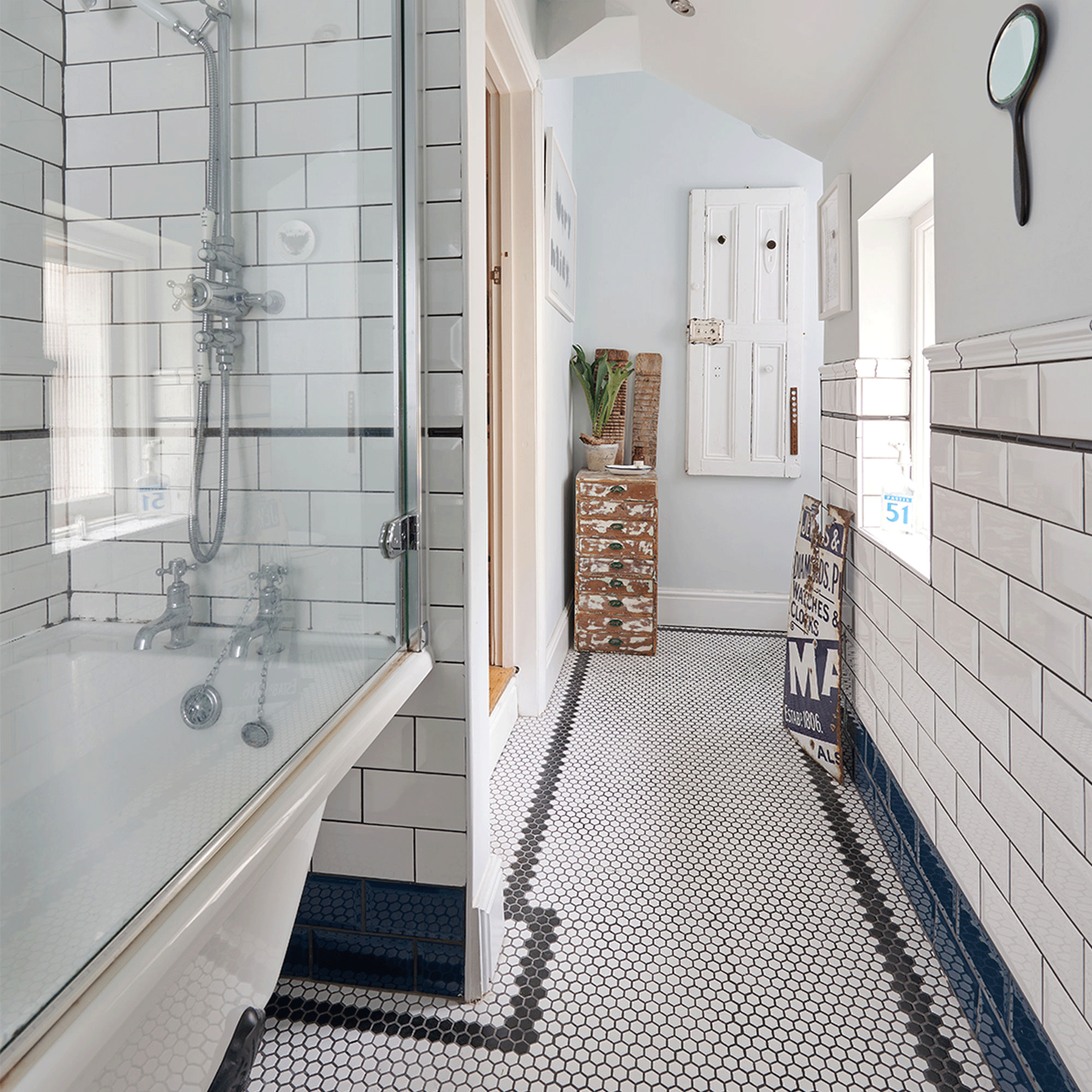
‘The colour scheme is simple with white metro tiles and a trim of navy around the bottom. I used some funky hexagonal floor tiles with a black edge to create a contrast and they have this retro American feel to them.’
The bedroom
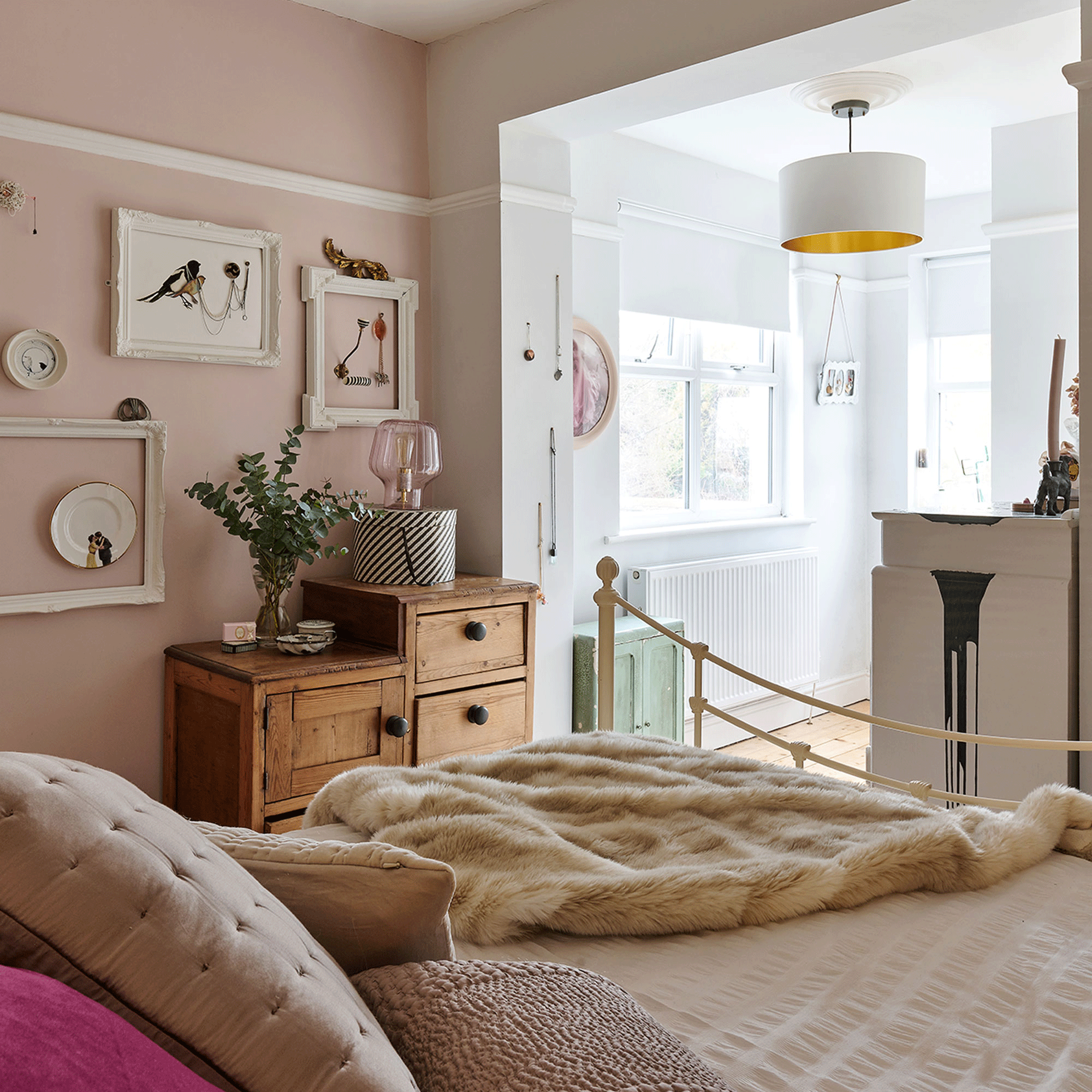
A hint of pink in the bedroom ideas highlights the white walls and adds a feminine touch to the scheme. Original wooden floorboards have been refurbed to go with the wooden secondhand furniture that the home owner found at a local flea market.
‘I love buying original pieces from salvage yards. During the decorating process I realised that I could be as creative as I wanted. I think that the attention to detail throughout the house is what really makes it a home and bit by bit the place started to live again. It's finally a happy, peaceful space that I absolutely love living in.’
Additional words: Zoe Bishop

Lisa is Deputy Editor of Style at Home magazine and regularly contributes to sister title Ideal Home. She has written about interiors for more than 25 years and about pretty much every area of the home, from shopping and decorating, crafts and DIY to real home transformations and kitchen and bathroom makeovers. Homes and interiors have always been a passion and she never tires of nosying around gorgeous homes, whether on TV, online, in print or in person.
-
 I tried out this neat little dehumidifier for a month – it dried my laundry in half the time
The 20L SmartAir Dry Zone dehumidifier tackled my laundry drying woes head on
By Jenny McFarlane
-
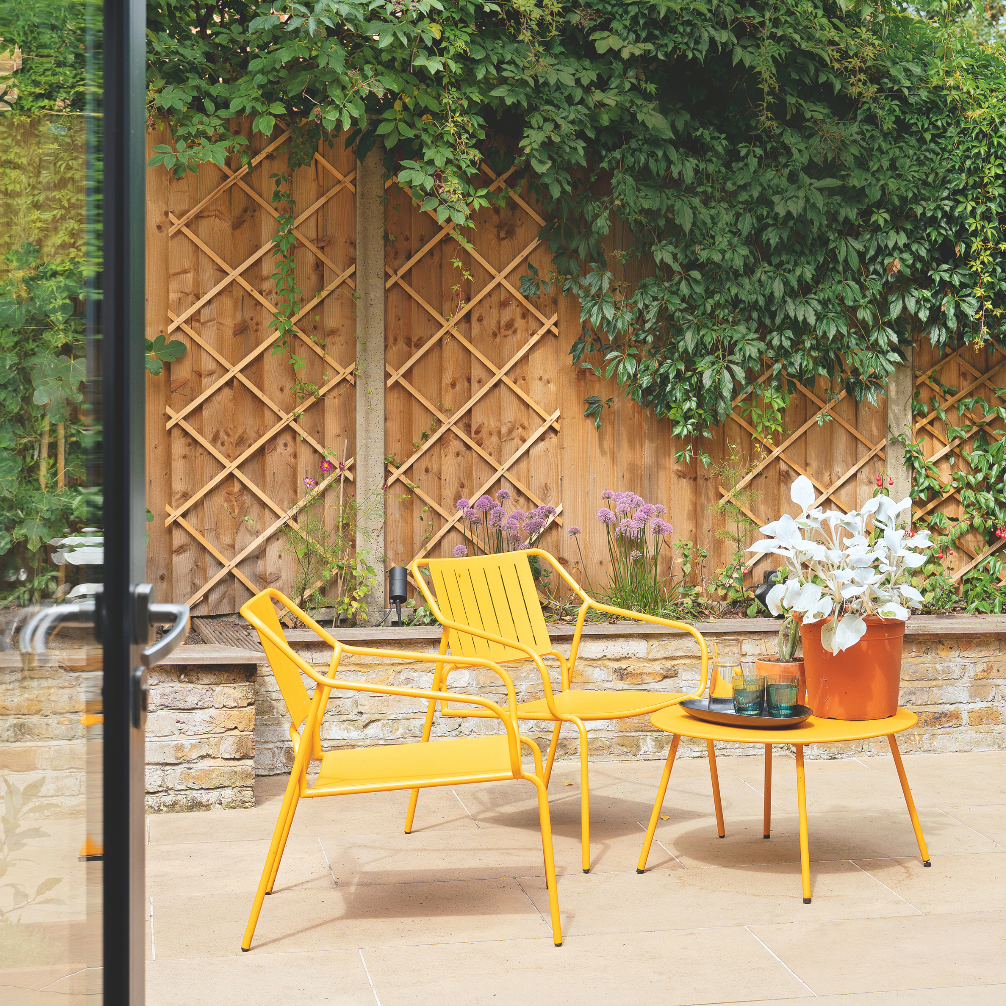 I’m seeing pastel garden furniture at all my favourite brands this spring, but QVC’s sorbet collection impressed me the most
Fresh pastel shades are a great way to liven up your outdoor space
By Kezia Reynolds
-
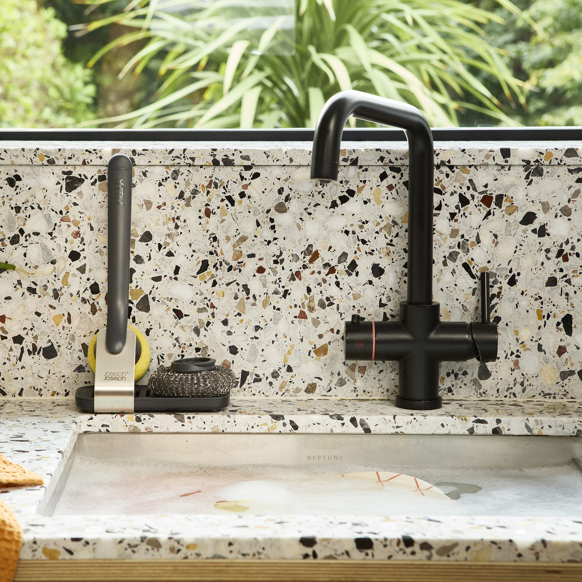 Don't tell my flatmates, but Joseph Joseph's clever new sink range finally made me enjoy washing up
I didn't know stylish washing up accessories existed until I saw this collection
By Holly Cockburn