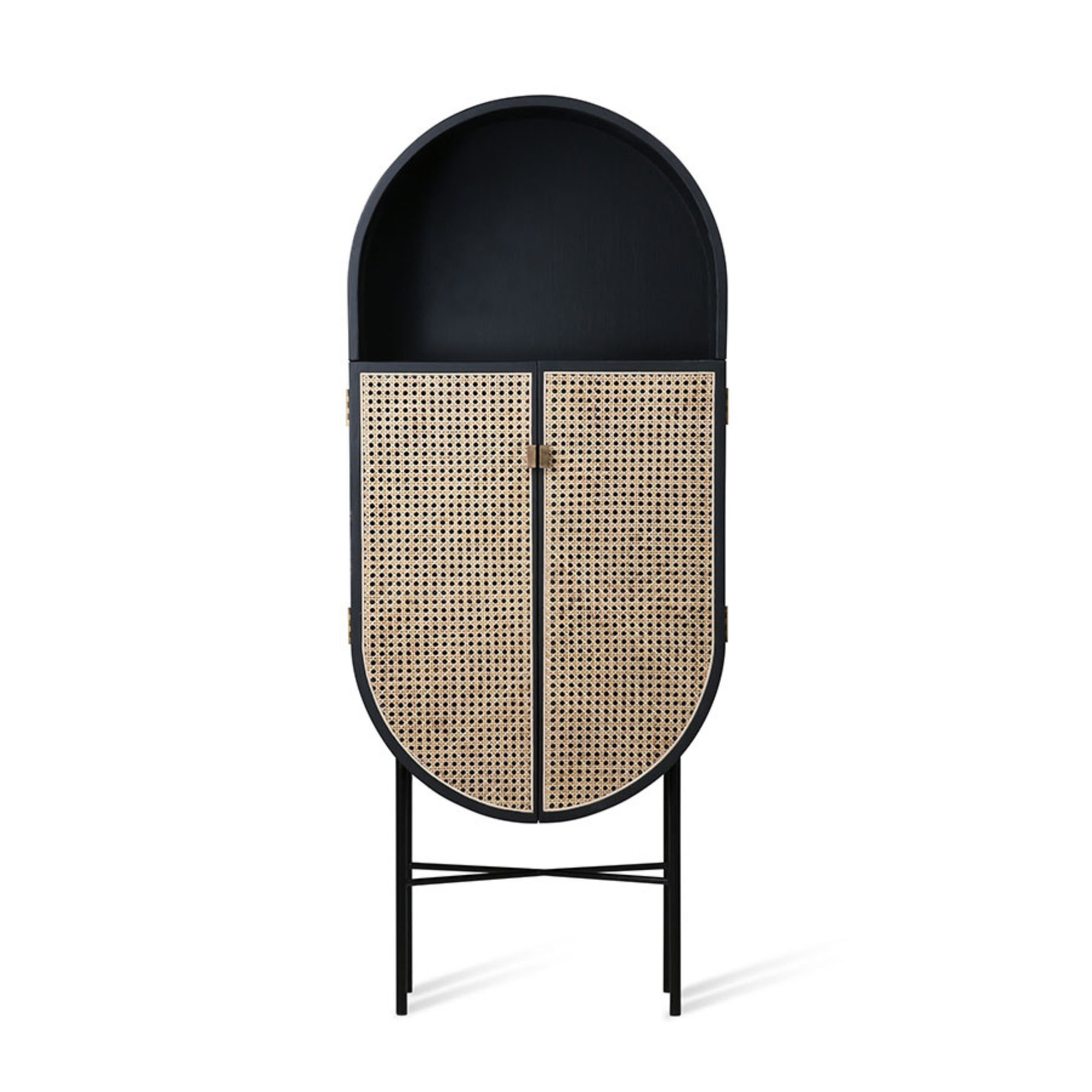
Custom-built storage is key in this modern family home
Practical storage and cohesive decor are the keys to a calm, comfortable interior and smooth-running family life in this modern home
Amy Lockwood
Even though they took a considered approach to renovating their family home in order to make it a practical space for two adults and three young children, the homeowners didn't stint on style when redesigning this spacious five-bedroom home.
Giving their interior designer a very specific brief about their taste and preferences helped them break out of their style comfort zone for this transformation to create a comfortable interior with practical extras that works for everyone.
The open-plan living room is divided from the hallway by glass sliding doors to bring light into the room. Another glass door leads to the kitchen-dining room in the extension. On the first floor, the main bedroom has a new ensuite, and there are two bedrooms with a bathroom, with two more bedrooms and a bathroom on the second floor.
'I don’t have a favourite room – I just love it all,' says the homeowner. 'Everyone looks for that open-plan, family-friendly ideal, and I think we’ve achieved it here.'
The living room
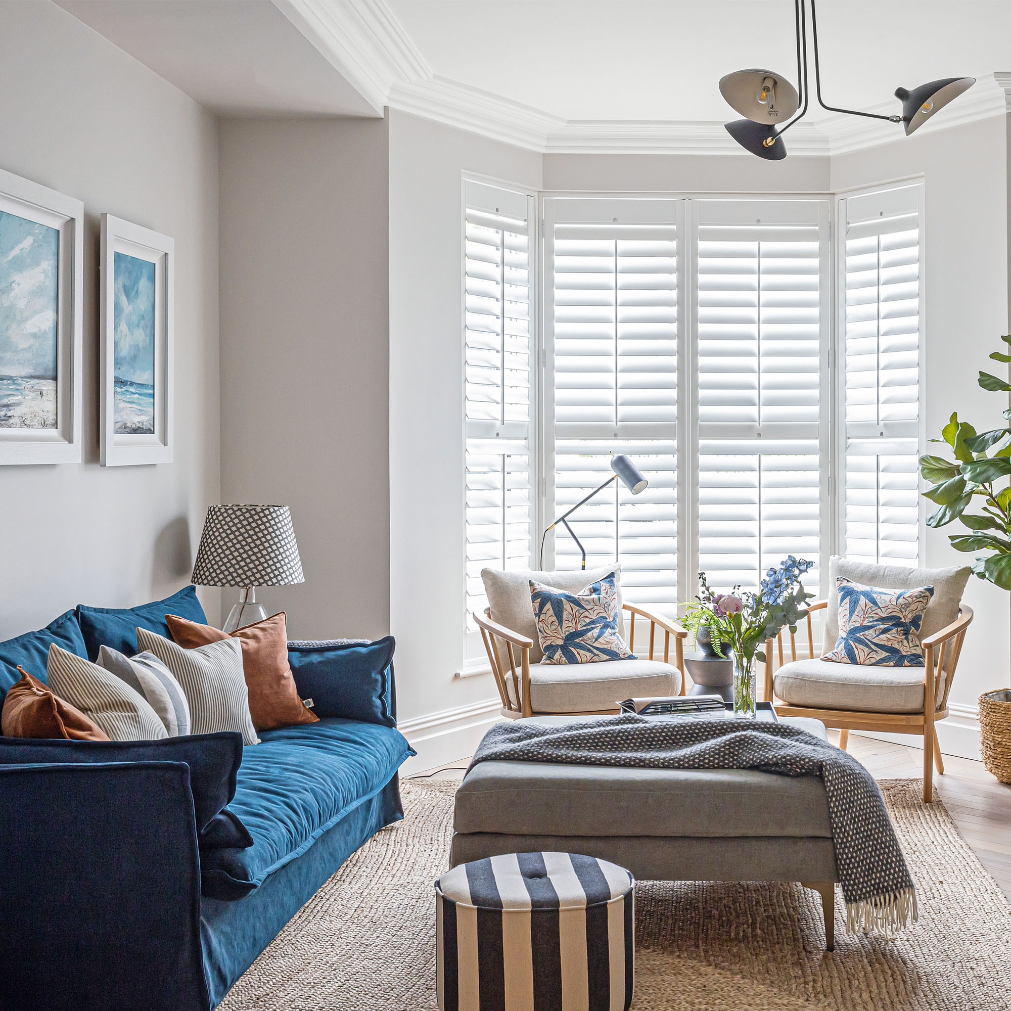
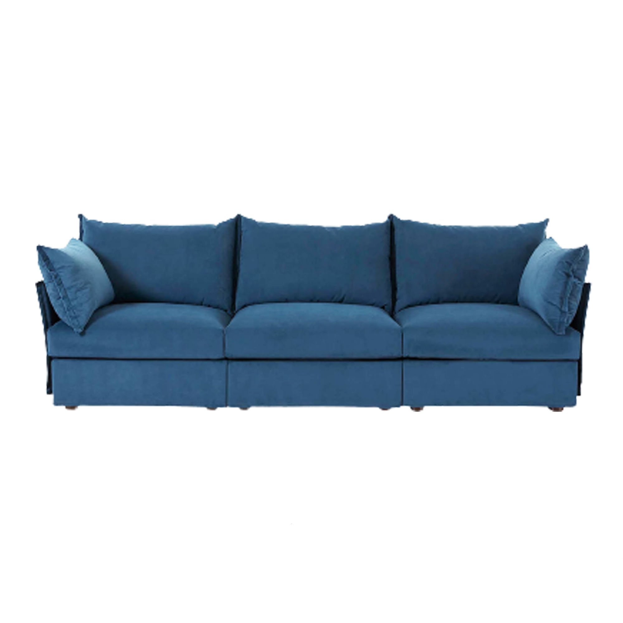
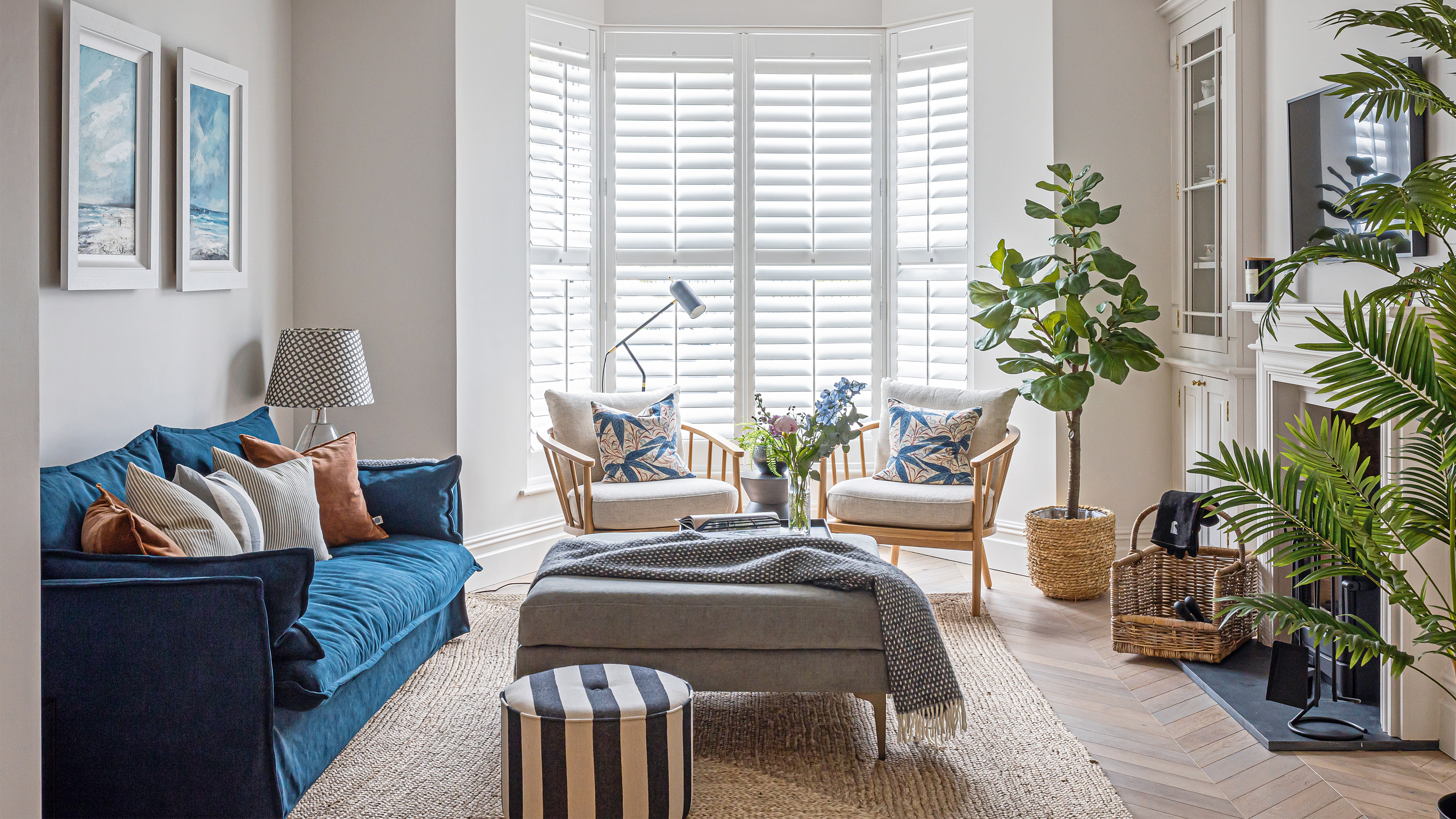
'I wanted the house to flow, so I’ve used neutrals everywhere as my base, with a highlight colour to give each room its own feel. I chose a blue living room, inspired by the three artworks we bought from a local gallery.'
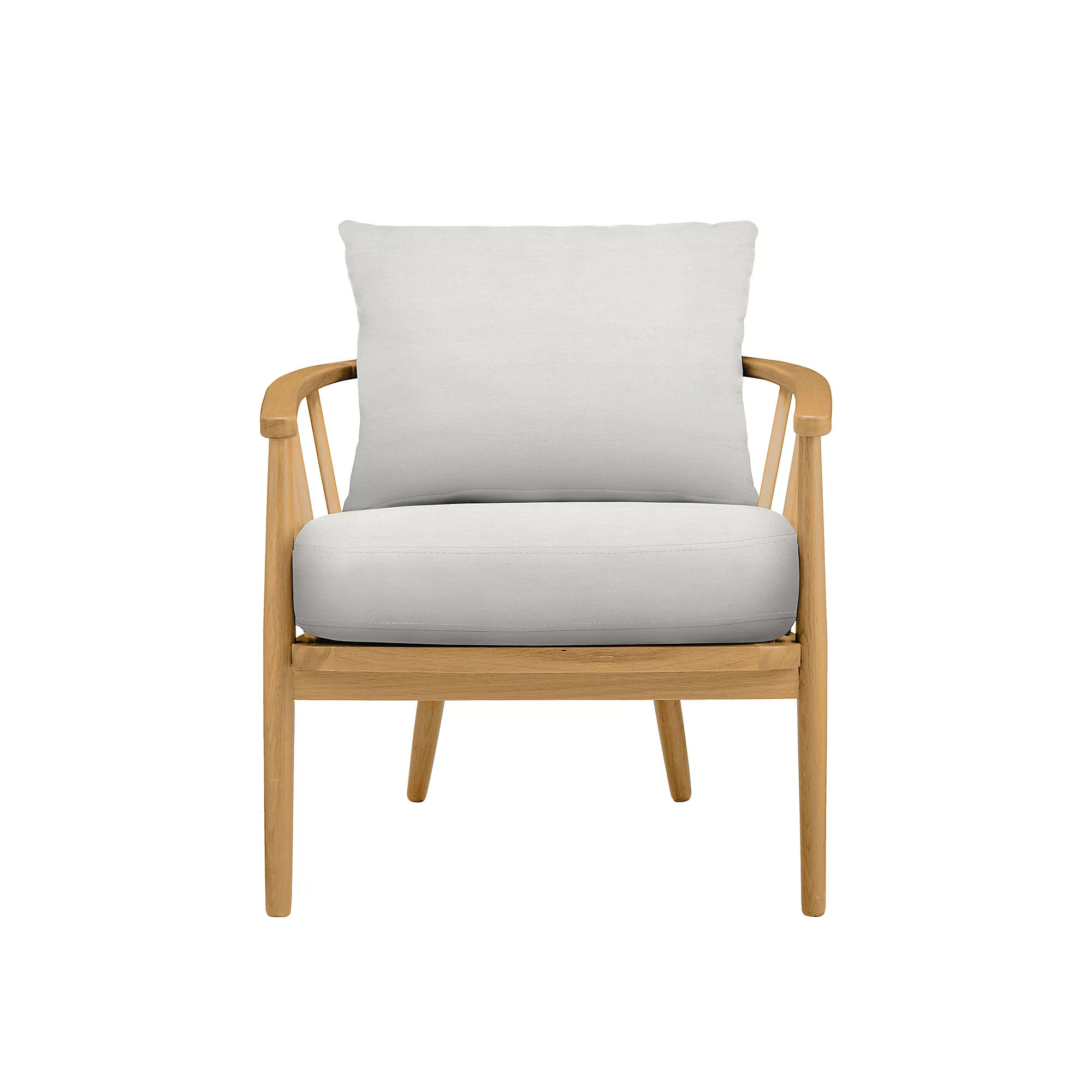
'The bay window is a lovely bright spot for reading. These open-design wooden armchairs are really comfy, but don’t fill the space or block light.'
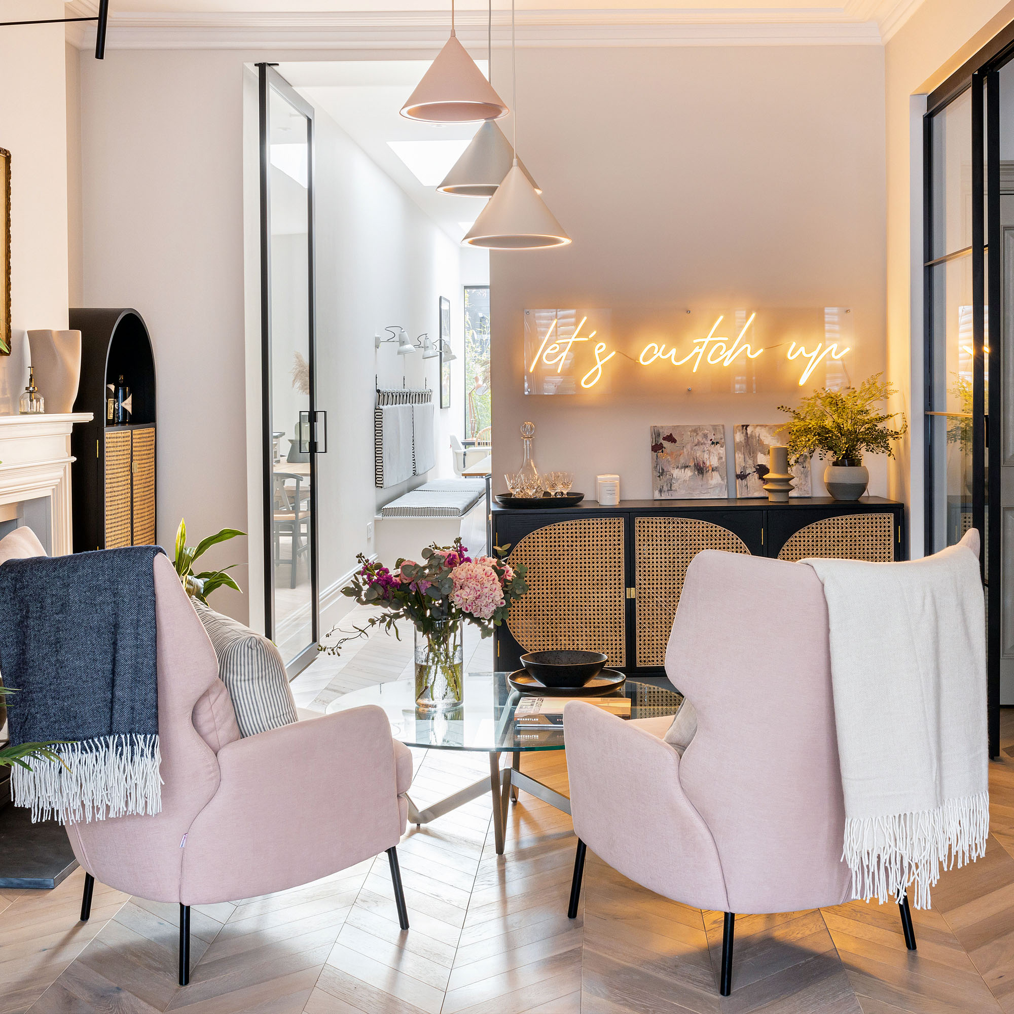
The spacious living room is a room of two halves. At the far end, away from the bay window, is a fireplace, accompanied by pink chairs and stylish rattan sideboards and cabinets with black detailing.
Get the Ideal Home Newsletter
Sign up to our newsletter for style and decor inspiration, house makeovers, project advice and more.
'I didn’t want this area to become a thoroughfare to the kitchen, so we’ve made it into our ‘cocktail lounge’. It’s got a bit of glamour and glitz and it’s a fun place to entertain. Pink is a favourite colour and I love these big, club-style chairs'.
'I’ve included a lot of natural textures like baskets and sisal flooring in the house, so my cane-fronted cocktail cabinets fit in well.'
The kitchen
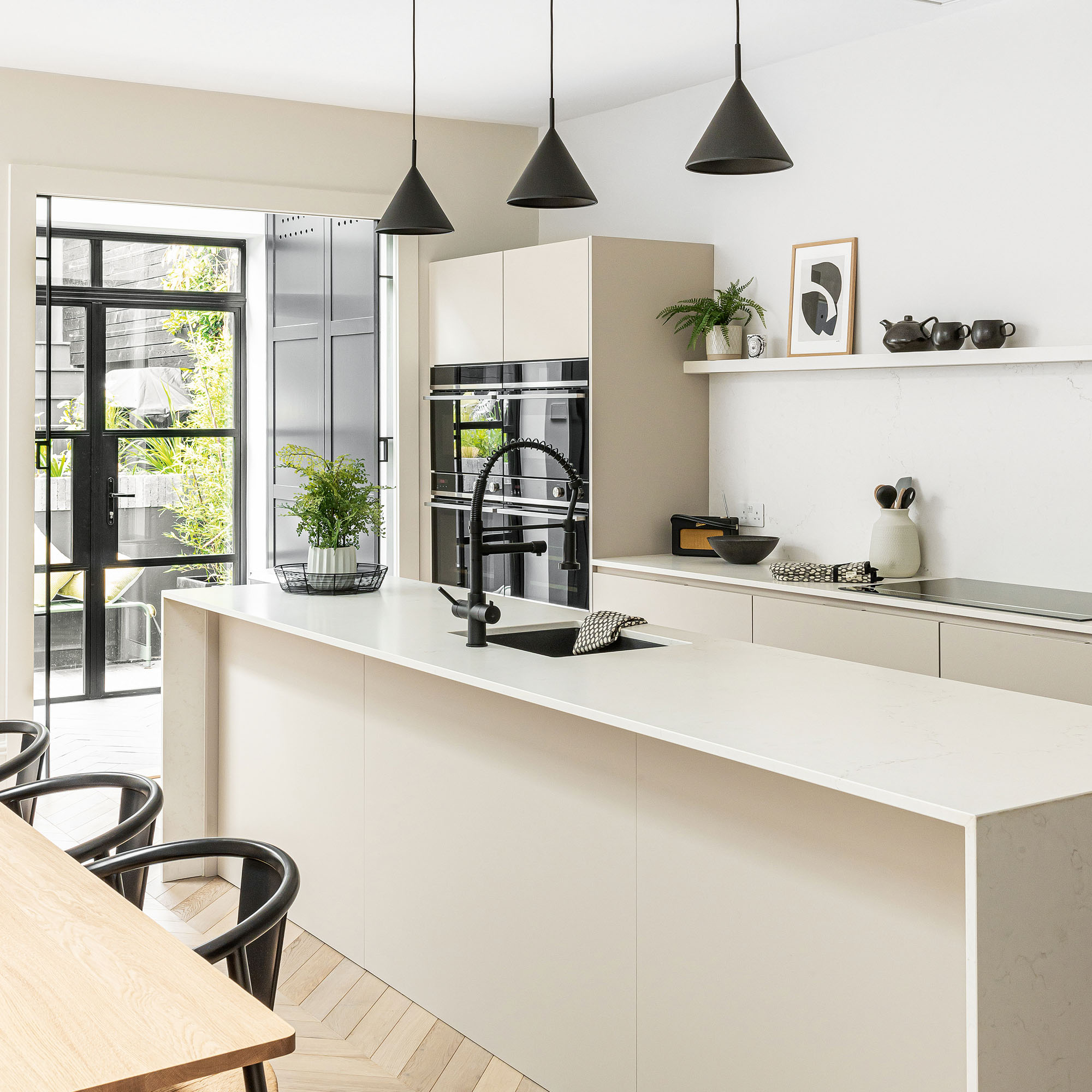
'I’ve accented the white kitchen with black, including the items on the open shelves. I’m careful not to let them look cluttered, but I do like having with a few interesting pieces on show to soften the room.'
'The utility area between the kitchen and the garden is brilliant. There’s a radiator in one of the floor-to-ceiling cupboards to dry coats and shoes. The washing machine is hidden in there too, and the sliding glass doors minimise noise.'
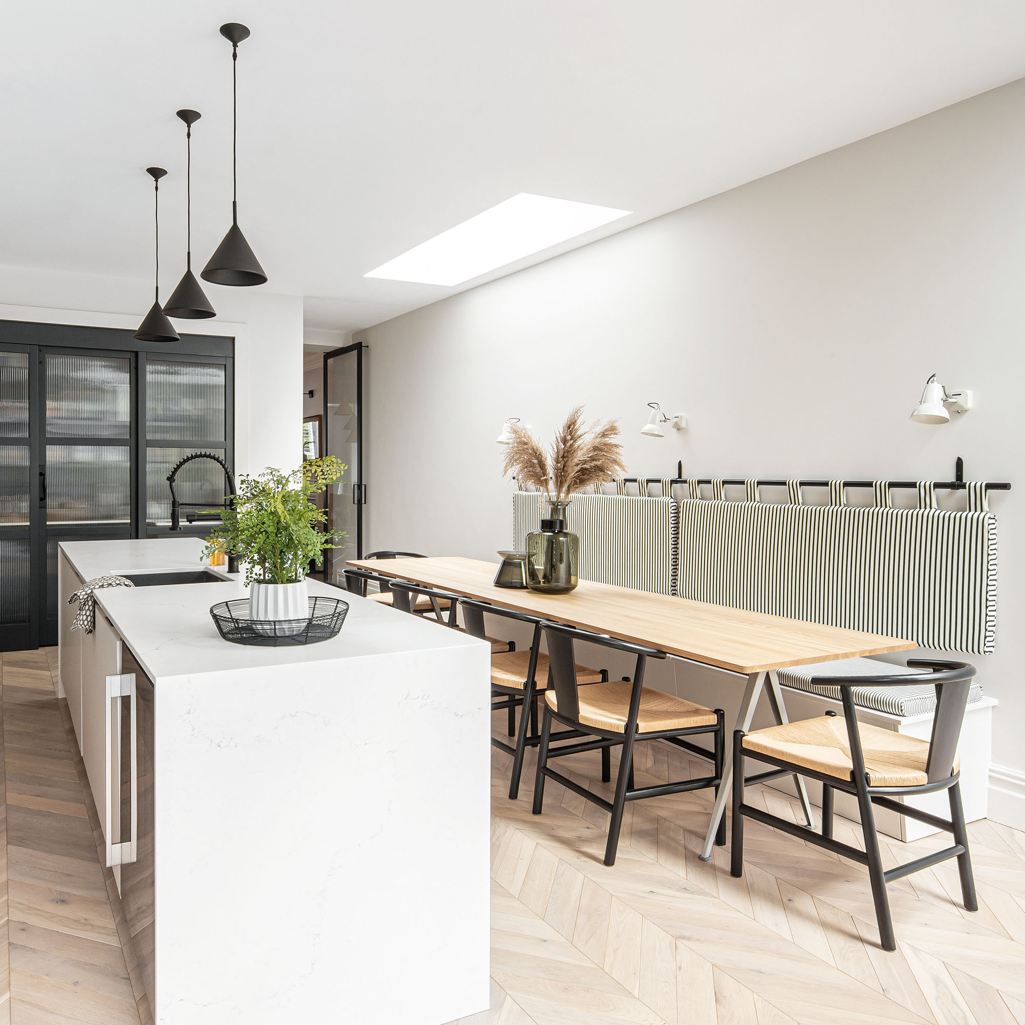
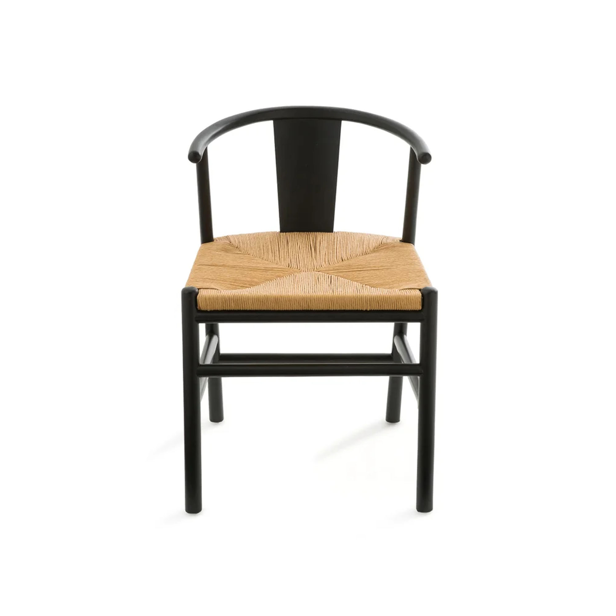
'Extending the kitchen width-wise gave us room for a proper, family-friendly dining area that can seat twelve. No space is wasted either, as one side is bench seating with storage underneath, and the hanging cushion makes a smart feature.'
'I wanted a modern, easy-to-clean, kitchen, so handle-less matt cabinets were a great choice and they’re a neutral, putty shade, so won’t date. The big pantry at the far end gives me masses of storage. It’s got sliding doors and a handy little prep sink inside.'
The main bedroom
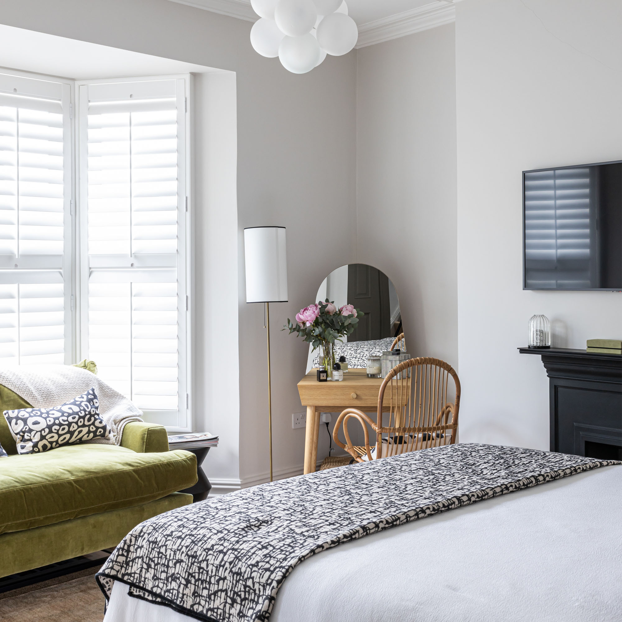
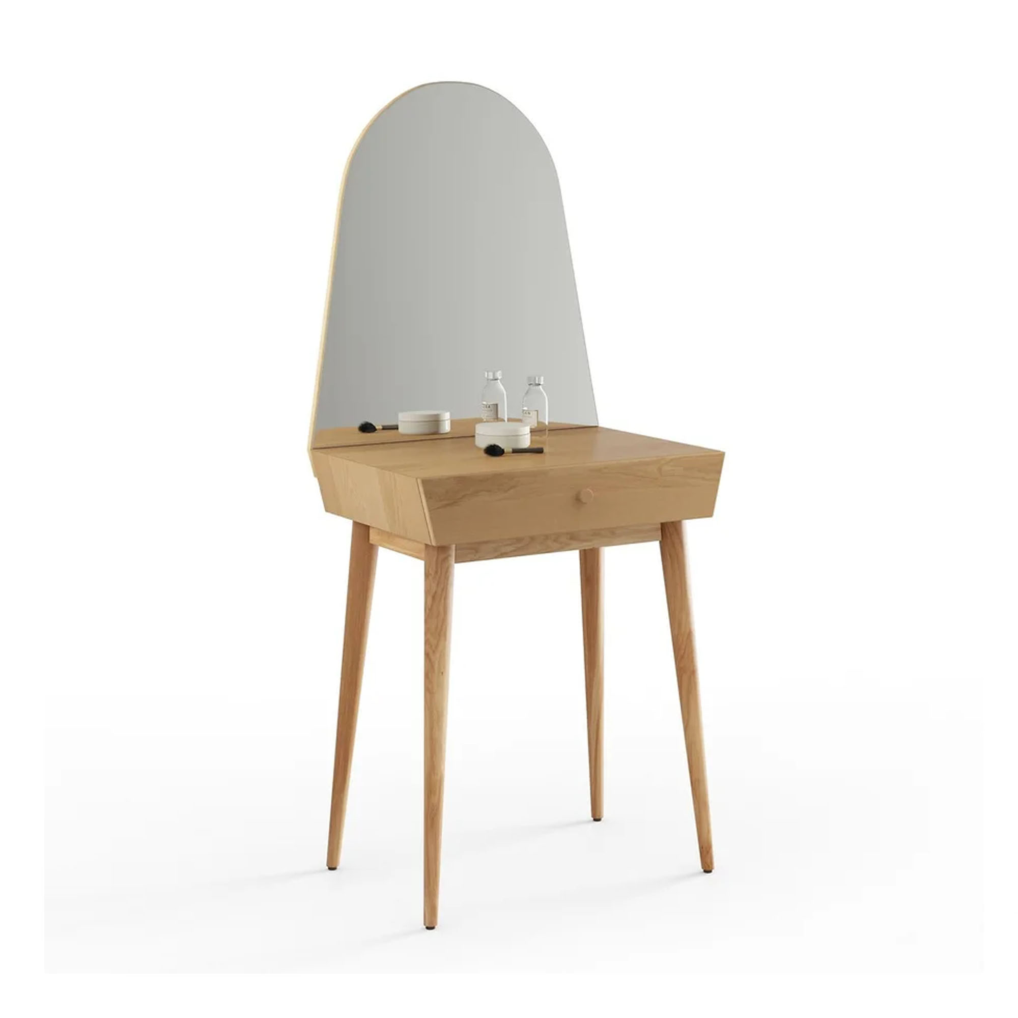
'The master bedroom is very light and tranquil, and I chose a soft olive green love-seat to lift the black-and-white look. The neat little dressing table was a great buy, as I didn’t want anything heavy or fitted.'
'Lighting is a big feature of the house and I think it’s a great way to add design interest. Our white bedroom pendant is like a soft, fluffy cloud and feels quite romantic. I like the contrast of a modern piece with the period ceiling rose.'
The ensuite bathroom
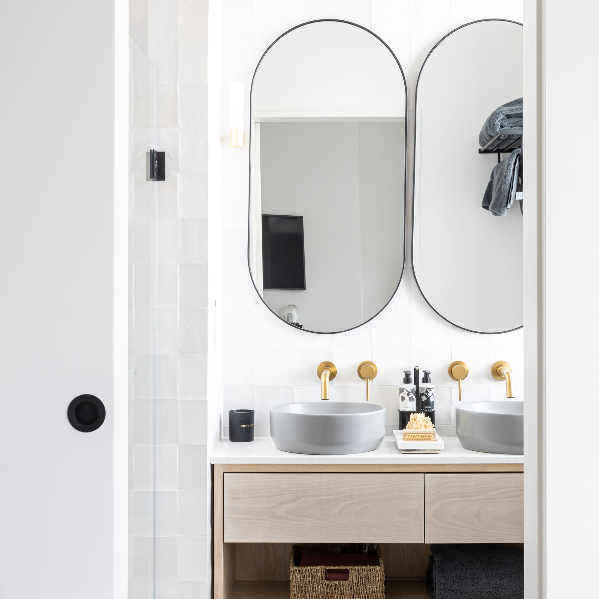
'The master bedroom was large enough for us to create an ensuite. It’s quite compact but there’s everything we want, and the sliding door makes a stylish touch.'
'My contemporary, brushed gold taps are wall-mounted so they save space, and give the ensuite a sleek, hotel-inspired feel.'
Get the look
Homeowner Q&A
We sat down with the homeowners to gain a little more insight into their house renovation process.
What prompted you to buy this property?
'I’m very familiar with this area as I holidayed here with my Welsh grandmother when I was growing up. I’d always imagined coming back and bringing my own three children.'
'My husband and I wanted an older house, with some period features, which we could turn into a practical and comfortable family home. This property had a lovely, happy feel, and great views, plus there were five good-sized bedrooms and it’s handy for shops and facilities as well as the beach.'
What was it like inside, and what changes did you envisage?
'The interior was in reasonable condition, but just not what we wanted. Some of the period charm was missing, and everything was quite tired. The kitchen was long and narrow and we quickly realised we’d want to widen it with a side return extension and lots of glass, to make a modern, family-friendly kitchen-diner.'
'The other must-haves for the ground floor were a utility area for coats, wellies and wet-suits, and a cloakroom. We saw we could reconfigure upstairs, adding an ensuite in the master bedroom, as well as a separate bathroom on each floor.'
How did you manage the work?
Although my husband and I are both involved in property development, we knew we just didn’t have the time to run our own renovation. I had a clear vision for the house, but felt I needed some guidance with sourcing everything and pulling it all together, so I approached a local interior designer.'
'She found us a great builder, and she also acted as project manager, which made a huge difference, giving us a single point of contact. The extra cost was a concern, but I needn’t have worried, because the designer’s expertise and contacts definitely saved us more than we paid in fees.'
What have you learned from the experience?
'Stay flexible and try not to stress about small things! I’d set my heart on marble kitchen worktops, but eventually had to accept they just wouldn’t be practical. I’ve got quartz composite instead, which looks fabulous, and is robust and user-friendly.'
'One of the floorings we loved wasn’t available, so we had to pick another, but now it’s down, I’m more than happy with our second choice. Also, the importance of storage - I planned mine in detail, so there’s a place for everything, and the house now functions very easily. It makes me feel calm and relaxed, and we’ve got everything we need.'
- Amy LockwoodSleep Editor
-
 My go-to Ninja coffee machine is on sale for Easter weekend
It makes coffee shop quality achievable at home
By Molly Cleary
-
 When to plant out annual flowering plants for vibrant, colourful garden borders – and give them the best start, according to experts
Not sure when to plant out annual flowering plants? We've got you covered...
By Kayleigh Dray
-
 I'm a kitchen decor editor and didn't like this tableware trend - until I saw H&M Home's designer-look plates
They made it easy to justify a new crockery set
By Holly Cockburn
