'We’ve turned several small rooms into an open-plan space and it functions perfectly for us'
This young family can all be together in a stylish and spacious replacement for an unused extension
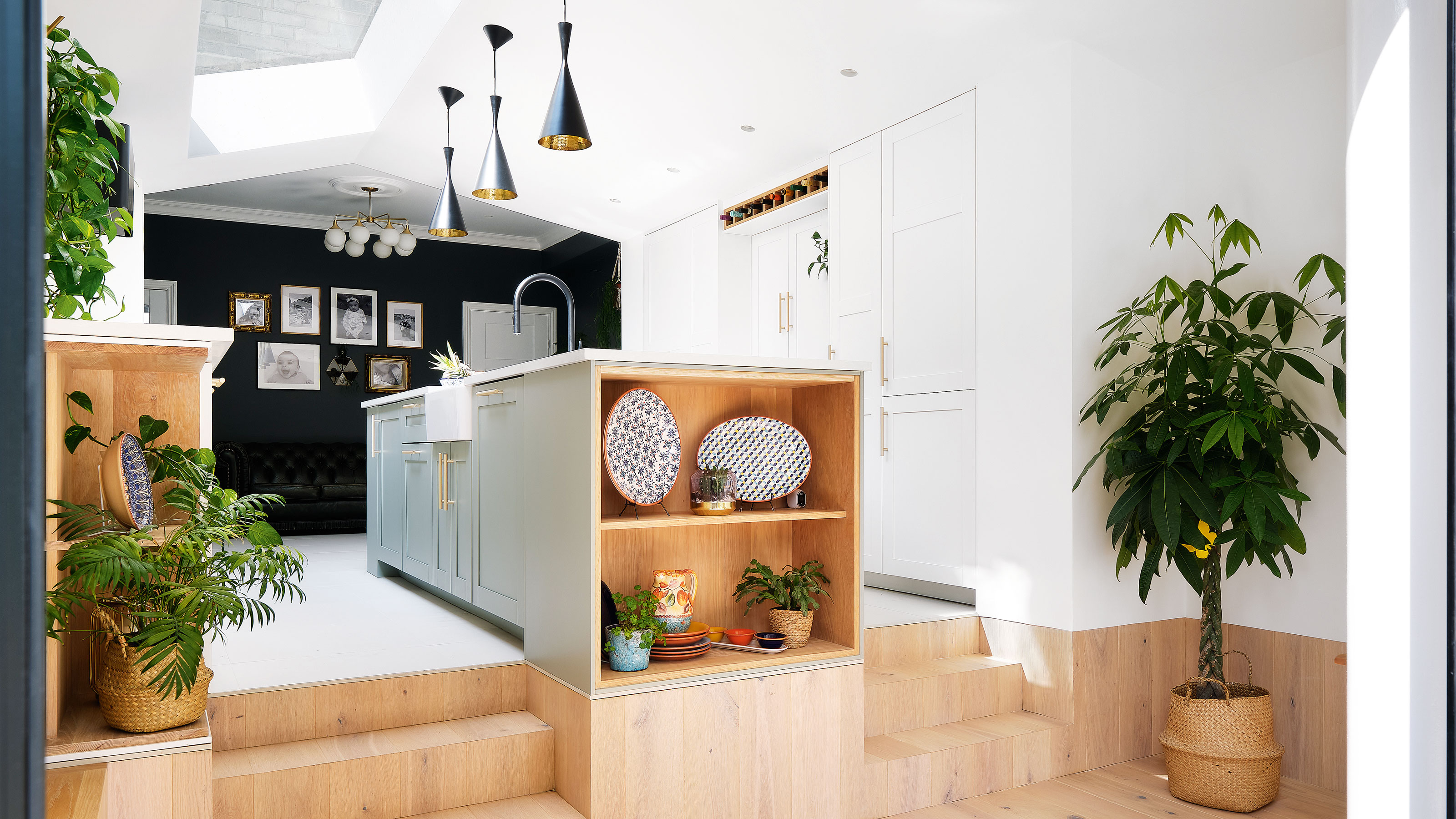

After renting a box flat in a lively part of London, this homeowner and her husband longed for a quieter, more spacious home that would be suitable for a young family. They found it in this Victorian terrace in south-east London, which backs onto a stream and fields. ‘There’s a river and park behind the property,’ she says ‘When you look out of the glazed doors, it’s like the garden goes on forever.’
The location gave them access to plenty of local amenities, and the property had character. Issues such as a narrow side extension that made the house feel disjointed, were outweighed by its period charm.
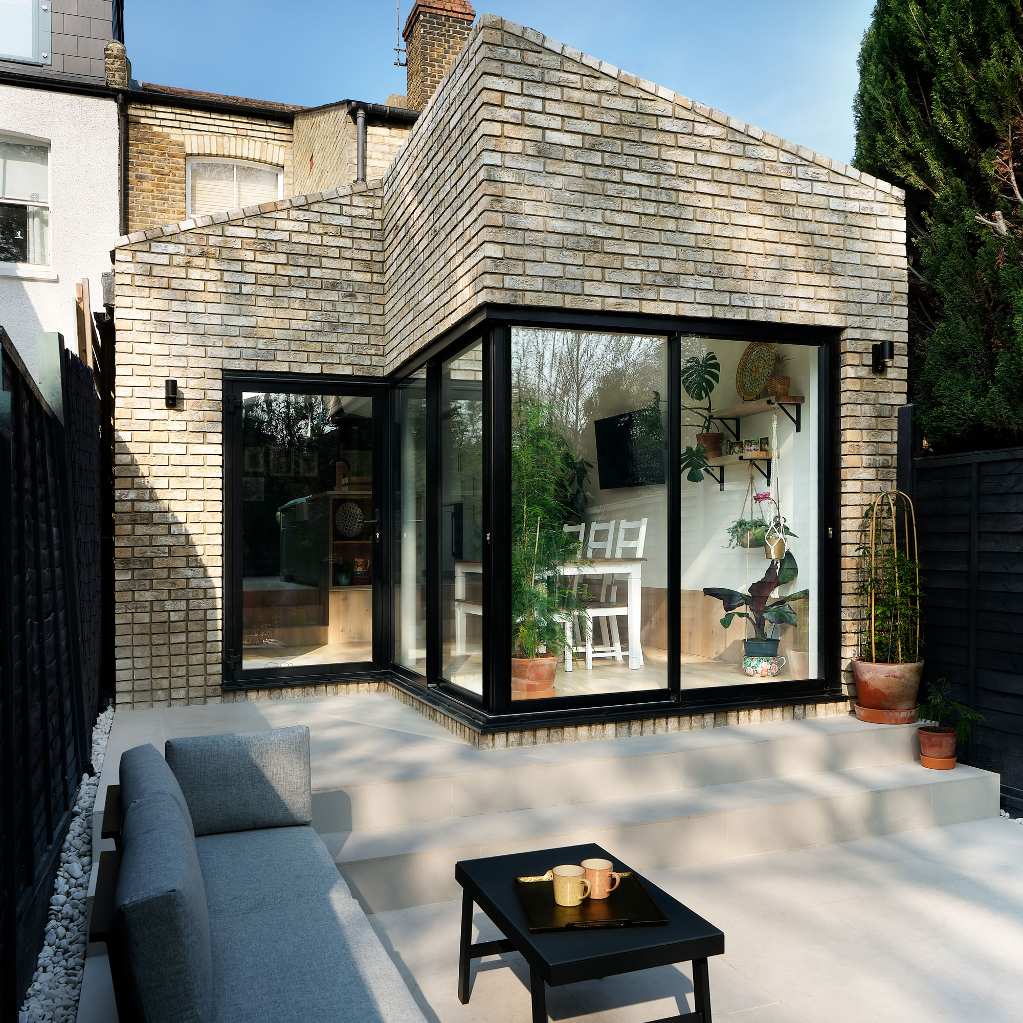
Two years after moving into their two-bedroom house, the couple started to make plans to transform the property into the family home they’d always wanted.
‘When we bought the house someone had already completed part of an extension, which was like a craft room,' she recalls. 'It wasn’t functional and was completely separate from the house. We never used it, possibly because we couldn’t put any furniture in it.'
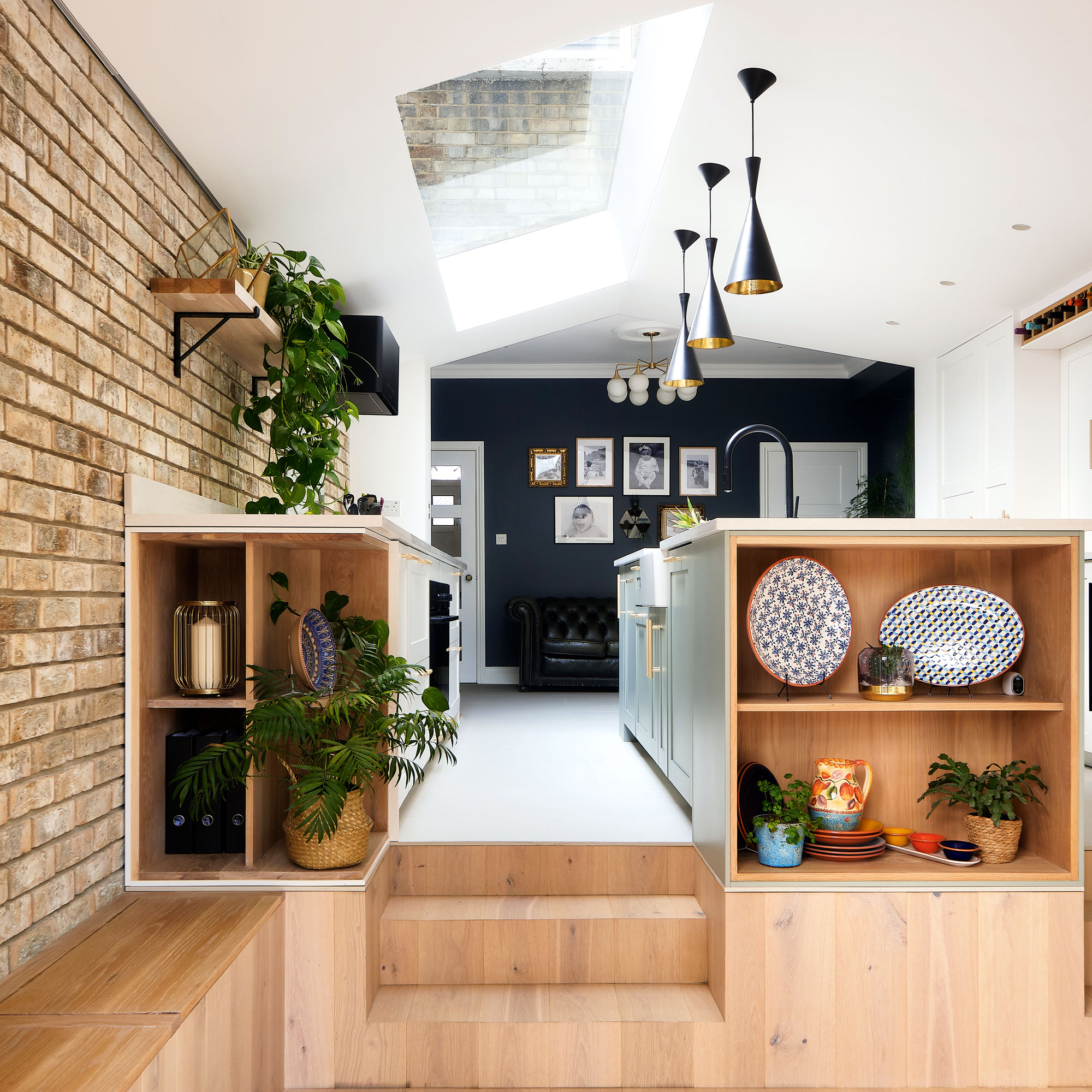
‘The previous owners had added it under permitted development; they had extended out on one side so there remained an unusable long and thin side return/courtyard-type space on the right. It didn’t work and it all felt very disconnected.
‘The house is also built on a sloping site, so we had steps going up or down to access each room on the ground floor, which wasn’t ideal.’
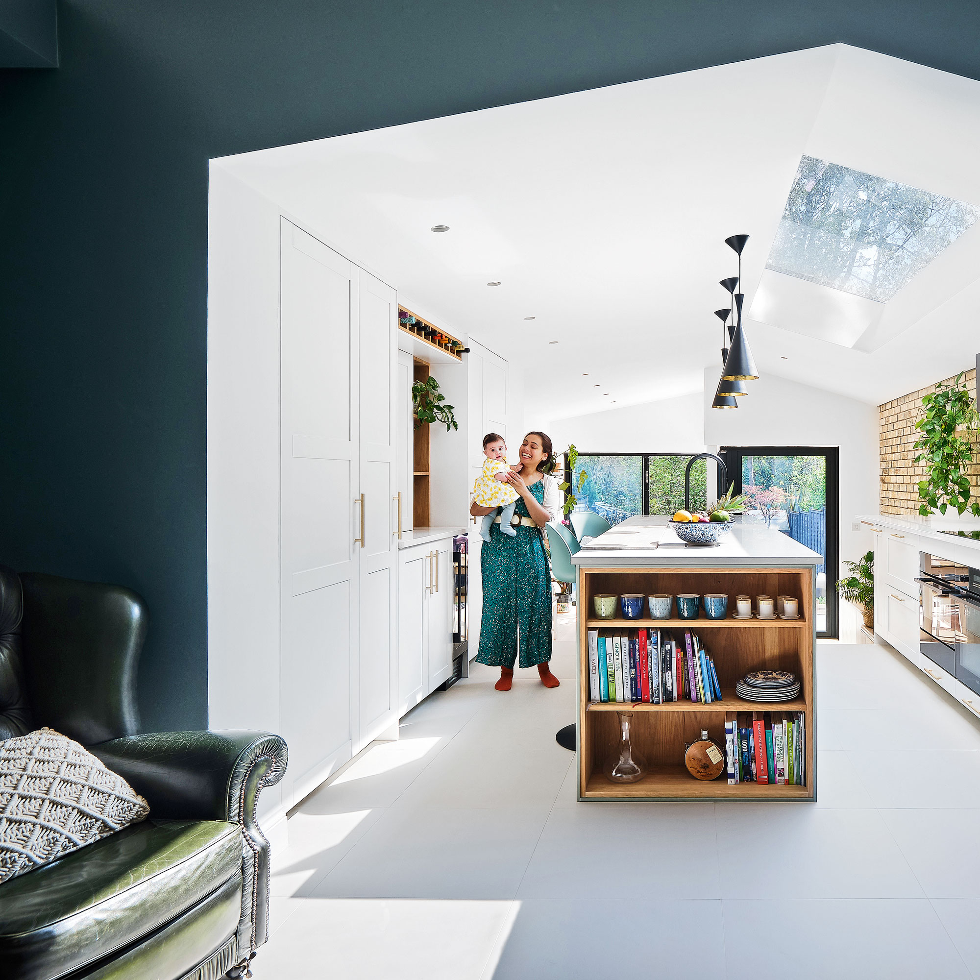
‘We opted for a six-metre extension that reworks and expands the old addition, incorporating it into the new space. Before, you’d walk past the stairs to the kitchen, then you’d step down into a small space with a WC to the left, followed by the long extension.
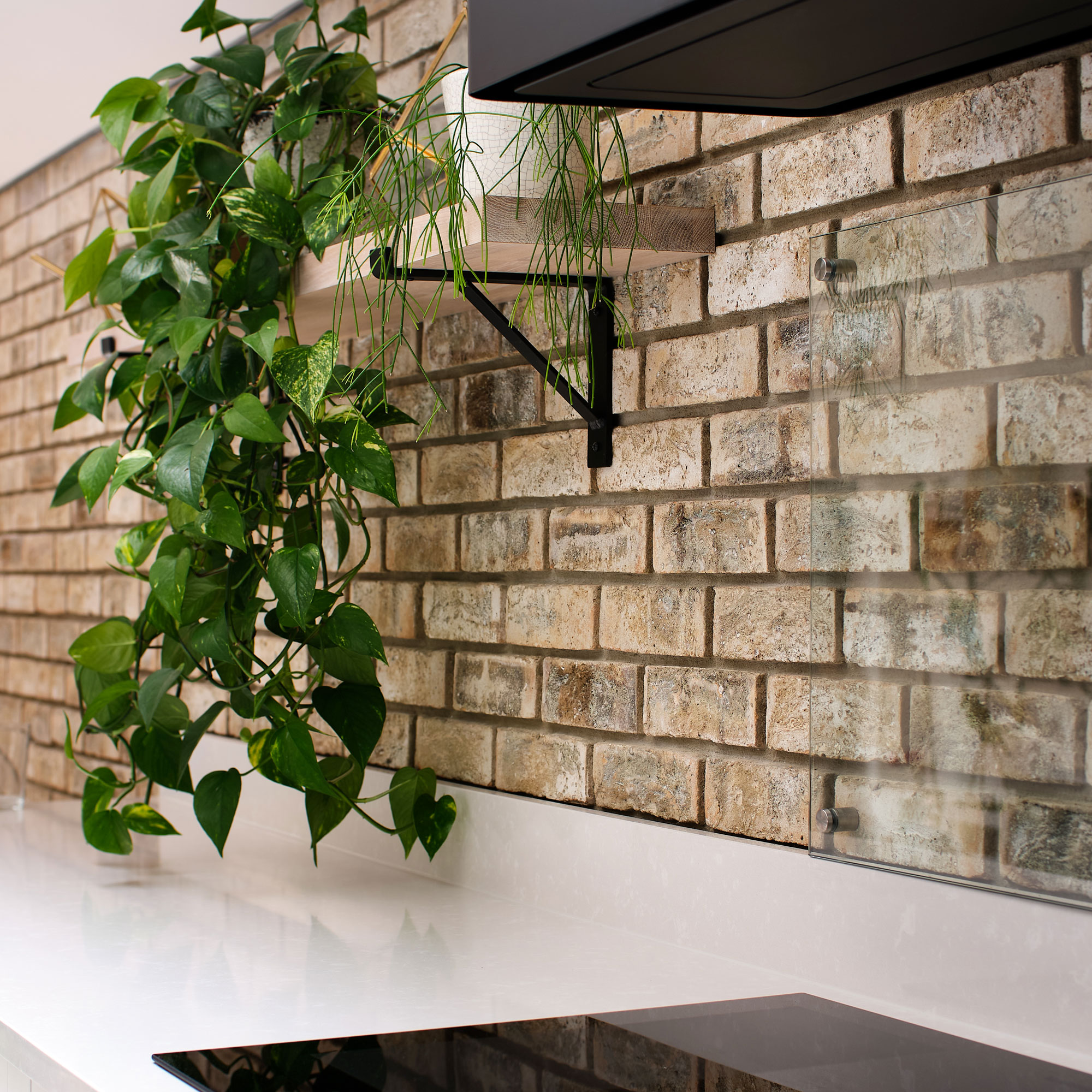
‘With the new design, we wanted to create an open-plan kitchen-diner with a seating area and better connection to the garden. It needed to be more seamless and retain the Victorian features, that’s why we matched the bricks to look like part of the house. We asked our architects, Alex and Helen at ABHR_A, for glass skylights as we wanted lots of glazing to keep things light, and for the family to relax and be in the same space.’
Get the Ideal Home Newsletter
Sign up to our newsletter for style and decor inspiration, house makeovers, project advice and more.
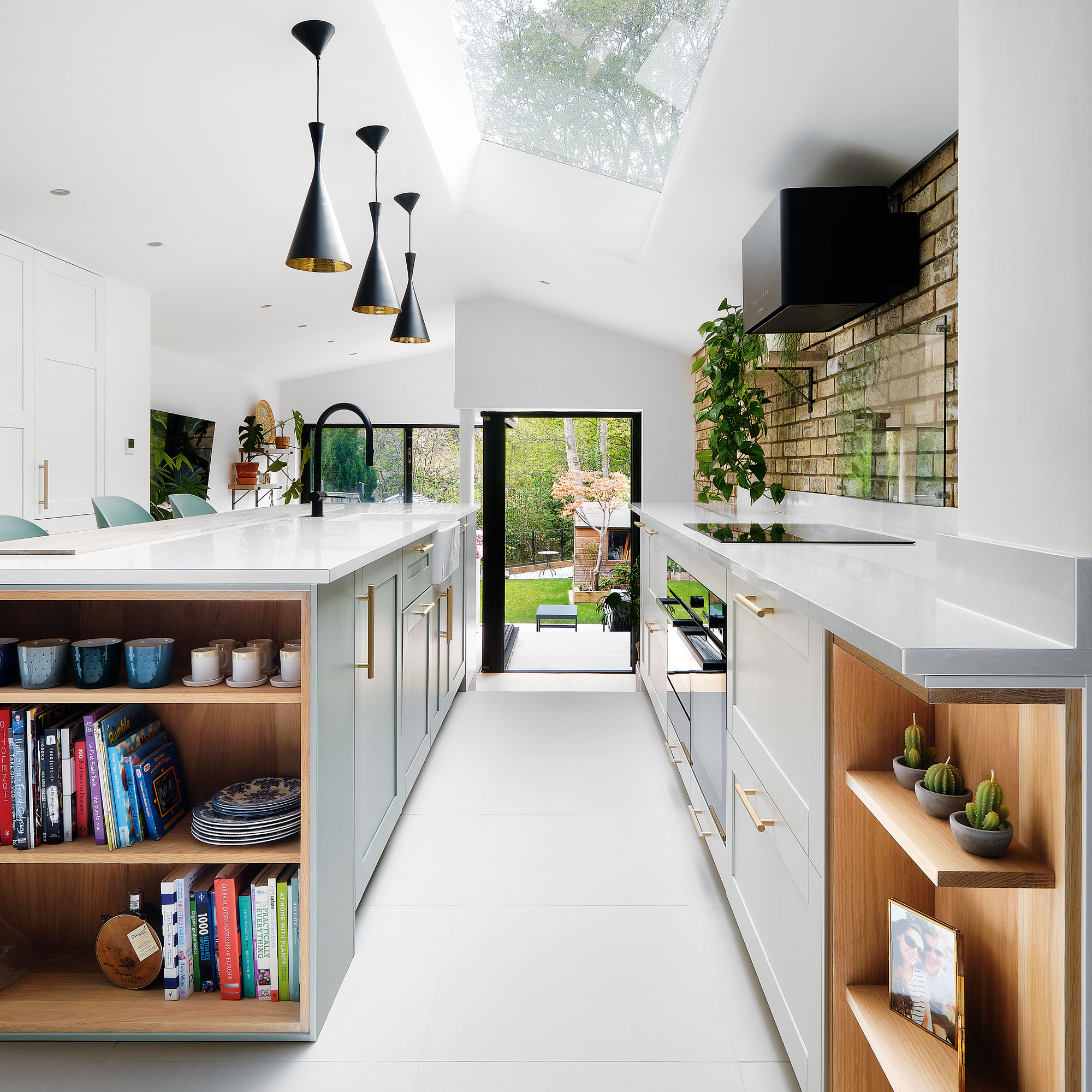
‘The existing extension roof and walls were removed before new foundations and masonry walls were constructed encompassing the full width of the property. The old external side wall was removed. The bathroom floor above was propped to allow a new steel frame to be inserted – this both acts as a support for the existing bathroom above and creates an opening for the corner glazing.
‘New timber roof rafters were installed to make a pitched roof and opening for a three-metre-long skylight. The builder knocked through the rear to the existing kitchen to complete the open-plan space, ahead of us installing the new kitchen and then decorating.’
‘There were two different stages to the build process: the main build took nine months with a two-month break due to Covid. There were also delays due to lack of materials. Construction was mostly finished by August 2020, but we had a lot of things on the snag list. Unfortunately, the builder abandoned the job and it took us another six months to do the remedial work.
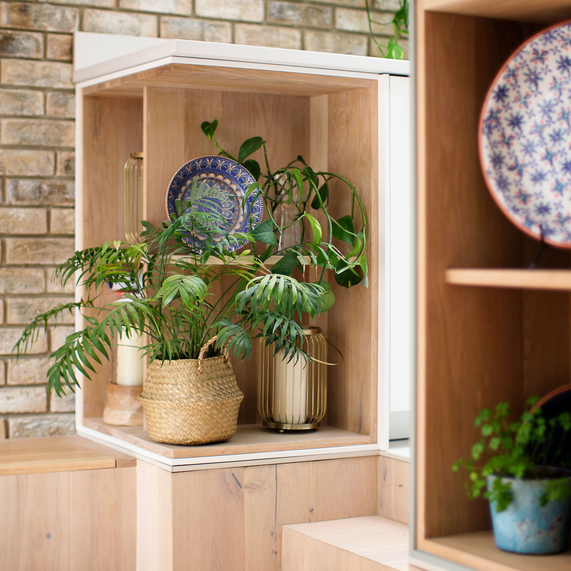
‘My husband designed the kitchen himself – it’s Ikea with bespoke elements as we got a carpenter to help us build things like open shelves and the wine rack. I like Tom Howley kitchens, but they are out of our budget, so we tried to make it look as custom-made as we could. We had the cabinets sprayed and got a breakfast bar added.’
‘We spend all of our time here. It’s nice because we have different zones in terms of functionality, so it feels like we have individual rooms in one space. We can see our daughter and all be in the same room together doing different things. We didn’t anticipate needing a home office, so it’s a bonus that we’ve even got a work area, too.
‘Décor-wise, we went modern, with industrial elements and lots of natural wood and white to soften the look. One of the unique things about the extension is there’s no visible structure holding up the back corner glazing, so it looks like it’s floating – I really love that. We’ve turned several small rooms into an open-plan space and it functions perfectly for us.’
Ifeoluwa is a writer currently based in Milan, Italy. She speaks Italian, French and Yoruba. She grew up in London and has studied and lived in France and Nigeria.
Ifeoluwa is a regular contributor to leading UK homes and interior titles including Real Homes, Ideal Home and Period Living. She was the launch editor of the travel website Culture Trip and continues to write travel, beauty and lifestyle features. Ifeoluwa also works as a voiceover artist and as a copywriter, helping small companies improve their content offering.
-
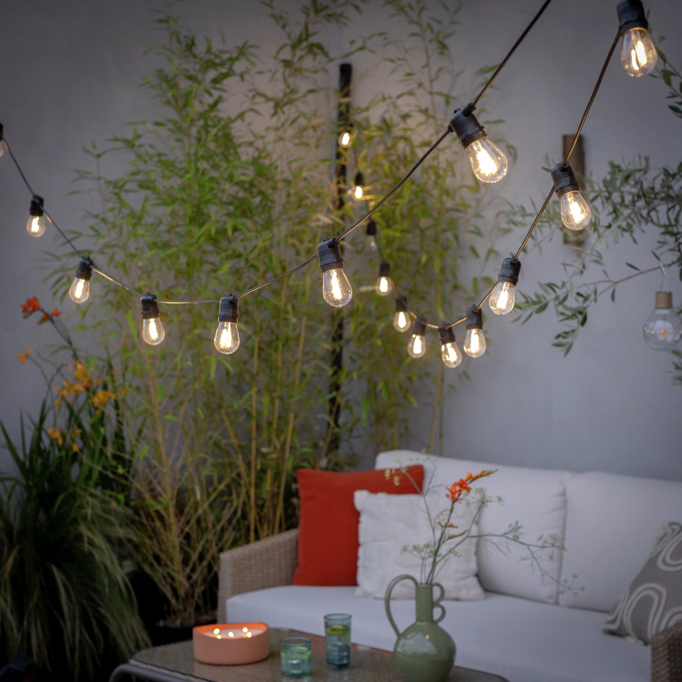 The 6 outdoor lights from Habitat that I'm choosing between to make my outdoor space look more expensive this summer
I couldn’t believe some of the prices
By Ellis Cochrane
-
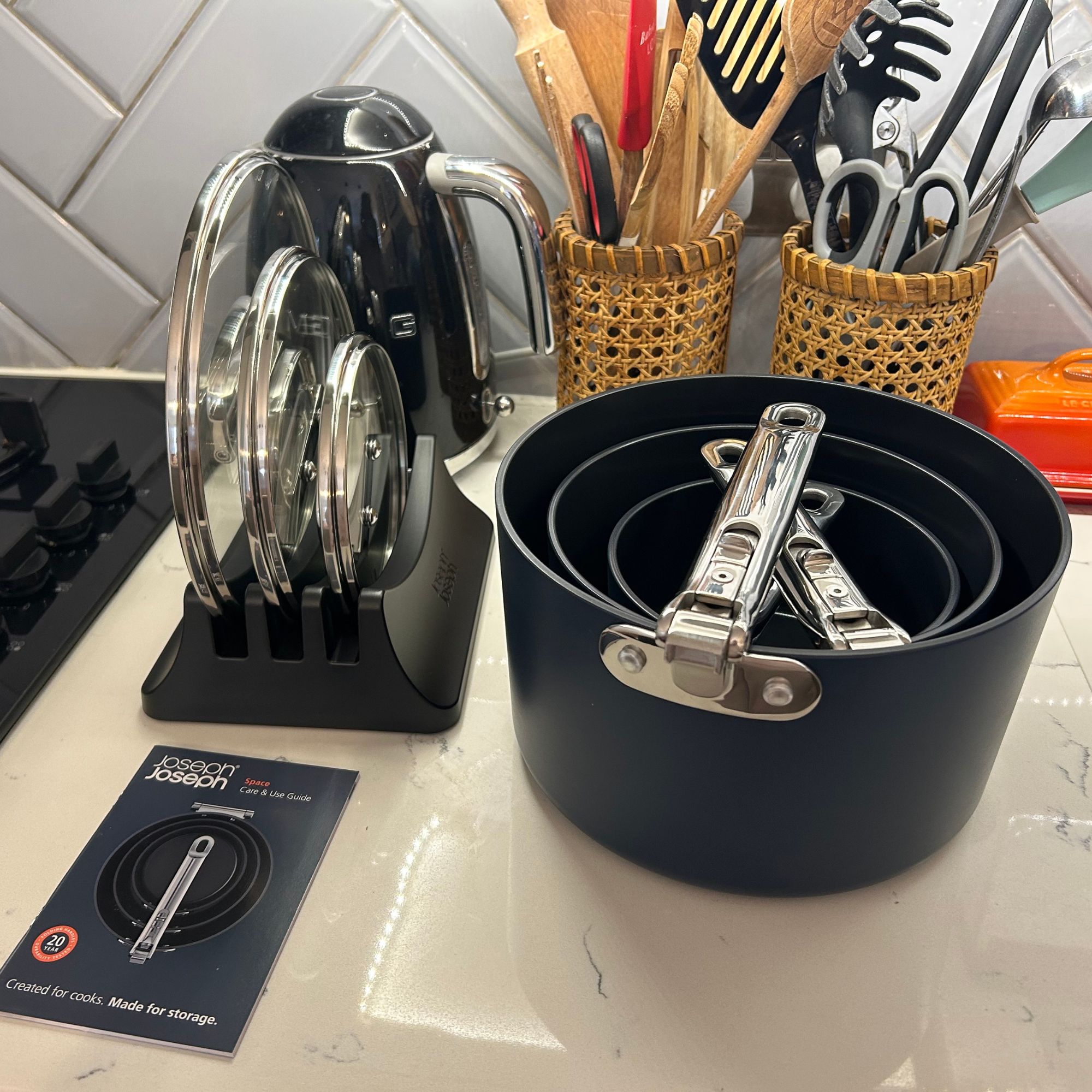 Joseph Joseph 3-piece Saucepan review – seriously space-saving
Small kitchen? I tested this innovative Joseph Joseph space-savvy set which has foldable handles — and I loved it
By Annie Collyer
-
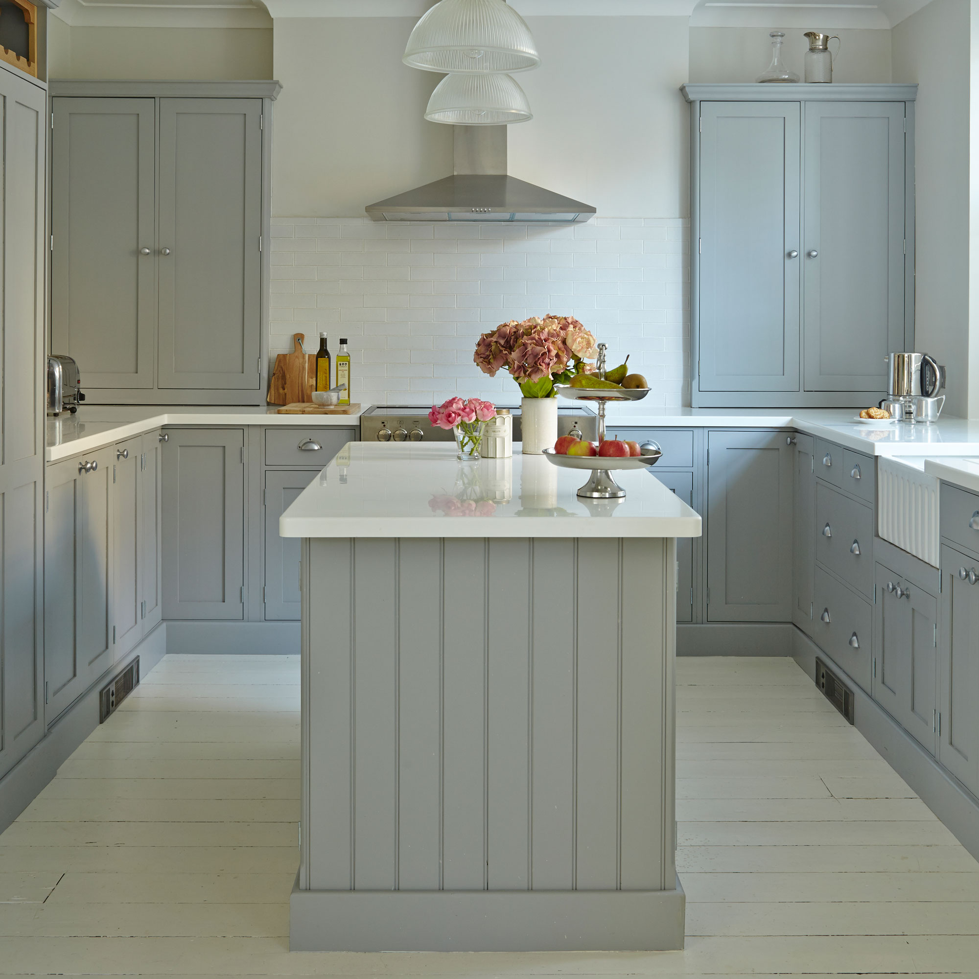 Forget seating, this is how you should be making the most out of your kitchen island in 2025
Seating doesn't always have to be a necessity on an island when you can choose these ideas instead
By Holly Cockburn