Be inspired by this cool boy's bedroom
Vibrant colours and a compact cabin bed may have been suitable for a little boy's room, but with the owner's 11-year-old son rapidly outgrowing both his furniture and decor, it was time for a change.
Vibrant colours and a compact cabin bed may have been suitable for a little boy's room, but with the owner's 11-year-old son rapidly outgrowing both his furniture and decor, it was time for a change. The room itself was in good condition, so all it really needed was a lick of paint. However, the owner's son had other ideas and after some negotiation - including being bribed with the rather dubious promise of him helping around the house - his mother agreed to a total revamp.
The owner's son was very keen to get started and scoured websites for ideas. Inspired by a recent trip to America, he decided to go for a loft-style look with a high bed, as it meant a desk could be fitted underneath. With a love of industrial schemes, his mother was happy with his choices, but she did draw the line at graffiti walls, so they settled on a brick-effect wallpaper instead.
A rather unusual layout (the result of an extension added by the previous owners) made planning the decor a little tricky at first. However, once the problem of neatly adding a desk area was resolved, the awkward through-room layout no longer seemed an issue. In fact, the mother-and-son team now had space to spare. They decided to divide it into two zones, with a conventional bedroom, plus a small adjoining space to accommodate a drum kit.
For a cohesive look, the decorating duo went for pale-grey walls and vinyl flooring to help open up the layout. They wallpapered matching brick-effect feature walls in both zones, which draws the eye through the entire area. Painting one wall in black has created a dramatic effect, too.
1/8 Clever use of space
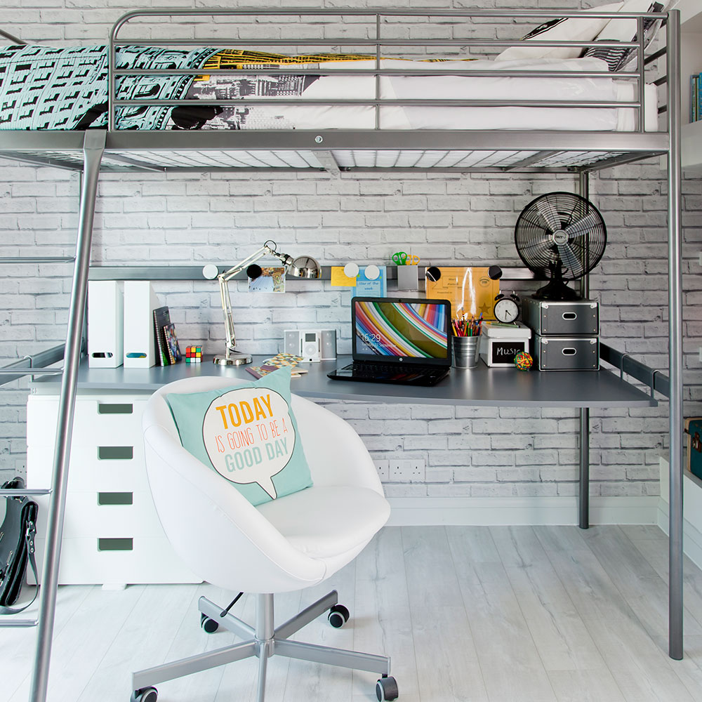
Both mother and son are super pleased with the final look. It took a lot of work, but they feel it was very much worth the effort. The result? A pad that's absolutely perfect for a growing boy.
Bed, desk top and swivel chair
Ikea
Bed linen
Primark
2/8 View of room layout
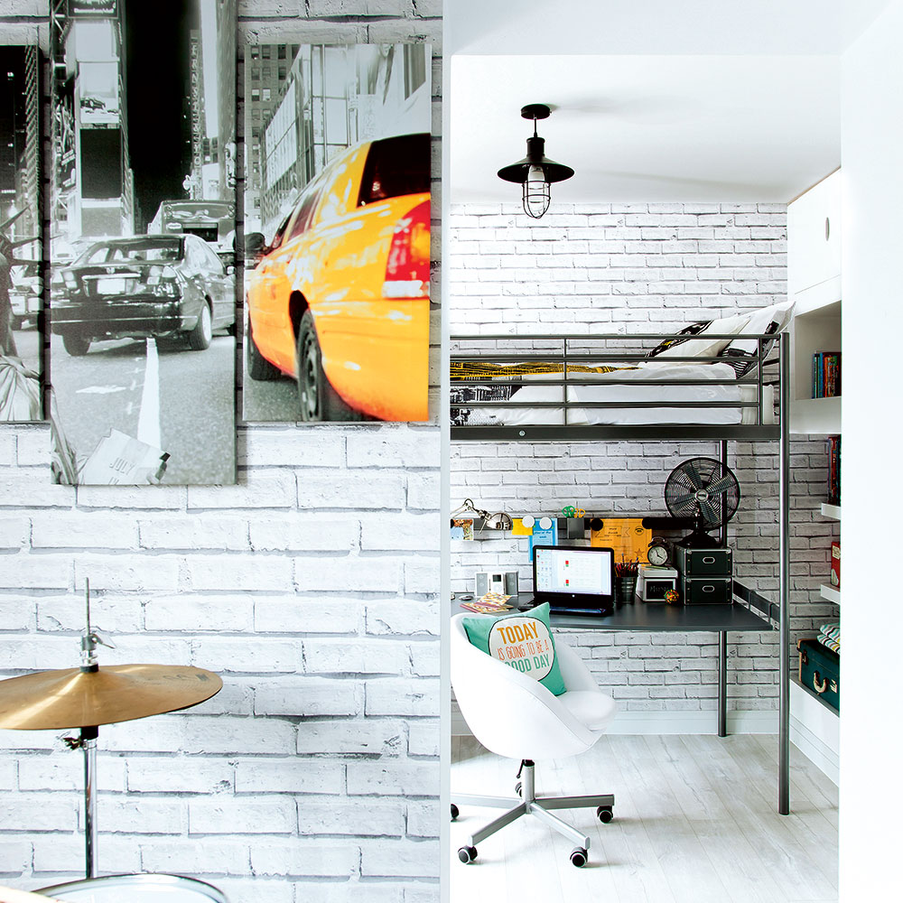
This image shows the layout of the room, which has a separating wall in the middle. At first, the divided nature of the space made it tricky to plan the new decor, but in the end it has worked in the scheme's favour. With two zones, it feels more like a self-contained apartment than a single room, and the wall has become like a feature in its own right. Using the same wallpaper on both the far and dividing walls unifies the look and makes it appear seamless and uncluttered.
Get the Ideal Home Newsletter
Sign up to our newsletter for style and decor inspiration, house makeovers, project advice and more.
Wallpaper
Wallpaper Direct
Flooring
Quick-Step
3/8 Cute corner
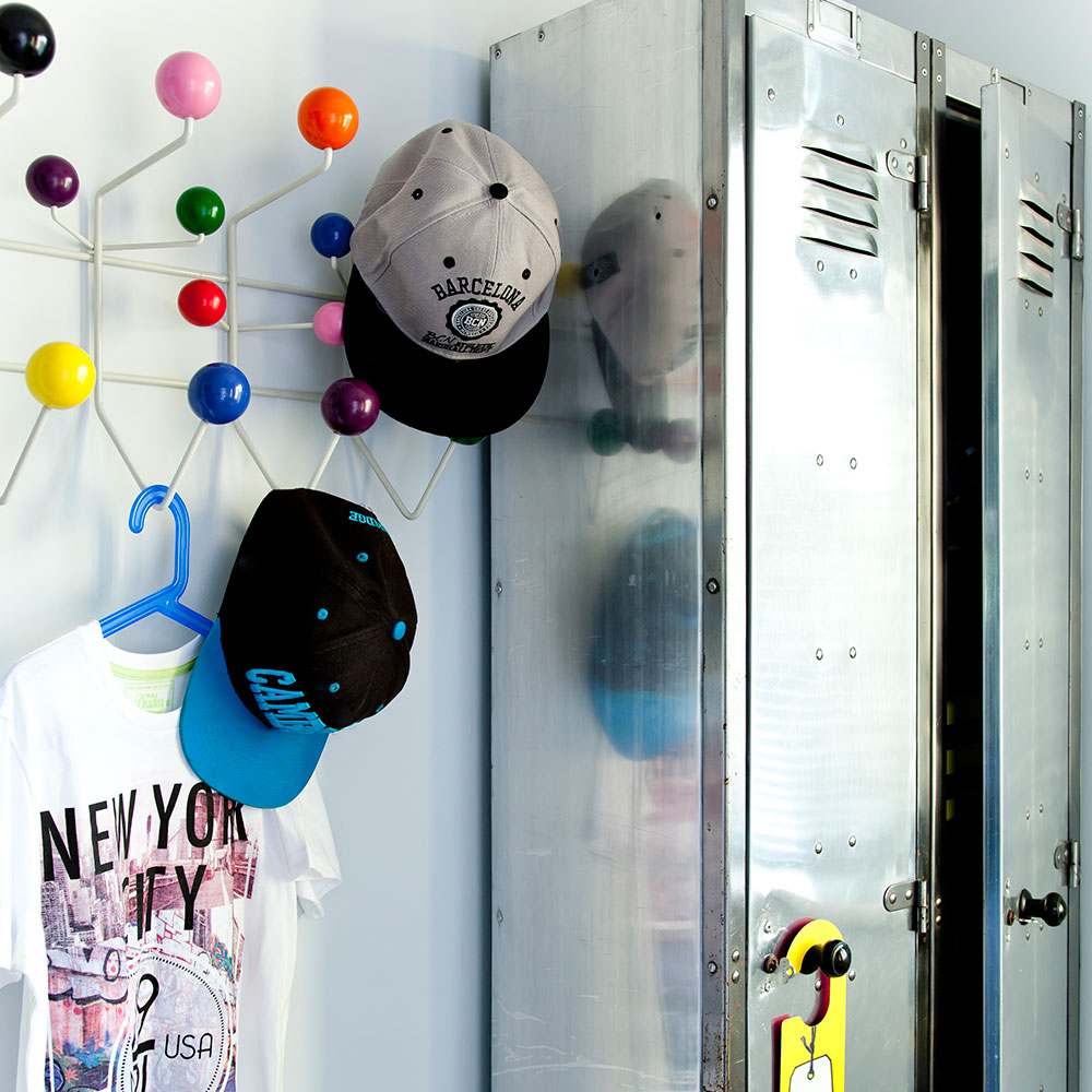
Dual-function pieces are the key here. The retro metal lockers look cool and create an industrial vibe, but they're more than just their appearance - they offer a practical space for storing all manner of sports gear, ideal in a boy's bedroom. In the same way, colourful hooks provide a place to keep hats and clothing tidy, while injecting a sense of fun and colour into the scheme. Win-win all round!
Similar lockers
Idyll Home
Similar hooks
Dunelm
4/8 Storage wall
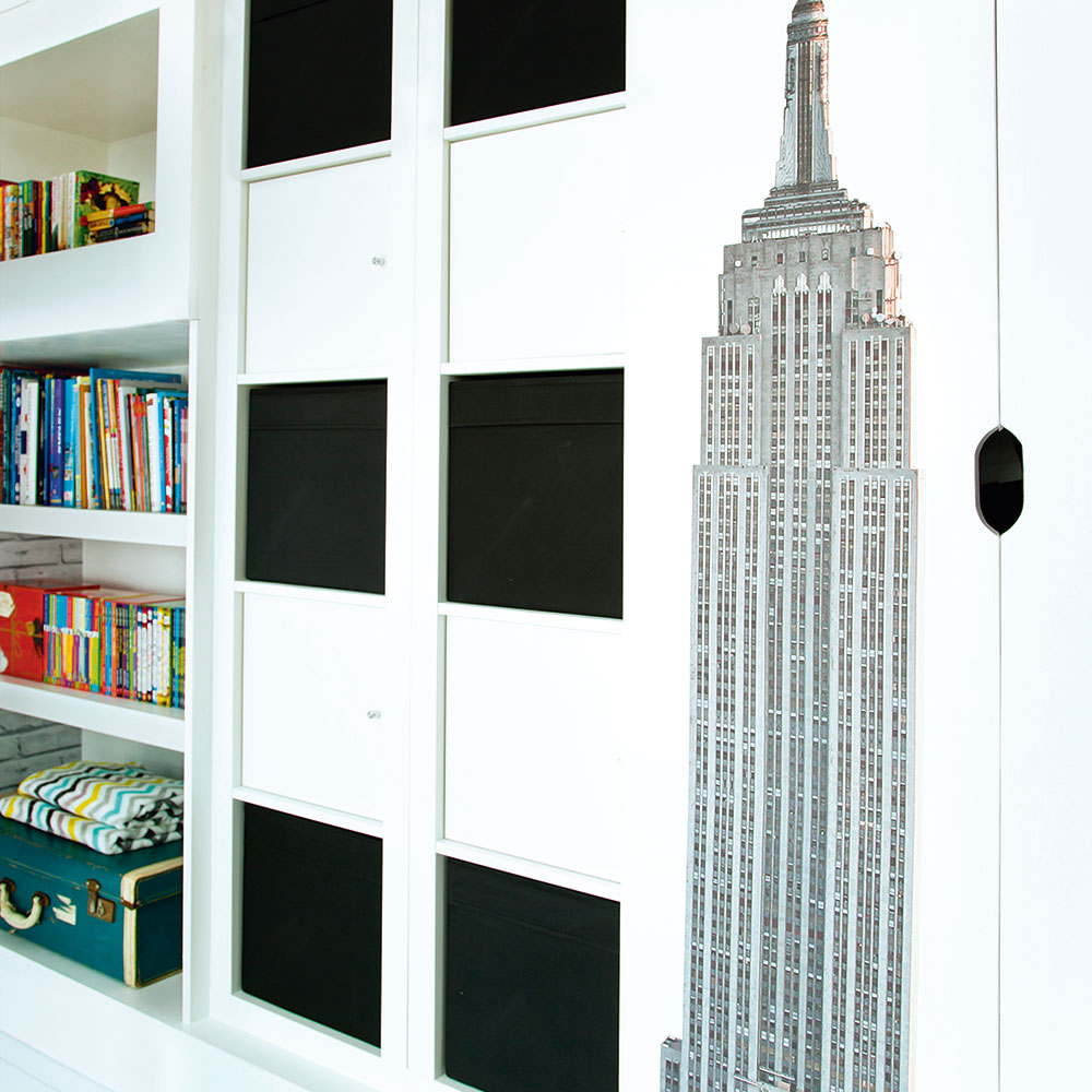
Storage is a vital part of any bedroom, especially if you want to help children keep their rooms tidy. Open shelving lets kids put their favourite books and toys on display, while closed units conveniently keep all the clutter hidden from view. A striking New York wall sticker adds a decorative touch to the practical side of the room, taking it from standard to standout.
Storage unit
Ikea
Similar wall sticker
Etsy
5/8 Feature wall
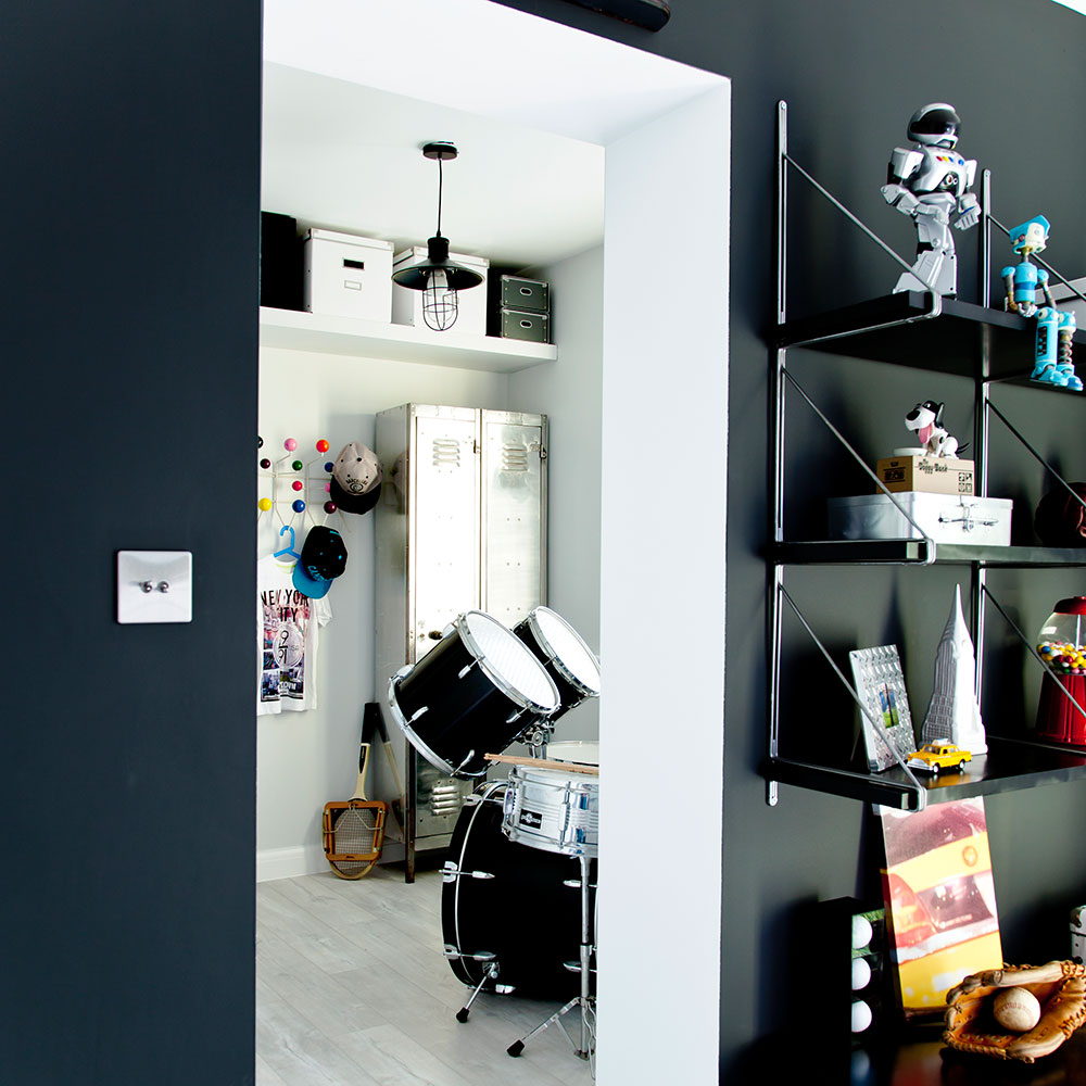
One wall in the 'sleeping quarters' has been painted in an impactful black shade. Teamed with the pale tones of the flooring, ceiling and brick wallpaper, the dark colour makes a powerful and punchy statement, rather than feeling overwhelming and sombre. The fact that there's an open doorway in the middle also helps to keep the overall look bright and light, too.
Wall paint
Little Greene
Pendant
eBay
6/8 No mess-desk

A metal strip has been mounted along the wall within easy reach of the desk. It's ideal for attaching cards and other bits and bobs with magnets, which saves damaging the wallpaper with adhesives and pins. The stainless-steel finish also blends in perfectly with the industrial metal furnishings used throughout the room. Other desk accessories, such as the clock, music box and pen pot, create a sense of fun that will help to make homework an appealing prospect.
Similar magnetic strip
Ikea
Similar clock
Tick Tock Clocks
7/8 Spray-painted shelving
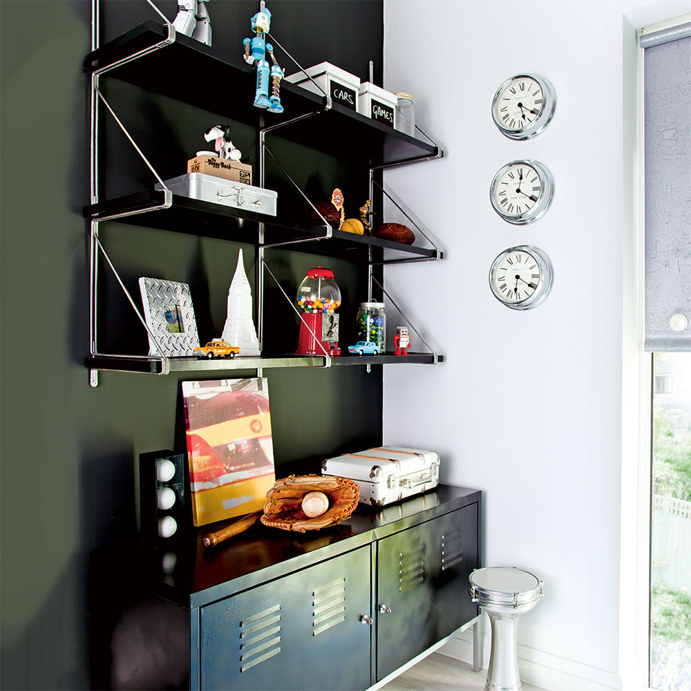
Spray paint has been used to give the shelving and storage unit a new look that blends in with the dark feature wall. It's especially good for metal surfaces such as these and is very quick and easy to use. Painting the furniture in the same colour as the wall helps to maintain the flow of the feature wall, enabling it to make a big impact in the otherwise neutral scheme.
Spray paint
Rust-Oleum
Clocks
Newgate Clocks
8/8 Roller blind
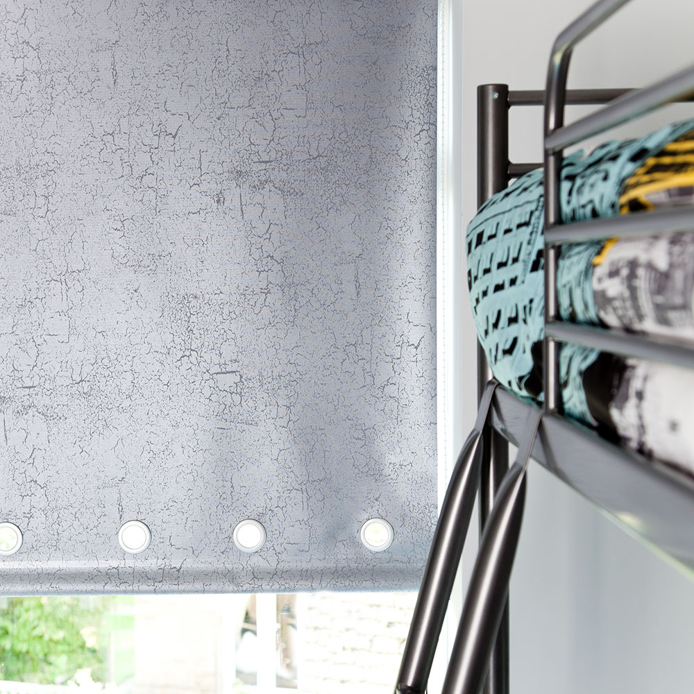
Roller blinds provide a sleek and unfussy look that means there's no need for curtains - they also let the daylight flood in through the full width of the window when pulled up out of the way. Choose one in a fabric to suit your scheme, like this painterly design, which blends in with all the grey and metallic finishes used throughout the space.
Blind
The Fabric Box
Bed
Ikea
-
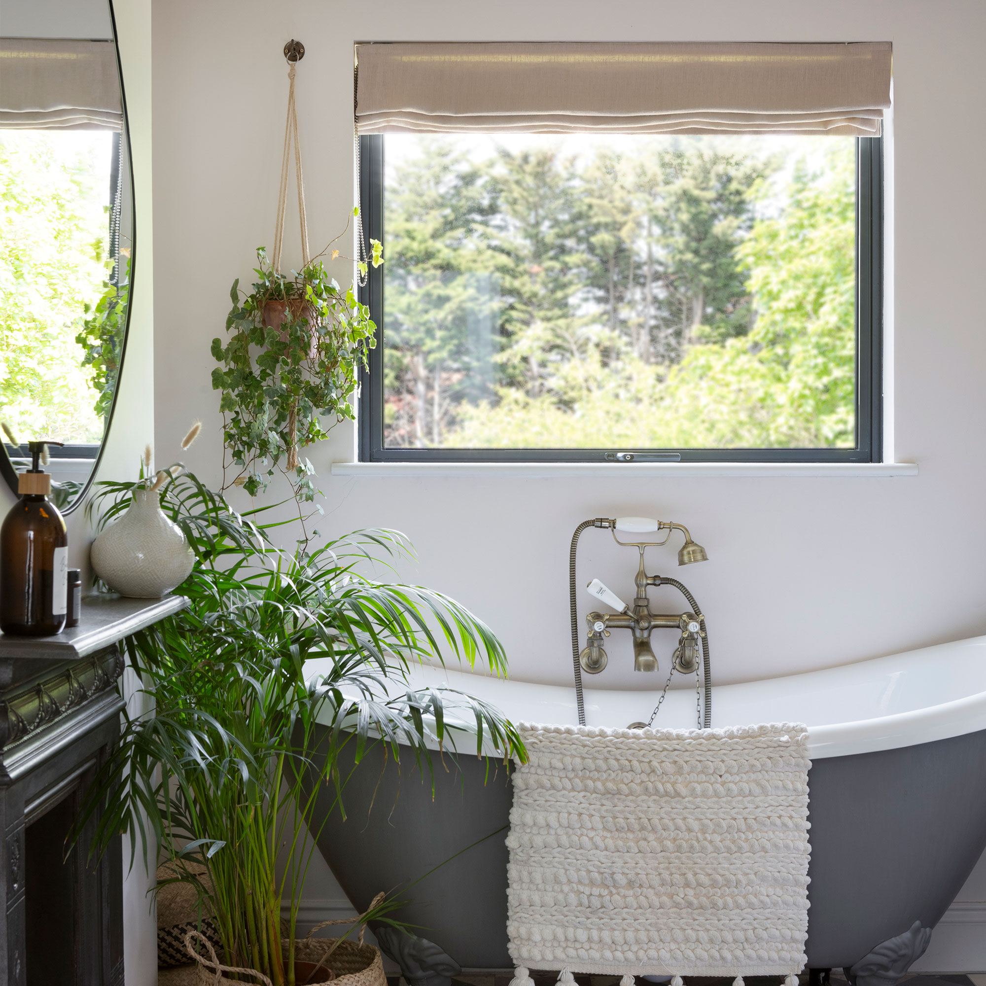 5 items I always add to a bathroom to make it look better instantly as a professional interior stylist
These are the things I add to every bathroom photo shoot I style
By Laurie Davidson
-
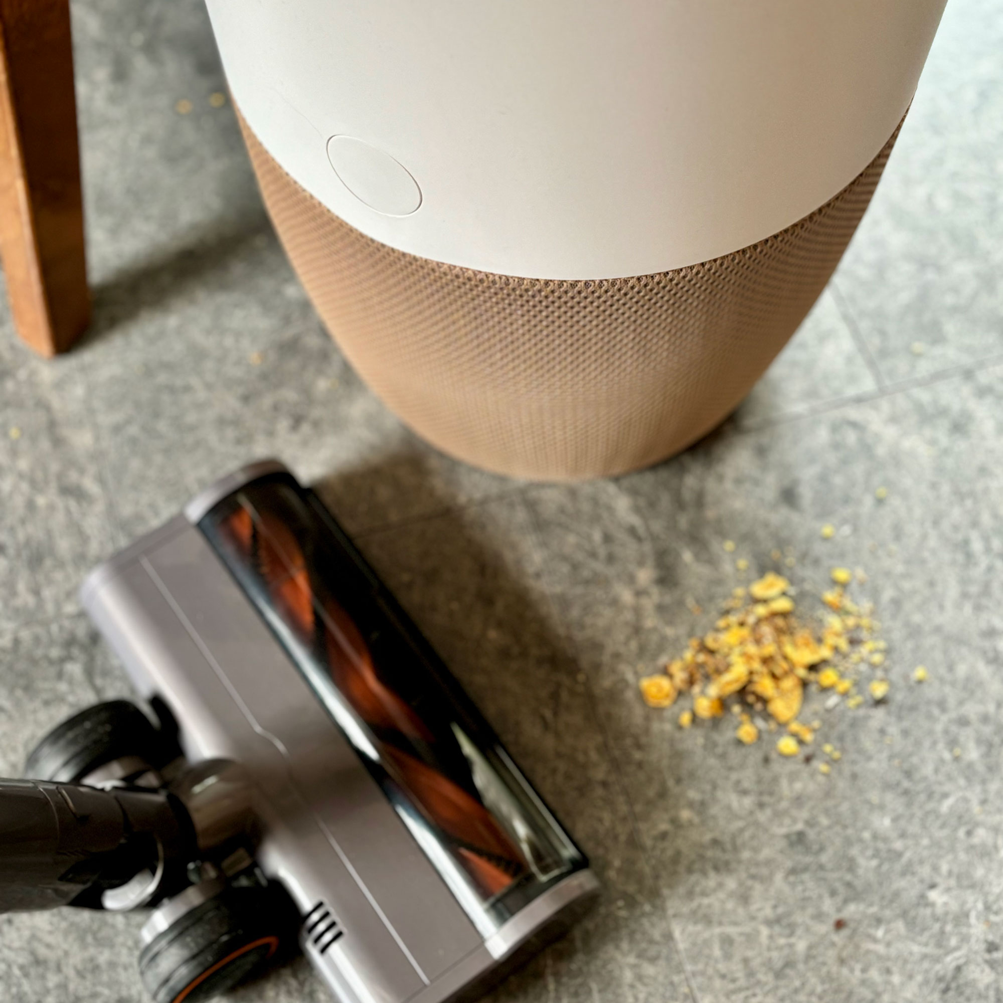 Should you have an air purifier on while you're cleaning? Air quality experts say this secret weapon will improve your cleaning routine
You'll need to follow 5 steps to make the most of it, though
By Rebecca Lawton
-
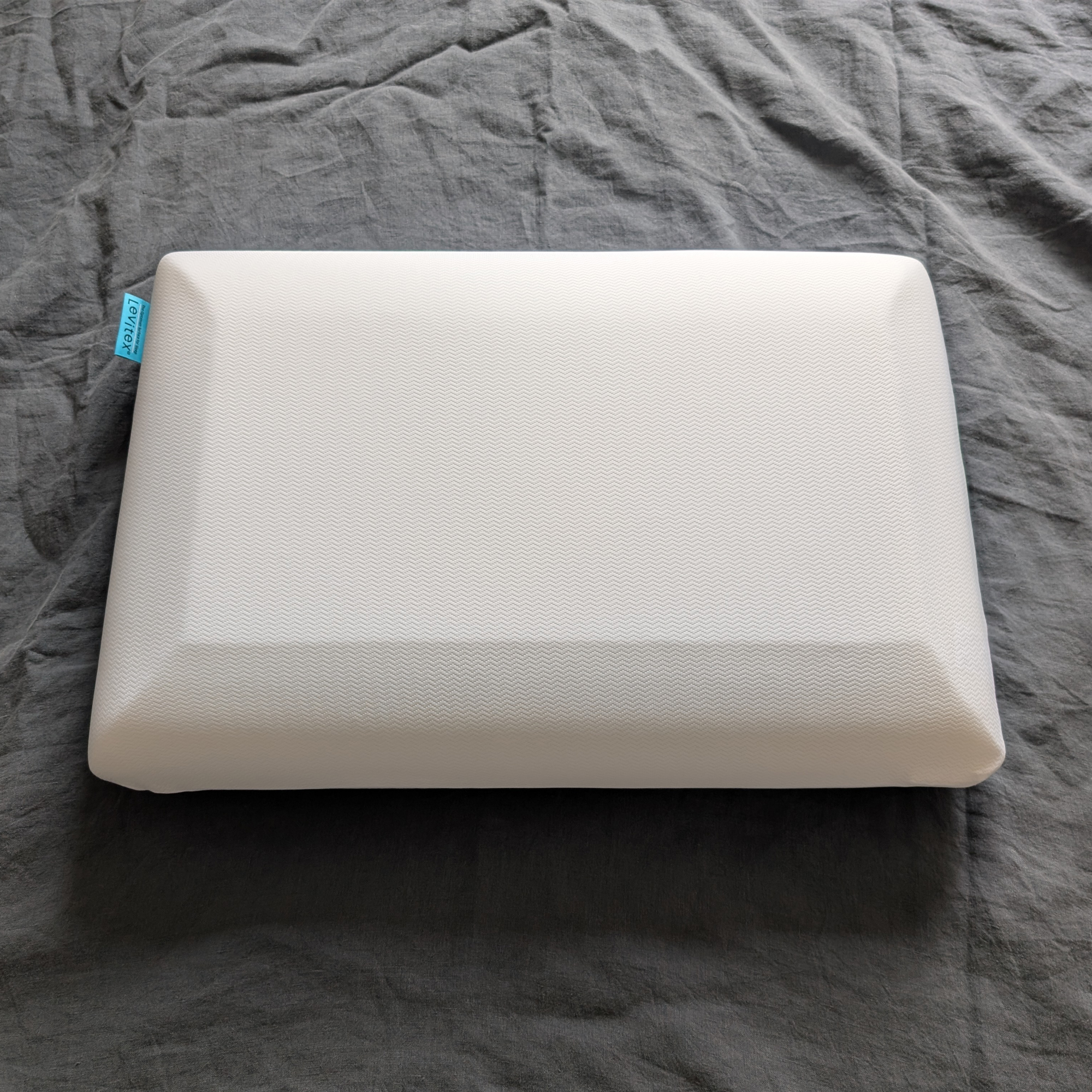 The Levitex Sleep Posture Pillow is so good, it just converted me from a front sleeper into a side sleeper – if you lie on your side at night, this is the pillow for you
I tried the Levitex Sleep Posture Pillow for a month, and I’m never looking back
By Amy Lockwood