'We wanted it to be light and bright' – why bold yellow was the perfect choice for this family-friendly kitchen
Bold yellow sets a cheerful mood in this family-friendly kitchen transformation
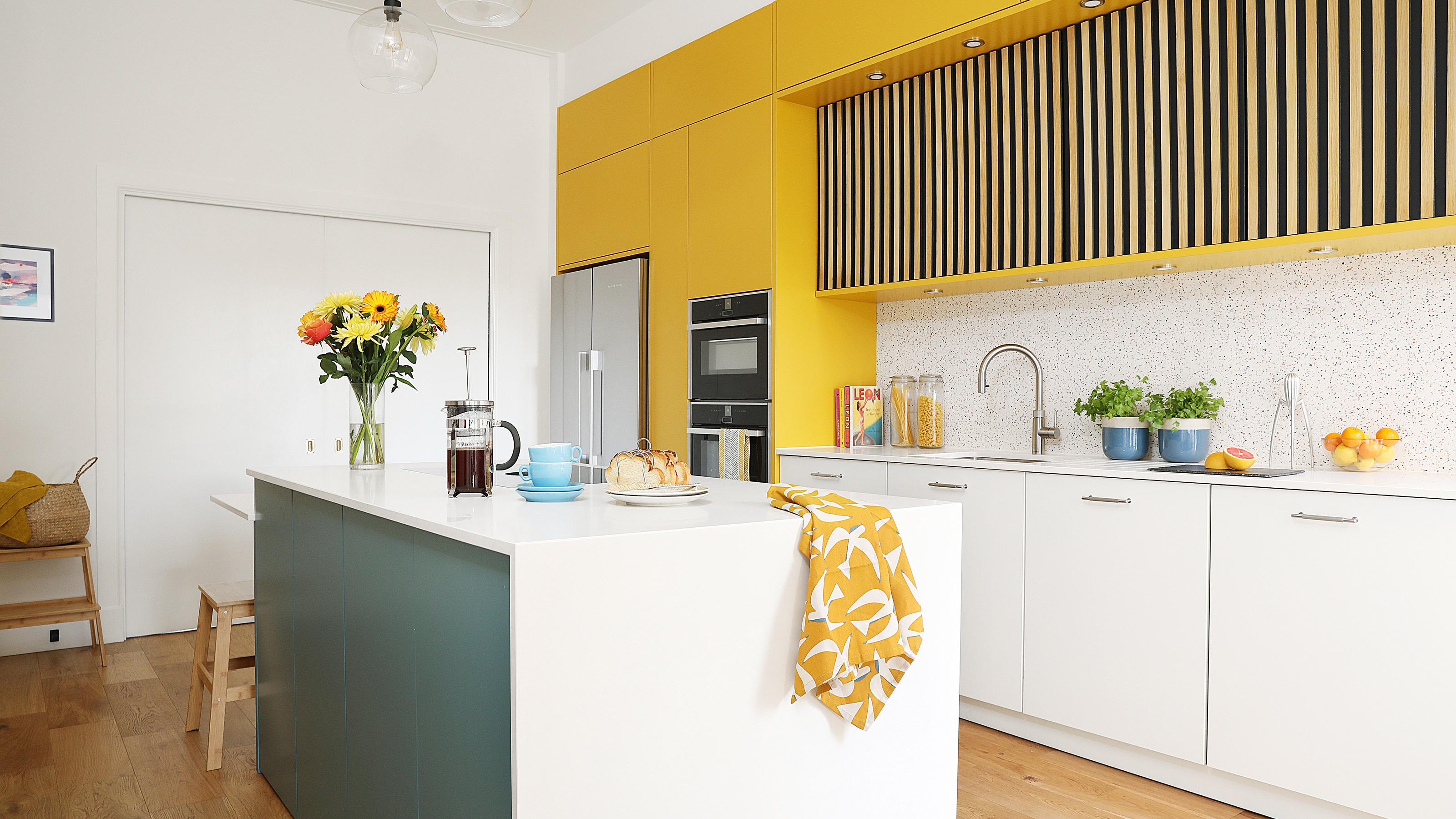
There's nothing better than a good before and after when it comes to a gorgeous kitchen project. It's a great to see the transformation, and glean ideas for our own future renovation wish lists.
Claire lives with her husband Nick and their sons, aged 11 and eight, plus Albie the cocker spaniel in a four-bedroom end-of-terrace Victorian house in Edinburgh. The couple embarked on an ambitious project which involved relocating the kitchen entirely.
Read on for all the juicy details about their kitchen makeover journey.
Before
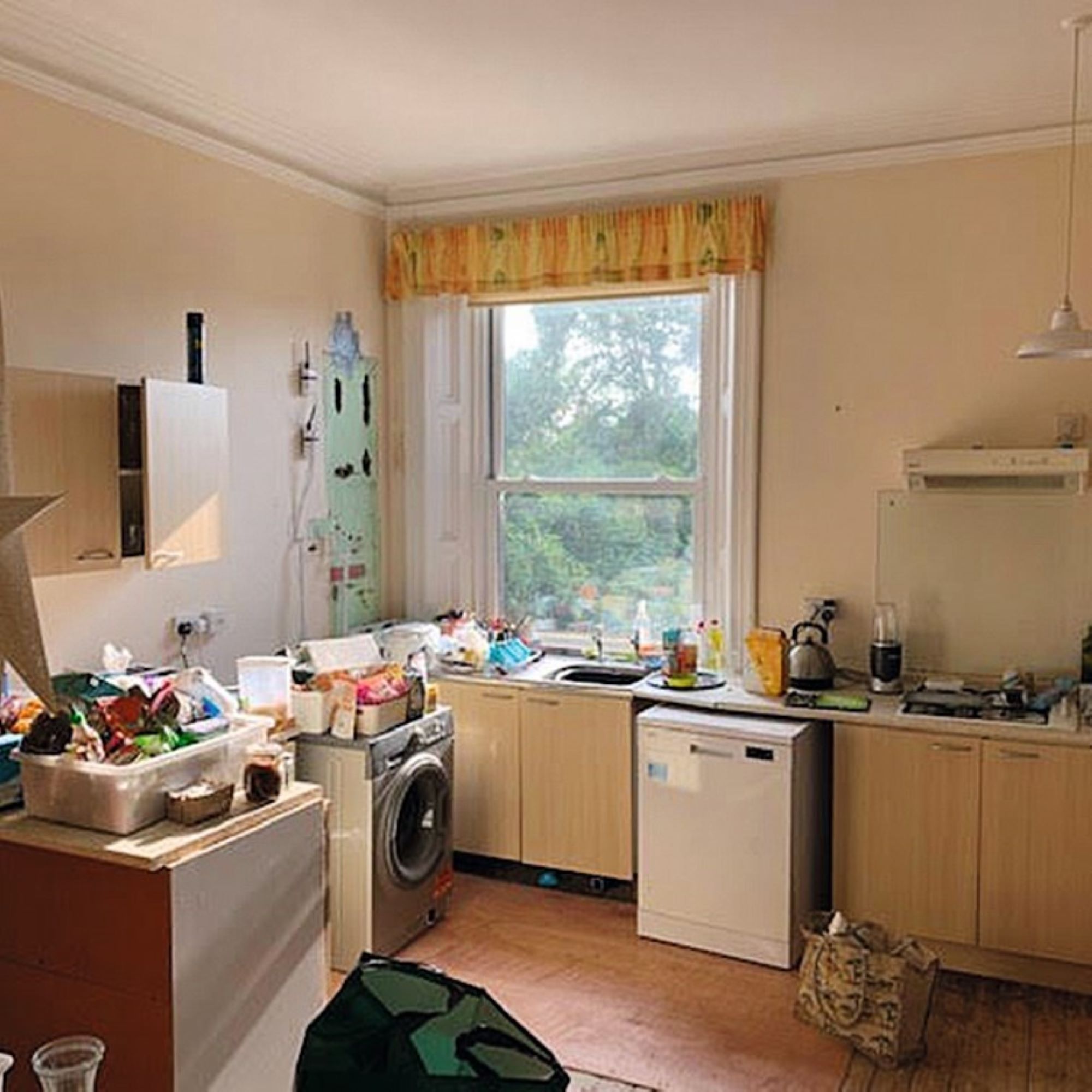
Claire's kitchen renovation project was kickstarted by the unusual original location of the room, which was actually on the first floor of the house, something which really didn't suit the family's lifestyle.
‘When we bought our house, the downstairs had been office space and the first floor was a flat – and it took us four years to start the project of moving the kitchen downstairs,' she explains. 'We love cooking and wanted a family space, so two rooms were knocked together to create a broken-plan area.' Broken plan is a great solution when it comes to zoning an open-plan layout.
After
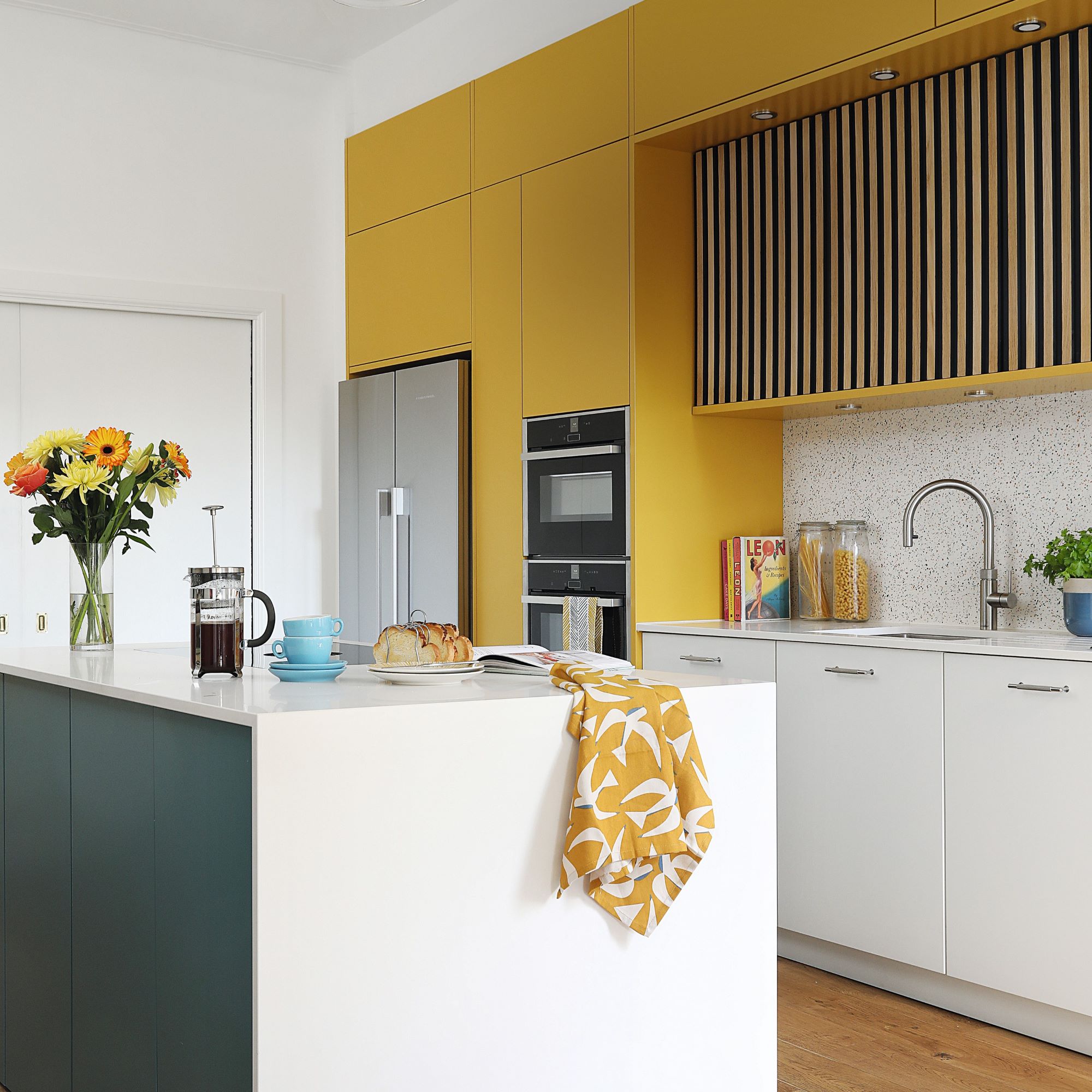
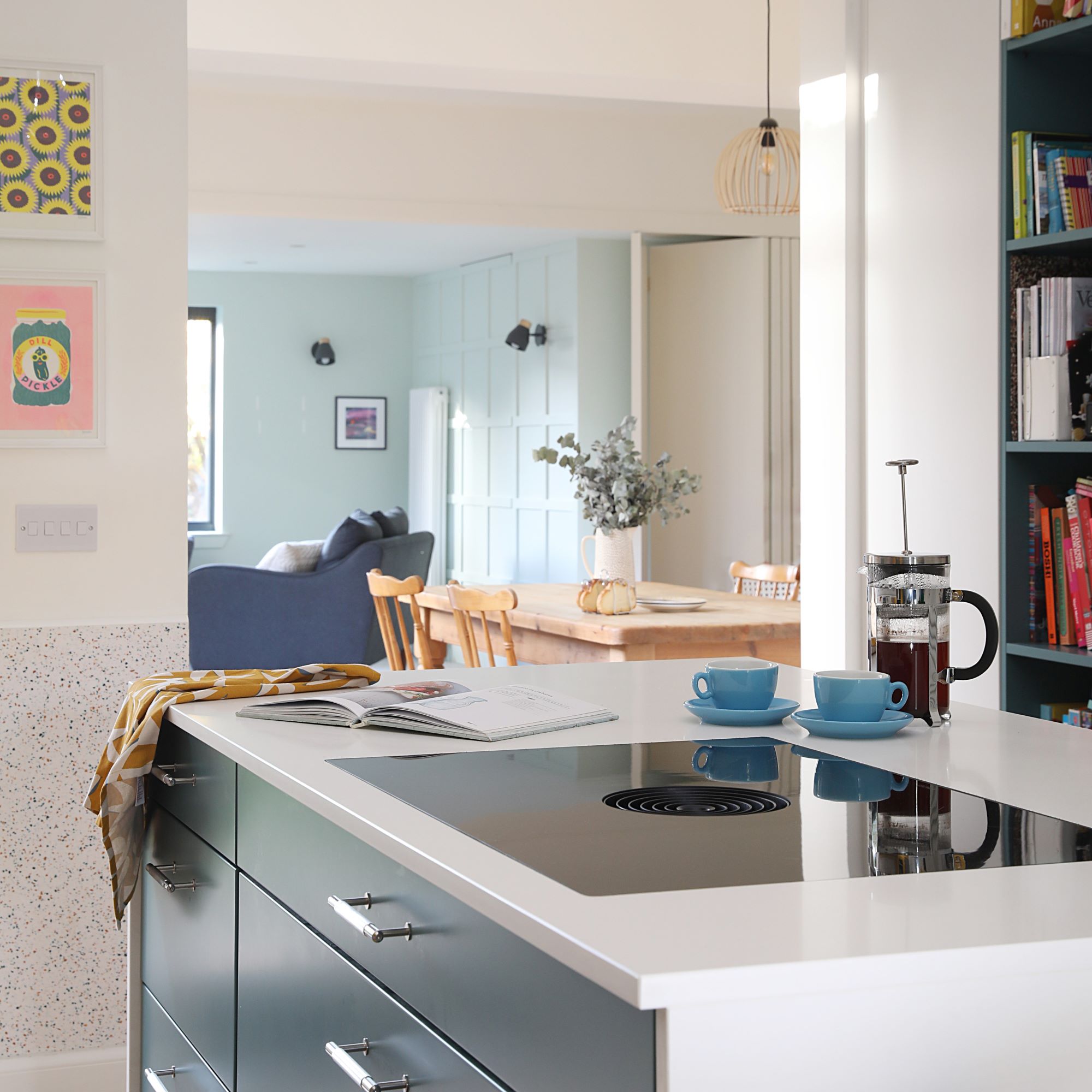
Now, the kitchen sits in the middle of the house, and has pocket doors to the living room and is open to the dining and family rooms at the rear.
'After looking at showrooms we realised an off-the-shelf kitchen wouldn’t work here,' Claire says. 'A friend recommended Kitchens by Nick McNally; designer Louise Berry was great at mixing aesthetics with functionality and even liaised with our builder Charlie of Edinburgh Construction. We pretty much live in the kitchen now. It’s guiding the décor of the rest of the house, so we’re glad we went with yellow.’
Get the Ideal Home Newsletter
Sign up to our newsletter for style and decor inspiration, house makeovers, project advice and more.
Yellow kitchen ideas are a bold choice, but Claire chose the colour based on longevity. ‘We considered green and pale pink first, but worried our love for that colour combo would be fleeting. Yellow felt more like us. By combining it with teal and white, it’s not so completely in your face and the wood cladding has a complementary golden tone.’
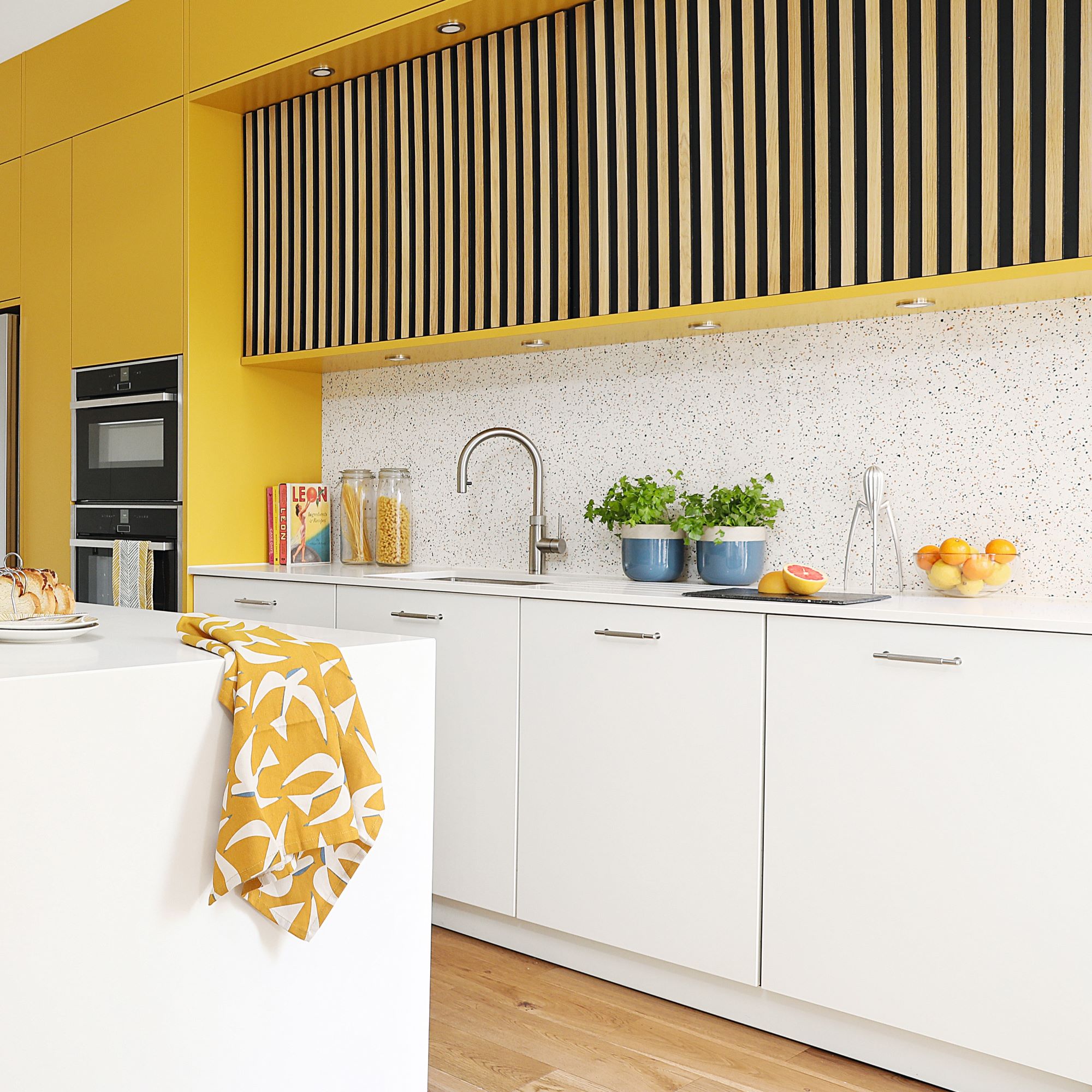
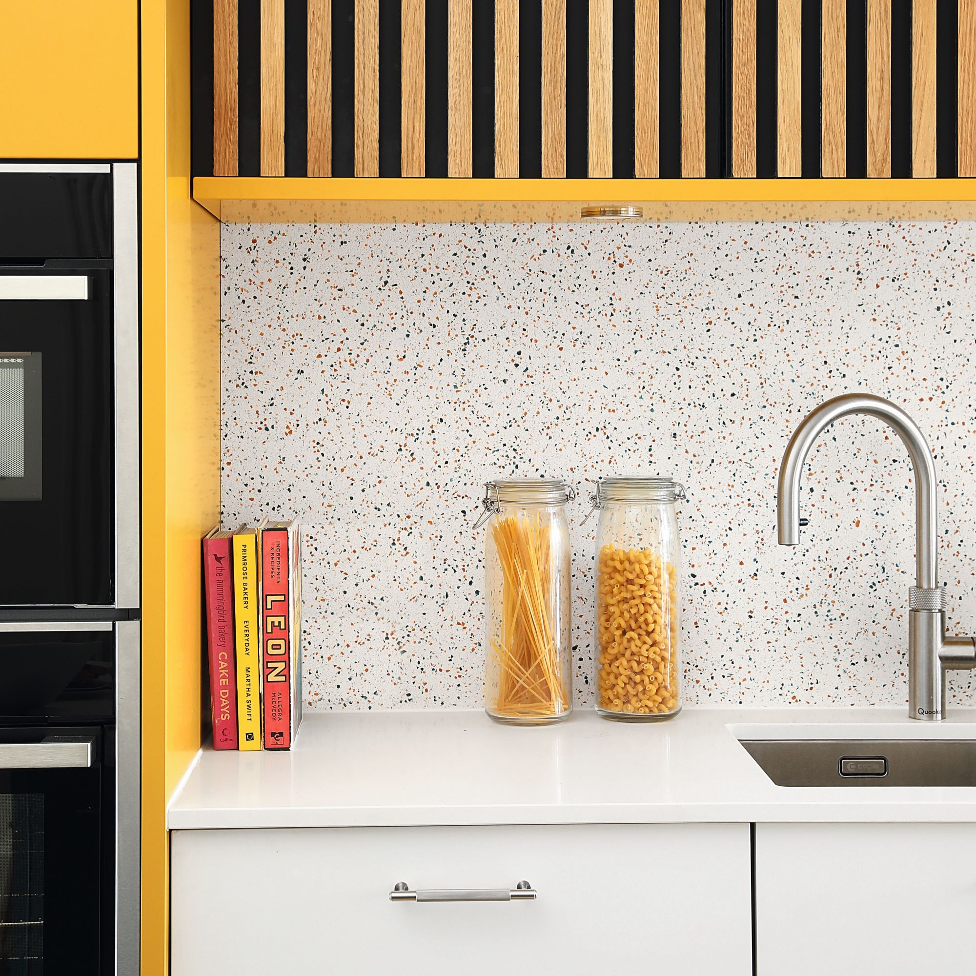
If you love the idea of turning waste material into something beautiful, the eco-friendly and seamless kitchen surface Claire chose could be for you. It's a solid surface material for worktops and splashbacks is made from recycled plastic granulated into small chips and cast in resin. It can be fabricated to a matt or polished finish, and is food safe, waterproof, durable and easy to maintain.
‘Because we’d chosen a terrazzo-effect splashback made from recycled plastic with teal and yellow flecks, we went for a white worktop that wouldn’t detract from it or the other eye-catching elements in the space,' Claire says. Durat worktops and splashbacks are made from 30-50% recycled post-industrial plastic set in resin, and are available in almost 300 colours, including RAL classic colours and custom shades.
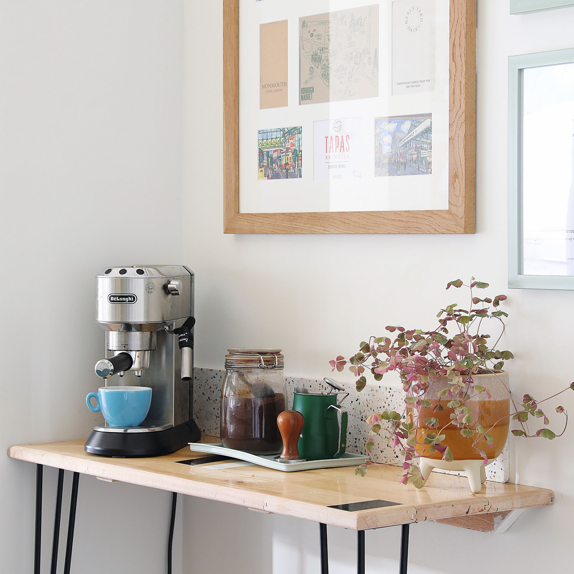
Making the kitchen functional but aesthetic was at the forefront of renovation plans, like with this ideal little coffee bar idea. ‘We made a little coffee station opposite the island using leftover reclaimed flooring from the hall. Above it is a framed picture featuring memories of our ten years living in London.’
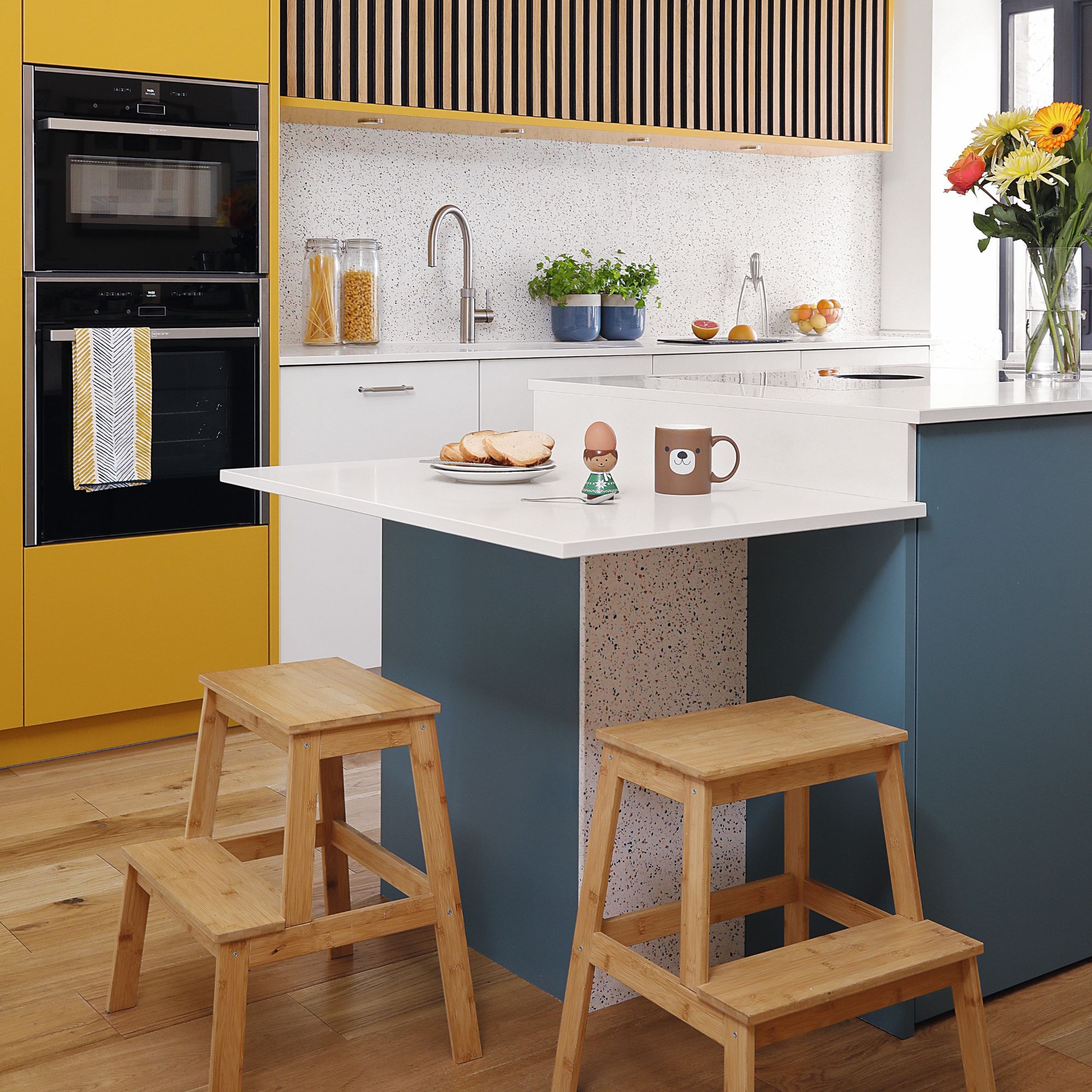
When it came to kitchen island ideas, Claire and Nick stayed true to their own wants and wishes. ‘We’re not fans of bar stools – they’re uncomfortable and too high – so our designer Louise suggested a 20cm drop to a table section on the island. It’s great for the kids having breakfast.’
This genius twist on a classic kitchen island works well for all the family. When making all of their design and styling choices, Claire didn't want to restrict the kitchen to fit a certain look or trend, and instead based all the decisions according to the family's lifestyle and tastes.‘We didn’t go down one particular route, such as a traditional, industrial or modern style. If we liked something we put it in, such as the wood slat cladding.’
And are they happy with how it turned out? Absolutely. 'We wanted the kitchen to be light and bright - a fun, relaxing space the whole family could enjoy - and that’s exactly what we got!'
-
 How to protect seedlings from birds – experts say there's a kind and clever way to stop them pecking
Yes, you can protect seedlings from birds without harming your feathered friends...
By Kayleigh Dray
-
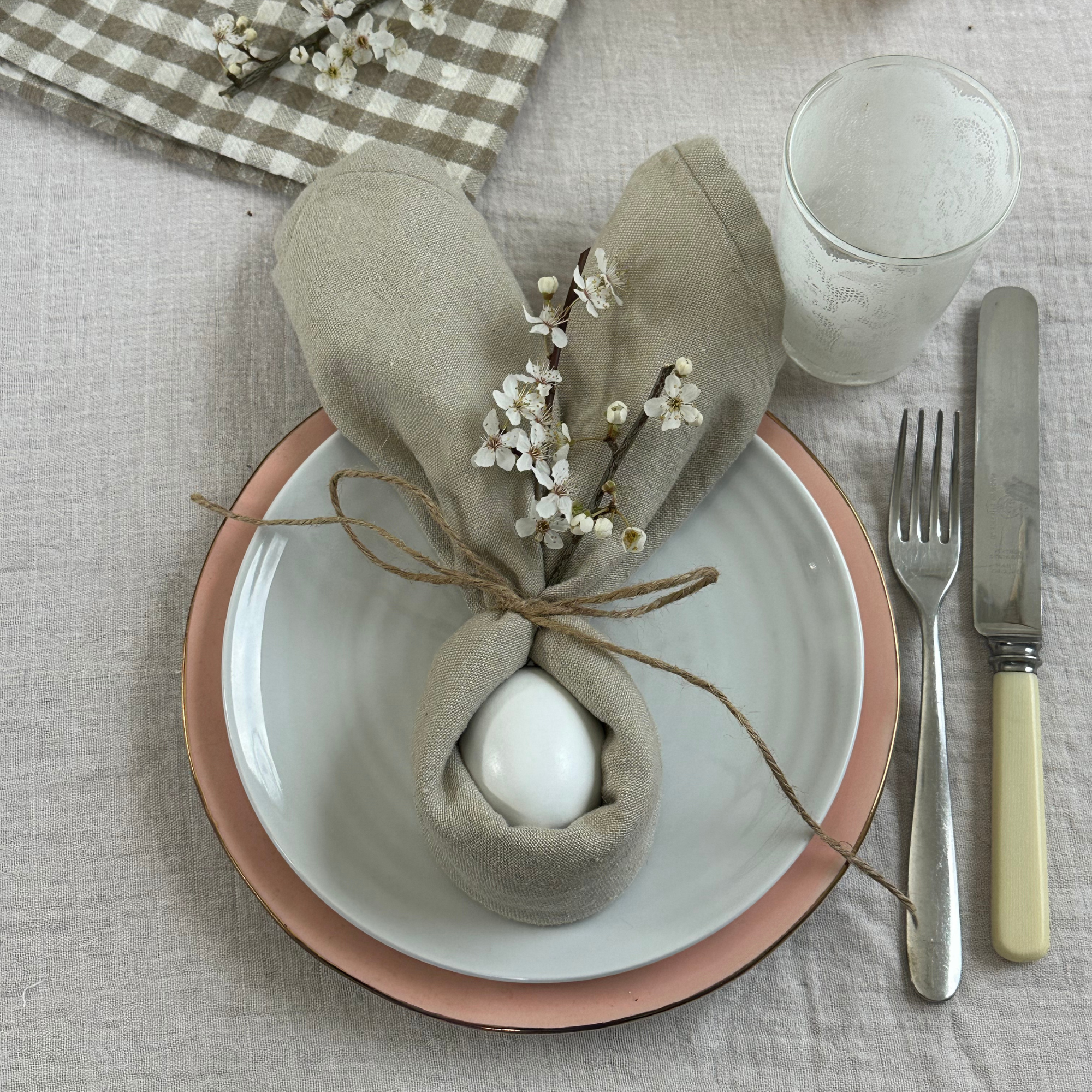 We tried the viral napkin bunny ears hack – it only takes five minutes and will take your Easter table to the next level
This Easter craft is not only beautiful, but really easy to do
By Kezia Reynolds
-
 Ooni's new stand mixer is already a sell-out success
Here's why the Ooni Halo Pro Spiral mixer is a big deal for at-home breadmakers
By Molly Cleary