A budget-savvy upcycling trick transformed this dated kitchen into a luxury space
With quality wood units hidden under layers of black vinyl, these homeowners saved money by giving them a fresh new look
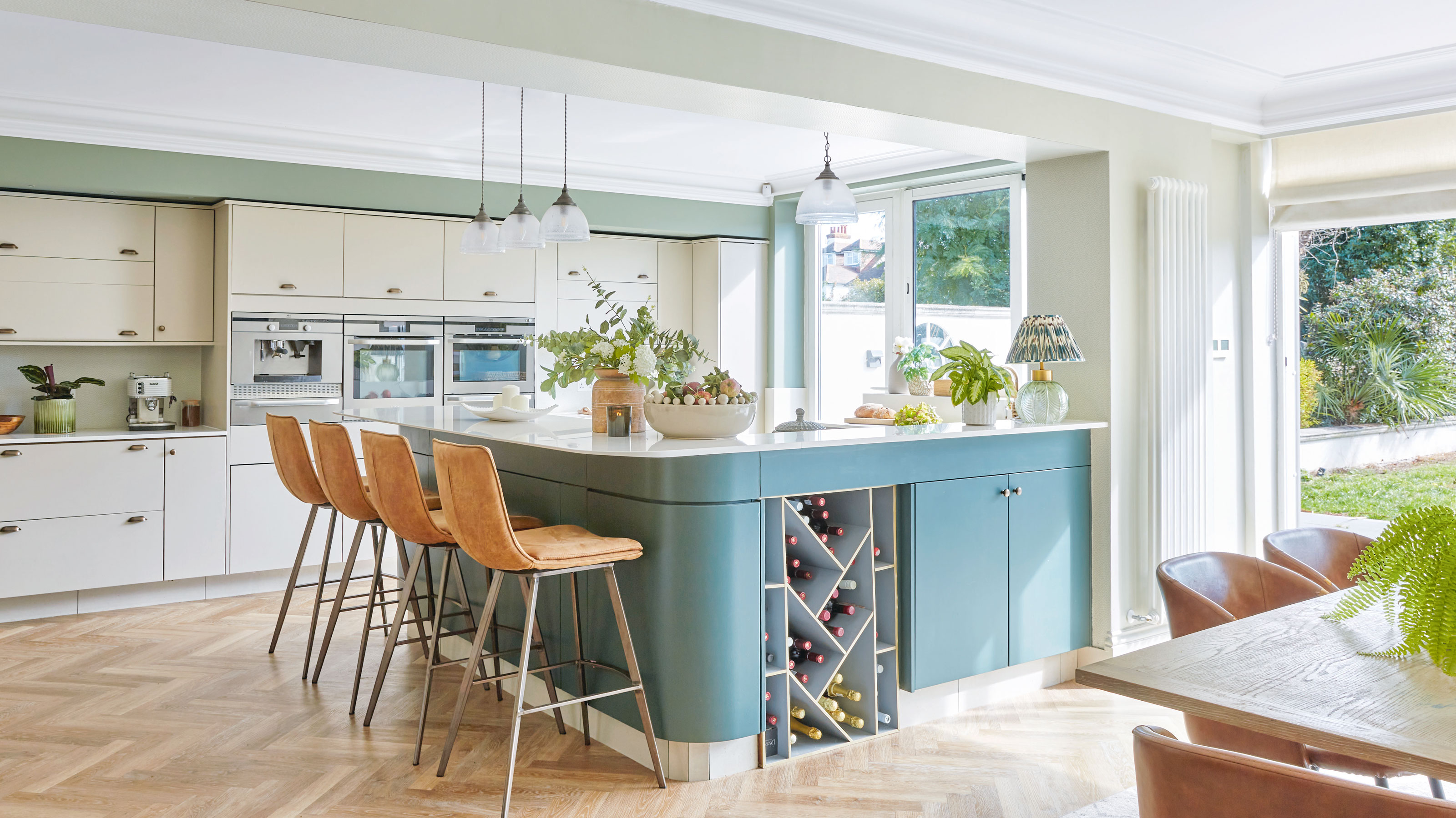
There is always a temptation to rip everything out and start again when faced with a kitchen that feels a million miles away from your dream space. But with a little imagination (and a lot of elbow grease), it’s possible to work with what you’ve got and create a seemingly ‘new’ kitchen after a few clever tweaks. That’s exactly what these homeowners did after relocating to Southend from London.
With their second child on the way, the couple bought a former bungalow which had been extended upwards and offered lots of space. Although they planned to live with the 11-year-old black gloss kitchen for a while, they soon realised that changing the dark and uninviting space was a top priority.
Before

‘Although the layout of the open plan kitchen idea was great, the décor wasn’t to our taste,' the homeowner recalls. 'Everything was quite blingy, shiny and over the top. The kitchen was a big mass of black gloss, while walnut panels in the dining room felt dated and oppressive.
'We started troubleshooting about how we could change it; considering new doors, getting a company to spray it or starting from scratch. Luckily, my husband noticed a small crack in the gloss and started pulling away at it.
'We soon realised there was a wooden carcass beneath the vinyl, which was in really good condition. As I was in full nesting mode and wanted to bring our new baby to a home that felt like ours, we decided to strip it and repaint it.’
After
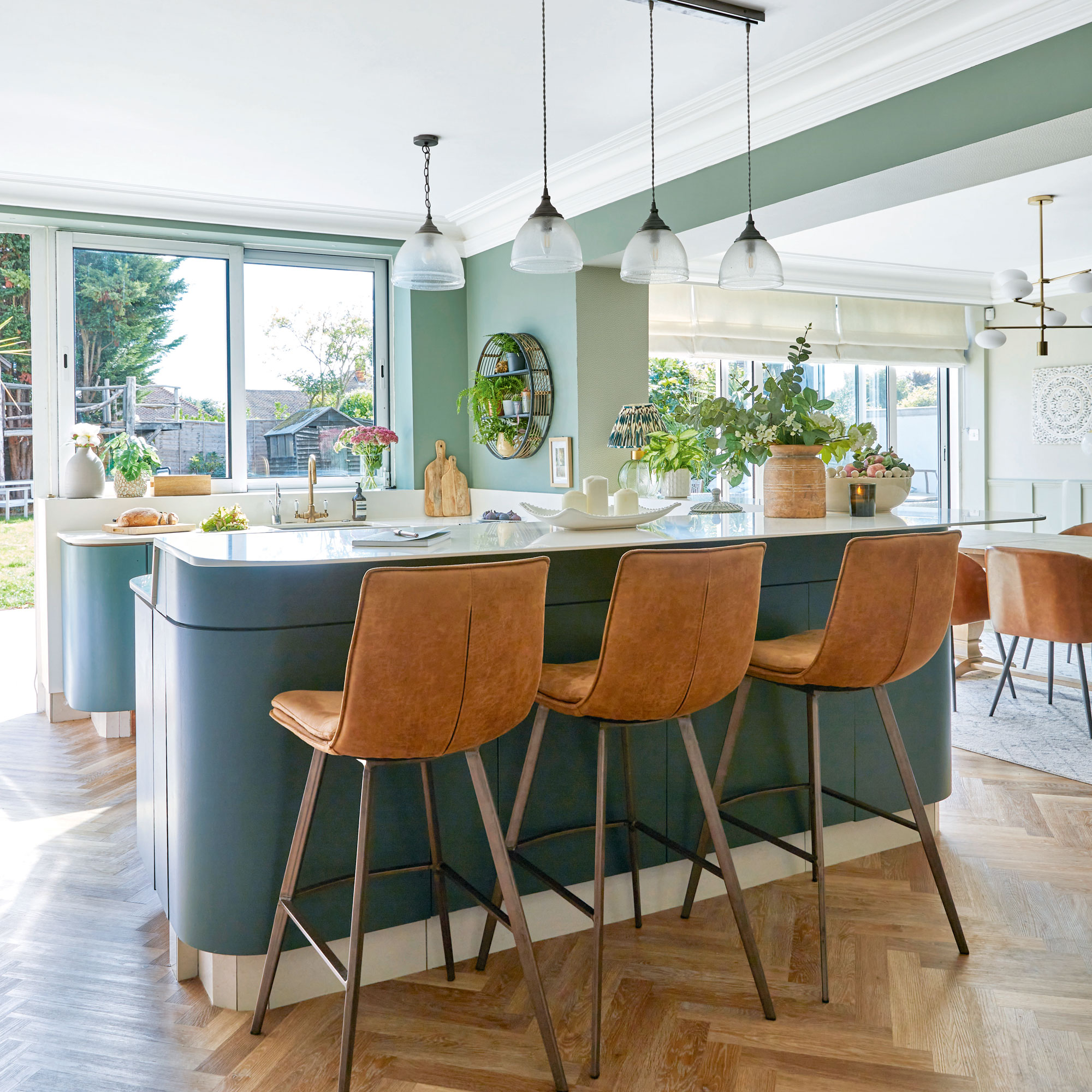
‘Before we could uncover the kitchen units, our first job was changing the kitchen flooring. There was a huge expanse of large white porcelain tiles with many that were broken and dangerous. We fitted Karndean parquet wood flooring over the existing tiles, so the underfloor heating wasn’t damaged. The fitters had to rub back the tiles so the leveller and screed would stick to it and there would be no movement, which meant it took five days to fit.
‘It cost quite a lot of money, but is the best decision we’ve made in the house. It’s so hardwearing, and it’s waterproof so doesn’t bow like wood can. Because I went for a warm tone, it’s made such a difference, and the herringbone pattern adds interest and breaks up the space.’
Picking the colour palette
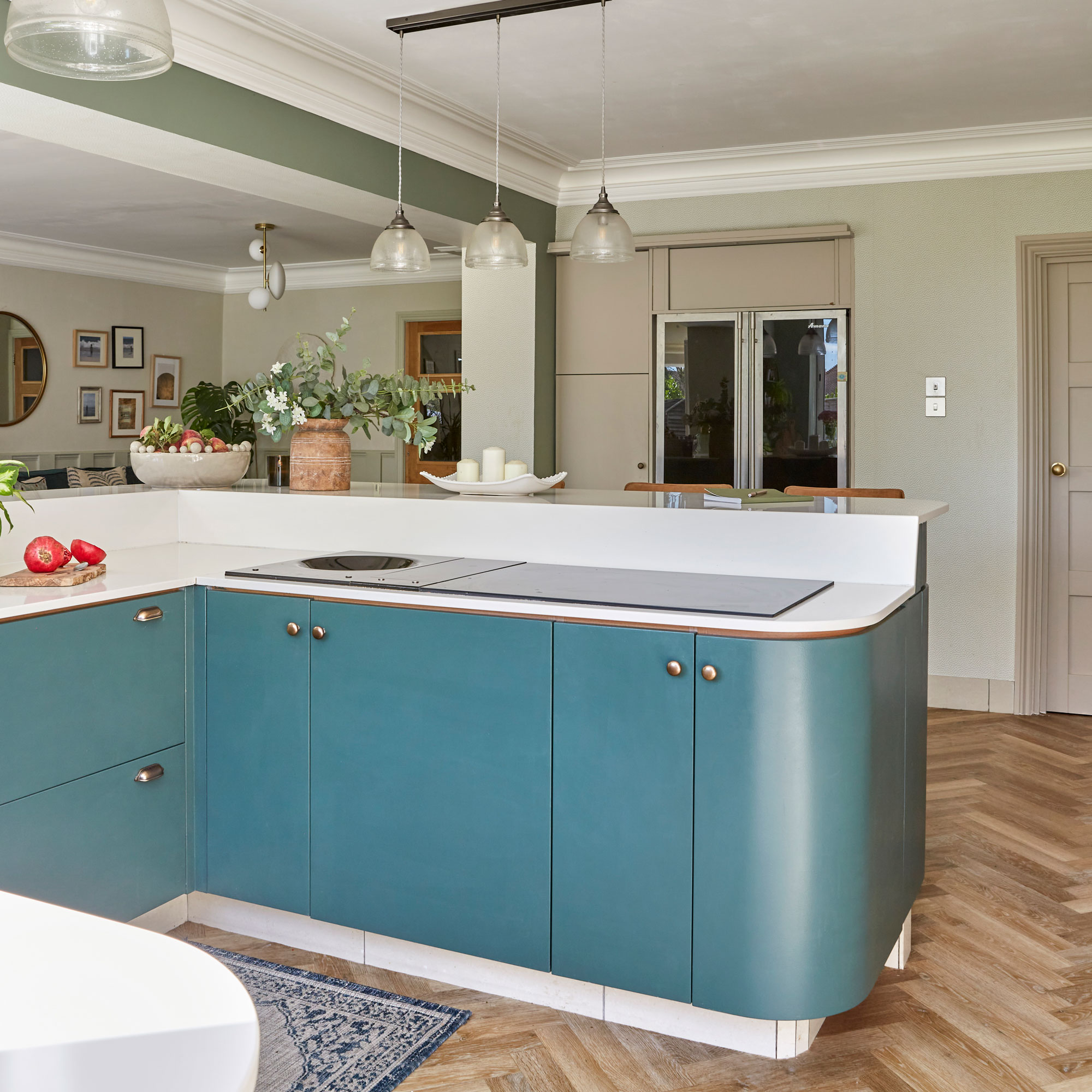
‘Most evenings and weekends were spent with a heat gun, melting the glue and scraping the vinyl covering off the units. It wasn’t easy with a newborn baby, and my husband cut his hands, but it was worth it. I work as a colour consultant for Little Greene, so I knew what colours would work. I wanted a kitchen colour scheme that wouldn’t go out of style quickly, and put up several sample cards to see how they looked throughout the day and in different weather.
'In the end, I chose a muted dark green for the island and complementary neutral shade with a pinkish browny grey undertone for the other units. As the kitchen faces east, it needs that warmth – anything too grey or blue just looks flat and cold.’
Get the Ideal Home Newsletter
Sign up to our newsletter for style and decor inspiration, house makeovers, project advice and more.
Hardware choices
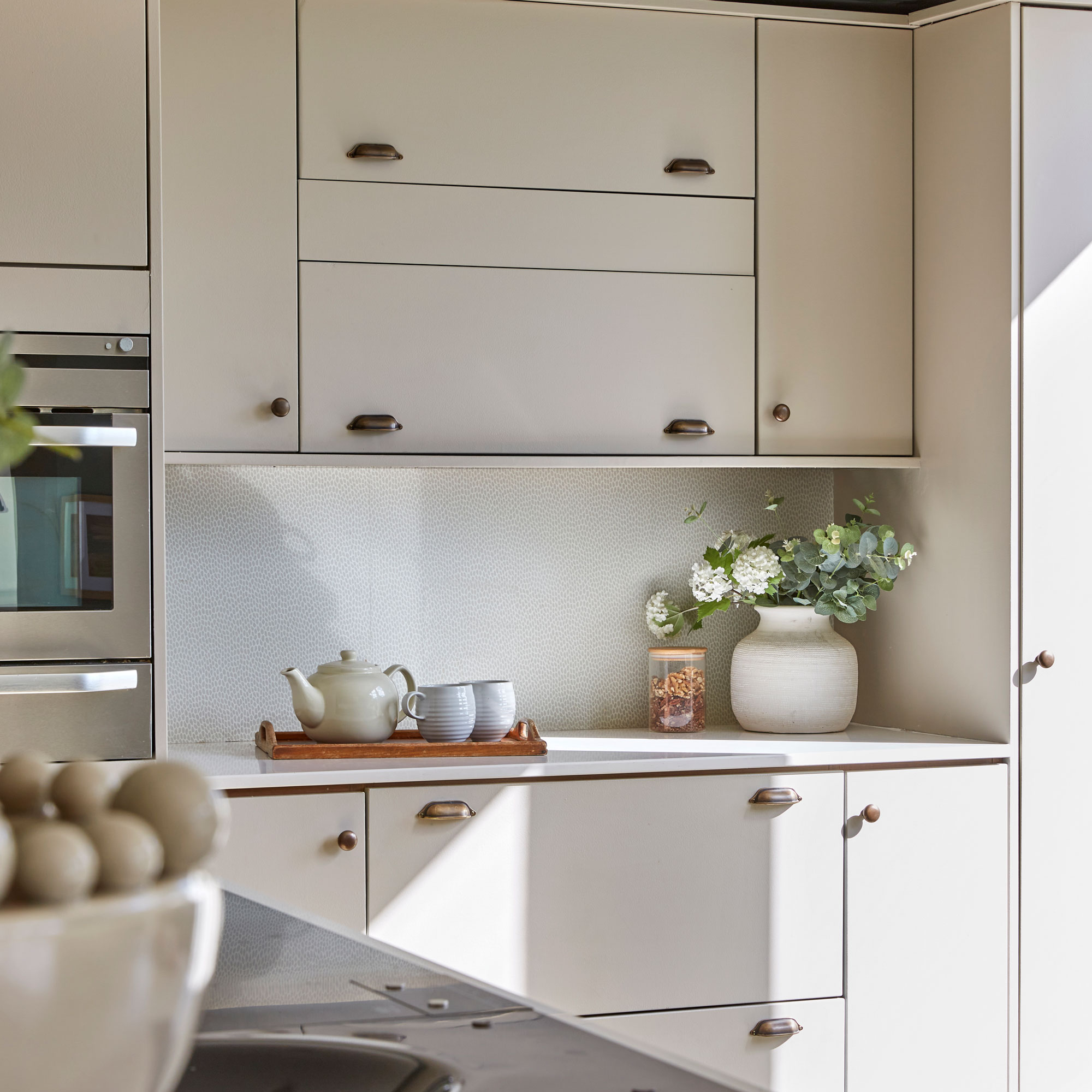
‘I’m all about the finer details, so it was really important to get it right when it came to how to choose kitchen cabinet handles. The previous ones were very long, linear chrome designs, which made the kitchen feel quite square. We saved up and bought some really nice, weighty antique brass cup handles and knobs. The curves elevated it and made it look like the timeless kitchen I really wanted.
'You can feel the quality. I also bought a new antique brass tap and changed the utility door handle to brass. Although I would’ve liked a butler sink, we just kept the old one as it would’ve been a big job due to the new plumbing required.’
Finishing touches
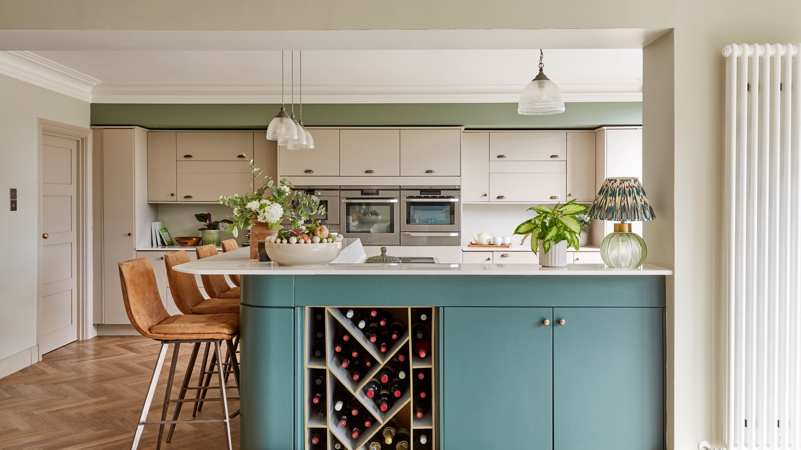
‘Although we kept the spotlights over the kitchen units, the main lighting reminded me of a spaceship, so we bought new pendants to make a feature of the peninsula kitchen. To add natural texture, I chose leather bar stools, and put up light green seedpod kitchen wallpaper on either side of the ovens and under the arch to break it up.
‘If I’d been starting from scratch I would’ve gone for an island rather than a peninsula as it’s quite a long walk from the table to the sink. I would also have picked warm veined granite worktops. But all that would’ve been more expensive. After six months of doing the work in stages, it looks like a completely new kitchen. When people visit, they can’t believe the difference.’
-
 Should your front door colour match your hallway? Interior experts reveal 3 reasons why it should (and 3 reasons it shouldn't)
Are you team matching or contrasting?
By Ellis Cochrane
-
 This £200 limited-time discount makes this Dyson vacuum cheaper than I’ve ever seen it - run don’t walk to Argos for this bargain
It's the most affordable Dyson on the market right now
By Lauren Bradbury
-
 Martin and Shirlie Kemp’s pastel flower beds has given their Victorian renovation a romantic look - how you can get the look
Their pastel garden is the cottage garden inspo you've been looking for
By Kezia Reynolds