'I planned for everything to be hidden away' - this small kitchen has been transformed
Knocking down a wall and creating a new open-plan layout was a recipe for success with this stunning kitchen makeover
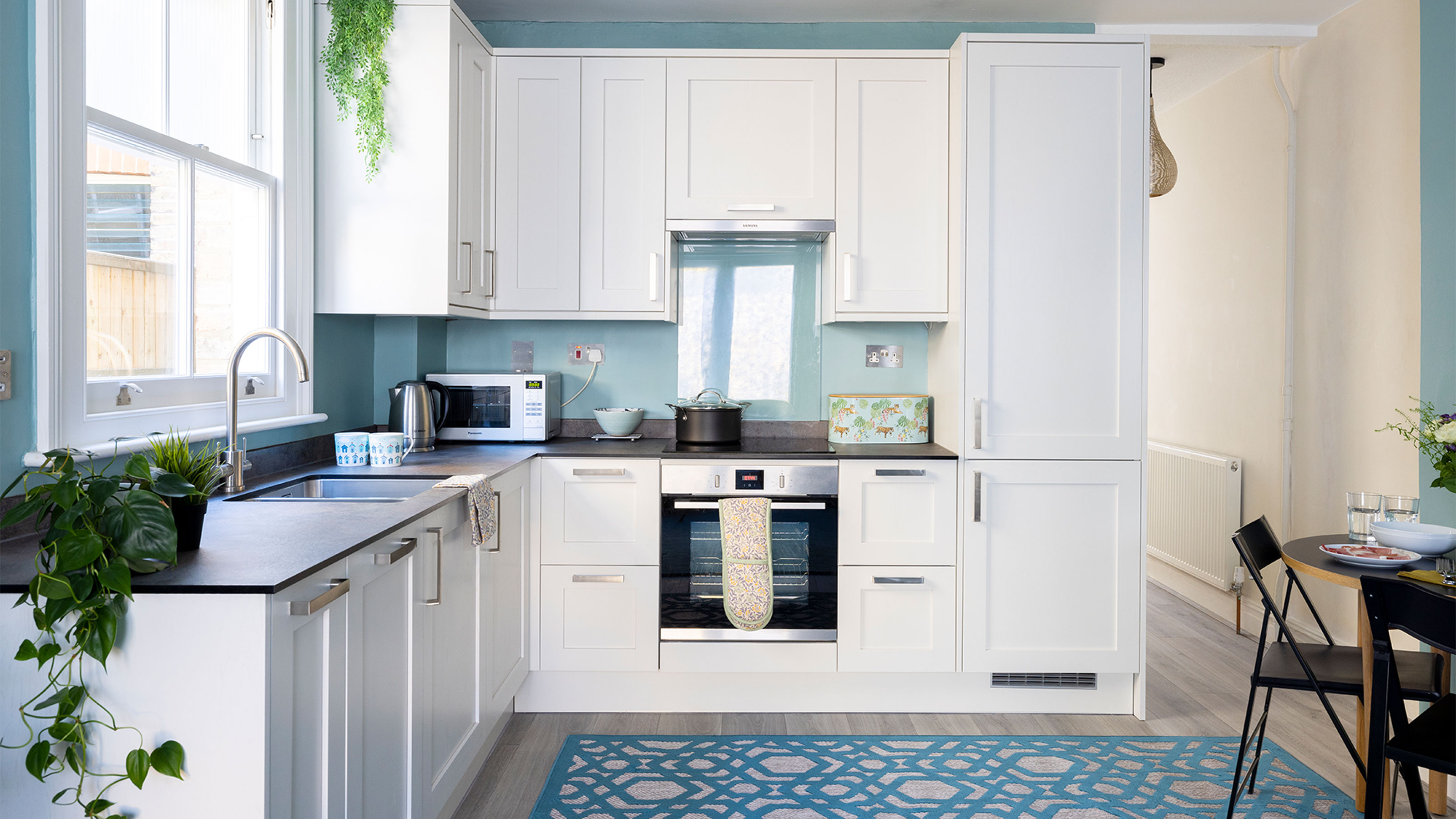

After downsizing from a large house to a two-bedroom flat, it wasn’t a lack of space that was the problem for this homeowner, but rather the lack of light. With a kitchen that was positioned in the middle of the flat with only one small window, the space felt very dark and gloomy before.
‘The major issue with the flat was that the kitchen was plonked right in the middle next to the living room which made both rooms feel cramped,' says the home owner. 'I knew that the only way of solving the problem was to take the dividing wall down in-between.’
The kitchen before
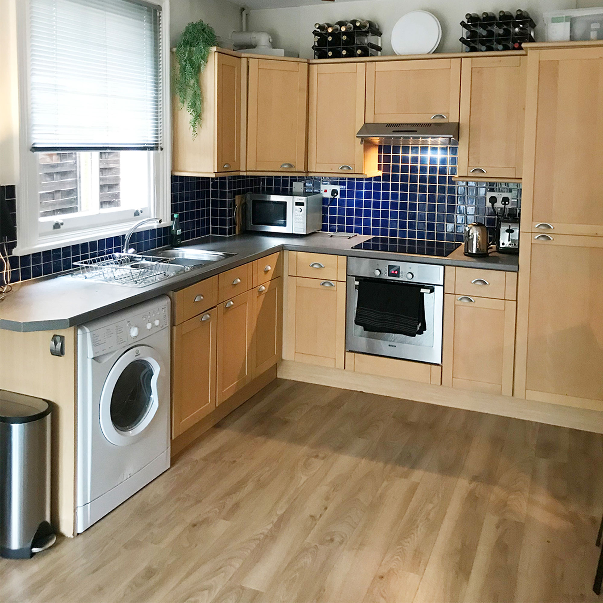
The small kitchen with it’s single window felt dark with a lack of light coming in, which wasn’t helped by the dated kitchen units, navy tiles and black worktops.
On the other side of the kitchen wall was a small living room with doors and windows that lead out to the garden, so the home owner’s plan of knocking down the wall and creating one large open-plan kitchen-diner and living space made perfect sense.
The kitchen now
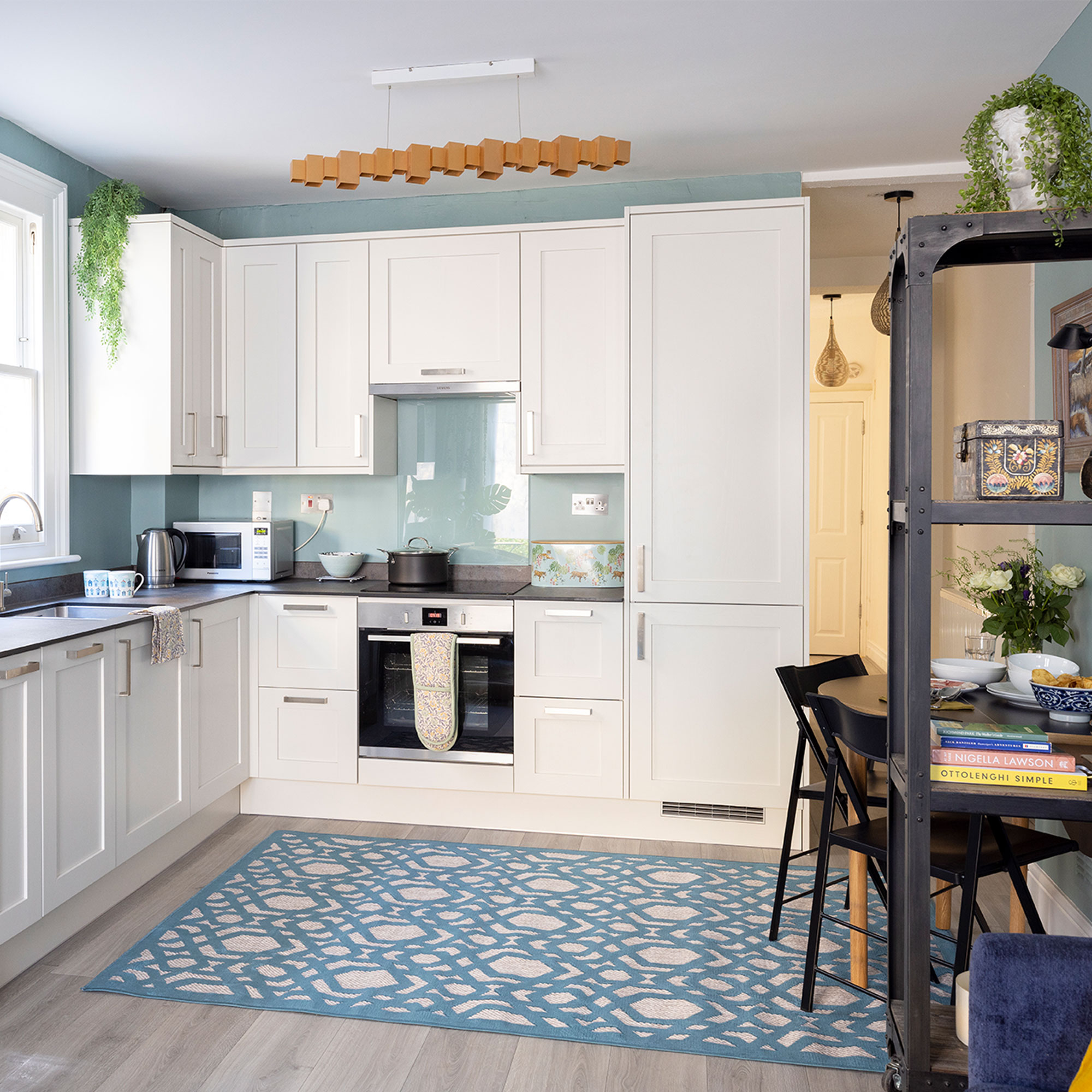
With the dividing wall between kitchen and living room removed, the space is now transformed, with a new open-plan kitchen layout that includes a dining area and living space beyond that. Light now floods all the way through from both sides and the sleek white kitchen only adds to the sense of spaciousness.
‘Knocking two spaces into one was a major project, but it’s given me the light, bright kitchen that I craved,’ says the home owner.
‘Light-coloured units, which were timeless and budget conscious were on my wish list from the start and I found this modern white kitchen, which was just right. I’ve had granite worktops in the past, but was worried they’d be too expensive, so I was thrilled to discover how much laminate worktops had come on – these were almost a quarter of the price!’
Get the Ideal Home Newsletter
Sign up to our newsletter for style and decor inspiration, house makeovers, project advice and more.
Get the look: Chilcomb units in porcelain with brushed stainless steel effect chunky D handles, £3,700; Caldeira Compact laminate worktop, £750; and toughened glass splashback, £130; all Howdens
Scandi-style flooring
The kitchen flooring in the original kitchen was a pine-look laminate with an orange tinge which had definitely seen better days.
‘Because I was going to make the space open-plan, it really had to be one floor all the way through,’ add the home owner. ‘So I chose a Scandi-style distressed wood-effect laminate with a grey wash to it. It’s a good idea for a heavy-duty area like a kitchen and it looks sensational.’
Get the look: Signature Brushed Oak flooring in Grey, £31.49sq m, Quick-Step
Co-ordinated colour scheme
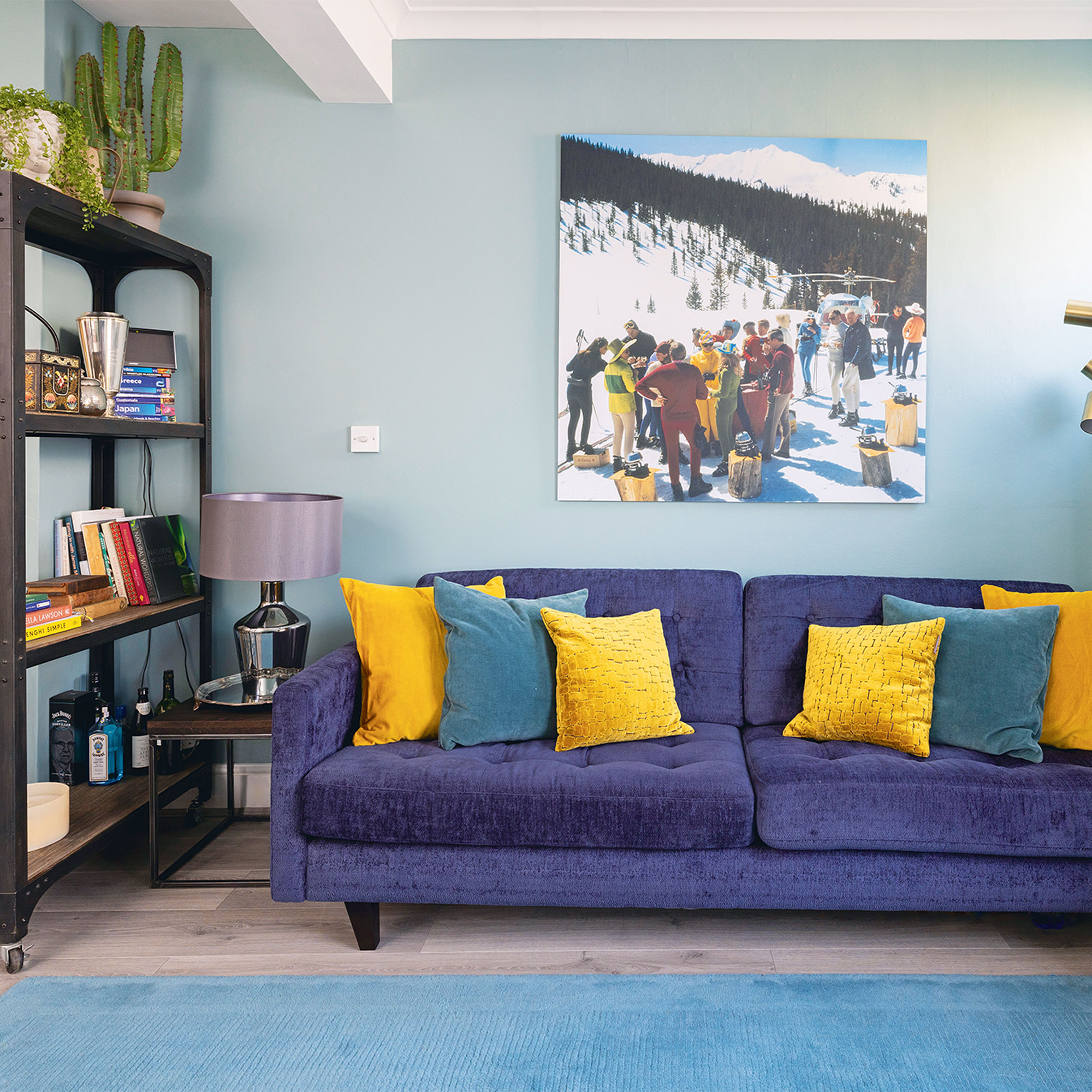
The colour scheme was already decided to some extent, because of the blue velvet living room sofa ideas and bright blue rug that the home owner had bought with her from her previous property.
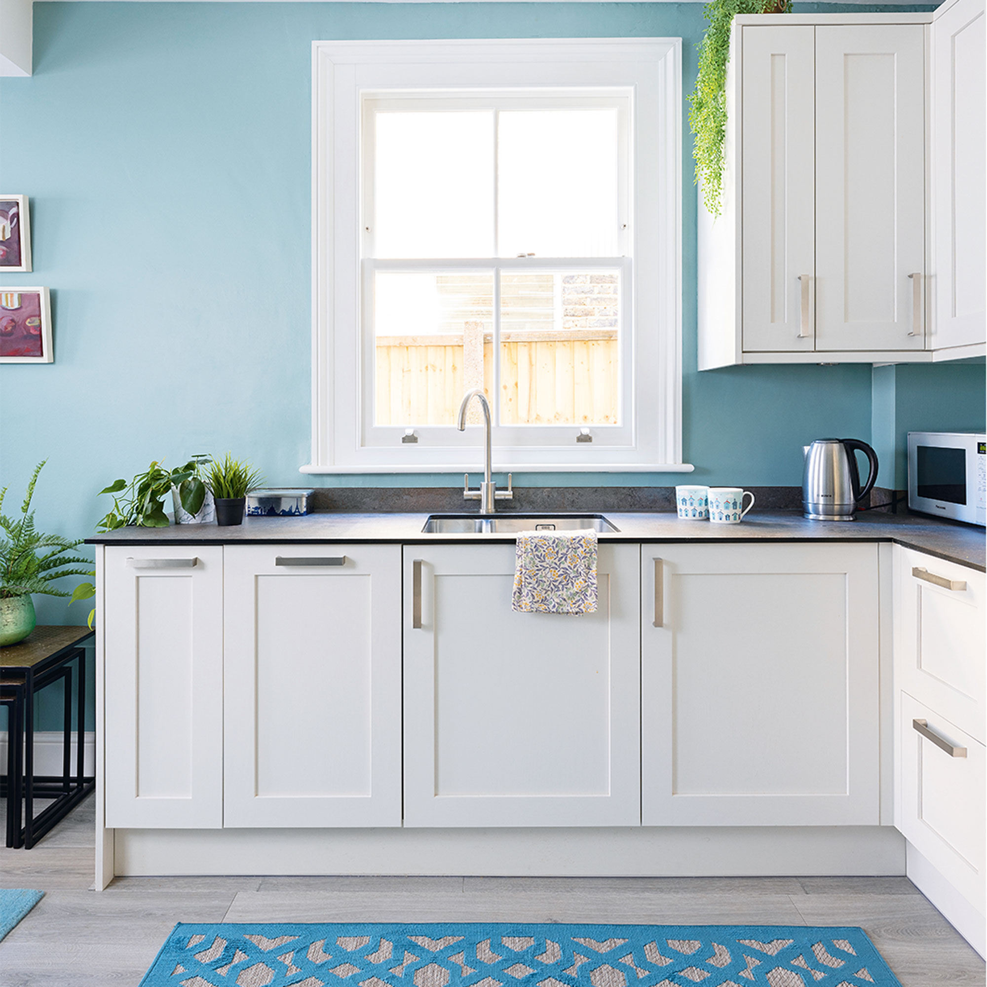
‘I moved out to stay with a friend for five weeks while the wall was taken down and the kitchen fitted, but I struggled with the wall colour in the new space. Initially I thought of Farrow & Ball’s Inchyra Blue, but the test patch was far too dark and made the space feel dingy. The room’s northeast facing, and I tried several others before visiting their shop and going with their suggestion of Dix Blue, which I love.’
Get the look: Walls painted in Dix Blue modern emulsion, £56 for 2.5l, Farrow & Ball
Integrated appliances
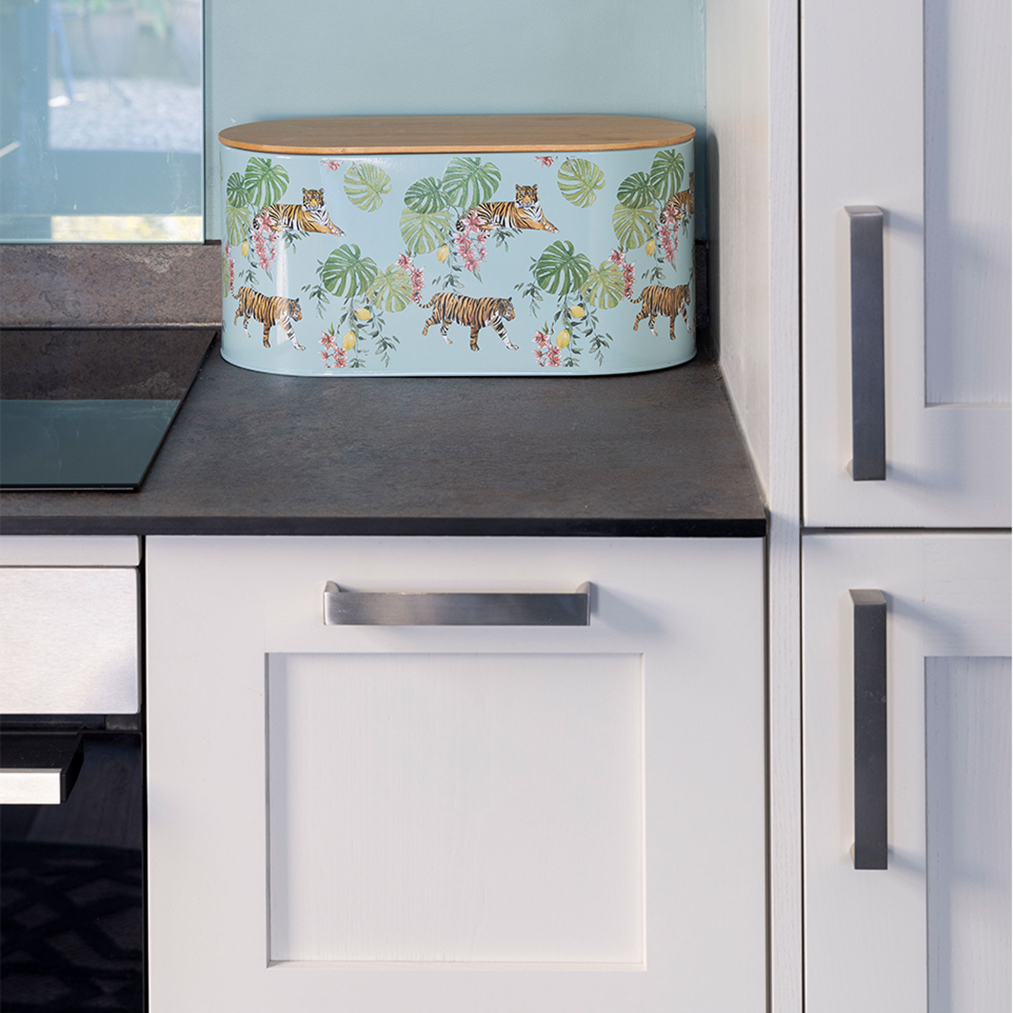
When it came to appliances, the home owner opted for a new oven and hood, along with a new sink and tap.
‘I bought an almost new fridge-freezer with me from the old house, as well as a dishwasher and a plug-in hob, which were all in good condition, and I made sure they fitted into the kitchen plan.’
‘There wasn’t really room for a dishwasher in the new kitchen, without encroaching into the living space, but I worked out that I could put the washing machine in the airing cupboard in the bathroom and slot the dishwasher in. It makes virtually no noise, and it’s one you can programme to come on at night, so it’s all clean when I get up in the morning. ‘
Compact dining area
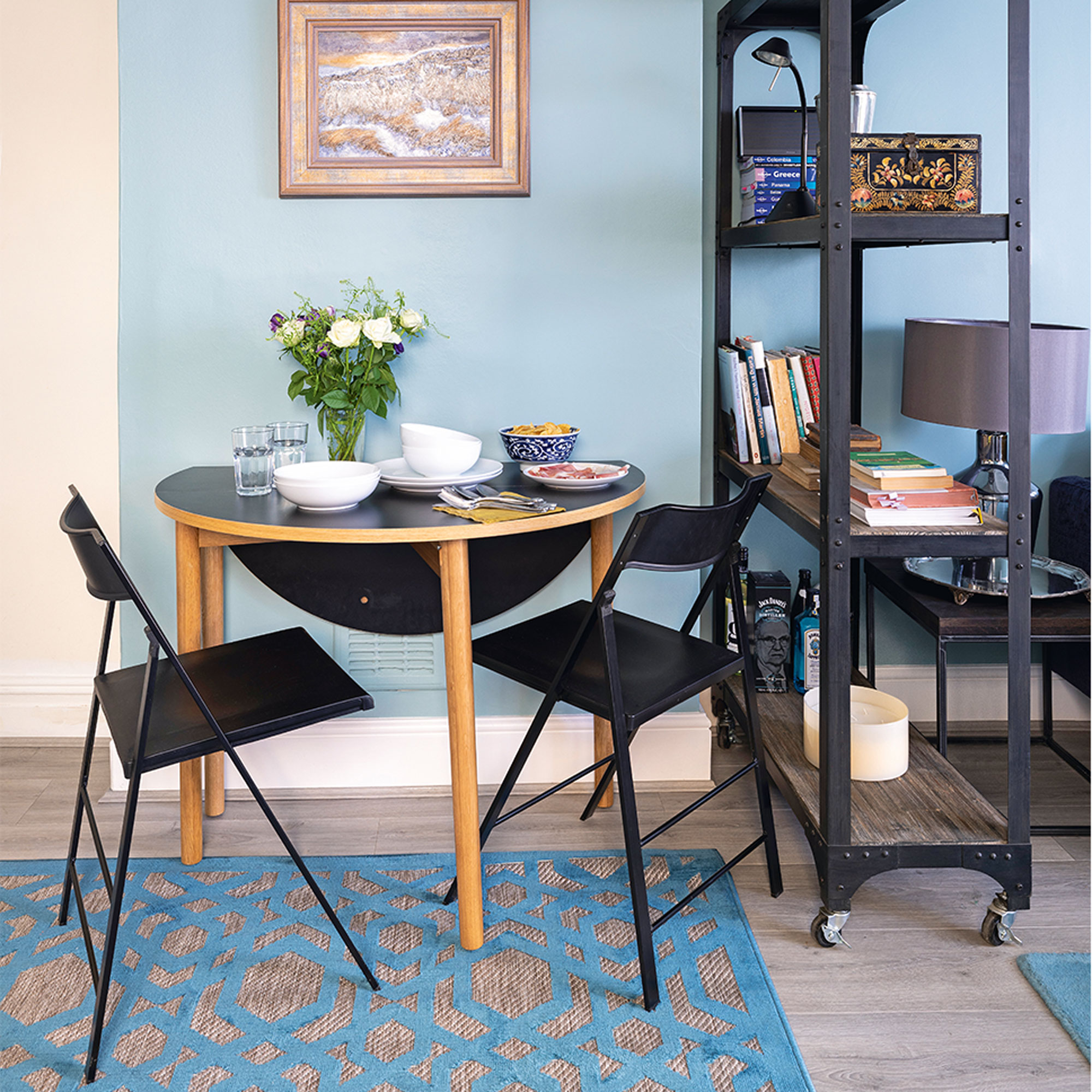
‘I already had two plain black chairs that I'd bought years ago, so I searched for a matching black table,’ says the home owner. ‘I wanted a round table with a drop leaf top so it could be pushed up against the wall when it was just me - and then opened out to seat up to six when I had guests.’
‘It’s a really nice spot to sit and eat, and the painting of sheep above the table reminds me of the Lake District where I’m from.’
Get the look: Drop leaf table in black, £225, Habitat
Dark accents
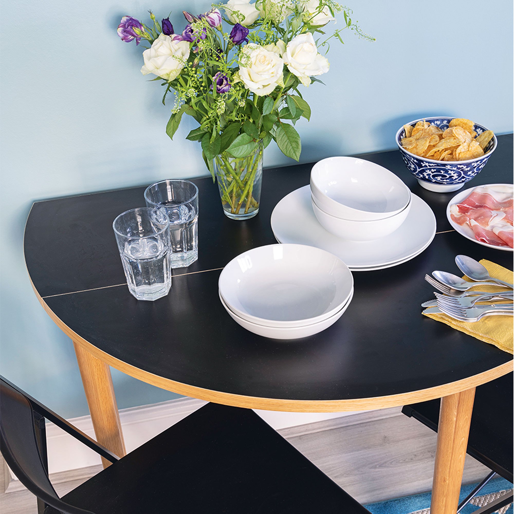
‘I’ve got metallic touches around the room, and I didn’t want a wooden table to clash with the grey flooring, so the black finish adds to the industrial feel.’
‘I deliberately chose a paint that can be wiped down easily and won’t mark, and in the tricky area behind the hob added a toughened piece of glass.’
Storage essentials
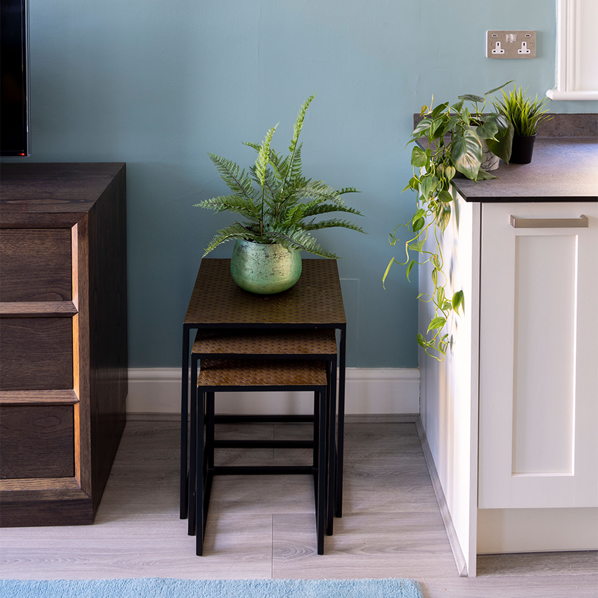
‘In an open-plan kitchen you can’t afford to have too much stuff on show, so I planned for everything to be hidden away behind cupboard doors.’
‘I couldn’t bear to have a big chunky bin on show in a small kitchen, so as part of the design I made sure that there was a pull-out one behind a door.’
Washing-up area
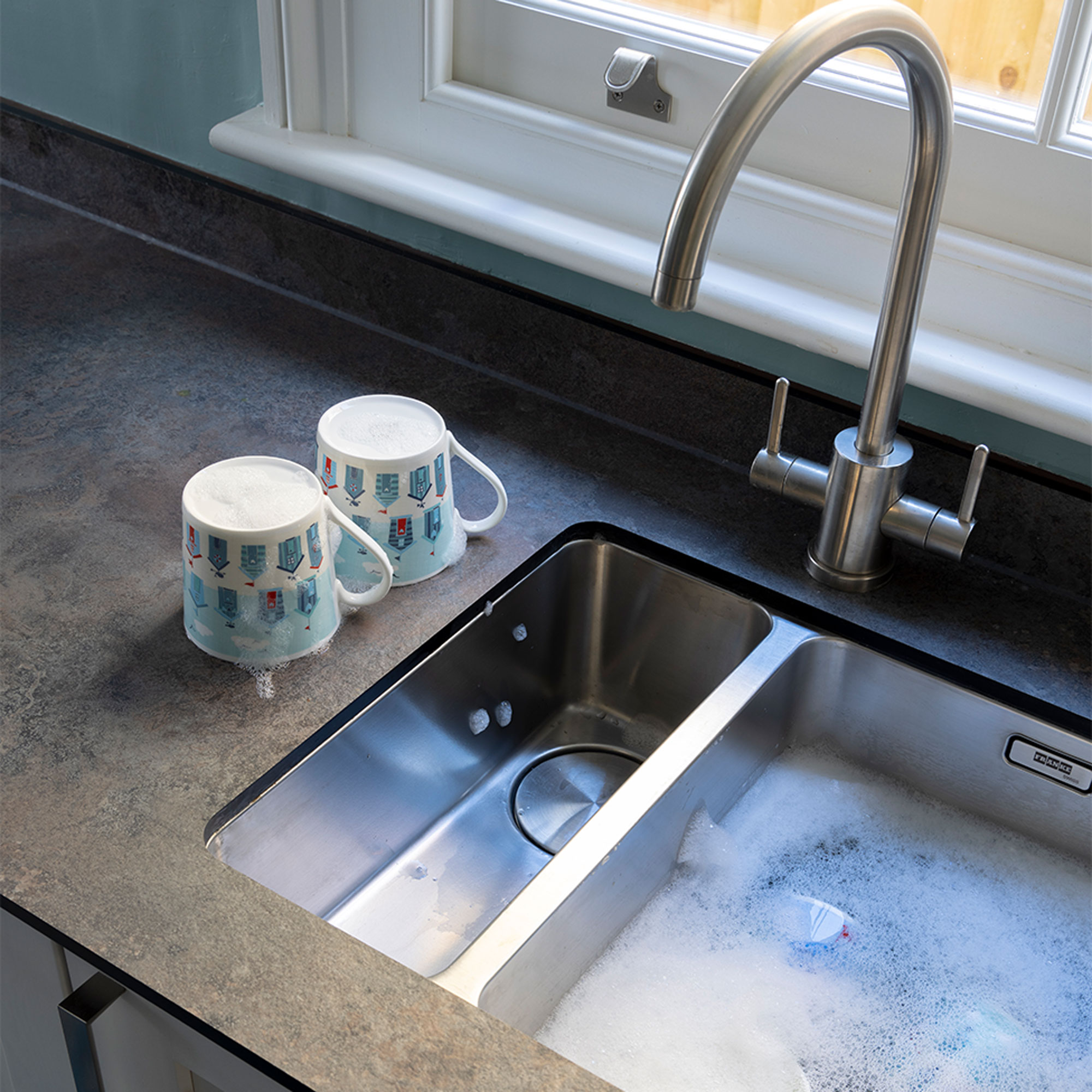
‘Good quality sinks and taps are always worth paying extra for and I got a sink and a half to be able to do two things at once.’
Get the look: Mythos MYX sink, £469.96, and Krios J spout tap, £247.96, both Franke
Statement rug
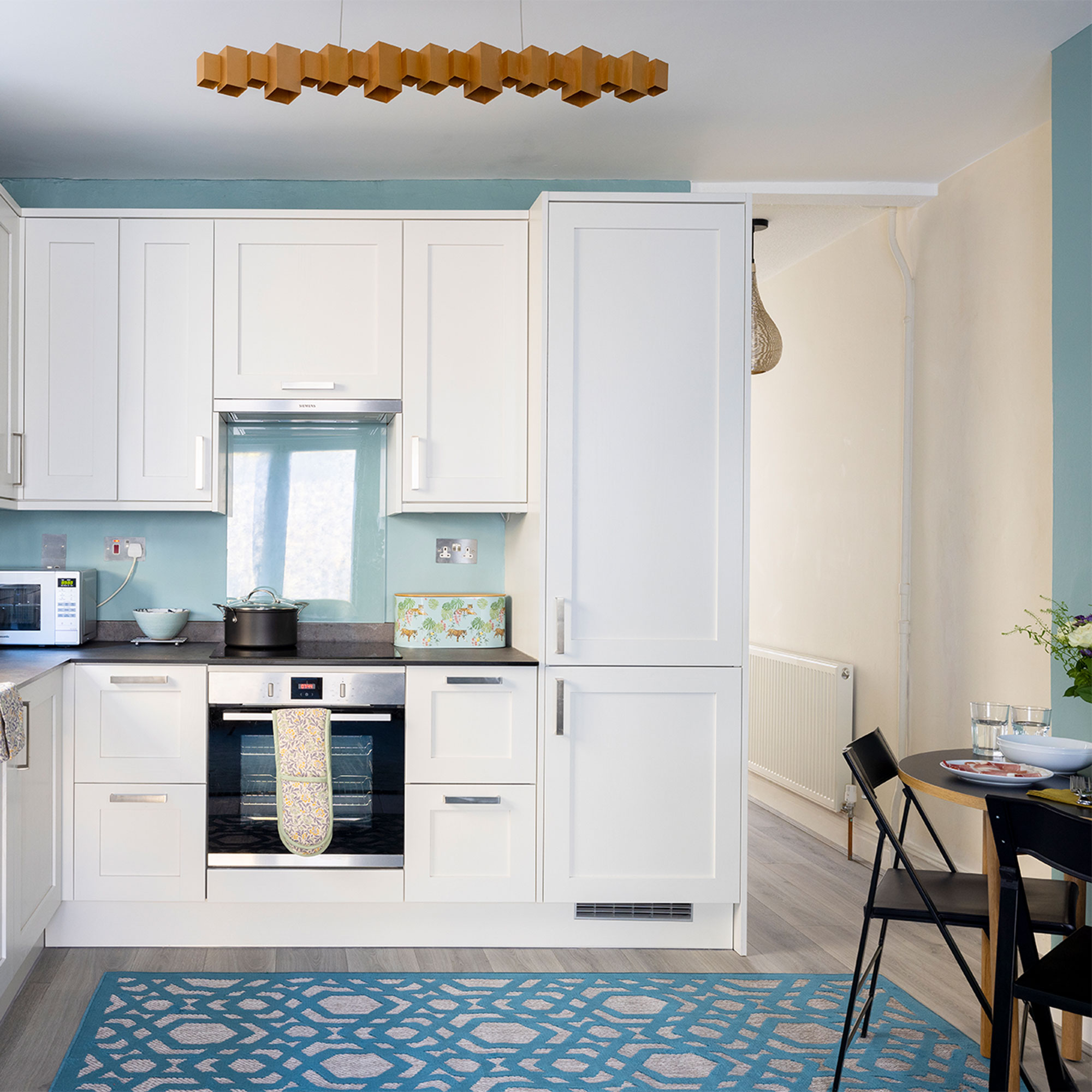
Get the look: Oro Geometric rug, £109, Dunelm, Bayla gold LED metal linear ceiling light, £180, Habitat
The fabulous blue and cream rug is a real statement piece that ties the colour scheme of the two areas together.
‘I couldn’t be happier with the result and am loving my bright new kitchen – it’s exactly what I wanted.’

Lisa is Deputy Editor of Style at Home magazine and regularly contributes to sister title Ideal Home. She has written about interiors for more than 25 years and about pretty much every area of the home, from shopping and decorating, crafts and DIY to real home transformations and kitchen and bathroom makeovers. Homes and interiors have always been a passion and she never tires of nosying around gorgeous homes, whether on TV, online, in print or in person.
-
 I tried out this neat little dehumidifier for a month – it dried my laundry in half the time
The 20L SmartAir Dry Zone dehumidifier tackled my laundry drying woes head on
By Jenny McFarlane
-
 I’m seeing pastel garden furniture at all my favourite brands this spring, but QVC’s sorbet collection impressed me the most
Fresh pastel shades are a great way to liven up your outdoor space
By Kezia Reynolds
-
 Don't tell my flatmates, but Joseph Joseph's clever new sink range finally made me enjoy washing up
I didn't know stylish washing up accessories existed until I saw this collection
By Holly Cockburn