‘I’ve always wanted a pantry - so we came up with a clever way to squeeze one into our new kitchen’
This savvy homeowner ticked off all her must-haves with her stylish kitchen makeover
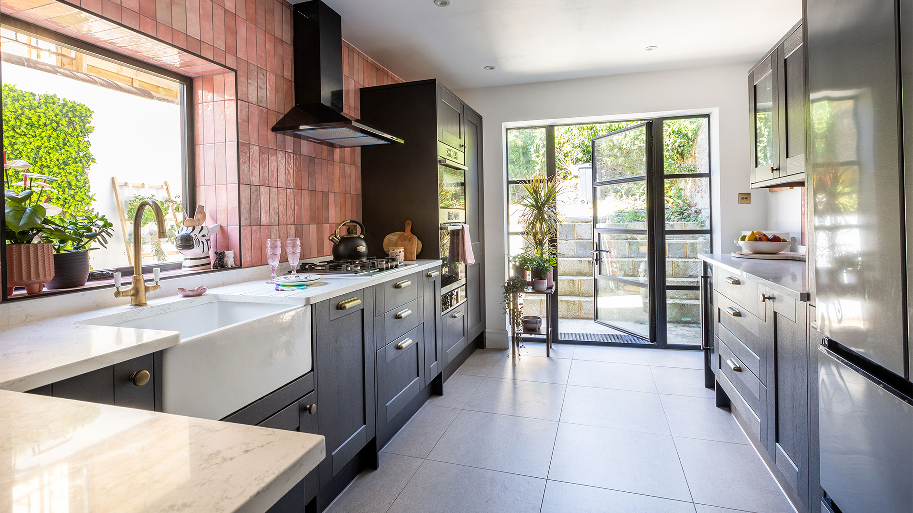

The dark and gloomy north-facing kitchen was top of the to-do list when the owners took on this Victorian terrace renovation in Brighton.
‘The kitchen was pretty bland, with beige units and dark worktops,’ says the homeowner. ‘There was a small back door and tiny window, so no matter how sunny it was outside, the room always felt dark and gloomy.'
'Our idea was to install huge glass back doors and a new, larger window that would allow daylight to filter into the room – as well as fit a brand new kitchen.’
Bright new outlook
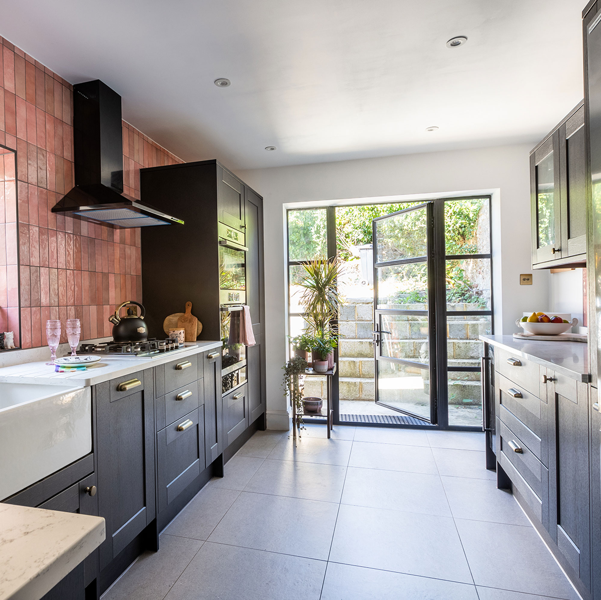
The first thing the owners did in the kitchen renovation was to rip out the old units, appliances and floor. They also pulled down an internal wall to open up the under-stairs cupboard, and knocked out the back wall to make a bigger opening for the large glass door.
‘We opted for full-width black metal framed doors that look super-chic and modern, but also ultimately flood the space with light. They make such a difference and the kitchen feels so much brighter.’
The kitchen before
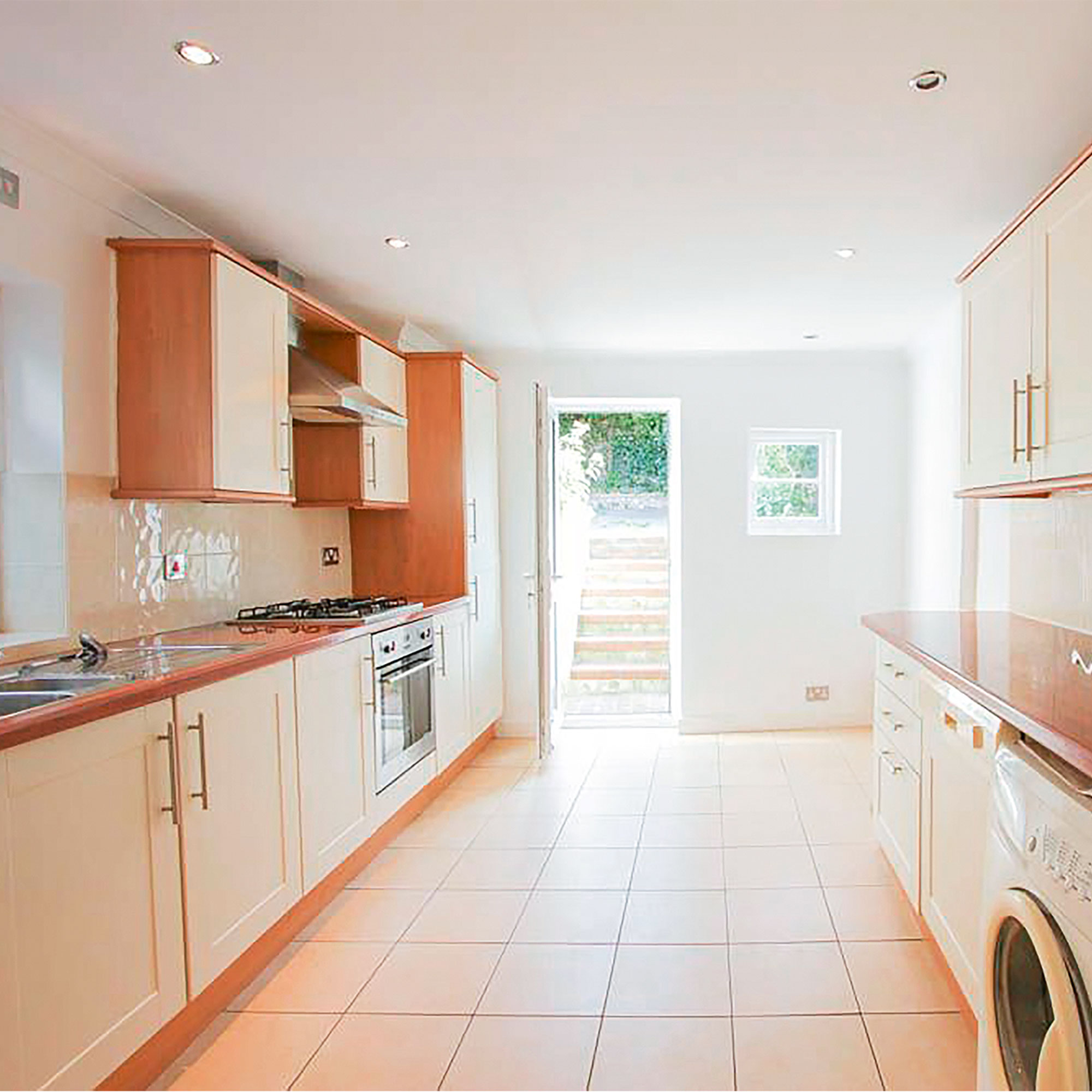
Drab kitchen units, dark worktops and plain floor tiles meant that the kitchen looked pretty uninspiring in its old state. Plus a standard door and tiny window let little light in, so the north-facing kitchen layout felt dark and gloomy even on sunny days.
Chic colour scheme
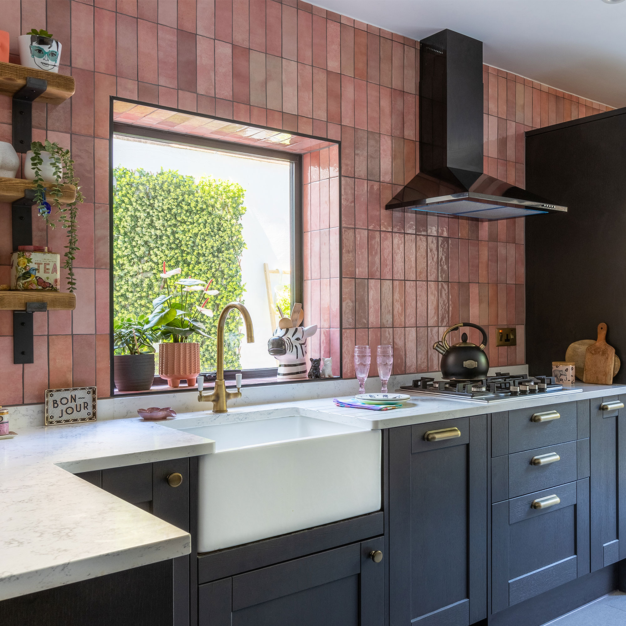
‘My inspiration for the black kitchen colour scheme came from Instagram where I’d seen lots of pink and black kitchens. I spent ages hunting down the perfect charcoal Shaker-style units, so when initially my kitchen went out of stock, it was very frustrating.’
Get the Ideal Home Newsletter
Sign up to our newsletter for style and decor inspiration, house makeovers, project advice and more.
‘But rather than go for another style or colour, we decided to wait. I didn’t want to compromise because I knew I’d regret that decision in the long term. And I'm so glad we did.’
Colourful pantry area
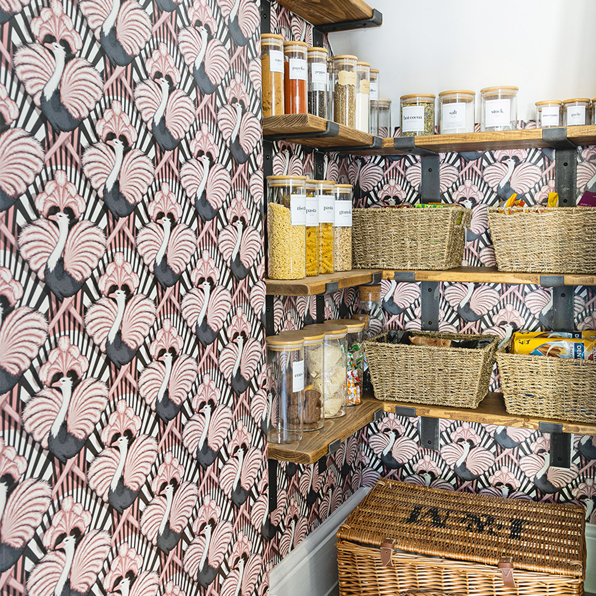
‘Knocking out the walls and opening up the under-stairs cupboard, left a bit of an awkward space in the corner. But we came up with the clever idea of turning it into a kitchen pantry. I’m a keen cook and I’ve always wanted a pantry, so it was the perfect solution.’
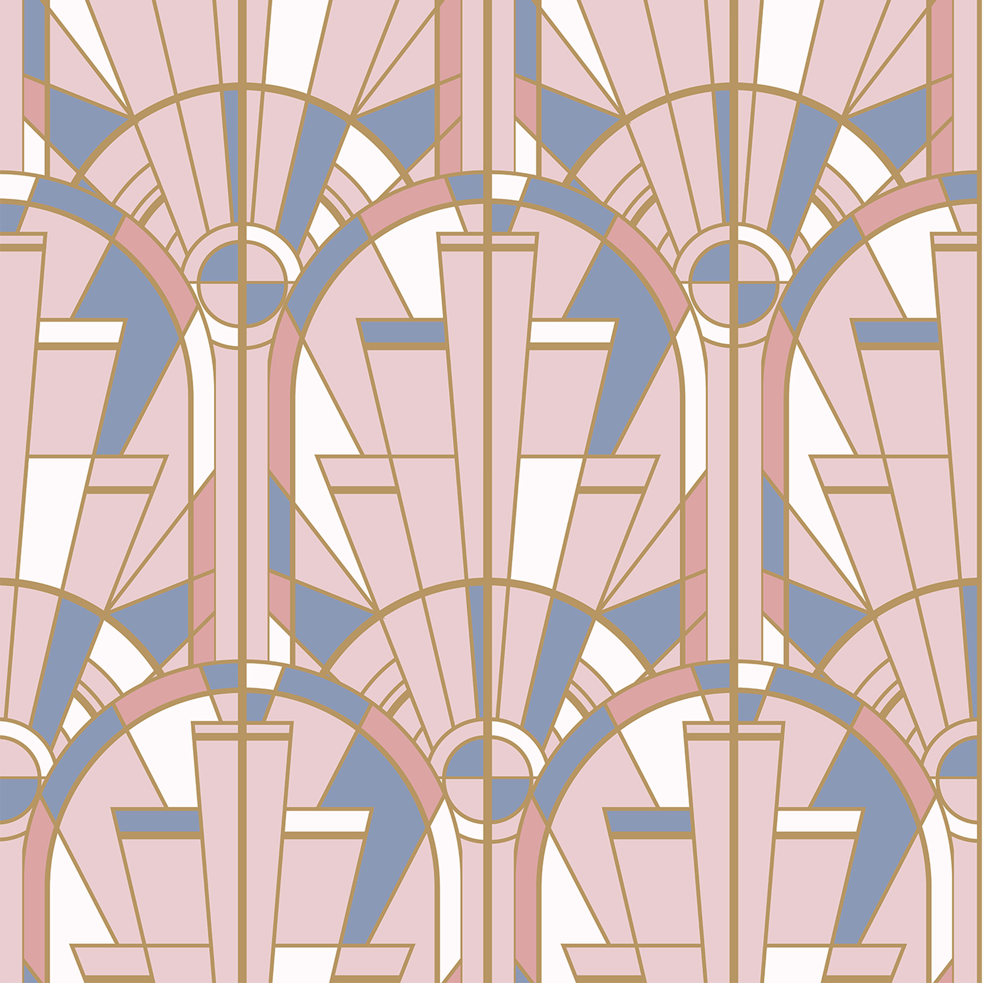
‘I wallpapered it myself using this Zsa Zsa Candy wallaper from Divine Savages that complements the colours in the rest of the kitchen. I found these clear glass jars with wooden lids and ready-made labels on Amazon. They’re perfect for storing dried goods and supplies.'
Neat integrated appliances
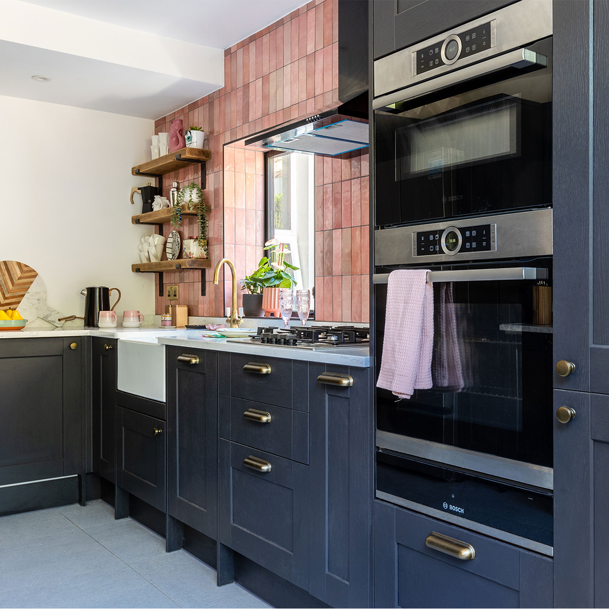
‘When planning the new layout of our kitchen, I considered how I would use the space first. I decided to place the hob, cooker and sink on one side, with the food preparation area opposite to maximize the space.’
‘In the end, we decided to upgrade our appliances and invest in better quality kitchen worktops too. This house is going to be our forever home so we thought it was worth buying decent fixtures and fittings that would look good for longer.’
Statement tiles
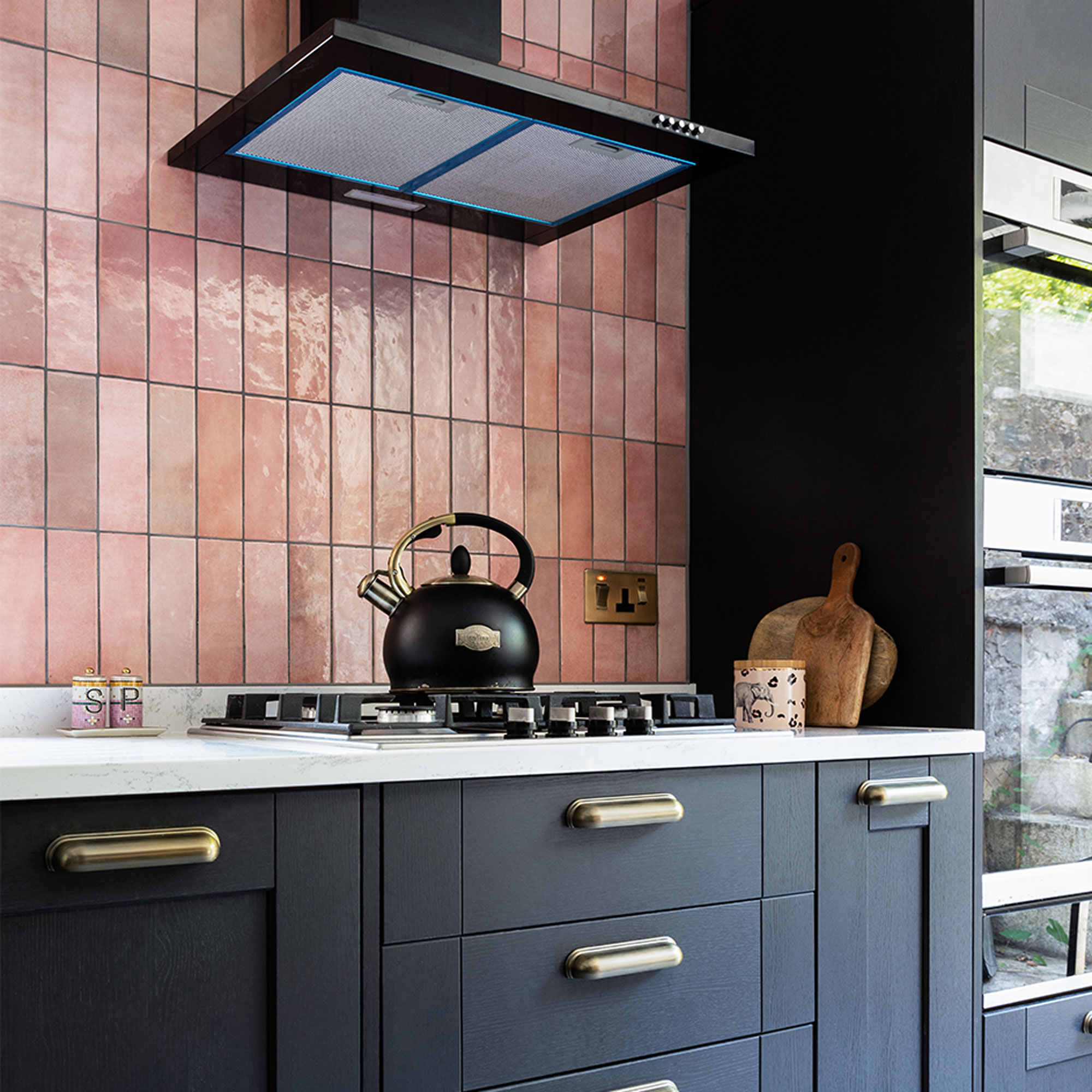
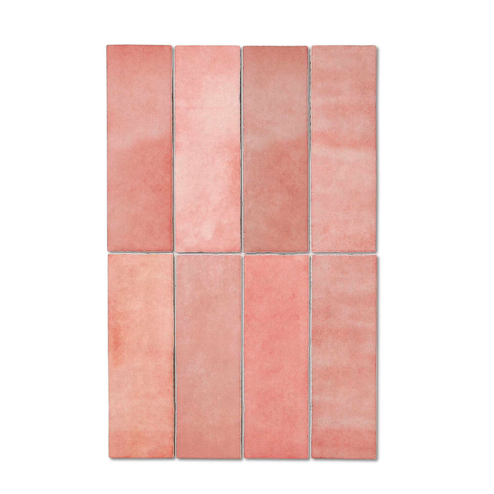
‘To save money on the project, we sourced the units, tiling and appliances ourselves. This got a bit tricky at times, as halfway through tiling the walls, we realised that we didn’t have enough pink metro tiles. I had a mad dash across town to pick up a couple of extra boxes. Luckily, the kitchen tiles were still in stock.’
Complementary colours
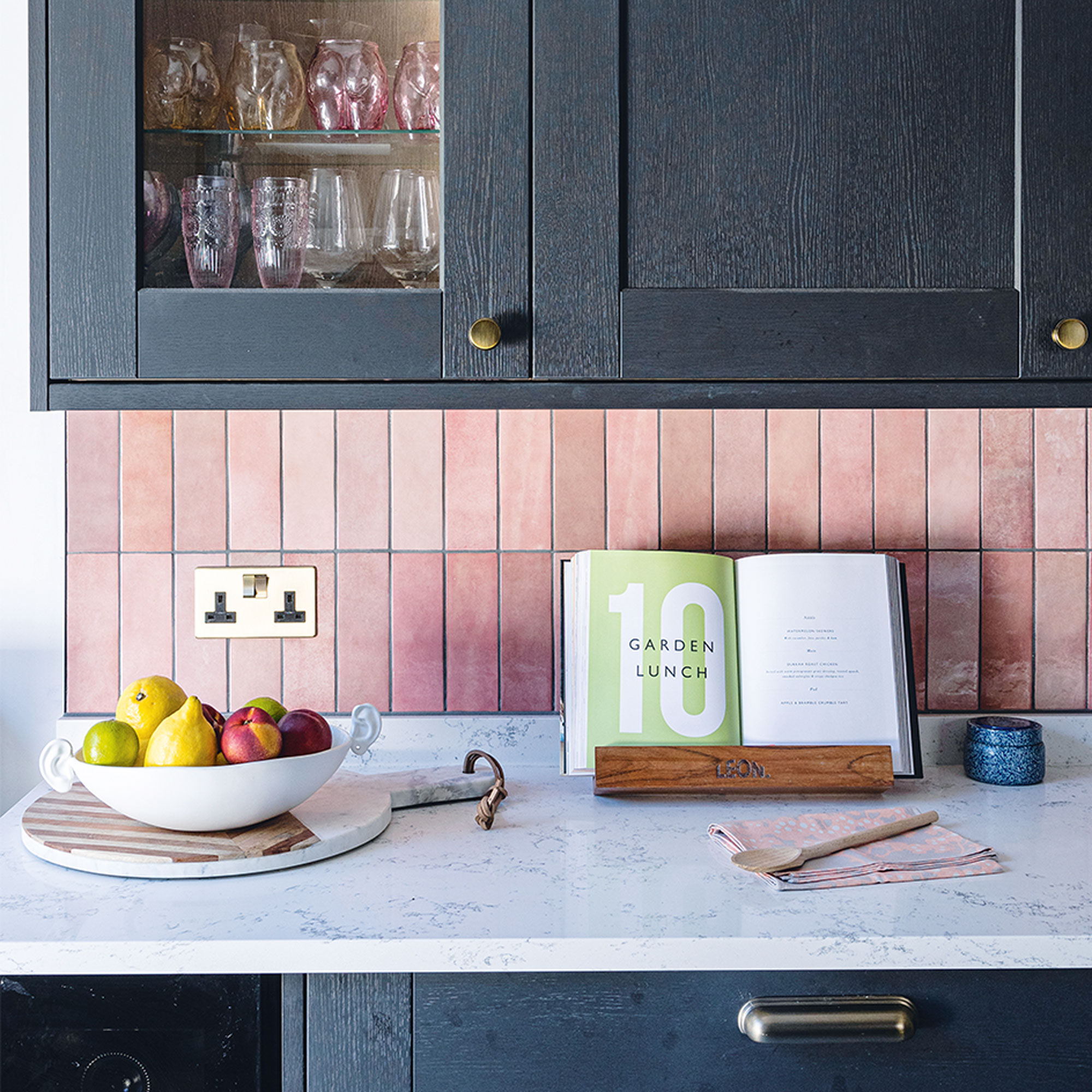
‘We found these charcoal kitchen units in Howdens and they were the darkest colour they had in stock. I wanted a kitchen that would contrast against the pink kitchen splashback for a fresh, modern look.’
‘Rather than tile the walls in a traditional metro layout, we choose to place them vertically up the walls.’
Display shelves
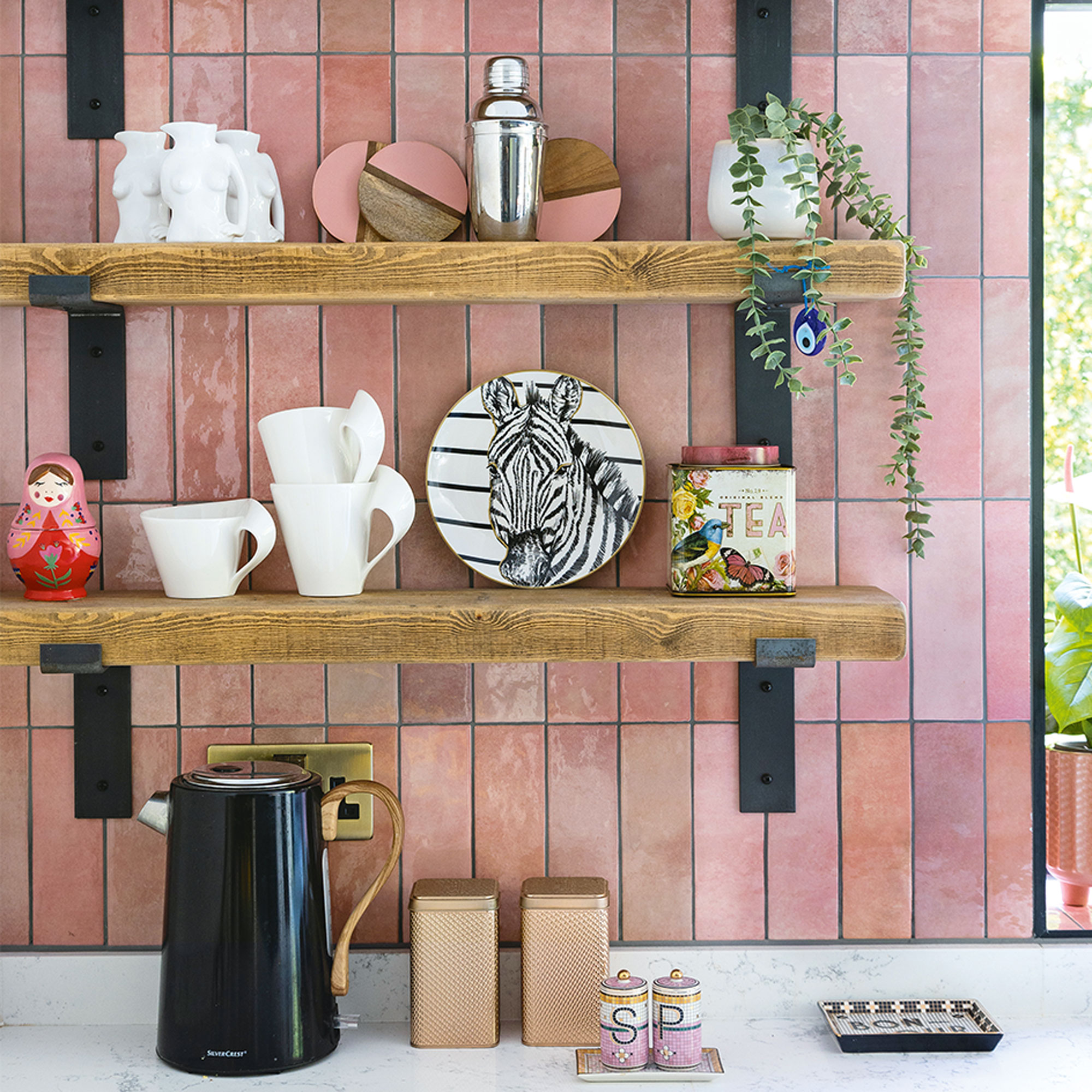
‘Once our builders were finished, it was time to focus our attention on the finishing touches.’
‘I didn’t want to overcrowd our kitchen with wall units on this side of the kitchen. So I choose open kitchen shelving made by Ben Simpson Furniture which is purely for display purposes. I’ve got quite a large collection of accessories that I’ve been collecting over time to dress the kitchen shelves. It was great to unpack everything and put my favourites out on show.’
Luxe finishing touches
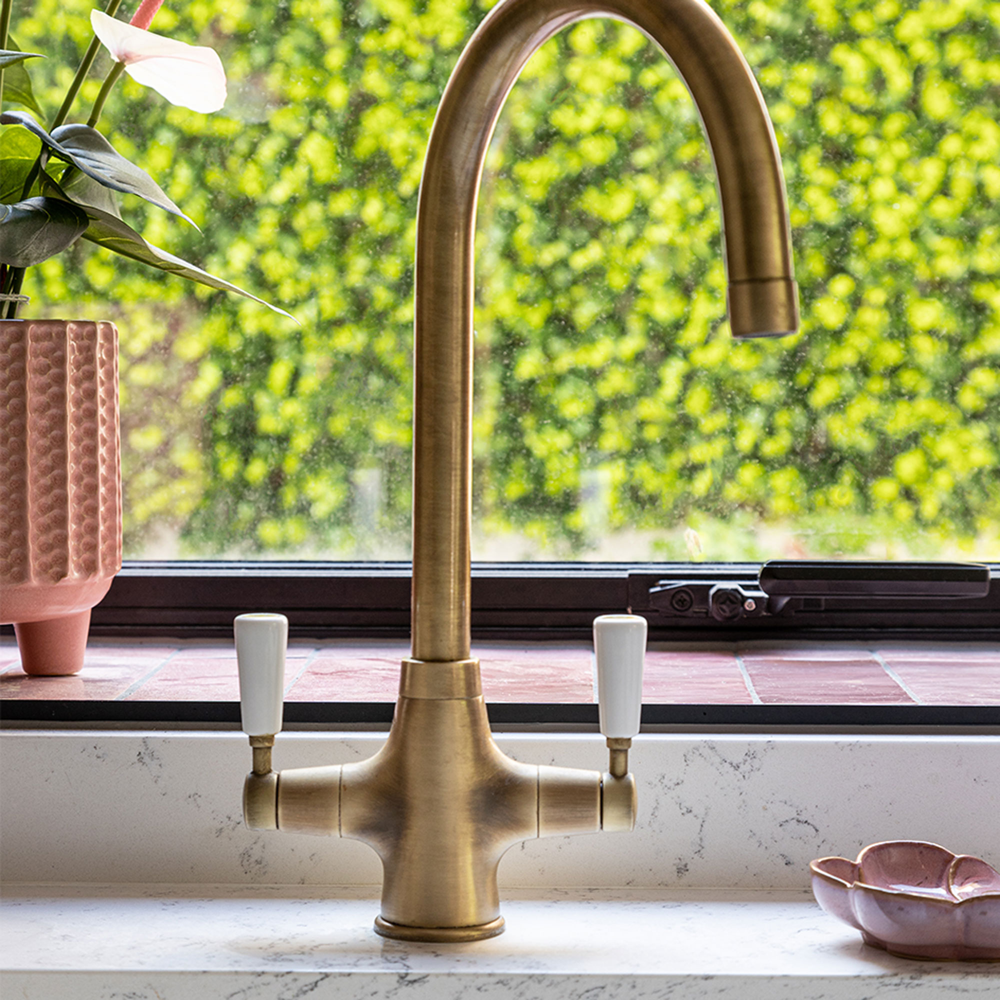
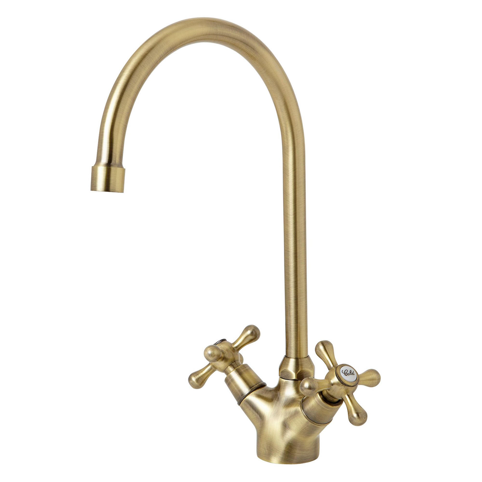
‘Although our kitchen is modern in design, we wanted some traditional touches in keeping with our Victorian house. That’s why we choose a generous butler sink and an arched mixer tap in brass that complements the cabinet handles. This house is going to be our forever home, so we thought it was worth buying decent fixtures and fittings that would look good for longer.’
‘I’m so pleased with the end result. All the little details that we have added to this space, like the Crittal doors, casement window, pink tiles and the wallpapered pantry have injected lots of personality into our kitchen. It’s completely unique to us.'
Get the look
Additional words Maxine Brady

Lisa is Deputy Editor of Style at Home magazine and regularly contributes to sister title Ideal Home. She has written about interiors for more than 25 years and about pretty much every area of the home, from shopping and decorating, crafts and DIY to real home transformations and kitchen and bathroom makeovers. Homes and interiors have always been a passion and she never tires of nosying around gorgeous homes, whether on TV, online, in print or in person.
-
 Is M&S or John Lewis bedding better? I'm a Sleep Editor and this is my go-to brand
The battle of the bedding is on
By Amy Lockwood
-
 5 things you should never put in your garden waste bin – experts warn these items could land you with a £400 fine
You should avoid these waste items at all costs
By Kezia Reynolds
-
 Typhur Dome 2 air fryer review – a glimpse into the future of air frying
The Typhur Dome 2 cooks food brilliantly and has all sorts of benefits, but is it worth the £499 price tag?
By Ellen Manning
