'We wanted everyone to feel really positive' – how a colourful redesign brought this workspace to life
'We wanted to create a 'sensory-balanced' workspace that was both socially sustainable and adaptable'

Sign up to our newsletter for style inspiration, real homes, project and garden advice and shopping know-how
You are now subscribed
Your newsletter sign-up was successful
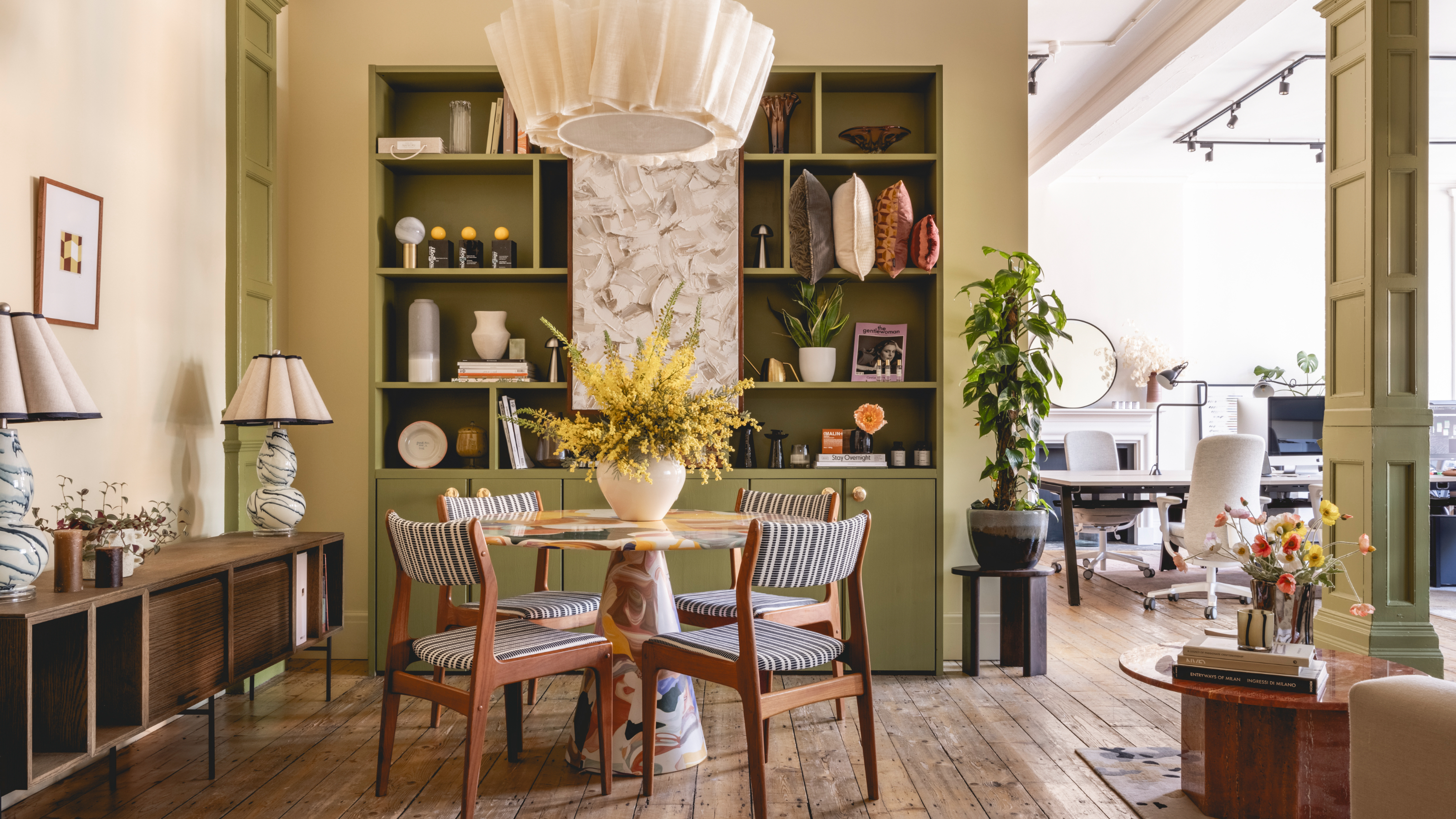
International design studio, Jolie, has transformed their central Manchester workspace into a 'sensory-led' haven that has us wanting to spruce up our own home office ideas and deck them out in colours that make us happy.
With this workspace makeover, Jolie's intention was to make everyone 'feel really positive'. They achieved this through a 'sensory approach' which combines materials, colour psychology, fragrances, and sounds to create an immersive, multi-sensory experience in every space in the office which would ultimately boost productivity and well-being.
A 'sensory-balanced' workspace
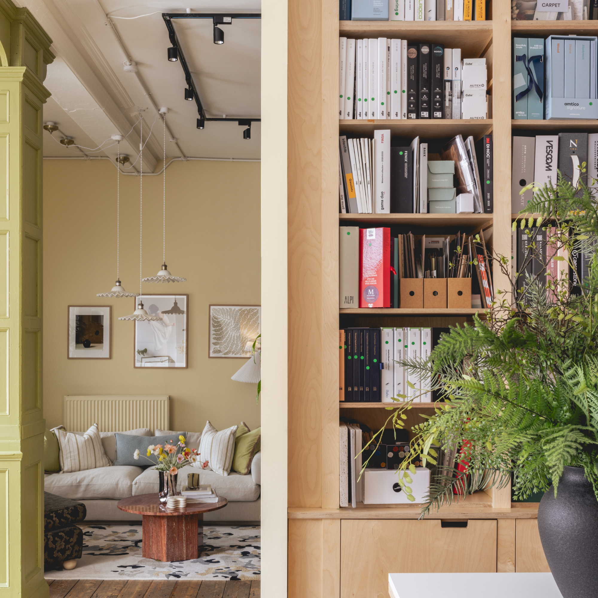
'We wanted to create a 'sensory-balanced' workspace that was both socially sustainable and adaptable for the varied needs of our team,' starts Franky Rousell, CEO and founder of Jolie Studio. 'We wanted spaces that encouraged interaction and connection and be highly functional for our team, both now and into the future.'
Article continues belowThe workspace before
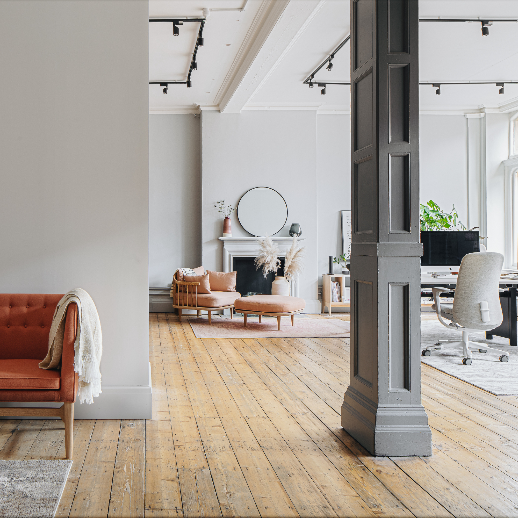
Although the workspace before was nothing less than gorgeous, we do have to admit that it felt a lot emptier and sported a colder office colour scheme. Therefore, it comes as no surprise that the new colour combinations chosen for the makeover are a lot warmer and more inviting.
The importance of a mood-boosting colour scheme
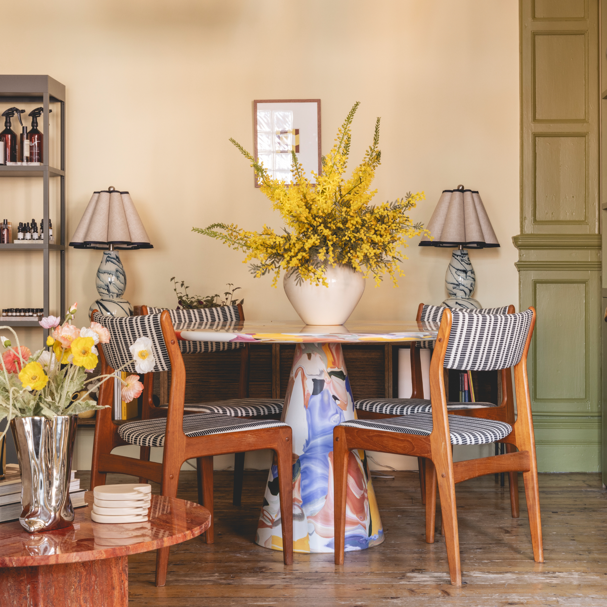
'Colour is intrinsically linked to the psyche and plays a huge role in helping to define a person's mood,' says Franky.
'We know that different hues and shades can make people feel creative, reduce anxiety, calm or motivate them. The four colour paint edit we curated invite clarity and focus, promote growth and refreshment, ignite innovation and energy, and establish a sense of balance.'
The four colours include a buttery yellow, an olive green, and a light blue, all tied together with a lighter neutral base. Each shade evokes various ways to boost mood in a space as well as promote productivity and focus, which was central to Jolie's goal in the transformation.
Sign up to our newsletter for style inspiration, real homes, project and garden advice and shopping know-how
A buttery yellow
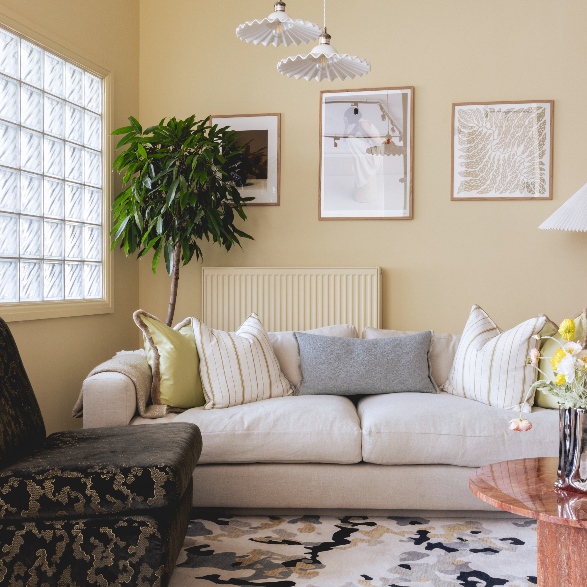
'We chose a buttery yellow shade (JOLIE 8149-1 from COAT) because we wanted everyone to feel really positive, whether they are clients or part of our day-to-day team.'
'This vibrant hue stimulates the visual sense, evoking a feeling of warmth and energy, and sets the tone for a productive environment. You should incorporate tones of yellow in your home in areas that you want to feel uplifting and energising.'
This may be why, for example, people would also choose to paint their living rooms in a happy colour and steer clear of a 'sad beige'. After all, who wants to bask in sad hues all day long?
An earthy fig leaf green
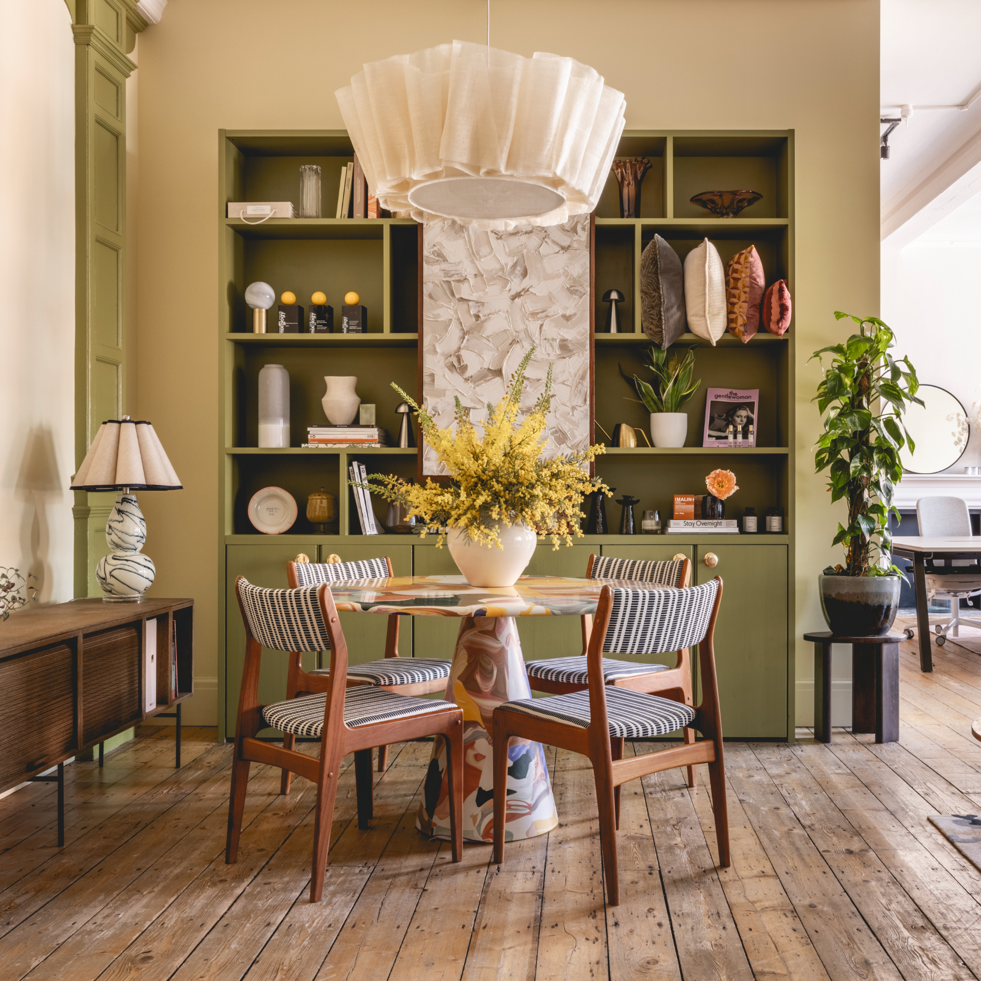
Transitioning further into the studio space, Franky continues, 'We chose an earthy fig leaf green (JOLIE 8727-5 from COAT) because it represents growth and creativity, instilling a harmonious ambience in the space that engages both the visual and tactile senses and fosters a serene and rejuvenating atmosphere.'
If you're not yet clued up, green has long been the new neutral to know about as it plays into the popular natureluxe trend we've seen taking up space everywhere.
'Green always reminds us of the beauty of nature, with its calming effect and connection to the outdoors. In the home, green is a great colour to introduce into a bathroom or a space where you want to encourage creative hobbies.'
A calming light blue
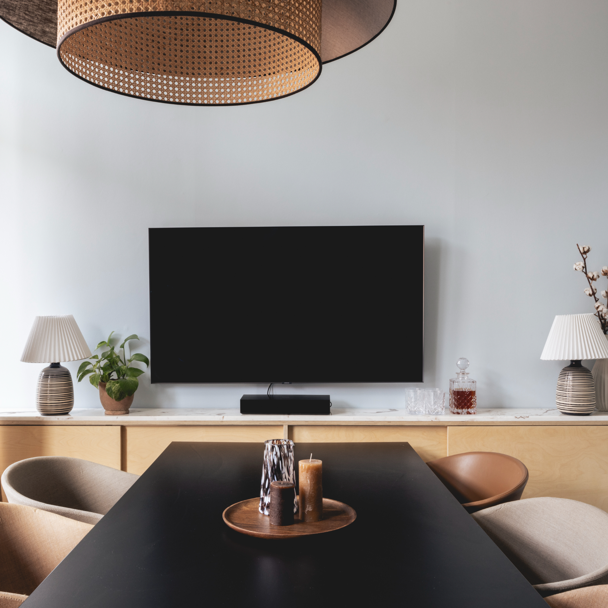
In the studio's meeting room, Jolie faced the challenge of working with an abundance of natural light while keeping to a calm colour scheme that would evoke focus.
'We wanted to find a light blue that could withstand the room's brightness without appearing washed out,' explains Franky. 'We needed it to provide clarity and focus while avoiding any sense of coldness or anxiety.'
The light blue they settled on (JOLIE 8486-1 from COAT) engages the senses by creating a calm and focused environment.
A chalky beige tone
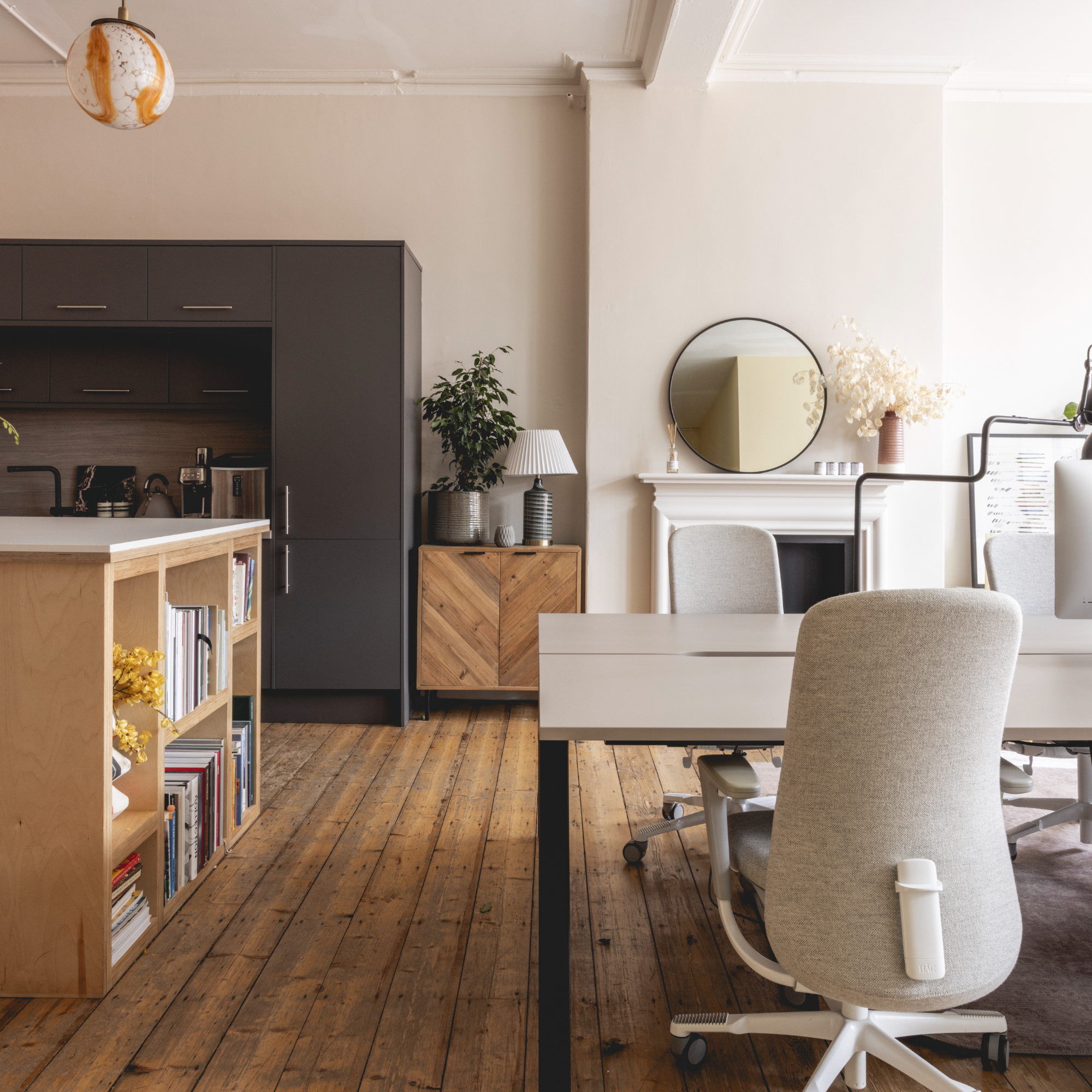
Finally, in Jolie's main workspace where the team spend most of their time working at their computer screens, they opted for a welcoming but slightly muted, chalky beige tone (JOLIE 9037-1 from COAT).
Although an all-neutral may be seen as a colour you should never paint your workspace, having a neutral canvas was important for Jolie so it wouldn't interfere with their day-to-day work.
Franky concludes, 'We wanted to create a sense of warmth and inspiration here, in a space that envelops and nurtures our designers. It needed to feel light, fresh, and inspiring, allowing our team to seamlessly blend various colours in their design process without conflict.'
Overall, what resulted is a gorgeous office workspace guaranteed to engage the senses and improve productivity in the workplace.
Jullia was Ideal Home’s Junior Writer from 2022-2024 and the Ideal Home Certified Expert in Training on Vacuums having spent over 60 hours testing different models. She’s always loved all things homes and interiors, graduating with a bachelor’s degree in Architectural Studies from the University of Nottingham where her love for writing blossomed following her internship at ArchDaily. Now focused on home tech and cleaning, Jullia works on writing features and explainers to help people make the most of their home appliance investments, putting the newest launches through their paces. When she isn’t writing, she loves exploring the city, coffee shop hopping, and losing hours to a cosy game or book.