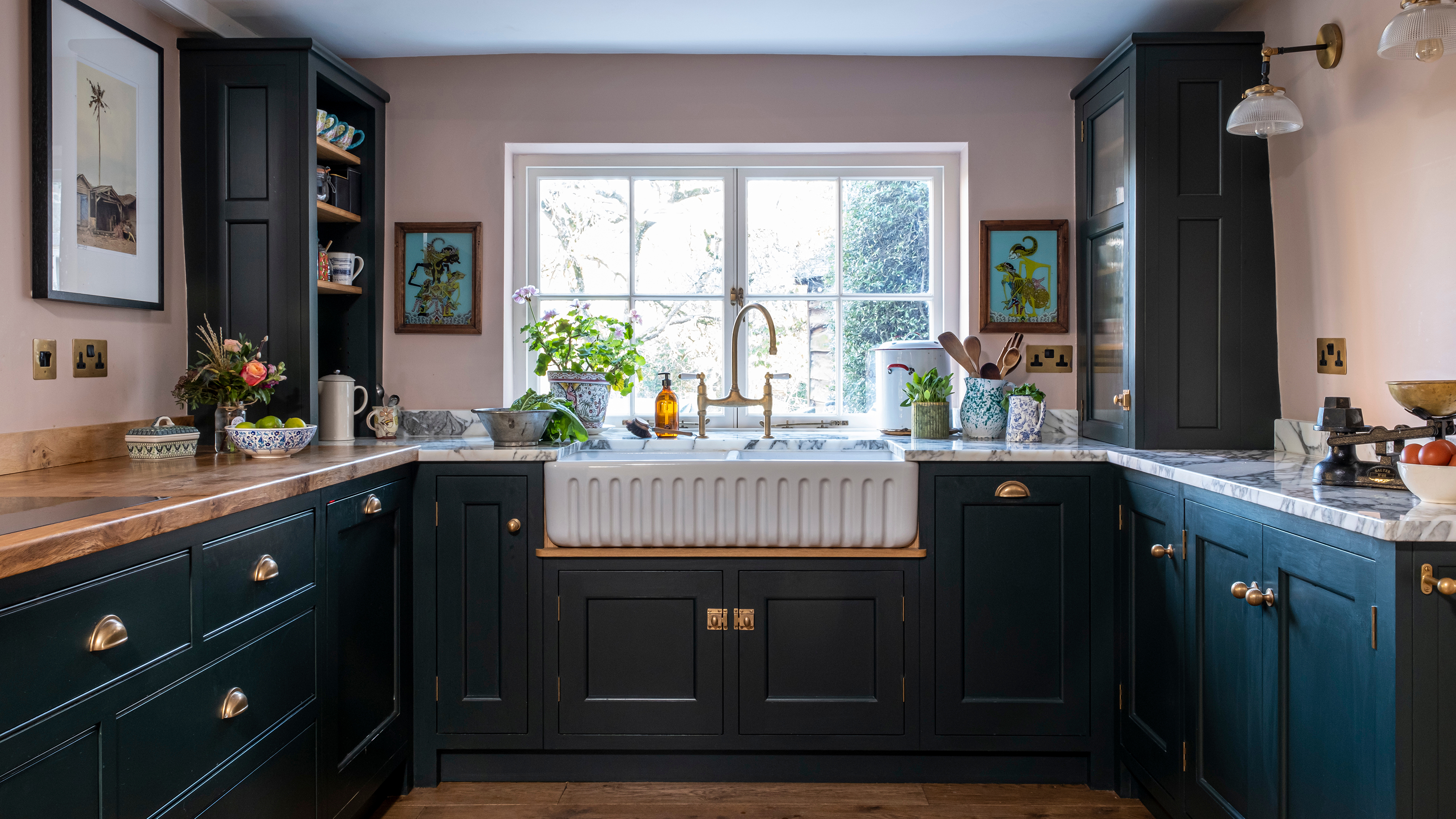
This beautiful cottage kitchen proves size shouldn't get in the way of a stunning design
Despite its small footprint, the compact space ticks the boxes for practicality, character and colour

Rachel Crow
Many things can inspire a kitchen renovation: a need for more space, a wish to update dated décor or plans to create a more cohesive layout.
In the case of this cottage kitchen, the owners desired to knock down an incongruous chimney, which housed an Aga, and replace it with a spacious window that would flood the room with light.
‘We had been wanting to do this since we moved in seven years ago, and our decision to finally go ahead was the catalyst for a total revamp of the kitchen,’ says the homeowner.
Adding a window to flood the formerly dark and dreary room with light was just one of the small kitchen ideas that have made this bijou space work perfectly.
Designing to a small footprint
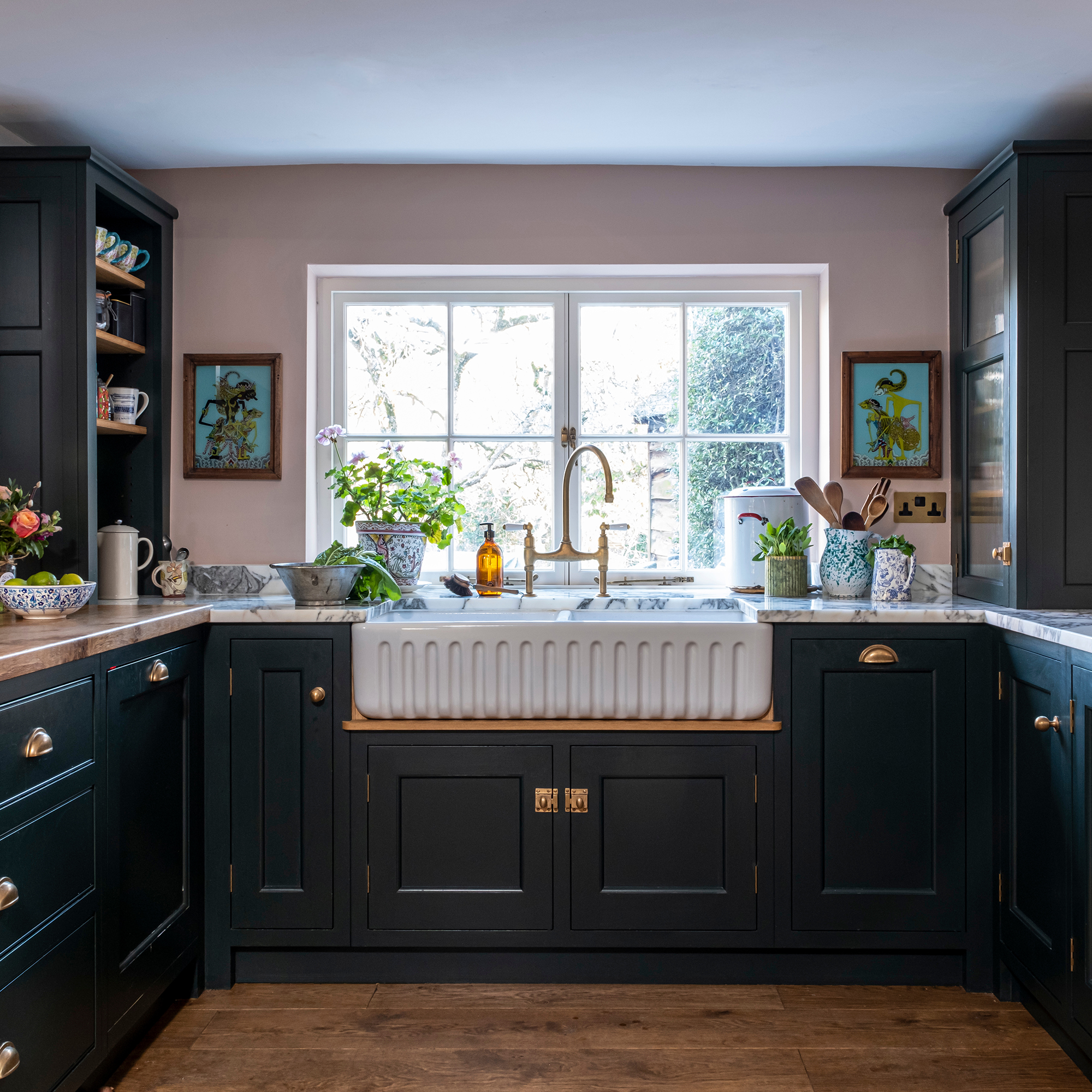
The cottage had been subject to various alterations over the years, and new additions and layout reconfigurations left the kitchen with a sub-optimal footprint.
‘Thankfully, there is a large utility room adjacent and a separate larder, so the kitchen can focus on cooking rather than storage,’ explains Nick Anderson, designer and director at Guild Anderson, who created this space.
They prioritised more light, more effective appliances – one of the top tips for a family-friendly kitchen – and creating a more efficient working space.
Get the Ideal Home Newsletter
Sign up to our newsletter for style and decor inspiration, house makeovers, project advice and more.
Clever cabinet orientation
Since it wasn’t possible to make the kitchen physically bigger, Nick had to be clever in the design and capitalise on the available space.
‘Maximising storage is often a priority but, typically, this doesn’t result in a good-looking kitchen,' he explains – one of the biggest kitchen layout mistakes.
'We could have added more wall cabinets and deeper work surfaces, but we didn’t as it would have made a predictable and heavy kitchen,’ Nick adds.
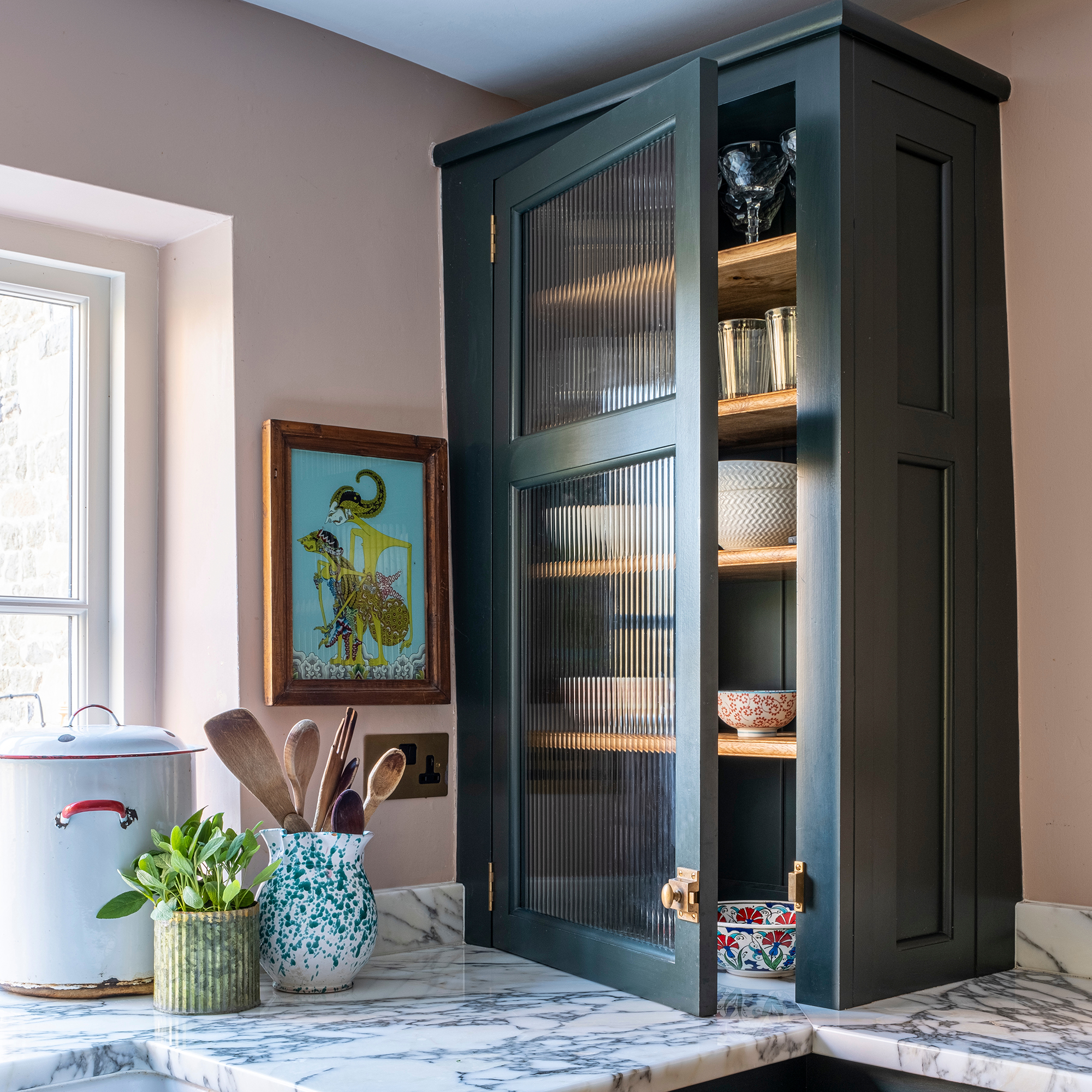
He needed to bookend the sink run, and as a kitchen cabinet idea, he advises that turning the cabinets to face inwards towards the sink, showing the side panels, makes them look taller and more elegant.
'One cabinet is glazed, with reeded glass to obscure the contents, while the other is open, with the oak shelves echoing the pippy oak surface. I find that a lack of symmetry often gives a happier result,’ he adds.
The combination of full-height cupboards and under-counter drawers balances plentiful storage with an open layout.
A practical peninsula
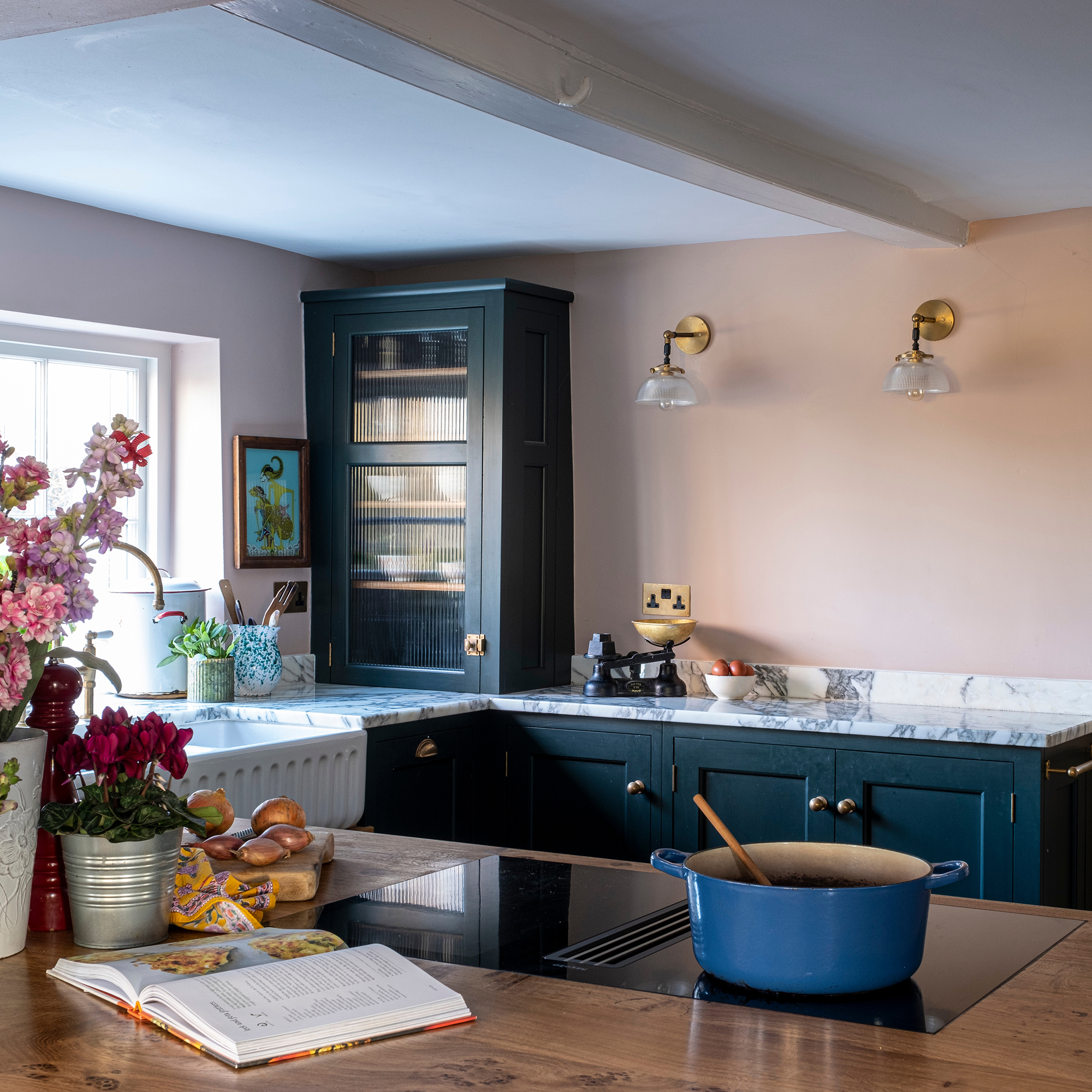
Building upon this lack of symmetry, Nick introduced a kitchen peninsula to maximise the available cooking space.
‘A peninsula is often a last resort,’ says Nick. ‘It’s difficult to make them look good, but sometimes there is just not enough room for an island.’
In spaces such as this one, creating room for an island requires significant structural work that doesn’t justify the benefit.
‘The secret to ensuring that a peninsula works is to make it stand out rather than absorbing it into the space,’ explains Nick. ‘It should look complete in itself. Sometimes this is achieved by adding legs and opening up the space, but here, storage was more useful, so we opted for an arrangement of three drawers over four deeper drawers with a centralised hob.'
Contrasting kitchen worktops
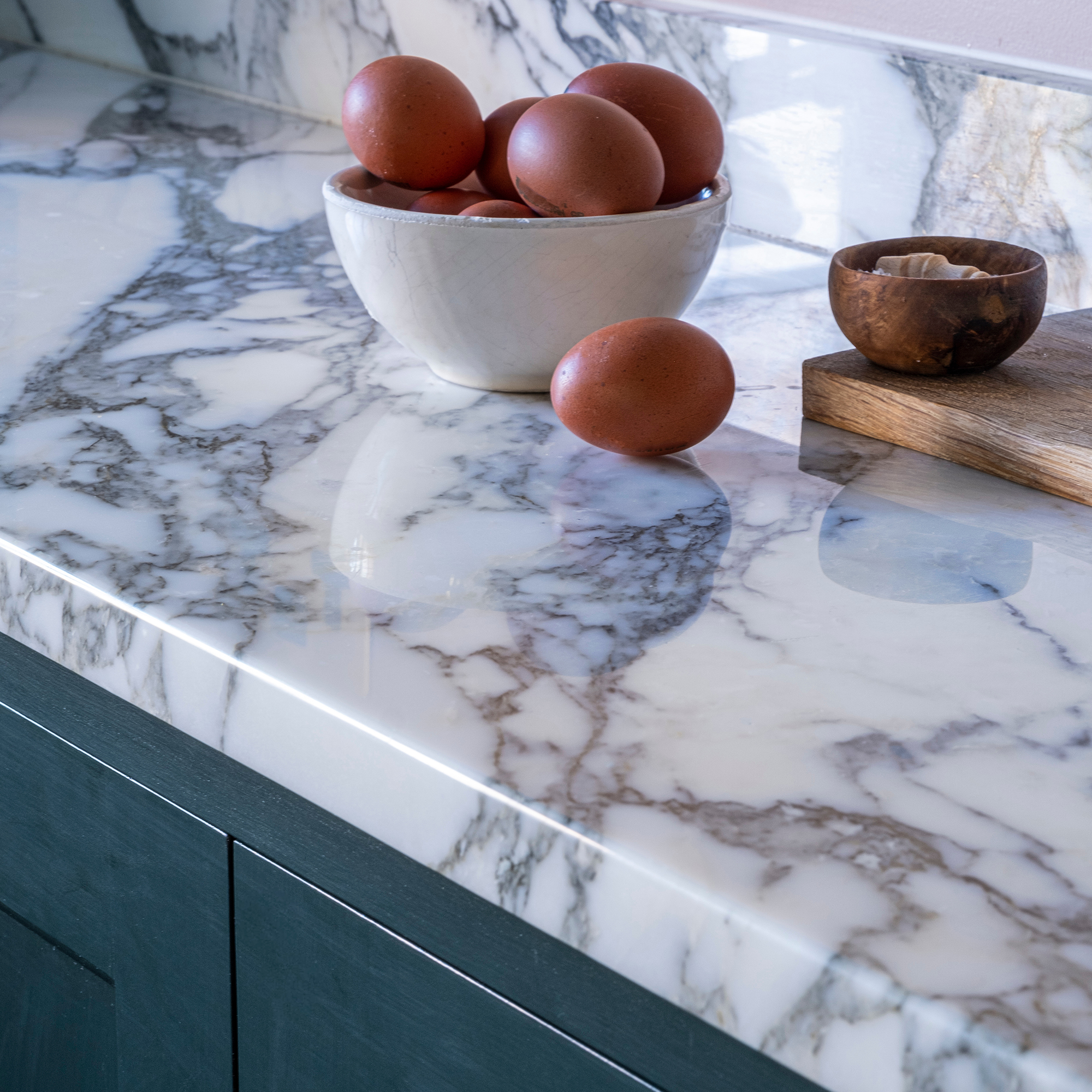
As a kitchen worktop idea, the team at Guild Anderson made the peninsula stand out with a Pippy oak worktop, 'which is a work of art in its own right,' says Nick
The oak serves as a softer foil to the marble worktops that run around the rest of the cabinetry and add a luxury edge, while also helping to brighten the room.
Making the sink a focal point
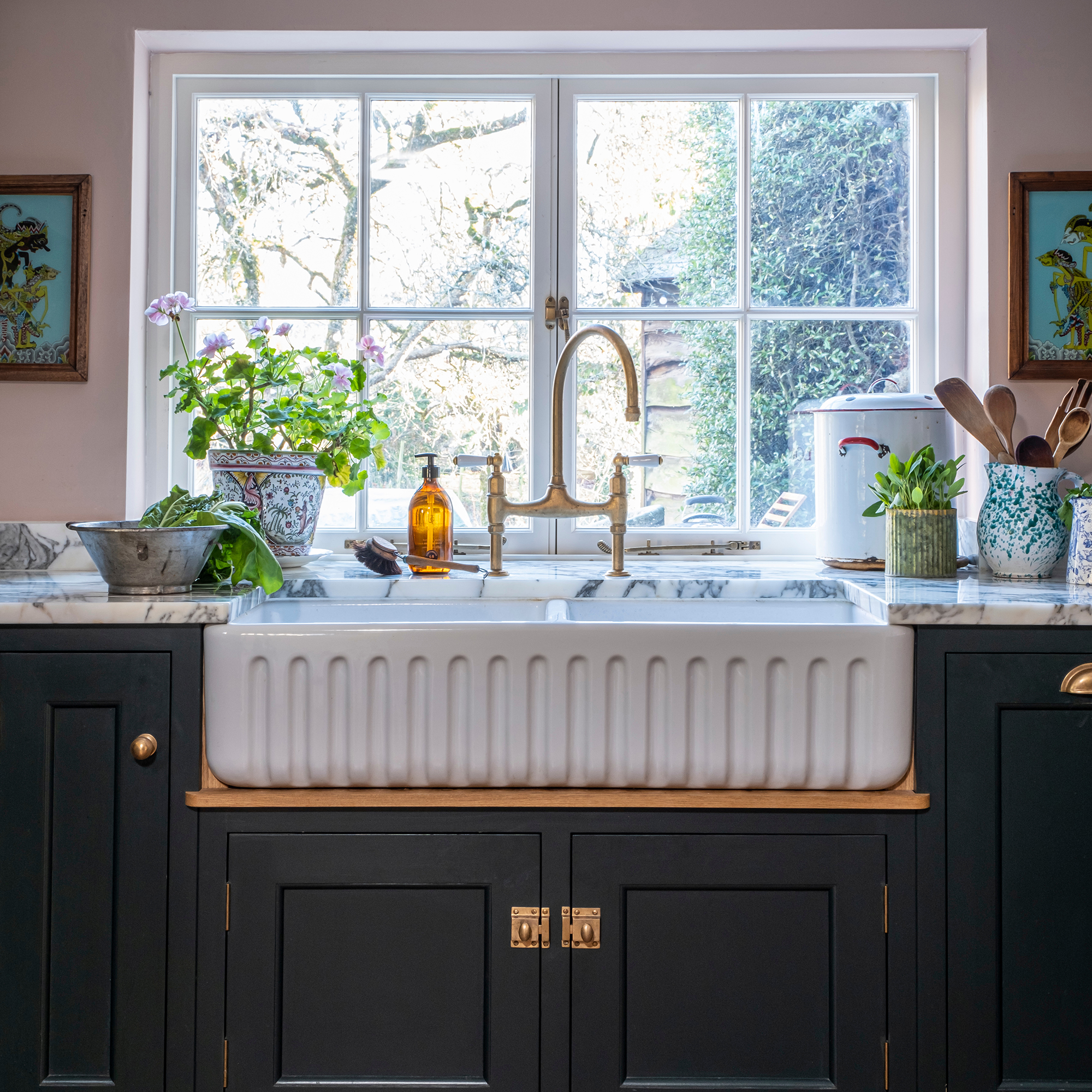
The homeowners recognised that the space saved by removing the Aga was too valuable to lose.
‘So often in a cottage kitchen, we have a range cooker as the centrepiece, but here we didn’t have that. The modern integrated appliances are almost invisible, so we had to find a new centrepiece.'
There was only one natural choice. The double Belfast sink with its luminous ceramic finish and pretty fluted apron, became the star of the show – which is among the many different styles of kitchen sink.
Nick paired the sink with a statement brass mixer kitchen tap, which catches the light from the window and ties in with the brass hardware on the cabinetry.
Works of art adorning the wall on each side of the window, and plants filling the window sill complete this beautiful focal point.
Colourful impact
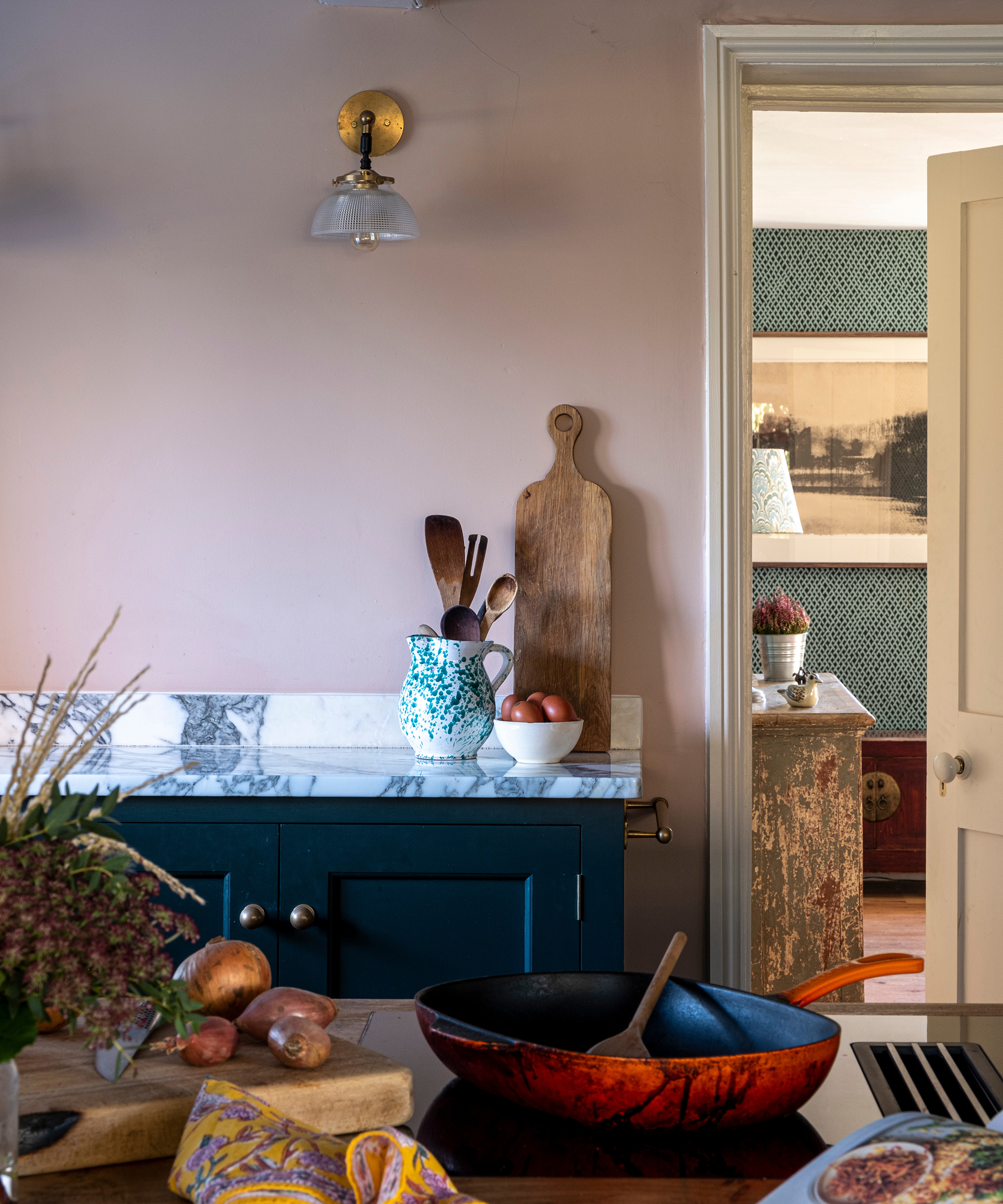
‘I have always felt very strongly that, as well as being a practical space, a kitchen should be aesthetically pleasing,’ says the homeowner. ‘It is by far the room where I spend most of my time.'
Walls painted in Paint & Paper Library's Temple shade contrast beautifully with the cabinetry in Farrow & Ball’s Studio Green – with deep green rising in popularity as one of the kitchen colour trends for this year.
Will you be stealing any design tricks from this clever kitchen design?

Holly is one of Ideal Home’s content editors. Starting her career in 2018 as a feature writer and sub-editor for Period Living magazine, she has continued this role also adding regular features for Country Homes & Interiors and the Ideal Home website to her roster. Holly has a passion for traditional and country-inspired interiors – especially kitchen design – and is happiest when exploring the countryside and hills of the Lake District. A keen gardener, she is a strong believer that you can never have too many houseplants.
- Rachel CrowSenior Content Editor
-
 5 signs you’ve taken decluttering too far — and how you can pull yourself back, according to organisation experts
You might have to start resisting the urge to purge
By Lauren Bradbury
-
 What is the Party Wall Act 3m rule and is it something you should be worried about? This is what the experts say
Don't get caught off-guard by the Party Wall Act 3m rule — our expert guide is a must-read
By Natasha Brinsmead
-
 Shoppers can’t get enough of The Range’s lemon tree, but I’ve found an even cheaper bestseller at B&Q - it’s perfect for a Mediterranean look
Welcome the summer with this glorious fruit tree
By Kezia Reynolds
-
 'The kitchen looked like the one out of The Tiger Who Came to Tea'
A leaky, run-down space didn't put off two seasoned renovators, who could see this home's potential
By Pippa Blenkinsop
-
 'The restoration of the cottage has been well worth the journey'
A sensitive renovation and neutral colour palette have accentuated the character of this pretty Cotswold cottage
By Janet McMeekin
-
 This London maisonette has been revived with vibrant and energetic colour and pattern
'I didn't want a cookie-cutter interior', explains the owner
By Alison Gibb
-
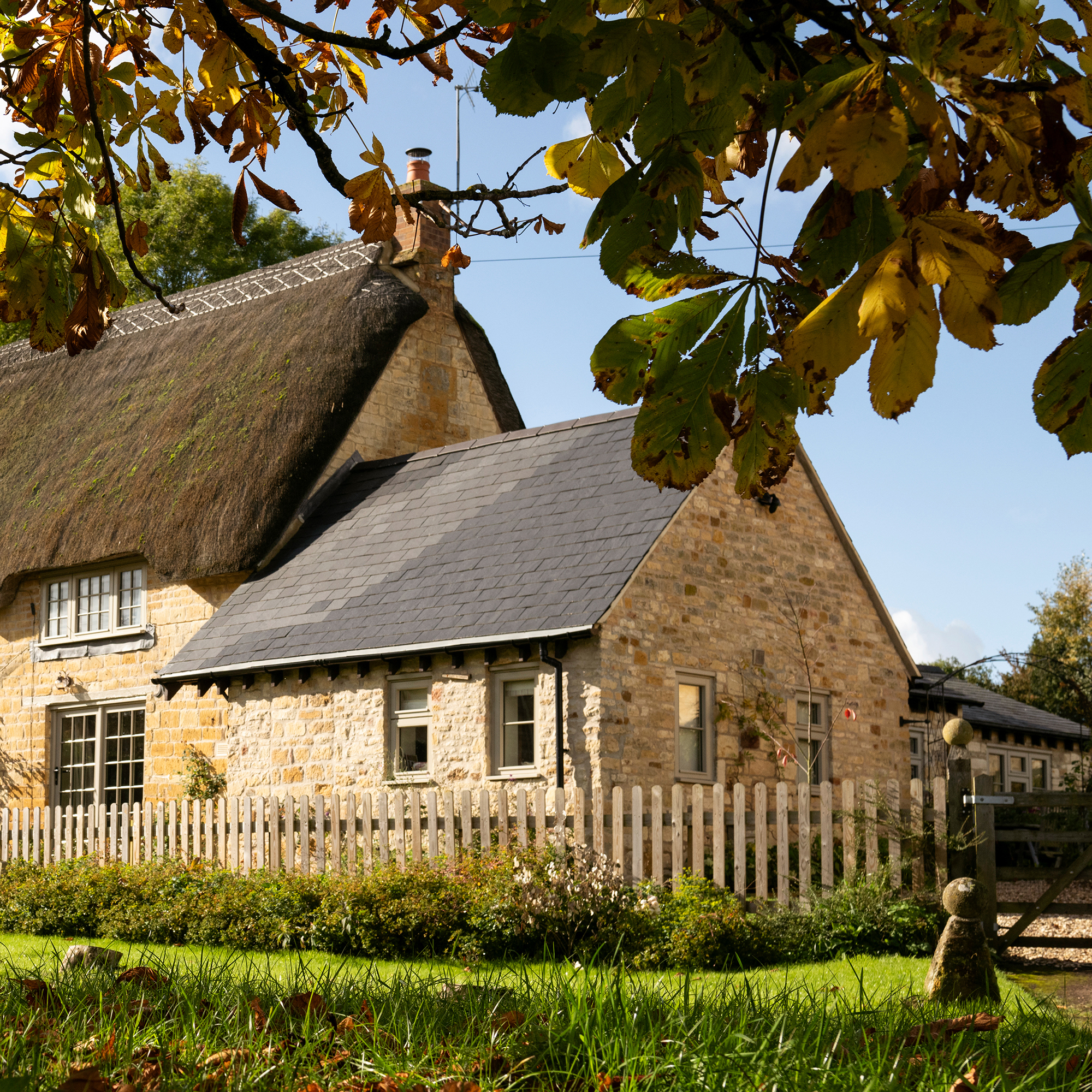 Actress Danielle Bux found her perfect English bolthole in the Cotswolds
A quintessential thatched cottage in a Gloucestershire village is the ultimate country escape from the actress's hectic US lifestyle
By Mary Weaver
-
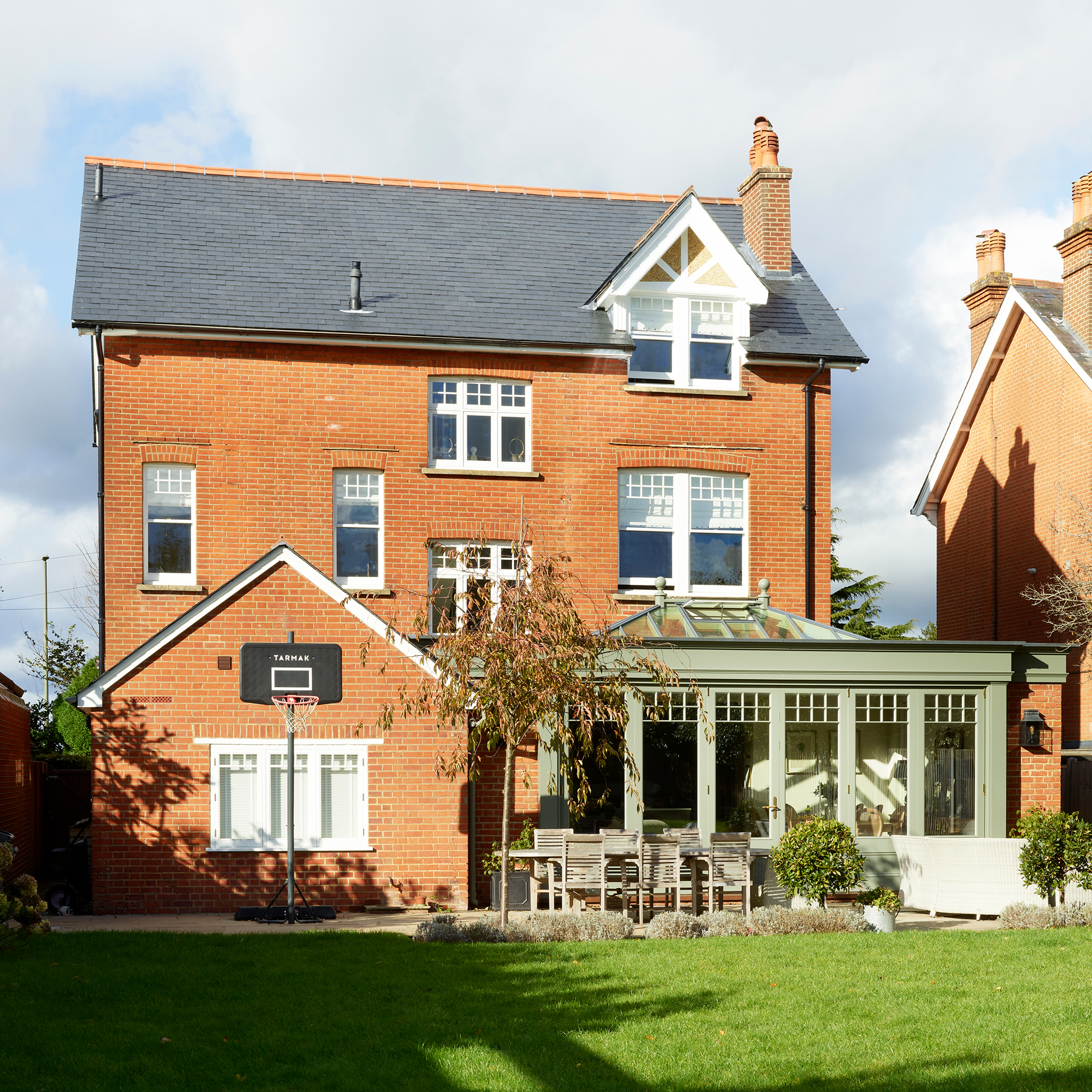 ‘We wanted to completely rejig the layout to make it feel more balanced and practical for family living'
It took vision to create an elegant family home from a neglected house with an awkward layout, but the owners knew where to start
By Janet McMeekin
-
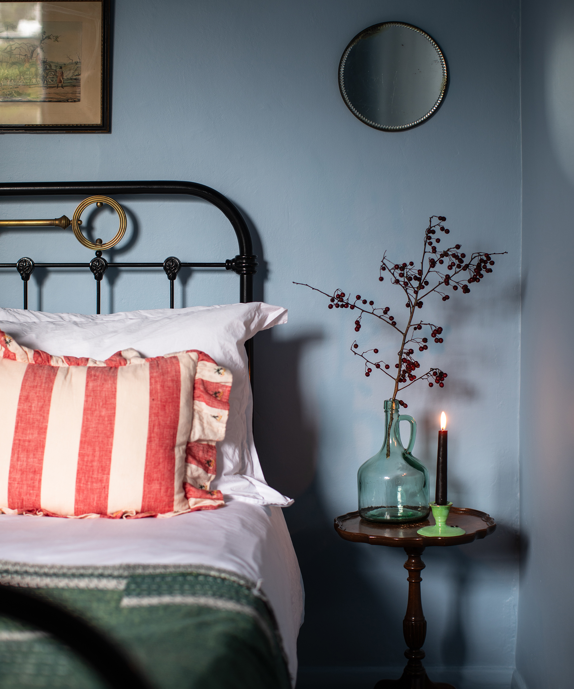 These homeowners took their time renovating this West Sussex Victorian property with stunning results
'We've adopted a relaxed approach, living in the house as we discover what changes we want to make'
By Alice Roberton
-
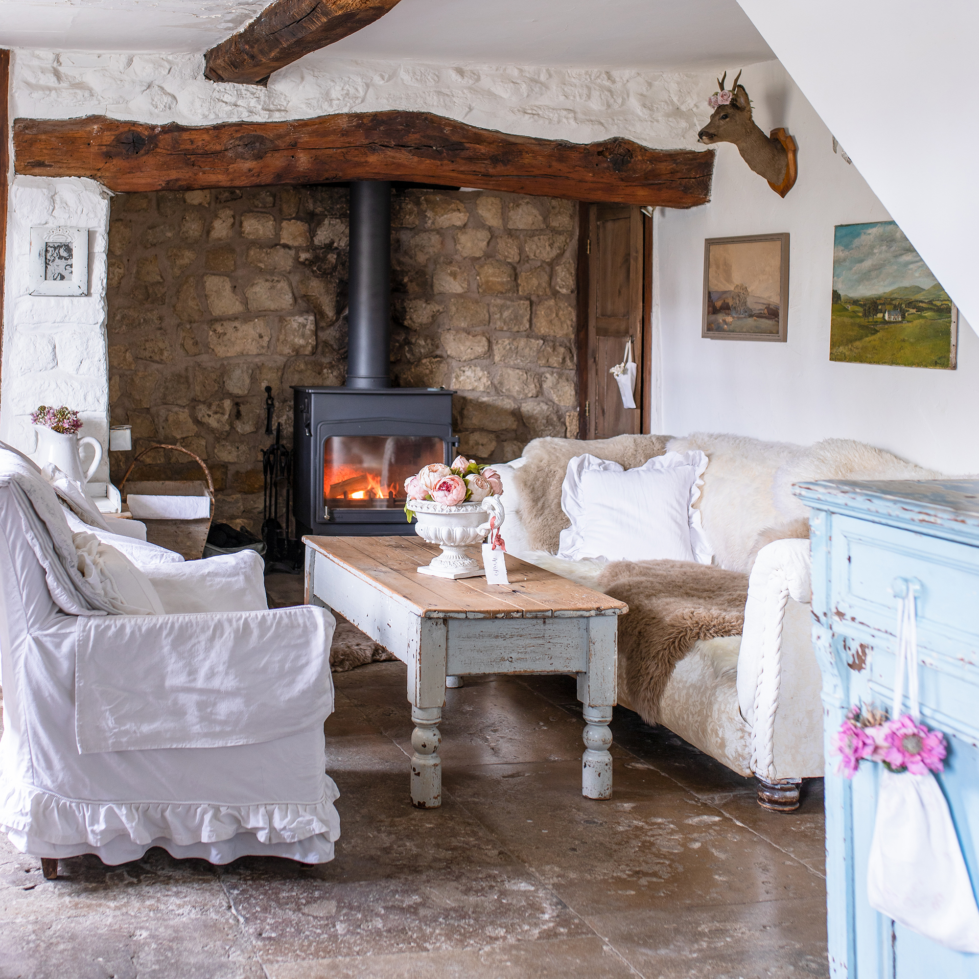 With this thatched cottage 'all practical thinking went out the window, and my heart won!’'
An all-white French farmhouse scheme enhances the beautiful original features of this home
By Alice Roberton
-
 'Simple ideas often make the most impact' – this home demonstrates how less really can be more
This homeowner opted for simplicity when decorating her 400-year-old cottage for Christmas
By Maggie Colvin