A clever change of layout was key to creating this luxuriously large bathroom
The homeowners knocked two rooms together for a bigger family space, decorated with a glamorous touch
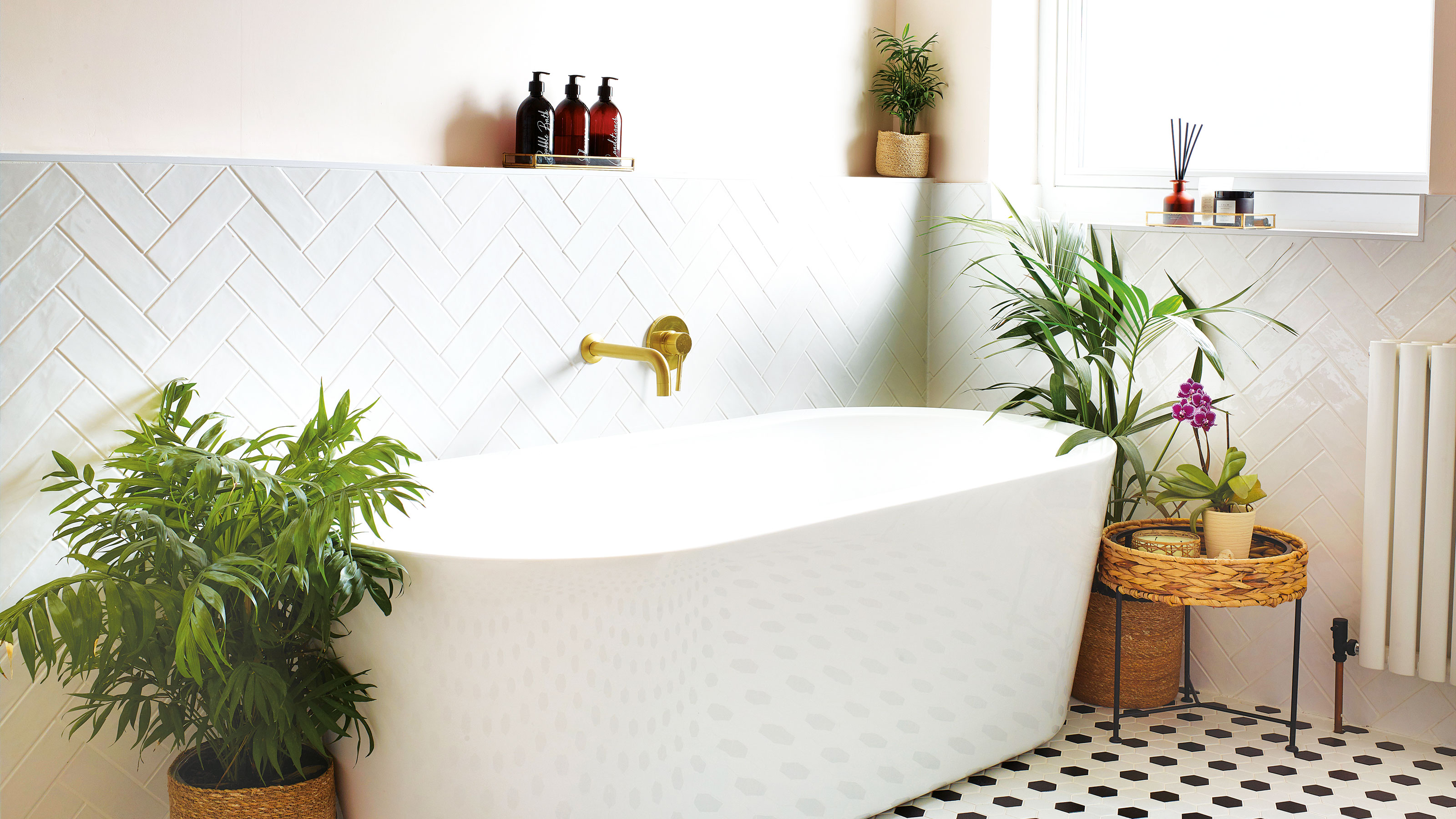

Small bathrooms and growing families aren’t a good combination. That was something this homeowner had first-hand knowledge of in their old house. So when she and her husband moved to their 1950s house in Nottingham with their two children, their renovation journey started with the bathroom ideas.
The water tank and boiler were taking up space in there, and as they needed to install a whole new heating system, it was the perfect opportunity to change the bathroom layout and make it into exactly what they needed. ‘The existing bath, basin and toilet were pink, and while I do love pink, that was a bit much for me, so I was eager for that to go,’ she says.

Making room
‘In our last house, the family bathroom really annoyed us as it was never quite big enough. We wanted to make this as large as we could. With the original floor plan, there was a lot of dead space; we wanted to change the layout to make the most of what we had.
'There was a separate bathroom and WC, a larger than necessary landing, and a huge built-in cupboard. We decided to knock between the two rooms, spread onto the landing and remove the cupboard for more usable space.’
Work in progress
‘The whole process took three to four weeks. We moved out for a week of this and rented a flat, as it was in the middle of a lockdown. To be honest, it was the worst time to move and the worst time to renovate, but we made it work.
'We installed all the radiators in the house and the bathroom at the same time, so it was great to have a key room and updated heating ticked off our renovation to-do list quite early on.’
Choosing the essentials
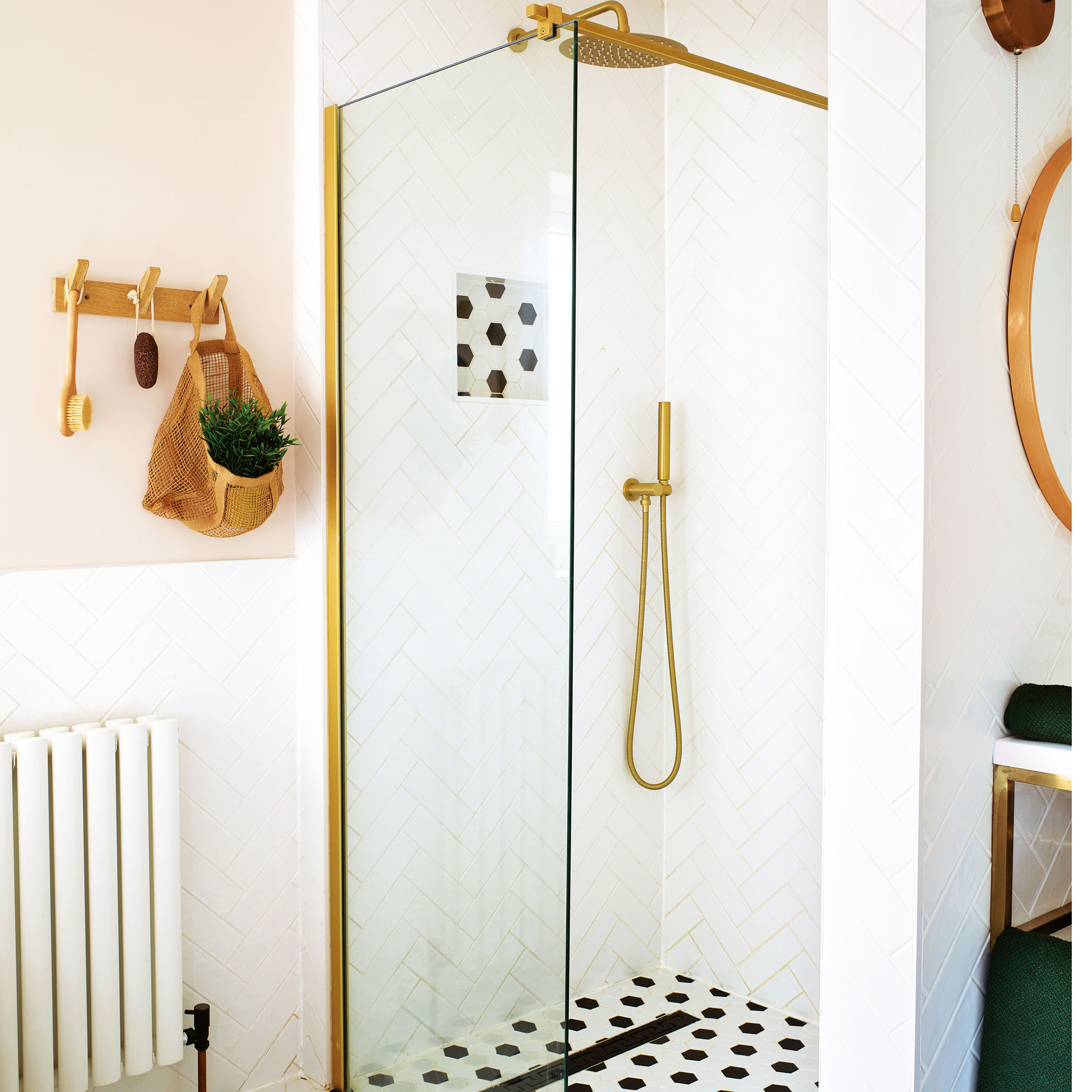
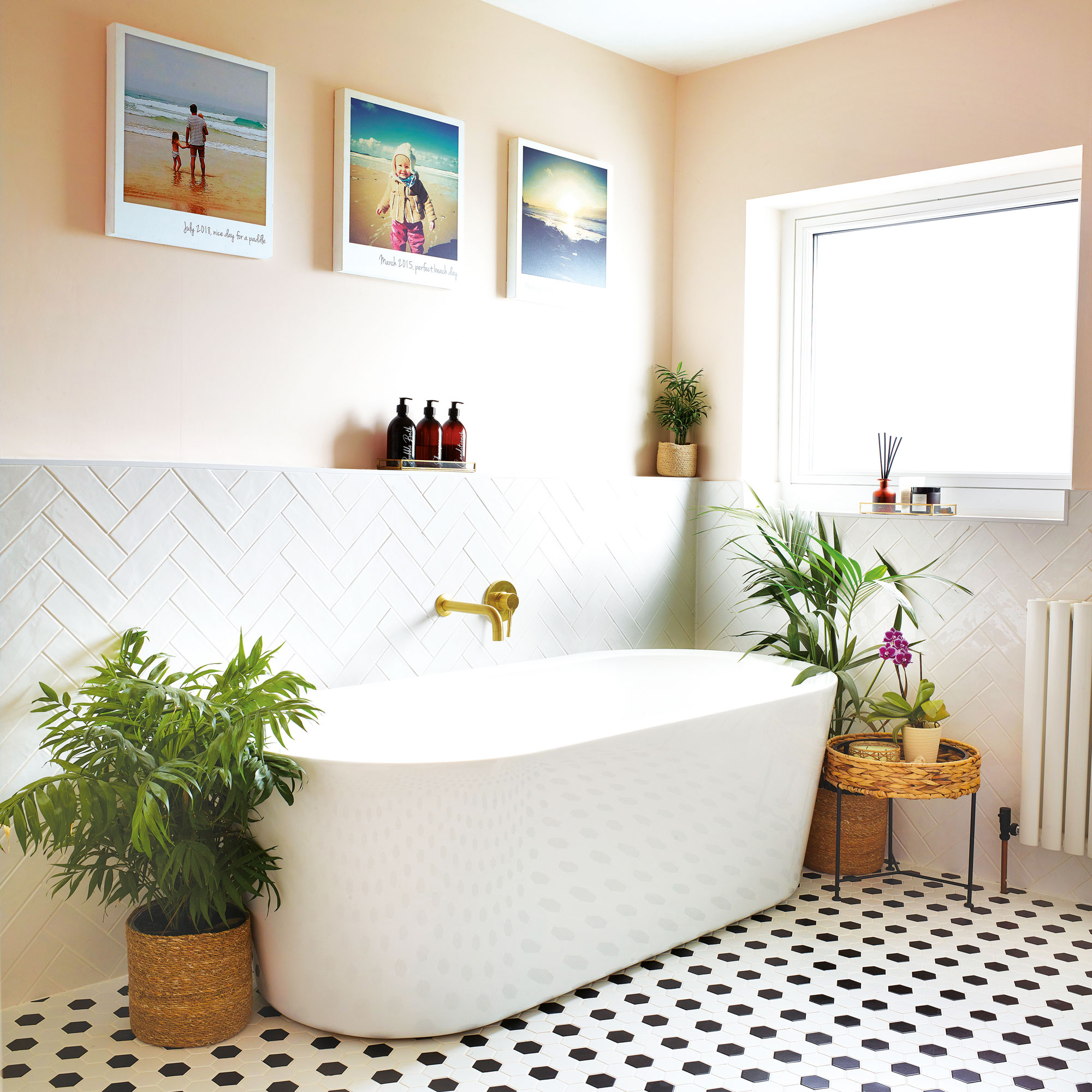
‘I really wanted to make sure the bath was big enough for us to properly lounge and relax in. I chose a wall-hung vanity unit to save on floor space and a walk-in shower to create a sleek, neat, and airy feel. We hunted around for ages to find the best deals and got everything from a variety of companies.
'When the walls were plastered, I really liked the look of the room in that colour — which is why I chose to paint in a soft, earthy pink. I wanted the bathroom quite neutral and not too bright.’
Pen to paper
‘We didn’t hire an architect to create the layout, but worked closely with our builder. We bought some graph paper and planned out the design ourselves. It was fun cutting out little baths to scale and placing them on the paper to get an idea of what the space would look like. Doing it this way was also a lot cheaper.
Get the Ideal Home Newsletter
Sign up to our newsletter for style and decor inspiration, house makeovers, project advice and more.
'Our builder was recommended to us by a friend. We moved into the house in the December and had a chilly Christmas with no heating. Luckily for us, the builder had a cancellation — so he was able to come in the first week of January.’

The décor
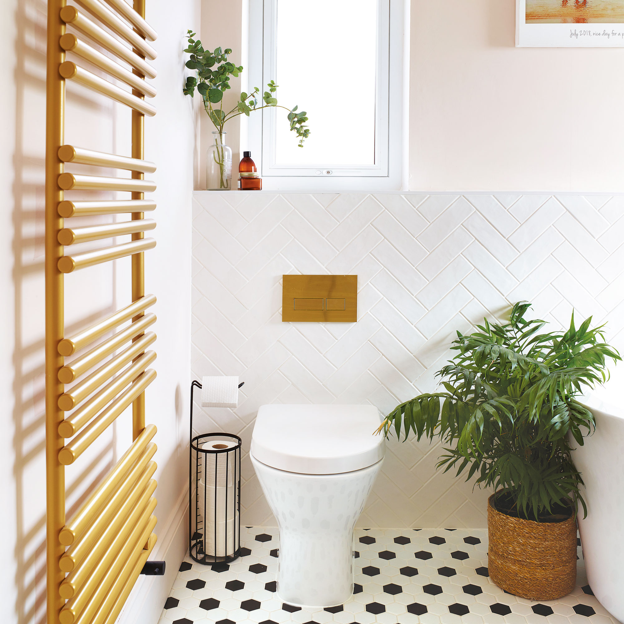
‘I’d say my style is classic meets contemporary. When planning a scheme, I just see something in my head and I just want to go with it. I really like the brass finish for hardware.
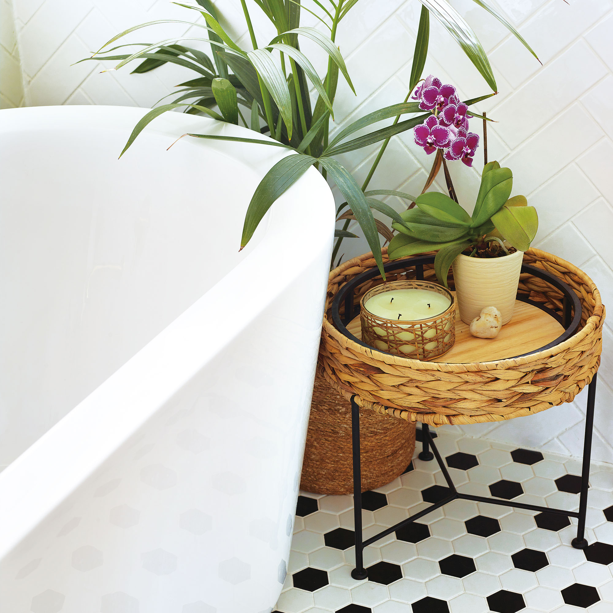
'The herringbone tiles were our only problem. As it was lockdown, we couldn’t go into showrooms to see how they looked, and when they arrived, I wasn’t completely happy with them. We sent them back and ordered new ones — which turned into quite a costly process. But I’m so pleased with them now, it was worth it.’

Amelia has worked in interiors journalism and home styling since 2016. She was previously the Co-Editor of Real Homes magazine, and has worked across titles including House Beautiful, Homes & Gardens and Gardening Etc.
-
 Move over, fences – dead hedges are the wild and wonderful alternative your garden will love and they're easier to build than you'd think
The perfect eco-friendly solution for small gardens
By Kayleigh Dray
-
 Did you know John Lewis can make your old curtains or rugs look like new? Their repair service is now available in all stores
John Lewis has added another string to its bow, and it's great news for your old homeware
By Kezia Reynolds
-
 This beautiful mixing bowl is the unexpected star of so many kitchens – including Mary Berry's and the Bake Off tent
This earthenware bowl proves that you don't have to spend a huge amount for a classic kitchen addition
By Molly Cleary