Adding more space in all directions has transformed this 1930's detached house
See how adding more space via an extension on the rear of this 90 year old property, has futureproofed it for years to come
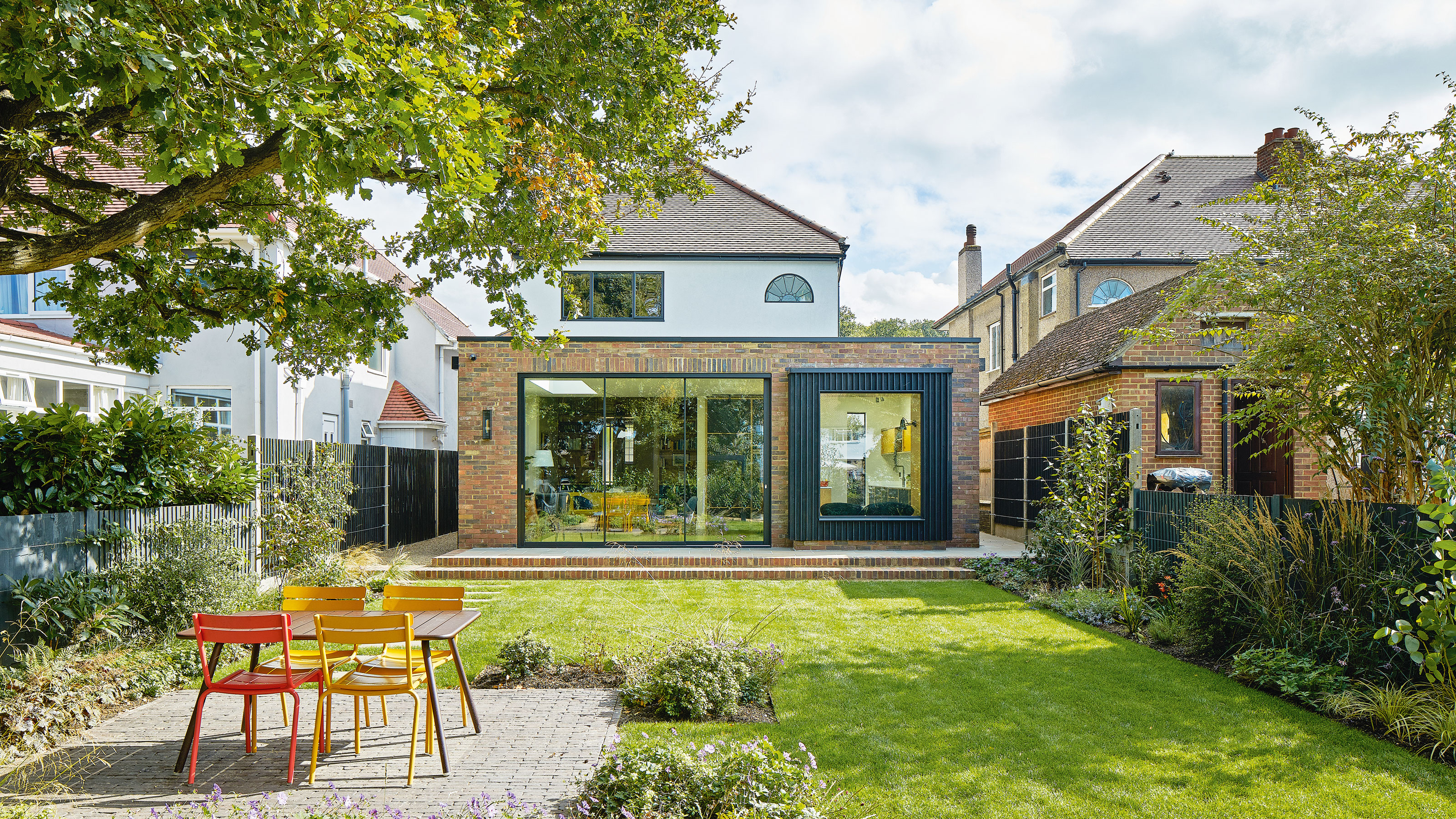

When finding ways of adding more space, sometimes extending up or out just isn't enough. That was the problem facing this family when they wanted to create an open plan kitchen, living and dining area in their 1930s detached home in Kent.
As well as having plans to renovate the entire property, the existing kitchen was small and disconnected from the dining room, with an old extension that was dark and cold. Aside from having clear plans on how to design the kitchen of their dreams, the cramped nature of the rooms at the rear of the house made the owners seek professional help on making their dreams a reality.
They enlisted the expertise of architect Marienne Pachonick to find a way to create the home they longed for, with a bright airy family-friendly multi-use space at its heart.
Here, Marienne Pachonick talks us through the project, the problems that her firm had to overcome and the finished result.
Adding more space - how this family extended up, down and out
The original house and garden had a significant level difference which made the garden feel disconnected from the house and less accessible. The existing extension was old fashioned and didn’t take advantage of the full width of the house.
It also starved the interior of natural daylight, which made the rooms feel dark and dingy. The grey rendered exterior and tiered level crazy paving contributed to the oppressive looking and outdated appearance.
‘As well as renewing almost every aspect of this house,’ explains Marienne, ‘the biggest improvement was to add a kitchen, seating and dining area in an extension that extends beyond the width at the rear.'
Get the Ideal Home Newsletter
Sign up to our newsletter for style and decor inspiration, house makeovers, project advice and more.
'So when the pandemic hit in 2020,' she continues, 'I adjusted the plans to include some modern home office ideas for working from home. The owners wanted a feeling of spaciousness, to maximise the natural light and to have easy access to the outside. By lowering the floor of the extension, we created a much better connection to the garden and gained height without making an overly large structure.'
'Floor-to-ceiling sliding doors, a feature window seat and large roof lanterns satisfy their wish for a bright interior,' she continues. 'They were also keen to capitalise on existing features of the garden and a mature oak has become the anchor for an outdoor dining space.'
'The entire project ran smoothly thanks largely to the great attention to detail from the start, an agreed budget and the open-mindedness of the owners,' says Marianne, 'who were bold in their commitment to using modern materials.’
The kitchen area
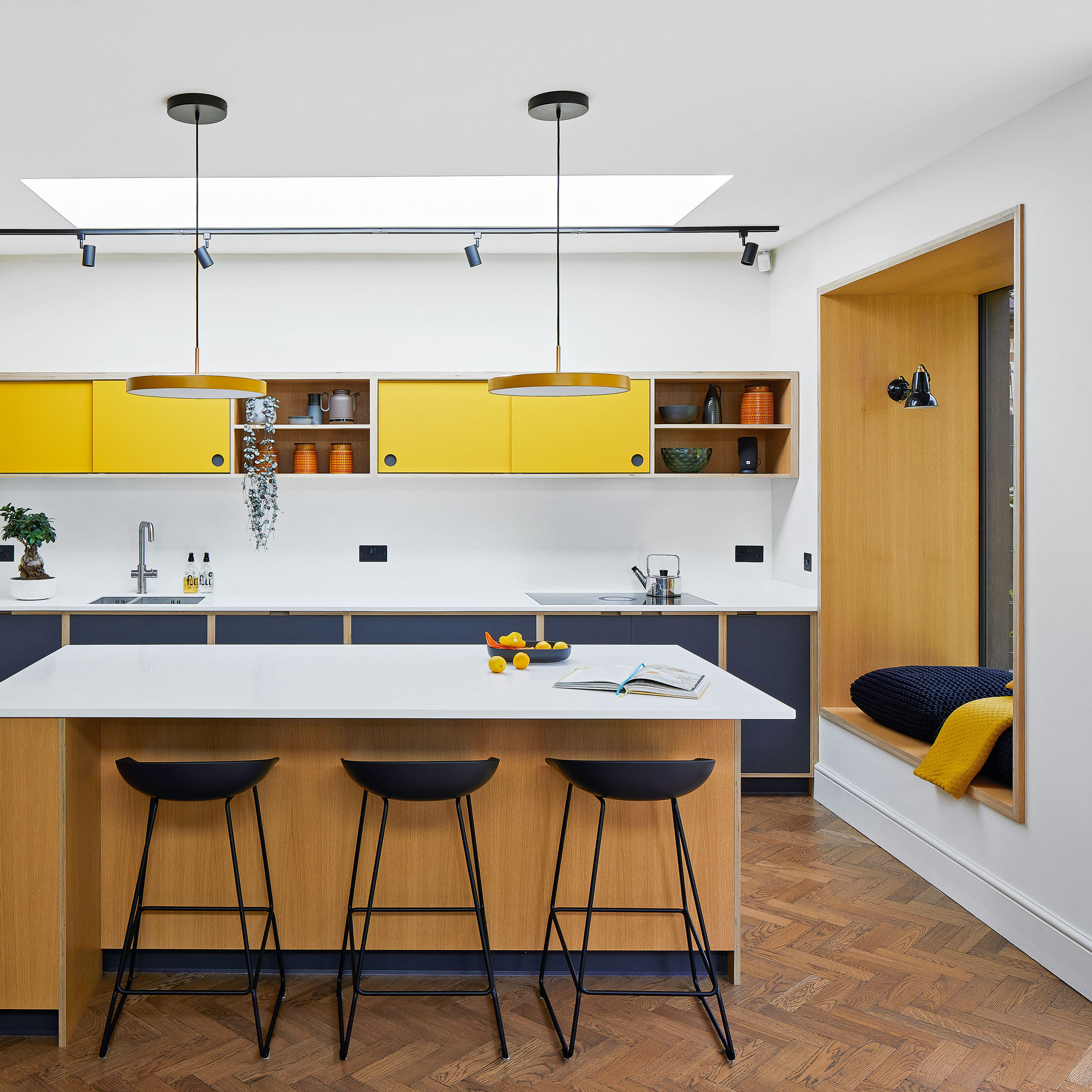
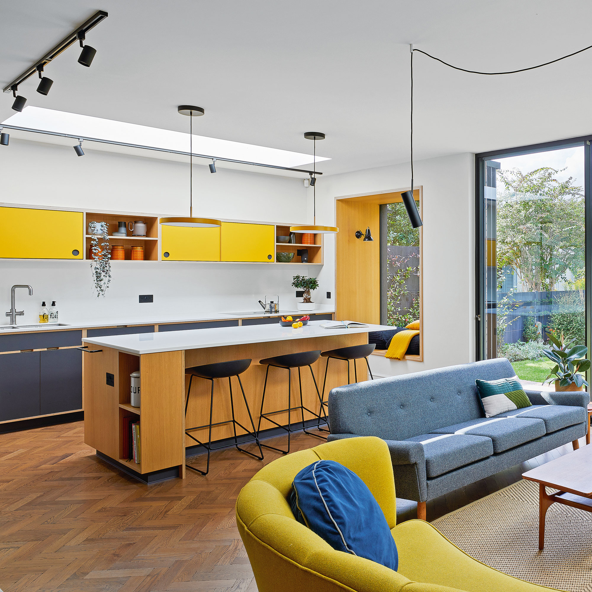
A two tone plywood kitchen cabinets complement the charred larch and the plywood lined window seat which frames the view to the garden, providing a sophisticated and bold finish.
Ceiling height built-in cabinetry echoes the floor to ceiling sliding doors in the sitting zone beyond.
A traditional herringbone floor coupled with a bold colour scheme emphasises the increased ceiling height of the new extension and adds a sense of scale to the new extension.
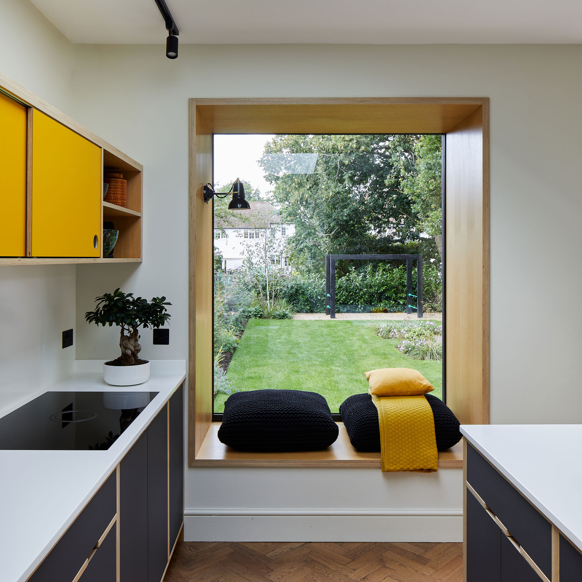
A feature window has a built-in seat and is framed using a plywood lining on all four sides to provide a cosy nook in which the family can curl up and relax whilst enjoying views into the garden.
Locating a projecting window seat into a kitchen turns an otherwise blank wall into a useful feature as well as introducing a furnishing feel to the hard-working kitchen space.
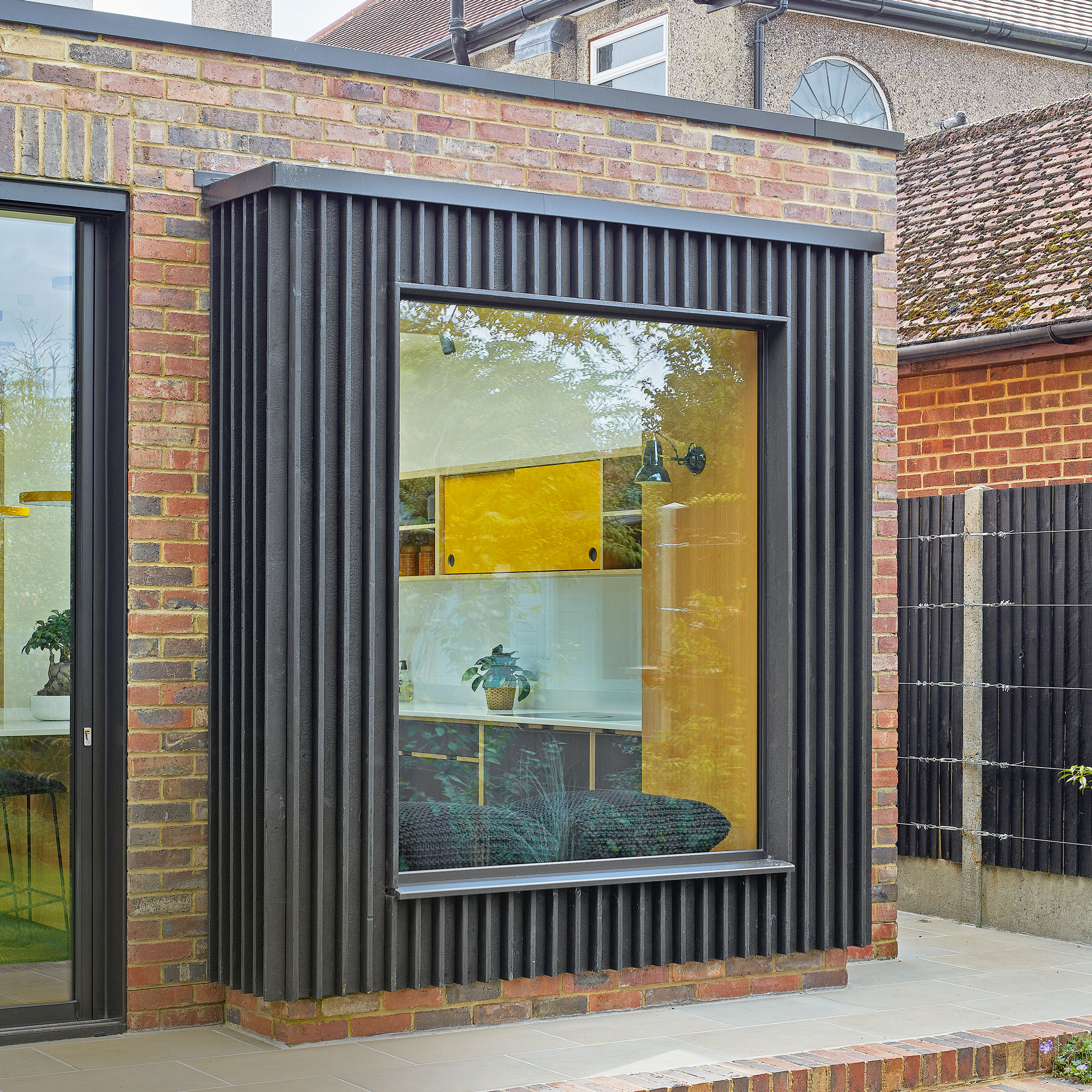
Combining contrasting materials adds an interesting architectural feature to the new extension in the form of a large window seat structure, which is framed with charred larch exterior cladding which adds a bold accent against the warmer red brick facade.
Tall glazing helps to amplify the light around the window seat area and into the kitchen space beyond.
The utility room
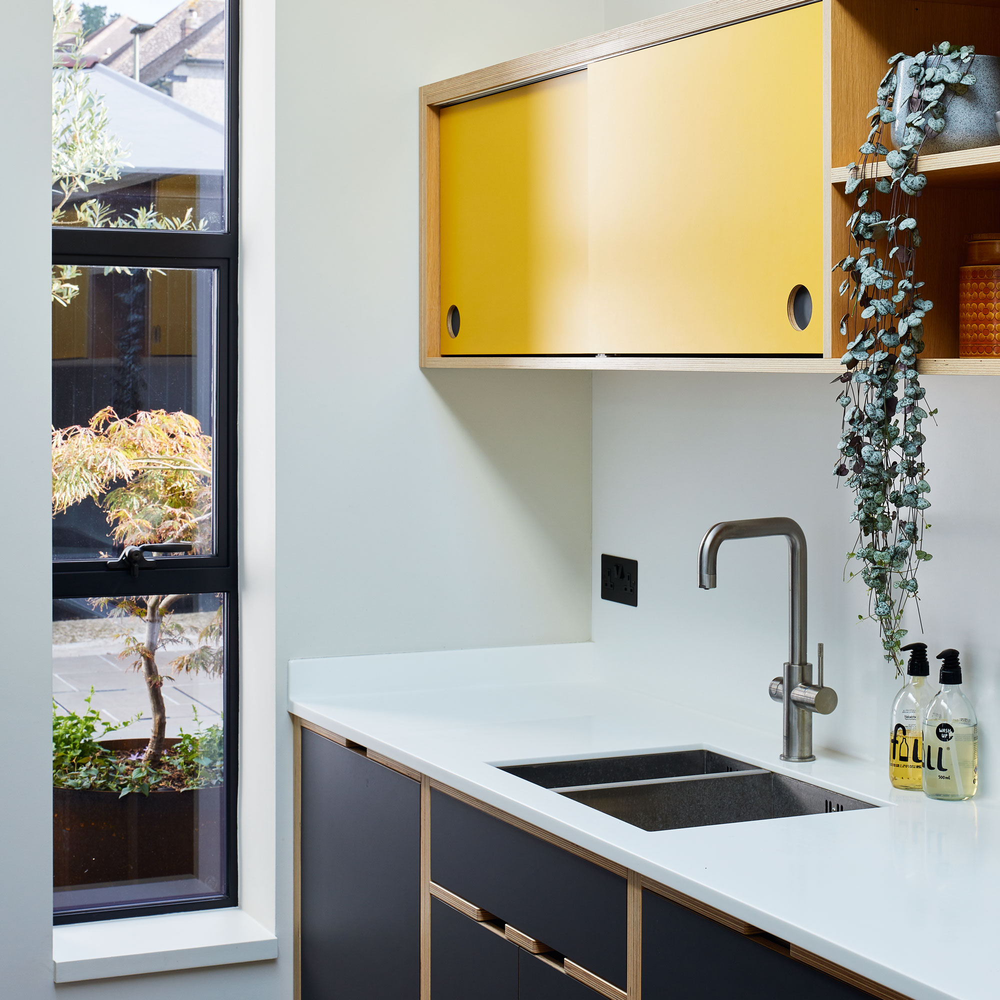
As utility room design ideas go, the bold yellow and black colour scheme provides strong visual statement within an otherwise all white interior.
The addition of black accents in the form of wall plugs and window frames anchor the scheme.
Subtle design details such as the sliding cupboard fronts echo the sliding pocket doors located in the dining zone. A tall, slim window frame looks out onto the courtyard beyond.
The living area
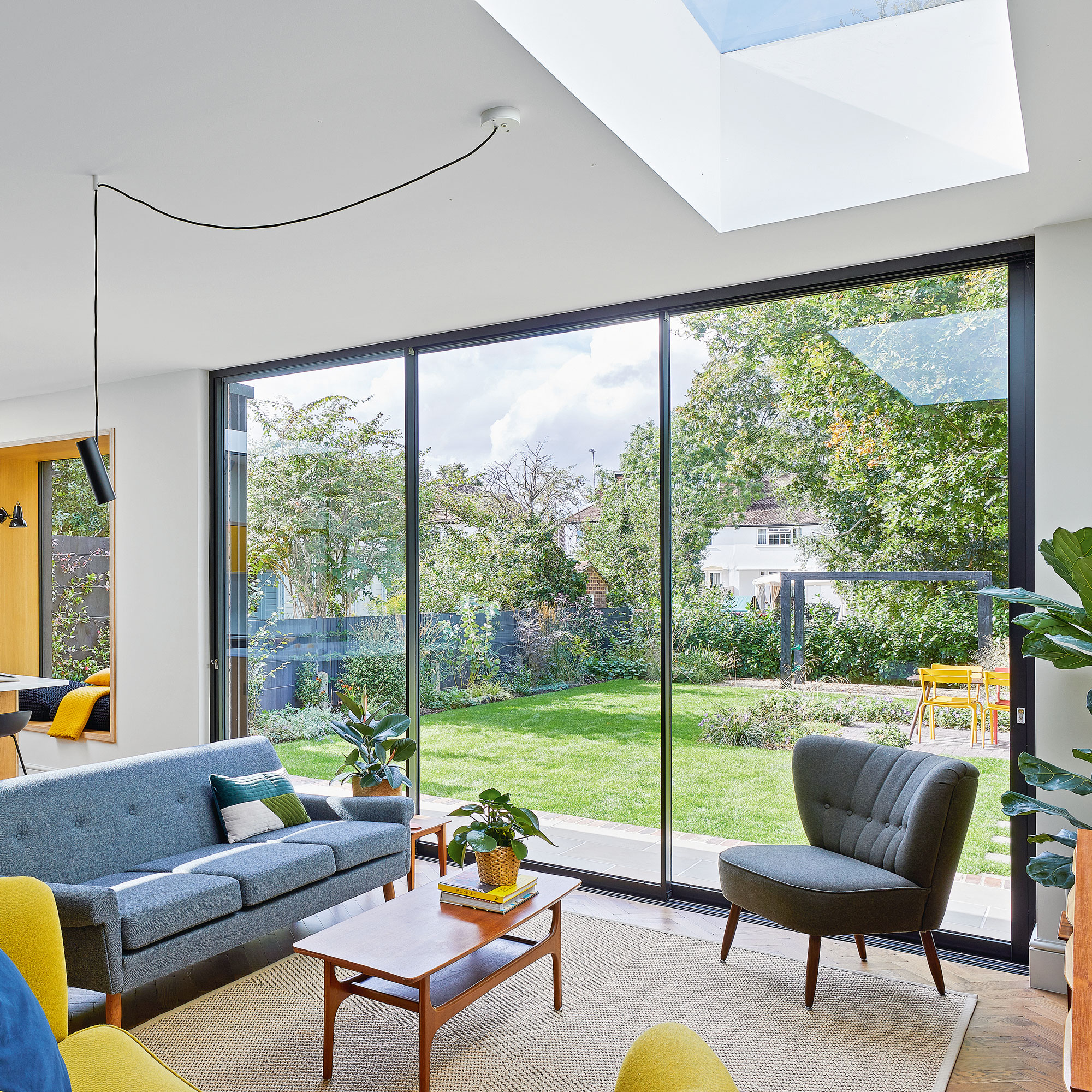
Floor-to-ceiling height sliding doors elongate the space, bringing the views from the garden into the interior.
Frameless glazed skylights and rooflights add a sleek, modern look that visually reinforces the sense of added ceiling height whilst boosting the flow of natural light throughout the entire new extension.
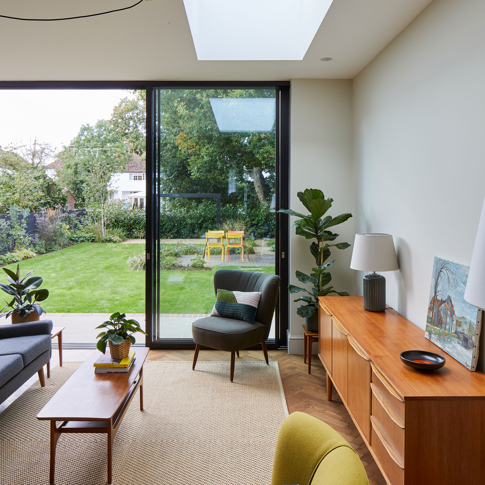
A living room within the open plan extension satisfies the owner's need for natural daylight with the slim framed sliding doors, which are framed in a bold black that echoes the charred large used on the exterior.
An all-white interior gives a contemporary appearance which is contrasted with the warmth of the herringbone wood flooring ideas.
The dining area
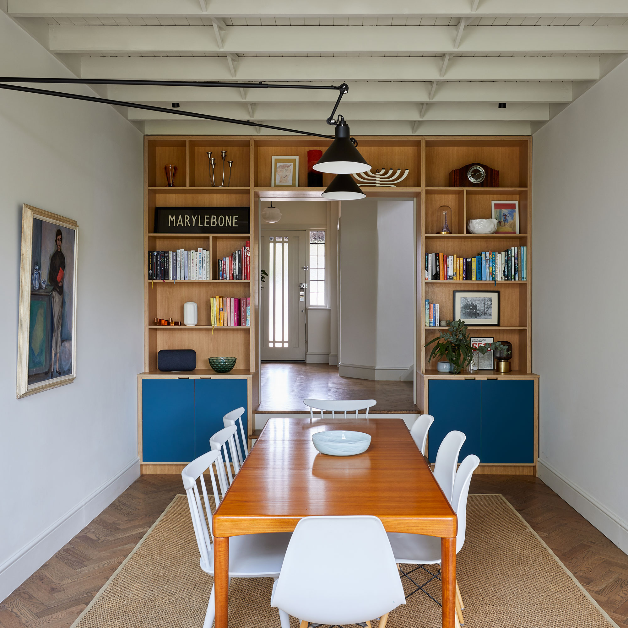
Revealing original architectural elements, such as the exposed ceiling joists, adds great character to the newly created dining area as well as contrasting with the modern panelling.
The herringbone floor continues through to this space, provideing a visual flow throughout the interior and bespoke storage has been built to house books, ornaments and clever hidden sliding pocket doors that can close off the room to create a more intimate space.
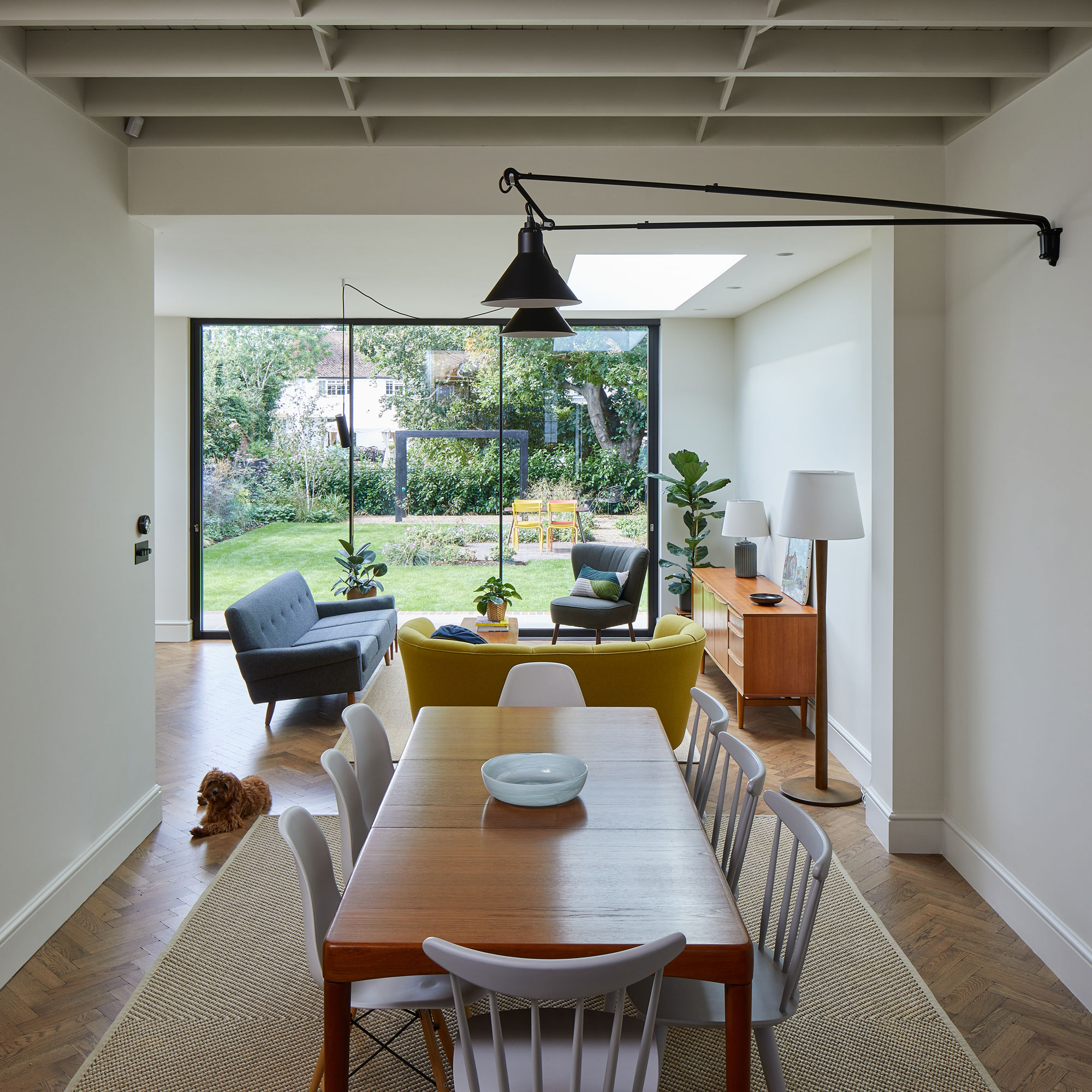
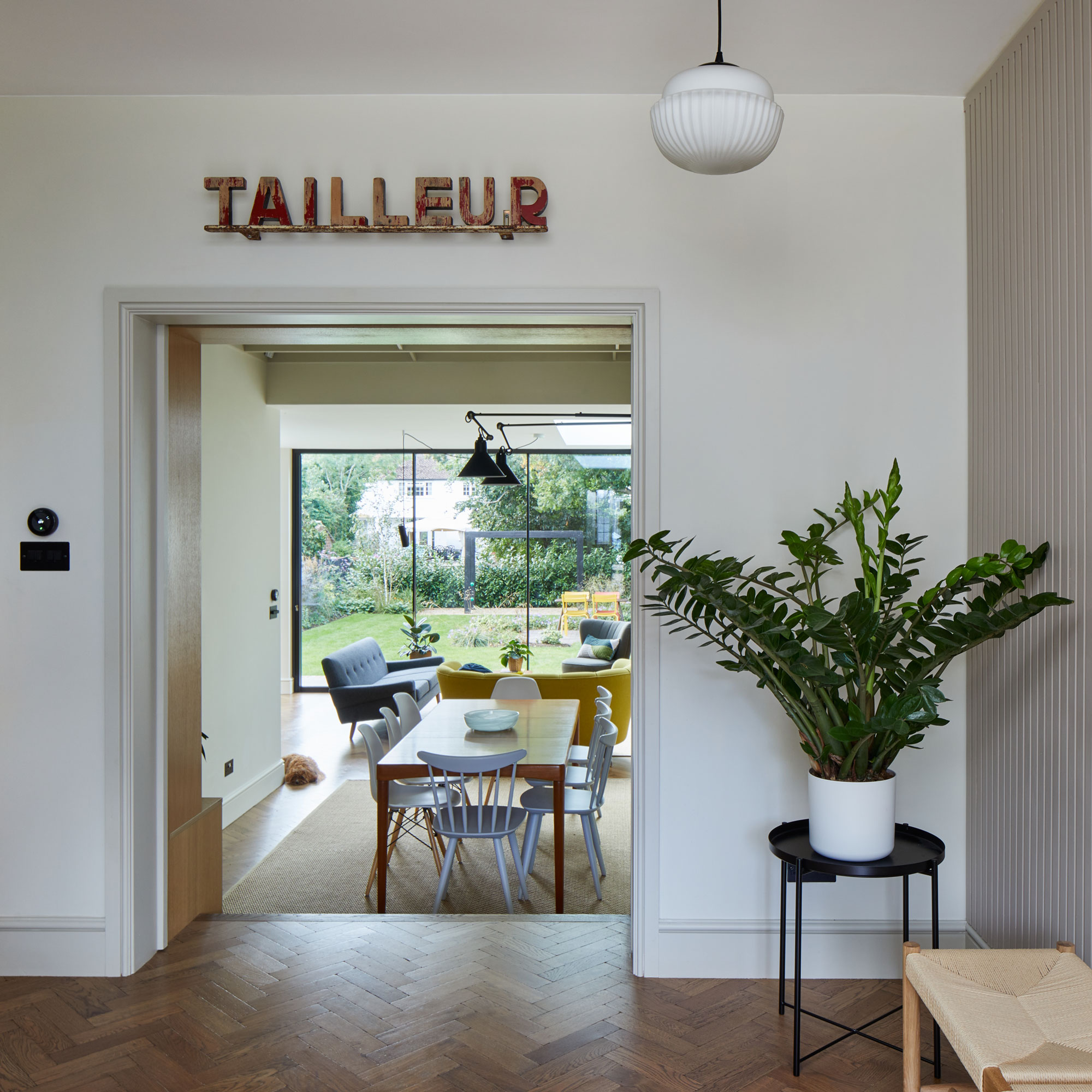
Incorporating an existing room into a newly created space will create character to an extension as well as giving the option of creating a new and useful living zone.
A dining room that was rarely used by the family has been given a new lease of life by connecting it to the new open plan family kitchen and living area.
Removing the ceiling to create a feeling of additional height makes the dining room feel more spacious.
The property before works began
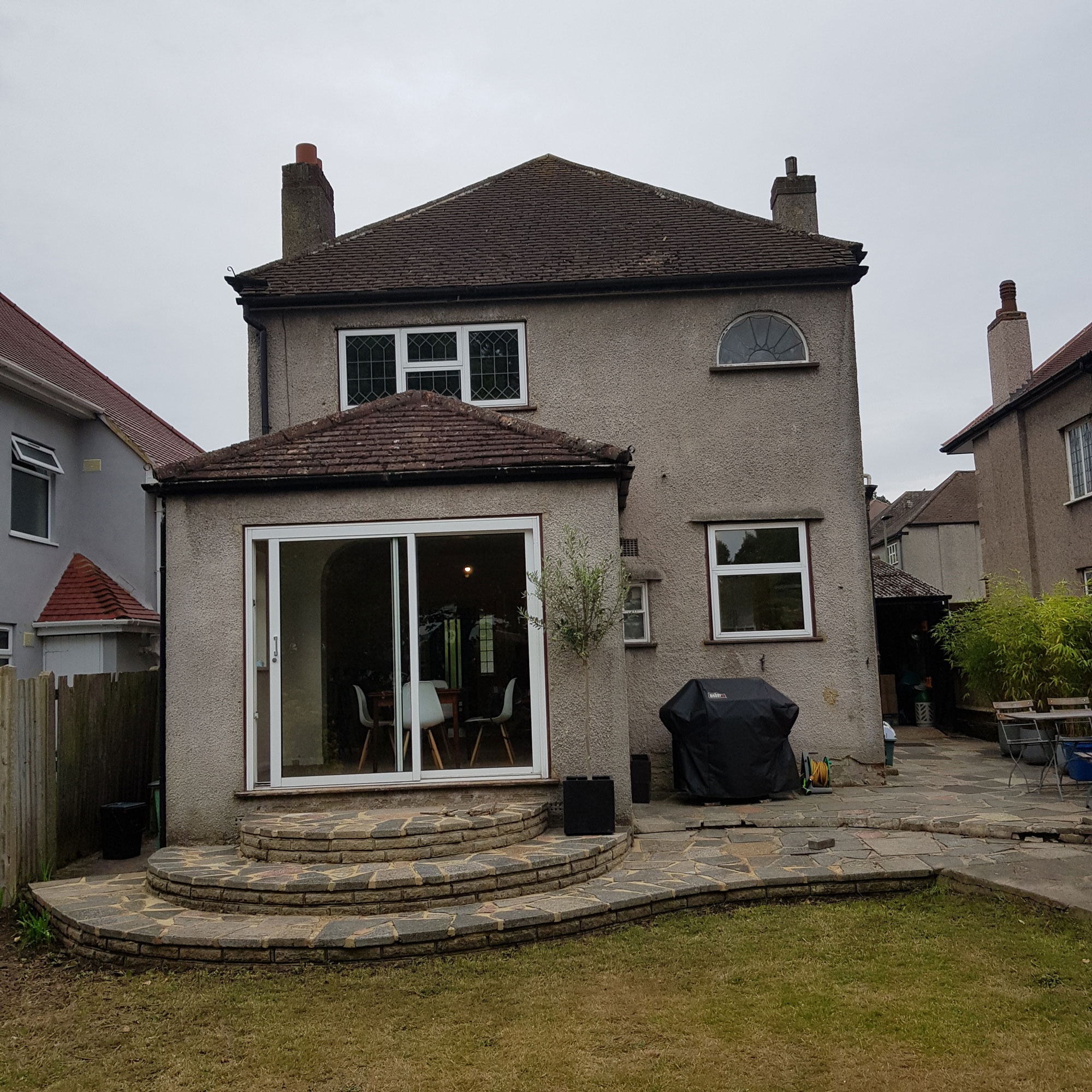
In comparison to the property before works began, the lower level extension now relates much better to the garden.
With easy access from the kitchen to the garden, the family enjoys the benefits of the open plan interior and newly landscaped garden, as does the family dog.
Focus on: Dropping down
Architect Marienne Pachonick shares her tips and ideas
- Planning regulations are sensitive to the height of an extension, but by lowering the structure you can avoid potential objections.
- You can achieve better accessibility and views into the garden by lowering the internal open-plan floor level of the extension.
- Adding glazed patio doors and a feature window will naturally connect a rear extension to the garden and make the most of the natural light. Large sliding doors will not intrude into the space.
- Installing steps leading down into a new, lower level extension will create a natural transition from the existing house interior.
- Lowering the floor of an extension increases the floor-to-ceiling height of the interior, which adds to the sense of spaciousness and increases headroom too.
Additional words by Caroline Foster

Ginevra Benedetti has been the Deputy Editor of Ideal Home magazine since 2021. With a career in magazines spanning nearly twenty years, she has worked for the majority of the UK’s interiors magazines, both as staff and as a freelancer. She first joined the Ideal Home team in 2011, initially as the Deputy Decorating Editor and has never left! She currently oversees the publication of the brand’s magazine each month, from planning through to publication, editing, writing or commissioning the majority of the content.
-
 Wood drenching is the calming new twist on the colour drenching trend – here’s how to make the look work in your home
It’s easier than ever to embrace natural materials
By Maddie Balcombe
-
 Aldi is launching a £200 day bed with four different features - its sleek design is suited to the whole family
You don't want to miss out on this Specialbuy
By Kezia Reynolds
-
 How to set up a drip watering system that saves water and a lot of effort
Keep your plants hydrated (and your water bill down) with this clever garden watering solution
By Natalie Osborn