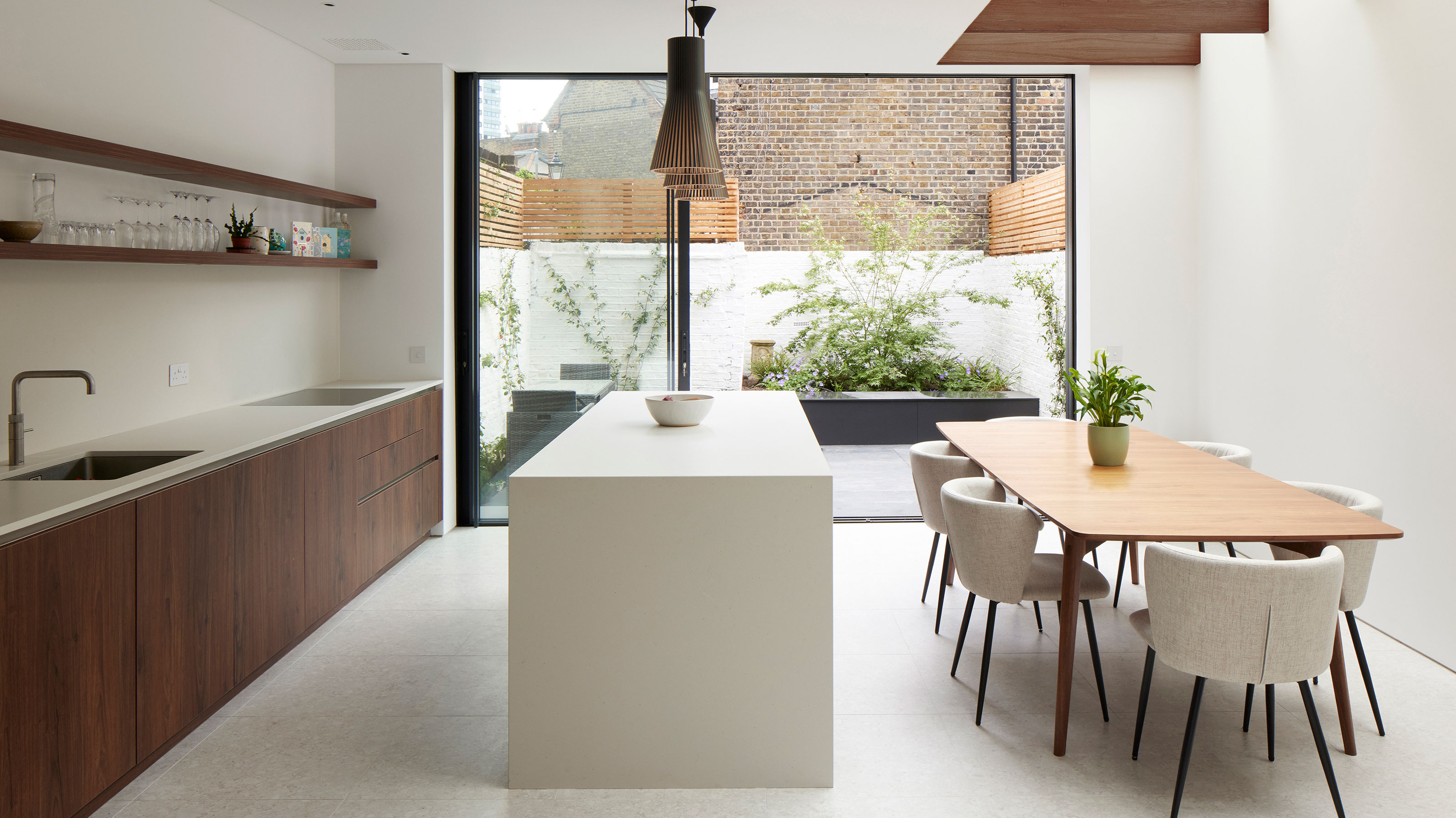
'Extending into the side return has helped create a spacious, new kitchen diner'
We asked an architect how extending into the side return and out the rear of this Victorian terraced house has revolutionised the interior layout

Rebecca Foster
With any transformation or extension project, extending out into the rear of the property is usually one of the easiest and most effective ways to add space. Houses that also have traditional redundant side returns also offer an additional opportunity to extend out to the side, as well as to the rear, providing extra width as well as depth to a new extension.
This traditional Victorian terrace in Battersea, south London had a confused layout without any clear connection to the garden. When the owners bought the property, it hadn’t been touched since the 1960s and was in desperate need of a refresh.
The ground floor had been divided into a series of small rooms, including a utility room and bathroom at the back which allowed little to no natural light to filter indoors. The side return contained a set of steps leading up to the first floor of the house, rendering the 1.5m-wide space completely redundant.
The couple got in touch with Simon Graham, director at Yard Architects who helped them see how much space and light they could gain by just extending into the side return. Here, Simon explains the transformation.

After graduating from The University of Nottingham and Westminster, Simon became a Partner at a practice in Clerkenwell before working for architectural practives Pitman Tozer and Orbit Architects.
It was at the practice in Clerkenwell that Simon met with fellow architect Jonathan Duffett and the two went on to found Yard Architects together in 2014. Simon is a huge admirer of mid-century modern architecture, and is currently renovating his 1960’s townhouse.
‘When we started the project,’ explains Simon, ‘the homeowners were planning to have a family. They wanted a home that would grow with them for a long time, including a big kitchen with a sociable island space next to the garden.'
'However, the existing ground floor layout was convoluted – with a small bathroom and utility at the back and a gap in the side return, which was completely unusable. Plus, the kitchen was on the first floor.'
'Our solution, continues Simon, 'was to remove the walls on the ground floor to open the space out, as well as extending into the side return and to the rear of the house to create a sunny open plan kitchen-living-dining area.'
Sign up to our newsletter for style and decor inspiration, house makeovers, project advice and more.
'To achieve this,' recalls Simon, 'we took out all the walls on the ground floor of the closet wing. This meant we had to support the two floors above while we did the work. We used huge steel beams to hold up the two storeys above what is now the kitchen-diner. Access was difficult because the house is on a busy road – so getting the 7m steel beams in wasn’t easy!'
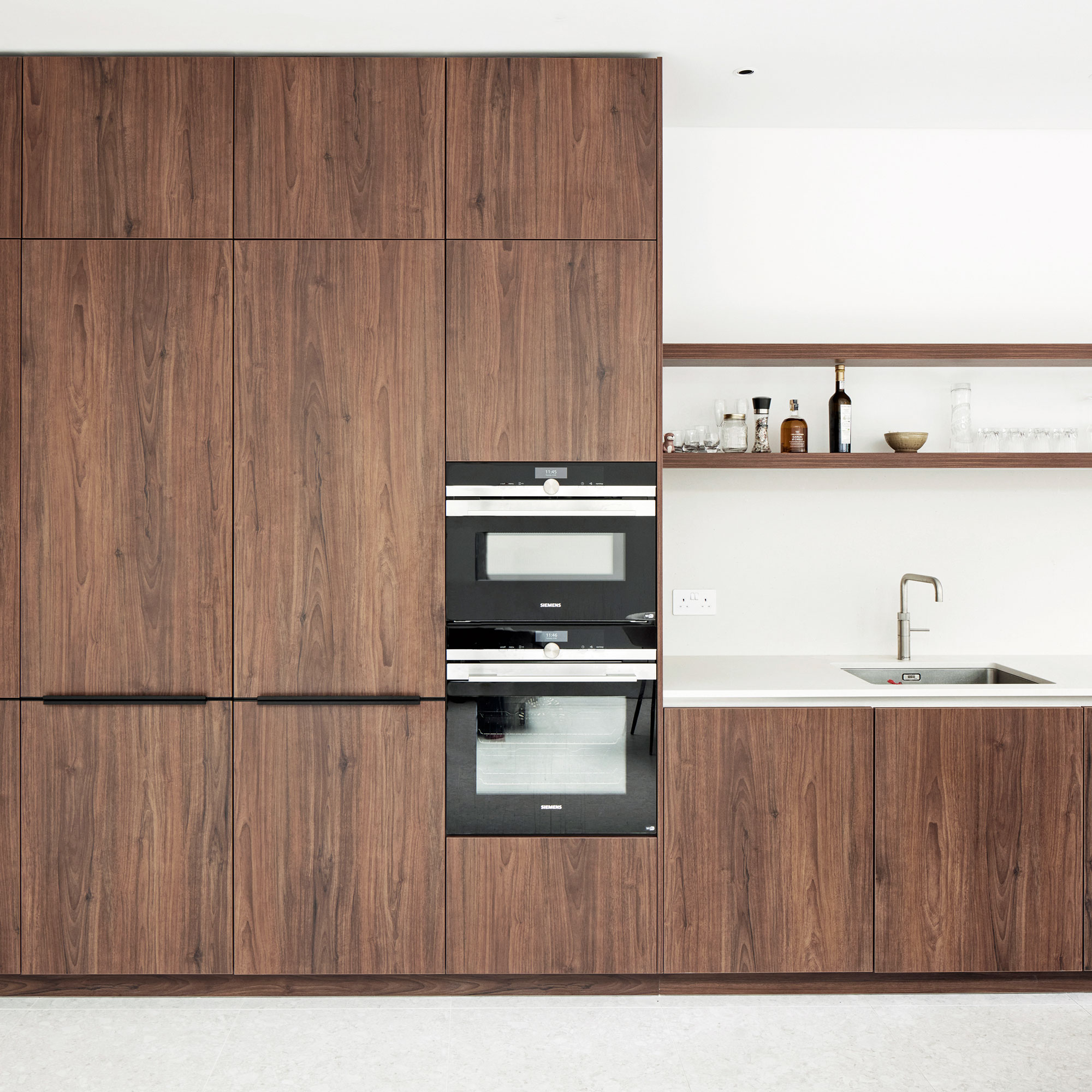
The owners wanted the open-plan space to feel as bright and spacious as possible. The main run of units that sits level with the kitchen island has been installed at base level only, with open shelving above.
Further down, there’s a run of tall floor-to-ceiling units that accommodate a larder, fridge and two ovens. There are plenty of clever kitchen storage ideas too, with the main bulk of the storage at one end of the kitchen to help the food prep area remain open and clutter-free.
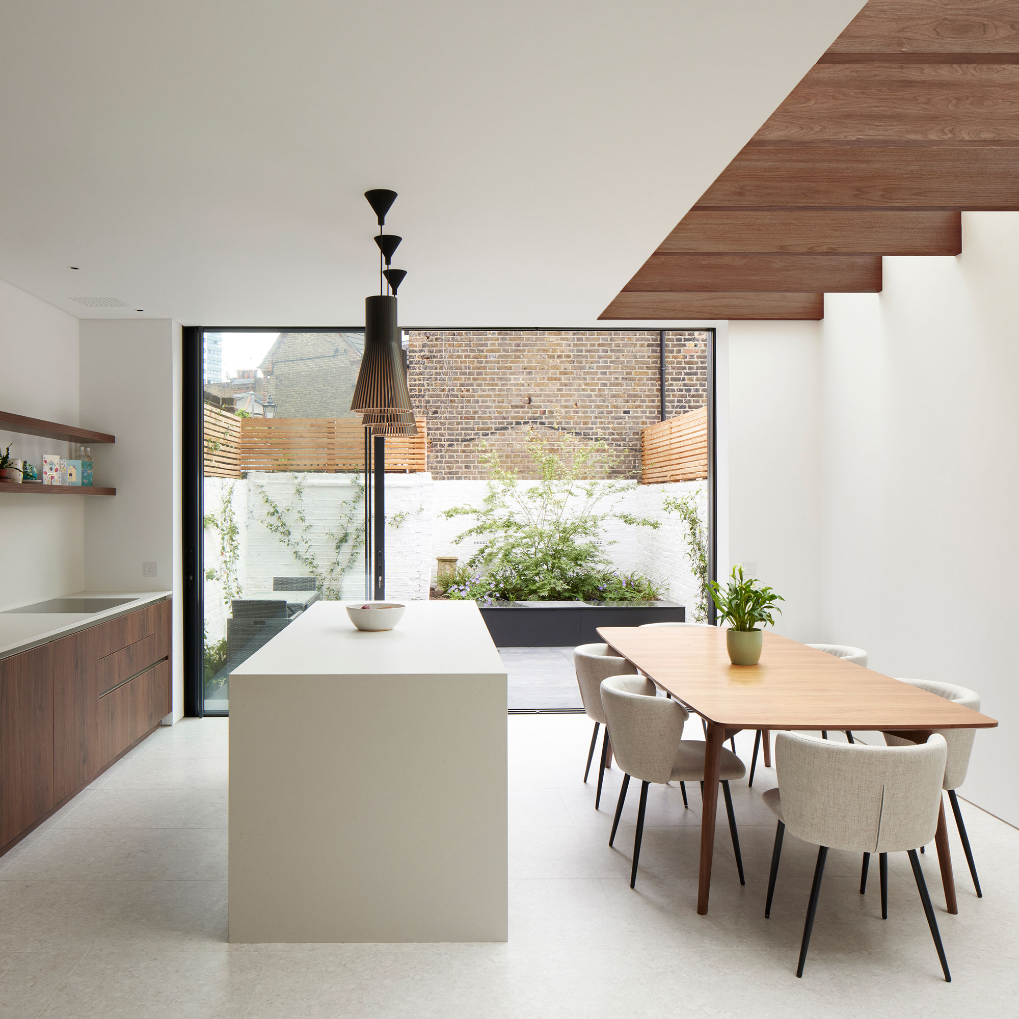
'Another design challenge was the fact that the house is overlooked from the four-storey block of flats next door,' says Simon. 'We were mindful that if we incorporated a glass roof in the side return extension, which we wanted for the extra natural light, occupants in the flats would see straight down into the kitchen.'
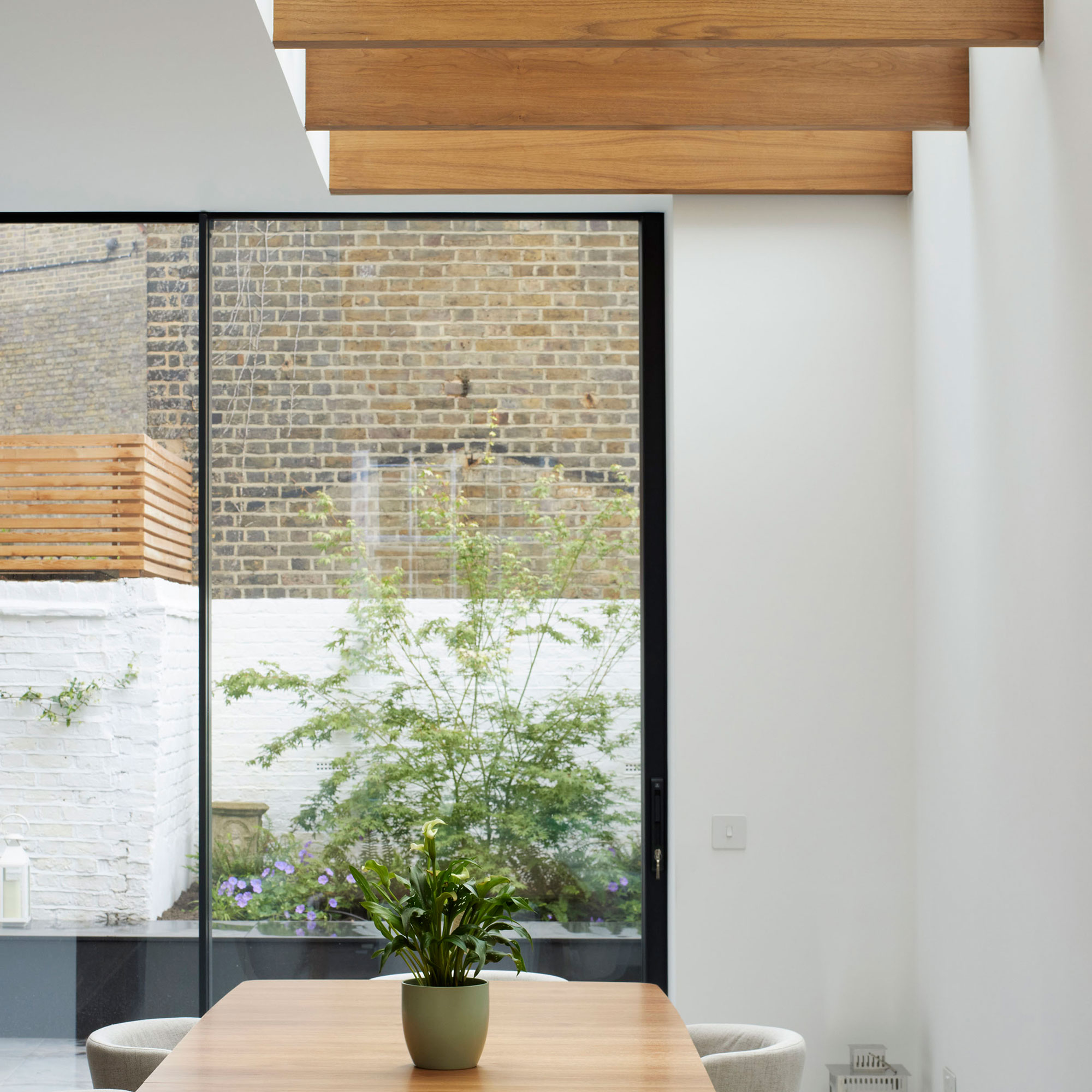
'To get around this, we incorporated a series of walnut fins beneath the rooflight. They are closely spaced when level with the flats, providing a visual barrier.'
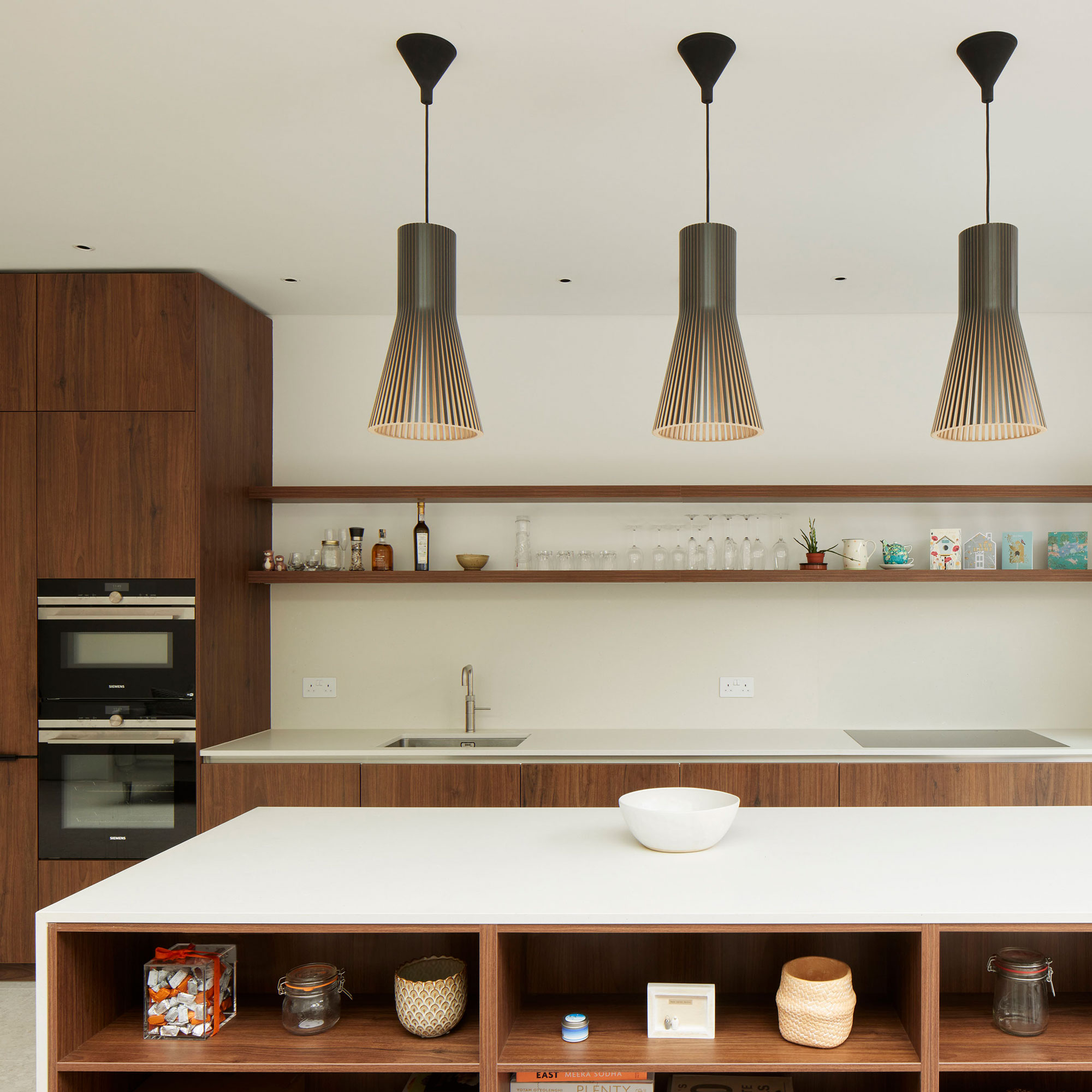
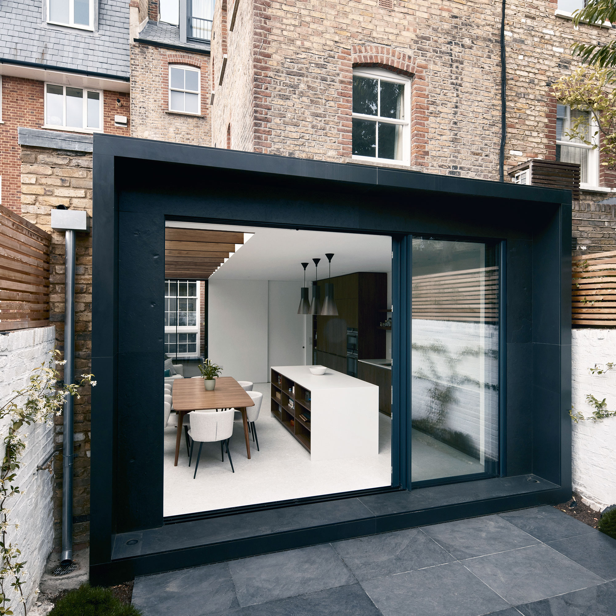
The new extension utilises the full width of the previously redundant side return, as well as pushing out from the back of the house at full width.
When viewed from the garden, the extension creates a picture frame effect around the sliding glass doors, encasing them within a recessed structure that’s clad in slate.
The recess provides shading to the back of the house, which is south-facing, and prevents the kitchen from getting too hot during summer.
'Since moving back in,' explains Simon, 'the couple have welcomed a new baby to the family. They’re enjoying the extra room – the living space on the ground floor now functions as a play area next to the kitchen-diner and their son is fascinated by the walnut fins.’
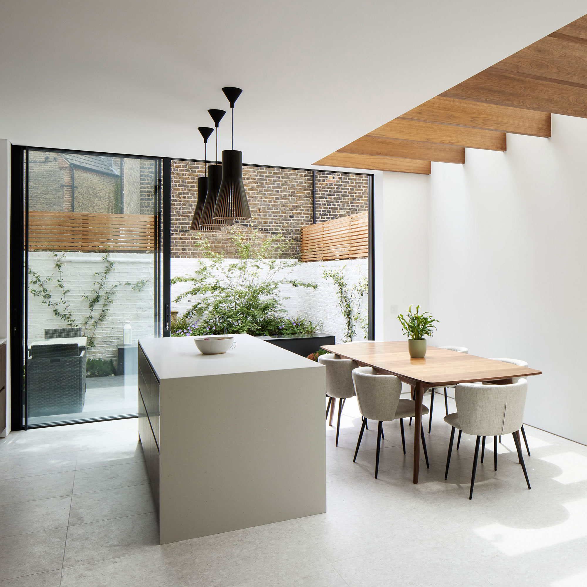
One of the couple's kitchen island ideas was the match the quartz worktop on the island with the countertop on the main run of units to the left. Handleless walnut cupboard fronts were chosen to complement the walnut rafters that support the glass roof in the side return.
Keen to create a sleek, contemporary aesthetic in the kitchen-diner, the owners chose porcelain tiles for the floor. These feel warm underfoot thanks to the water-based underfloor heating laid beneath.
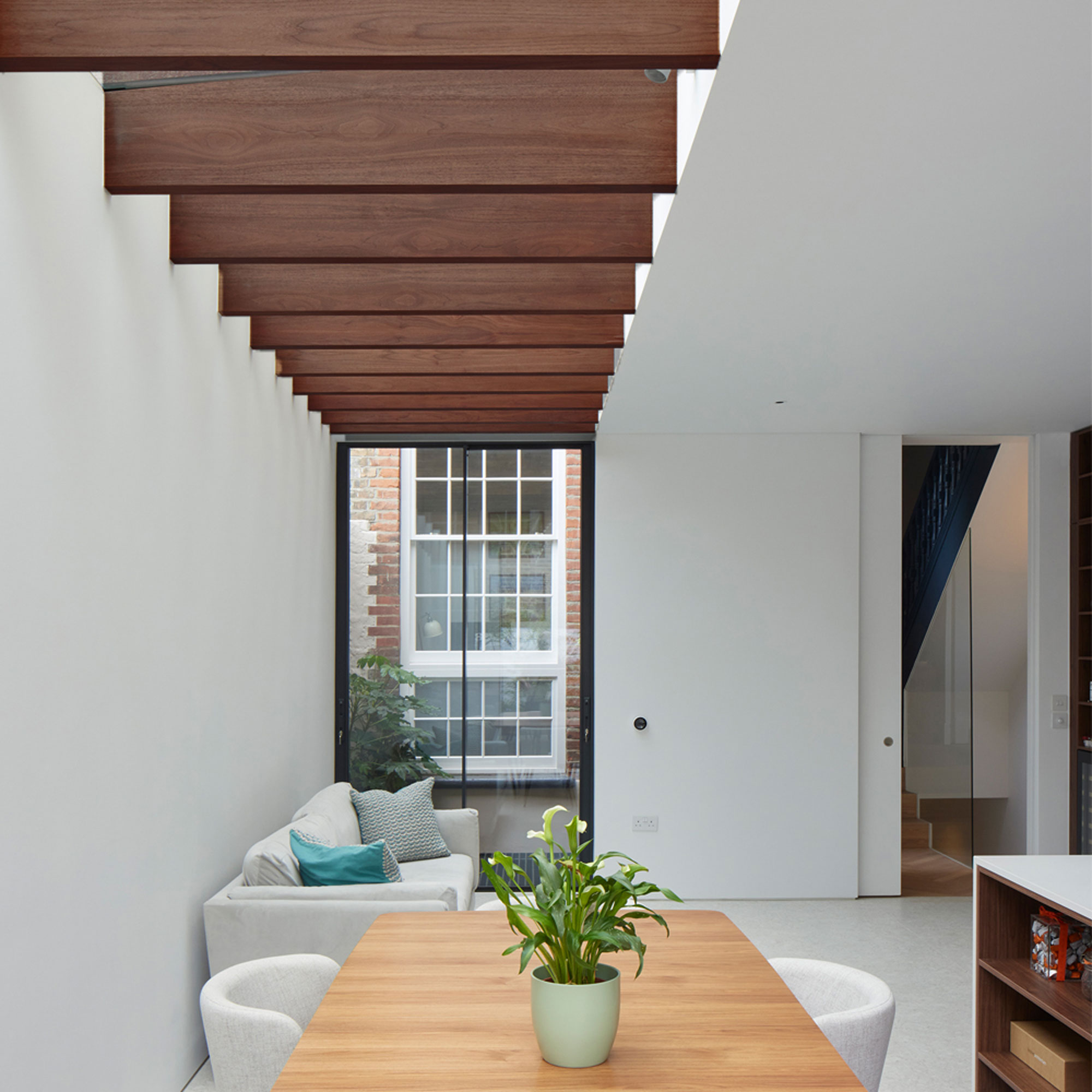
In addition to serving as structural rafters, the fins provide a visual barrier from the four-story block of flats next door. Where the fins are level with the flats, they are spaced closer together to prevent overlooking. Where the fins are nearer to the garden, they are spaced more widely to maximise the amount of light coming in.
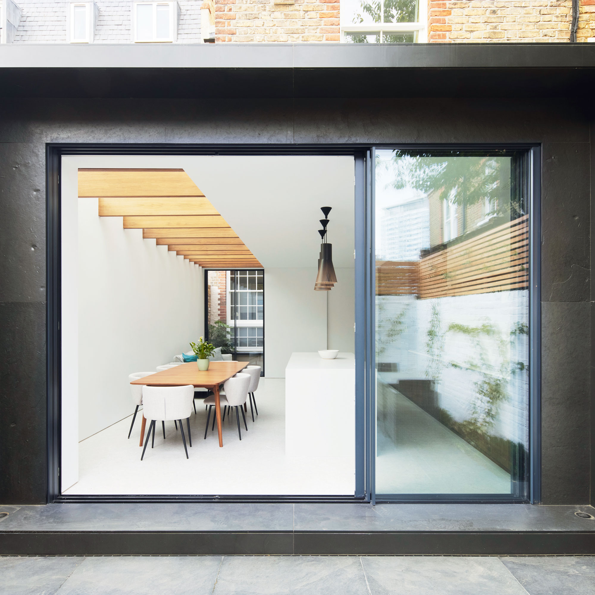
A smooth honed slate, mined in Wales, clads the outer edge of the ‘picture frame’ extension. The surrounds that encircle the sliding doors have a rougher riven texture, providing an interesting mix of textures.
Aluminium frame sliding doors were chosen thanks to their slim sightlines, which maximise views of the garden and the amount of natural light streaming in. Measuring 2.9m in height, the doors were manufactured to bespoke dimensions to fit the extension perfectly.
Focus on: Timber rafters
Simon Graham, director at Yard Architects gives us the lowdown
- SHOP AROUND Different materials are available to suit different budgets. Here, we wanted to use solid walnut but it was prohibitively expensive, so we chose veneered timber to get the same aesthetic.
- SPACE IT OUT The spacing of the rafters is important – when they’re closer together they can help create privacy or provide shading from the sun overhead.
- HIDE & SEEK Hidden structural connectors provide the sleek, minimal aesthetic you see here. Steel connecting bolts can be used as an alternative to concealed fixings, but you wouldn’t get the same slick aesthetic.
- PICK THE RIGHT GLASS Different types of glass roof can be installed above. Here, we used structural glass with a 5° fall to keep the rainwater off, with the glass sitting straight on top of the timber. Other patent glazing systems with aluminium bars are available, but won’t achieve the same minimal look.
- TREAT IT WELL Some types of wood, including walnut, lighten over time due to UV exposure. Using a UV oil on the timber will protect it and gives you more control over its appearance.
The property before works began
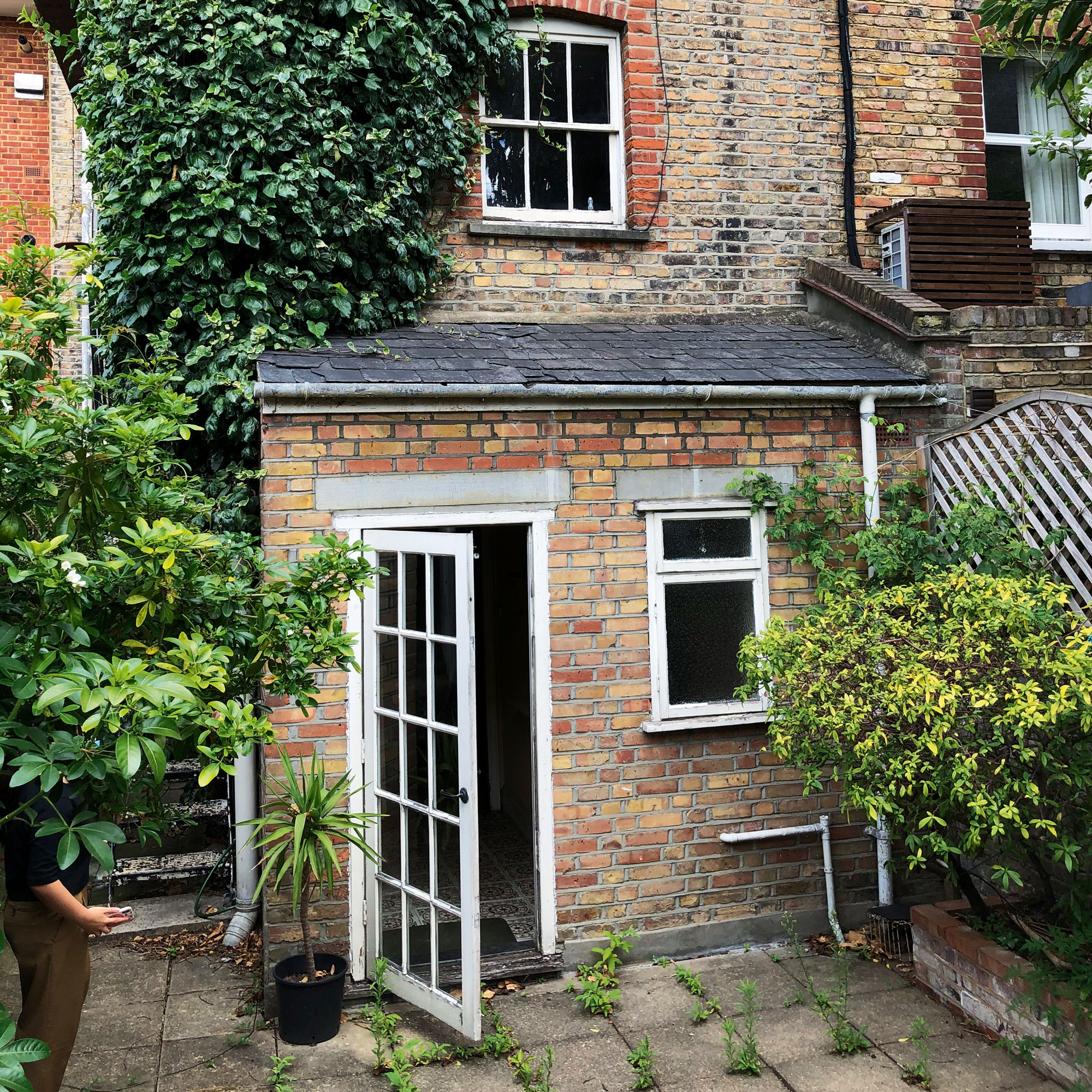
With a bathroom and utility room at the rear of the property and a kitchen on the first floor, the layout was messy and confusing. Furthermore, the lack of access to natural light from the small door and window at the rear left the ground floor dark and gloomy.

Ginevra Benedetti has been the Deputy Editor of Ideal Home magazine since 2021. With a career in magazines spanning nearly twenty years, she has worked for the majority of the UK’s interiors magazines, both as staff and as a freelancer. She first joined the Ideal Home team in 2011, initially as the Deputy Decorating Editor and has never left! She currently oversees the publication of the brand’s magazine each month, from planning through to publication, editing, writing or commissioning the majority of the content.
- Rebecca FosterContributor