Smart, stylish and futureproofed, this energy-efficient bungalow is a masterclass in clever design
Dated and draughty, a complete renovation has given this compact home and much-needed update

It's common to come across stories of people renovating their homes and doing their best to retain all the original features, sometimes even returning architectural details that had once been stripped out from the property by previous owners.
However, your home dates from a period that wasn't memorable for its decorative techniques or it was built with practicality in mind rather than design, it may have lacked these features to begin with.
What you're often left with is an old property with no discernible style, without adequate insulation and a poor layout. This is where renovating is a must, whether you're looking to transform the entire space of bit-by-bit with extension ideas for every budget.
Giving a tired property a complete refresh
This two-bedroom 1930s brick and white rendered bungalow featured an awkward layout, with a complicated arrangement of rooms. The whole house was dark and cold, it lacked insulation and had a poor overall energy performance, or EPC rating.
The owners enlisted the help of Chambers McMillan Architects to bring the dated property into the 21st century. They chose the practice because they spotted one of their renovations on the same street when they were looking for properties to buy.
They knew that their design would be considerate to the neighbourhood and that they already had experience with local planners.
Ian McMillan, co-founder of Chambers McMillan explains what they did to transform the dated bungalow into a cosy, contemporary home.
Get the Ideal Home Newsletter
Sign up to our newsletter for style and decor inspiration, house makeovers, project advice and more.

With over 20 years experience as a qualified architect, Ian is a member of the Royal Incorporation of Architects in Scotland (RIAS), Royal Institute of British Architects (RIBA) and Architects Registration Board (ARB).
Chambers McMillan Architects is Ian and his wife, fellow architect Thea McMillan's practice where both are co-directors.
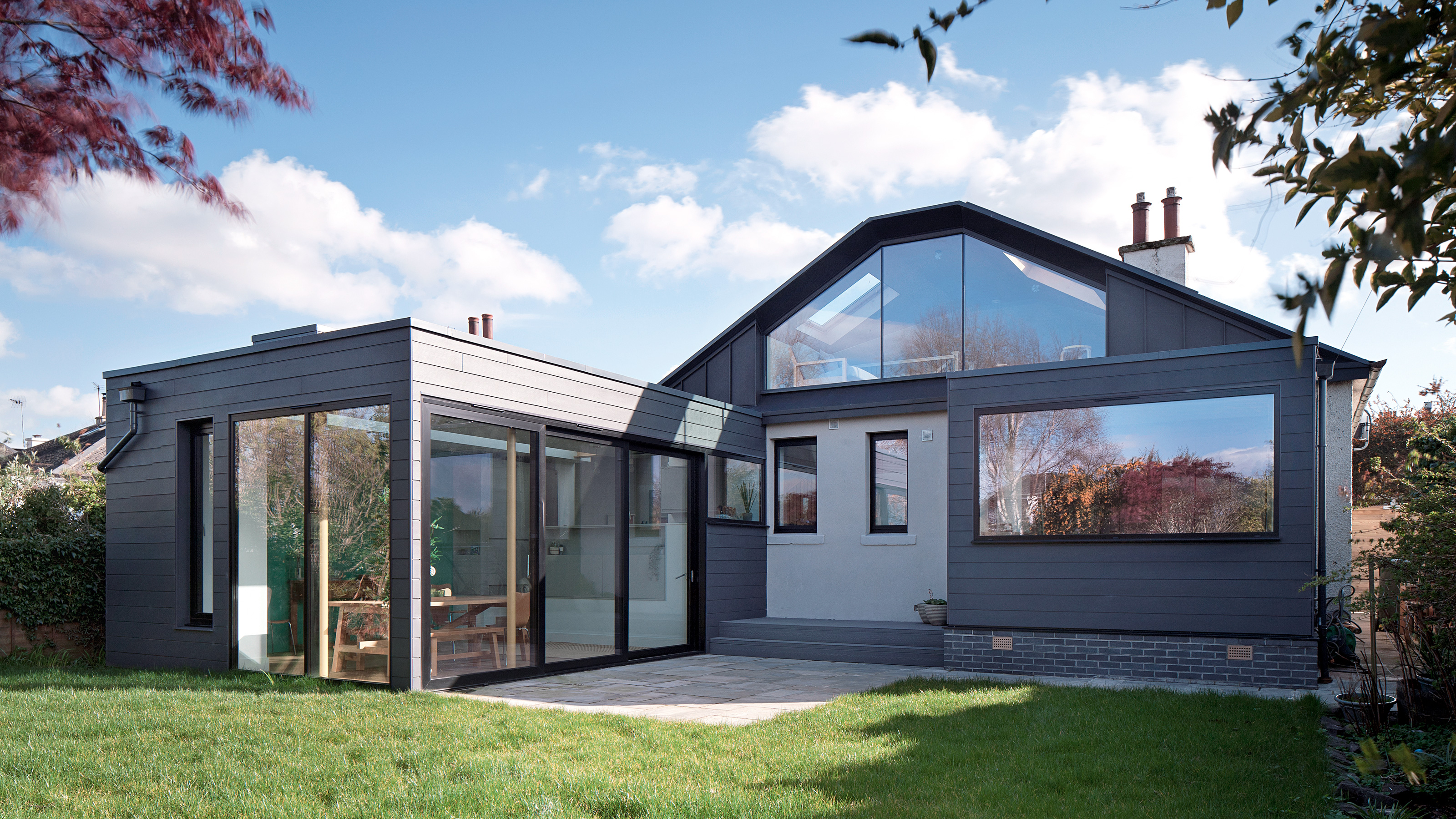
‘As the house is on a north-facing sloped site,’ explains Ian, ‘the back garden was overshadowed by the building itself, so we came up with the concept of designing a long kitchen and dining extension out into the garden, which catches the afternoon and evening sun directly into the space.'
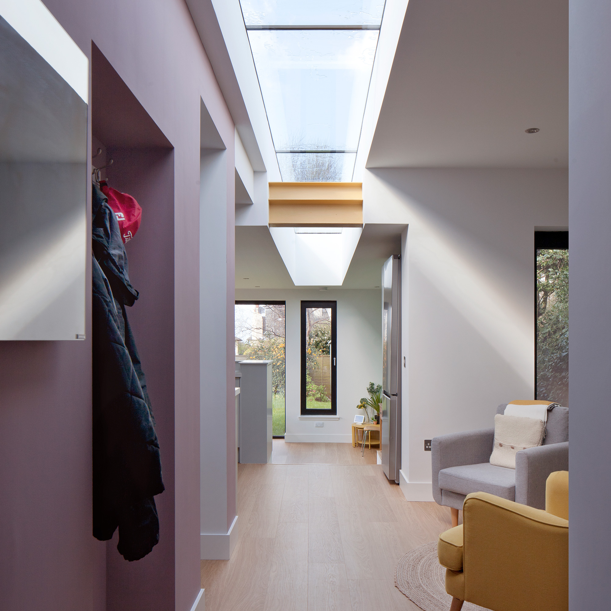
'From the new front door,' continues Ian, 'a 15m long linear rooflight draws you from the entrance straight into the garden, and offers views of the sky and weather outside from all parts of the new living accommodation.'
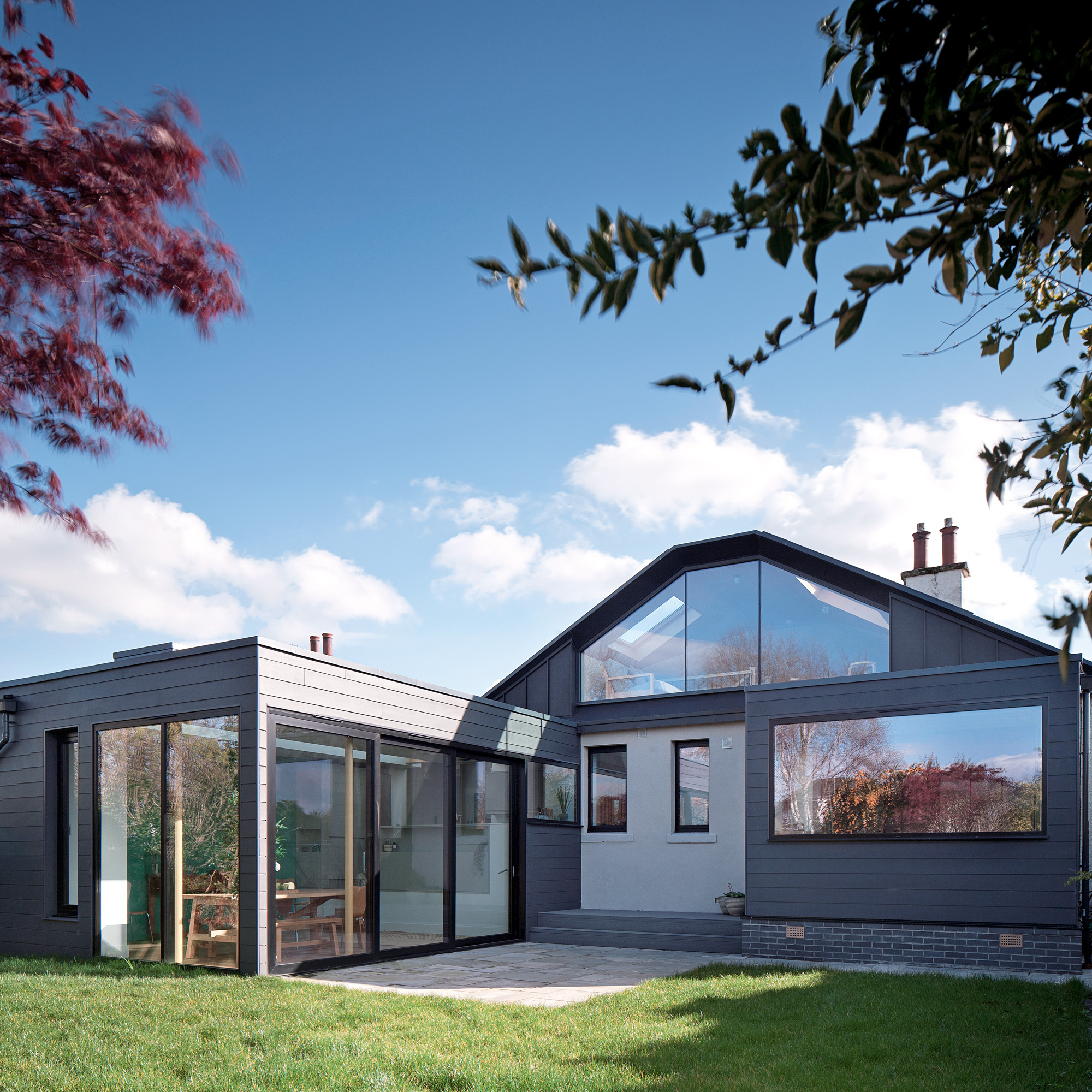
'In terms of upgrading the existing house,' continues Ian, 'the home report highlighted that the property was uninsulated and had a poor EPC rating, so we suggested fully insulating the home as part of the project works.'
'We decided to take out the gas boiler, and opt for energy efficient InfraRed heating panels in combination with photovoltaic solar panels on the roof and a home energy battery.'
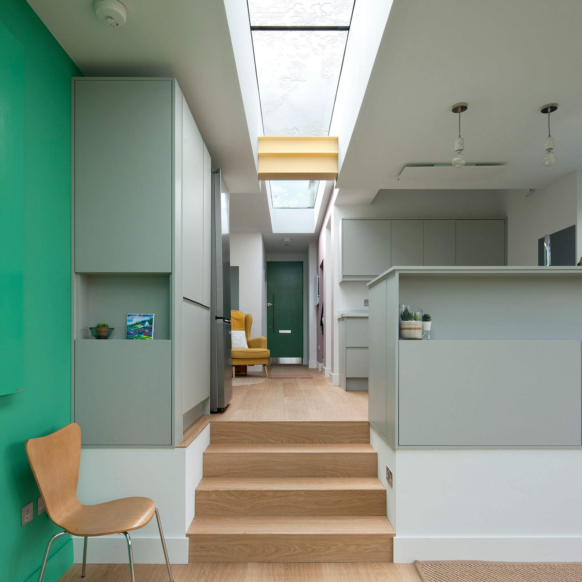
'Ultimately,' Ian says, 'the owners wanted more space and light. The sliding doors to the extension and large bedroom and attic windows combined with the ground floor rooflight have created an impressively light-filled home despite being north-facing.'
'The owners have said that as soon as you walk into the house, the light from the skylight "just hits you and lights up the colours on the walls, which is the icing on top of the cake".
Also, in terms of space when their family comes to stay, the house can comfortably accommodate seven guests at the one time (in the two bedrooms, as well as the snug and study), which is great for a house of this size.’
Redesigning the floorplan
The reconfigured house now features a redesigned loft conversion, and five rooms on the ground floor - a living room, snug, two bedrooms and study.
The 15m long rooflight is one of the most eye-catching features as it begins at the front door, leading the eye straight through to the garden.
Chambers McMillan talked the owners around from using a palette of plain neutrals to include some bold colour. They told them that they could paint over it if they didn’t like the finished result but when the owners saw the newly decorated spaces, they were smitten.
Open plan perfection
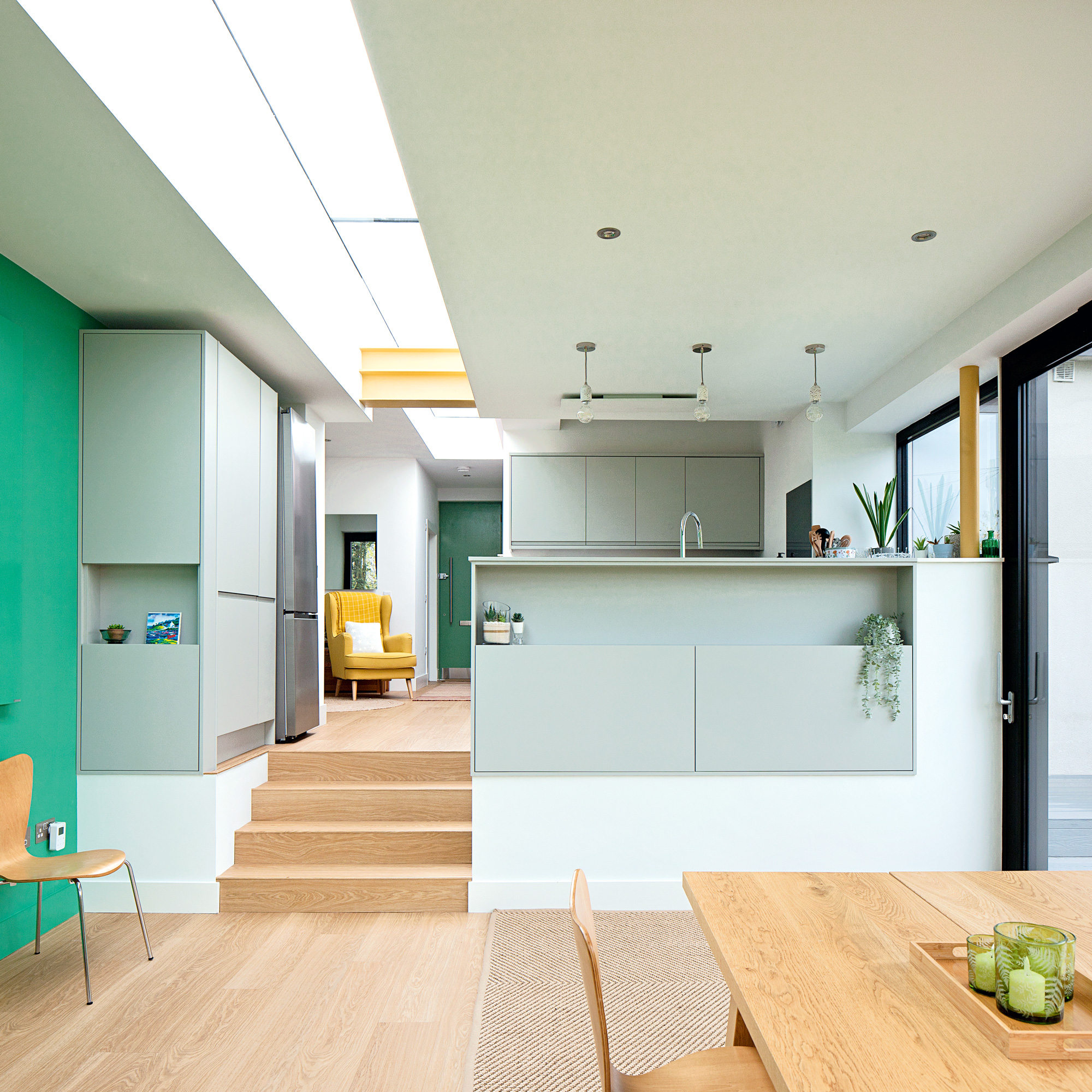
The exposed steelwork in the ceiling and posts have been painted in the same mustard colour to break up the white of the kitchen and adds to the colourful character of the space.
The bright green wall also matches that of the kitchen and dining space at the back of the house, as well as the green front entrance door. The black window frames also create a contrast to the white and light grey kitchen.
Bringing in the light
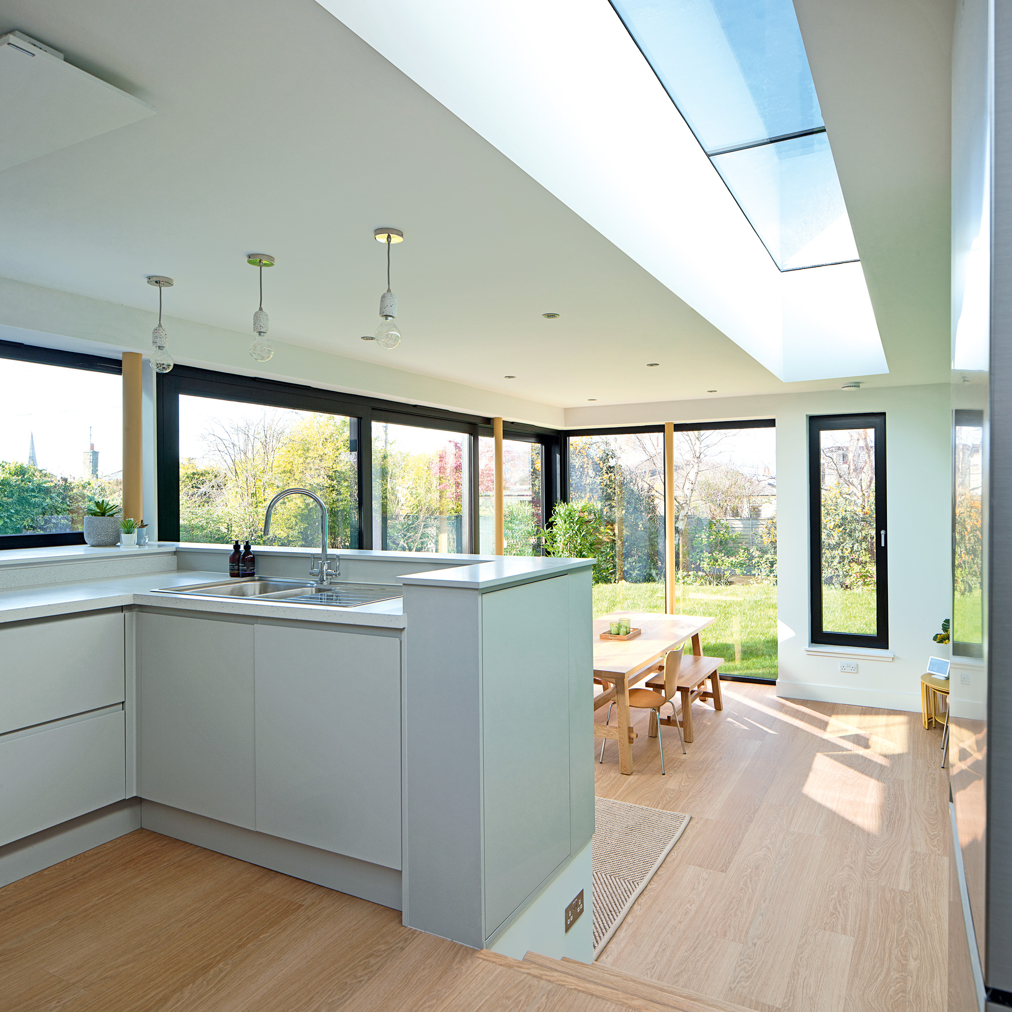
They used high performance, frameless bespoke glazing, mainly to keep energy consumption down and installed internal wall and underfloor insulation.
They also installed photovoltaics and a storage battery and switched all electric power so the property doesn’t use any fossil fuels. As a result, the house has gone from a typical EPC D to an EPC A rating.
A bigger and brighter space
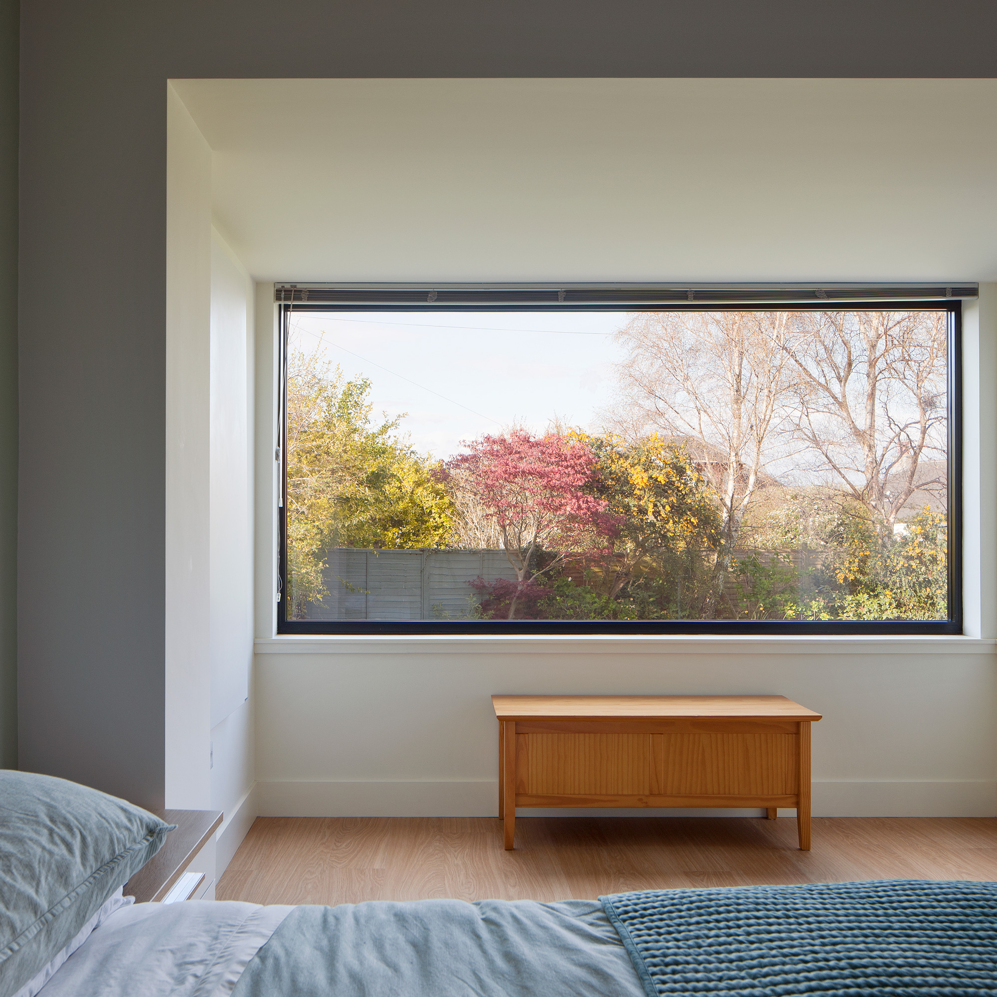
The plans involved increasing the master bedroom in size and adding an ensuite, so the original wall was ‘pulled out’ of the original elevation to create a bay window.
The extended bedroom now features a large picture window and two side windows that overlook the garden, adding to the peaceful ambience. The bedroom has greater privacy as it’s been separated from the main living and circulation areas.
A room with a view
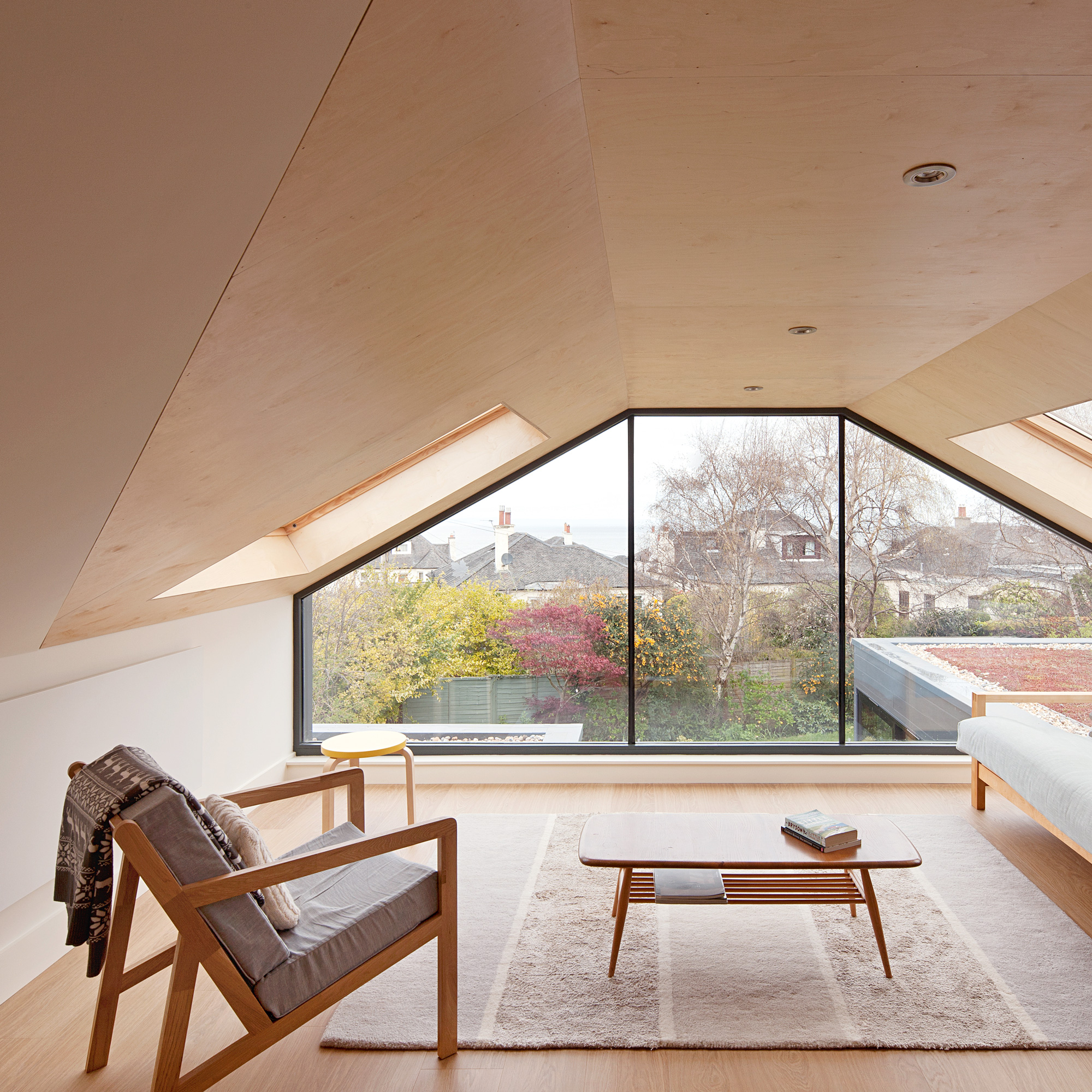
Rather than add a loft bedroom, they decided to create another living space. Although the space is small, it opens out onto views of Edinburgh and the Firth of Forth. The owner's neighbours felt the attic dormer room would overlook them, but Ian's model demonstrated that this wouldn’t be the case.
This new upstairs living room flooring is made of timber, together with and plywood walls and ceilings, all of which creates a quiet relaxing space. This is in contrast to the bright colours to the new kitchen and dining area.
Joining the old with the new
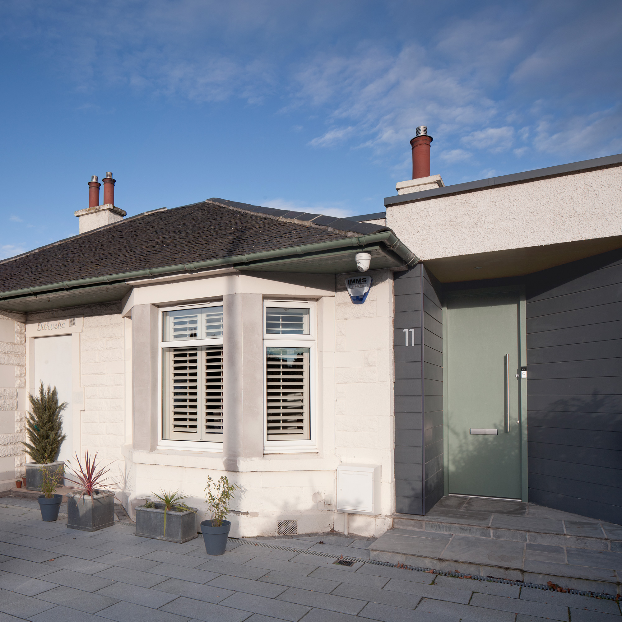
The homeowners wanted any changes to the front of the house to be low-key, as they were keen to blend in with the neighbouring properties.
At the front, the existing doorway and door has been retained to preserve the original character of the house, as requested by the planners when they granted planning permission, while the new entrance to the side is located in the former garage.
‘We wanted the new parts to be distinct and visible from the existing house,’ explains architect Ian, ‘so we chose zinc to contrast with the slate roof. The owner is originally from the US, so he likes the horizontal clapperboard feel of the cladding, which contrasts the traditional rendered Scottish masonry walls of the main house.’
'Ultimately,' recalls Ian, 'creating a space with lots of light in a north-facing property has been the most rewarding aspect of this project.’
The bungalow before renovations began
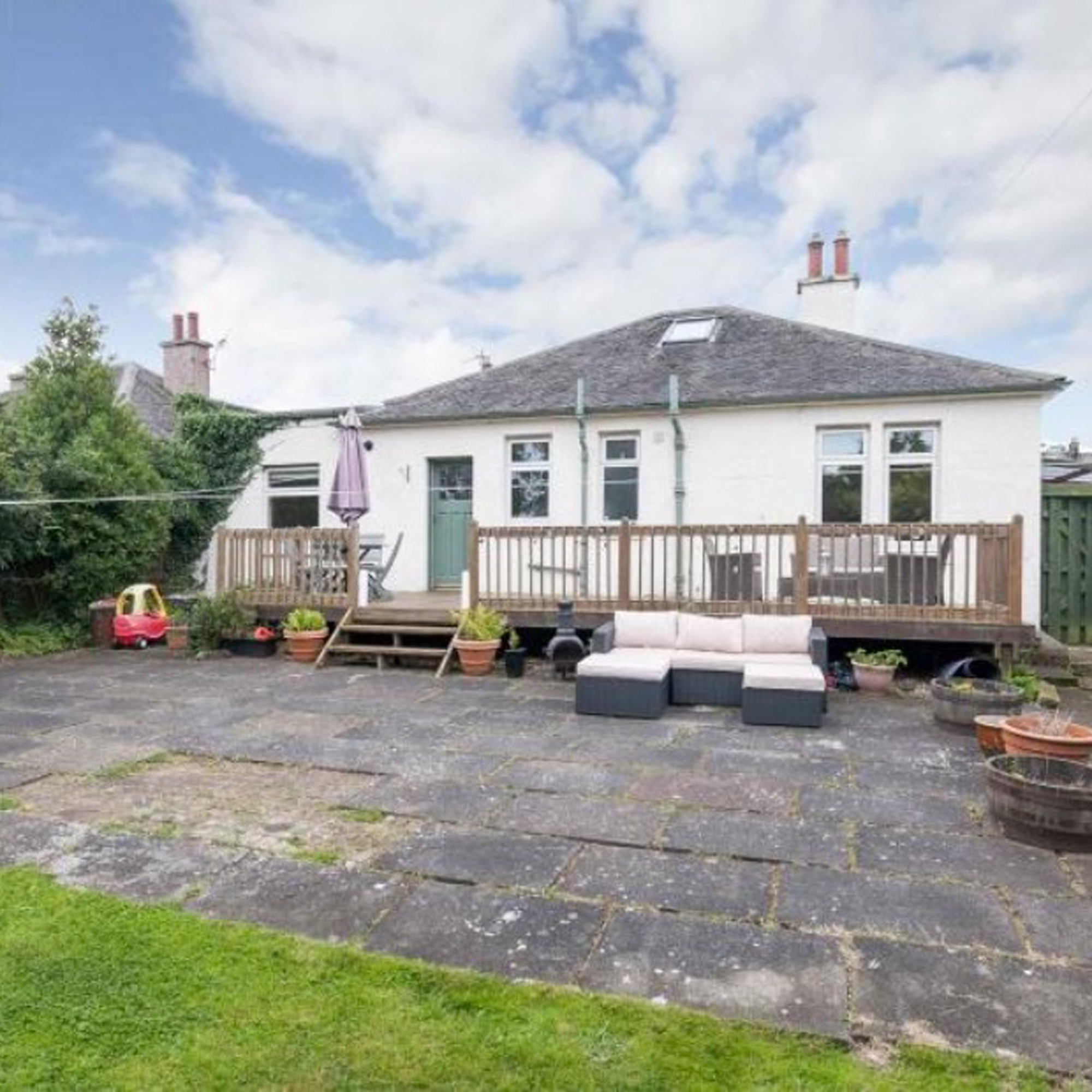
The previous layout of the house was three main rooms: two at the front and one, plus a kitchen and WC, to the back. The garage had been converted into a bedroom which meant accessing it had to be through living space.
The stair to the attic was in one of the front rooms, again meaning access and circulation was through the living areas. Chambers McMillan suggested moving the front door to the right garage side, which would create a suite of private bedrooms to the left of the property which was separate from the entrance and living spaces.
Focus on - Oversized rooflights
Ian McMillan, co-founder of Chambers McMillan Architects gives us the lowdown...
- Size matters -The standard size of oversize is 1m x 3m. After 3m in length you need to have silicone joints between the glazing units.
- Go long and compromise - For longer units, you’ll have to decide whether to remove or retain structural elements.
- Think about angles -The units can be flat, but remember that rain is never ‘clear’, and will leave deposits on the flat glass. Try sloping it at 10 degrees.
- Choose key positions - Try using the rooflights along circulation paths, or at the entrance, so it has maximum impact and wow factor.
- Make it work for you - With the internal upstand, think about integrating with internal lighting, or a colour to work with sky blue, or using mirrors to accentuate the length.
Additional words by Caroline Ednie

Ginevra Benedetti has been the Deputy Editor of Ideal Home magazine since 2021. With a career in magazines spanning nearly twenty years, she has worked for the majority of the UK’s interiors magazines, both as staff and as a freelancer. She first joined the Ideal Home team in 2011, initially as the Deputy Decorating Editor and has never left! She currently oversees the publication of the brand’s magazine each month, from planning through to publication, editing, writing or commissioning the majority of the content.
-
 Should your front door colour match your hallway? Interior experts reveal 3 reasons why it should (and 3 reasons it shouldn't)
Are you team matching or contrasting?
By Ellis Cochrane
-
 This £200 limited-time discount makes this Dyson vacuum cheaper than I’ve ever seen it - run don’t walk to Argos for this bargain
It's the most affordable Dyson on the market right now
By Lauren Bradbury
-
 Martin and Shirlie Kemp’s pastel flower beds has given their Victorian renovation a romantic look - how you can get the look
Their pastel garden is the cottage garden inspo you've been looking for
By Kezia Reynolds