See how a two-storey extension has transformed this Victorian terrace
Adding a two-storey extension and rebuilding the back of this Victorian terrace has unlocked the property’s potential

Rebecca Foster
A two-storey extension is by no means and easy task to complete. But the space gained, even in a relatively modest property like a Victorian terraced house, can be transformative.
This (now) four bedroomed, three-storey classic Victorian terrace in Chiswick was packed with issues, making it difficult for the family of four to make the most of the space. The layout was poorly organised with the ground floor bathroom blocking the small kitchen from garden access and views.
The homeowners hired William Tozer Associates to redesign the rear of the property, opening the space out and making it more family-friendly.
‘Rather than a traditional Victorian layout with boxy rooms,’ explains Tom Shelswell, senior associate at William Tozer, ‘we wanted a bright, kitchen-living-dining space with lots of natural light and garden views. To achieve this, we took out the back of the house at ground floor level, plus the closet wing on the first floor.'
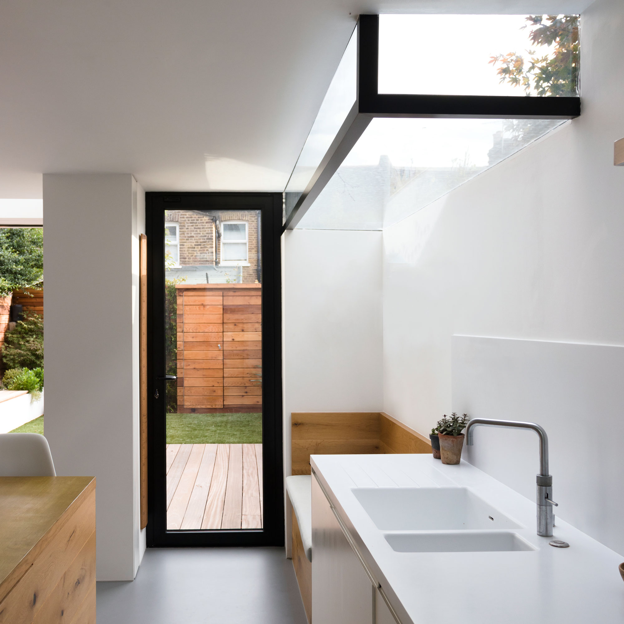
In order to give the space more light than before, the architects came up with an innovative design for the white kitchen ideas. 'During construction, we always enjoy the phase of work when the back of the building is open-ended, and we wanted to recreate the same feel in the extension.'
'So,' continues Tom, 'we incorporated full height openings at the back of the house and used frameless glass or minimal framing to maximise the amount of sunshine coming in.'
The light, bright sense of height didn't end there. 'The internal doorways are full height, too,' says Tom. 'This means there’s no head above the doorway – just a flush ceiling that runs seamlessly from the original house to the extension.'
They did have to make allowances for planning permissions though and the original plans had to be amended. Tom explains, 'Planning constraints meant we lowered the height of the side return wall to 2 metres on the boundary, giving rise to the minimal design of the rooflight box in the kitchen.’
Get the Ideal Home Newsletter
Sign up to our newsletter for style and decor inspiration, house makeovers, project advice and more.
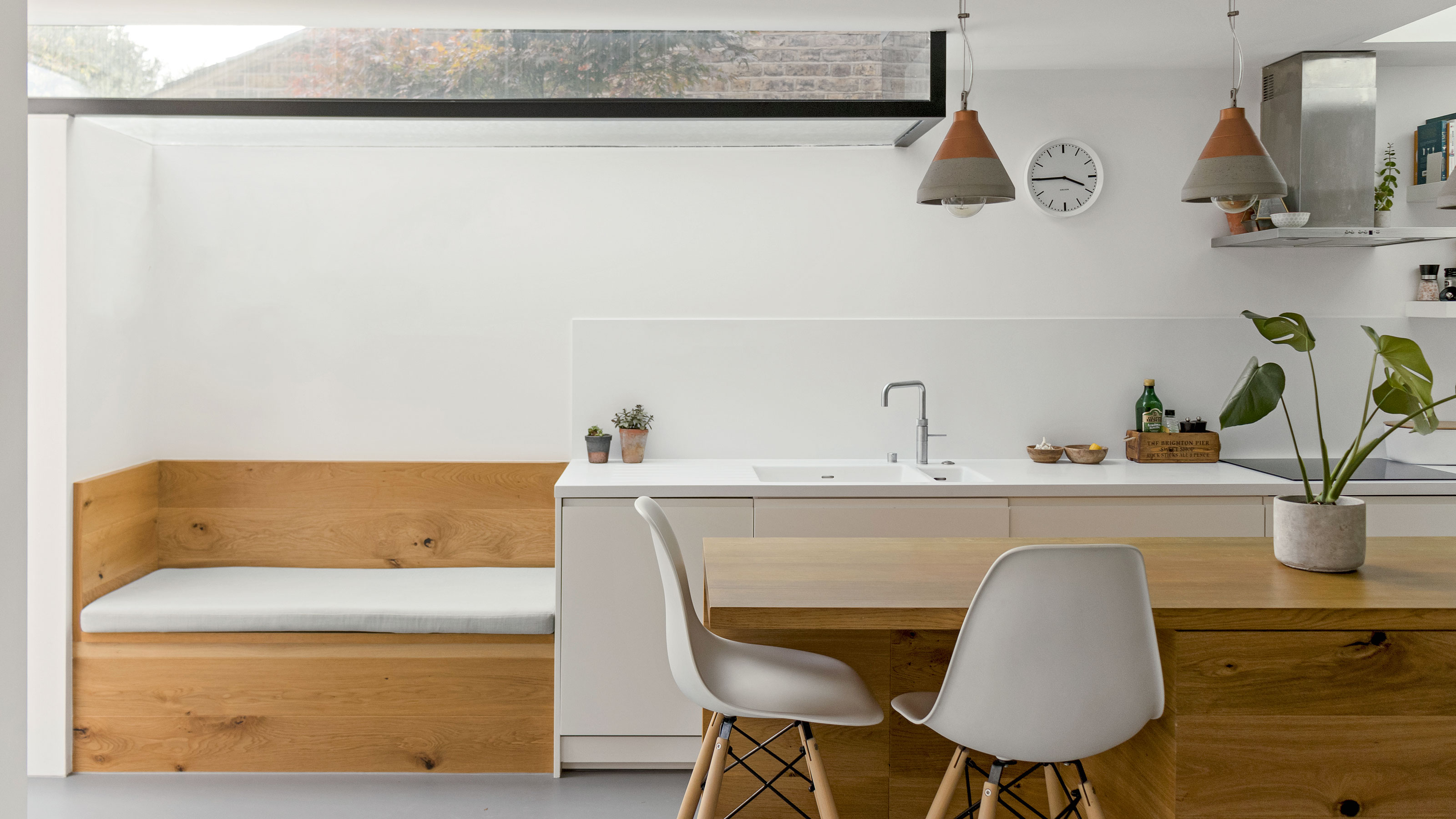
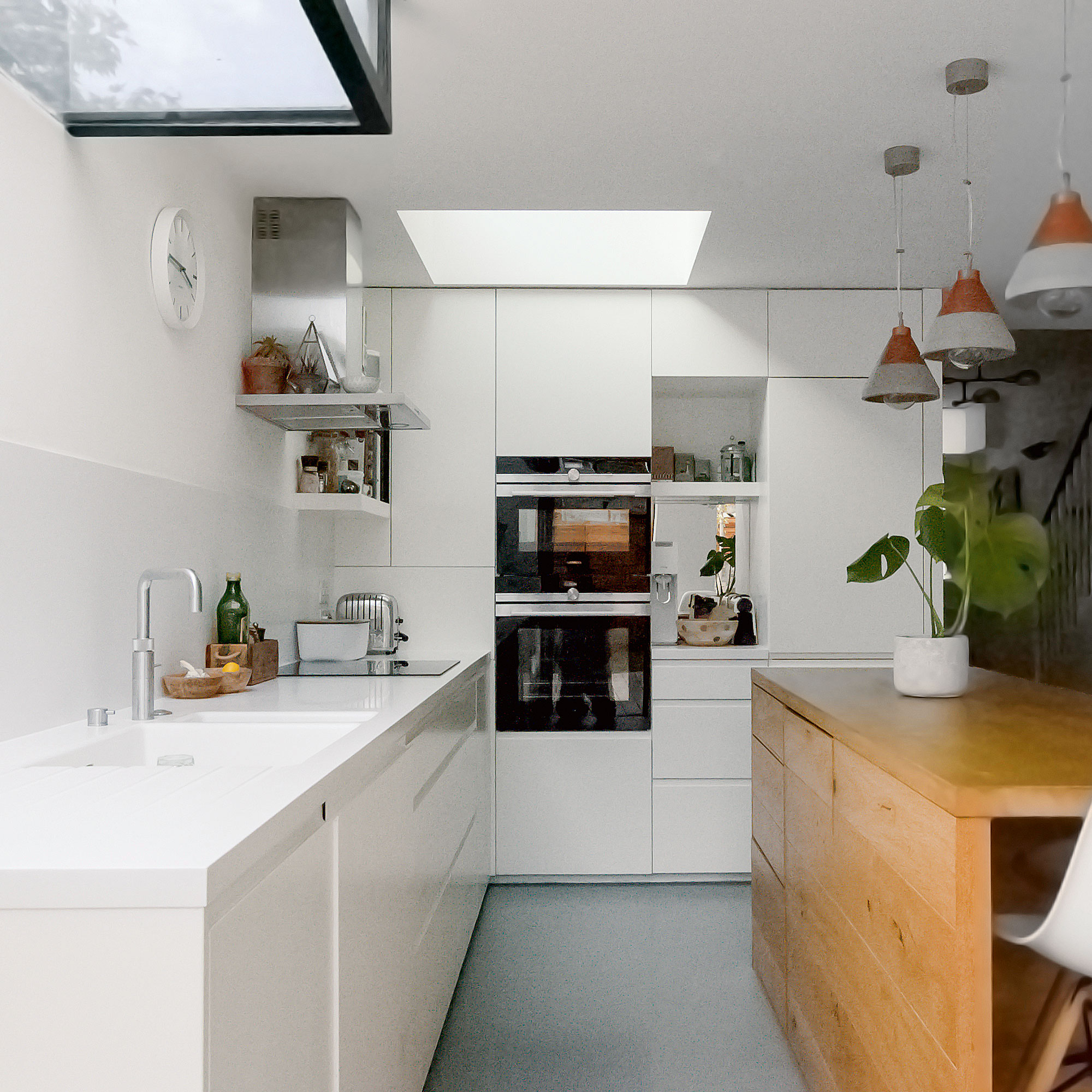
When it came to modern kitchen ideas, the homeowners chose white Corian countertops paired with smooth handleless cupboard fronts to establish a sleek, contemporary look. Grey resin flooring is laid throughout the extension, creating a seamless, open feel in the kitchen-living-dining space.
The solid oak island and bench seating was designed by the architects and manufactured by the contractor on site. The texture of the wood contrasts with the smooth white surfaces used in the rest of the kitchen.
As well as adding warmth and character, the rich timber features provide a visual link with the pine floors in the original house. The bench seating doubles up as storage, too.

It wasn’t possible to remove this structural wall in the extension, so it was transformed into a design feature instead. On the living room side, a shallow recess provides a neat slot for the television. On the kitchen side, there’s a shallow cupboard within which the family stores their glassware.
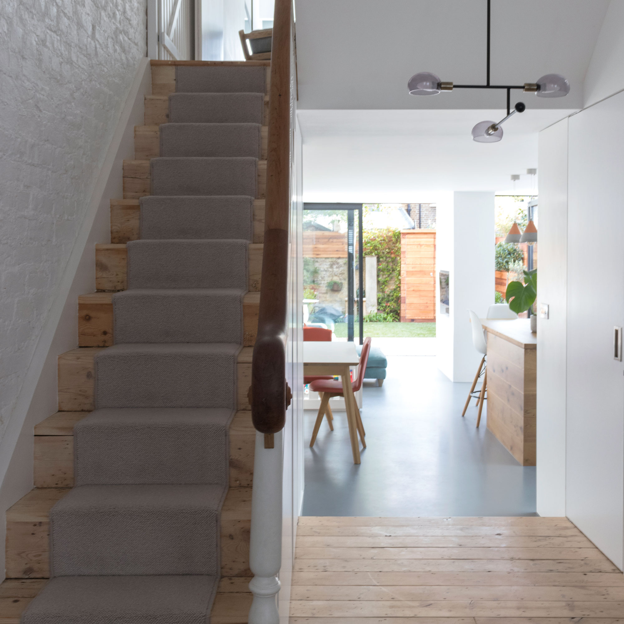
The house wasn’t gutted throughout, as the homeowners didn’t want to eliminate the property’s traditional character completely. Instead of stripping out the original pine floorboards, they were sanded back and treated with white oil to give them a new lease of life. Hallway runner ideas have been laid over the top to establish a homely feel.
Now, the two-storey extension design features four stacked boxes - two white and connected to the ground floor, with a further two slate-clad boxes on the second floor.
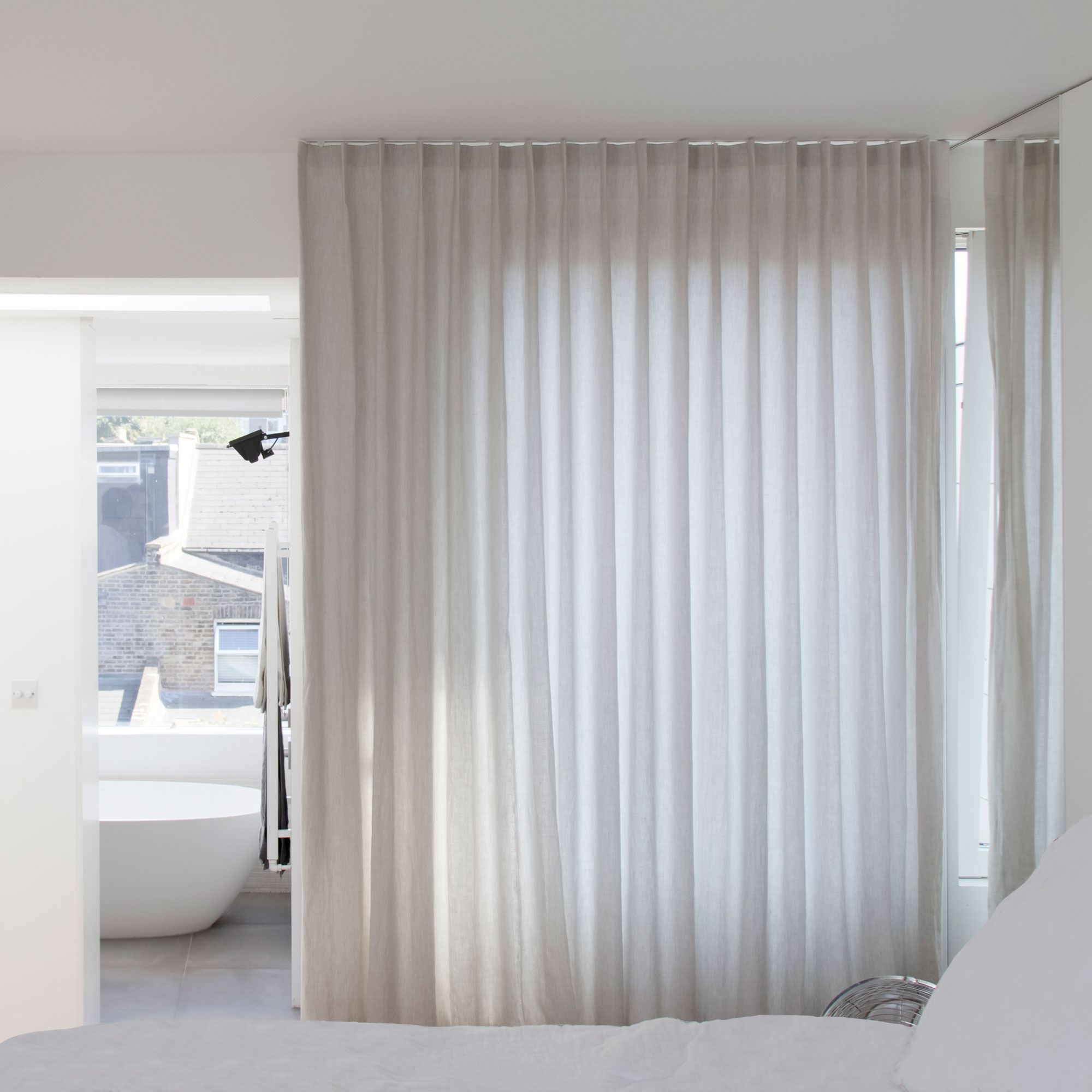
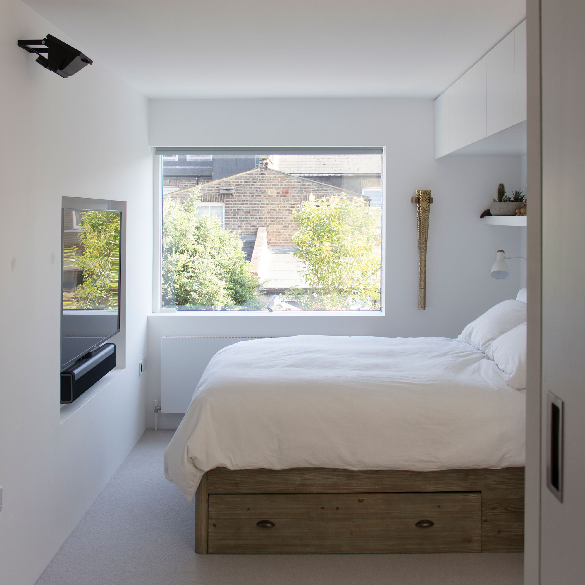
Upstairs, they've added a new bedroom and bathroom, and all the windows have been replaced with wider openings, filling the property with natural light.
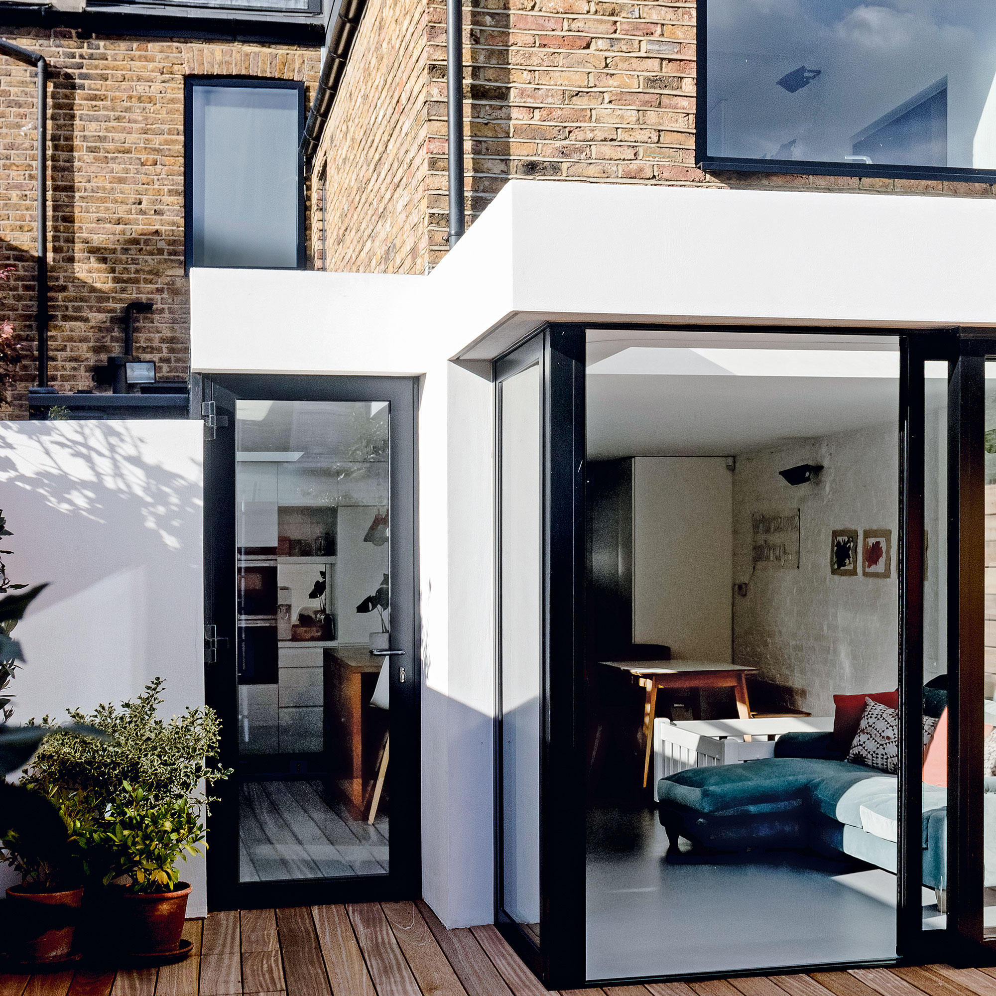
The owners wanted a modern extension with crisp detailing to contrast with the original property. The cement-based render is painted white, so the extension stands apart from the original house without appearing disparate. The rainwater goods are concealed within the structure, enhancing the property's sleek aesthetic.
Downstairs, the garden is now easily accessed via the open plan kitchen living area via either powder-coated aluminium sliding doors and a single hinged door. Both feature minimal frames, providing the sought-after connection with the garden.
The property before works began
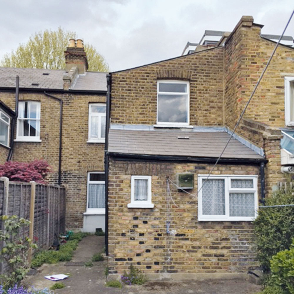
The closet wing at the back of the house was typical of many Victorian homes. It featured a small kitchen that was completely blocked from the garden by a ground floor bathroom at the rear. The interiors hadn’t been updated since the 1970s, so needed modernisation.
Focus on: Rooflight boxes
Tom Shelswell, senior associate at William Tozer Associates shares his top tips and idea
- A suspended glass structure enhances the bright, open feel and provides better views of the sky.
- Overhead glazing introduces more sunshine than windows installed in a vertical wall.
- Concealed framework requires lots of technical detailing, so a good working relationship between your architect, contractor and glazier is essential.
- If the glazing is fixed, you’ll need an openable window elsewhere to create a fresh flow of air.
- A low emissivity coating on the inner face of the outer pane controls the amount of UV light that’s able to enter your home…
- An argon filling between the two sheets of glass improves the level of insulation.

Ginevra Benedetti has been the Deputy Editor of Ideal Home magazine since 2021. With a career in magazines spanning nearly twenty years, she has worked for the majority of the UK’s interiors magazines, both as staff and as a freelancer. She first joined the Ideal Home team in 2011, initially as the Deputy Decorating Editor and has never left! She currently oversees the publication of the brand’s magazine each month, from planning through to publication, editing, writing or commissioning the majority of the content.
- Rebecca FosterContributor
-
 5 brilliant budget alternatives to paving slabs that won't cost the earth
Looking to pave your garden on a budget? Try these stand-ins...
By Sophie King
-
 Want to cook like Jamie Oliver? Here's the top-rated pan from his collection
Jamie's collaboration with Tefal has led to this casserole dish getting the best user reviews I've ever seen
By Molly Cleary
-
 7 best colours to paint a windowless bathroom that will transform the mood of a dark wash space
A bathroom without a view needn’t sink your plans for a warm and welcoming retreat
By Linda Clayton