'We extended our listed building and the result is transformative'
A smart, contemporary extension on this period bungalow was accepted as a sympathetic addition by planners and the finished result is breathtaking
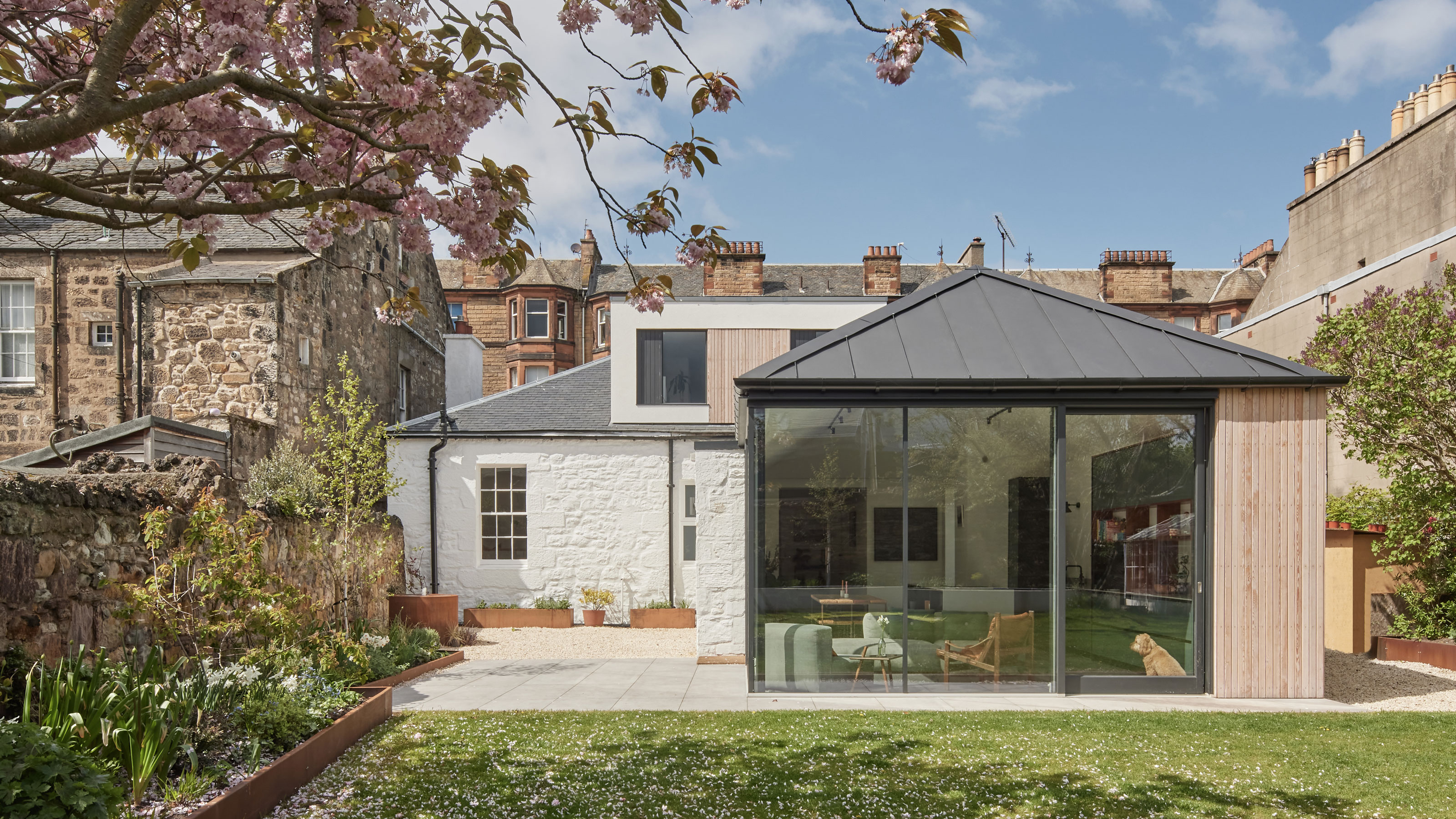

It's nearly always the case that once you buy a property, you then set out to improve it and make it your dream home. But this can prove time consuming and expensive when the property in question is listed and planning permission has to be granted.
Bought in late 2019, this four bedroom Georgian bungalow had oodles of potential, despite the fact that the rear of the house was damp with a complicated arrangement of rooms, and it had a decaying, 1980s conservatory that obscured views of the garden. Aside from the property itself, it was located in a very desirable location near Portobello beach in Edinburgh.
Here, the architect who worked on the home's transformation, Kieran Gaffney from Konishi Gaffney Architects explains how the project came to life.
‘I viewed the house with the new owners before they bought it,’ recalls architect Kieran. ‘It was listed and they were worried that they couldn’t do too much to it. But I advised that there was an opportunity to improve and extend the house within the planning parameters and their budget.
'We took a clean, modern design approach to the new plans,' continues Kieran, 'and the final design was viewed sympathetically by planners as an improvement to the existing property.'

Having studied in Glasgow and London, Kieran spent a number of years work overseas in the USA, Zimbabwe, London, Berlin and Tokyo. Returning home to the UK in 2007, Kieran self-built his own family house before setting up Konishi Gaffney Architects two years later. Based in Edinburgh, Konishi Gaffney Architects takes on projects all around the country, both residential to commercial with the aim to "create beautiful buildings that are simple and modest, creating spaces which enrich people’s lives."
'There was a long, narrow corridor and large bathroom separating the front part of the house from the back garden, so we took 2ft off the width of the bathroom in order to widen the hall and offer views of the garden on entering the house.'
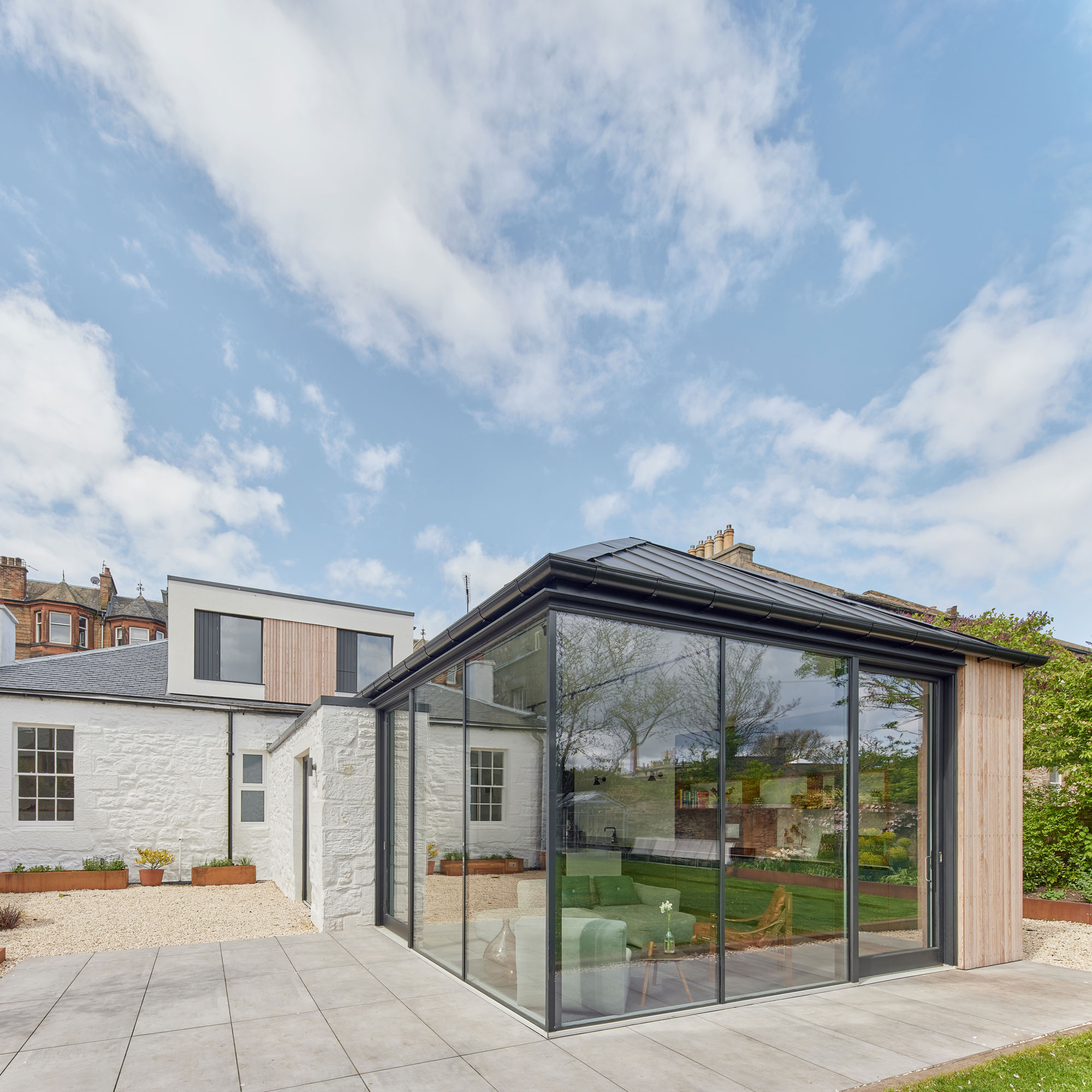
'The new timber frame and larch clad kitchen extension ideas to the rear are set within retained stone walls and houses a simple, tall and open-plan kitchen and dining space. A sofa area faces the 2.8m tall black stained timber glazed doors with direct access to the garden.'
'A new hipped roof - which echoes the form of the front roof - is clad in black zinc. Internally, the existing concrete floor was replaced with an insulated slab, then a decorative microcement finish was carried through the hall to the bathroom walls and floor.'
'It’s an understated, modest cottage from the front, but opens up into this surprising and bright space once inside. The back of the house is now a really welcoming place to spend time in as a family and socialise with friends.’
Get the Ideal Home Newsletter
Sign up to our newsletter for style and decor inspiration, house makeovers, project advice and more.
The transformation in detail
The brief was for lots of light and glass at the back of the house. The existing rear extensions had mostly fallen in already, but as the new owners were keen to respect the original house as far as possible, the stone walls were retained as original fabric. The new timber kit extension was ‘set within’ these walls and ‘sliding out’ towards the garden.
The existing stone walls were insulated and repointed. The new building houses a simple, open and tall space with kitchen and dining functions; a sofa; 2.8m tall doors; views and direct access to the garden.
The existing roof was removed and roof insulation added. An additional 5m2 was created in the attic space by removing poor circulation and creating a large open-plan bedroom space with a bathroom. The two dormers with chimney between were removed and a new single bigger dormer was created to maximise the garden views.
The kitchen diner
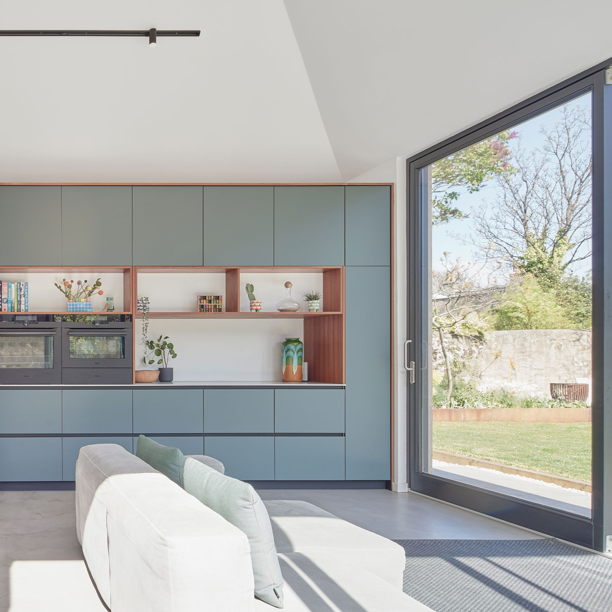
The bespoke kitchen was designed by local craftsman Simon Muir from Muir Studio, who had worked with the couple on their previous flat. The owners had originally thought about a matt black kitchen but the designer came up with the grey-green colour finish with accents of black and the couple felt this had a timeless look. The worksurfaces are Corian, chosen for its practical, low maintenance qualities.
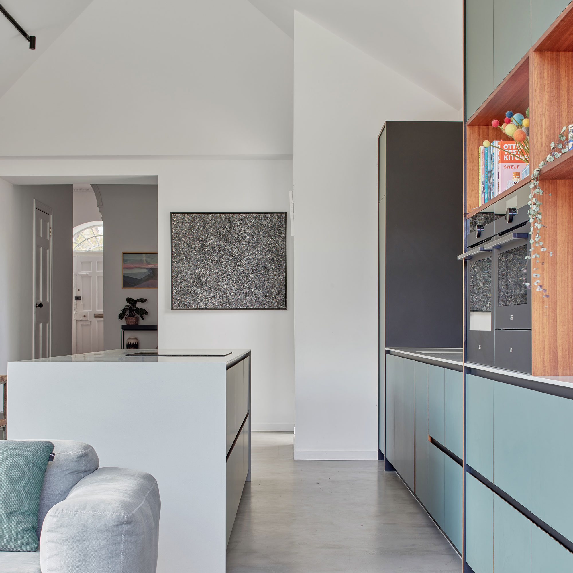
The kitchen dining area can be viewed from the front door entrance and hallway. This was achieved by taking some width off the original bathroom in order to widen the hall and offer views of the garden on entering the house.
This also allows the light from the new extension to filter right through the ground floor, where previously a muddle of rooms and utility areas had blocked light coming in from the rear of the building. There is now a seamless flow throughout the ground floor.
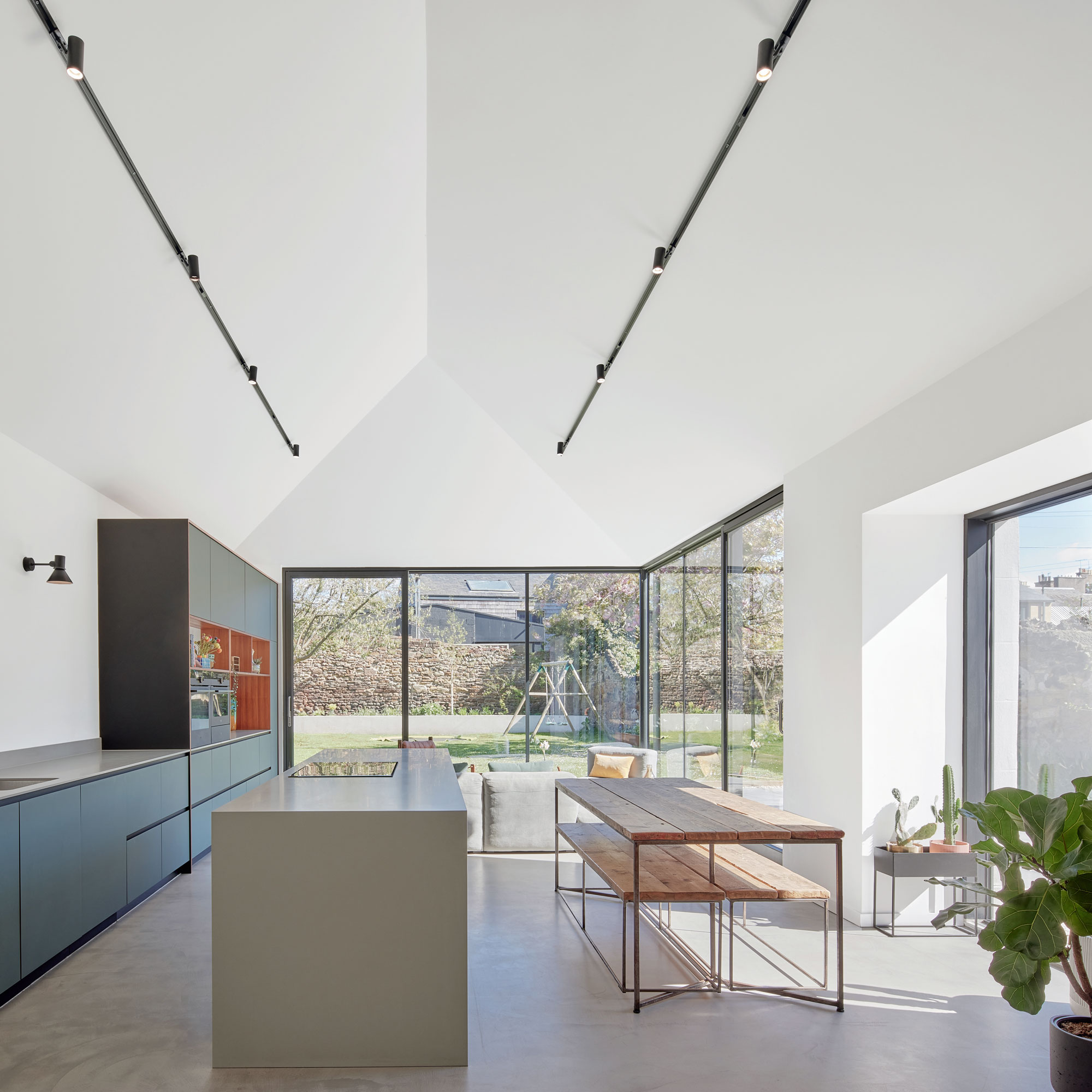
The dining table and benches are made from scaffolding board by a supplier who mainly works for bars and restaurants. The couple chose it for its rough look which contrasts with the smooth, pristine finishes of the bespoke kitchen and micro cement floor and wall finishes. The pitch of the hipped roof is expressed internally in the double height vaulted ceiling.
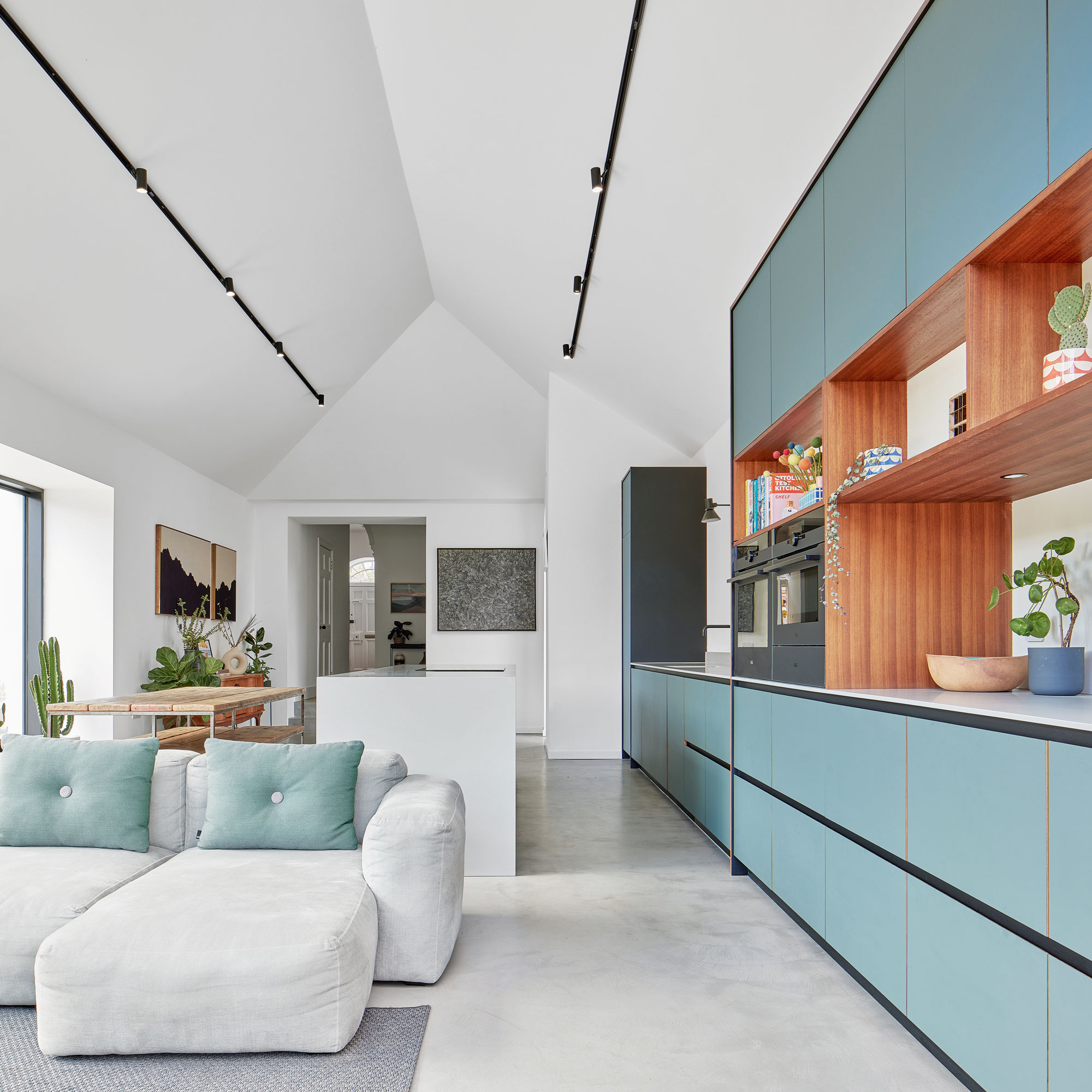
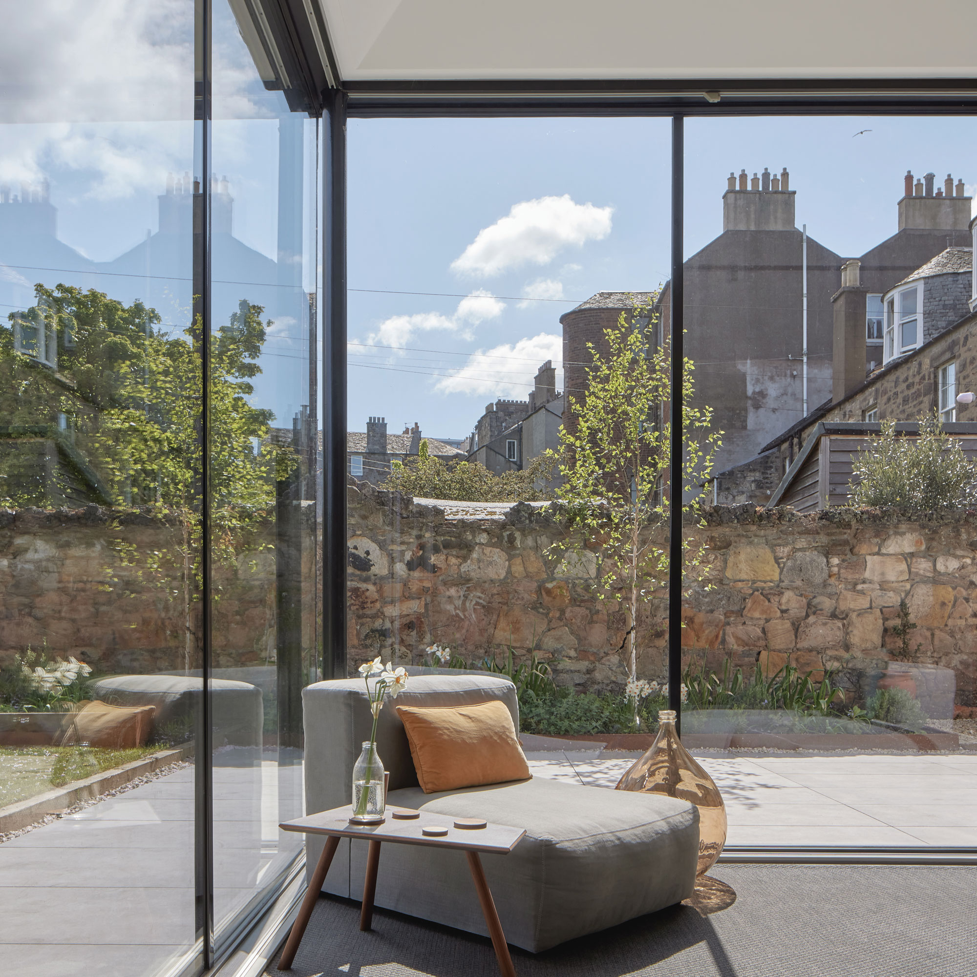
The sofa in the extension was bought especially for that space, and was chosen because it's long and low and offers a place to put your feet up and enjoy uninterrupted views over the garden.
The extension floor is flush with the garden, and the area can be opened up via the black stained timber sliding doors in summer to create indoor / outdoor dining and social spaces.
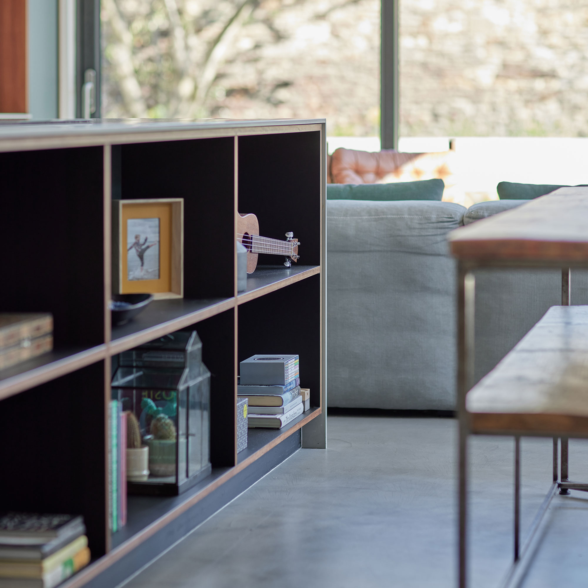
The kitchen and dining area is the family’s main living space so they didn’t want it feeling too ‘kitchen-y’. The kitchen designer came up with kitchen storage ideas such as the island with shelves on one side and drawers on the other, like a sideboard. The shelves are used to display personal items that lift the space and add colour and personality.
One of the owners is Australian and enjoys the outdoors, so getting as much light as possible into the house was important. Originally bifold doors were considered but the architect encouraged the family to invest in large scale bespoke doors to create greater height and a more seamless connection to the garden.
The garden was mature but overgrown when the couple bought the house. The new owners took on the landscaping themselves with the help from garden designer Nick Burton who assisted with the type of planting that would work.
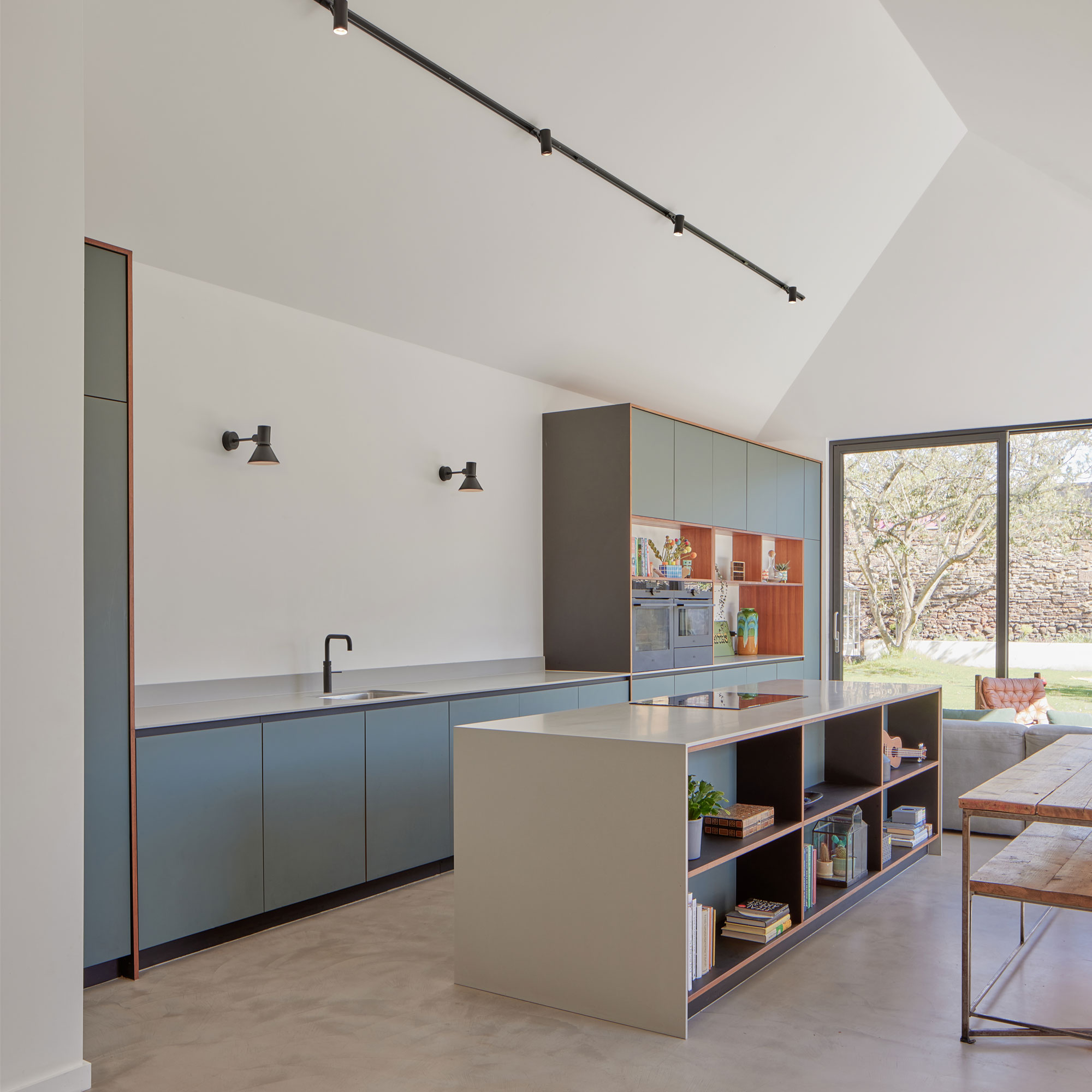
The corner glazing
The owners have chosen vintage furniture pieces such as the midcentury sideboard to contrast with the modern kitchen. The idea of the lighting rig in the ceiling was driven by architect Kieran and it has worked out ‘brilliantly’ according to the couple.
There is underfloor heating in the new south facing extension and huge thermal gains from the glazing as the sun heats the floor throughout the day.
The bathroom
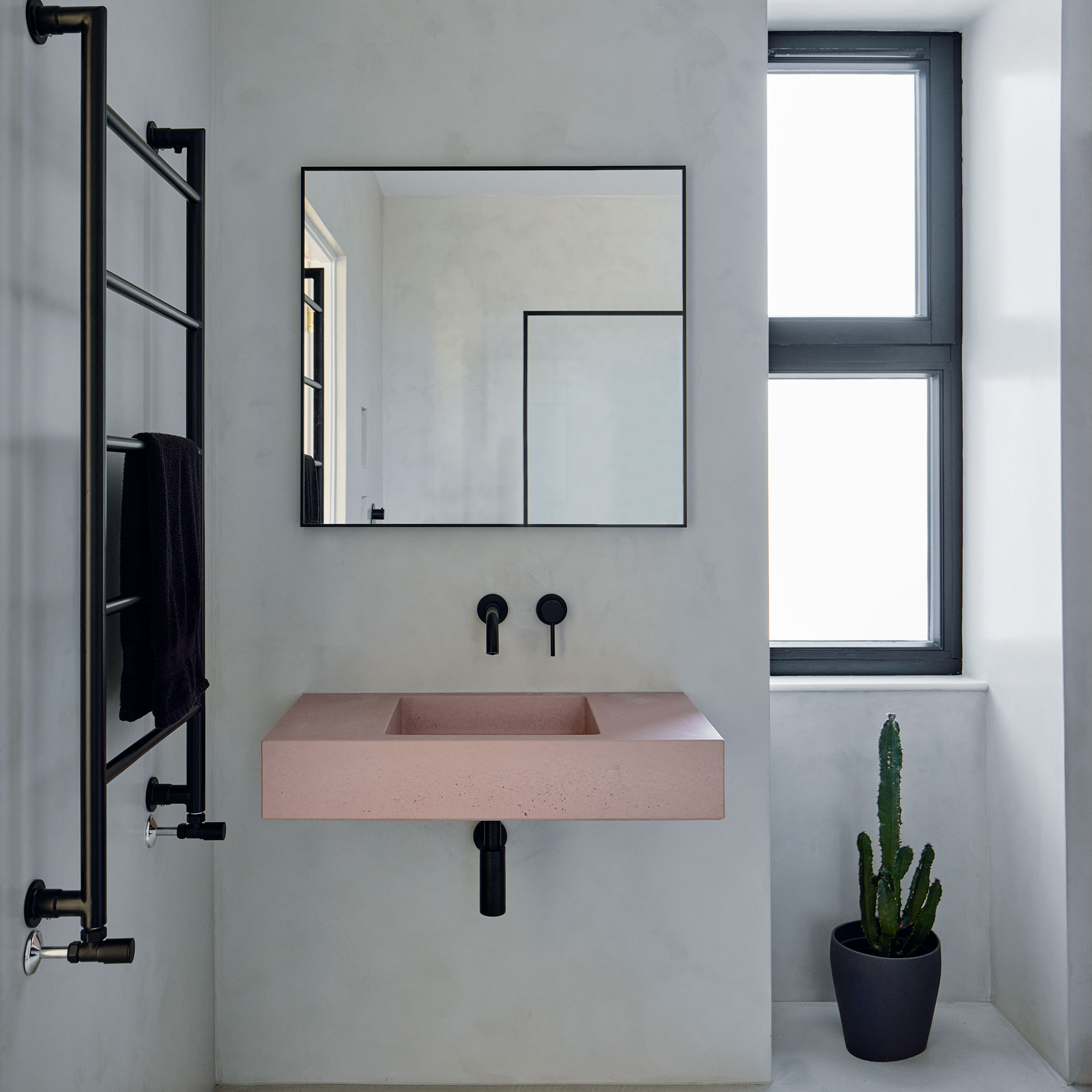
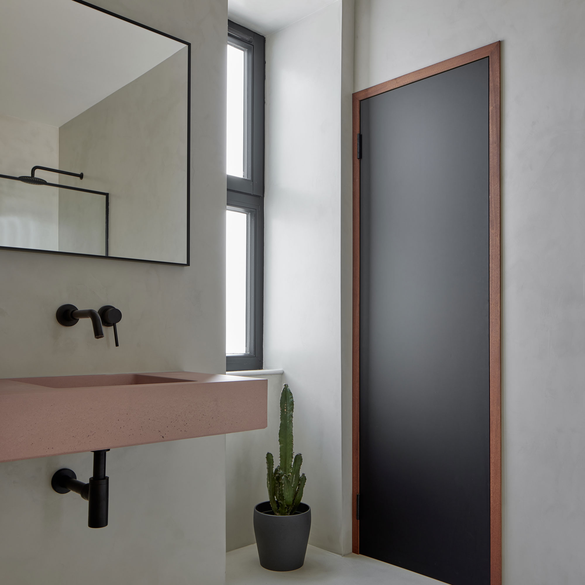
The new bathroom is narrower than the original bathroom and a new window was installed to bring in more light. The bathroom floor and walls are finished in microcement to create a smooth and waterproof wet room.
The couple were keen to source a concrete basin. They ordered samples settled on a pink coloured basin as they felt this was the best fit and a colourful contrast to the neutral cement surfaces.
Focus on: Microcement
Kieran Gaffney from Konishi Gaffney Architects shares his top tips
- SUPER SMOOTH SURFACE Microcement is a cement and quartz mix. The ultra smooth finish is ideal atop underfloor heating - the surface generates heat well and the lovely smooth surface is perfect for walking with bare feet or socks.
- A LOW MAINTENANCE CHOICE Microcement floors are low maintenance. They are easily swept and mopped, and particularly suited to pets where hairs and dirt from mucky paws can be brushed up easily. The surface is also resistant to scratching.
- NOT JUST FOR FLOORS It can be used for other surfaces such as walls (as it is in the family bathroom) as it's such a smooth tactile finish.
- IDEAL FOR BATHROOMS It’s a perfect surface wet areas as it's waterproof, fast drying, and it won’t shrink or crack. It’s also easy to wipe and clean and mildew resistant.
- COST EFFECTIVE It’s cheaper than tiles, and can also be applied directly over existing surfaces.
The property before works began
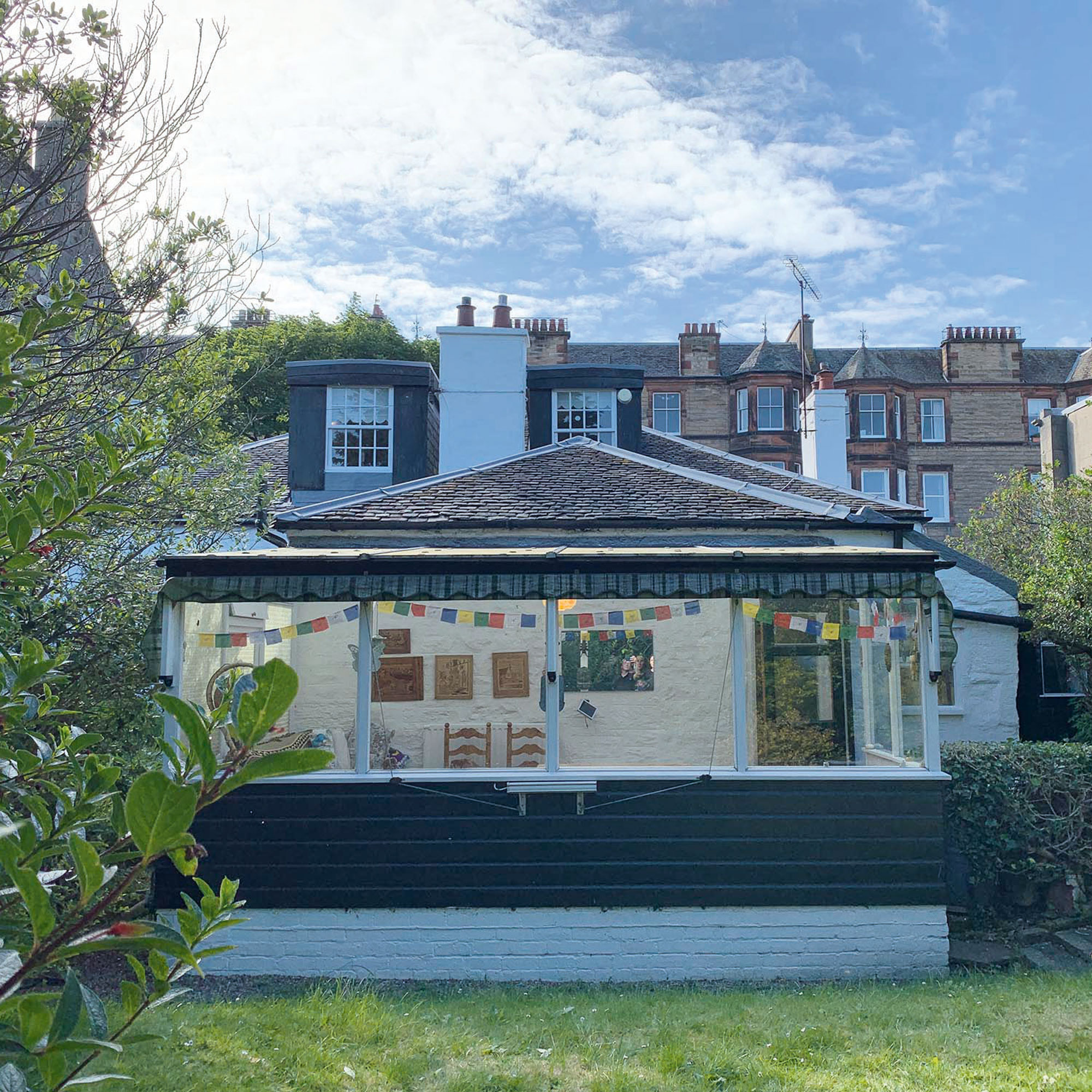
The back of the house was not fit for purpose when the couple bought the property. Former renovations to the house involved a long, narrow corridor with multiple doors and two changes in level, separating the front, formal part of the house from the large south facing and beautiful garden.
The later addition of the 1890's conservatory effectively cut off the house's connection to the garden, and was also damp and decaying. It was excessively hot in summer and freezing and unusable in winter.
Additional contributions by Caroline Ednie

Ginevra Benedetti has been the Deputy Editor of Ideal Home magazine since 2021. With a career in magazines spanning nearly twenty years, she has worked for the majority of the UK’s interiors magazines, both as staff and as a freelancer. She first joined the Ideal Home team in 2011, initially as the Deputy Decorating Editor and has never left! She currently oversees the publication of the brand’s magazine each month, from planning through to publication, editing, writing or commissioning the majority of the content.
-
 The pink Ninja air fryer of our dreams has arrived, but only in the US
Ninja's spring colours collection i the US has sparked some serious appliance envy
By Molly Cleary
-
 3 humane methods to stop squirrels eating your plants, according to garden experts
Stop squirrels from munching on your plants with these three humane methods
By Kezia Reynolds
-
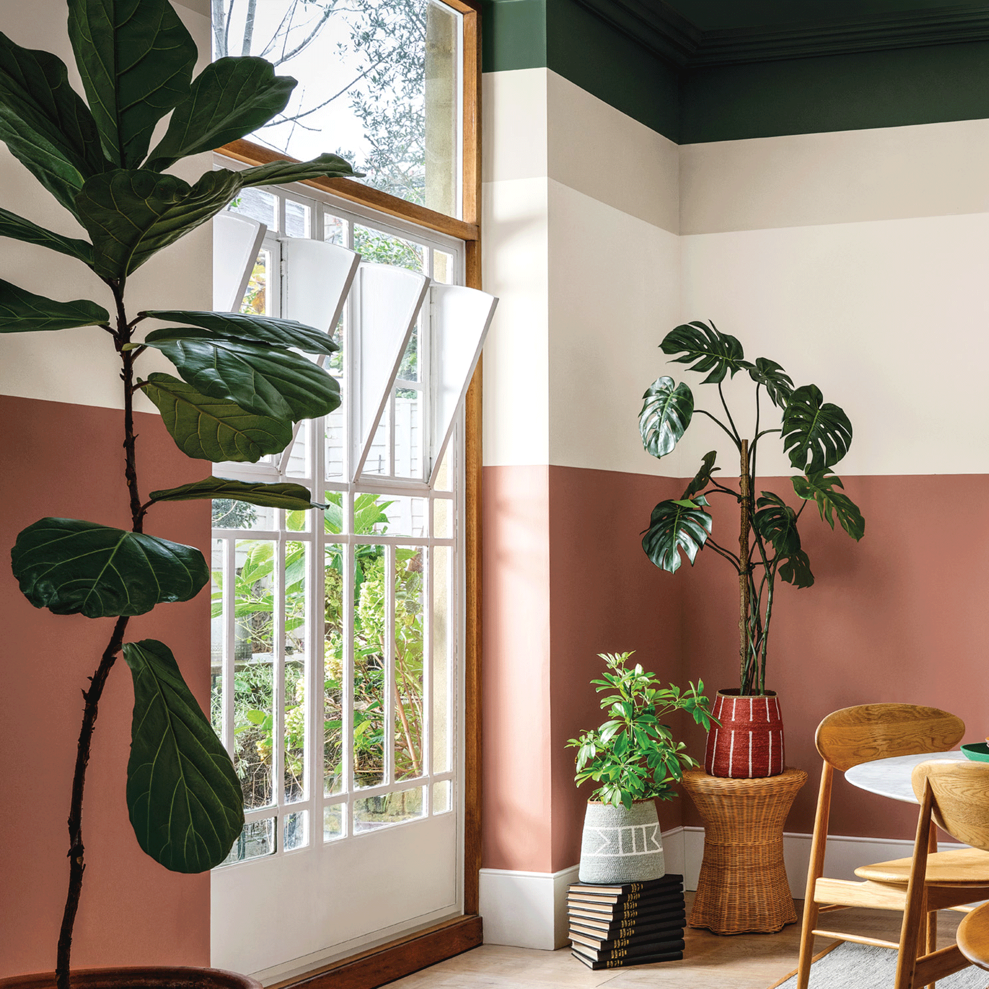 Crown Paint has launched new wall colours for the first time in three years, and changed how I think about neutral shades
Is terracotta the ultimate neutral?
By Rebecca Knight