'Out with the old, in with the new' - demolishing an old extension was key to this stunning home
By choosing to demolish some old extensions in favour of building a brand new one, the owners have completely transformed their home

Rebecca Foster
When you buy a property, you inherit the layout that may have worked for the previous owners. But that might not necessarily be suitable for you and your family.
Quite often, especially with an older property, historical additions will have been built over the years - things like a dated conservatory or a variety of kitchen extension ideas - and together, they never really work to make the space feel bright, open or insulated.
If faced with this, the best thing to do - budget and planning permissions permitting - is to get rid of the old and rebuild something completely new. Robert Houmøller, director at Merrett Houmøller Architects, worked on a similar project recently.
Located in Ealing, west London, the three bedroom, 1920s end-of-terrace property had been extended multiple times, resulting in a complex floorplan with a small kitchen. The new homeowners - a couple with two small children - were keen to open the cramped spaces up to create a larger open plan kitchen, perfect for family life.
Though the existing kitchen was larger than a galley kitchen, it was still too small to have an island for the family to sit round together. Plus, the convoluted ground floor layout meant the middle reception room, which previously functioned as the dining room, was disconnected from the kitchen.
We asked Robert to talk us through the transformation, from a house with a confusing ground floor layout to a family home with a new full-width rear extension.

Robert, along with his practice partner Peter Merrett, run Merrett Houmøller Architects, a practice in north London. Merrett Houmøller offers a comprehensive range of services for residential homeowners, as well as commercial clients, developers and public bodies. Merrett Houmøller's aim is to create beautiful, practical spaces that make people happy, incorporating a sustainable approach wherever possible with each project.
'The clients found the house’s small kitchen to be very impractical, especially with two young children,' explains Robert. 'Instead, they wanted a spacious kitchen-dining-living area to function as a family hub, where everyone could have their own space, yet still be connected to each other.'
Sign up to our newsletter for style and decor inspiration, house makeovers, project advice and more.
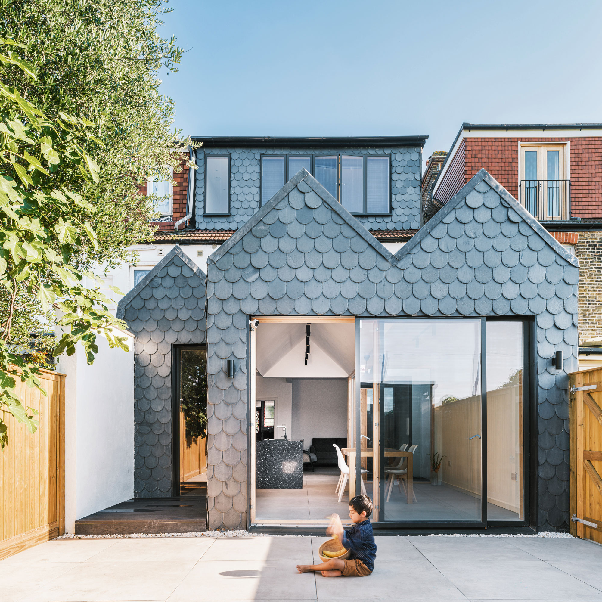
'Our solution was to remove the property’s previous extensions and replace them with a full-width rear addition, which pushes out six metres from the back of the original house.'
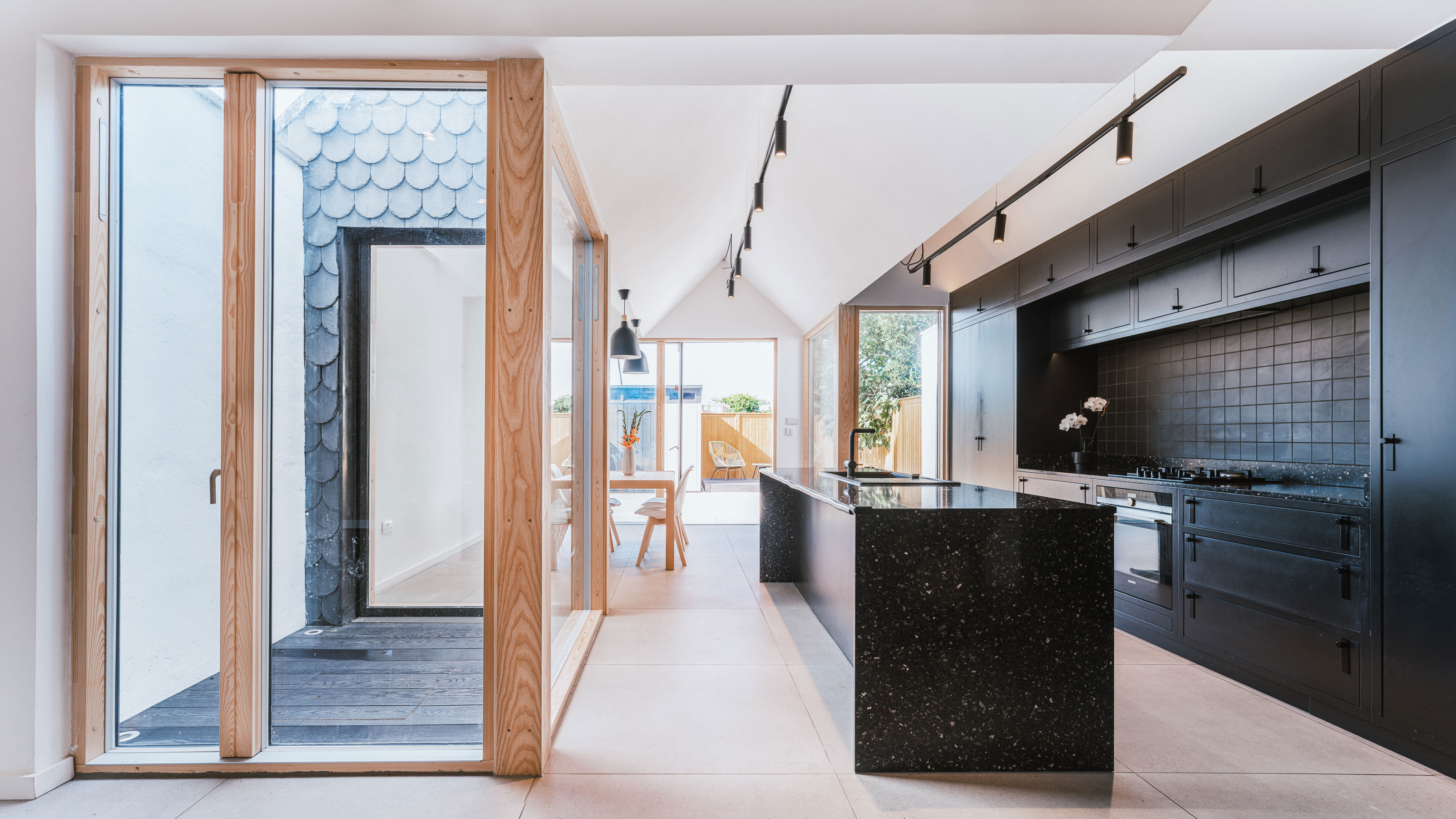
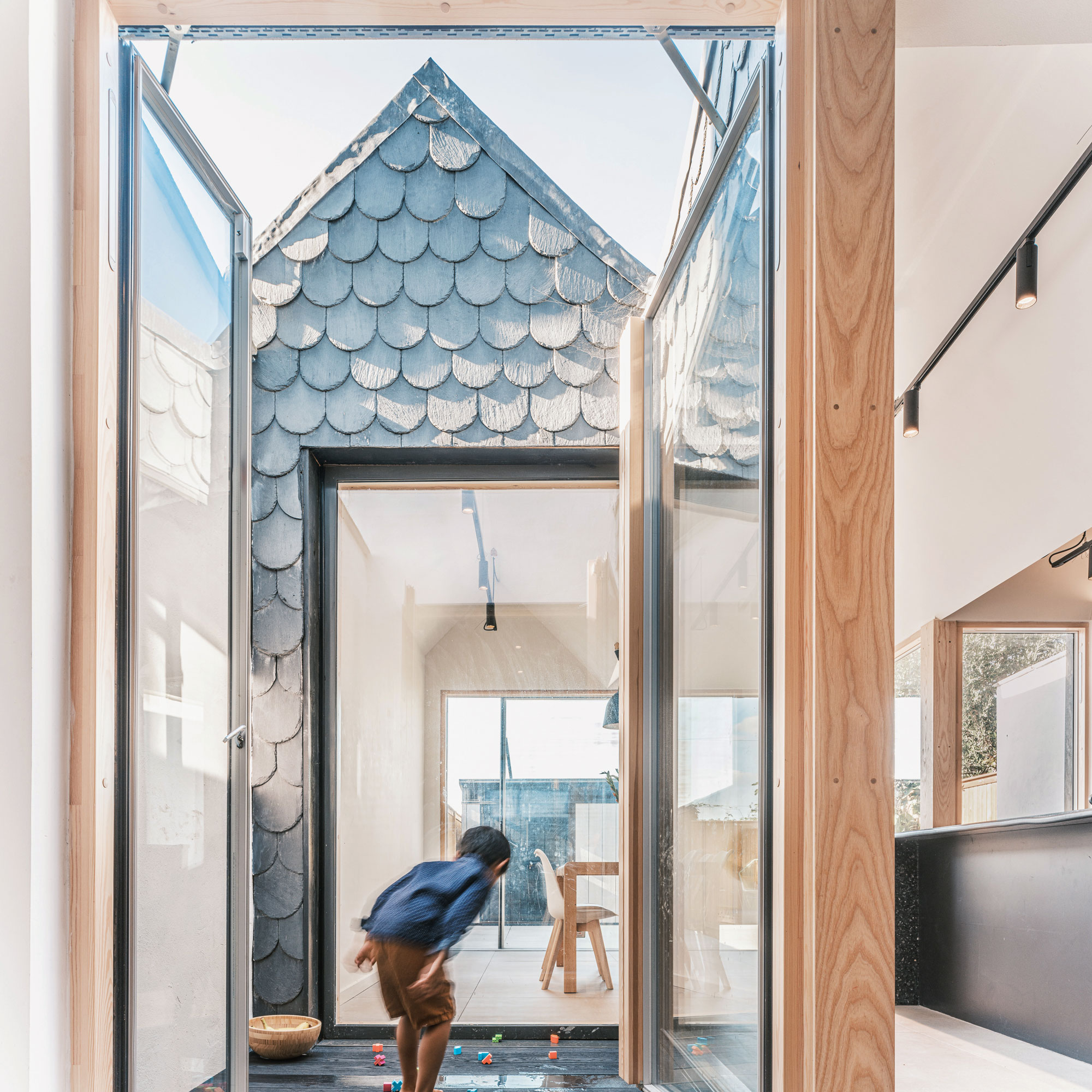
'Because the new extension is quite a large structure, the plan became incredibly deep, so to avoid ending up with a dark, stagnant space in the middle of the house, we incorporated an internal courtyard to bring in plenty of natural light and fresh air.'
The kitchen diner
The extension was laid out on a grid, so that the three pitched structures forming the roof mirror the lines of the large format porcelain tiles on the floor exactly. The porcelain tiles form a highly conductive partner for the water-based underfloor heating system that’s been laid underneath.
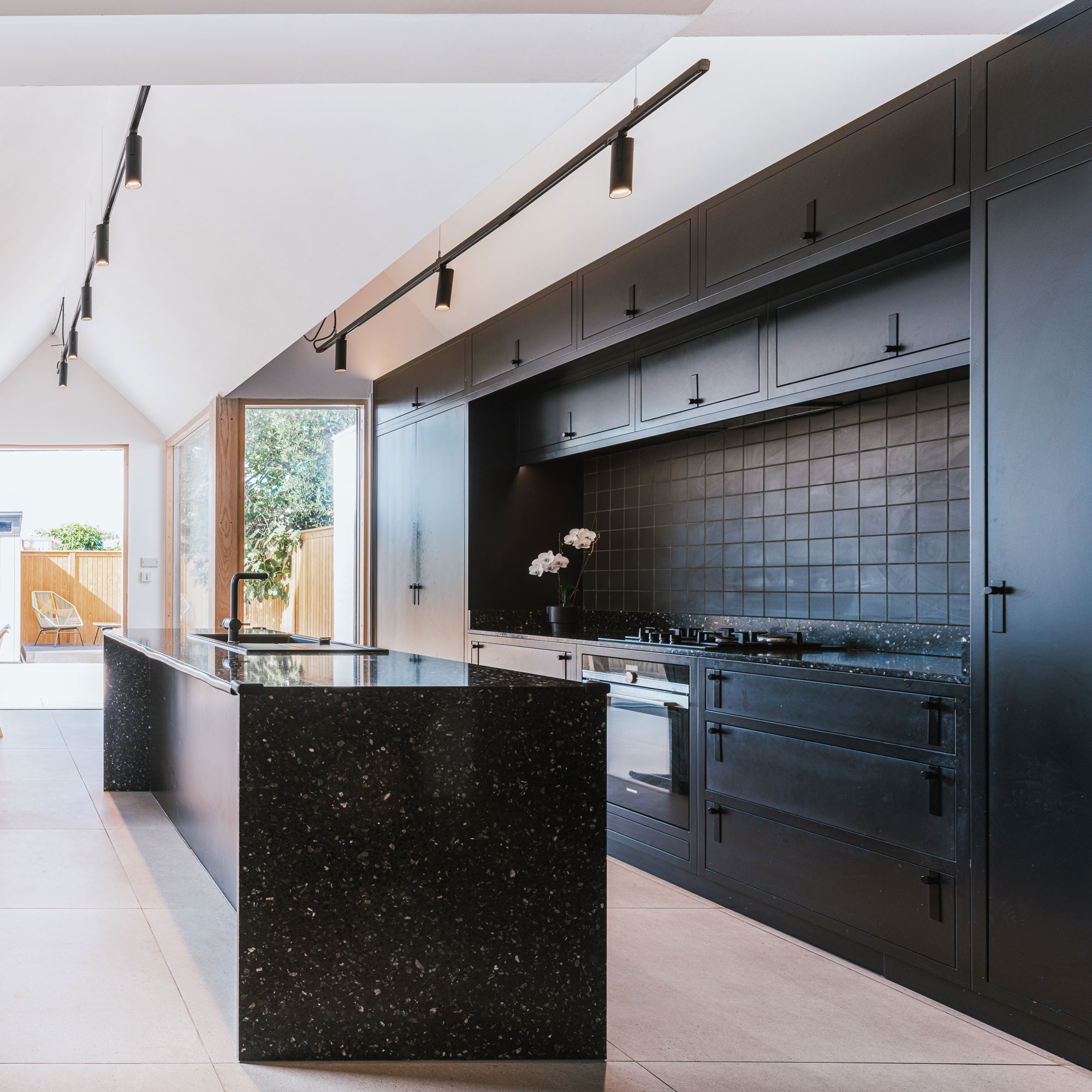
The black terrazzo on the island coordinates with the terrazzo upstand and porcelain tile kitchen splashback ideas in the kitchen, continuing the theme of pattern from the exterior tiles to the interior space.
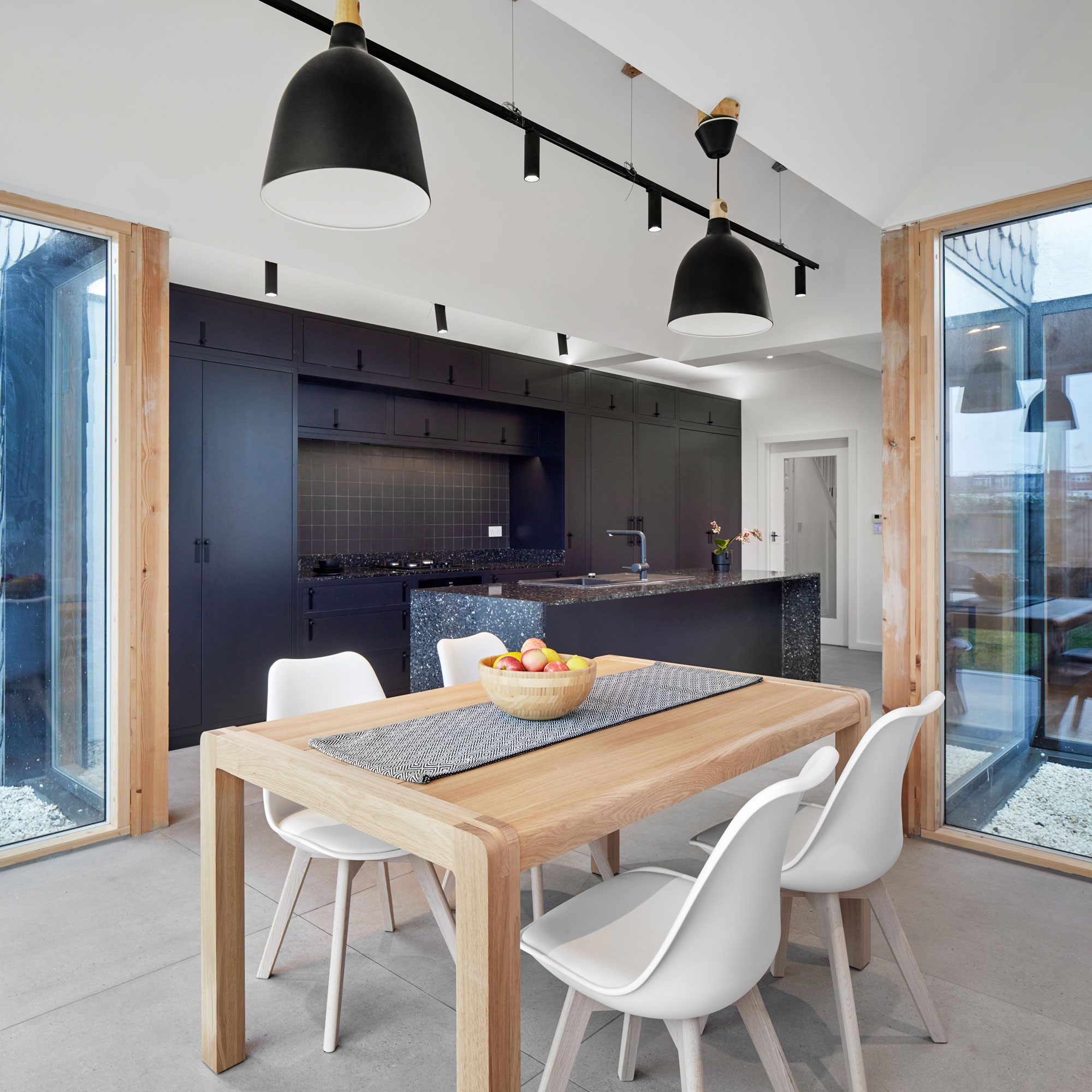
As part of their drive to establish a calm, serene space, the homeowners chose a relatively neutral colour palette formed principally from white, greys and black.
Composite windows, with aluminium on the outside and a timber finish on the inside, were chosen for the character and warmth the wood brings to the space.
Selecting neutral tones also comes with the advantage of longevity, allowing the homeowners to use smaller items of furniture to introduce colour should they wish, which won’t be expensive to update later if they want to change the theme.
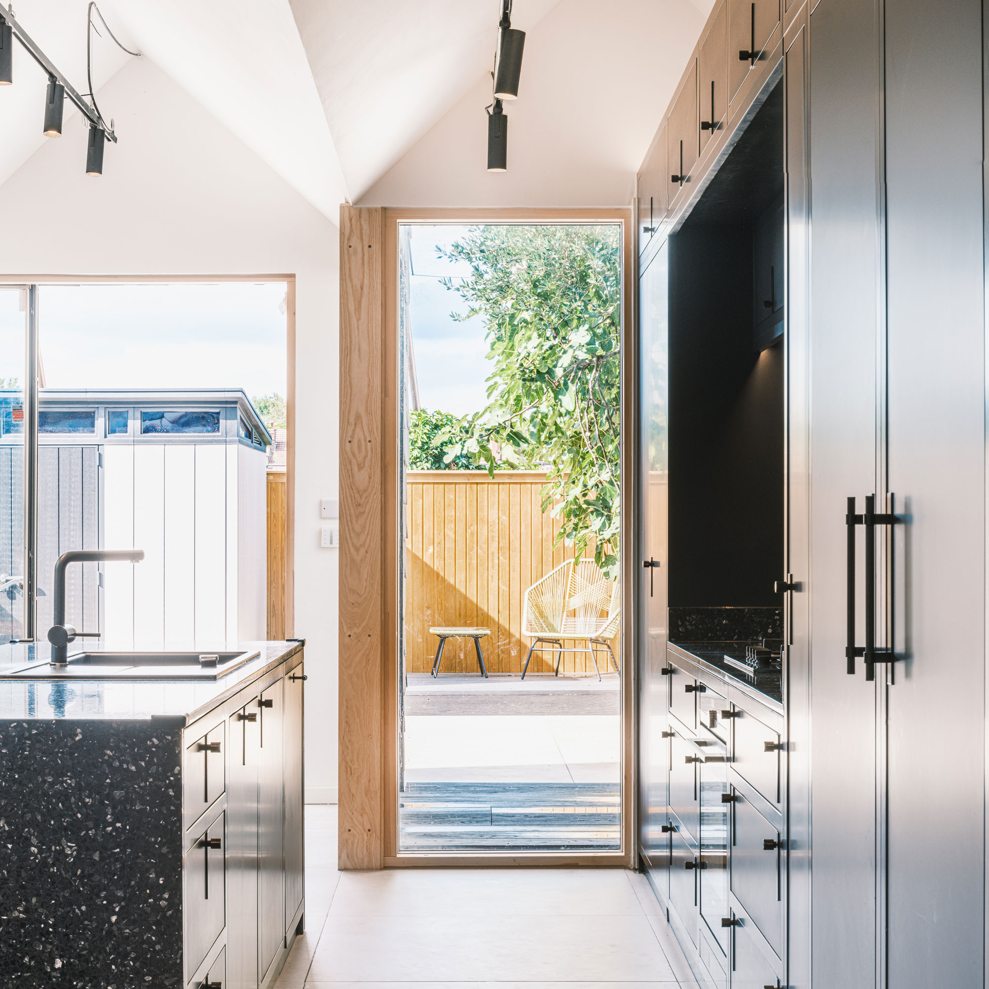
Initially, white marble chippings were laid as the floor covering in the internal courtyard. However, with two young children, the couple quickly realised this solution was impractical as the chippings proved too tempting for the kids to bring into the house and use as toys.
The couple soon switched the floor covering to a more family-friendly timber decking, with uplights integrated flush with the wood to illuminate the courtyard after dark.
The internal courtyard
Keen to keep the extension’s layout as practical and fuss-free as possible, the couple opted to position the bulk of the kitchen units, apart from the island, running in one long bank against the side wall.
This creates a clean, streamlined kitchen with all the storage space for kitchen crockery and appliances in one convenient place. The kitchen sink has been positioned in the central island so the owners can be connected to the dining area when they’re preparing food for the family or cleaning up.
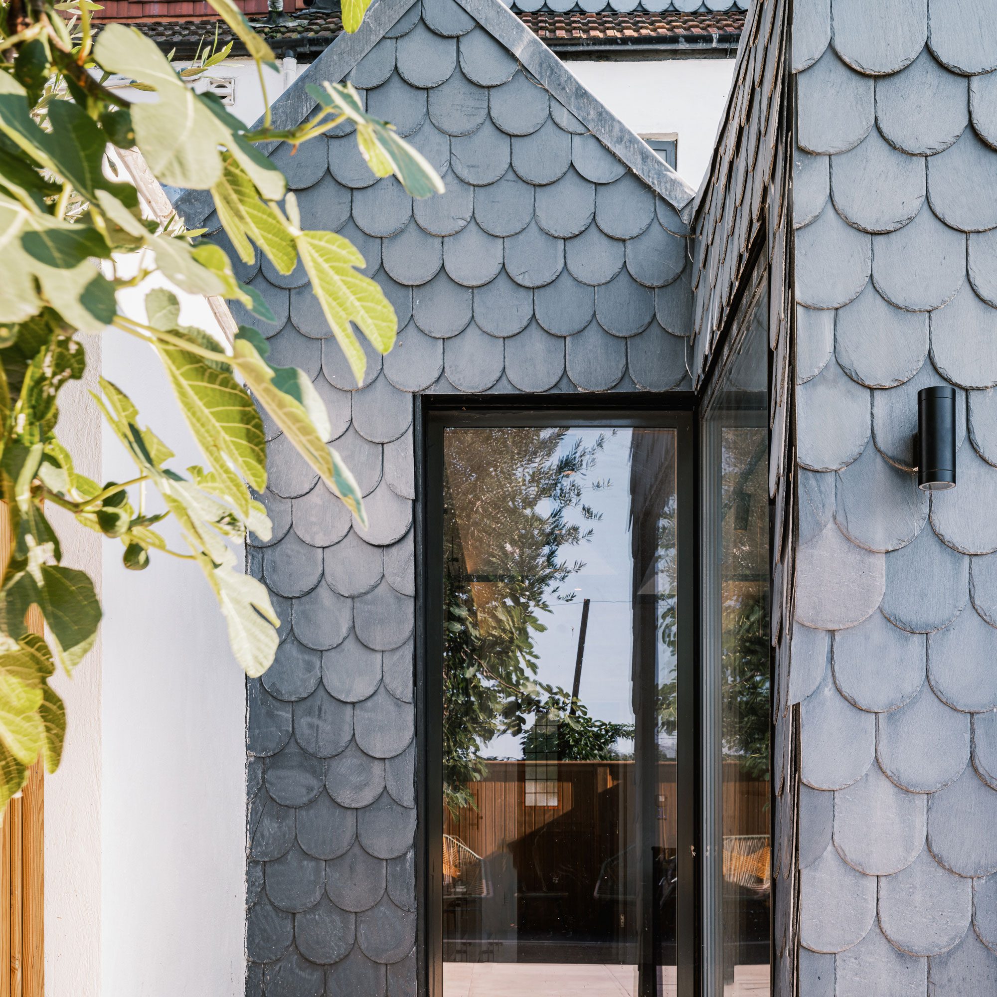
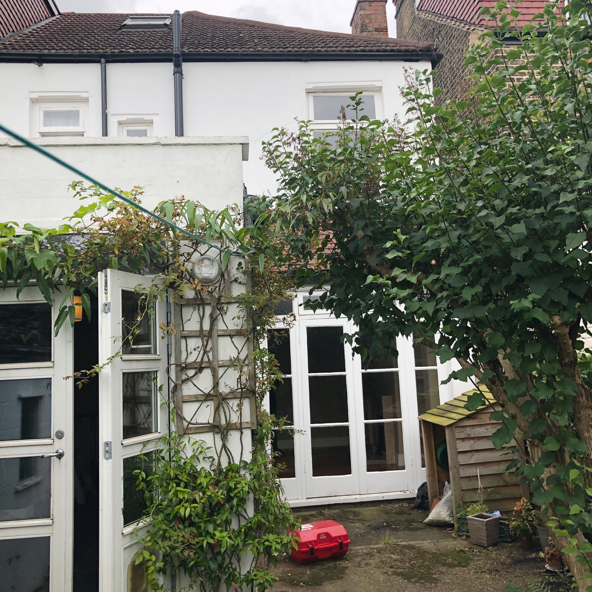
As part of the project, the existing outrigger and previous extensions were all removed to make way for a spacious new extension spanning the entire width of the plot.
The owners wanted the exterior cladding to give the extension a unique edge, so they chose fish scale slate tiles to coordinate with the new dormer window in the loft. The curved edges of the tiles create a sense of softness, which contrasts with the crisp, contemporary feel in the rest of the extension.
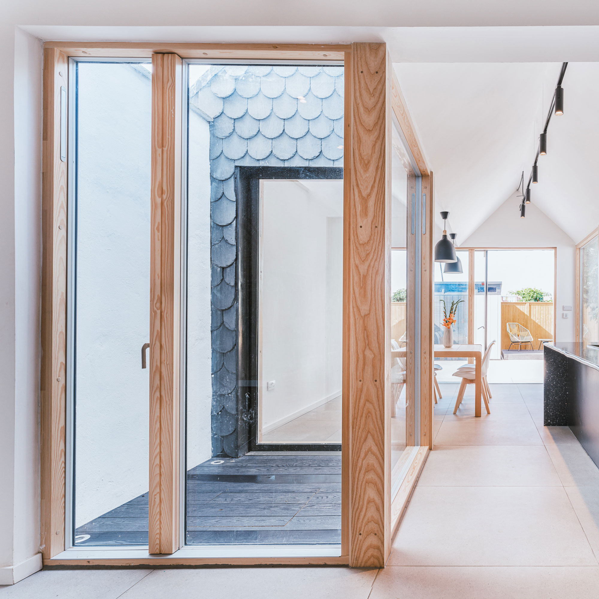
Staggering the back wall of the extension and retaining an outdoor decked space in the side return has had various advantages for the family.
For instance, it has allowed the couple to incorporate a fixed corner window to channel extra sunshine into the kitchen and dining areas at different times of day.
Incorporating the vertical glazing at different angles has also opened up more varied viewpoints from the extension and out into the garden.
Focus on: Internal courtyards
Robert Houmøller, director at Merrett Houmøller Architects gives us the lowdown
- PLANT UP Incorporating plants and trees is a great way to bring nature into the home.
- SMALL DESIGN, BIG RETURN Even a small courtyard provides an effective way of bringing light and air into what could otherwise be a dark, dank space
- ADD EXTERIOR LIGHTING Lots of glass in a dining space can feel unfriendly, so exterior lighting can help you avoid creating a curtain of darkness in the evening
- SIZE ISN’T EVERYTHING Your courtyard doesn’t have to be habitable, which means it can be quite small. The main thing is that it’s sized in proportion to the rest of the spaces in the extension.
- CONSIDER DRAINAGE Ensure you install an adequate drainage system, as rainwater needs somewhere to go.
The property before works began

Ginevra Benedetti has been the Deputy Editor of Ideal Home magazine since 2021. With a career in magazines spanning nearly twenty years, she has worked for the majority of the UK’s interiors magazines, both as staff and as a freelancer. She first joined the Ideal Home team in 2011, initially as the Deputy Decorating Editor and has never left! She currently oversees the publication of the brand’s magazine each month, from planning through to publication, editing, writing or commissioning the majority of the content.
- Rebecca FosterContributor