Dropping the floor level in this house has added both space and light
See how dropping the floor level in this Victorian property has transformed a once dark and dingy room into a light and bright space

Ifeoluwa Adedeji
Looking to add height and light to your space? Consider dropping the floor level. That's what this couple did when building an extension on their house with help from their architect.
Located in south London, this four-bedroomed Victorian terrace is home to a couple and their young daughter. Before they enlisted Alice's help, the rear of the house had a linear, dark kitchen in a space with low ceilings and the cramped space wasn’t suitable for entertaining.
Here, their architect Alice Theodorou, director at Noto Architects, explains the process of what her company did to transform the space into this delightfully bright open plan kitchen diner.
Dropping the floor level - kitchen diner transformation
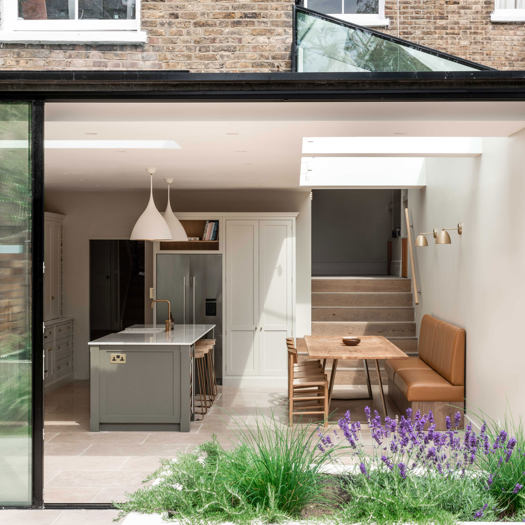
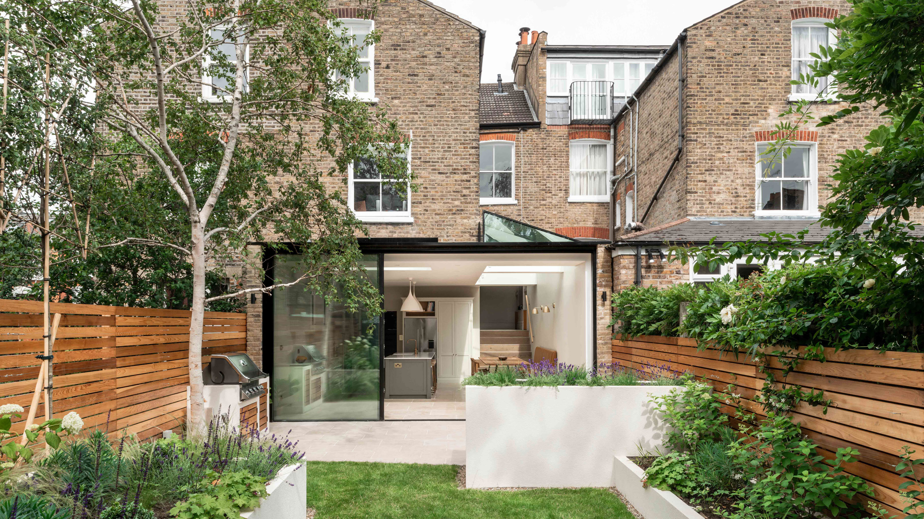
‘The homeowners came to us with a clear brief for the kitchen’, explains Alice. ‘They wanted the dark space at the back of the house to feel as light and open as possible. By dropping the floor level, we tackled the issue of the low ceilings. We underpinned the existing foundations and created an uninterrupted vista, or picture window, which frames the garden.’
The rear extension features a fully glazed wall made up of a fixed and sliding doors that helps link the garden to the rest of the property.
The architects used a flat roof on one side, which features a green roof system, while the other section of the roof is pitched.
Along the glazed roof to the infill, the roof windows are fixed panes, while the rectangular units open electronically to ventilate the space when required.
Get the Ideal Home Newsletter
Sign up to our newsletter for style and decor inspiration, house makeovers, project advice and more.
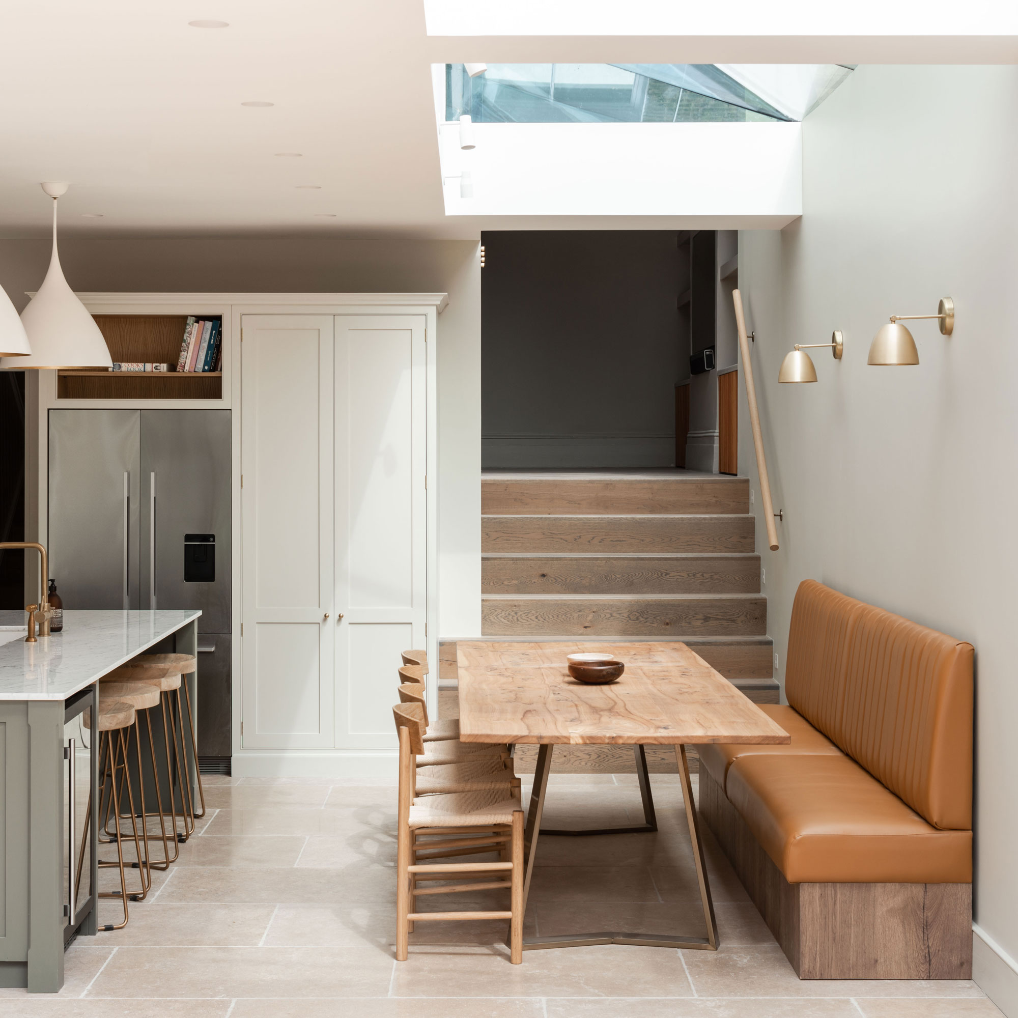
The new design allowed for an effortless connection between indoors and out. ‘A flush threshold detail with concealed drainage channels allows for an almost seamless transition between the kitchen and the garden,' continues Alice, 'which helps the space appear much larger.’
Clean symmetrical lines combine to give this new extension a modern finish. However, traditional design choices in the joinery and materials such as the leather found in the banquette seating make it feel warm and inviting.
The neutral shades help reflect light around the space and the natural materials such as wood add texture and stop the space from appearing flat.
Strategically placed glazed units work together to provide brightness that penetrates all corners of the room.
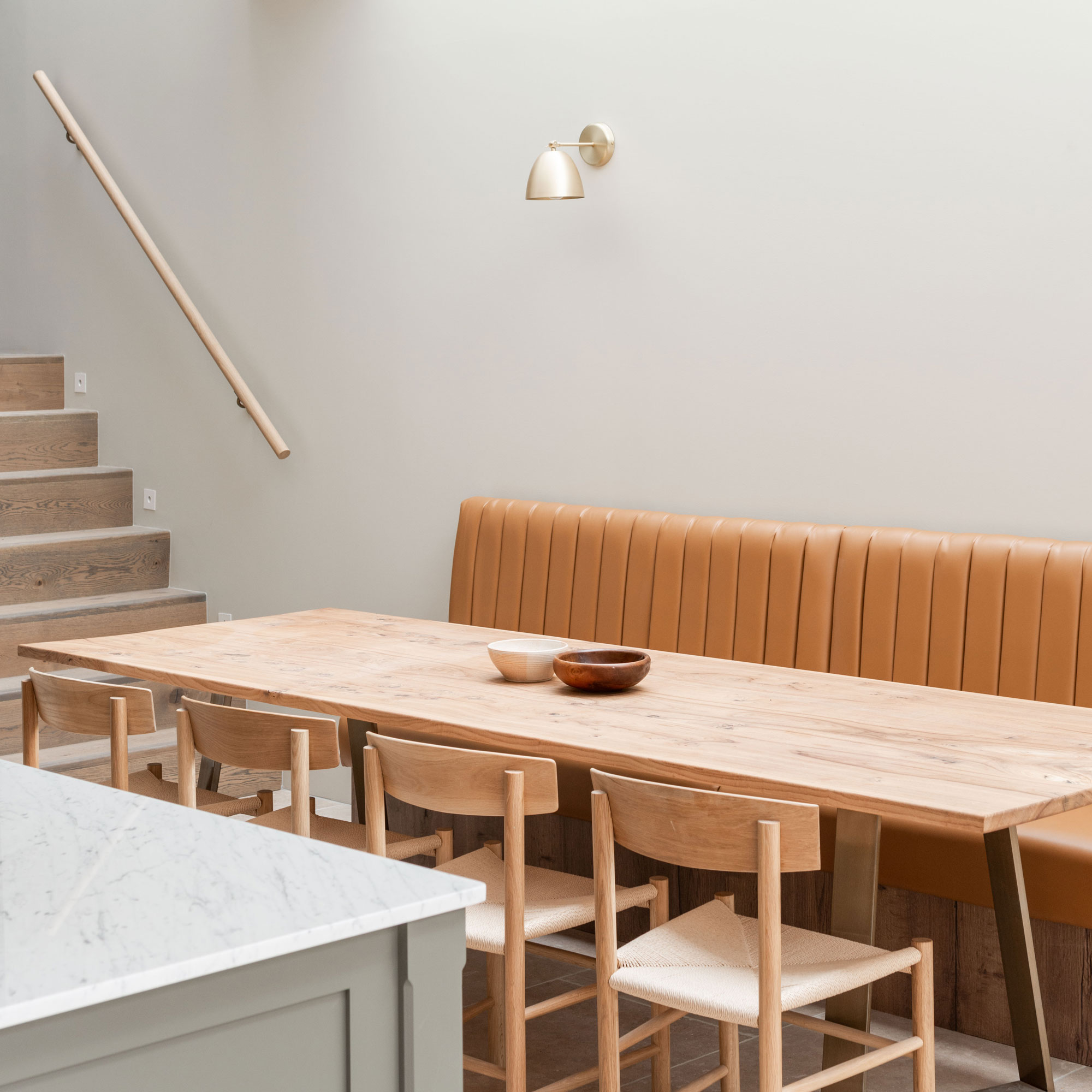
The dining area features ample space for the family and their friends to gather around, with informal leather upholstered banquette seating on one side and individual timber dining chairs to the other.
Natural top-down lighting pours through the fixed glazing and wall hung lighting supplements this during evening mealtimes.
The position of the skylight means the owners can enjoy intimate moments together without being overlooked by neighbouring properties.
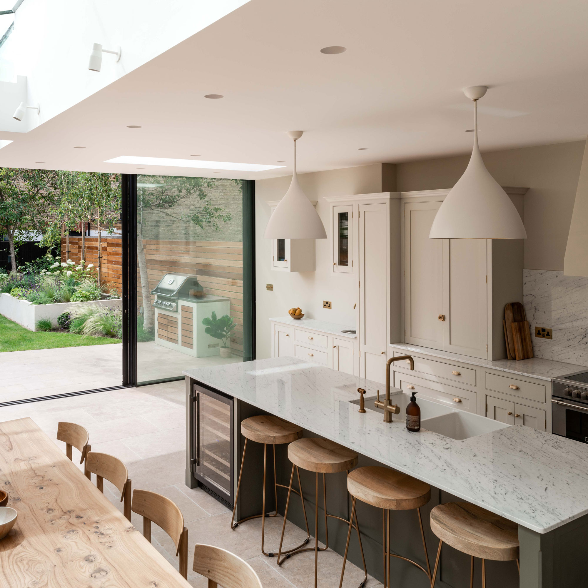
The garden is separated from the kitchen diner via a large sliding door, which when open creates a wide opening that invites you to explore the external space.
By dropping the floor level and evening this our into the garden, they could then lay large format limestone flooring both indoors and out. This flows out from the extension connecting up with the patio to create a solid visual link between the two spaces.
The neutral green and cream shades employed in the kitchen cabinetry are a mirror of the colours naturally found within the garden.
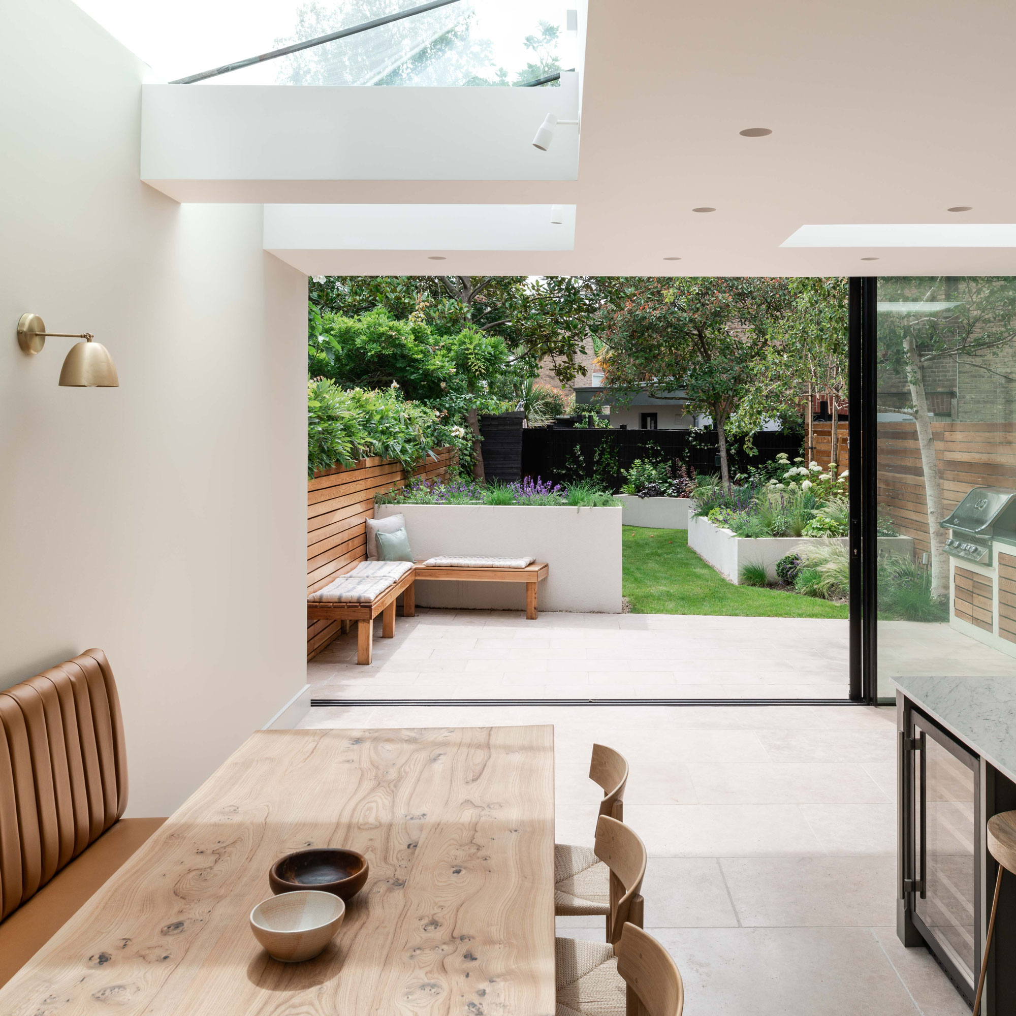
A pitched glazed roof is a striking element of the design which allows plenty of daylight to flood into the news space. ‘The roof structure,' explains Alice, 'is visually independent of the large-format sliding doors, allowing the glazing to appear to sail in front of it, maximising the doors’ height.’
An external seating space has been integrated into the tall raised beds and reflects the setup that has been established in the internal dining area.
Entertaining family and friends and/or watching children play outside while in the kitchen is made easier as the extension has uninterrupted views out all the way to the rear of the garden. The entire space is kept warm and cosy during the winter by underfloor heating.
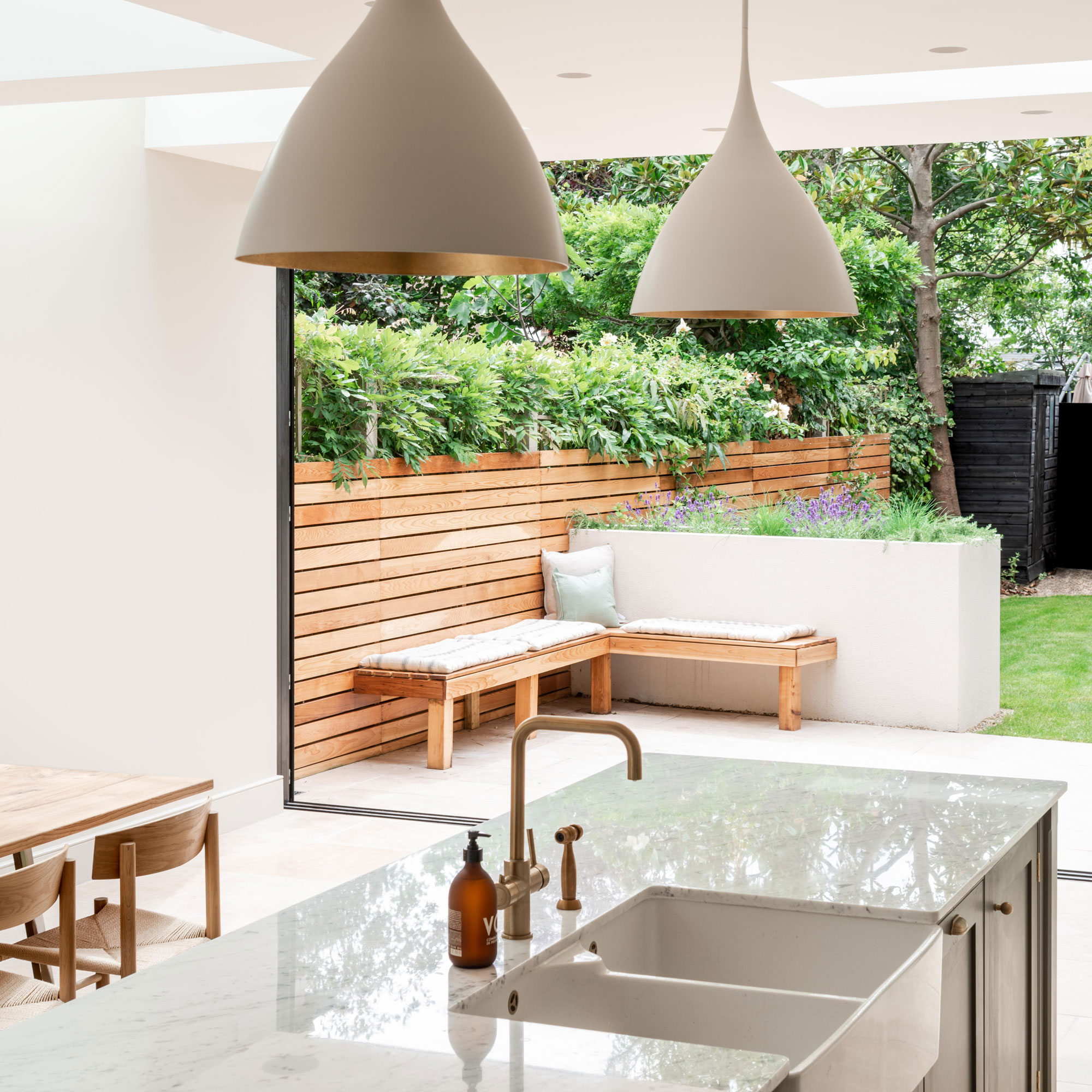
The garden has been designed to be low maintenance while presenting different levels in the form of raised beds, shrubs and trees.
The contemporary style blends well with the new addition and makes it easier for the owners to enjoy the space during the warmer months. It's afforded privacy via the vertically mounted timber cladding and high level planting, which helps soften the scene.
Internally a classic style double butler sink provides lots of room to wash food and utensils, while the durable marble worktop space offers plenty of room for people to prepare food and gather around the island.
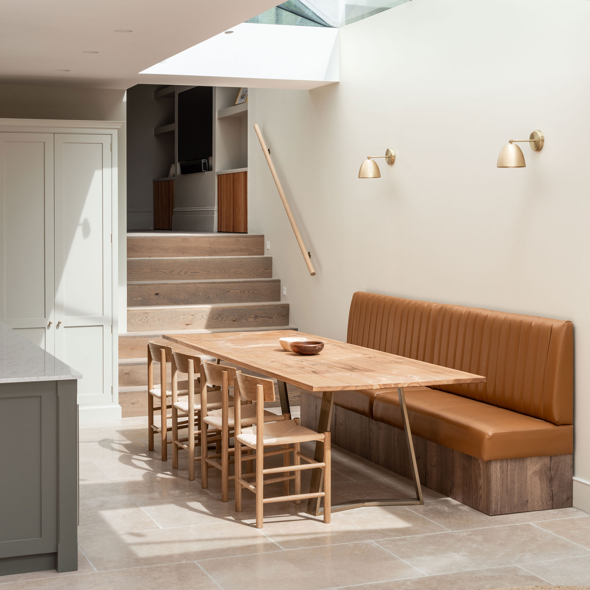
The dining zone has been finished using complementary earthy brown hues that help establish a formal, yet cosy setup.
The leather upholstery is reminiscent of trendy London bar seating, a setup that maximises the use of the space available.
Positioned to enjoy views out through the large rear sliding door, the dining area is a distinctly separate space from the rest of the kitchen and helps maintain a sense of order in the open plan space.
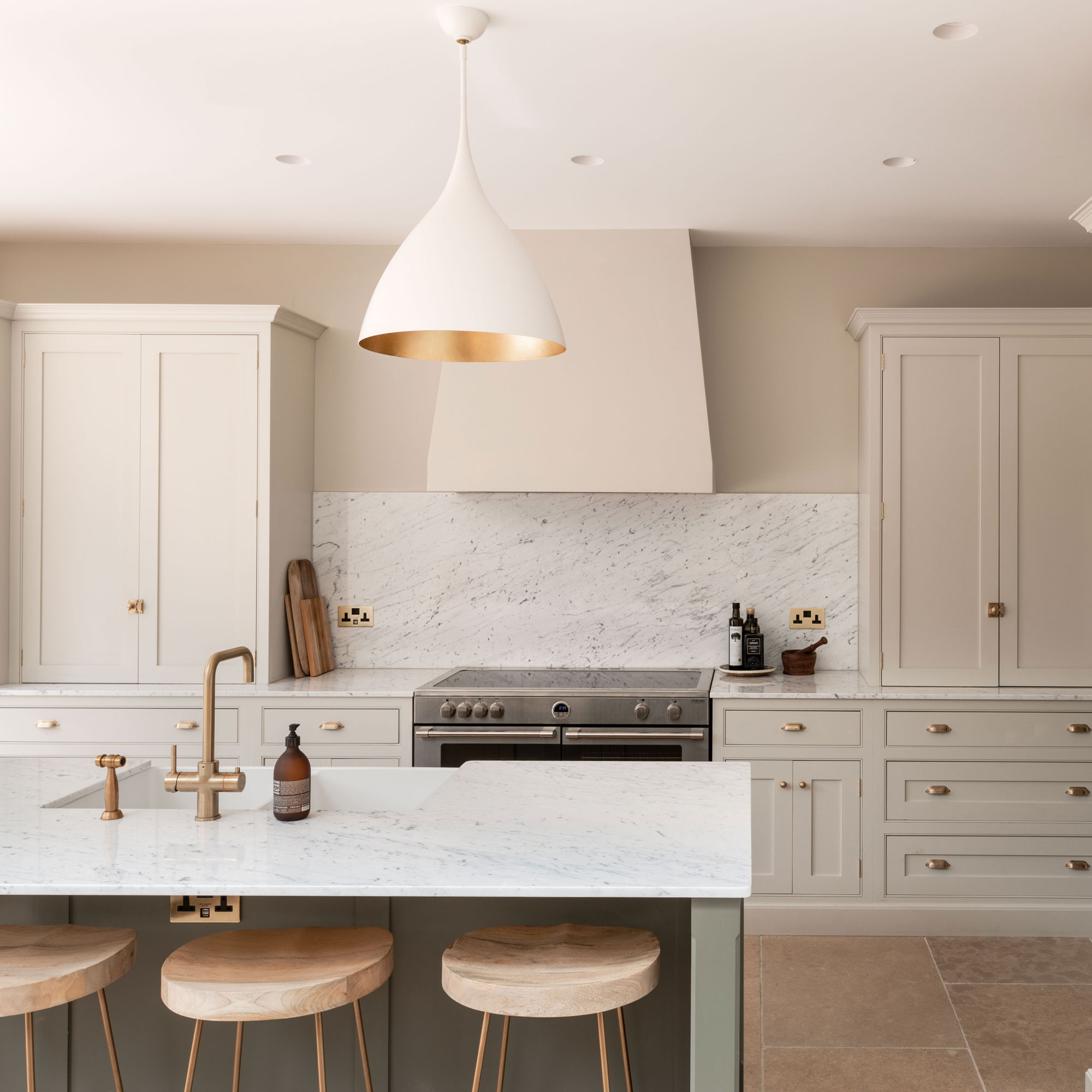
The mapping of the kitchen diner was also well through through according to the owners needs. They wanted a new kitchen diner layout that would allow them to cook and socialise simultaneously, whilst encouraging free flow between all the areas.
'The kitchen island can be accessed at both ends,' explains Alice, 'which increases the openness of the space - it became the focal point of the whole scheme.'
Knowing how to commission a bespoke kitchen helped the owners choose the exact look they wanted without compromise. The kitchen units were designed and built to fit the space, each unit serves a purpose and ensures that the maximum amount of storage is readily available.
A neutral colour has been chosen for the wall units, with a green hue selected for the island to bring the whole scheme together.
The bar seating neatly tucks in under the island worktop so that when the space is not in use the path from the stairs to the garden can be kept clear of obstacles.
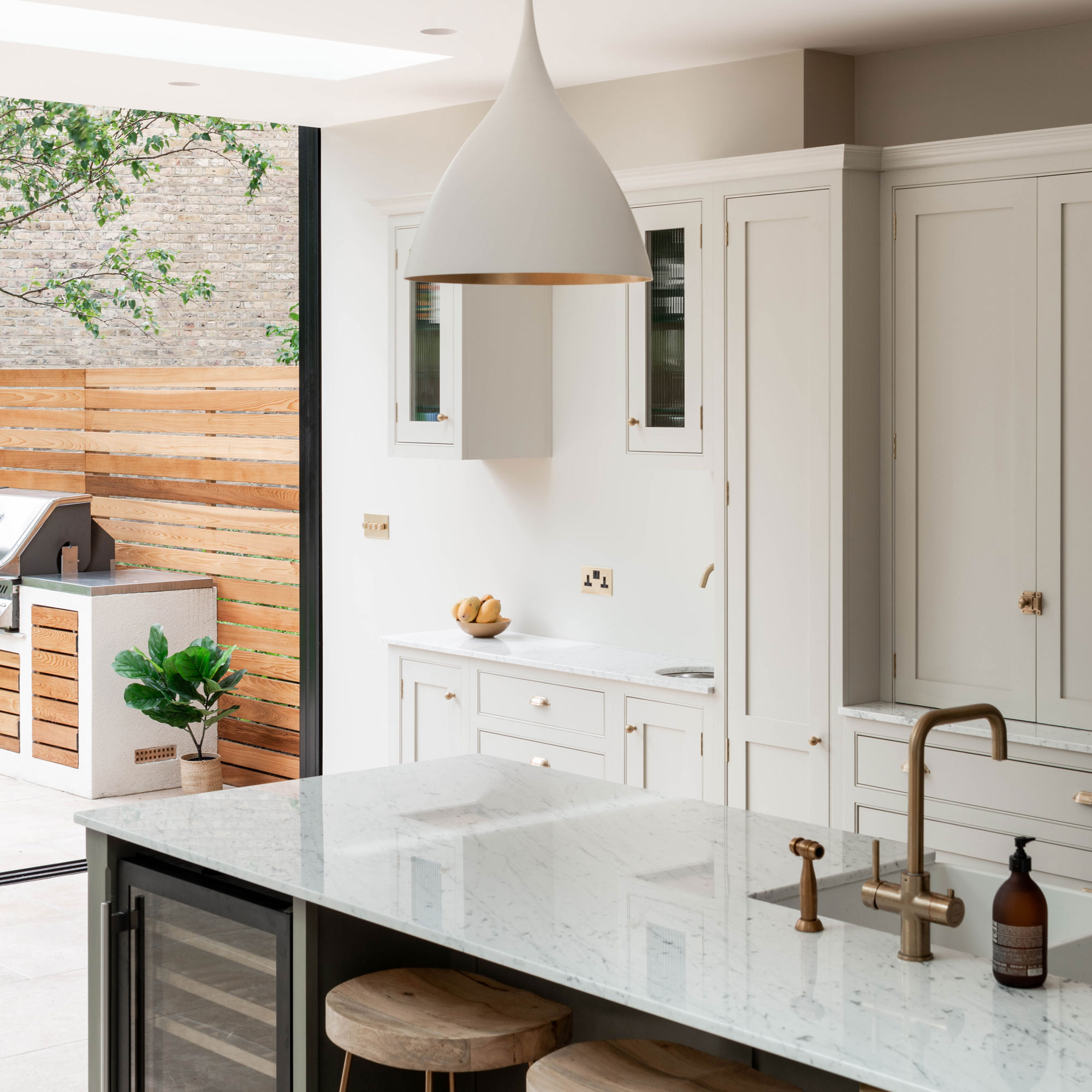
A built- in wine cooler has been integrated into the central island, conveniently positioned for easy access, especially when entertaining.
The large fridge has additional storage located above it to ensure that no space is wasted.
Small, yet noticeable touches include the matching up of the pendant lampshade, worktop and unit doors colour to create continuity within the open plan space.
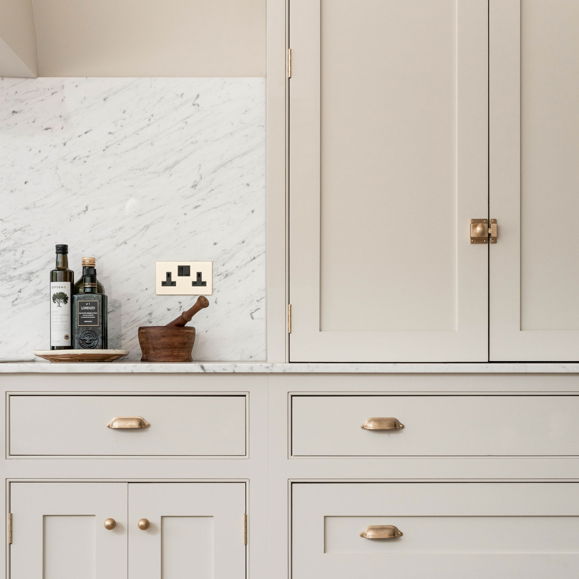
In contrast with the modern style extension structure the kitchen is made up using traditional shaker style cabinet doors, these are complemented with classic style pulls, which stand out against the neutral beige hue.
The owners have chosen a mix of floor and wall cabinets in order to have as much hidden storage as possible, this way the space remains tidy and clutter-free.
The marble splashback ties in with the worktops to create an elegant, timeless finish.
The property before renovation
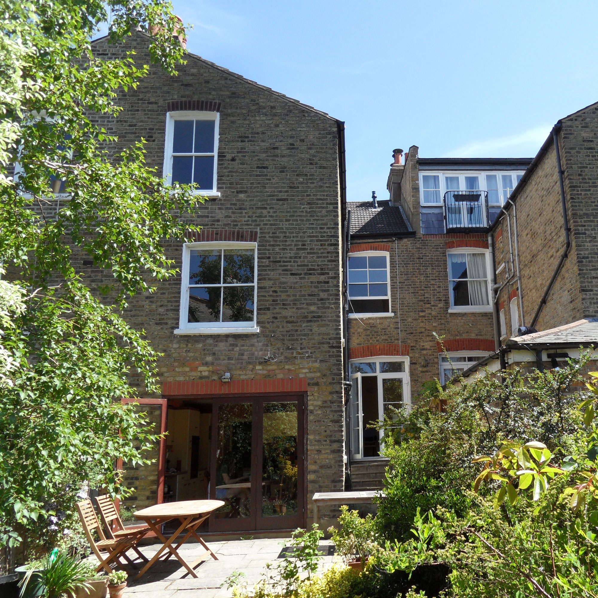
The original kitchen was nondescript in its design with a configuration that was linear and dark, and fundamentally was not conducive to entertaining guests or cooking with company present in the same room.
The overgrown garden didn’t lend itself to entertaining or family life and needed a lot of maintenance, especially during the summer.
The entire rear area required an overhaul in order to make it enjoyable year-round.
FOCUS ON Pitched Glazing
Architect Alice Theodorou shares her top tips and ideas
- Choose wall-hung lighting Lighting pitched glazed roof systems don't provide much opportunity for overhead lighting, so go for wall-mounted fittings around the side of the rooflight instead.
- They’re perfect for side-infill extensions Pitched glazing is transformative in even the darkest of lean-to side extensions in a terraced house, providing up to 30% more natural light than conventional windows
- Factor in drainage Don't forget that first floor drain pipe systems will need to be considerably re-routed around a new glazed roof - and ideally remaining concealed from view.
- Consider the sun In areas of direct sunlight, opt for glass with a UV filter and integrated blinds for your windows
- Pick your pitch Glazing with too acute a pitch can overwhelm drainage channels during heavy rain.

Ginevra Benedetti has been the Deputy Editor of Ideal Home magazine since 2021. With a career in magazines spanning nearly twenty years, she has worked for the majority of the UK’s interiors magazines, both as staff and as a freelancer. She first joined the Ideal Home team in 2011, initially as the Deputy Decorating Editor and has never left! She currently oversees the publication of the brand’s magazine each month, from planning through to publication, editing, writing or commissioning the majority of the content.
-
 Ooni's new stand mixer is already a sell-out success
Here's why the Ooni Halo Pro Spiral mixer is a big deal for at-home breadmakers
By Molly Cleary
-
 I’ve been using Lakeland’s new £5 mini mop as a shower squeegee, window cleaner and damp duster — it’s the ultimate multi-purpose cleaning tool
Yep, I've added this new mini cleaning tool to my collection
By Lauren Bradbury
-
 This old dairy barn was brought back to life and is now an amazing home
It's brilliant blend of old and new in West Sussex
By Sara Emslie