Demolishing an old conservatory was the key to this family home extension
By demolishing a conservatory and rebuilding an extension, this disjointed property transformed into a cohesive space

Ifeoluwa Adedeji
Out with the old - demolishing an old conservatory was the first step to this home's success
Demolishing an old conservatory isn't something one takes on lightly. For one, you're lucky enough to have the extra space and since most of it is glass, you hardly lack natural light.
But old buildings can sometimes be limiting, and those built decades ago many not use the space as effectively like most modern conservatory ideas do today. Plus the trend for open plan, while waning somewhat since the pandemic, still proves the most popular option with young families.
This was the dilemma facing the owners of this five-bedroom, three-storey 1930s property in South London. While the owners had two young daughters and a dog, they certainly didn't lack space in such a large house.
However, the ground floor consisted of a succession of poorly connected spaces internally and access to the garden was awkward and limited. They longed for an open plan space and a dedicated playroom for the children.
They eventually enlisted the help of James Lai and his team at JL Architecture to help transform the ground floor of their home to make it a more family friendly space. Here, James talks us through the project.
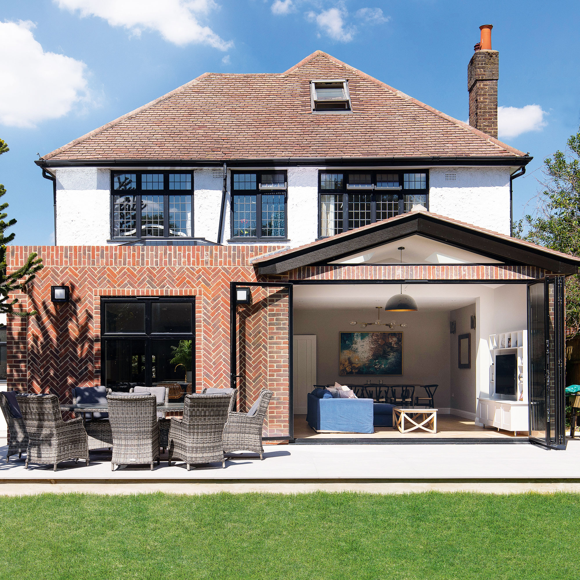
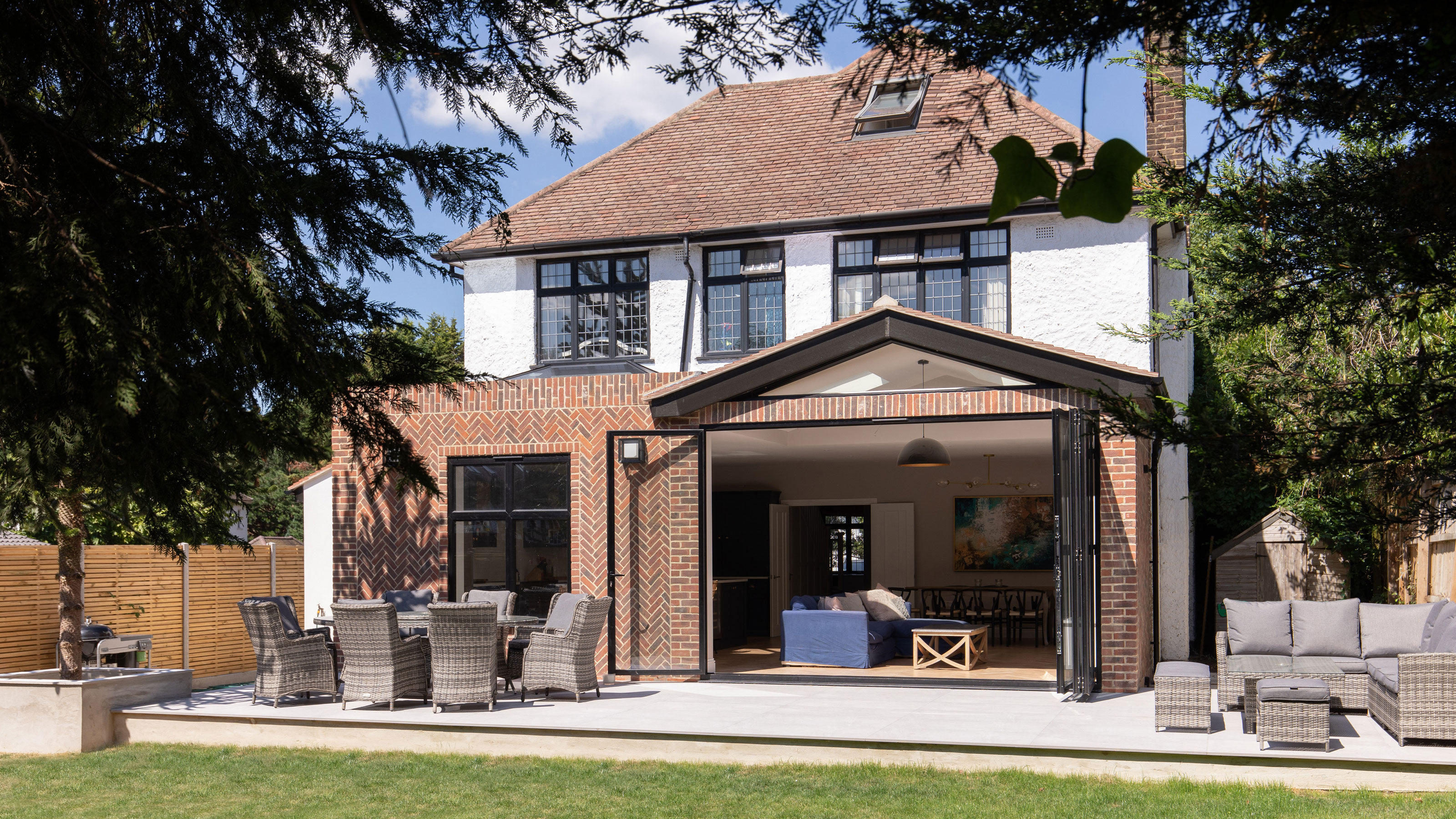
‘We began by demolishing the existing conservatory,’ explains James from JL Architecture, ‘and we replaced it with a new ground floor rear extension. It spans the full width of the property and opens out onto a new patio area. This created a clear connection with the garden area that features plenty of outdoor seating.’
Get the Ideal Home Newsletter
Sign up to our newsletter for style and decor inspiration, house makeovers, project advice and more.
Externally, after demolishing an old conservatory and rebuilding the new extension, the facade is sympathetic to the existing building, which makes it look as if it has always been there. The new rear facade features a brick pattern that mimics the front of the house, to give continuity between both sections.
‘The new extension also allowed us to reconfigure the ground floor plan', continues James. 'We removed the dividing wall between the former rear reception room and the kitchen to create a generously sized family/dining and kitchen space.’
The open plan kitchen
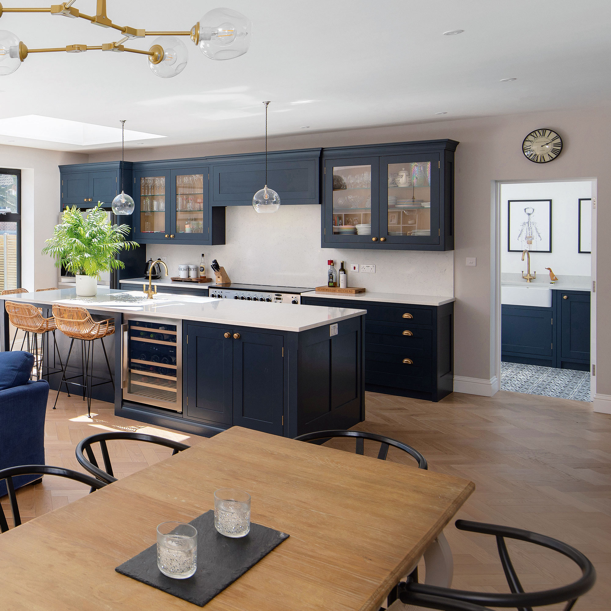
The new open plan space feature central kitchen island idea that divides the open plan room and also provides additional dining space. There is plenty of space for food preparation on the large work surface and it also features a built-in wine fridge and cupboards.
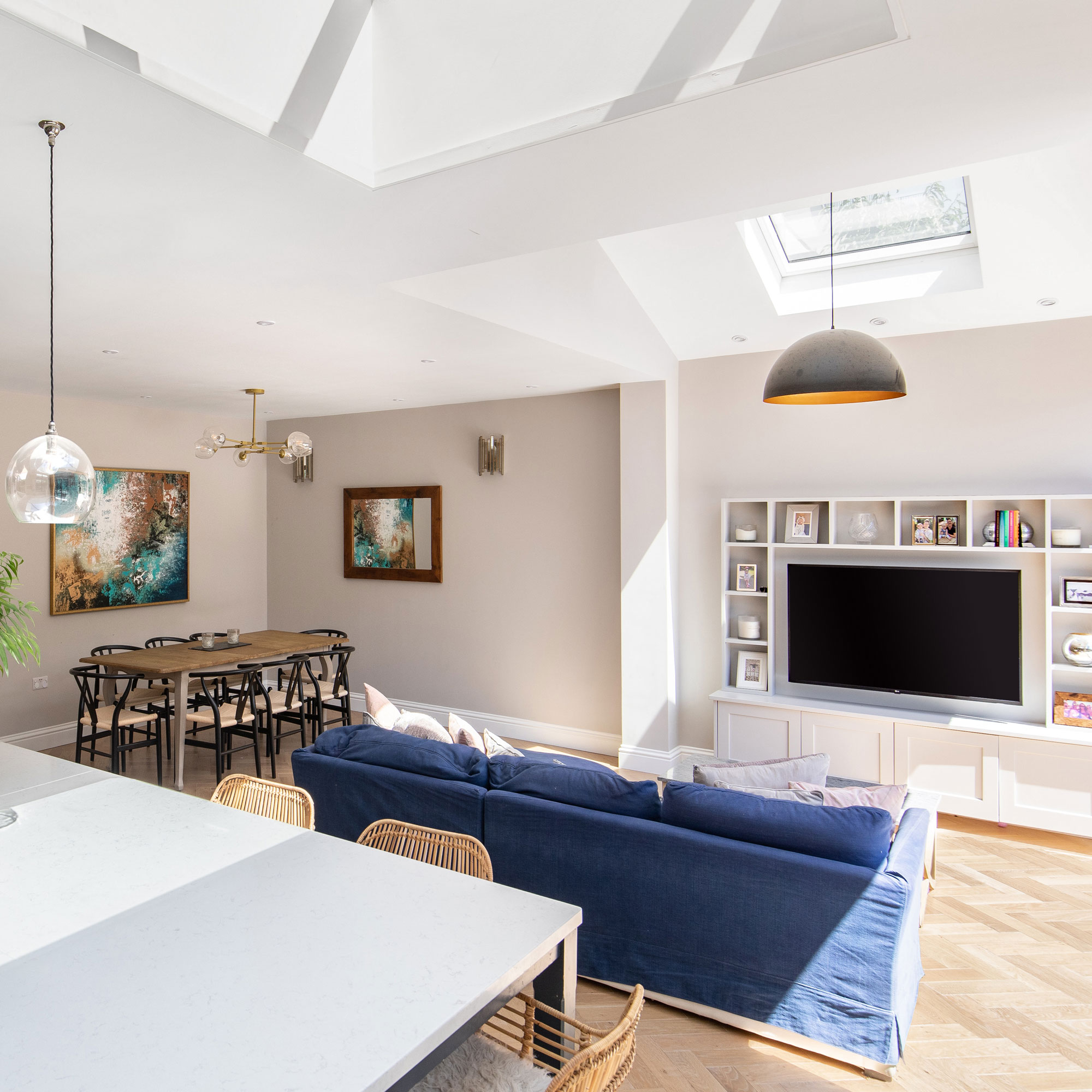
From the island, you have 360° views of the entire open-plan area, this is an ideal setup so that whoever is cooking or tidying away can still be included in conversations taking place in any part of the open-plan room.
The design offers a clear passage to the key areas with the space and encourages unobstructed movement. There is both amble work and kitchen storage ideas so the kitchen remains tidy.
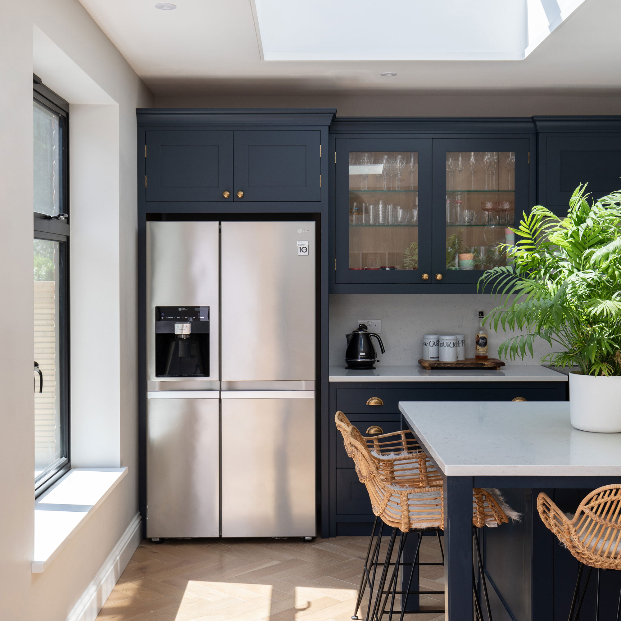
The choice of cabinets with glass fronts helps break up the row of solid blue units and the suspended glass pendants bounce light around the room. It's now easy to manoeuvre around the spaces, including the utility room located just off the kitchen.
Natural light illuminates the kitchen area on sunny days pouring in through the rear window and roof lantern and bouncing off the neutral floor covering and glazed cupboards. A mixture of knob and cup handles have been allowed access to the units and pair well with the classic scheme.
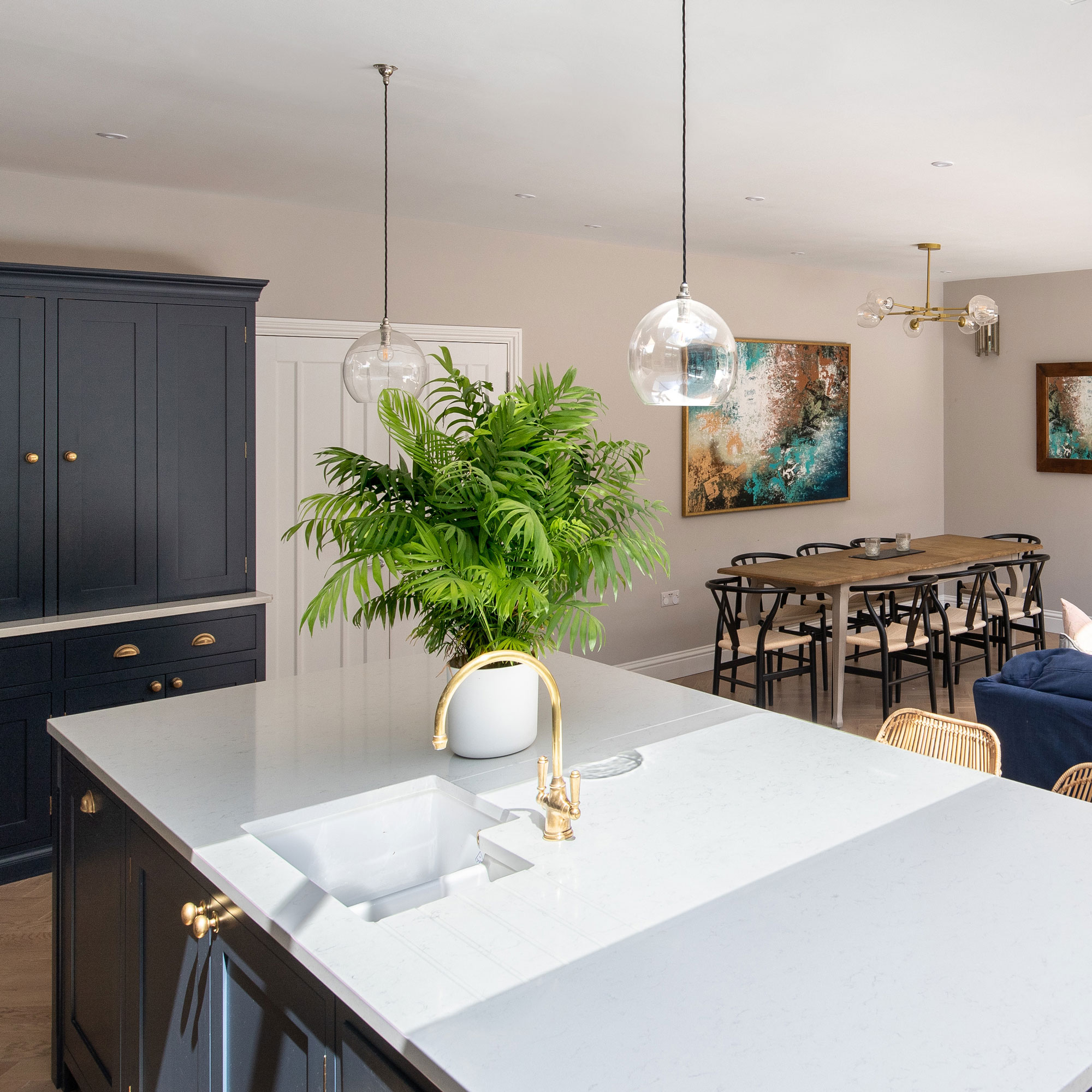
The multi-functional island provides an area for food preparation, storage and a simple area to hang out. High level island seating can be tucked away under the overhang, or used for casual meals such as quick lunches.
There is space for four people to sit comfortably around this area without feeling squashed. An American-style fridge sits in a niche and provides ample storage for fresh produce. The position of the stainless steel unit also helps distribute natural brightness around the space.
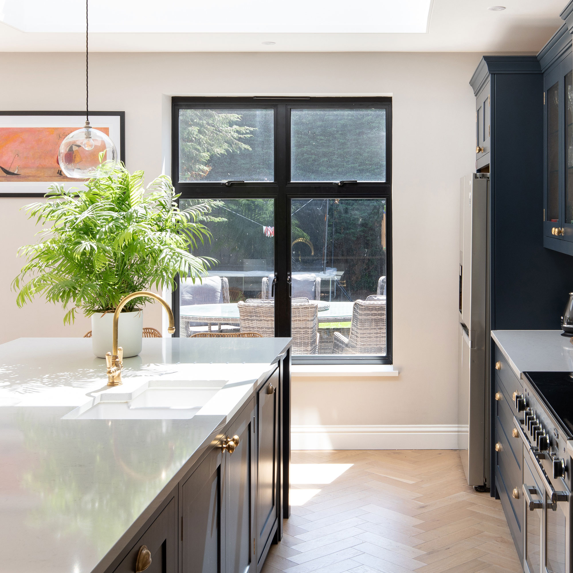
James explains: 'The oak engineered floor has a hardwood surface and was chosen especially to be laid atop the underfloor heating that runs throughout the kitchen.’
The same modern kitchen flooring ideas run throughout the living-kitchen-diner, making it look even more spacious. The room, however, is clearly zoned using furniture to clearly delineate the spaces.
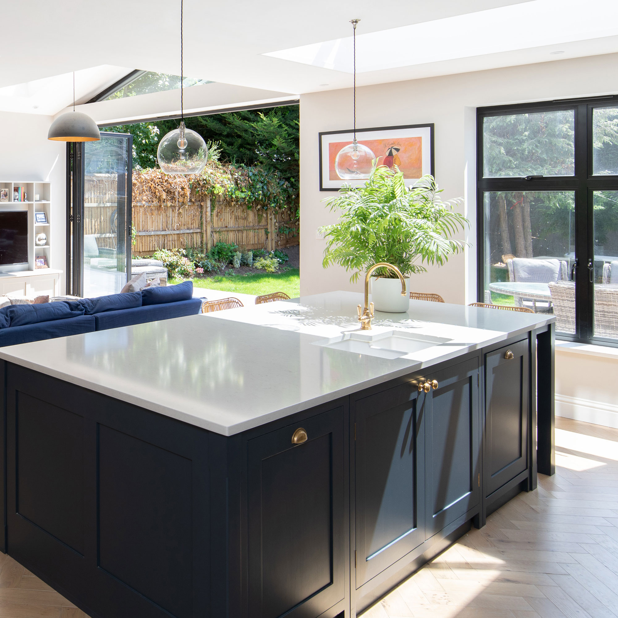
The largely glazed rear elevation feature bifold doors which can be opened up fully to the garden. This helps create a good connection between the spaces and allows for conversation to flow between people in either space. The owners can also prepare meals or relax in the living area while the children play outside.
Contemporary finishes such as the lighting fixtures, minimal style, built-in media unit that blends into the wall, and modern glazing systems ensure that it feels current. The space has been set up so that you can sit at the dining table or the living area and enjoy views out into the garden.
The dining area
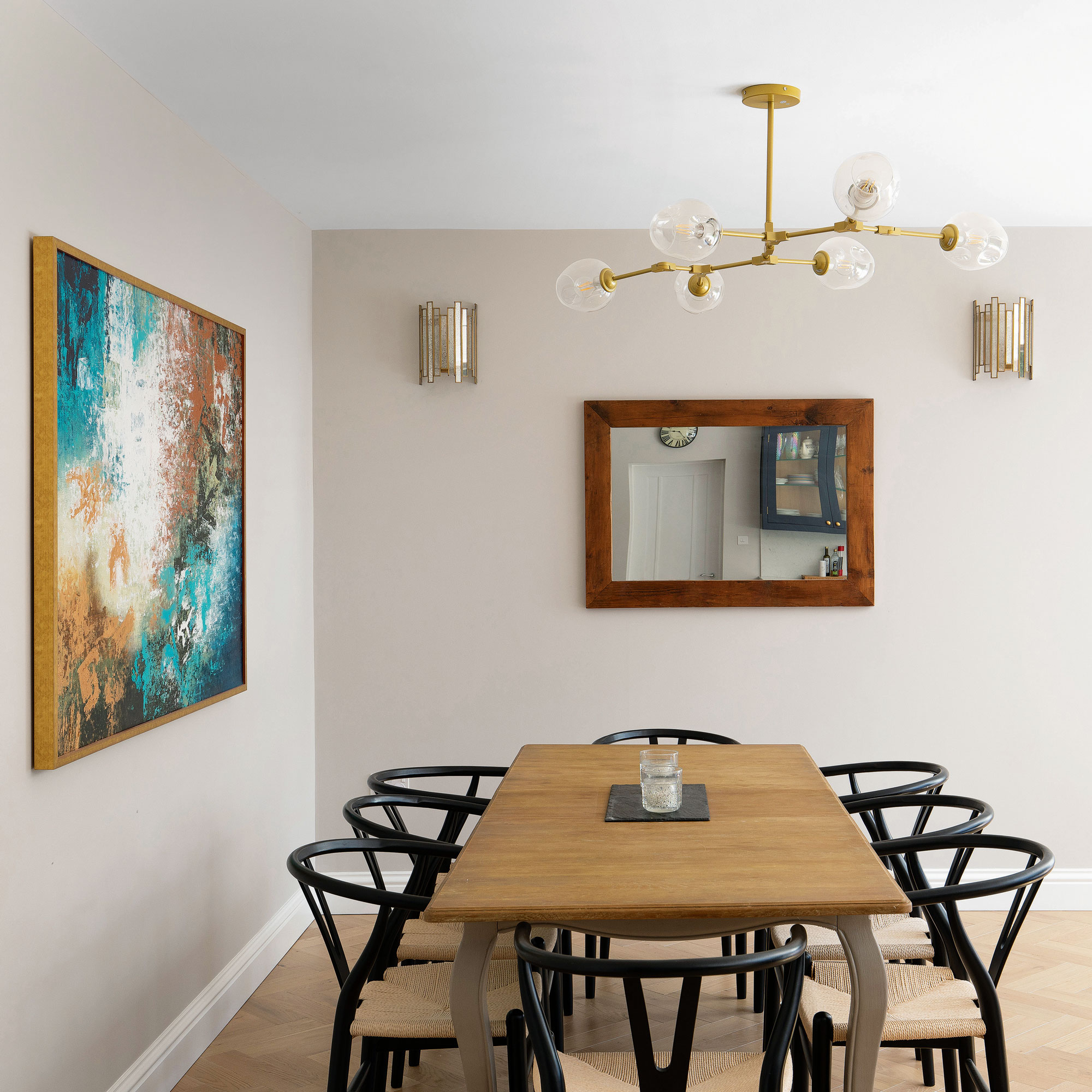
This space has been created by the removal of a diving wall into the living room area. The new formal dining room ideas features a striking contemporary glass chandelier, which dominates the area while adding supplementary lighting.
A large abstract piece hangs on the wall helping to focus attention on the space. The furnishing, which comprises a farmhouse-style table and wishbone mid-century style dining chairs help continue the classic theme.
The utility room
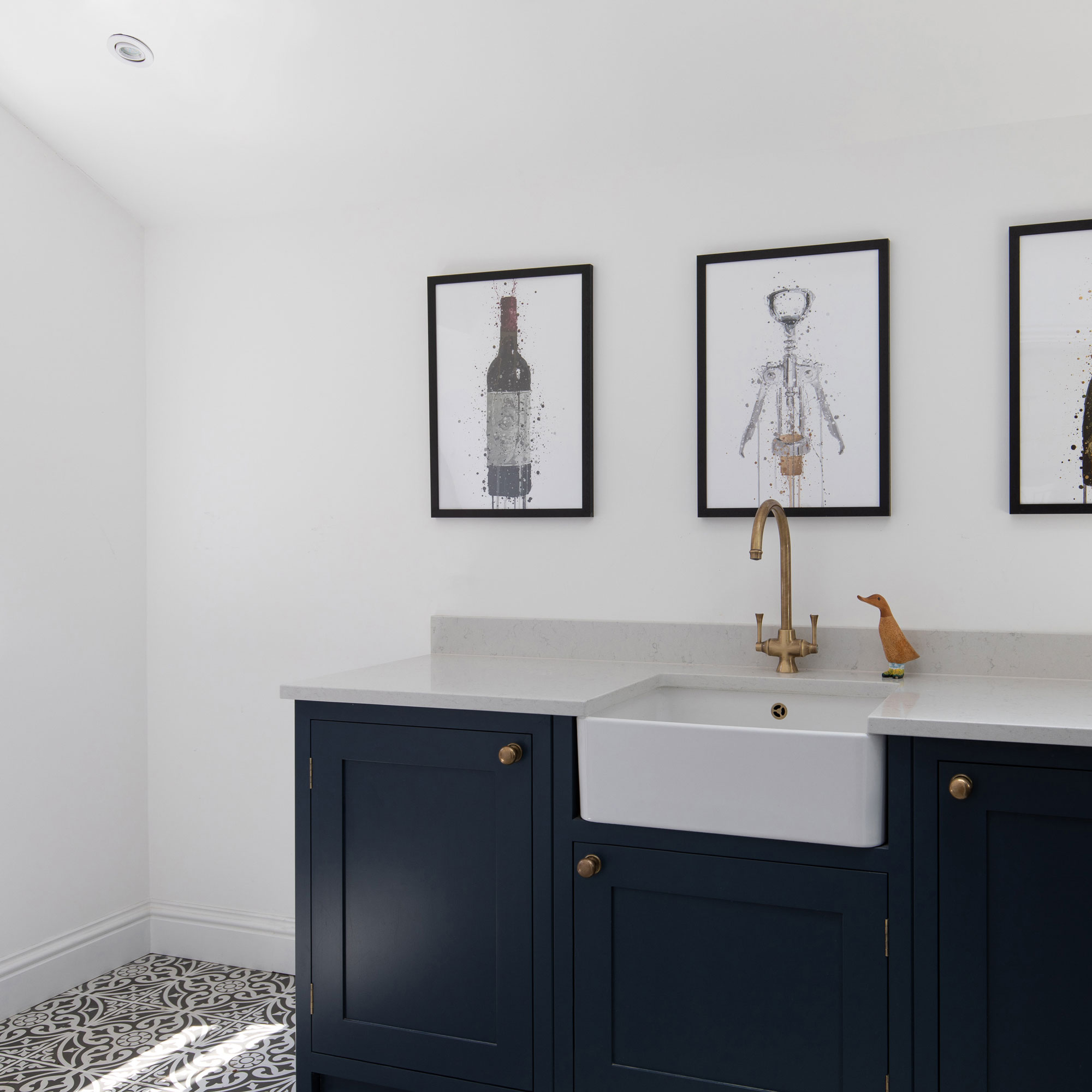
'There was an existing side extension that housed the utility space,' says James, 'which was cold and poorly insulated with a plastic corrugated roof. This has been rebuilt and serves the same purpose with a practical new utility space accessed from the side of the kitchen, rather than the middle of where the kitchen wall cabinets run.’
These small utility room ideas offer a practical and warm space for laundry and to keep cleaning products. The room is located in the new side extension, rebuilt to provide a usable, functional space.
The utility units are the same shaker style as those in the kitchen area and conceal the built-in appliances. Fun artworks line the neutral walls helping to give the space a personality of its own. The tiled patterned floors also help to establish an entirely separate space whilst referencing the period of the property.
The playroom
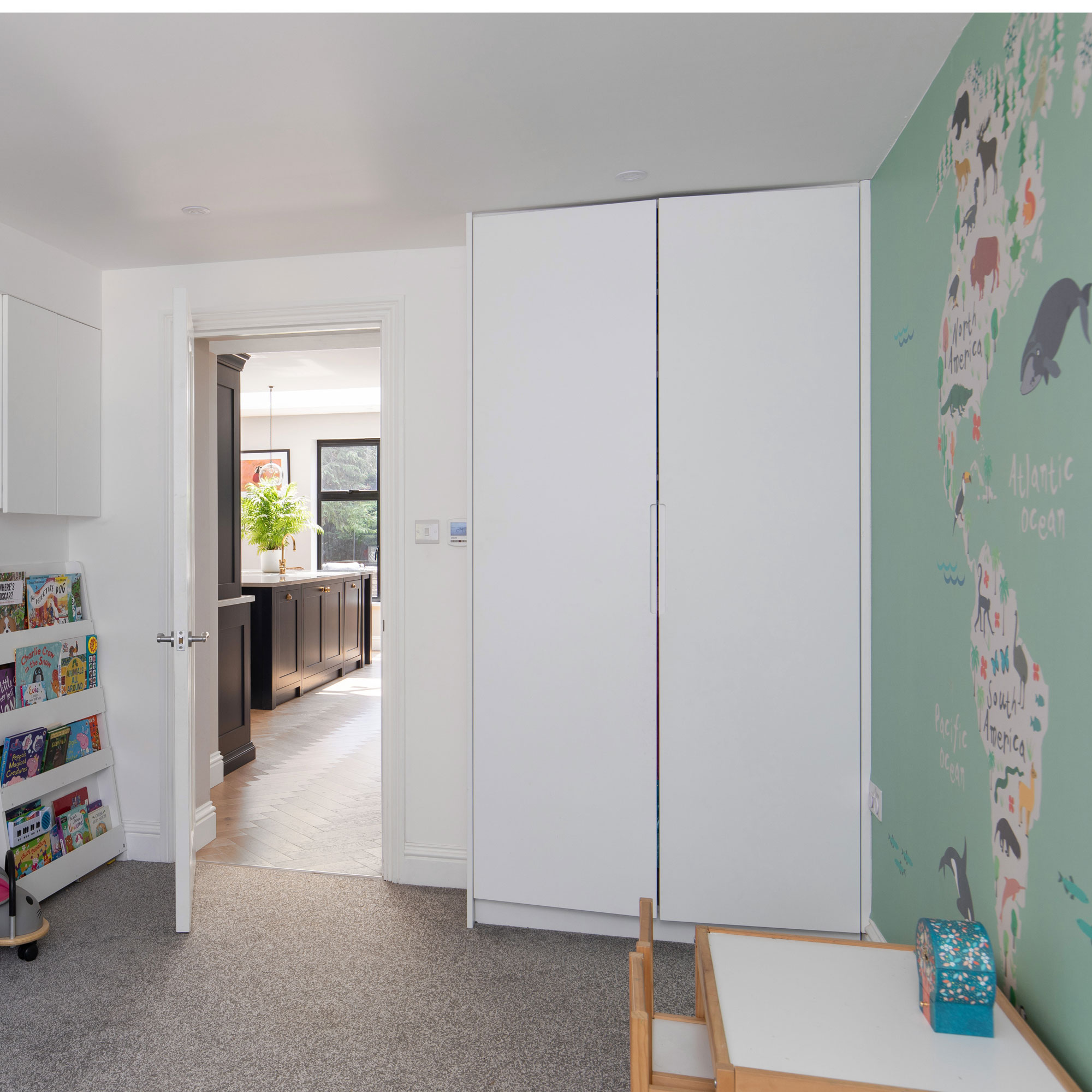
‘The existing garage has now been converted into the children’s playroom,' explains James, 'and it can be accessed via the kitchen and the main hallway.'
The former garage is now a haven for the children and features carpeting making it a distinctly separate space from the rest of the downstairs area. Among the clever children's play room ideas featured are built-in floor to ceiling cupboard houses toys that can be tidied away at a moment's notice.
Being in a direct line of sight from the kitchen means that the adults can prepare meals while the children play. In the future it can be used as a den or separate television room or even a home office.
The property before works began
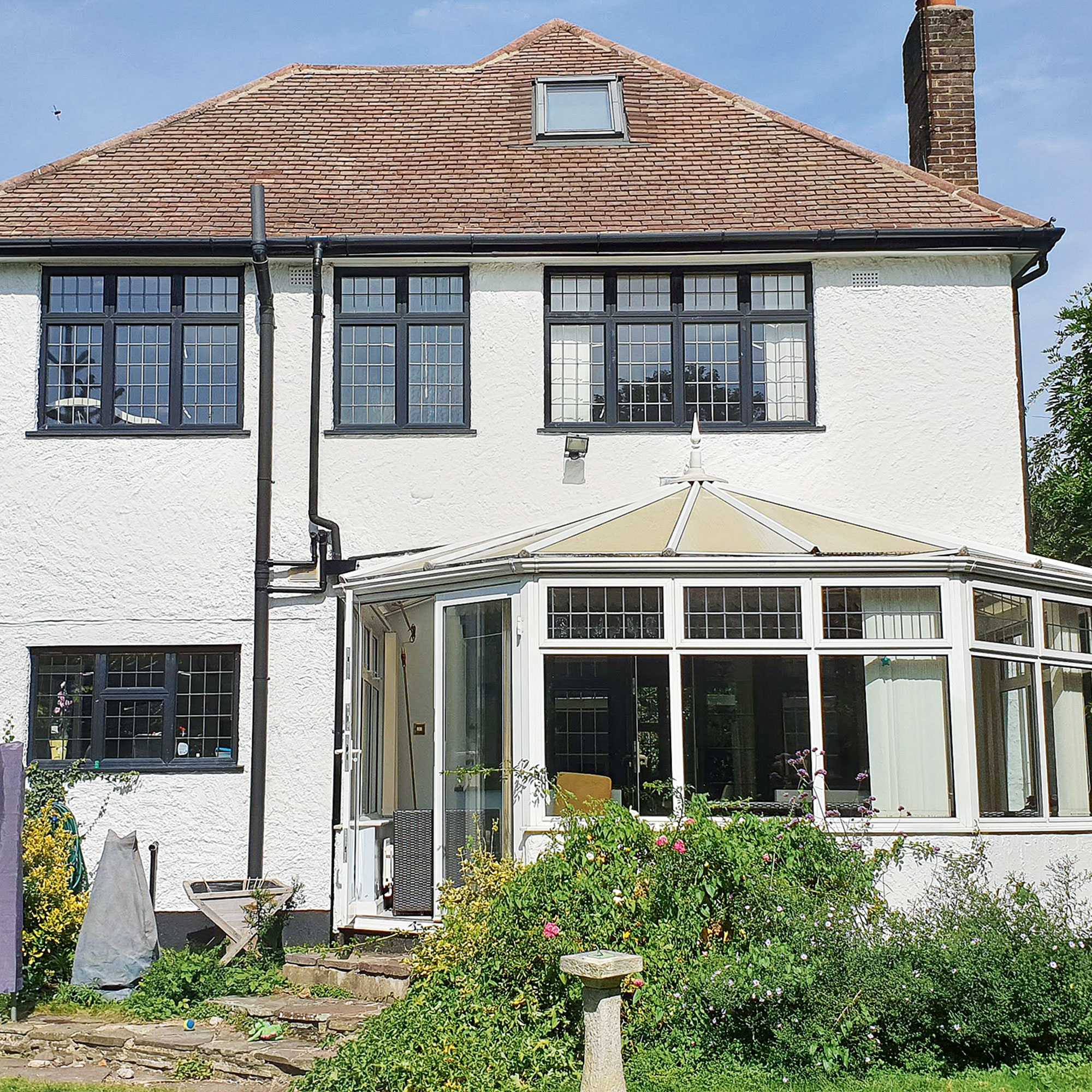
Two uncomfortable additions to the period property and a convoluted ground floor layout meant that the family weren't able to make the most out of the existing spaces.
The house was thermally inefficient, which had an impact on bills as well as the internal comfort levels. They wanted to create a better connection between the internal spaces and the garden, too.
Focus on...Gable windows
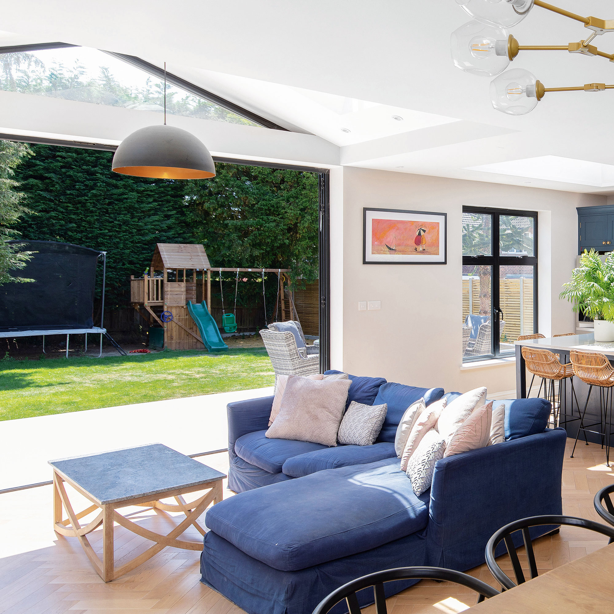
James Lai at JL Architecture shares his top tips and ideas
- FOCAL POINT These glazed fittings add wow-factor and can be made in many different styles to suit all types of building design, so don’t feel limited by your design.
- FOLLOW THE LINE A typical gable window will usually follow the roofline, which allows them to let copious amounts of light to filter into the space.
- ADDING LIGHT While they are very often installed in loft areas, they can be a great choice for new pitched roof extensions as they can light penetrate deeper into the plan.
- DOUBLE UP It is possible to install a set, yet save on costs by designing in a mix of traditional off-the-shelf windows.
- FIXED DESIGN They are often installed as fixed fittings, which are not openable so consider how you will ventilate your space if you choose to add them.

Ginevra Benedetti has been the Deputy Editor of Ideal Home magazine since 2021. With a career in magazines spanning nearly twenty years, she has worked for the majority of the UK’s interiors magazines, both as staff and as a freelancer. She first joined the Ideal Home team in 2011, initially as the Deputy Decorating Editor and has never left! She currently oversees the publication of the brand’s magazine each month, from planning through to publication, editing, writing or commissioning the majority of the content.
-
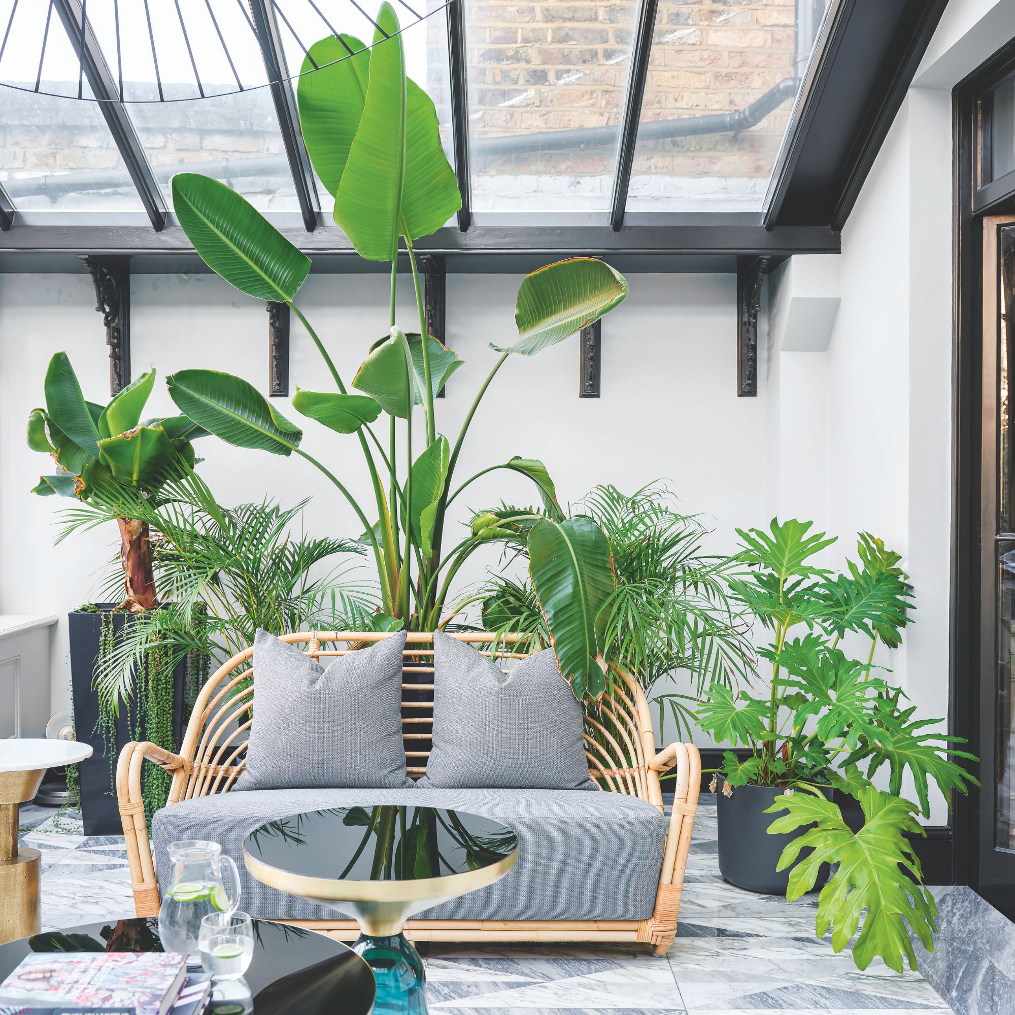 Will a conservatory add value to your home and how can you maximise it?
This is what the pros say
By Amy Reeves
-
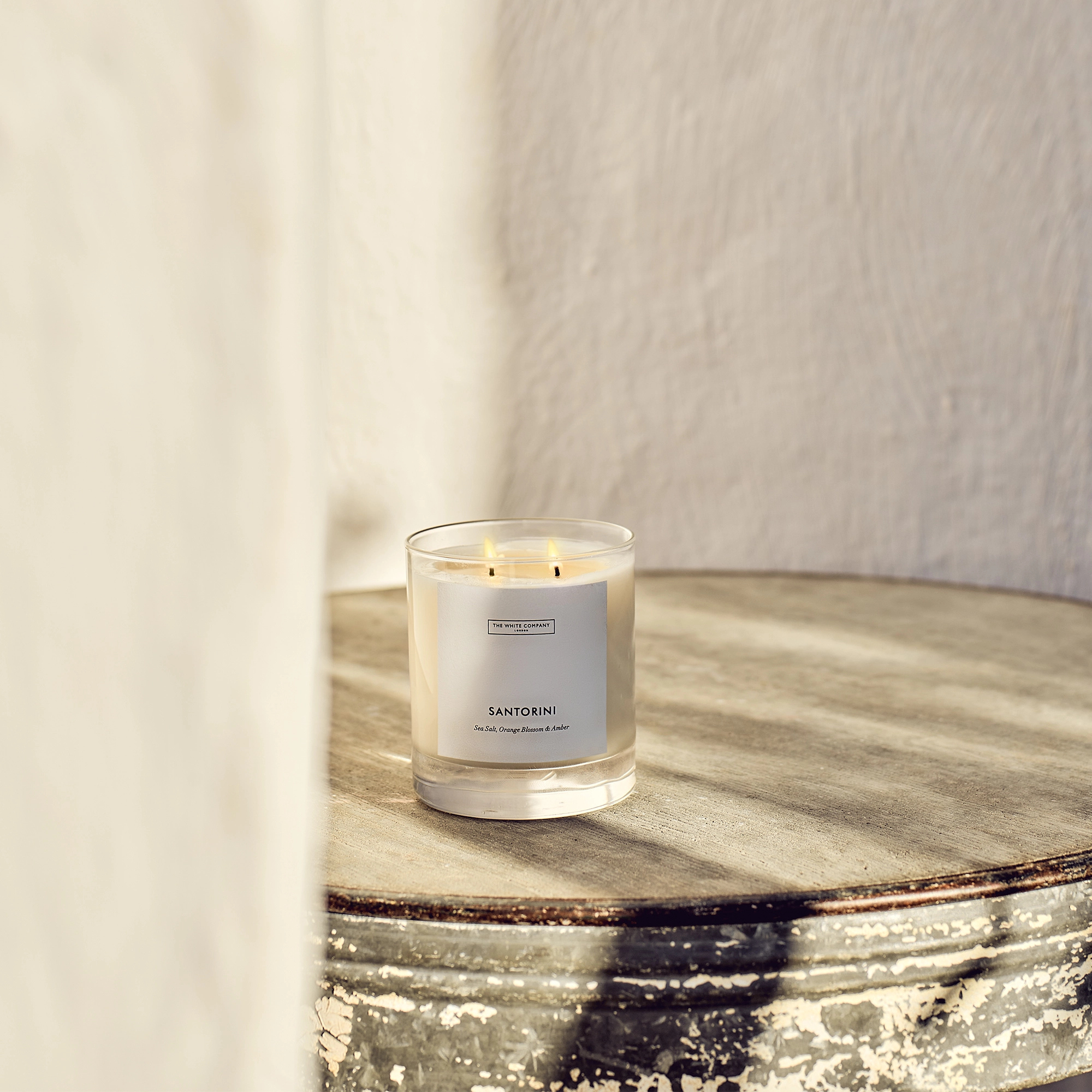 I’ve been looking for a new signature scent for my home and The White Company's new fragrance is the exact summer holiday smell I needed
Santorini smells fresh, summery and sophisticated
By Kezia Reynolds
-
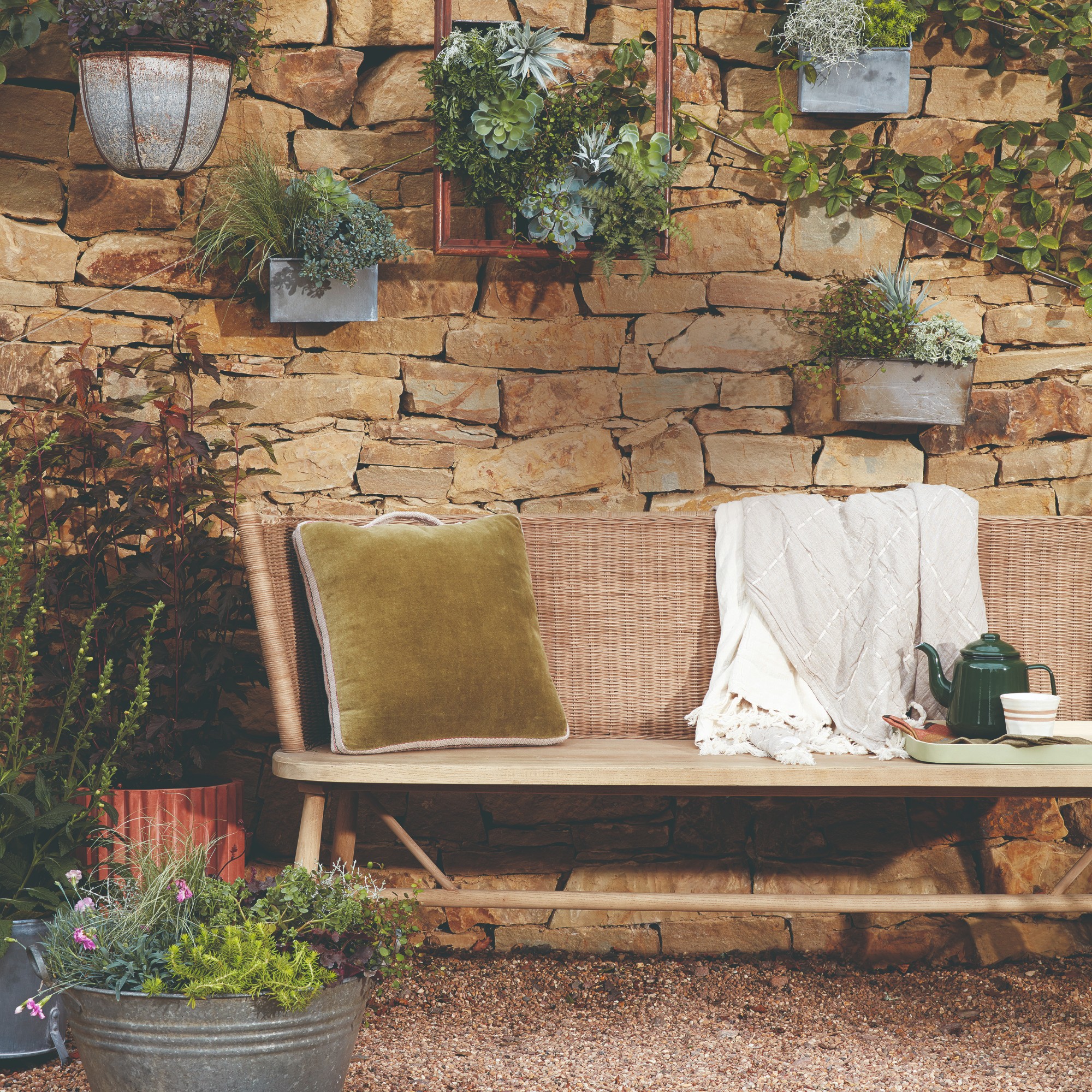 How to remove algae from garden walls in five steps – and the cleaning product experts rave about for tackling it fast
Experts share their top tips for getting garden walls algae-free
By Katie Sims