See how this flat roof extension has maxed this property's space
These clever homeowners installed a flat roof extension with wraparound glazing in order to maximise their spaced

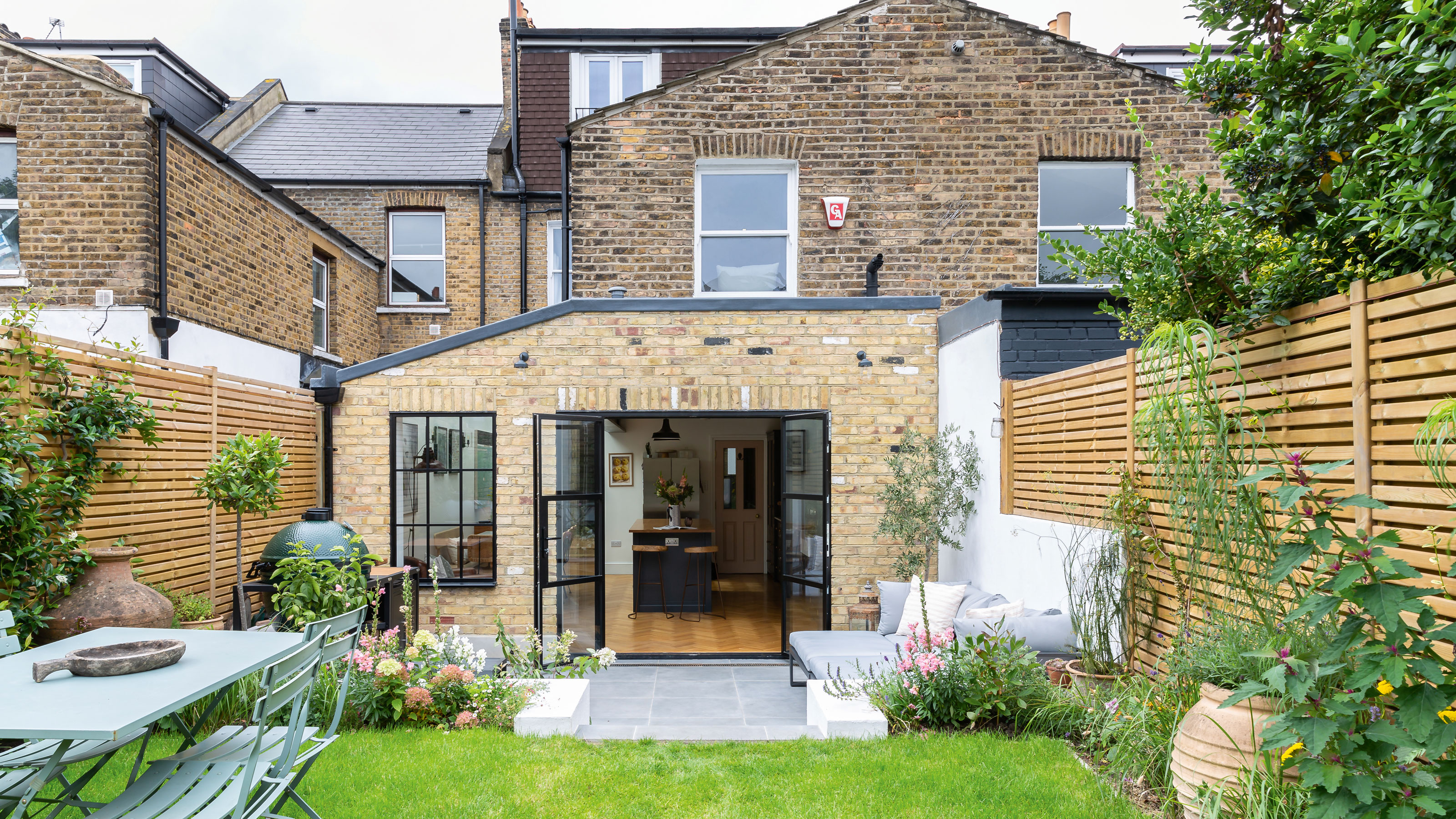
Ever wondered what a flat roof extension might look on the back of your home? A hugely extravagant home transformation might seem tempting but not everyone has the budget for such an enormous project, let alone the existing space to renovate.
Often, some of the simplest kitchen extension ideas can make a massive difference to the space in a modest property, and this is the perfect example of a super smart design executed brilliantly and successfully.
In a search for more light and space in their home, the homeowners of this five bedroomed terraced house from the 1900s in south east London contacted architect James Bernard, director of Plus Rooms.
Flat roof extension transformation
The family's original kitchen was cramped with limited space for the owners to cook or entertain guests. They wanted to add an extension to create an open plan kitchen and dining interior without stealing previous garden space. Here, James takes us through the transformation.
'We extended at the rear and into the side return to create a wraparound extension,’ explains James, ‘which involved moving the existing cloakroom in line with the stairs for a new small utility room idea. Instead of a large opening onto the garden, we fitted a separate steel-framed door and window to help regulate traffic flow.'
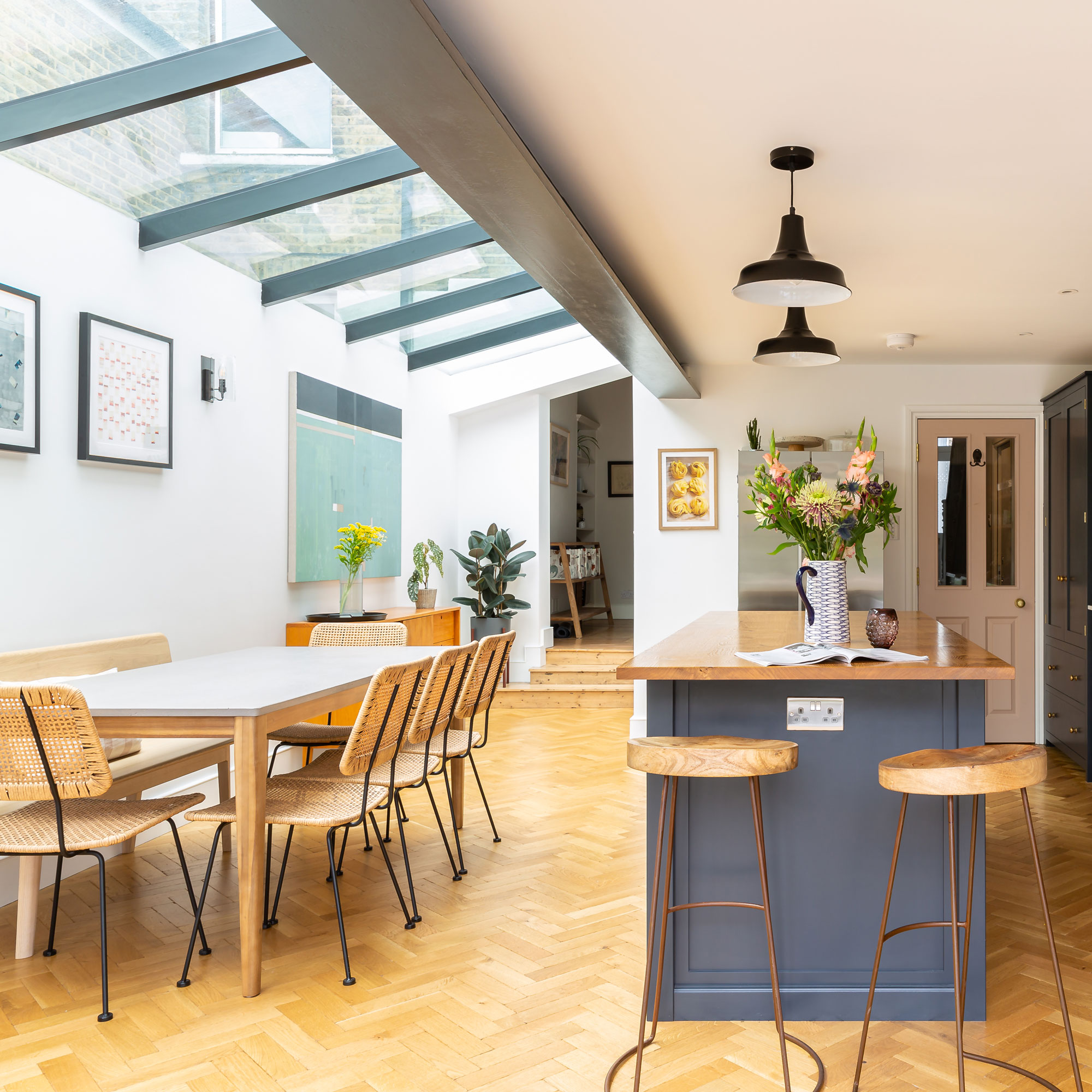
'The newly landscaped patio and garden has now become a natural continuation of the kitchen/dining room, continues James. 'The homeowners were keen to have a continuous glass ceiling so we created a pitched flat roof extension with sloped glazing, which opens the area up to the sky.'
'The steel-framed glazing and exposed steel beams add a sleek and industrial accent to the room. Exposed brickwork paired with a herringbone flooring gives the new extension warmth, while perfectly balancing detail and simplicity.'
'The build took eight weeks before the kitchen and flooring were added. Now, the garden feels more connected to the house, creating a wonderful atmosphere inside and out.’
Sign up to our newsletter for style inspiration, real homes, project and garden advice and shopping know-how
The kitchen
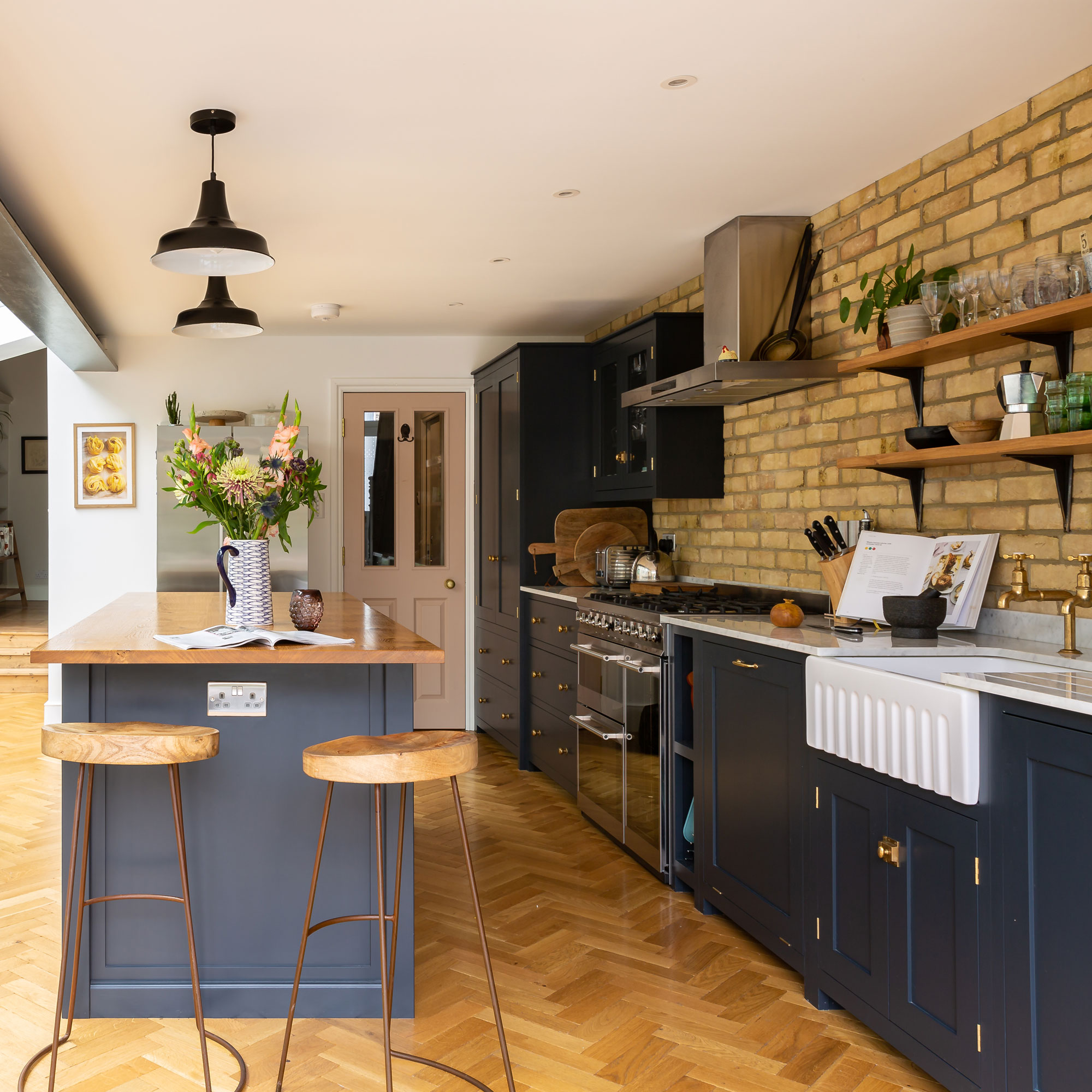
Incorporating a side return that is squared off with a rear extension - as the homeowners have done here - can make a huge transformation to a standard terraced Victorian house.
James from Plus Rooms created various ‘landing points’ for people entering the space and also moving through it. Guests can move from the dining zone into the kitchen zone and step up to the living room via the clearly defined traffic pathways created throughout the open plan extension.
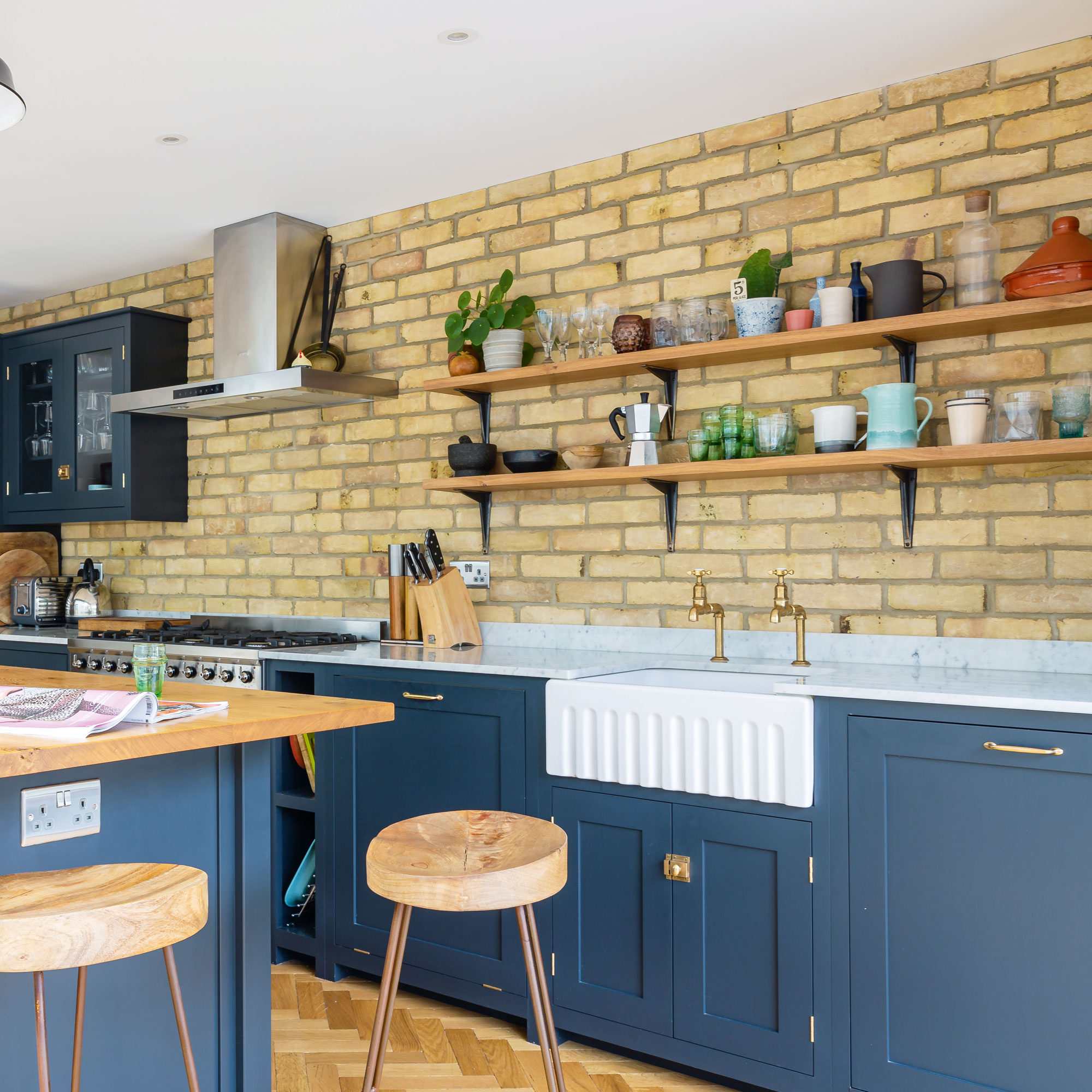
The clean lines of the kitchen island ideas and cabinetry give a very contemporary appearance with salvaged brickwork creating a feature wall.
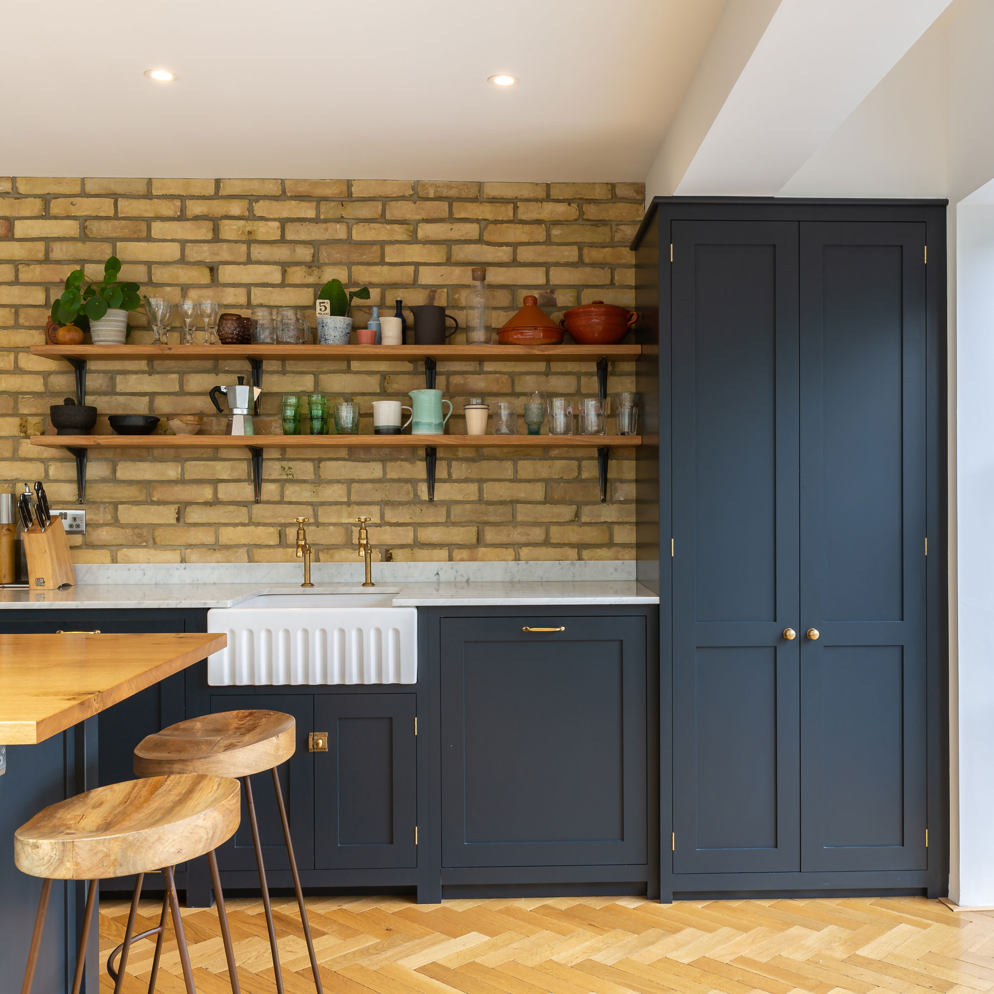
Victorians prioritised drawing rooms to the rear of the house, but tastes are very different now. The focus has switched to the kitchen, as homeowners want it to have more space, light and greater flexibility.
The dining area
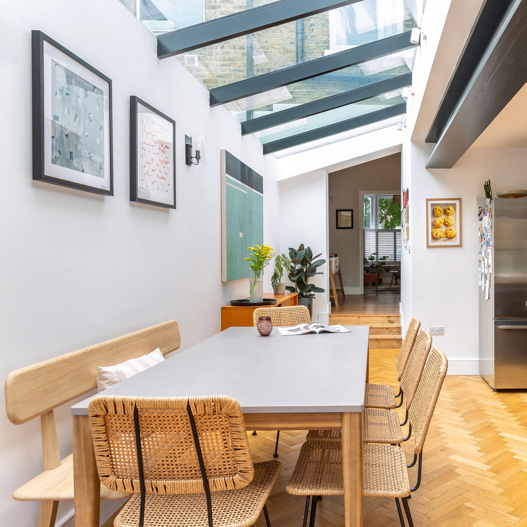
It was important to maintain continuity of glass down the side of the old return. The pitched flat roof extension design allows the stretch of glass to be supported within the whole side area. This gives a spacious feel to the dining area in particular as natural light floods in from above.
Opting for a pitched flat roof satisfied the homeowner’s brief as they wanted a continuous glass roof to run all the way down the space making the best use of the side return extension ideas. A flat roof extension requires fewer materials which can lead to cost savings when undertaking an extension.
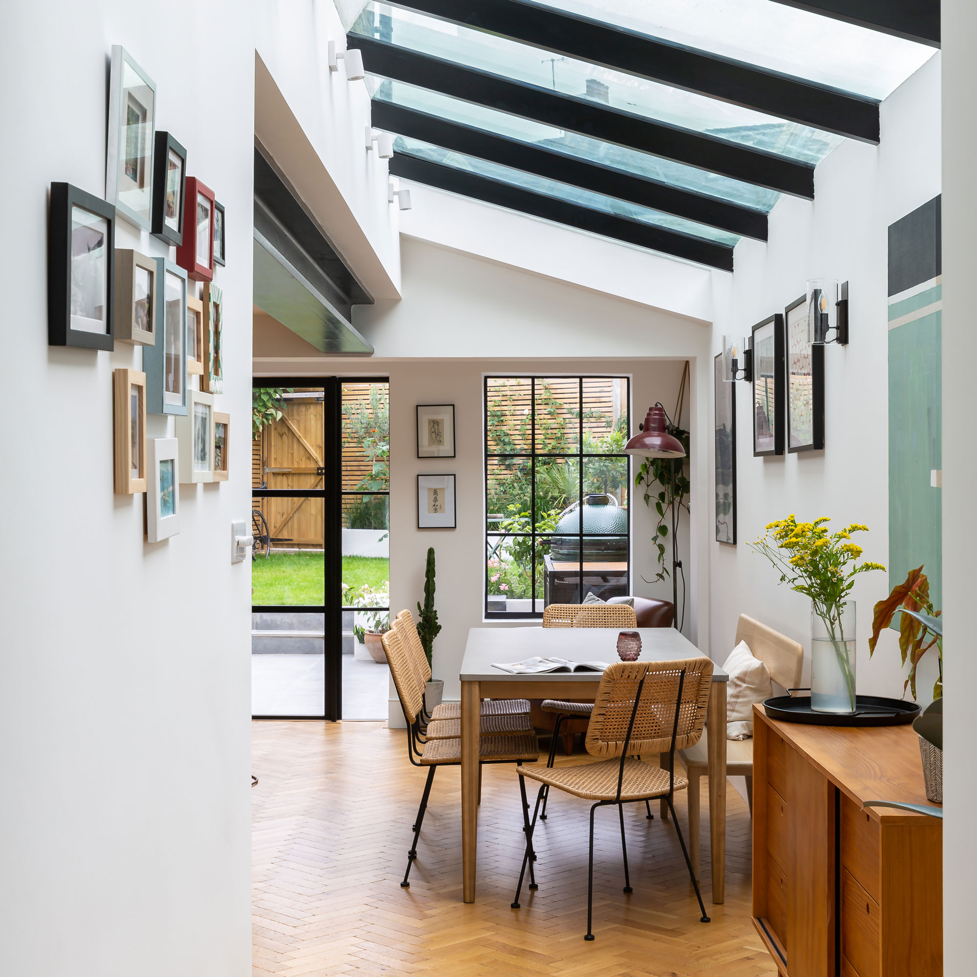
Steel-framed doors offer a modern rustic look that works well with textures and raw exposed structures, such as the steel beams and industrial style brickwork.
All these are complemented by the clean lines of the glass roof. The black finish of the patio doors echoes the pitched glazed roof supports and provides a strong accent colour within the interior.
Including a glass roof creates a great sense of freedom and connection to the outside, as well as adding a stunning architectural feature to an extension. The side return glazed roof creates a cost-effective aesthetic and creates a unique interior that is both subtle and dramatic.
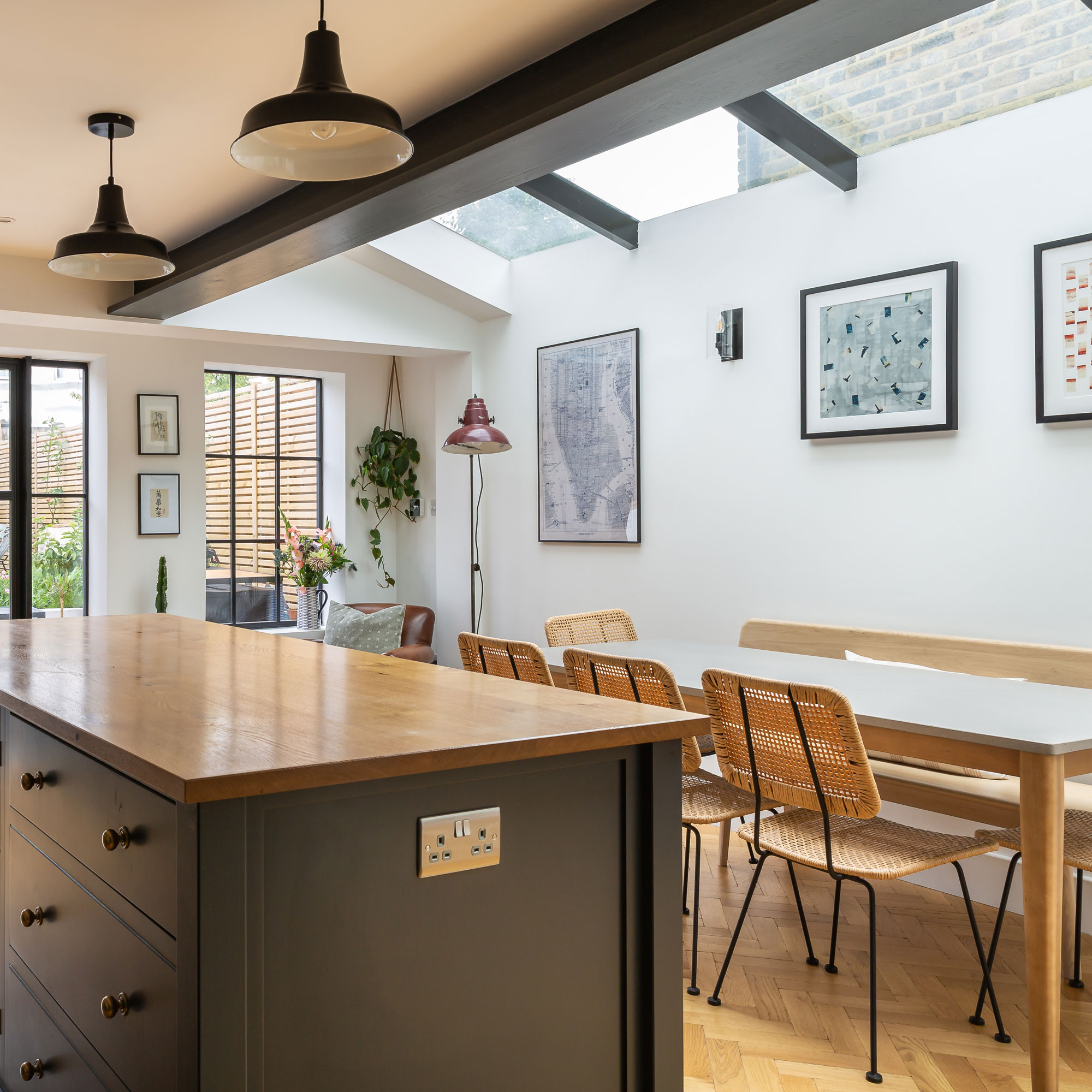
Zoning the kitchen and dining areas ensures the space doesn’t feel cavernous. Herringbone wood floors add a strong geometric element to the room that is softened by the tones of the timber, contrasting with the sharp lines of the ceiling support beam and the pitched glazed roof.
Many period terraced buildings have a pathway that runs alongside the ground floor at the rear of the property.
Utilising the full width of the house by building a new structure into this often unused side return is the ideal design solution to maximise a compact extension. Including this redundant space offers the opportunity to reconfigure the ground floor layout providing more of a family-friendly interior.
The patio doors to the garden
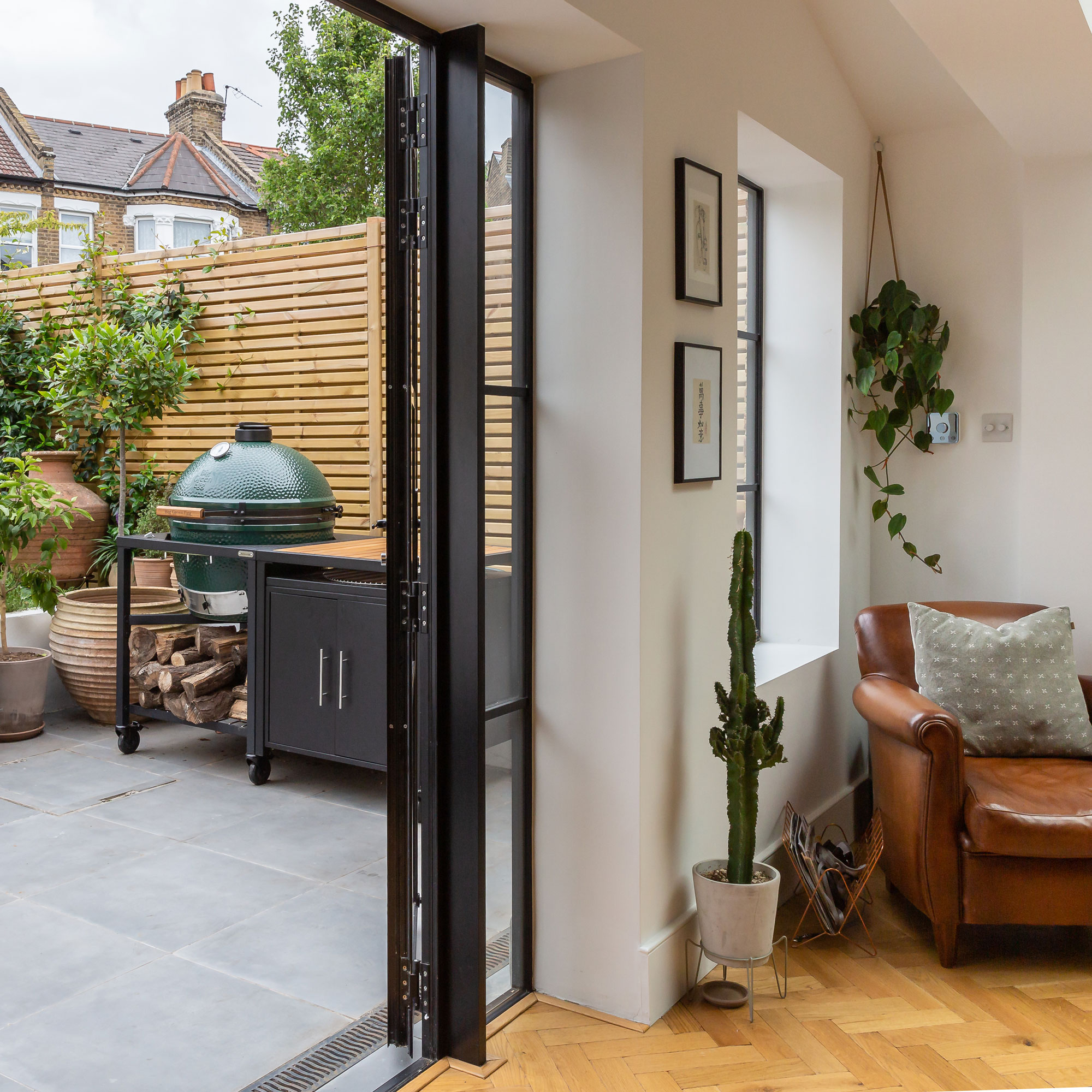
Choosing a modest and compact extension meant that only a small proportion of the garden was lost.
The choice of a flat roof extension shape works perfectly with a smaller extension and ensures the overall design inside and out remains simple and uncluttered.
Adding a deep recessed window adds character to a corner, which has been turned into a cosy nook.
The cloakroom
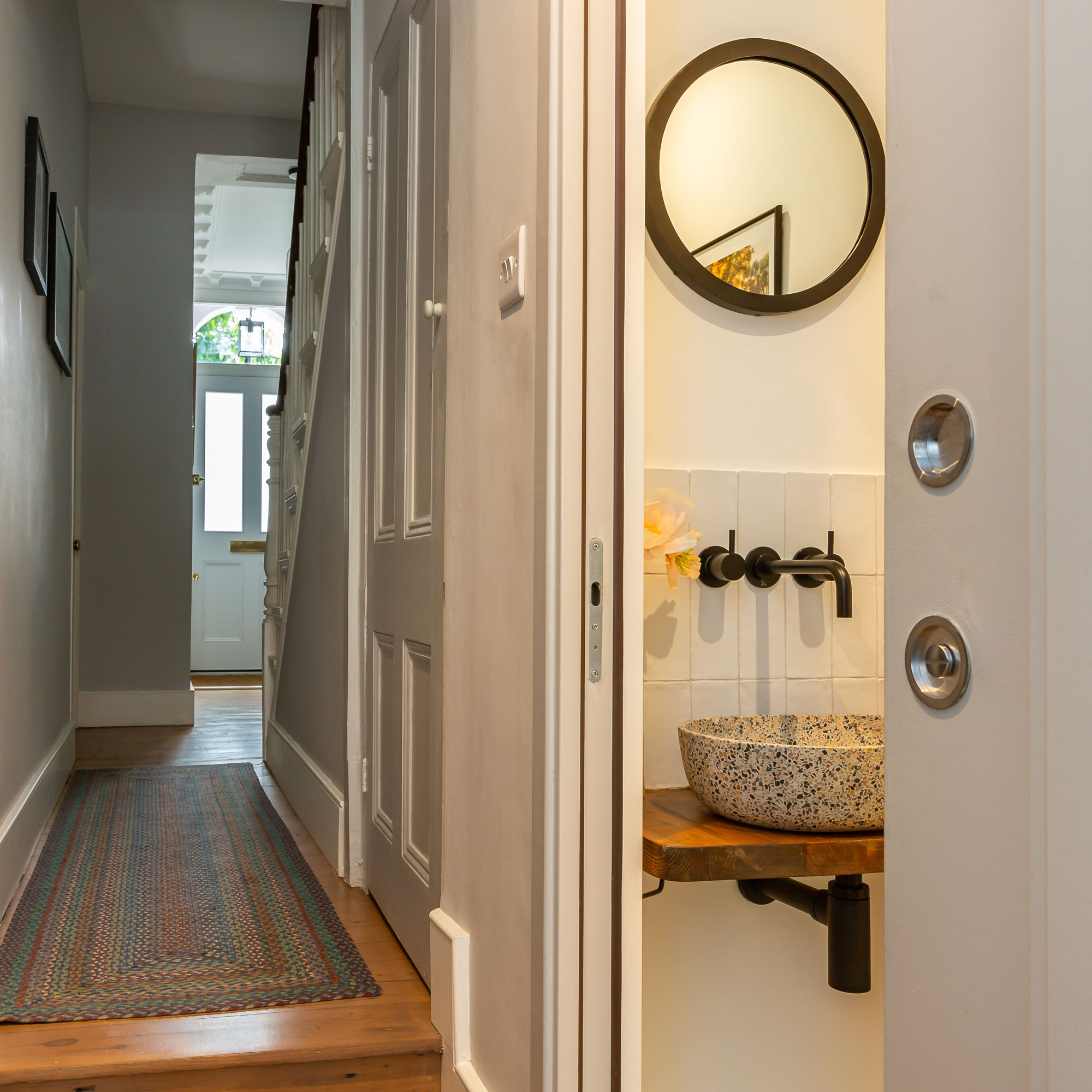
Relocating the downstairs cloakroom so that it is in line with the stairs simplifies the traffic flow between the kitchen and dining extension and the original part of the house.
Sliding pocket doors to the cloakroom ensure the lines in the hallway remain uninterrupted.
The property before works began
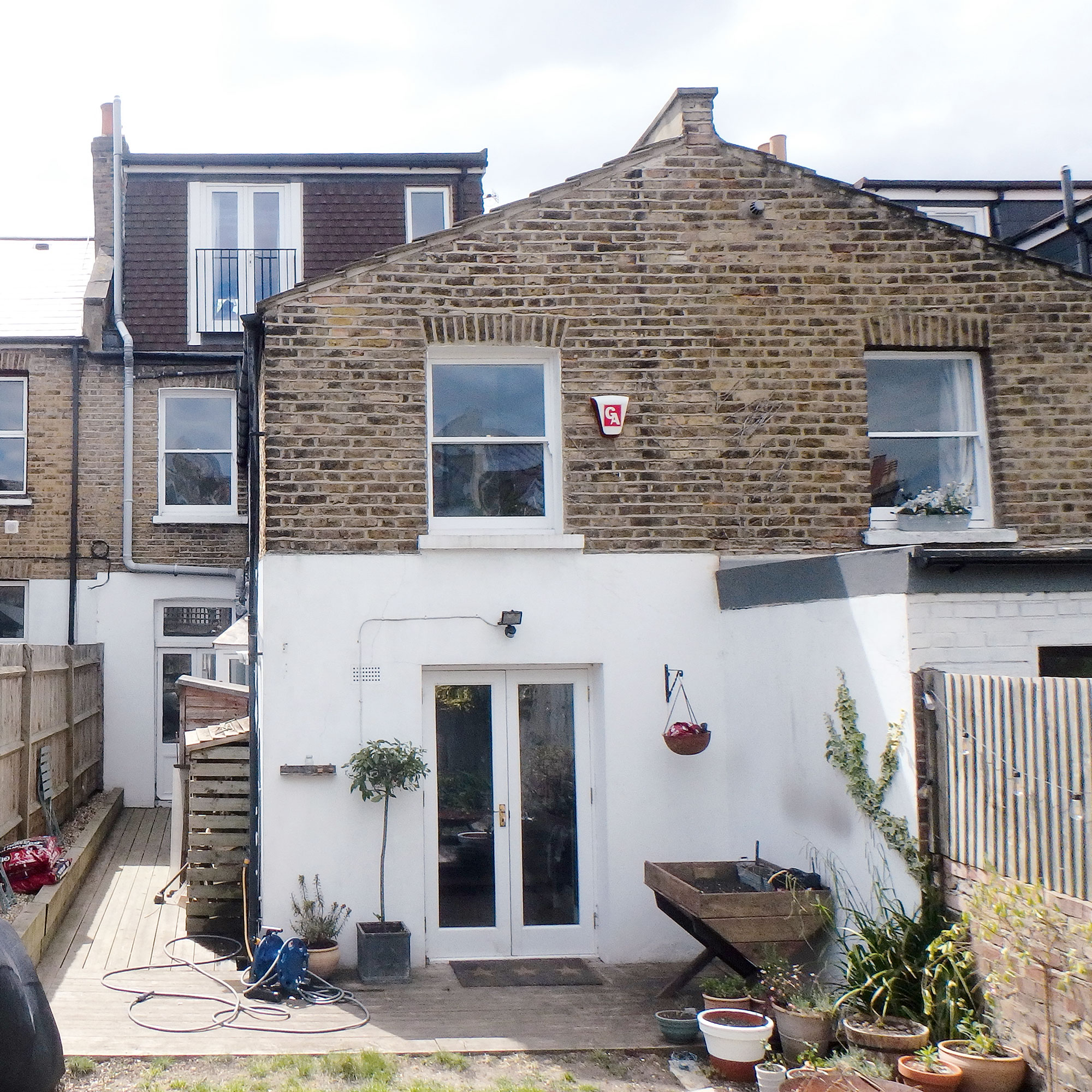
The rear of the house felt cramped which was increased by the lack of glazing, which limited natural light and the kitchen space was quite cramped. However, it had a good sized back garden and a side return that was essentially unused.
Outside, the garden felt bare and uninspiring. The white render and painted brickwork looked tired and old fashioned, whilst the patio area felt uninviting.
Focus On: Exposed brick walls
Architect James Bernard gives us the lowdown
- An exposed brick wall is a great way to add character and it brings a lot of detail to the room, but keep it in context as too much and it starts to look busy. As a rule of thumb, use about 30-40% of the overall amount of wall space for the best effect.
- Aim to place an exposed brick wall on the opposite side to the entrance to the space, because this way it will create the maximum impact.
- Running a continuous, exposed brick wall from your inside space into your garden makes a great design feature. It will carry your eye through the house and out to the garden and you’ll really feel like your space really extends to the outdoors.
- Reclaimed yellow bricks lend themselves best for this because of their texturing and the variety of colours they hold. You’ll have walls that have more character, and this will really shine through in the overall atmosphere of the room.
- Keep in mind that an original brick wall left unsealed may have moisture coming through, which can cause white marks and ruin the overall effect, so make sure that it’s properly sealed during the works.
- Brick slips are really beneficial as you don’t have to seal them. Remember that you will lose a few centimetres of space, but they work out much more cost effective than treating the whole wall.
Additional words by Caroline Foster

Ginevra Benedetti has been the Deputy Editor of Ideal Home magazine since 2021. With a career in magazines spanning nearly twenty years, she has worked for the majority of the UK’s interiors magazines, both as staff and as a freelancer. She first joined the Ideal Home team in 2011, initially as the Deputy Decorating Editor and has never left! She currently oversees the publication of the brand’s magazine each month, from planning through to publication, editing, writing or commissioning the majority of the content.