'We couldn’t afford to size up our home in London, so we made the move to the coast and we love it!'
Being able to walk to the beach is one of the best parts about living in this fabulous house says the happy homeowner
Lisa Fazzani
If you're considering ditching the capital for a more affordable housing market, that will give your family space to grow then prepare to be inspired to take the leap.
‘We’d been looking for a larger home but couldn’t afford the next size up in London where we were living at the time,’ explains the homeowner. 'So moving to Folkstone, where we’d be close to the sea and to the children’s grandparents, seemed like the obvious solution. And being able to walk to the beach is one of the best parts about living here.’
‘However, in order to get the size of house that we wanted, there were some compromises to be made – namely in the condition of the property. This place had been rented out for 20 years and the previous tenants had adapted some of the downstairs rooms due to mobility issues.’
The Victorian semi's exterior
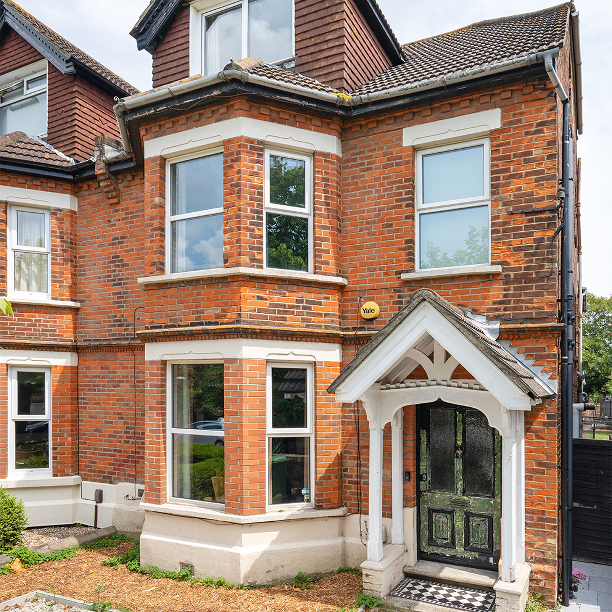
‘We knew the house was going to need a lot of work, but it had some beautiful original features that attracted us, along with a basement and large staircase that were big selling points. Plus, we’d already renovated our old home so were ready to get stuck into another project and transformation.’
‘We moved in in 2018 and set about making the house a family home. Being so rundown forced us to do a lot of work quite quickly to ensure it was habitable and safe for the children, so the first 18 months were pretty busy. All the walls were covered in woodchip and needing replastering, there was a major leak in the main bathroom and the kitchen cabinets were falling off the wall! Doing all the painting ourselves, with three children who at the time were six, four and two, wasn’t easy, but I think we did okay!’
Dark blue living room
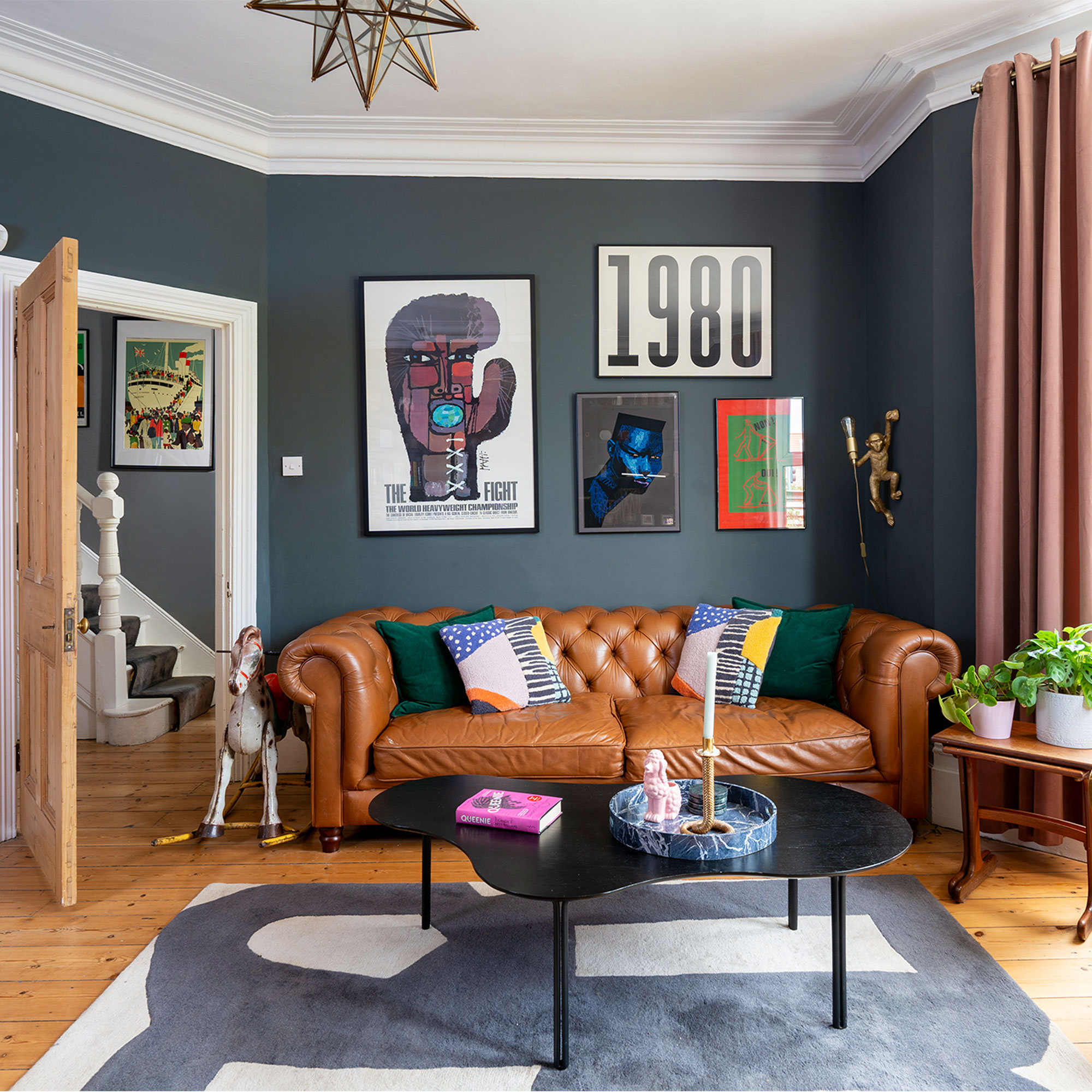
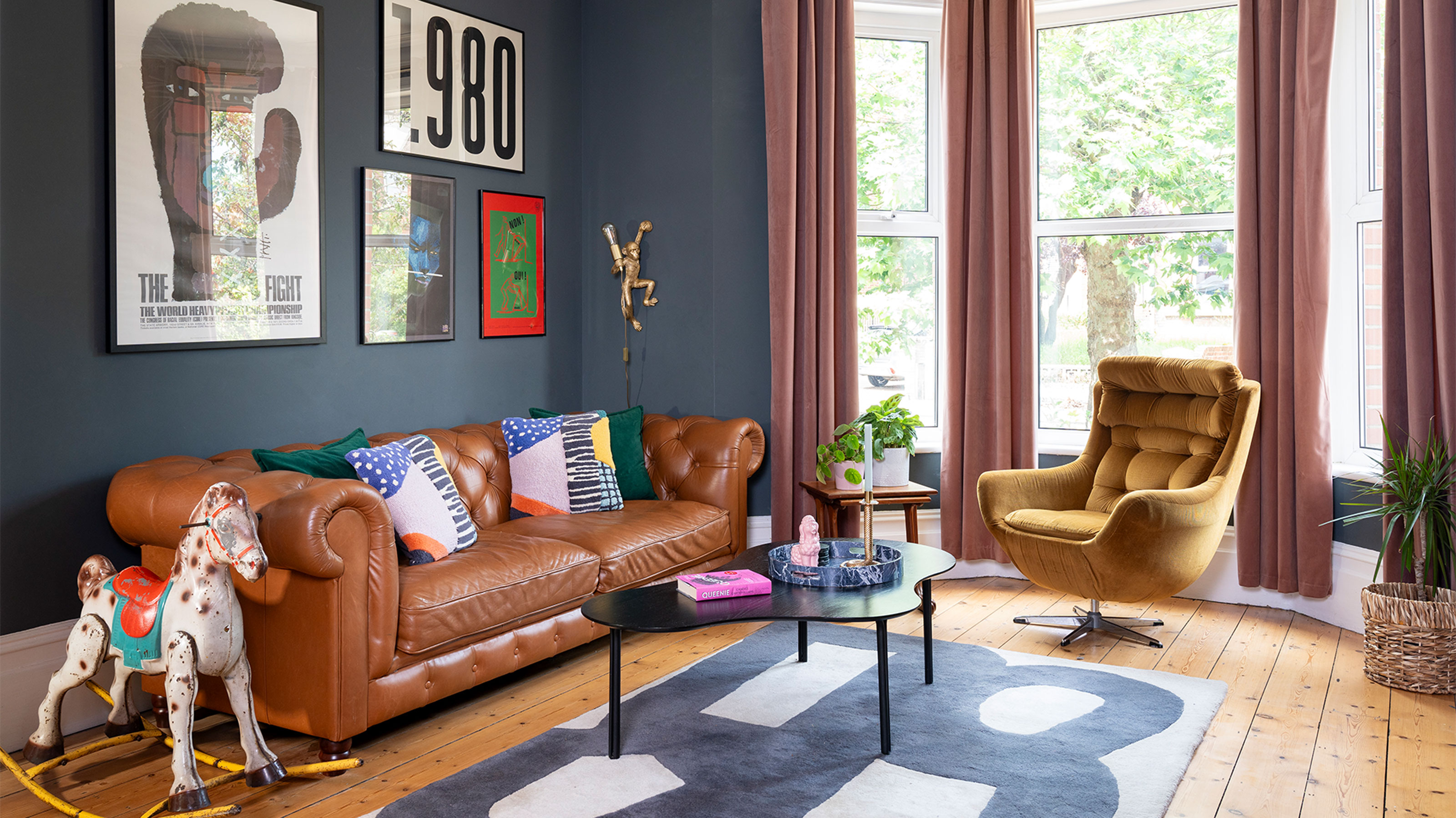
'Both myself and my husband like dark interior colours and mid-century furniture, so we already knew the look we wanted for our new home. We’ve added colour through our choice of artwork and the quirky décor throughout. I love artwork and we probably have too many – I still don’t have them all up yet after five years of living here!'
‘We have lovely high ceilings in this house, especially the living room, and as it’s so light it could take a darker colour on the walls, so we colour-matched the paint to Farrow & Ball’s Downpipe. We sourced the Muhammad Ali original boxing poster from an antique shop in Margate, while the 1980 print is from Habitat. Our leather sofa came from John Lewis .’
Get the Ideal Home Newsletter
Sign up to our newsletter for style and decor inspiration, house makeovers, project advice and more.
Period fireplace
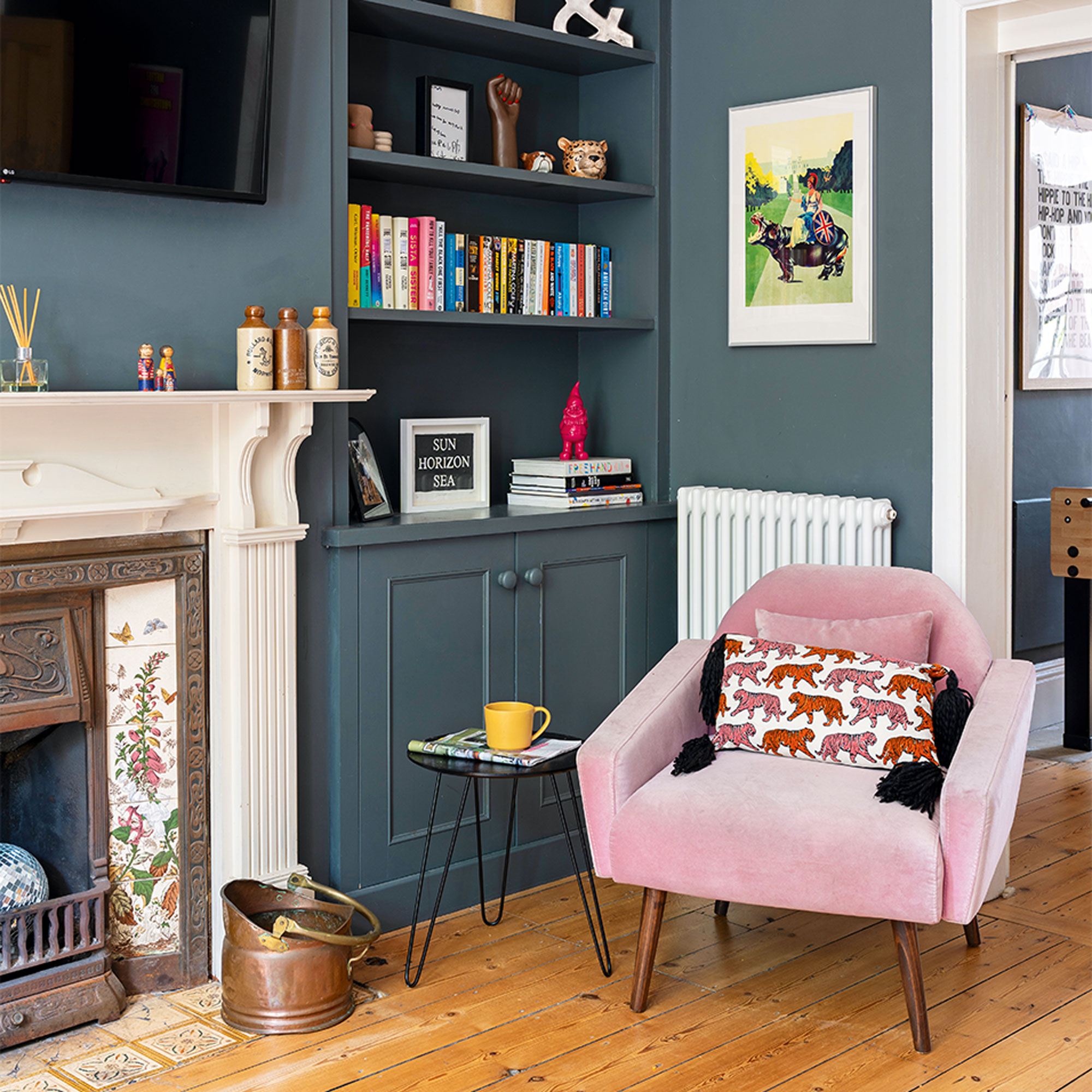
'We’ve sourced lots of furniture and accessories from Facebook Marketplace, like our original Victorian fireplaces, and I love charity shops and car boot sales, too. We have a rocking horse in our living room that I spotted at a car-boot sale as I ran past it while out for a jog… and then had to carry home through Folkstone!'
‘The fireplace we installed in the living room was a bargain find on Facebook Marketplace from a house that was being renovated. Our amazing carpenter made the cupboards either side and a lot of the accessories on the shelves are gifts – my friends and family know I love small trinkets. The pink chair came from Swoon.’
Bright and airy dining room
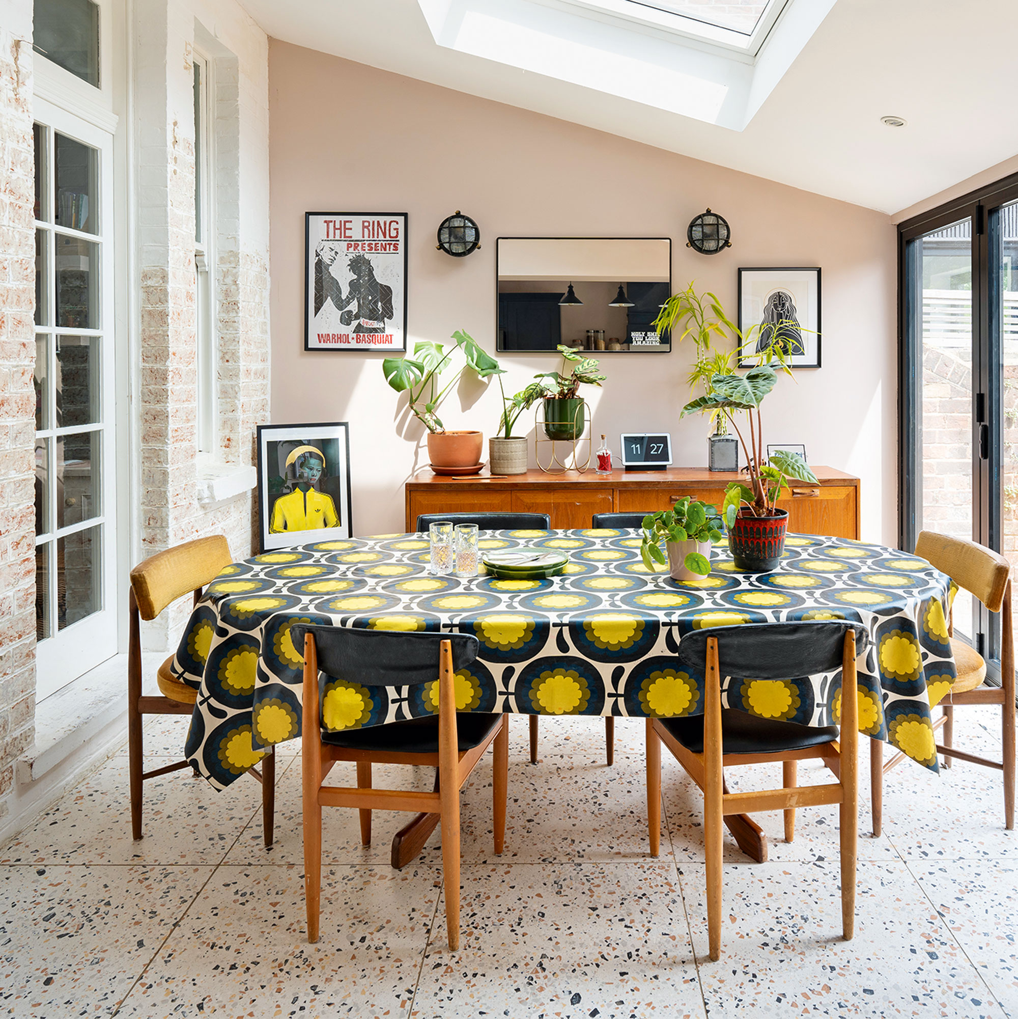
'Our dining table was another Marketplace find and the man who sold it to us said it had been in his family for 65 years. It feels like a table that has witnessed a lot of love from its previous family and we’ve already made lots of memories sitting around it eating and drinking in the last five years. I’ve teamed it with chairs that I sourced from a variety of sellers on eBay.'
‘The brick wall in the dining room has about 10 layers of paint on it! I’ve started to strip it back as I’d like to get it back to original brick and then seal it, but it’s taking longer than expected. We wanted to keep the brick as it adds texture to the space, and I think it complements the wall colour in the kitchen and adds a bit of a contrast. This dining space was originally a lean-to that we converted into a more useable area – we were lucky that the footings were the right depth so it didn’t need too much work.’
Bi-fold doors
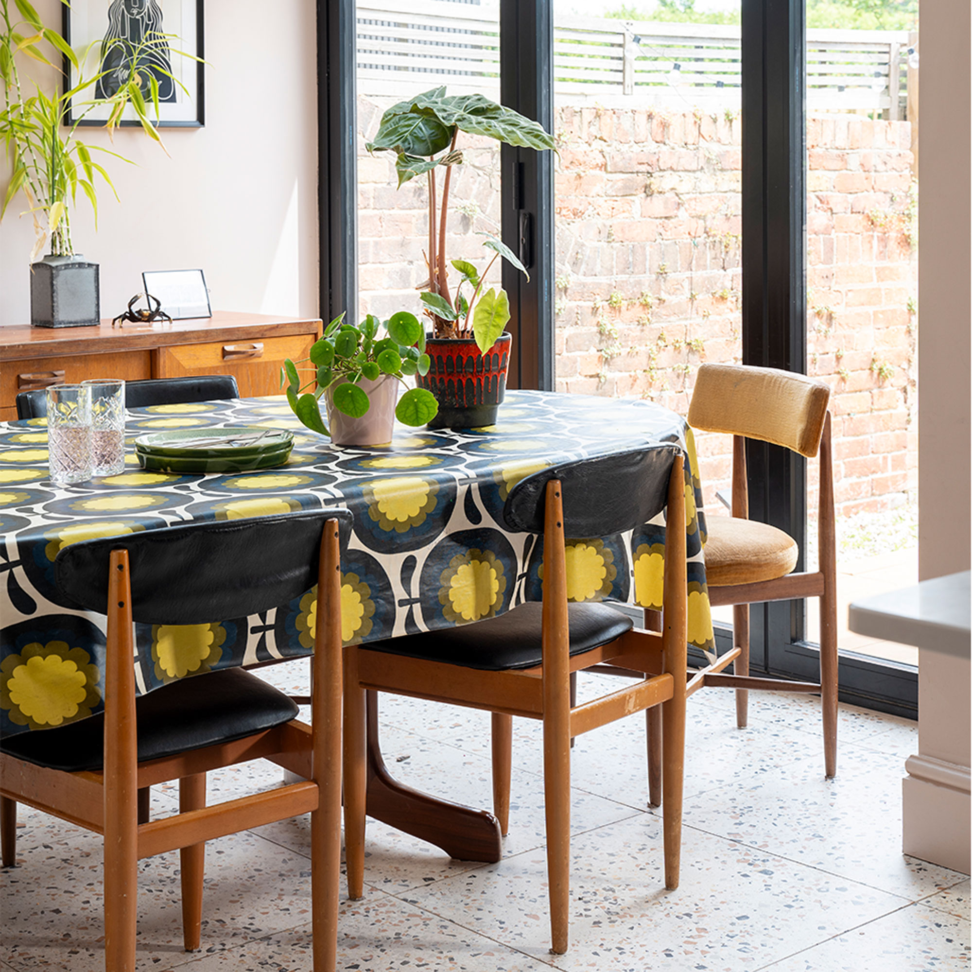
‘Adding bifold doors to the dining area make it feel much larger as we can fully open up the back of the house onto the garden. I love our mid-century chairs, which I sourced from a variety of sellers on eBay.’
Chic pink and navy kitchen scheme
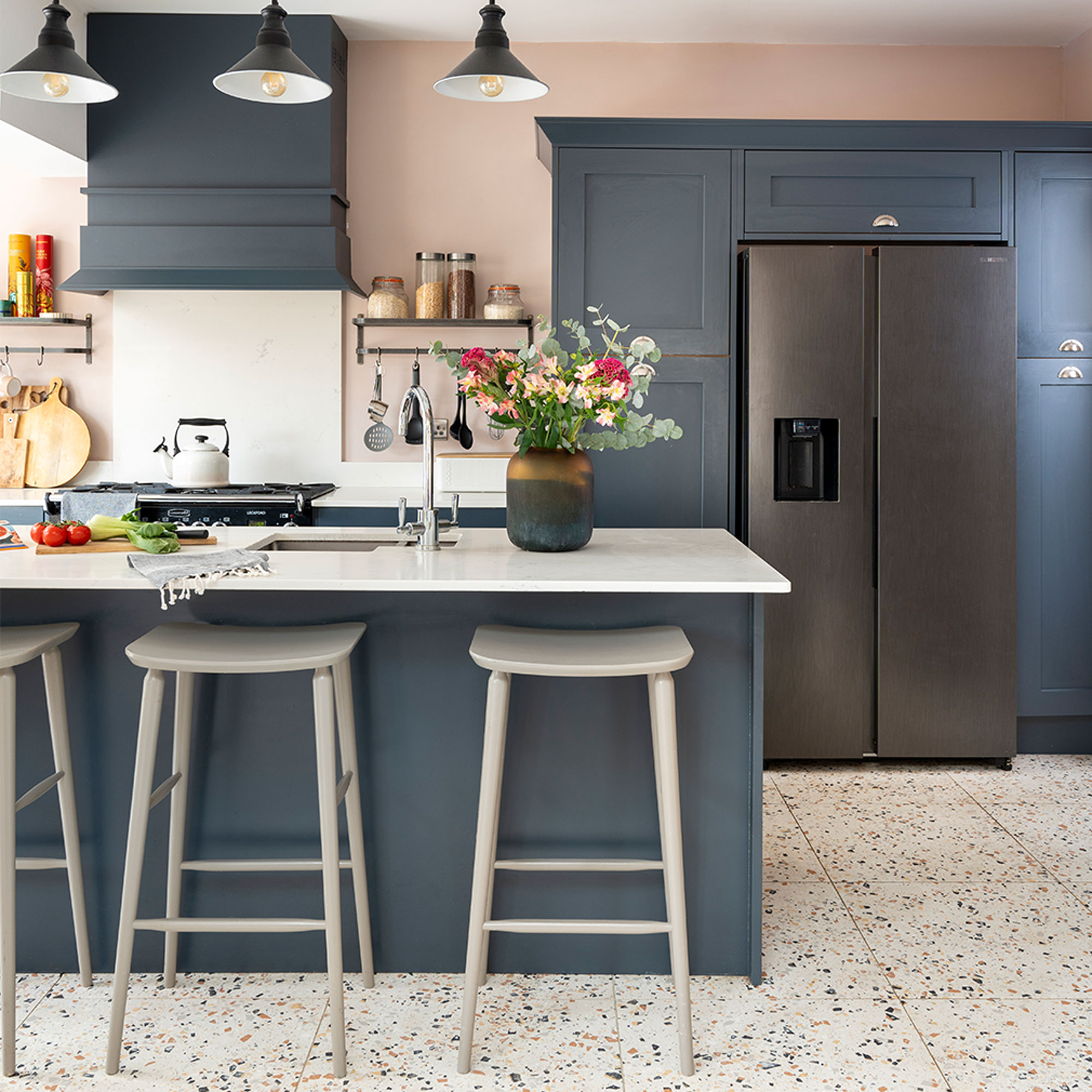
'The kitchen-diner was originally a smaller kitchen, breakfast room and lean-to, but we opened it up to create one space. We were lucky with the footprint and size as it’s a large property and we didn’t need to extend it. This is our favourite room and it’s where we spend most of our time as a family, plus it’s a great space for holding parties! The old pub sign above the door is from Etsy.’
Well-designed layout
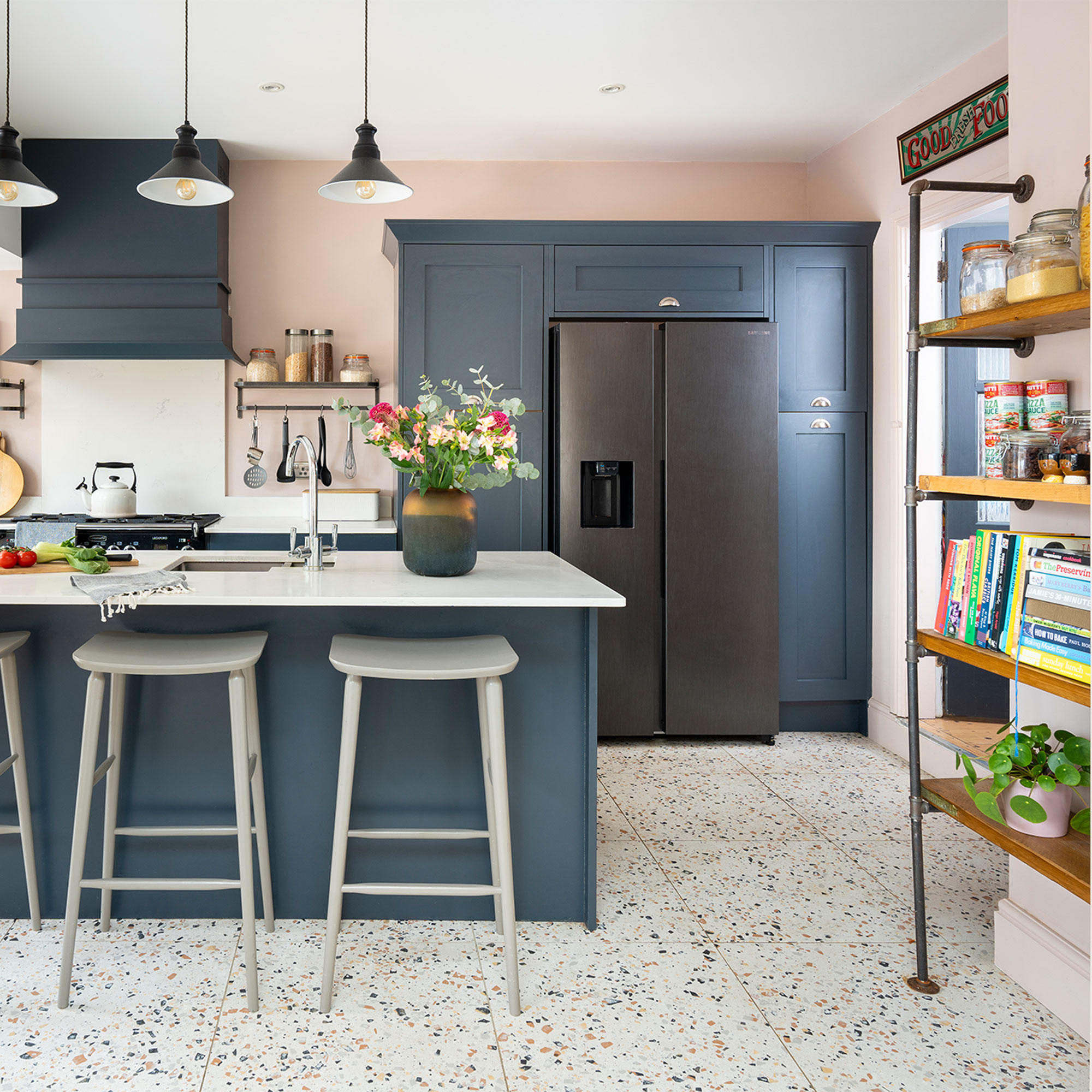
‘We chose cabinetry from Second Nature for the kitchen – the style is called Mornington Shaker – along with an island that’s ideal for the kids to eat at. The breakfast bar stools are from Habitat and the terrazzo floor tiles are from Mandarin Stone.'
'We’d chosen a traditional-style kitchen design so I wanted flooring that lifted the design and created a bit of wow factor. The pattern also masks a heavy footfall and doesn’t need daily mopping with the kids running in and out.’
Hob-side shelving
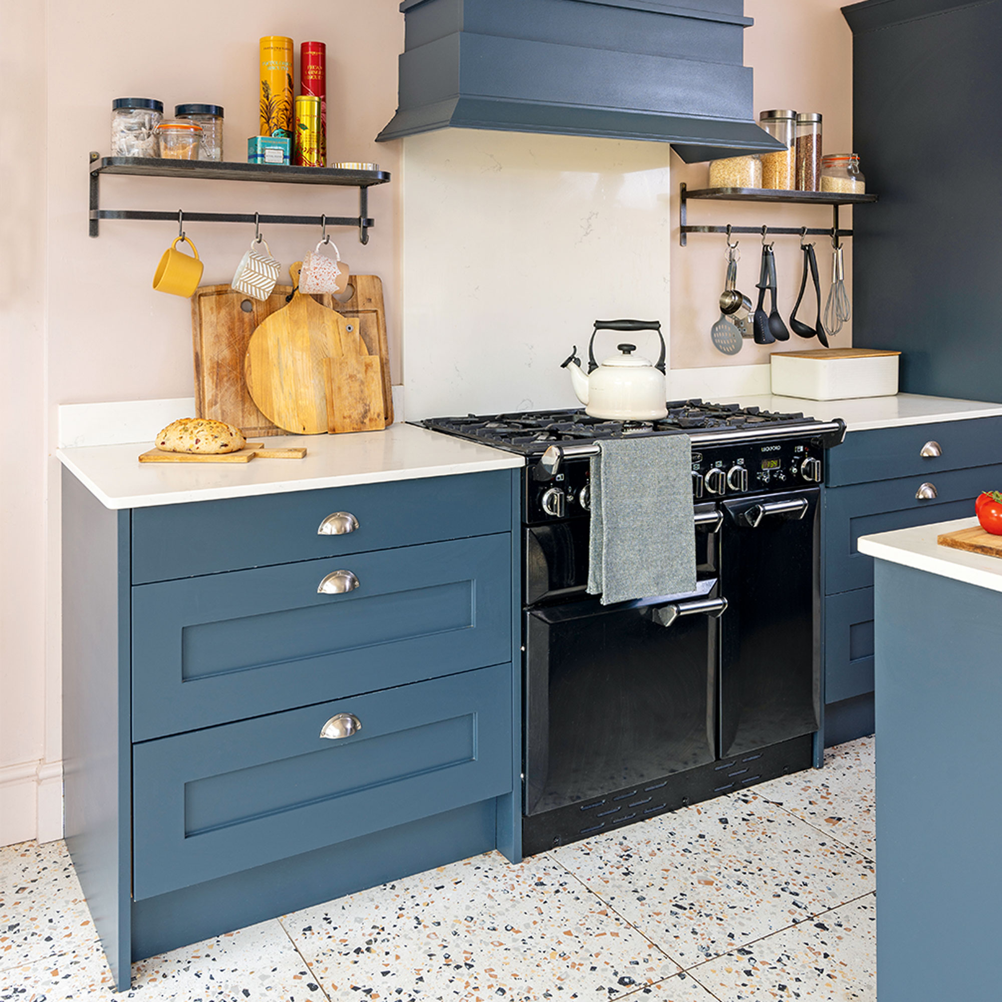
'Adding some open kitchen shelves either side of the oven gives me a spot to keep items we use regularly, along with some colourful tins. We bought the range cooker from John Lewis.’
‘I bought the shelving unit from Etsy as I liked the idea of having open shelving rather than more wall cupboards. It adds interest to an awkward wall shape, too. The hen is from my mum – she has a similar one and I’d always liked it, so she bought this one from a local antiques shop to her when we bought our first home in London.’
Stairway gallery
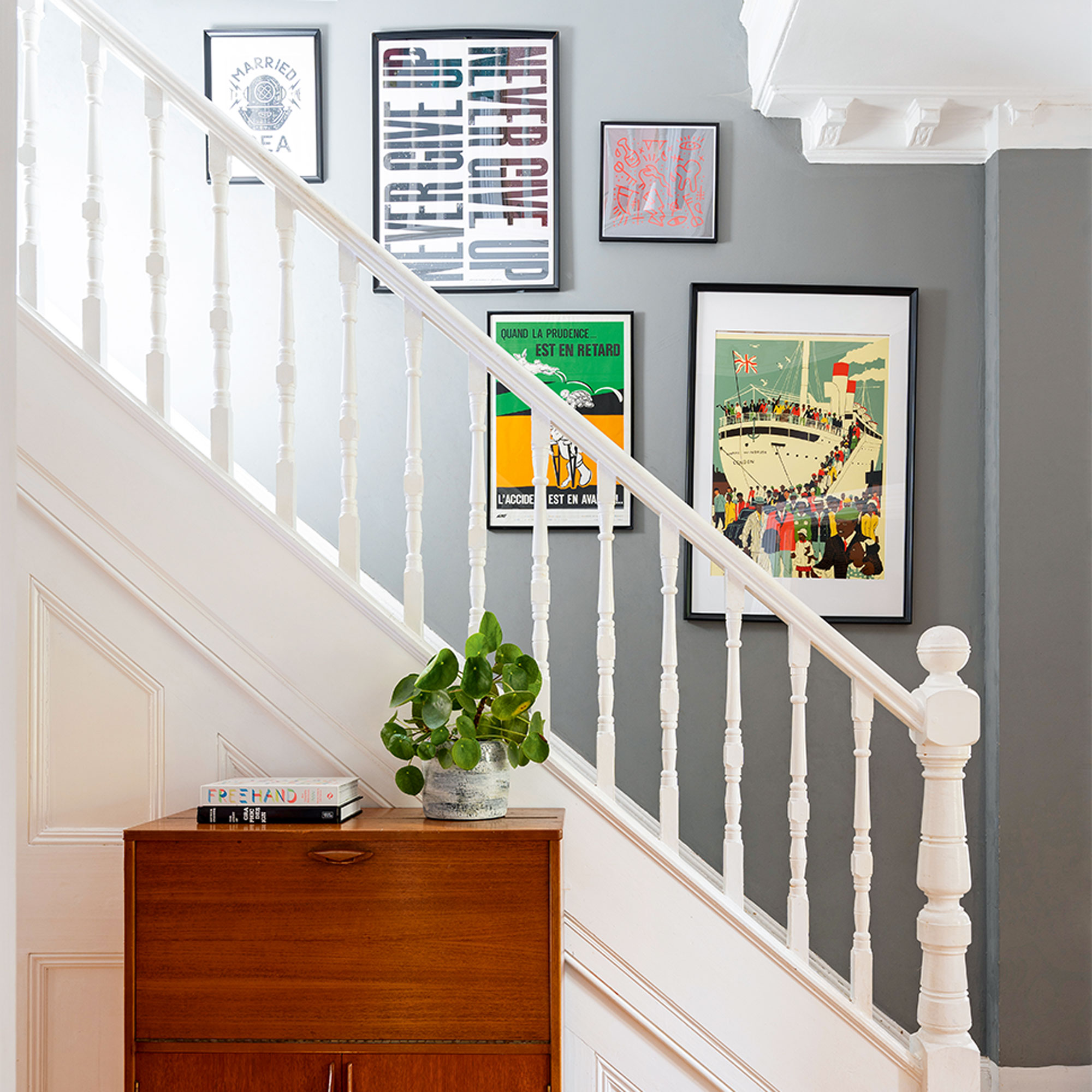
'We’ve done so much, though, and I’d say we’re about 70 per cent finished. I still want to strip back the staircase and banister, as at the time we just did a quick touch-up job, but I’d like to get rid of the thick white paint that was already there.'
'Some of our artworks are displayed on the stairs, while a vintage unit we found on Facebook Marketplace is used to store photographs and the sewing machine. There’s also a cupboard at the top of the stairs that I store random clutter in. It keeps it hidden out of the way!’
Vibrant bedroom
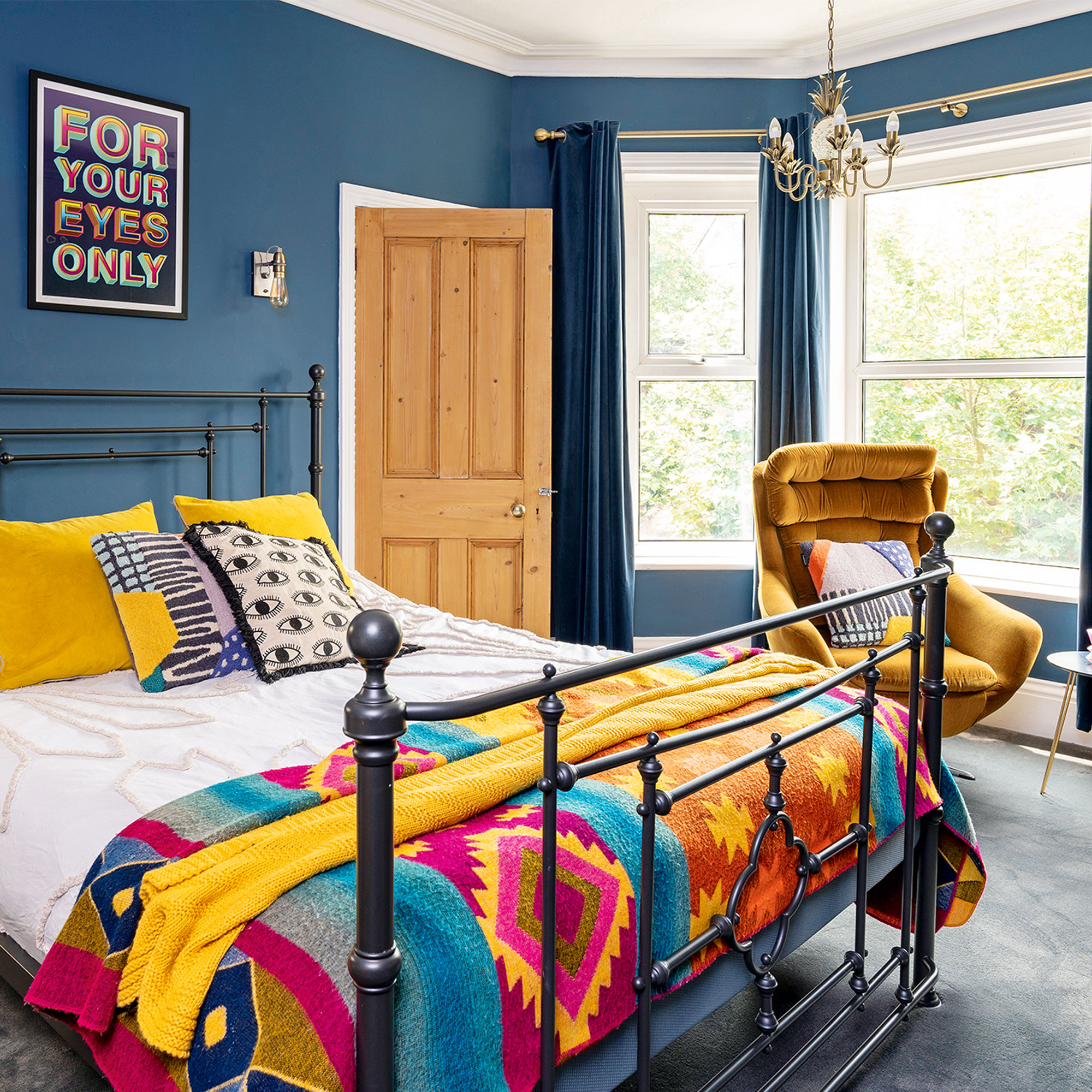
‘We were inspired by the décor of the Standard hotel in King’s Cross for the interior of our bedroom and I like that it’s a cosy space. We wanted it to have a retro vibe and I liked the idea of a block colour across the walls, wardrobes and curtains, to create a striking look.'
'I love the colour as it’s both dark and vibrant, and makes the chair, bedding and artwork really pop. Our ‘For Your Eyes Only’ print is from Eddy Bennett and my cushions are from TK Maxx and Habitat.’
Painted wardrobes
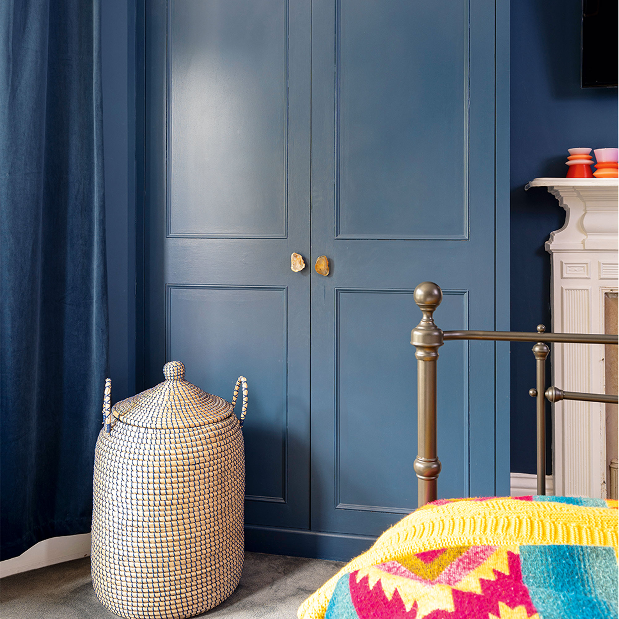
‘I love the handles on our wardrobes, which I bought from Anthropologie. The washing basket is from Habitat’
‘We went for a Valspar paint in here, that we colour matched to Farrow & Ball’s Stiffkey Blue shade. The door leads to our en-suite which was originally a cot room. My bedding is from Habitat and the blanket is from Wolf & Badger. The vintage chair is the same as the one in our living room, as they came as a set of two.’
Cute girl's bedroom
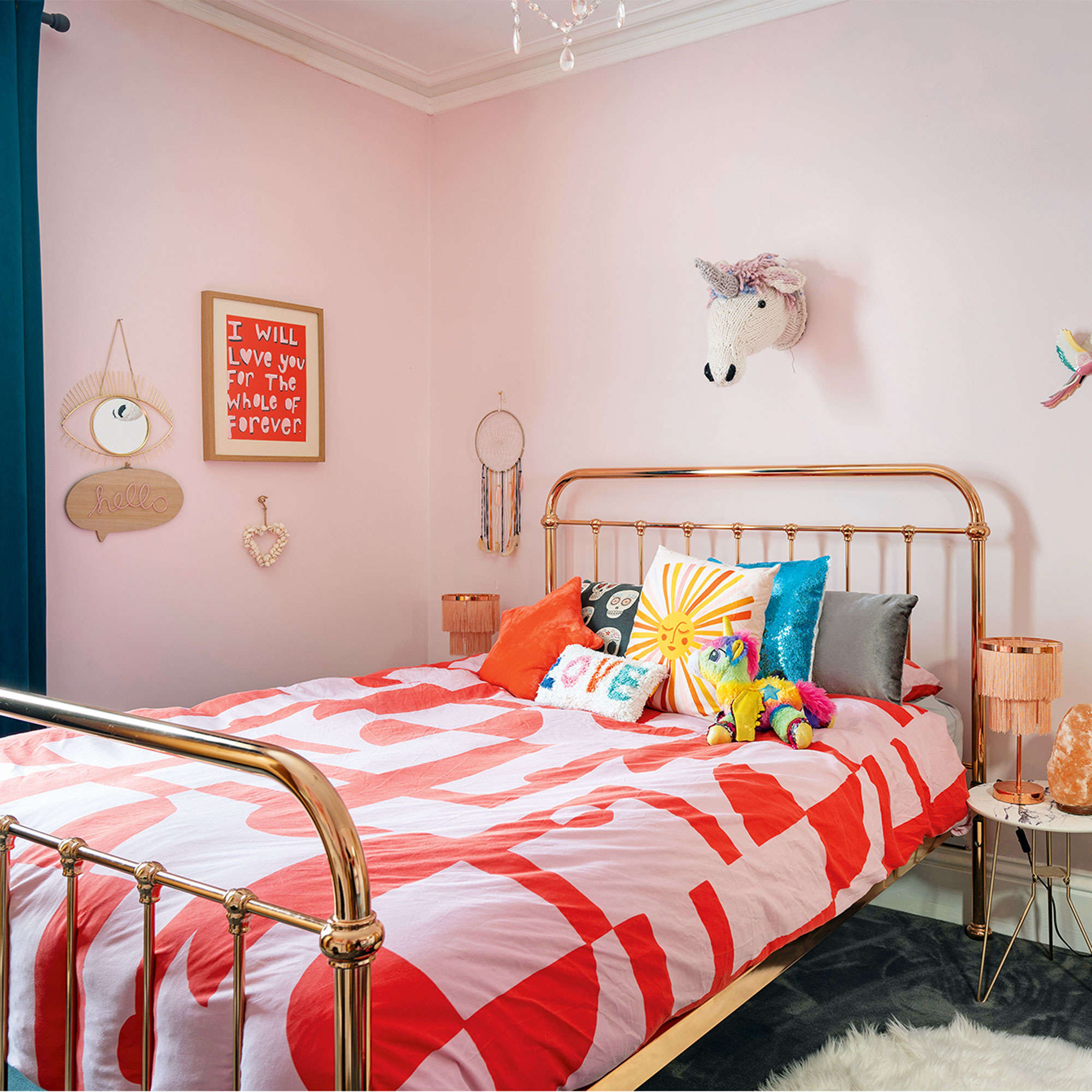
‘Our daughter's bedroom was very much directed by her… she loves pink and bright colours. I wanted it to be a fun space where she’d be able to play and be a reflection of her bubbly personality. Our favourite shop for bargains is B&M, so I took her there and let her choose a lot of the items, like the lamps, bedside tables, “Hello” plaque and eye mirror. The unicorn head on the wall was made by a friend when she was born, and the bedding is FURN. She loves her room and so do her friends.’
Soft pink colourscheme
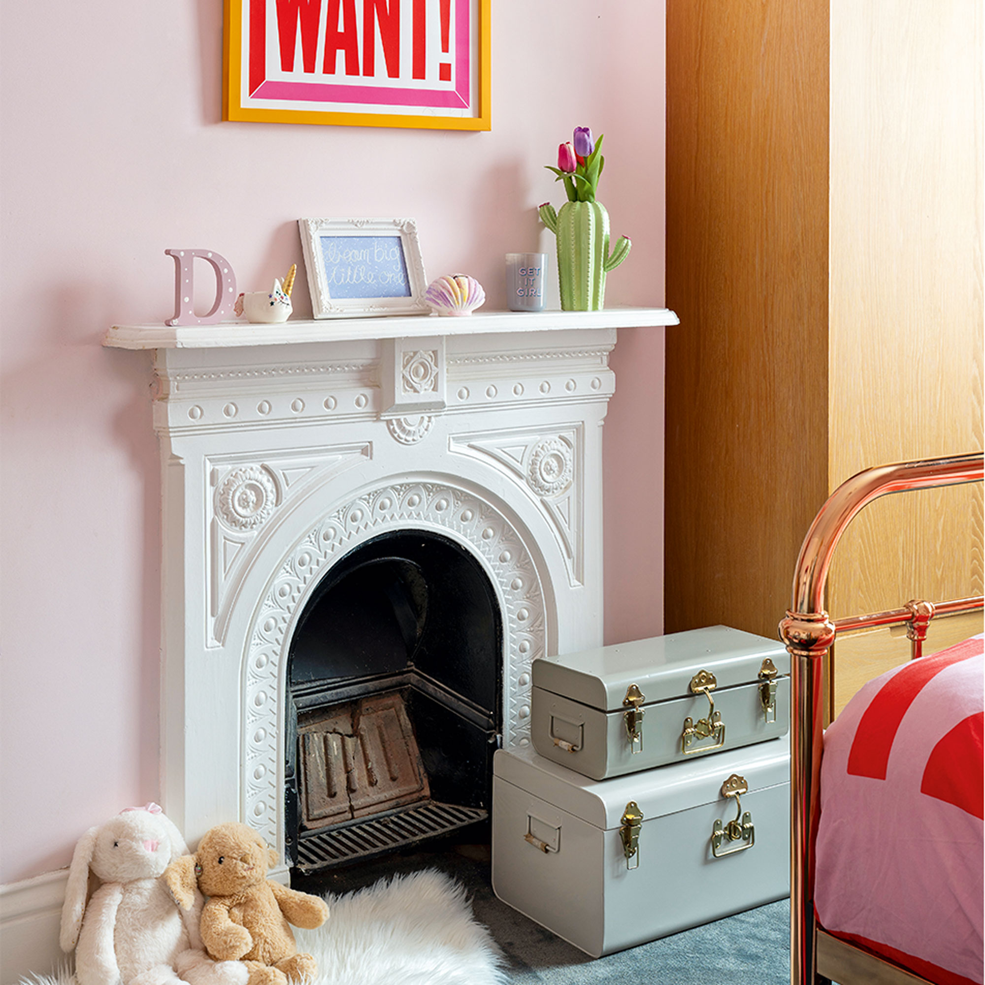
‘The fireplace was already there when we moved in. We painted the walls in Blush Pink by Dulux and the ‘I Want What You Want’ print is by Anthony Burrill.’
Panelled bathroom
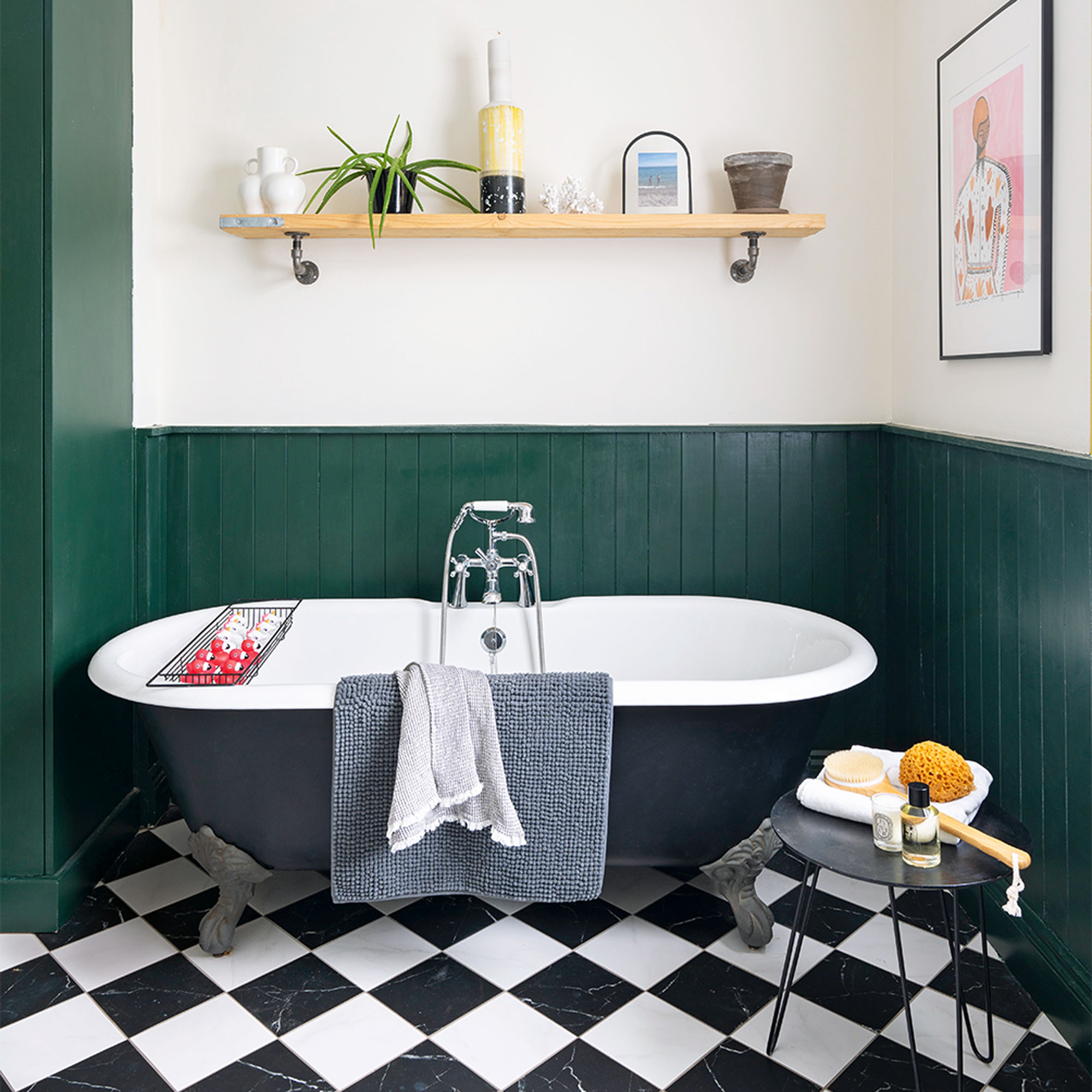
‘We wanted the bathroom to have a period feel and match that of the house, so we chose to put in the panelling ourselves, painting it in Craig & Rose’s Ottilie.
The bath and sink were bought from a large Victorian property in London that was being converted into flats. We actually got the bath, two toilets and two sinks for just £250 by bidding on eBay! The children use this bathroom and we have our en-suite.'
Bold accent details
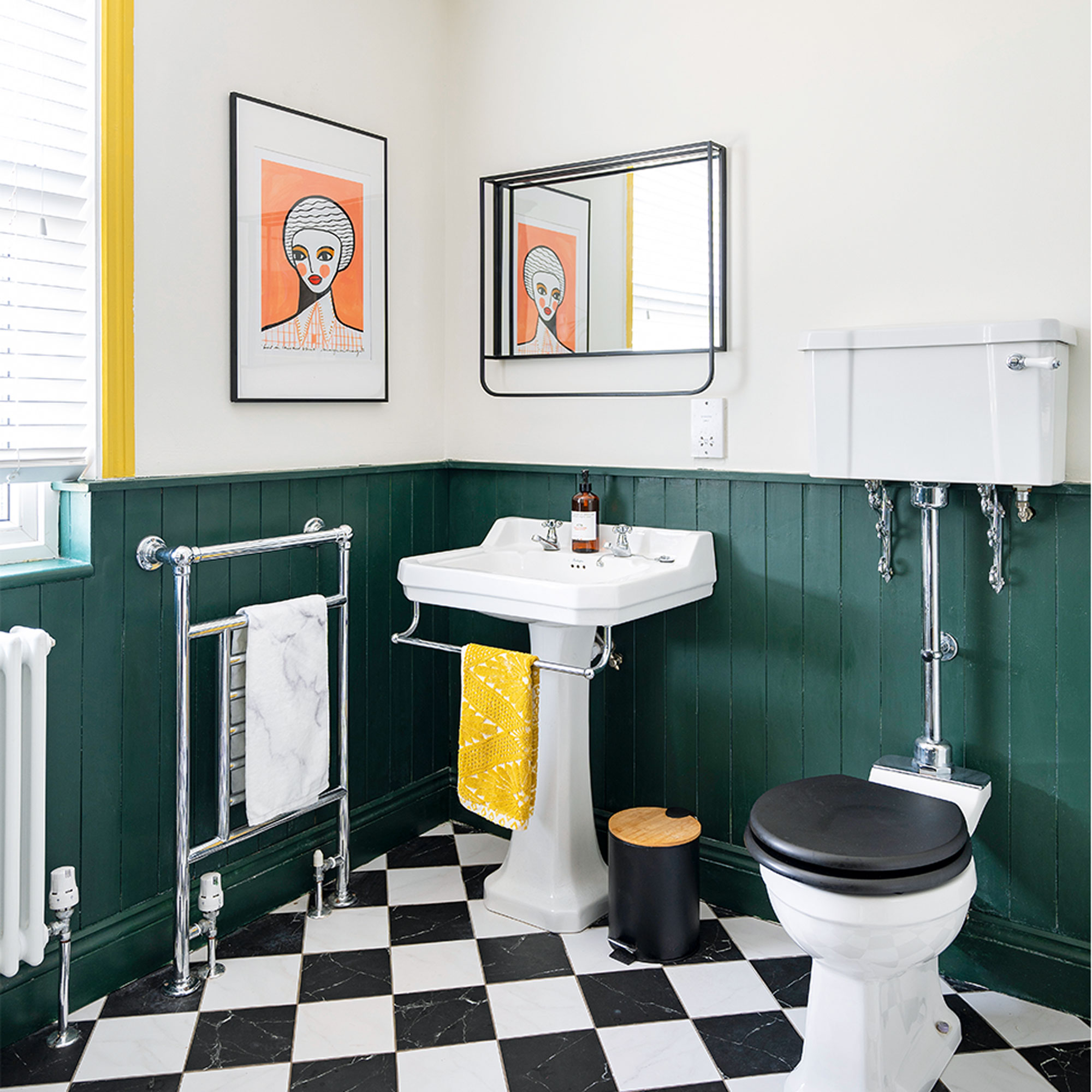
‘I painted the window frame yellow to bring a pop of colour to the bathroom as the heavy colours felt quite flat. We chose traditional fittings to suit the age of the house and give it a luxurious feel.'
In hindsight, there are a few things I’d have done differently. We originally wallpapered the family bathroom, but it gets such heavy use that the wallpaper started to peel quite quickly. It just wasn’t a practical choice. We also chose a gorgeous, luxurious carpet, but it’s been wrecked by the children and a few parties we’ve had.'
'Despite that, I'm really pleased with what we've accomplished so far. The house feels really cosy and unique to us and suits our family's vibe and energy.'

Focus on: Using dark paint colours
Make a bold move and step over to the dark side.
- Contrary to popular belief, dark paint colours show up marks on walls just as much as light shades, so using the right type of paint is key. If your walls have any imperfections, steer clear of gloss as its high shine and reflective properties will only highlight them.
- If you’re worried a dark paint colour will feel too dreary, help lift it with an accent colour. Yellow, blush pink and even orange all work well to add life to a darker scheme, so pick one and use it in small hits around your room.
- Dark colours will ‘close’ your walls in, so it’s ideal if you want to make a long wall feel smaller or create a cosy vibe. If, however, you’re still on the fence when it comes to going over to the dark side, why not start with just one wall to see whether you like it?
- Look at the features in your room when it comes to deciding which areas to paint dark. Skirting, alcoves, doors (and frames), all make good choices, and you can decide whether you want to use a combination of dark and light paint, or go all the way by painting the whole room dark for a cocooning feel.

Laurie Davidson is a professional stylist, writer and content creator, who lives and breathes interiors. Having worked for some of the UK’s leading interior magazines, styled homes up and down the country and produced sets for TV shows, adverts and top brands, it’s safe to say Laurie has had a pretty exciting career. Find her on Instagram at @lifeofaninteriorstylist or over at lauriedavidson.co.uk
- Lisa FazzaniDeputy Editor
-
 Should your front door colour match your hallway? Interior experts reveal 3 reasons why it should (and 3 reasons it shouldn't)
Are you team matching or contrasting?
By Ellis Cochrane
-
 This £200 limited-time discount makes this Dyson vacuum cheaper than I’ve ever seen it - run don’t walk to Argos for this bargain
It's the most affordable Dyson on the market right now
By Lauren Bradbury
-
 Martin and Shirlie Kemp’s pastel flower beds has given their Victorian renovation a romantic look - how you can get the look
Their pastel garden is the cottage garden inspo you've been looking for
By Kezia Reynolds