'Our new bathroom is full of little details that make life just that little bit nicer'
This eye-catching bathroom cleverly combines pattern and texture
When this couple first moved into their house 20 years ago, the bathroom needed replacing almost immediately and they chose a neutral scheme that worked well for family life.
But when the underfloor heating broke down last year it prompted a refresh. 'After all that time, the space felt a bit tired, and the floor tiles we had originally chosen made it feel dark, even though it's a bright room. They showed dirt and hair so were hard to keep clean,' explains the homeowner.
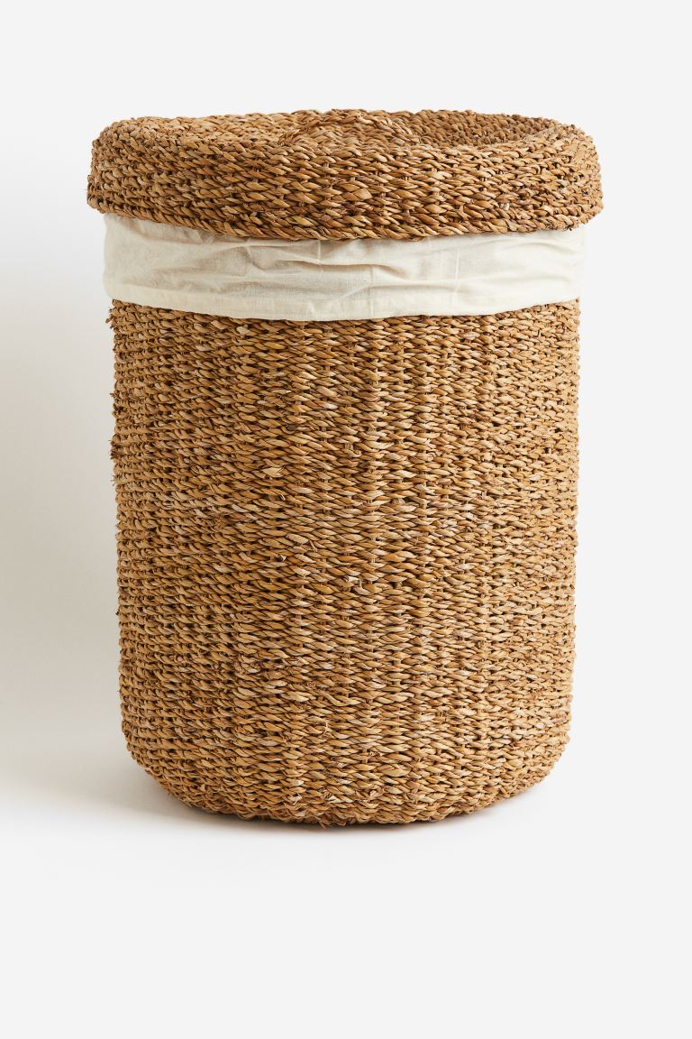
'Our main criteria for the new bathroom was a practical space with lots of storage, somewhere for a laundry basket and that it used plenty of natural materials.'
After a bad experience with builders the first time round, they were keen to work with a supplier who could help with everything, so when a friend recommended The Tap End Bathrooms in Cardiff, the couple enlisted their help to reconfigure the space.
Although the new layout stayed mostly the same, moving the shower made the biggest difference to the new design, providing bathroom storage ideas for baskets, as well as a large alcove for keeping bottles to hand.
‘One of the biggest problems in our old bathroom was having nowhere in the shower for products - there were always shampoo bottles all over the floor,’ explains the homeowner.
After deciding on practical wood-effect tiles for the floor, which would be compatible with underfloor heating, as well as easy to clean, Laia set about finding something of interest in the shower area.
Get the Ideal Home Newsletter
Sign up to our newsletter for style and decor inspiration, house makeovers, project advice and more.
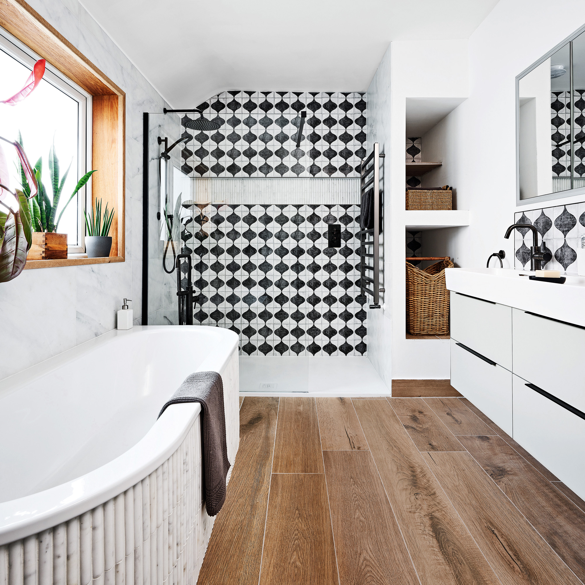
‘We came across these amazing bold wall tiles by chance, just as we were leaving the showroom,' recalls the owner. ‘I thought it would be too much black and white, as they are so geometric. But when the designer showed how we could put it all together, it was a scheme that really resonated with us.'
'We wouldn’t have considered using marble as a material,' she continues, 'because I thought it would give a pristine hotel-style bathroom look which we didn’t want.'
'But it really works with the rest of the scheme, and the mosaic ones in the shower alcove look amazing - I can’t stop looking at them.’
Get the look
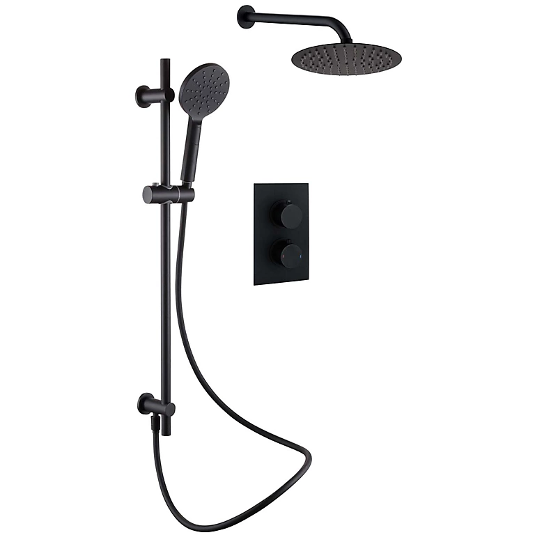
This all-in-one shower package features a shower slide rail, a rain showerhead, and shower arm. The sleek, contemporary design is the perfect choice if you're looking for a modern modern look for your washspace.
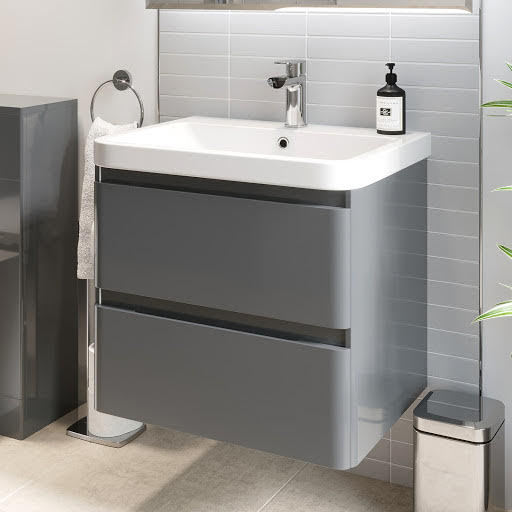
Despite its relatively affordable price, this vanity unit boasts a bunch of high-end design features. The two large handleless drawers provide ample storage with soft-close mechanisms, while the resin finish provides a stain and scratch-resistant surface, that's a cinch to clean.
The bathroom in detail...
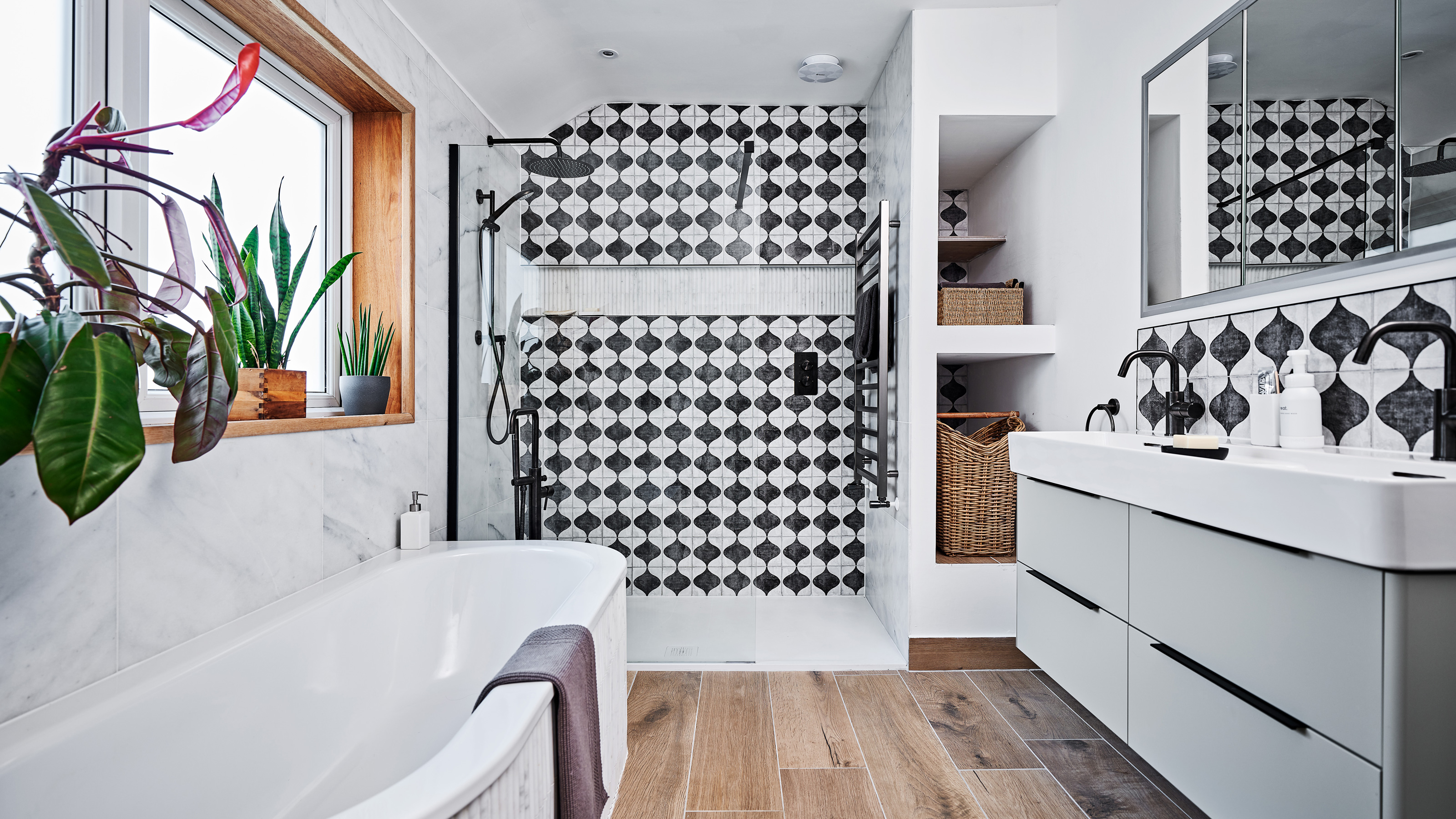
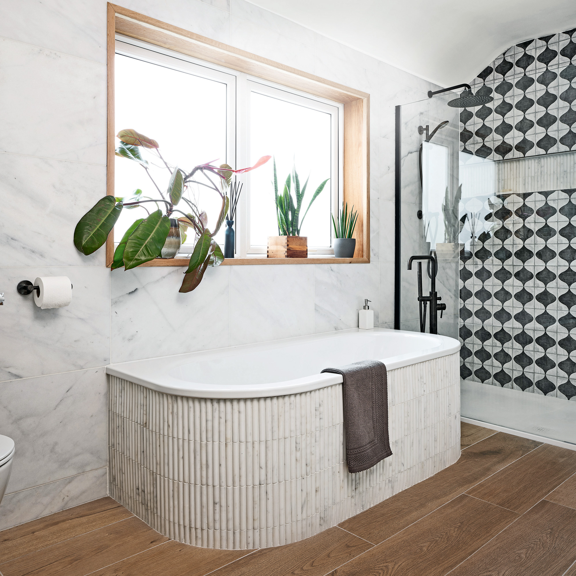
A deep, wood-clad windowsill provided the perfect spot for plants and greenery above the bath. Balancing a black and white bathroom scheme with natural materials like wood and marble creates a calm, yet warm result.
‘Every inspiration picture we found had natural materials and a laid-back vibe,’ remembers the owner. ‘Moorish patterns appealed to us as well, and we were looking for a way to include that design.’
The bath was the original bath from the old space, but was updated with Ca’Pietra tiles.
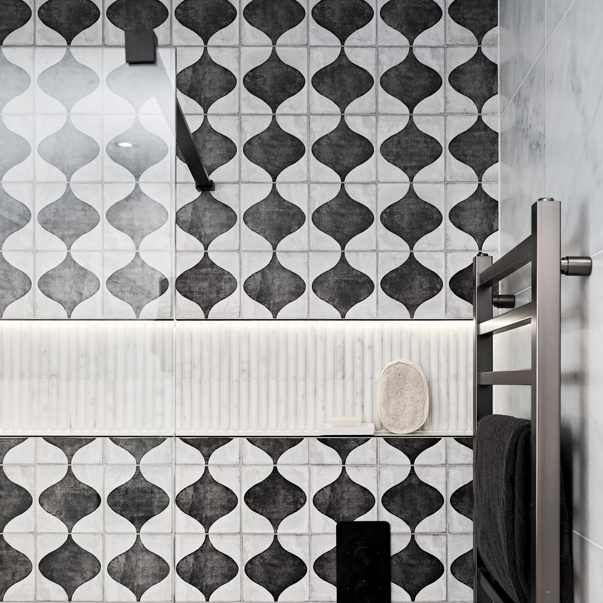
A large shower tray provides ample space for showering, giving a wet-room effect. ‘The shower is so spacious and bright, and it’s very easy to keep clean,' says the owner.
‘I love the illuminated alcove as well,' sahe adds, 'it has long, marble mosaic tiles at the back which I can’t stop looking at. The alcove is just the right size for products and bottles.’
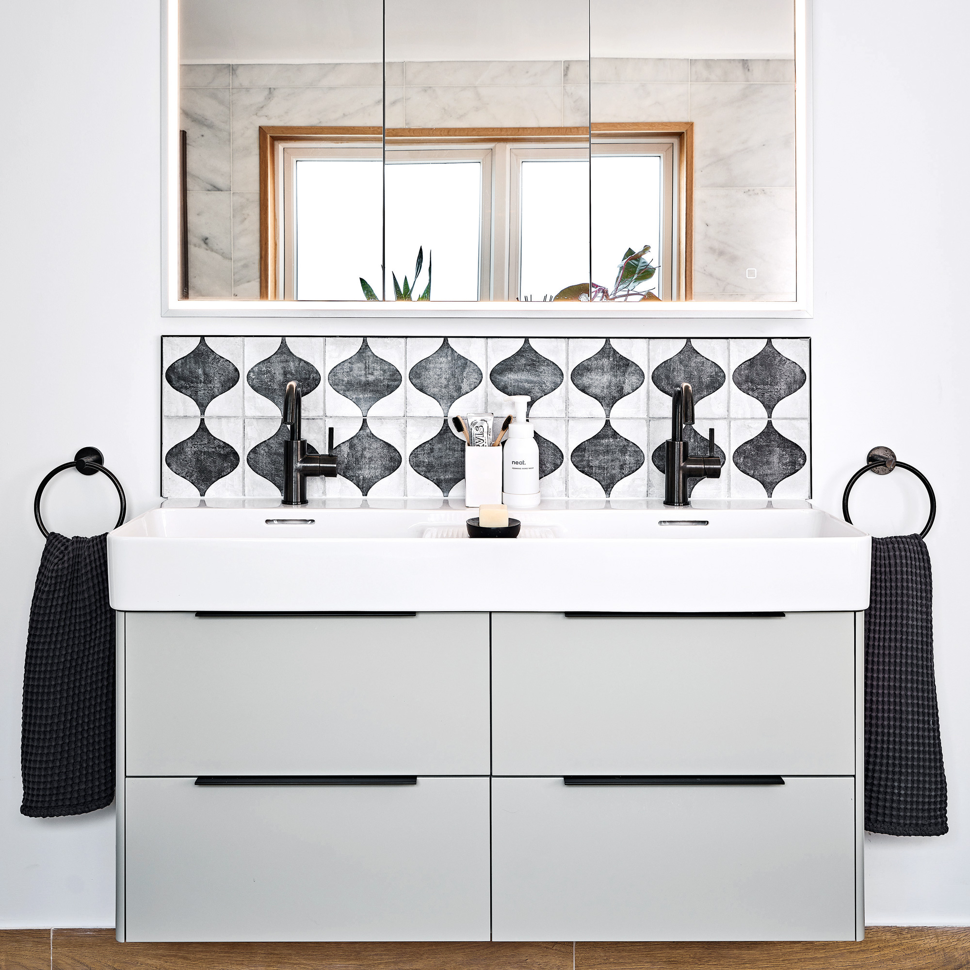
‘The mirrored cabinet lights up and is recessed into the wall, which is very practical’ she continues. ‘It’s got a charging point for our electric toothbrushes, so that stops them having to be out all of the time.'
'And the vanity unit drawers have internal organisers to make the most of the space, which my daughter loves to put her make-up brushes in.’
Under the vanity unit are sensor lights, which illuminate the room when you walk in at night time.
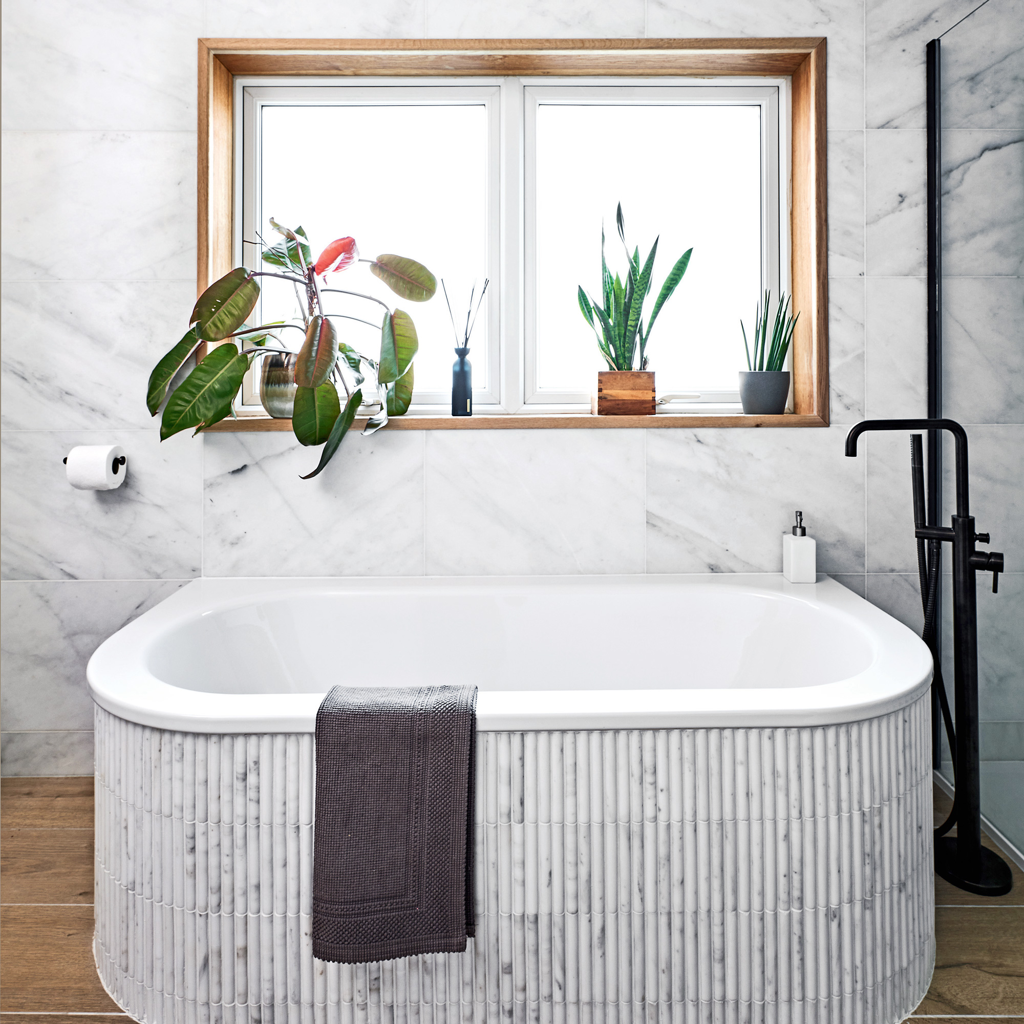
The existing bath was reused and updated with marble-effect tiles around the edge. ‘We wanted to keep the bath because it was still in perfect condition. Our designer Zoe from The Tap End suggested we use the same mosaic tiles as the shower alcove around the edge,' recalls the owner.
'At first, we couldn’t picture it, but it’s worked so well. I can’t believe it’s the same bath - it looks so different!'
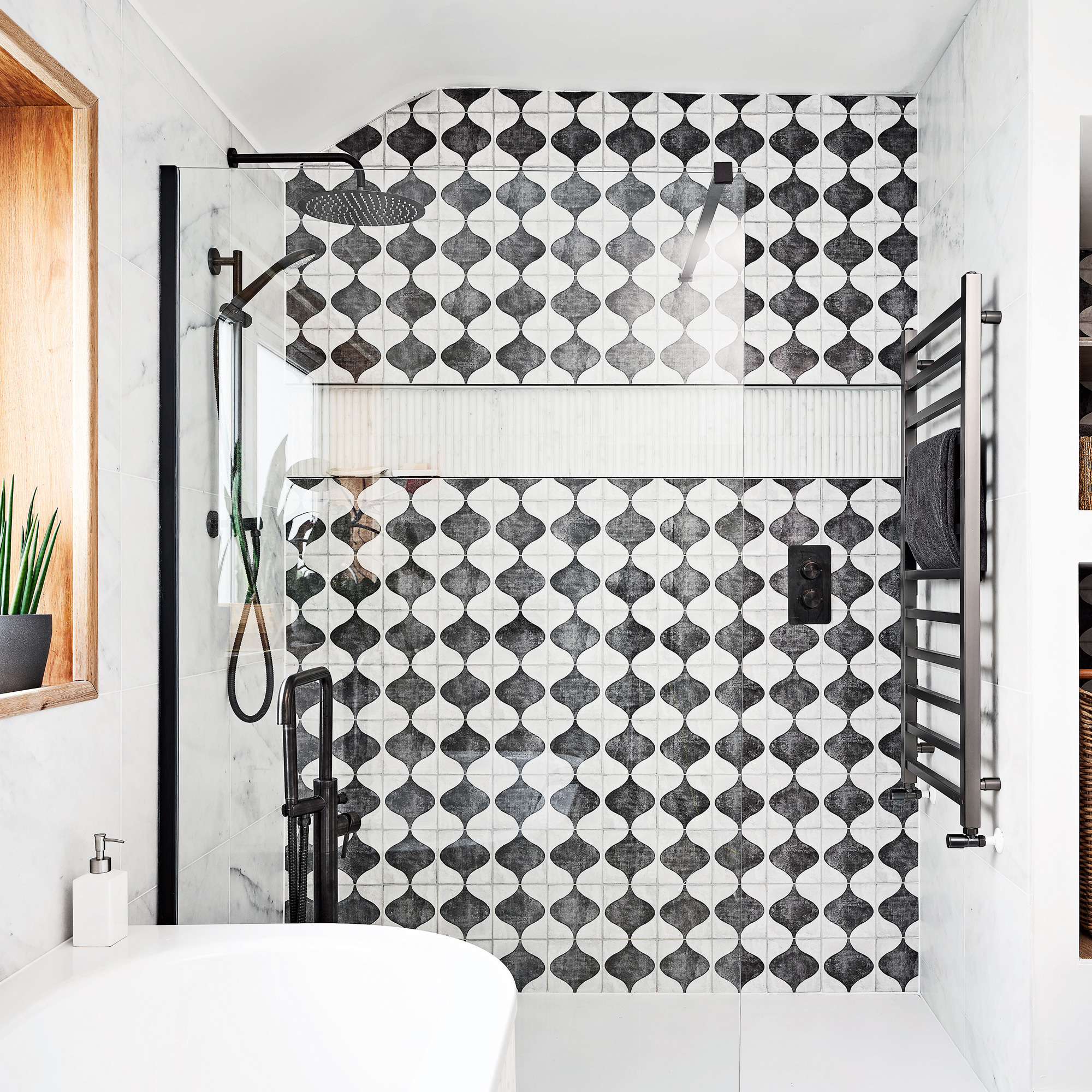
‘Having the towel rail in the shower enclosure means you don’t have to come out of the shower area to dry,’ says the owner, ‘and being able to reach the controls before actually getting under the shower makes so much difference. It’s my favourite part of the room because it’s so practical and spacious.'
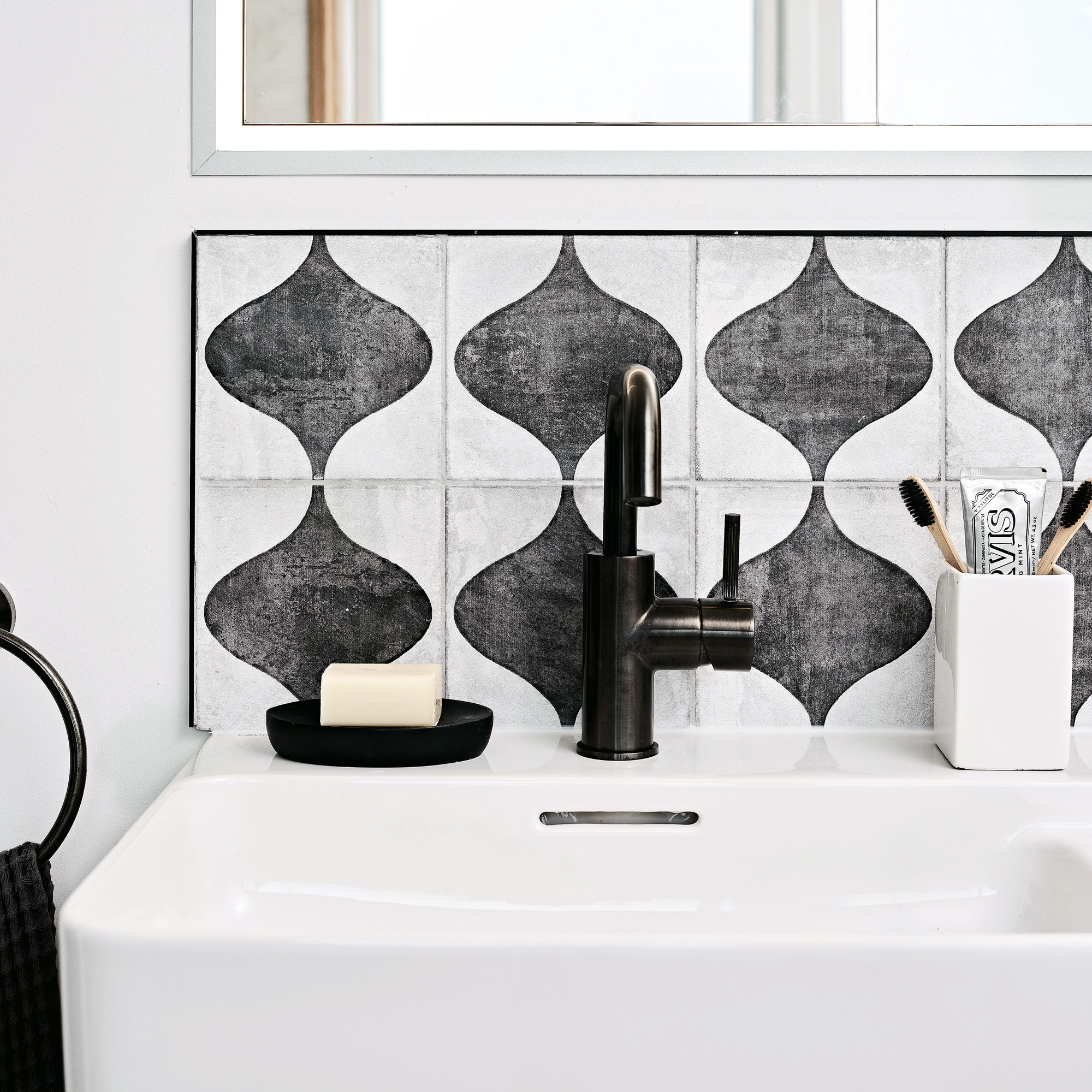
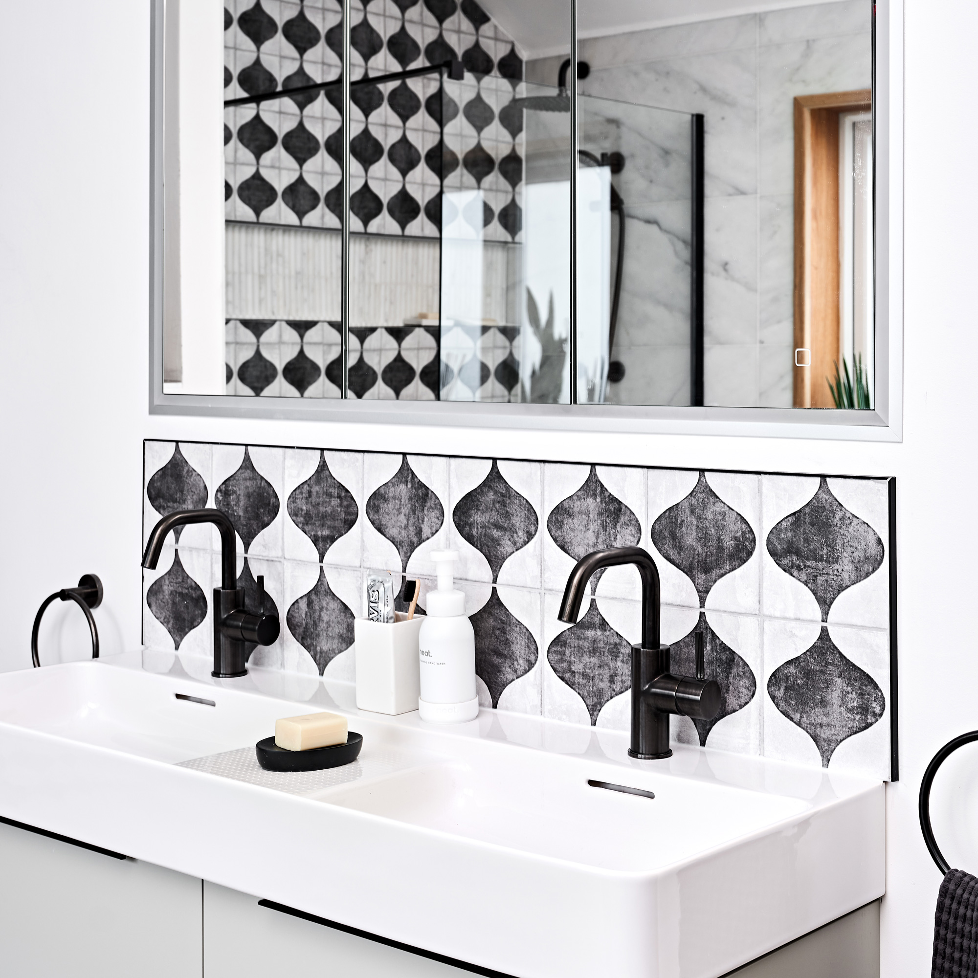
To elevate the neutral space, the couple chose eye-catching geometric tiles to make a focal point of the large shower area. For a co-ordinated result, the same tiles have been used to create a smaller splashback behind the double sink.
‘Although monochrome, they have a worn texture which adds warmth and softness,’ explains the owner.
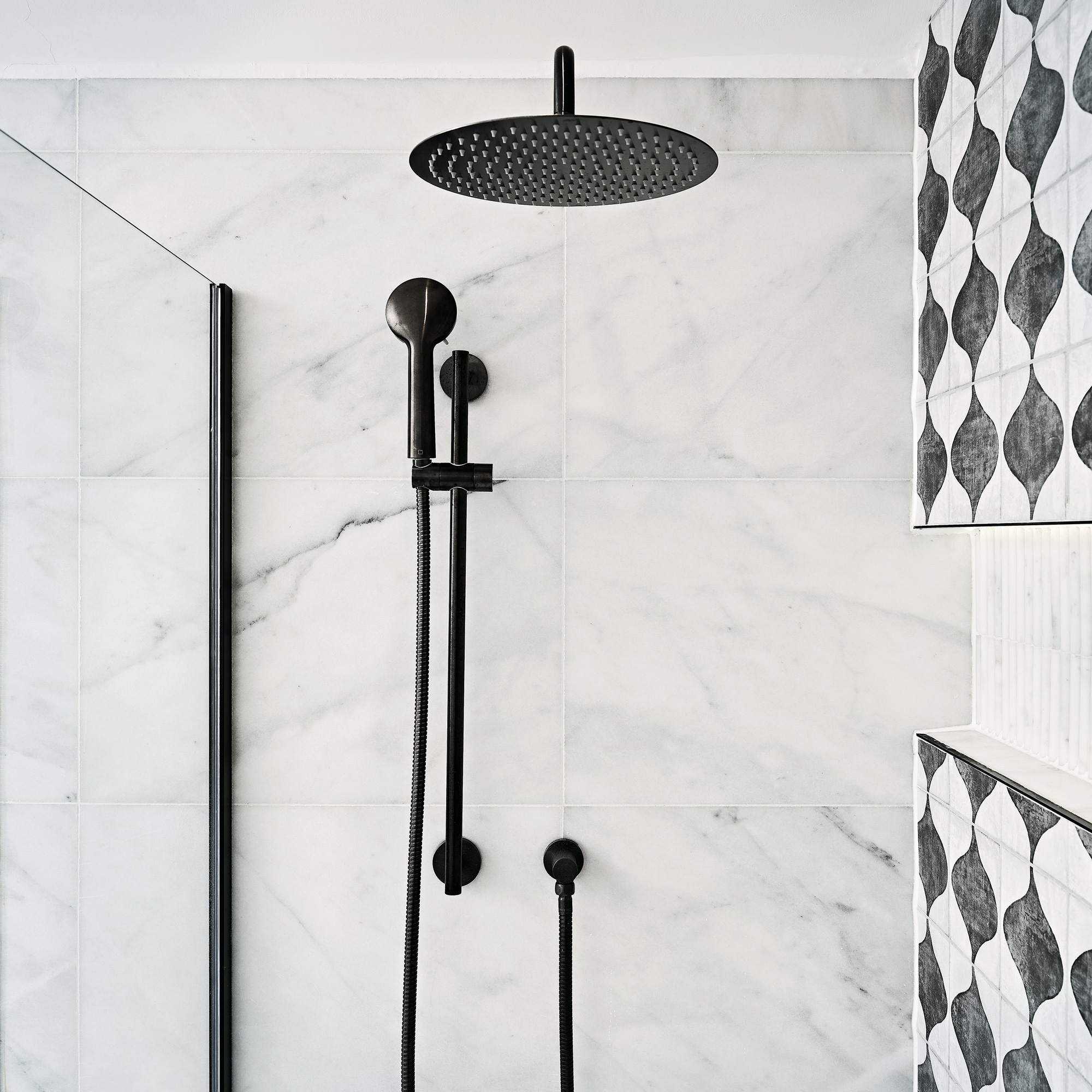
Although originally planning to use chrome fixtures in the scheme, they were worried they would look cold against the marble tiles.
‘It was really useful to see real-life examples of furniture and bathrooms in the shop as I’m not sure we would have considered using black before,’ she explains.
‘I think the black shower and taps look timeless and less clinical, finishing the whole scheme off perfectly,' she adds.
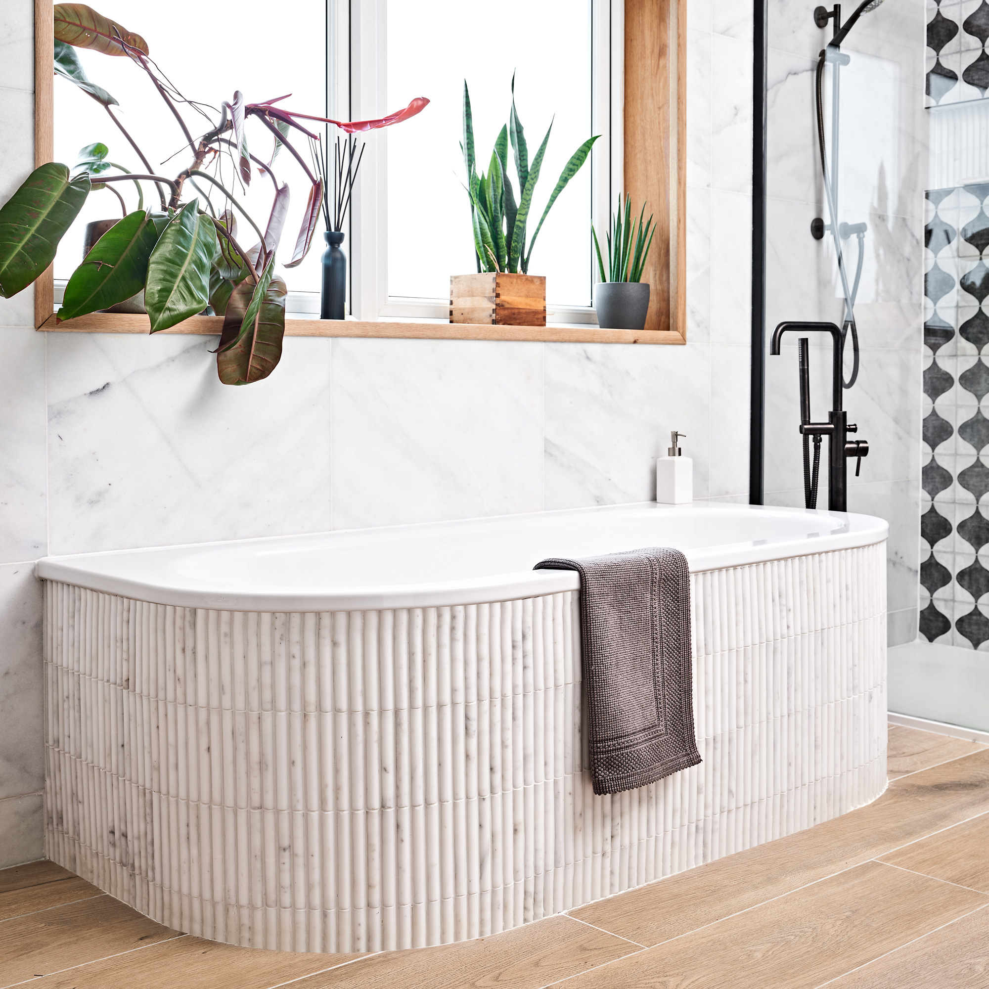
‘We’ve really achieved a clutter-free space which is really practical,’ says the owner. ‘When the builders finished, I just couldn’t believe how different it looked. There are some lovely small touches which make a such big difference to daily life.’

Ali has been the Houses Editor at Ideal Home for the past two years, following 12 years in interiors magazines, writing features, interviewing homeowners and styling shoots. She's now in charge of finding all the most inspiring and special homes to appear in Ideal Home magazine.
-
 The 6 best colours for a north-facing bathroom – brighten and warm up a cold space with expert-approved shades
These warming paint colours will completely change how your space looks and feels
-
 Is it better to rent or buy a carpet cleaner? From cost to convenience, experts weigh up the pros and cons
How to choose the best carpet cleaning solution for your home and budget
-
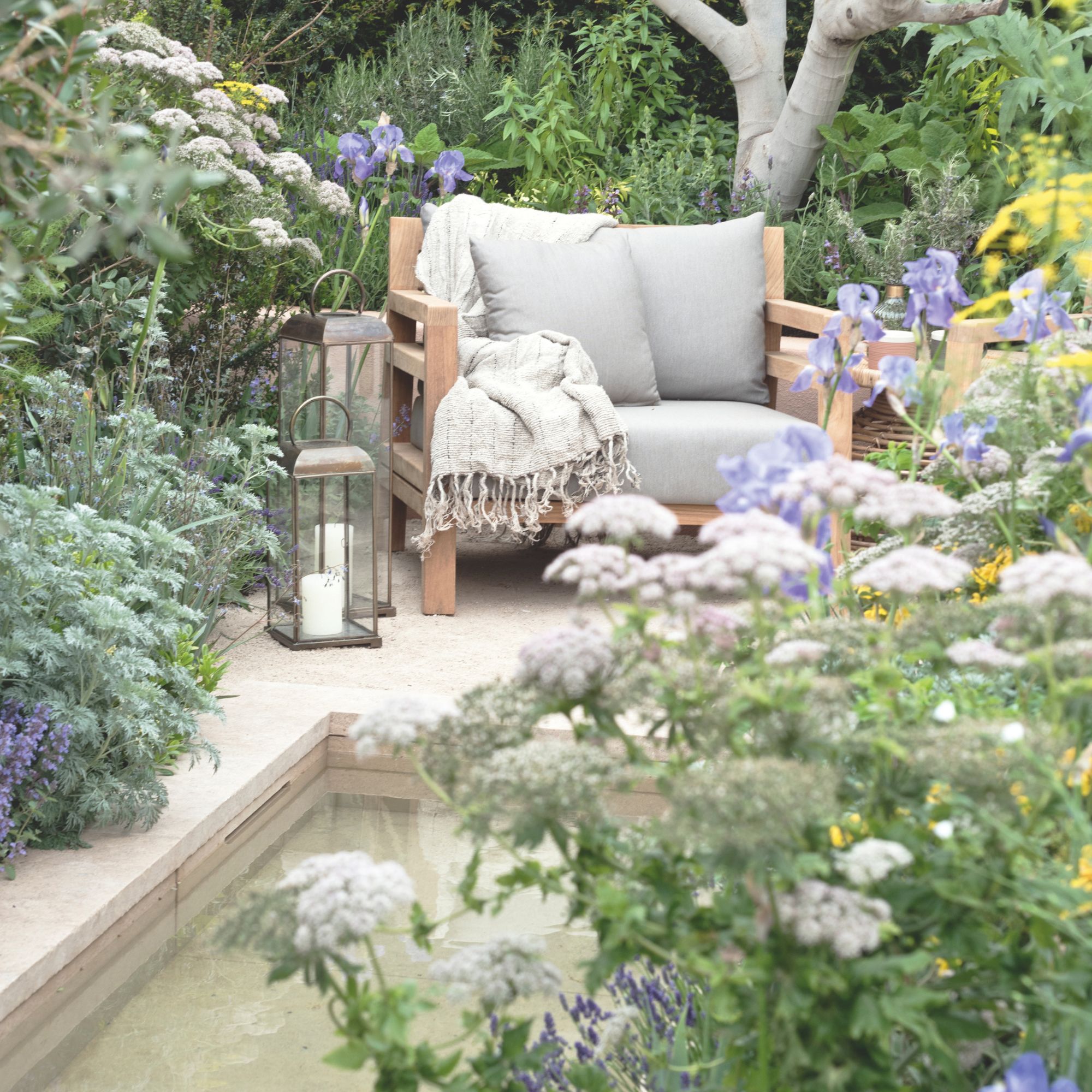 What is a ‘spa-den’? This emerging garden trend will transform your outdoor space into the ultimate space to unwind
Bring calm and relaxation to your garden
