A simple extension transformed this home from dark and cramped to light and bright
A spacious, light and bright rear extension had completely changed the way these homeowners live now
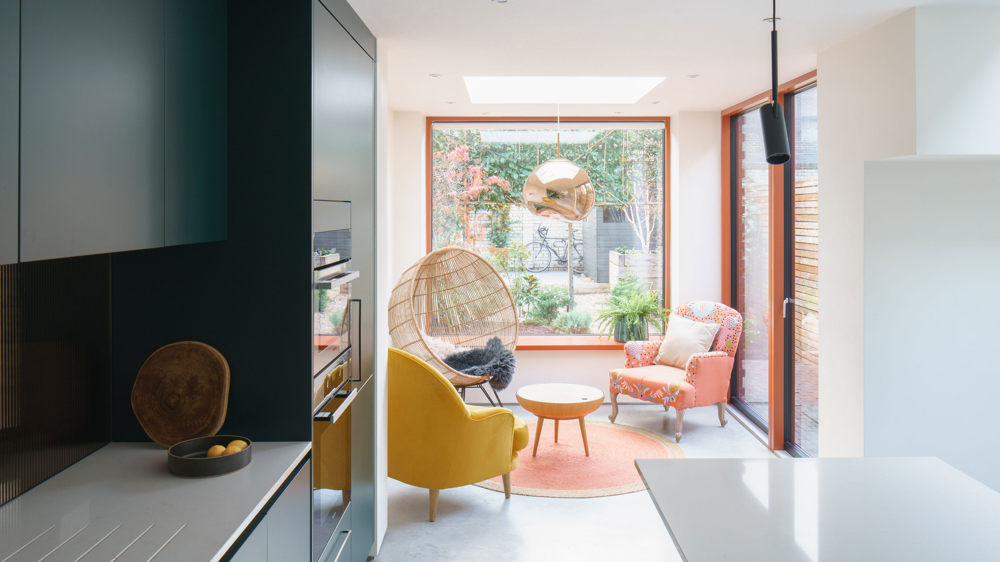

Victorian terraced properties are hardly known for being light and bright on the inside. The rooms tend to be small, lacking natural light and unconducive to modern family life. They're ripe for renovation, from small kitchen extension ideas to large rear property revamps.
This run-down mid-terrace house in East London was no different. The homeowners bought the property as part of a probate sale so it was in a very poor state of repair and was in dire need of refurbishment.
They enlisted the help of architect James Daykin of Daykin Marshall Studio to transform the property into one that would work for a young professional couple.
‘This property was like a time capsule. The previous tenant had been in it practically all her life and she was in her 90’s when she sadly passed away. It hadn’t been touched since she moved in, so it was a blank canvas in that respect,’ explains James.
‘The survey identified that the only part of the house that was in good repair was the outside bathroom!’ adds James.
The existing house was stripped back to the brick and required a deep retrofit to give the couple the energy efficient and modern home that they were looking for.
'A lot of natural light, and clean minimalist spaces was important to the owners,' explains James, 'so our brief was to put the house back together, improve insulation and services, and create more space and connection to the garden at the back of the house.'
Sign up to our newsletter for style and decor inspiration, house makeovers, project advice and more.
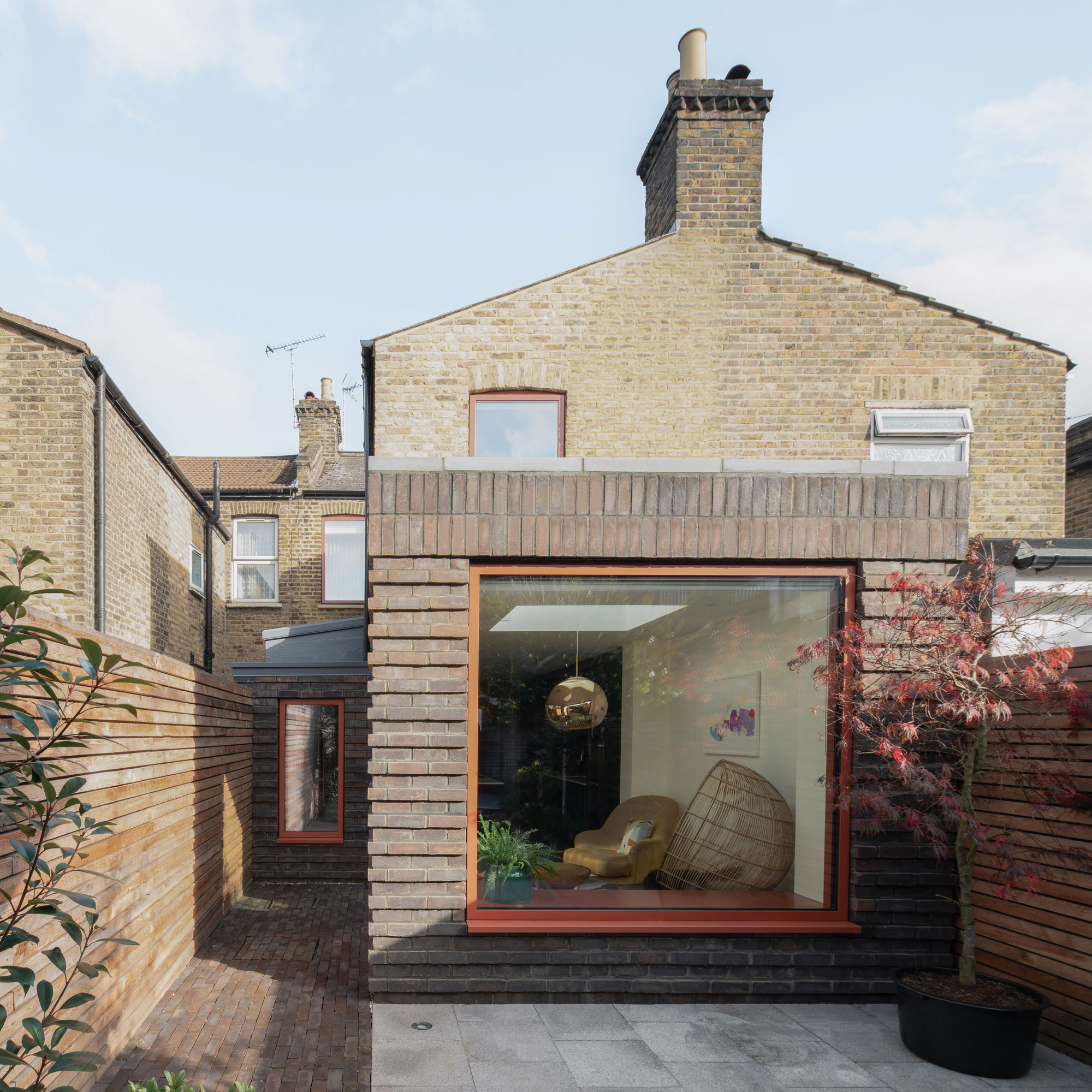
‘The original outrigger at the rear could not be saved, as there were significant cracks from subsidence,' explains James. 'This had to be demolished and a new garden and side extension were built, creating an open plan layout for a kitchen and dining space with a garden-facing snug.
'The extension walls are built in brick to reflect the original house and complement the surrounding buildings, continues James. 'Overhead glazing and simple, large format, triple glazed windows maximise the space and light.’
On the upper level, the remodelled third bedroom, overlooking the garden, is now a modern home office when the couple work from home. The garden path was made with the same brick used to build the new extensions, creating a seamless effect.
The homeowners are now delighted with their home's transformation into a light and bright space. 'The house has been important in creating a post-pandemic working environment for the couple,' explains James, 'as they now work in the new third bedroom upstairs overlooking the garden and in the open plan dining area, while in summer they work outside in their garden.’
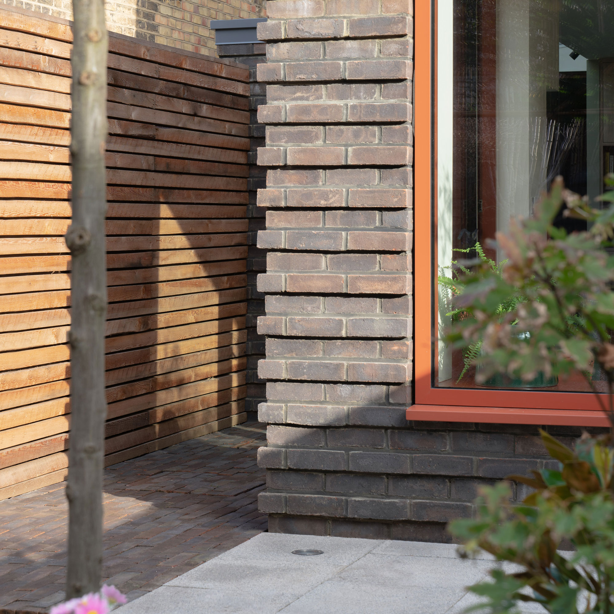
The new cavity walls of the extension are blockwork with a brick outer layer that compliments the original house and blends in with the neighbouring properties.
The terracotta colour of the external window frames was the homeowner's idea and was chosen to contrast with the darker toned brick. The same colour has been used on the frames internally to tie in with the colour palette of the interiors.
A new UK-made brick was used for the garden extension. Architect James was keen to create something bolder, that would give the extension a character and texture, so they came up with the idea of a horizontal ribbing effect by stepping the brick in and out by 25mm on alternate courses to get a corduroy-like pattern.
Clever use of stepped levels means the low wall permitted on the boundary with the neighbour doesn’t limit space or effective height inside.
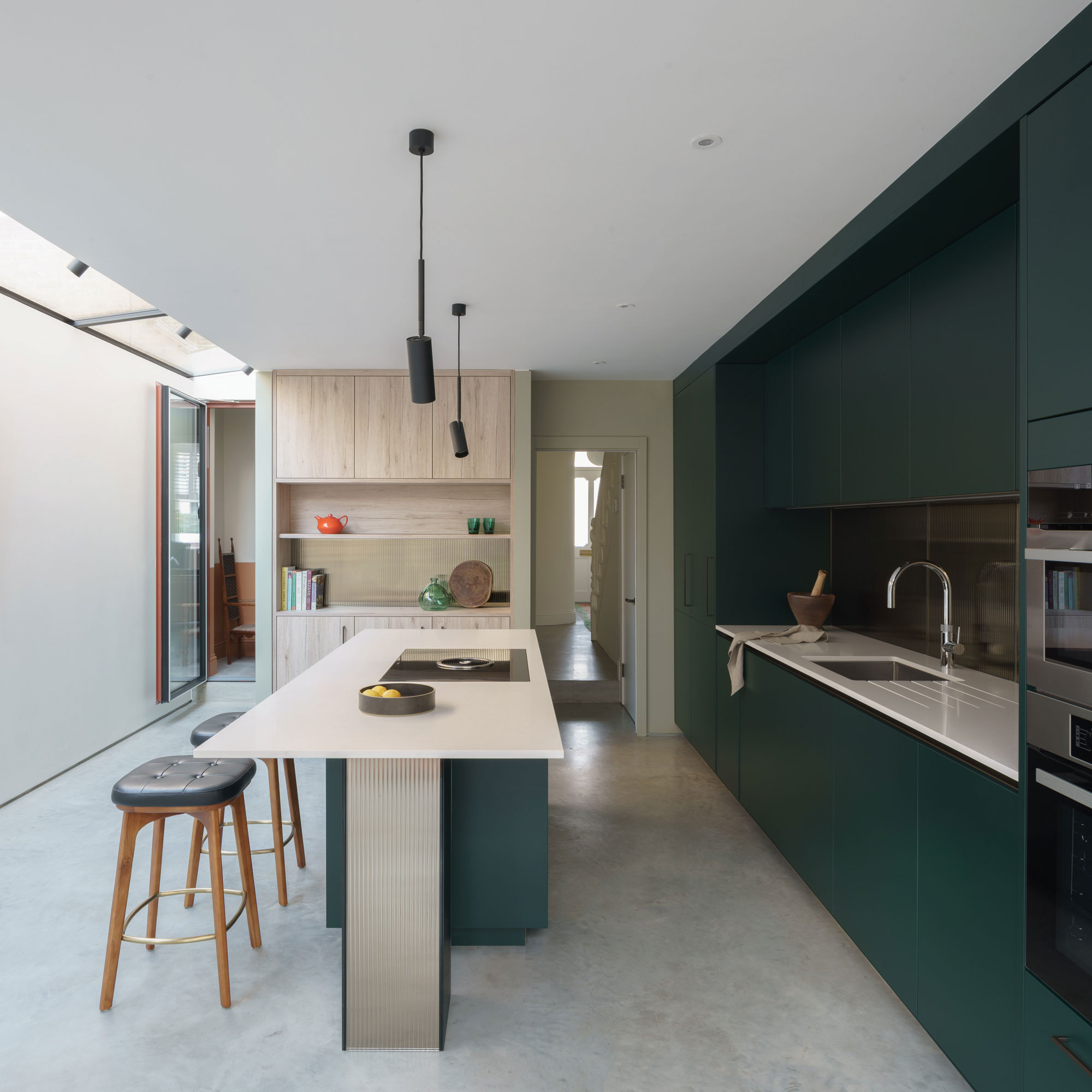
The kitchen has been dropped down by a step to meet the planning regulations and planning permission regarding height in terms of the new side extension.
This was achieved by digging down into the kitchen floor. The step between the old house and new kitchen dining area has worked well for the couple. It creates the feeling of leaving one space in the traditional house and stepping into the new contemporary space with its contrasting character.
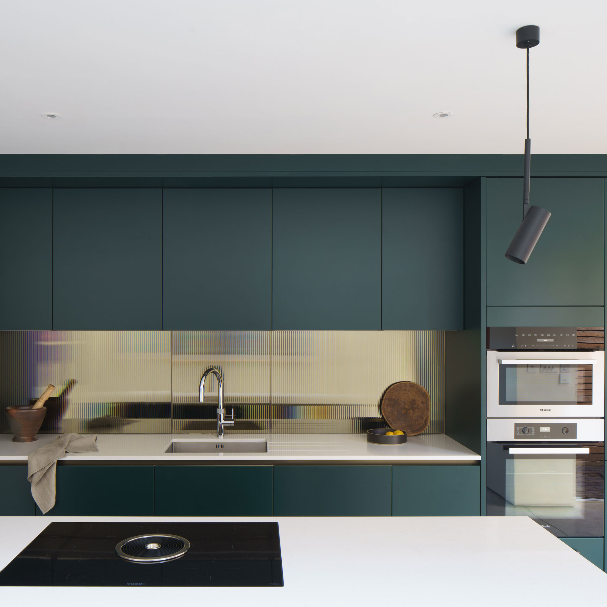
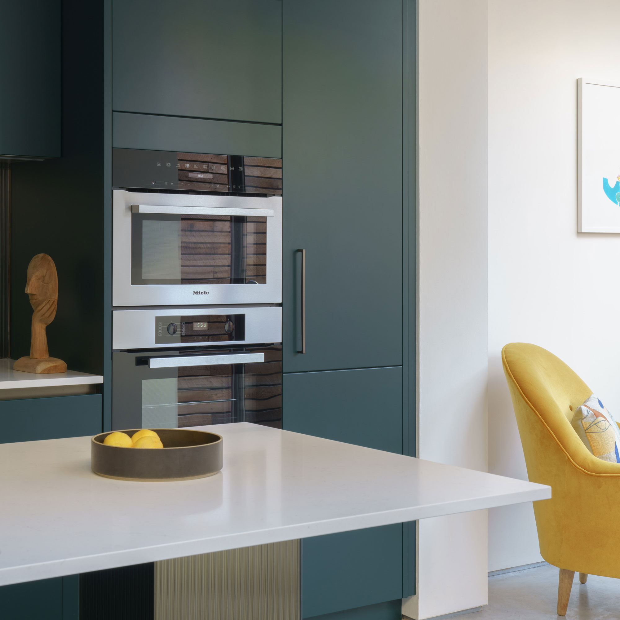
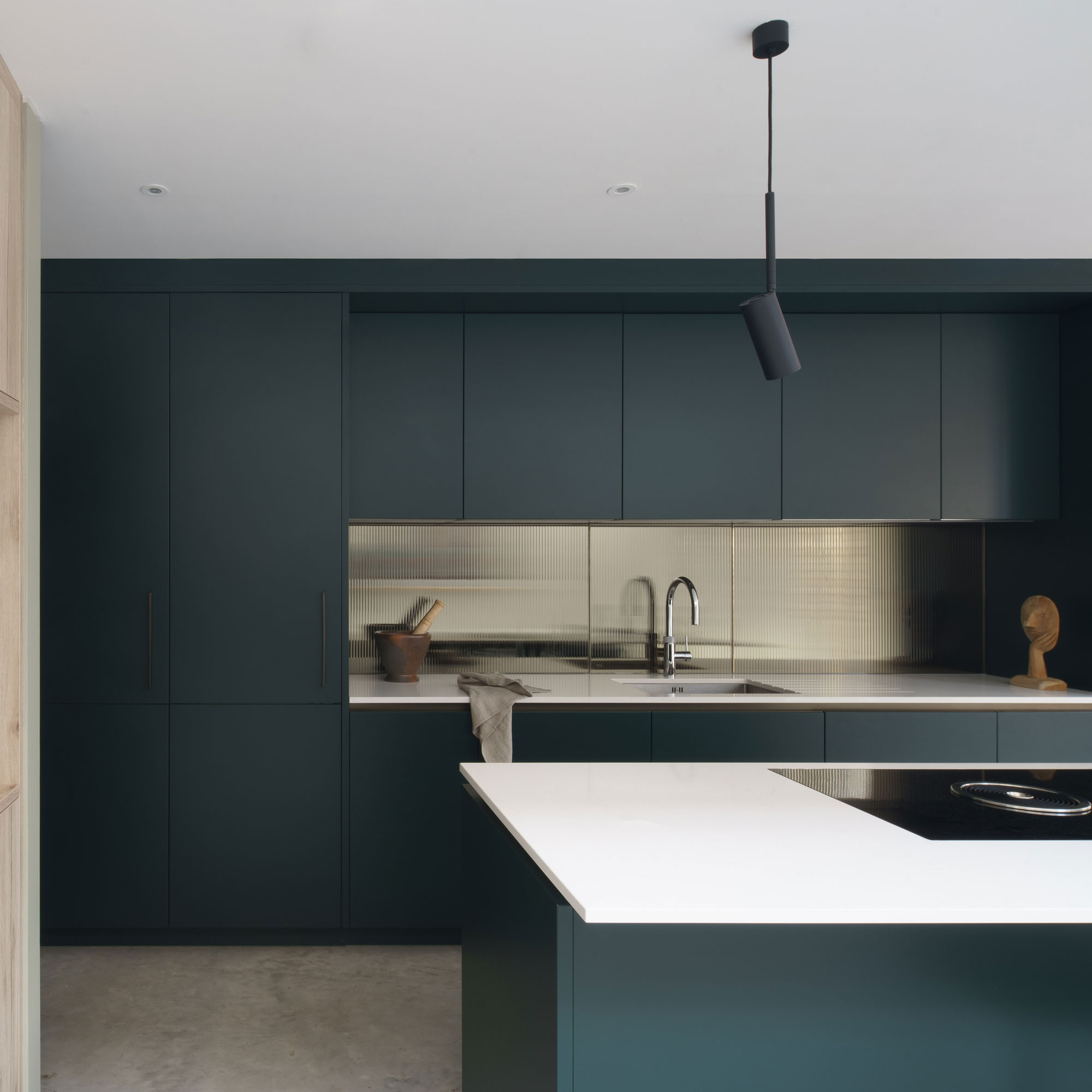
The kitchen company and the architects worked closely together to create a design that was integrated into the couple’s vision. The bold forest green kitchen ideas were chosen by the homeowners to contrast with the pale colours in the rest of the space.
Contemporary finishes include a polished concrete screed floor throughout the ground floor, atop the underfloor heating. This creates a seamlessness between the traditional house and new kitchen/dining/sitting area.
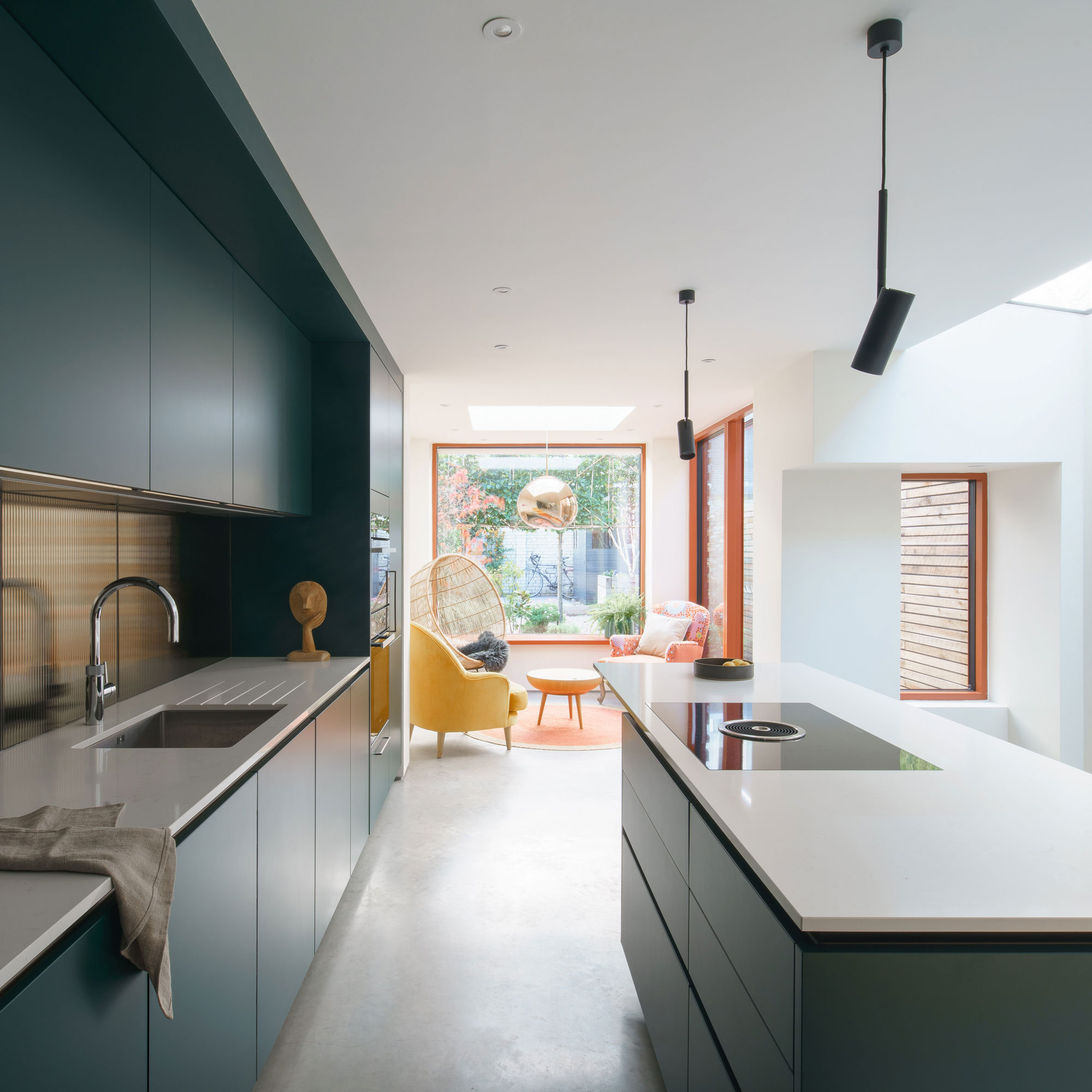
Simple, large format, triple glazed windows – with a bright, terracotta frame colour – bring lots of light into the space and are more cost effective than the typical giant sliding or bi-fold doors typically installed in extensions.
Large format windows were chosen over sliding doors to both extensions. ‘In British weather you sometimes like to feel self-contained and you don’t necessarily need glass that goes down to the ground to have a view out,’ explains James.
‘With the rear extension we brought the glazing up to create a window seat, so that you can sit right up to the edge, making the most of the space. If you’ve got bi-fold doors or sliding doors you can’t put furniture in front of them, so you can’t go up to the edges of the room,' adds James.
Art Deco-style metallic back painted fluted glass detailing adds a subtle decorative touch as the sink splashback and side panel to the island. This main island, which the couple sometimes use as a workspace, features a composite worktop.
The bespoke cabinetry was built by the main contractor in limed oak to create the clean, minimalist finish that the couple sought in their original brief.
The property before works began
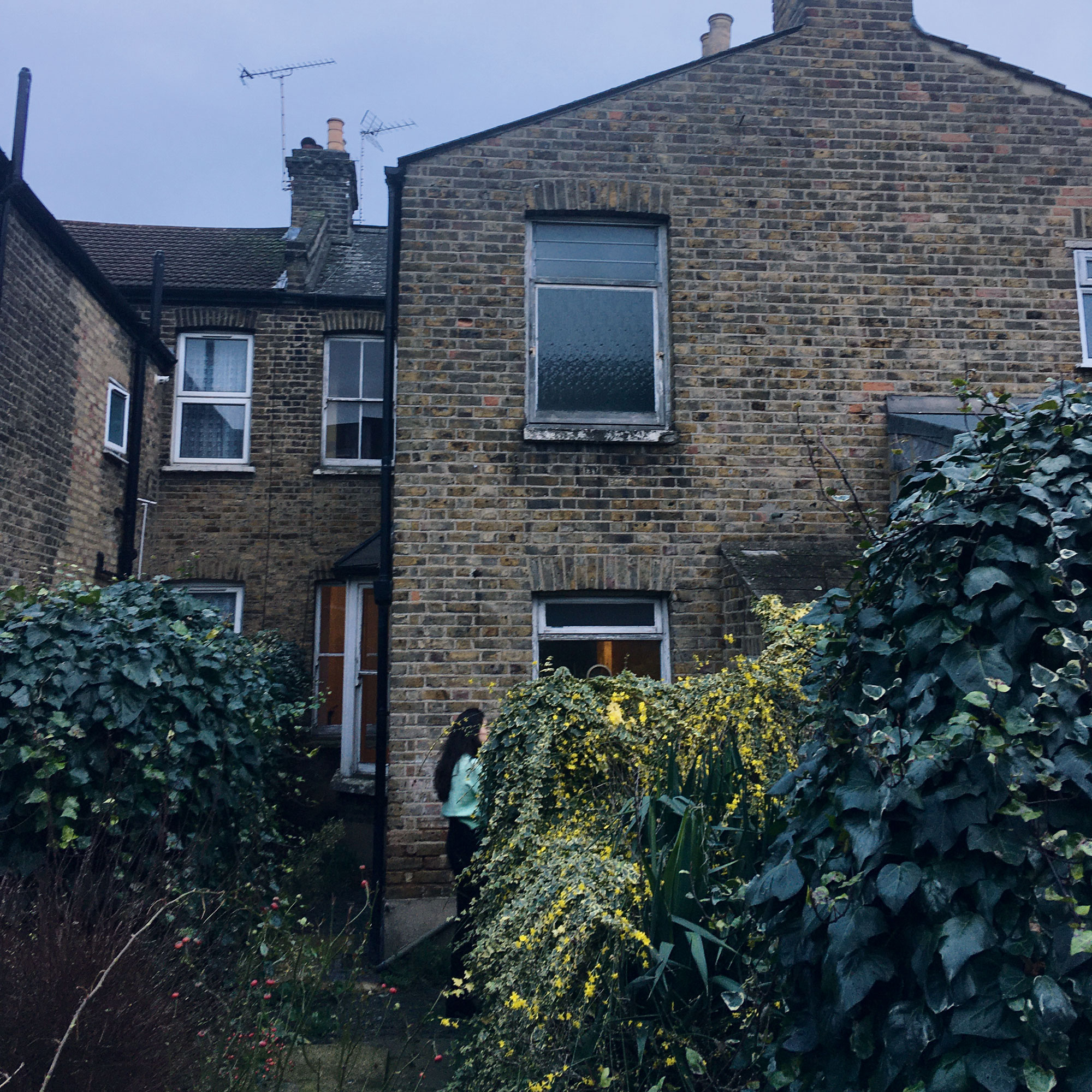
When the couple bought the house, it hadn’t been touched since the 1960s, and there was no connection to the garden, making the rear spaces dark and cramped.
Focus on: Rooflight boxes
Architect James Daykin shares his wisdom on how to speed the application process up
- SEEK ADVICE It should be simpler and more straightforward, but the planning process can be complex and unclear, even for private homes. So if you don’t have experience, take advice from an architect or planning consultant.
- LOCAL RESEARCH Check local records of recent comparable applications to see what has been allowed or refused helps you understand what could be possible, or where you might need to make a careful argument. If you’re planning something significant, always consider pre-application advice from the council and you may want to seek the support of your ward councillor.
- PROTECTED PROPERTY OR AREA Do you live in a conservation area or is your building (or one nearby) listed? These classifications make a big difference to what you are likely to get permission for.
- PERMITTED DEVELOPMENT Also known as PD, it sets out what changes and additions you can make to your home without full planning permission. Limits are set by dimensions (heights, areas, volumes), so check your designs carefully. Protected properties or areas typically have more limited or no permitted development rights.
- SPLIT APPLICATION Sometimes parts of your project may be better split into different applications. For example, on this project the loft (not yet built) and rear extension were allowed under permitted development and the side return was passed through a planning application.
With contributions from Caroline Ednie

Ginevra Benedetti has been the Deputy Editor of Ideal Home magazine since 2021. With a career in magazines spanning nearly twenty years, she has worked for the majority of the UK’s interiors magazines, both as staff and as a freelancer. She first joined the Ideal Home team in 2011, initially as the Deputy Decorating Editor and has never left! She currently oversees the publication of the brand’s magazine each month, from planning through to publication, editing, writing or commissioning the majority of the content.