This modern terraced extension is a prime example of how to update a classic design successfully
By adding this contemporary terraced extension, these homeowners have updated the original design with a sympathetic new look

Ifeoluwa Adedeji
Building a standard terraced extension wouldn't have done this property justice as the previous additions to this five-bedroom Edwardian property in southwest London had proved.
The owners - a couple with their two young children - longed for a bigger kitchen that befitted their large property, as the existing one was cramped, disconnected from the rest of the house. As kitchen extension ideas go, all they wanted is what every young family does - a roomier space to cook, dine, entertain, as well as a clear path to their outdoor space.
The original kitchen lacked direct access to the rear garden, a must for the kids. In order to get outdoors, you had to either go via an old patio door from another room or an old (and cold) sun room/porch area.
The couple enlisted the help of architect and co-founder of Abhr_a, Alex Bilton who worked closely with them to create a new extension while taking into account the existing traditional terraced layout that was sympathetic to the existing terraced formation of the neighbouring properties.
Here, Alex, explains how he and his practice came up with their unique design and what obstacles they had to overcome when creating it.
‘We began by knocking down the existing kitchen and old extension and then added a larger six metre deep extension,’ explains Alex from Abhr_a Architects.
‘As the terraced houses along the road follow a stepped design, we had to carefully consider how to create the large open plan space that the owners wanted, without impacting on the neighbours too much.'
Get the Ideal Home Newsletter
Sign up to our newsletter for style and decor inspiration, house makeovers, project advice and more.
Alex's top bit of advice when planning and working out how to build an extension if to get your neighbours on side from the outset. ‘Discuss your plans with your neighbours early to keep them on board, he says. 'If you can win them over, the build will be less hassle and save you money.'
A stunning, modern terraced extension
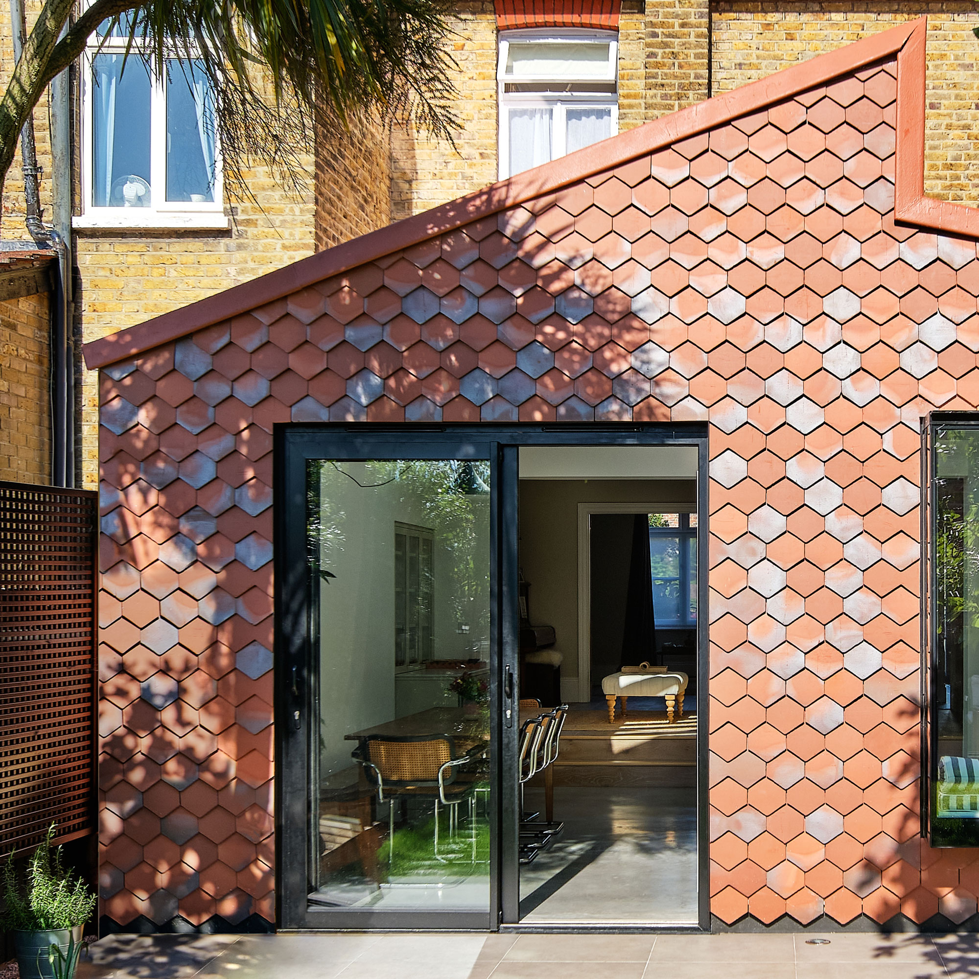
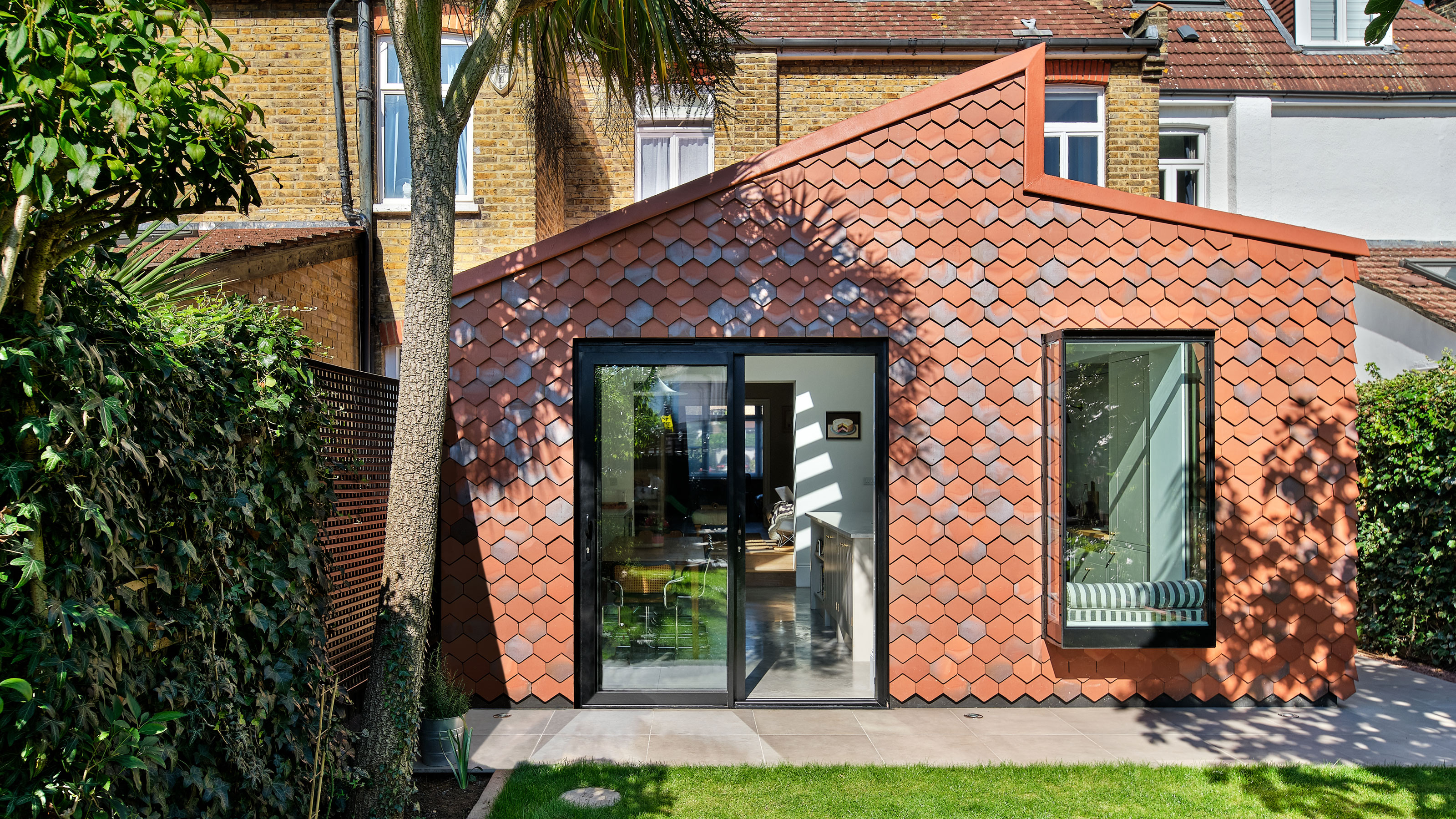
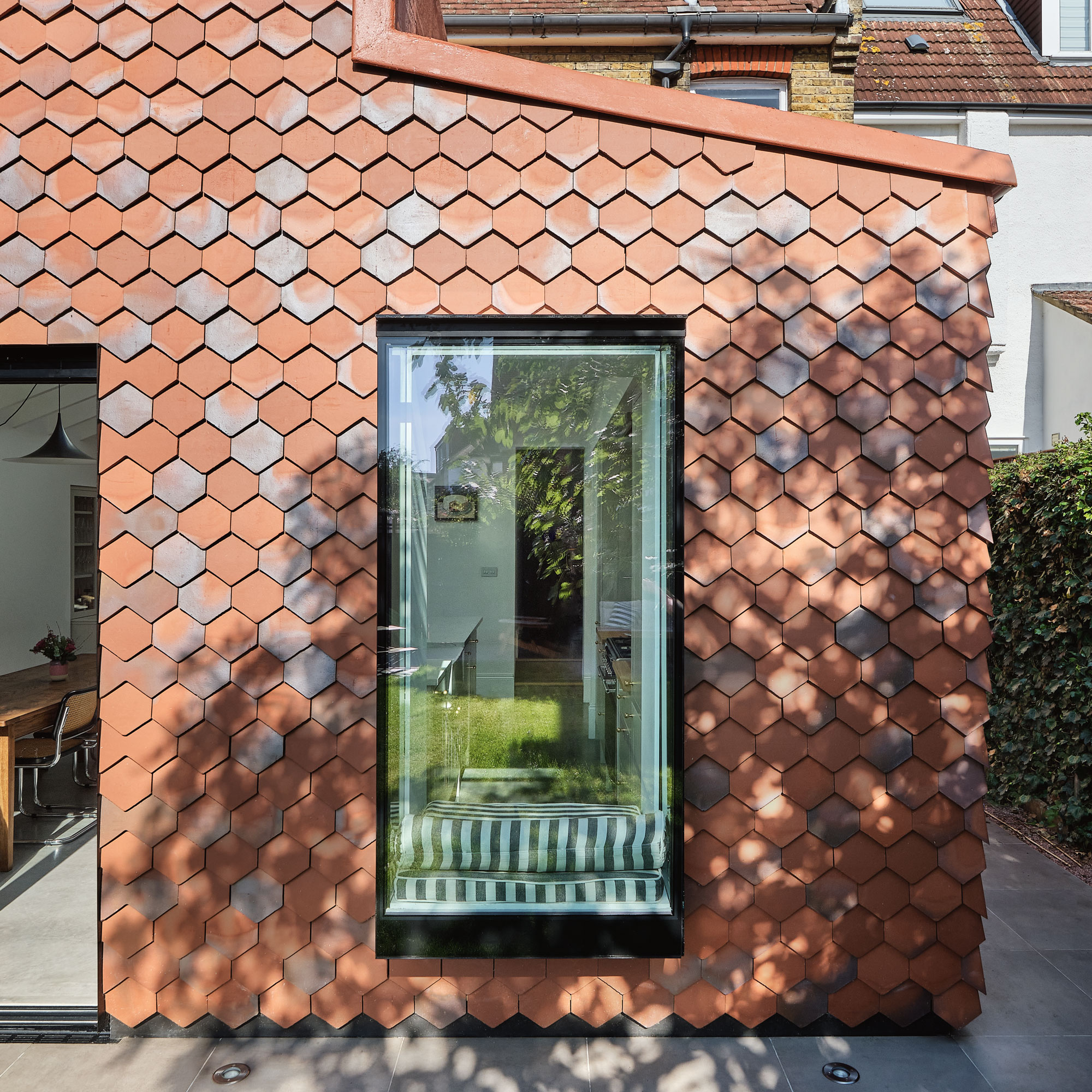
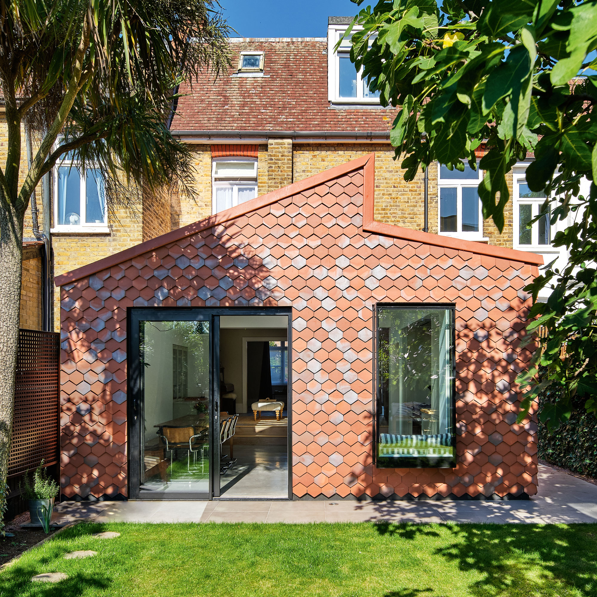
The new single storey extension, spans the full width of the garden. The architects have used a traditional style facade of hanging clay tiles in a mix of terracotta and grey hues to form a unique finish.
These arrowhead clay tiles have been used to create a hexagonal pattern across the rear extension to reflect the exterior cladding of the host building in a modern and original way.
The extension, although contemporary, sits perfectly in the period context with the considered design ensuring that it is not jarring.
The open plan kitchen diner
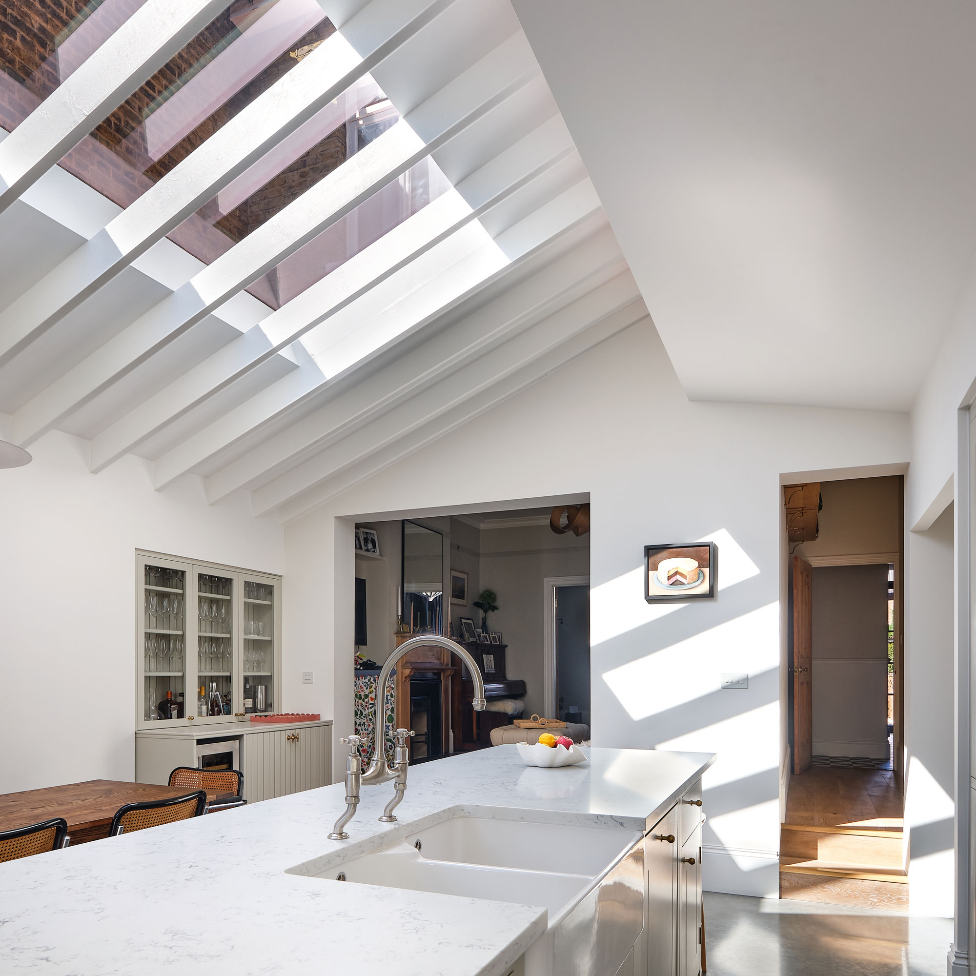
'We stepped the footprint of the building away from the boundary to create a nook for a pantry off the kitchen,' explains Alex. 'We then pitched the roof to slope towards each neighbour to minimise the impact the extension would have, as well as lower the height of the eaves at the boundary.'
'The new open plan space is split in two - a dining space on one side, with a built-in kitchen alongside a kitchen island idea on the other. The tall kitchen units and the bar area are positioned under the lowest part of the roof at the perimeter with an island in the tallest part of the extension.'
'We used glazing to give character to each of the zones,' continues Alex. 'Above the dining table, the roof structure is exposed to give character to the ceiling and steal some height. A five-metre long high-level clerestory window allows shafts of natural illumination spill into the space.'
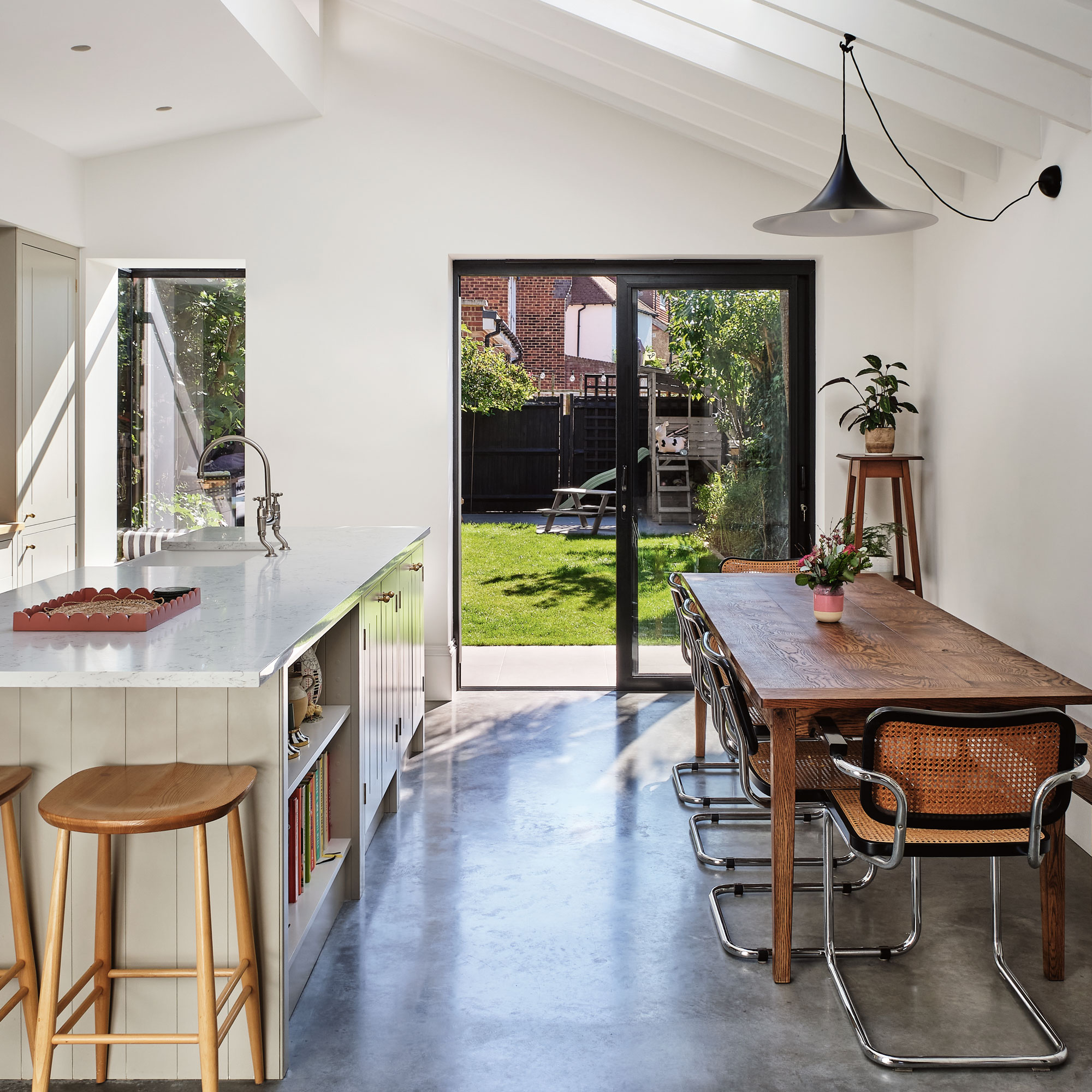
A poured concrete floor is comfortable underfoot with the addition of underfloor heating and complements the interior scheme, a mix of the industrial, contemporary and period.
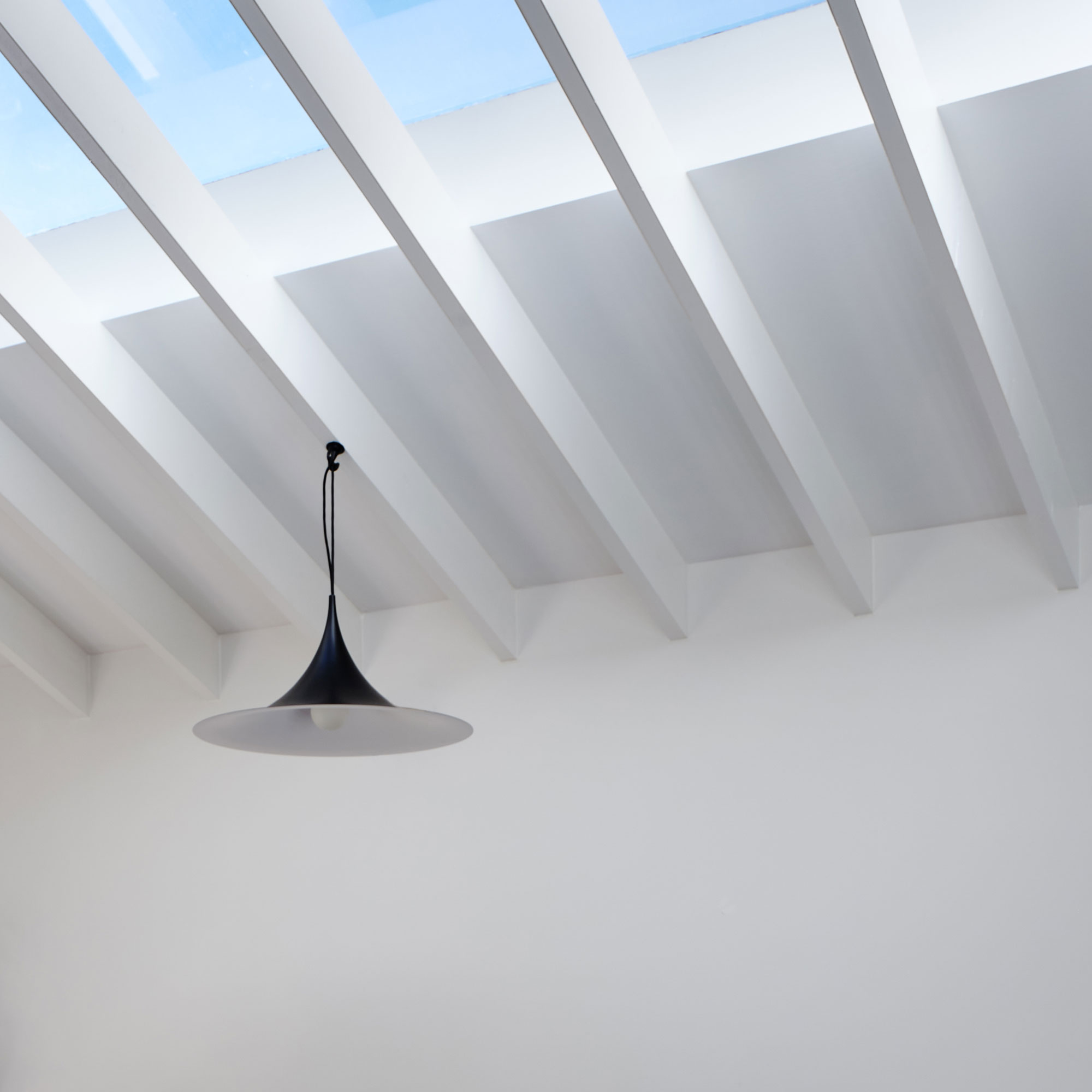
One of the key requests from the owners was to create a liveable space with copious amounts of light. The roof has been designed to allow further glazing to be installed in the form of clerestory windows so that natural brightness can penetrate further into the plan. These fixed skylights and rooflights ensure the space benefits from passive solar gain in the winter.
Keeping the decor neutral was important to the homeowners and you should always stipulate this with your designers in order to make your open plan kitchen work for you.
The smart kitchen-diner combines warm wood materials that soften the stark white walls and beams. The layout is set up to encourage you to focus on the views out towards the garden.
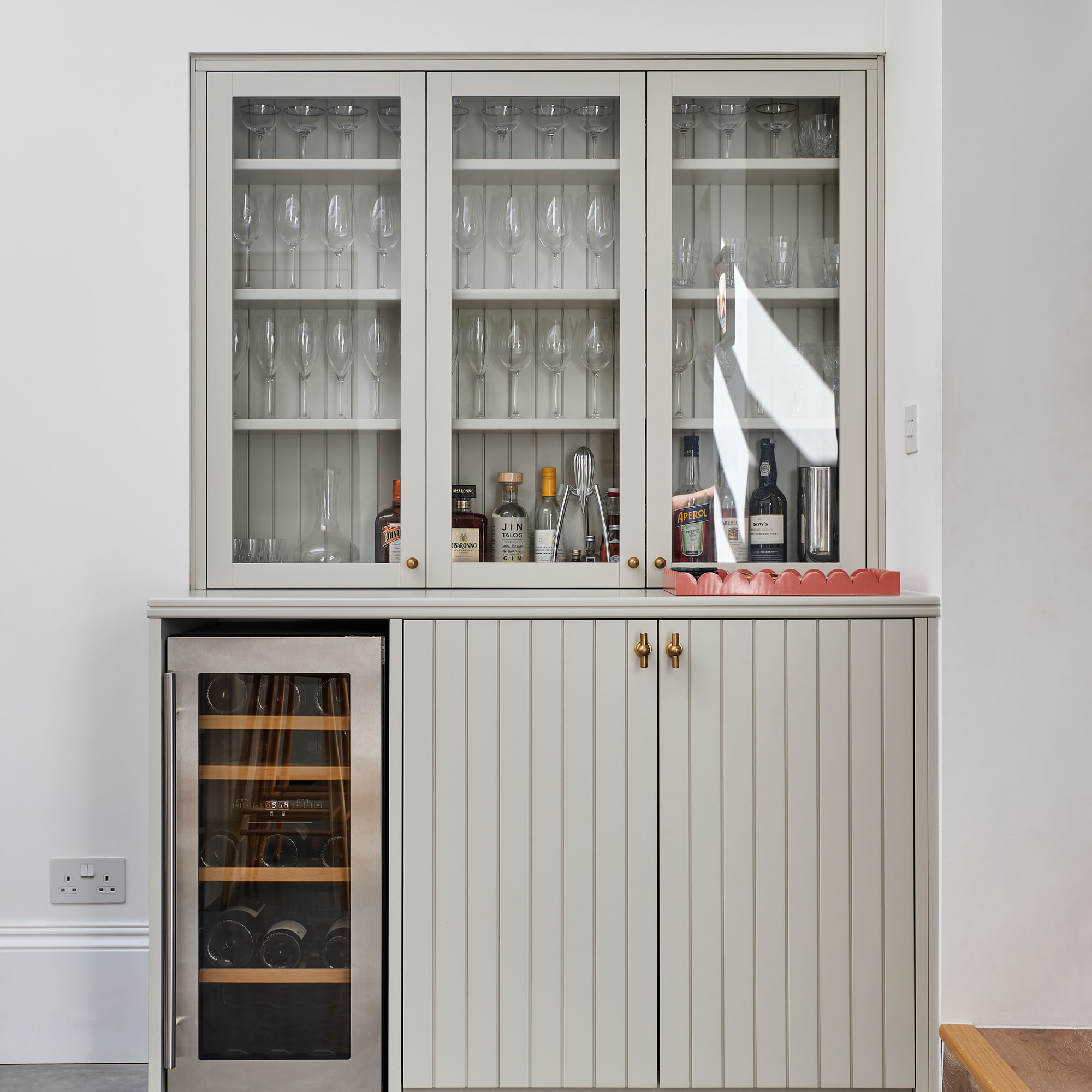
Built-in storage and a best wine fridge elevate the interior finish and maximise on the room available.
Here, the niche has been filled with a bespoke unit that matches the kitchen cabinetry, which was chosen because it offers a unique, modern take on the classic shaker kitchen style.
The unit was designed into the layout from the beginning, with the space created as the result of the challenge to limit the extension’s impact on the neighbouring properties.
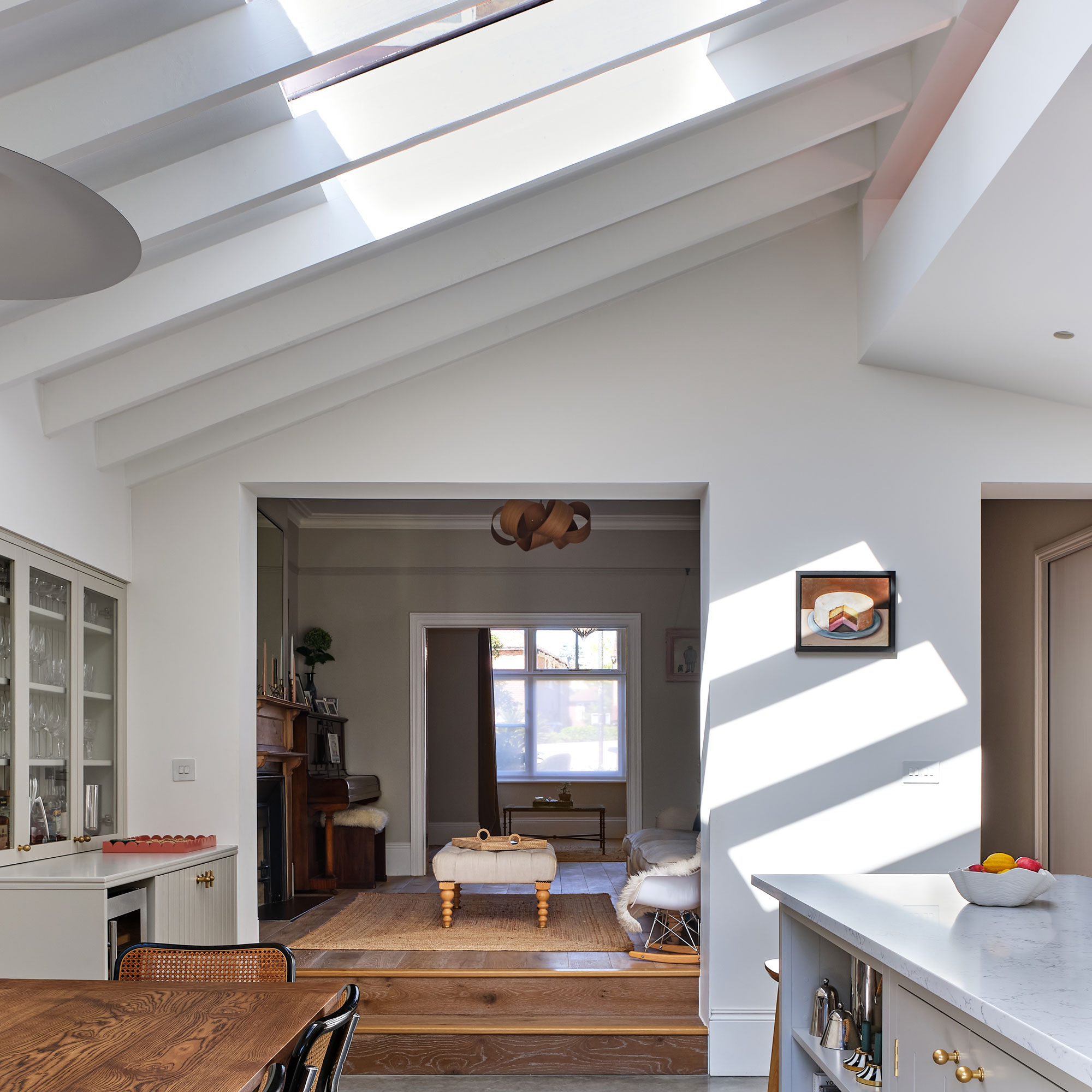
Views back into the original part of the building are uninterrupted by visual barriers, but demarcated with the use of timber flooring in the living area. There are two separate openings, lead from the original part of the property into the new kitchen-diner.
The larger opening connects the existing formal living room, while a narrower doorway leads to the entry hall that contains the staircase taking you to the upper levels of the property.
The steps leading back up separate and help define the areas further. While the cleverly positioned glazing helps transport light through to the front of the property.
The central island has further storage that helps the space remain tidy keeping the space free of distractions.
The kitchen island
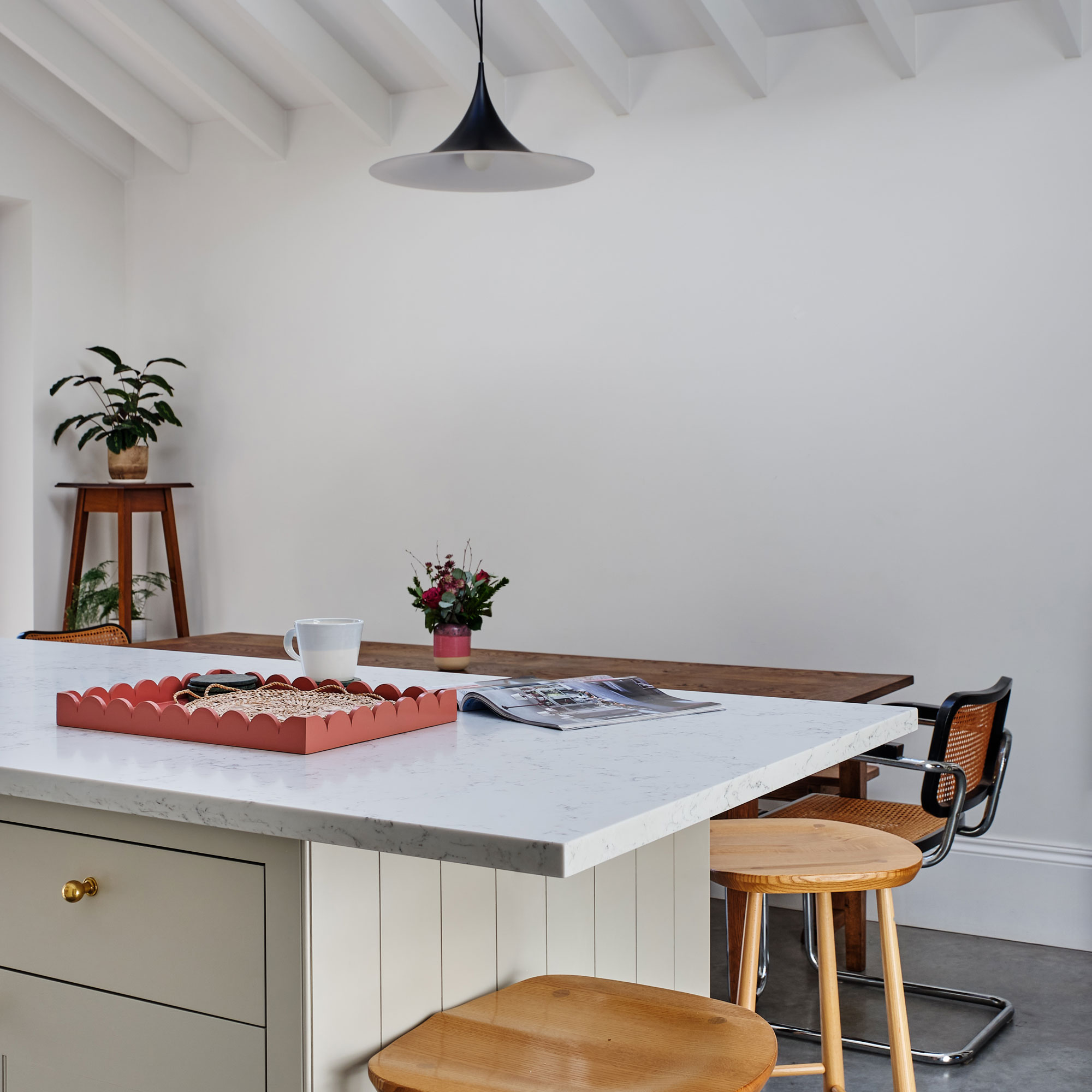
A central kitchen island is key to this communal space, offering a practical area to prep and cook meals, while simultaneously encouraging group conversations to centre around the unit.
The two best bar stools are ideally positioned for intimate dinners or quick catch-ups with friends and family while enjoying cups of tea and coffee. The kitchen island presents a less formal space to dine right at the heart of the home.
The window seat
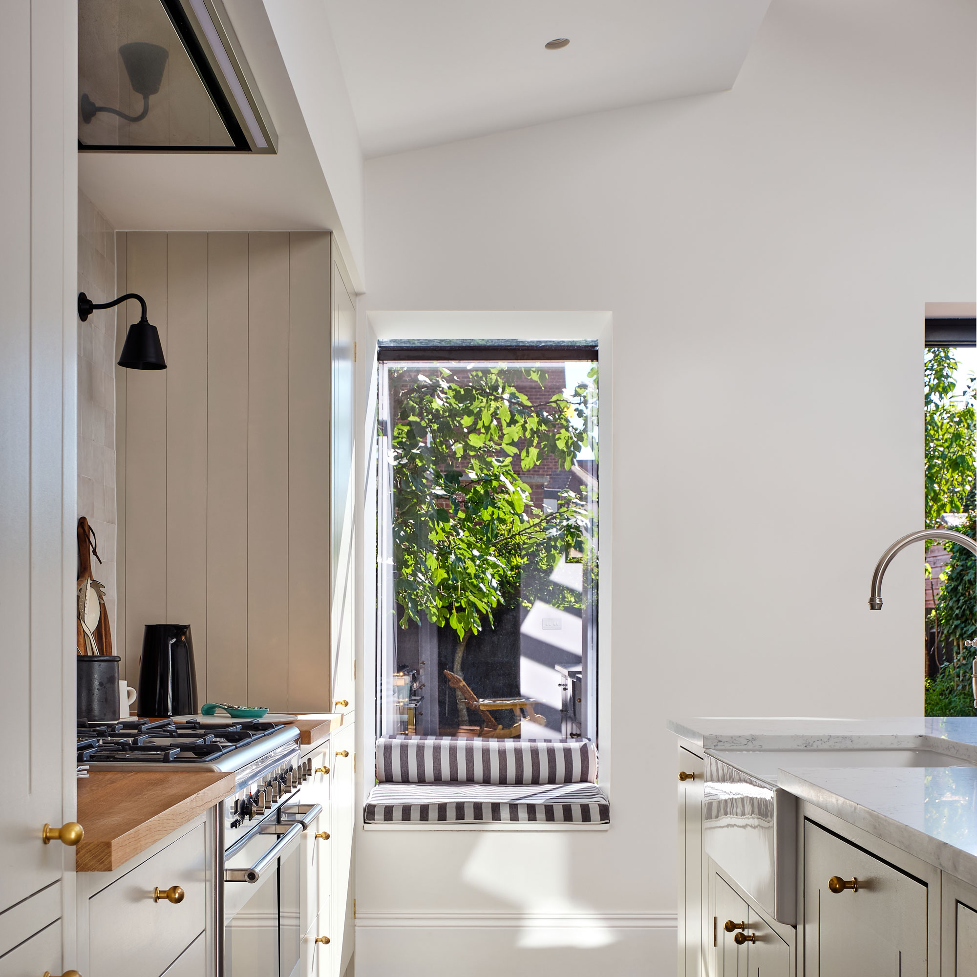
An oriel window enables the occupants to enjoy the garden space even in winter as it protrudes into the external space, connecting the two areas to make it seem like you’re sitting in the garden. The bespoke window seat offers more space for guests to relax while food and drinks are being prepared for entertaining.
The path to the window seat is clear of obstruction and has been designed to invite individuals to sit and enjoy the space. The cooking area features versatile cladding, a nod to the period heritage, which complements the modern shaker style.
The property before works began
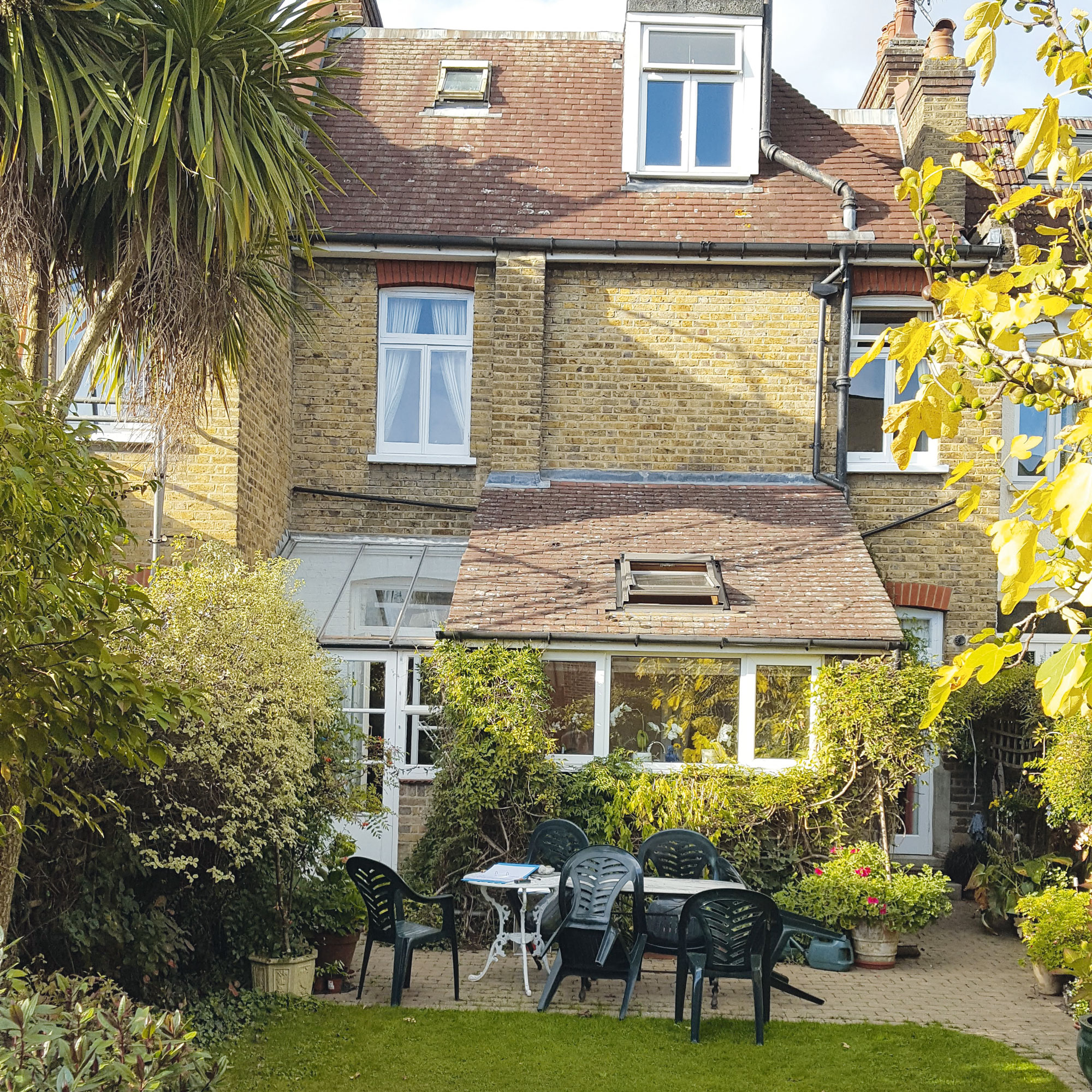
The property is located in a conservation area and is a typical Edwardian terrace with a pitched roof. It had an existing rear extension that didn’t connect well to the garden and internally was slightly disjointed.
The homeowners wanted to rejig the layout and create an extension that would be distinctively modern while celebrating the traditional elements of the existing building.
Focus on: Extension roofs
Architect Alex Bilton shares his top tips and ideas
- Angled design makes it easier for rainwater, debris and snow to drain away from the roof, which means that these are less likely to build up in your gutters and cause blockage.
- Expose the timber or steel structure in key areas to add texture to the ceiling or zone the internal spaces.
- Position skylights over a dining table or island to create a focal point, but make sure to consider where the lighting will be positioned.
- Embrace existing level changes beneath the roof by adjusting the height accordingly to create higher ceilings in your extension.
- Make savings on your bills by adding insulation into the gap between the pitched roof and the internal ceiling or create energy by adding solar panels to the angled surfaces.

Ginevra Benedetti has been the Deputy Editor of Ideal Home magazine since 2021. With a career in magazines spanning nearly twenty years, she has worked for the majority of the UK’s interiors magazines, both as staff and as a freelancer. She first joined the Ideal Home team in 2011, initially as the Deputy Decorating Editor and has never left! She currently oversees the publication of the brand’s magazine each month, from planning through to publication, editing, writing or commissioning the majority of the content.
-
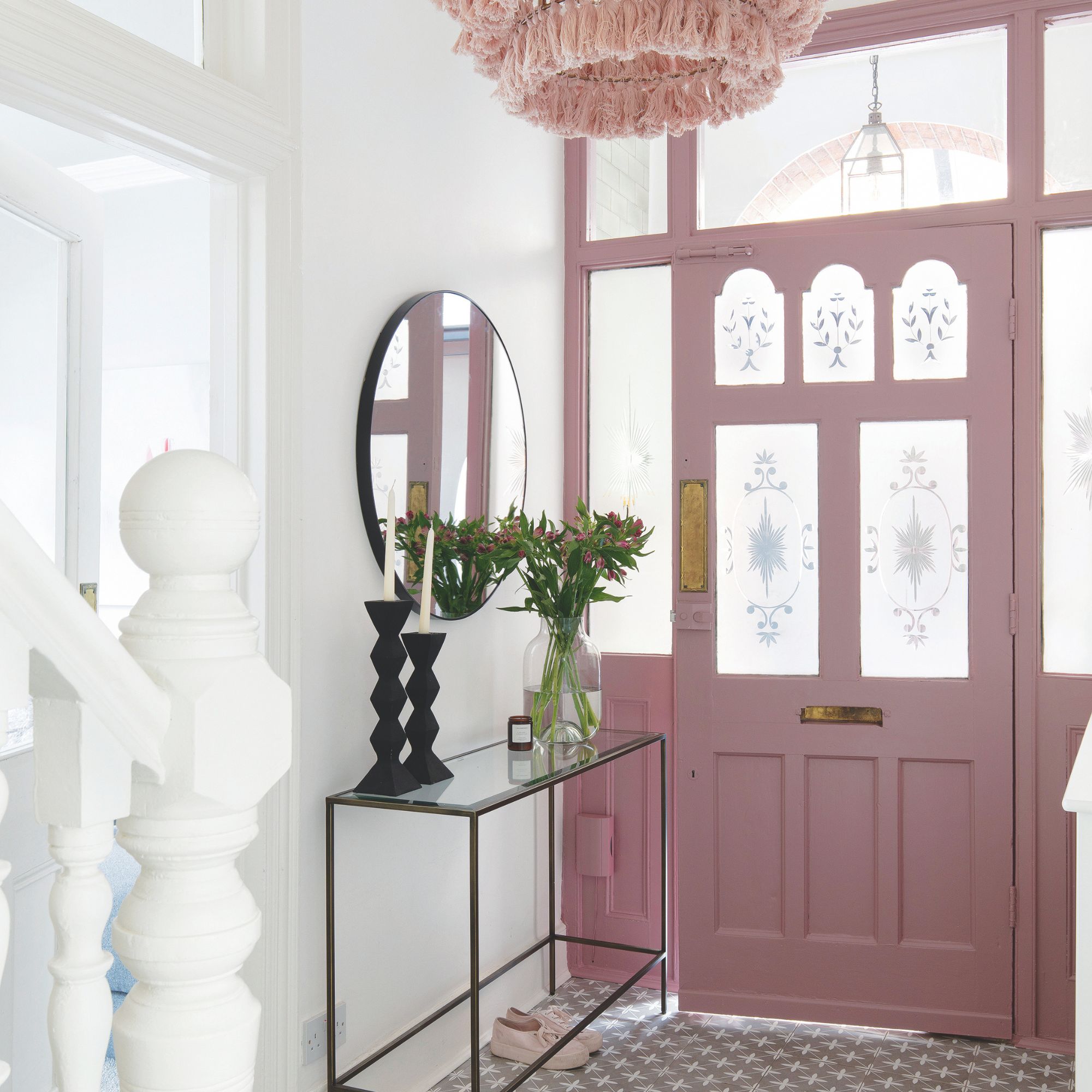 Should your front door colour match your hallway? Interior experts reveal 3 reasons why it should (and 3 reasons it shouldn't)
Are you team matching or contrasting?
By Ellis Cochrane
-
 This £200 limited-time discount makes this Dyson vacuum cheaper than I’ve ever seen it - run don’t walk to Argos for this bargain
It's the most affordable Dyson on the market right now
By Lauren Bradbury
-
 Martin and Shirlie Kemp’s pastel flower beds has given their Victorian renovation a romantic look - how you can get the look
Their pastel garden is the cottage garden inspo you've been looking for
By Kezia Reynolds