Small yet spacious, light and bright - this renovation ticks all the boxes
A clever redesign has transformed this cramped kitchen into a flexible multipurpose open-plan space, packed with natural light and storage

Ifeoluwa Adedeji
Sign up to our newsletter for style inspiration, real homes, project and garden advice and shopping know-how
You are now subscribed
Your newsletter sign-up was successful
When renovating old buildings, there are many issues that you have to deal with but one problem that tends to crop up the most is the layout. Traditionally, Victorian properties had small rooms - the smaller the space, the easier it was to heat.
The original layout of the rooms was also unusual - or at least unusual to today's standards - with a general lack of access to the rear garden.
This three-bedroom Victorian semi-detached maisonette apartment in South London was the perfect example of this - the rooms were disconnected, dark and dreary, urgently needing light and more flexibility befitting of modern life.
Article continues below 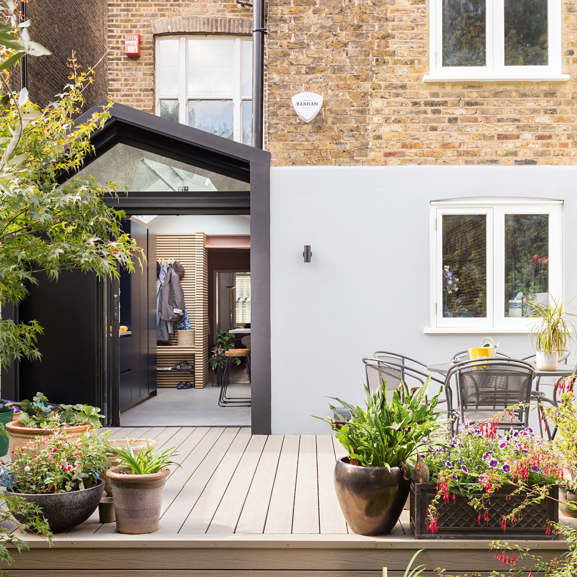
The owners were a couple whose children had long left home, and they had bought the maisonette in order to downsize. They could see the potential in the property, despit the dark cramped layout and enlisted the help of architect Lanre Falase at Bolans Architects to help create a new, more livable design.
Here, Lanre explains how when designing this kitchen extension, the combination of a well-planned space and natural light can make the world of difference to a home.

Lanre studied architecture at the University of Kingston, Oxford Brookes and the Architectural Association. He has worked within the design teams at Sir Nicholas Grimshaw and Partners, BDP (Building Design Partnership), as well as Carey Jones Architects.
Based in South London, Bolans is a family run, design-led team of architects, designers and surveyors with over 35 years combined experience.
'The maisonette apartment had no real connection to the beautiful garden beyond,' explains Lanre. 'In order to rectify this, we opened up the lower ground floor and introduced a number of multifunctional areas. We always try to utilise natural light as a material to create a better feeling of space and a connection to the outside.’
'Before work began,' he continues, 'the maisonette received very little to no natural light. We designed a new infill side extension with an elongated roof in the shape of a scalene triangle. The ridge rooflight forms a natural chandelier which provides a connection to the sky and draws natural light into the deeper parts of the subterranean space.'
Sign up to our newsletter for style inspiration, real homes, project and garden advice and shopping know-how
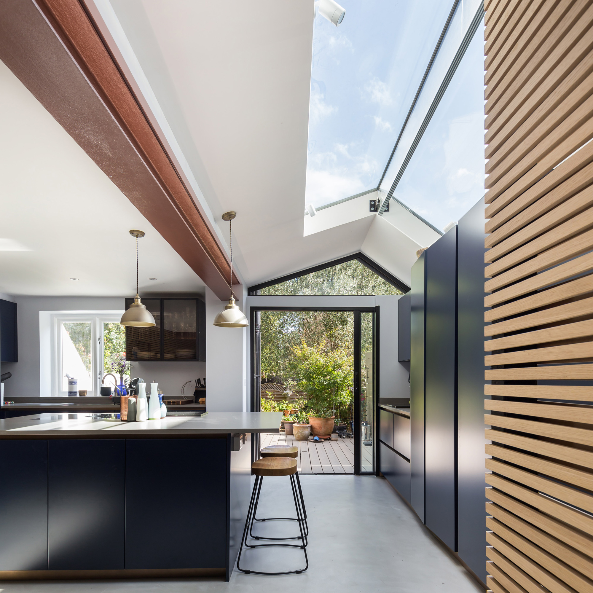
'The main roof of the extension,' continues Lanre, 'was raised to create a pitched roof with a larger than average 2.5m long ridge rooflight. This has doubled the height of the space and ensures more natural light reaches the lower ground area. To lessen any noise disturbance - a common side effect of multi-unit living - we introduced high-spec soundproofing.'
'New additional entrance points and connections to the garden have been key to the space's success,' explains Lanre.
'The kitchen space which now forms the heart of the home, acts as a social space for the homeowners, their grandchildren and guests alike. We have been able to create a multifunctional light and airy space that gives them the much-needed flexibility to use their space in a way that best serves them.’
A smart new space
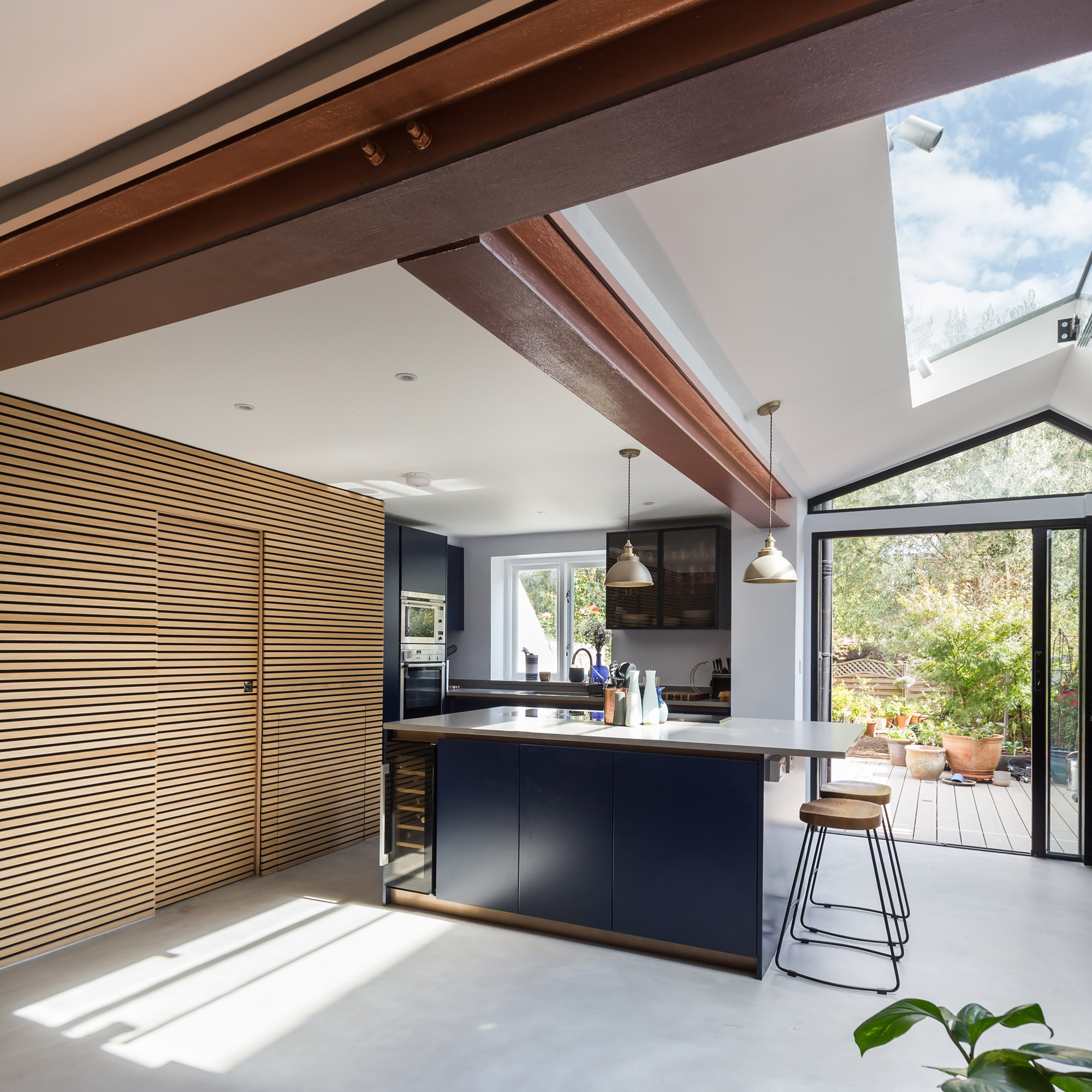
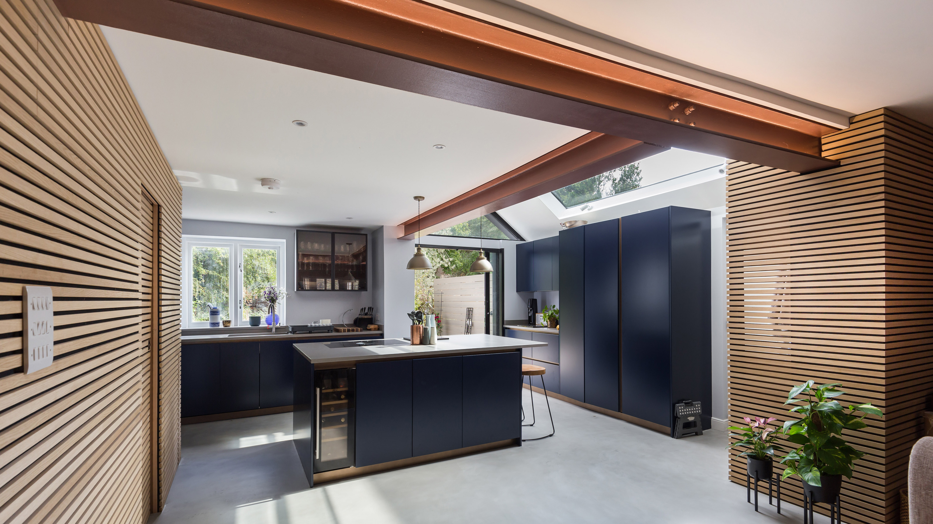
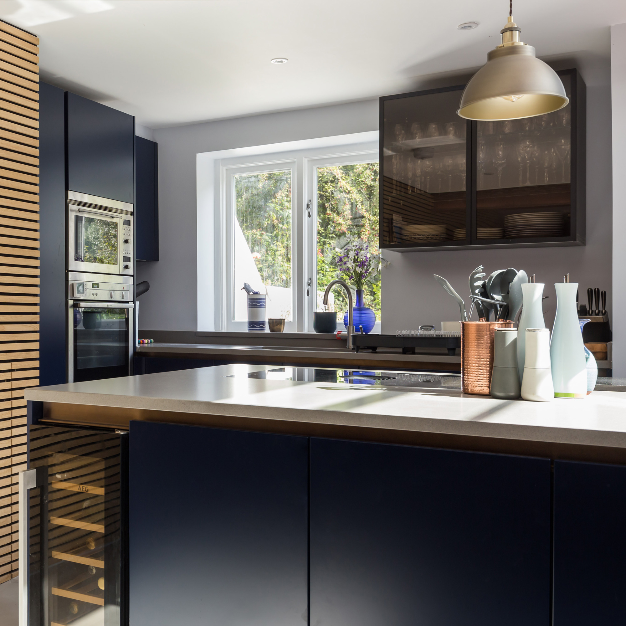
The new dark kitchen units provide a striking focal point in the airy space thanks to the large amount of natural light thanks to all the new glazing.
The contemporary style of the space is further evident in the microcrete floors and horizontal timber panelling on both sides of the space, mirroring each other with a strong sense of symmetry.
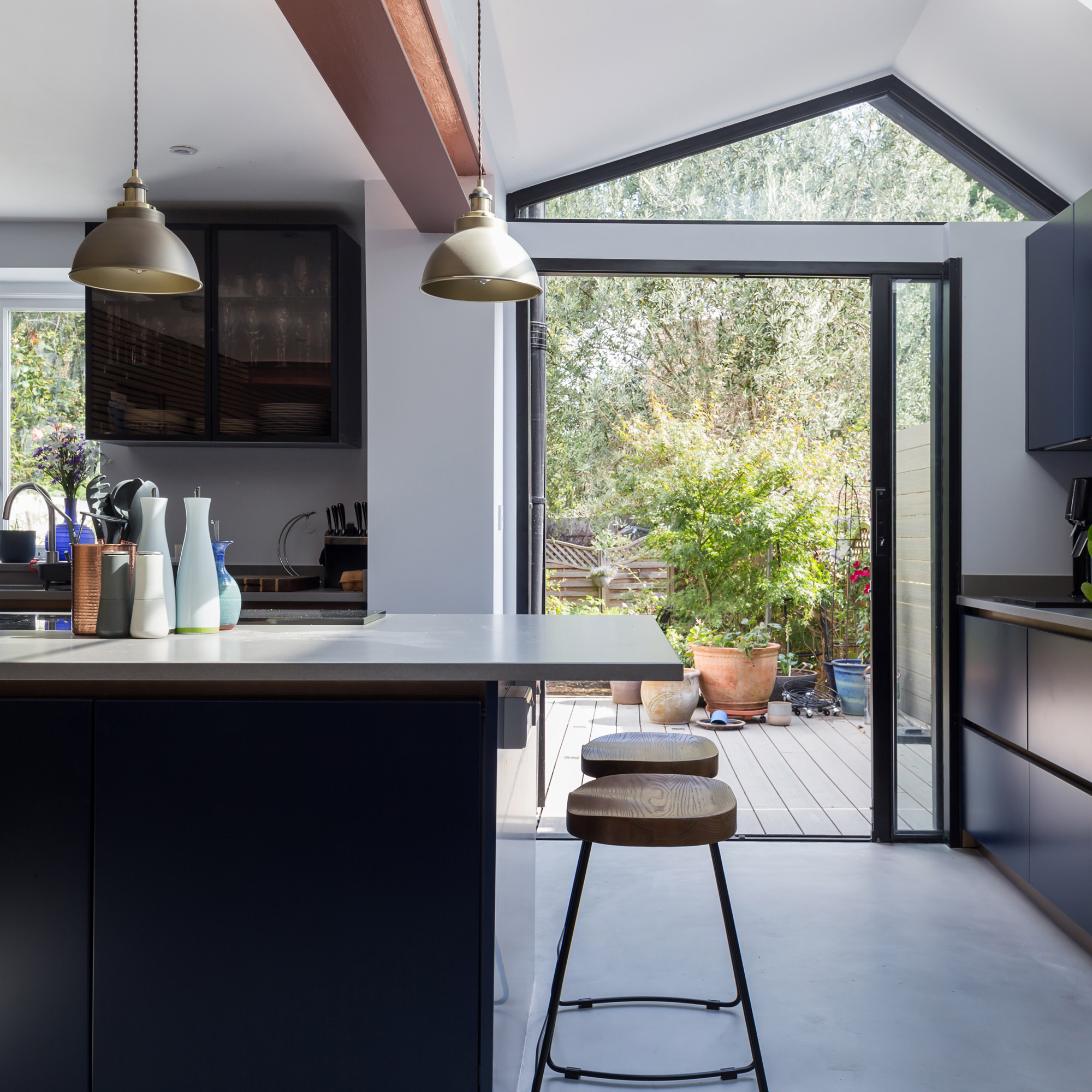
The large central kitchen island ideas which features an integrated wine fridge helps zone the kitchen area in the open plan space. The island adds more welcome counterspace in the compact kitchen area.
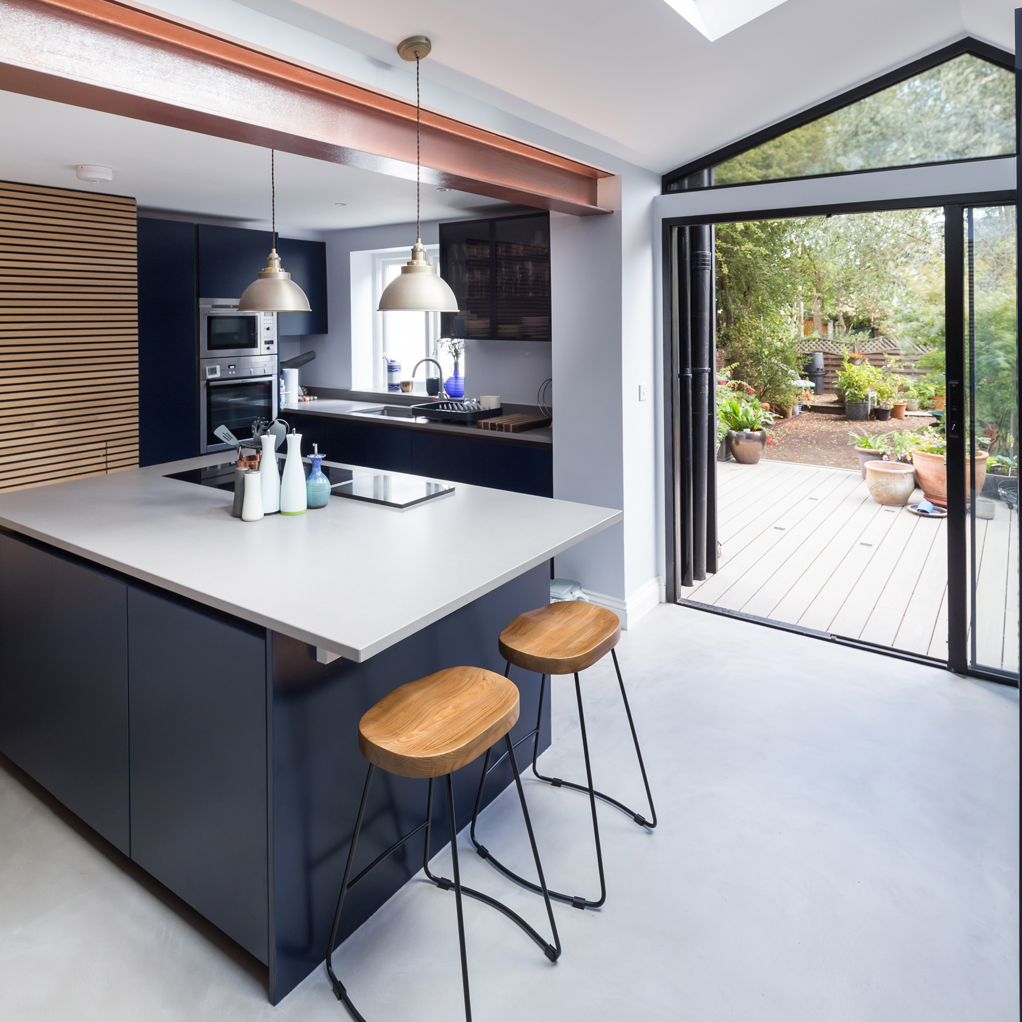
Two steel beams have been installed to support the upper floors of the maisonette. Instead of letting it blend in, this exposed steel work is highlighted for its architectural use and finished in a contrasting copper shade.
Light from above
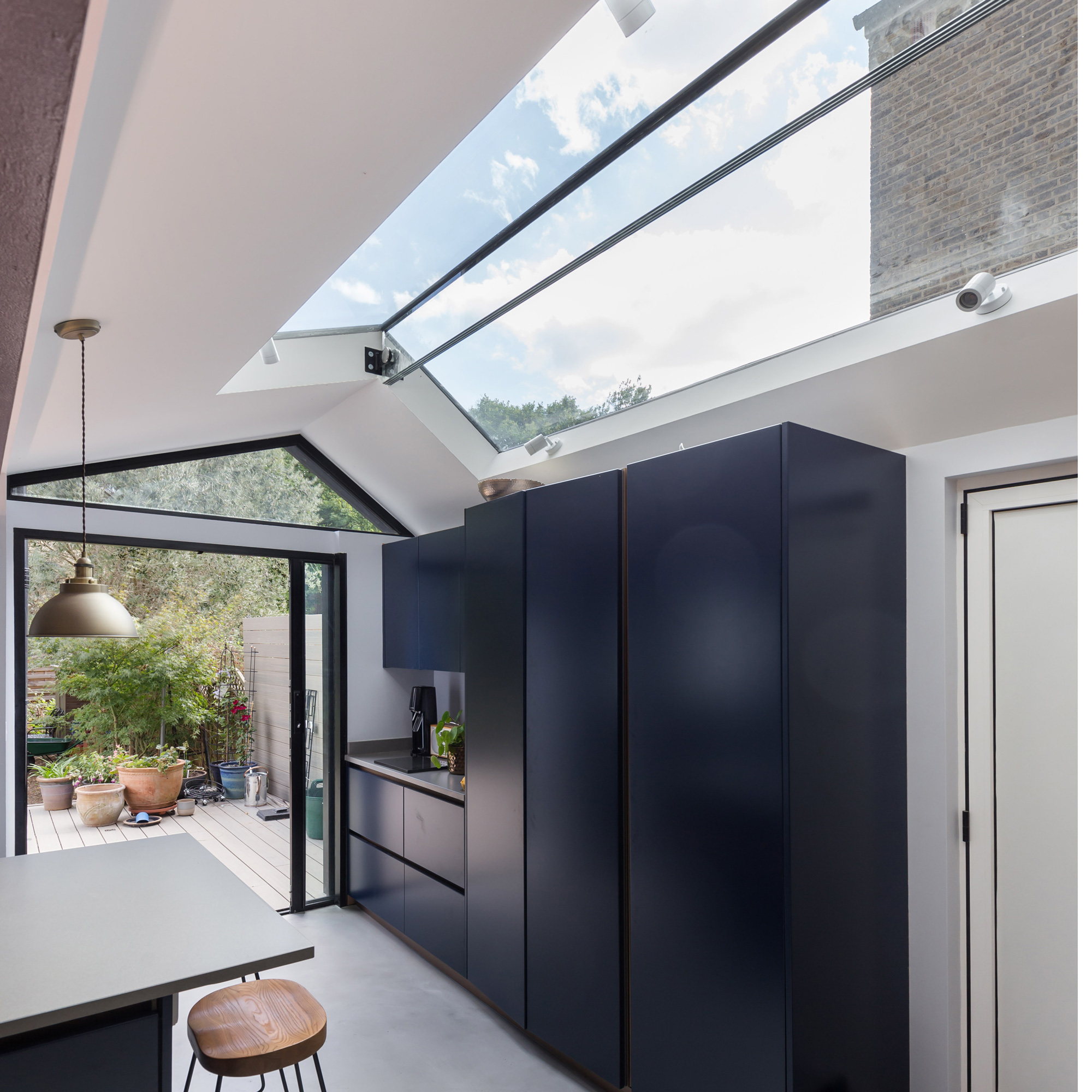
Apart from the kitchen cabinets, the rest of the space is decorated in a pale, neutral shades to let the sunlight that floods in from the rooflight and windows to fill the space as much as possible.
A large expanse of the side extension roof is glazed in order to provide views out and let light in. The pitched form of the skylight also adds interest to the space as the striking design draws the eye upwards and out.
Space-saving pocket doors
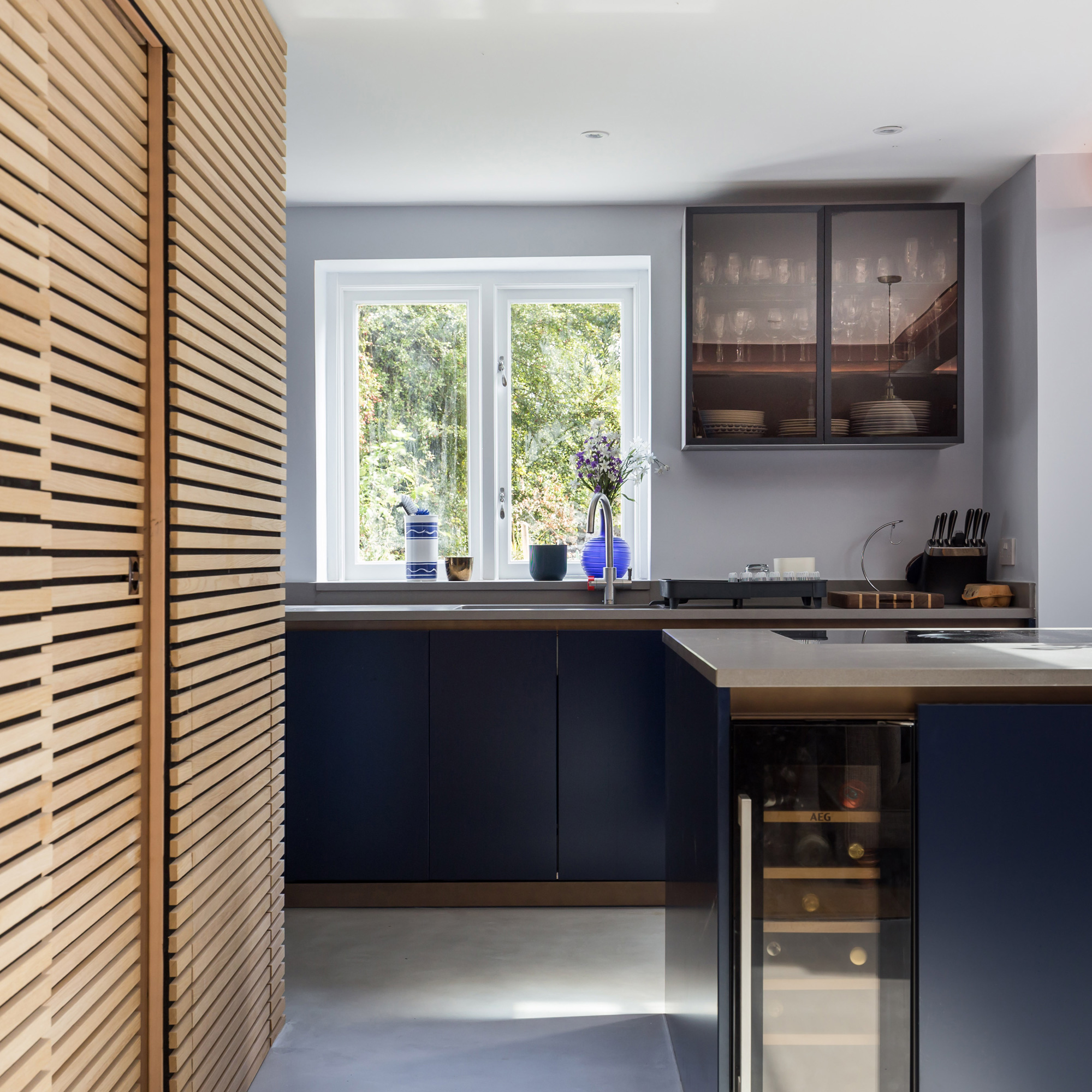
Large pocket doors provide level access to the new decked patio area of the garden. The aluminium frame unit slides away to provide a clear visual of the exterior space.
They instantly create an indoor-outdoor feeling within the space, further enhancing the sense of connection to nature.
This clever space-saving feature is a sleek modern addition that contributes to the clean and uncluttered aesthetic.
A compact cloakroom
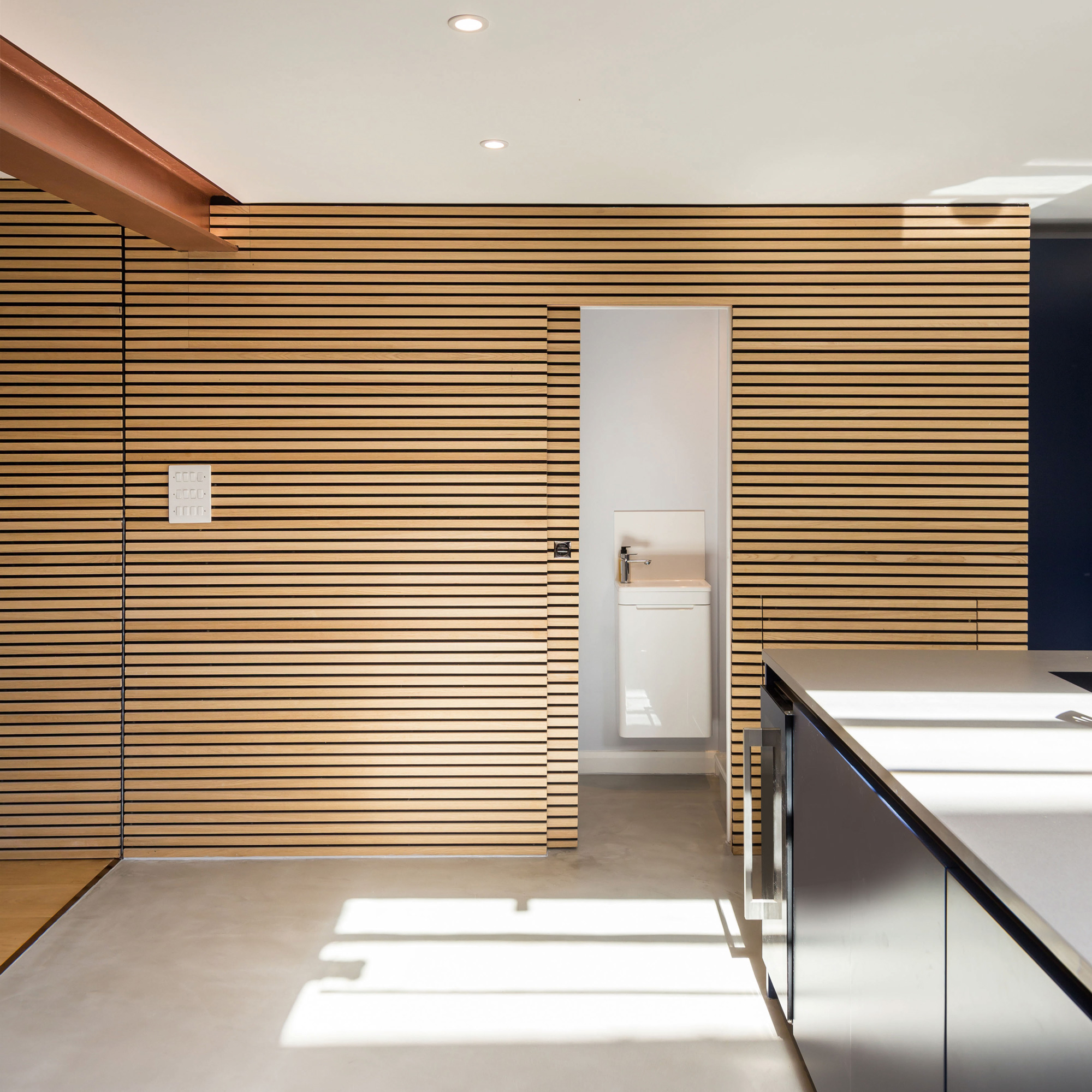
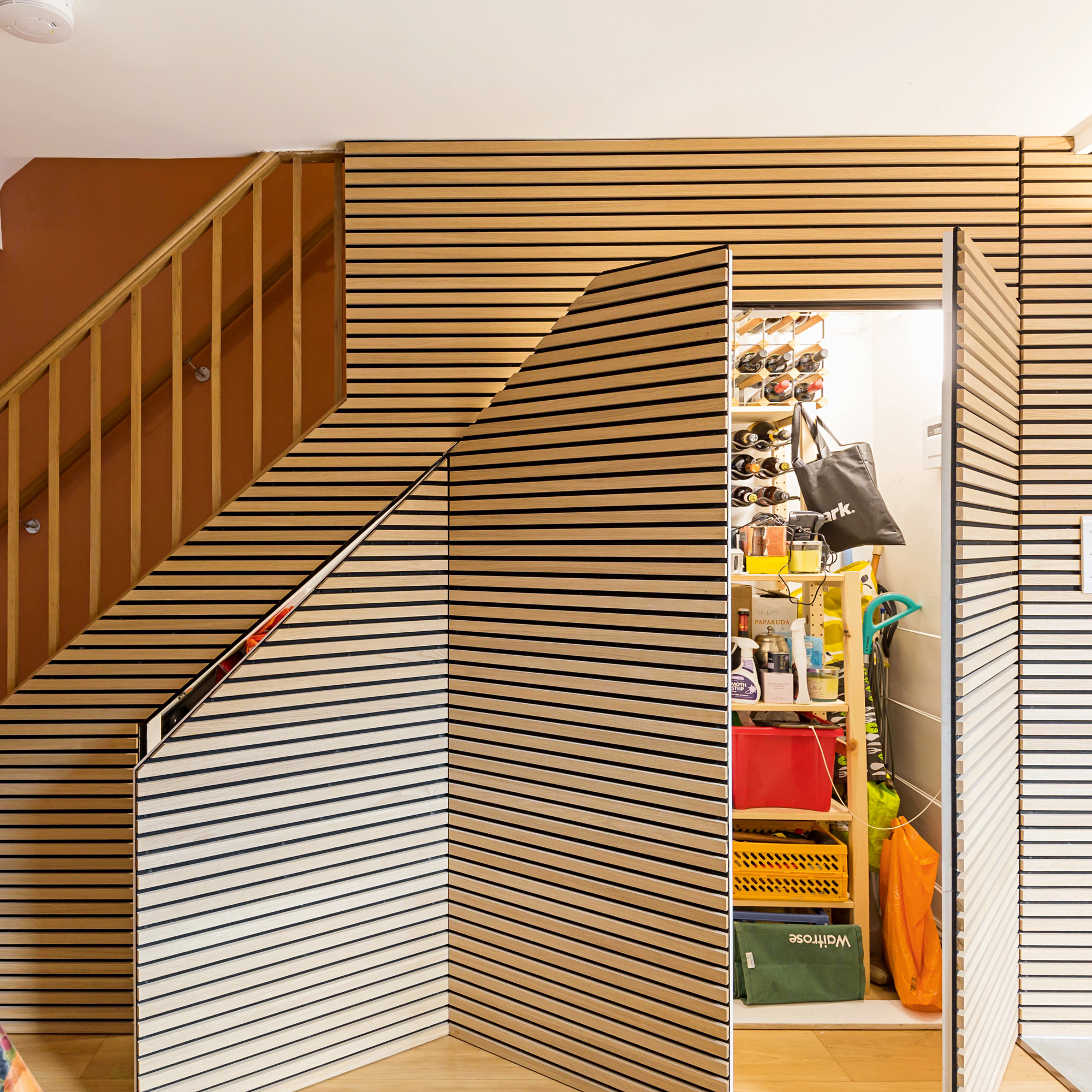
Space has been maximised in the extension by installing a cloakroom under the stairs. Again, they chose to install sliding doors to space on space, this time they're clad in horizontal timber panels.
This is the existing section of the ground floor area, with the existing fenestration style remaining largely unchanged. However, the new kitchen features plenty of storage helping to keep the open-plan area looking tidy.
Must-have storage
Bespoke storage has been built using the same style as the panels that enclose the WC; this open system, much like an open plan boot room provides practical storage solution for shoes and coats.
Featuring integrated seating, the timber bench provides a comfortable space to stop and prepare to enter or exit the house.
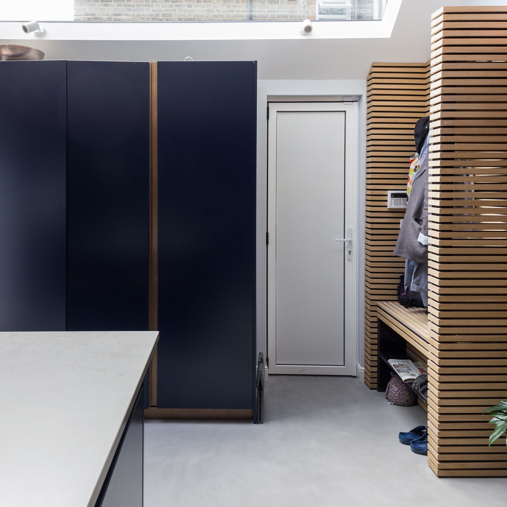
The horizontal slat cladding is repeated here to create a sense of continuity while at the same time clearly identifying the practical storage areas within the room.
This feature effectively defines the essential storage areas from the main food preparation zones.
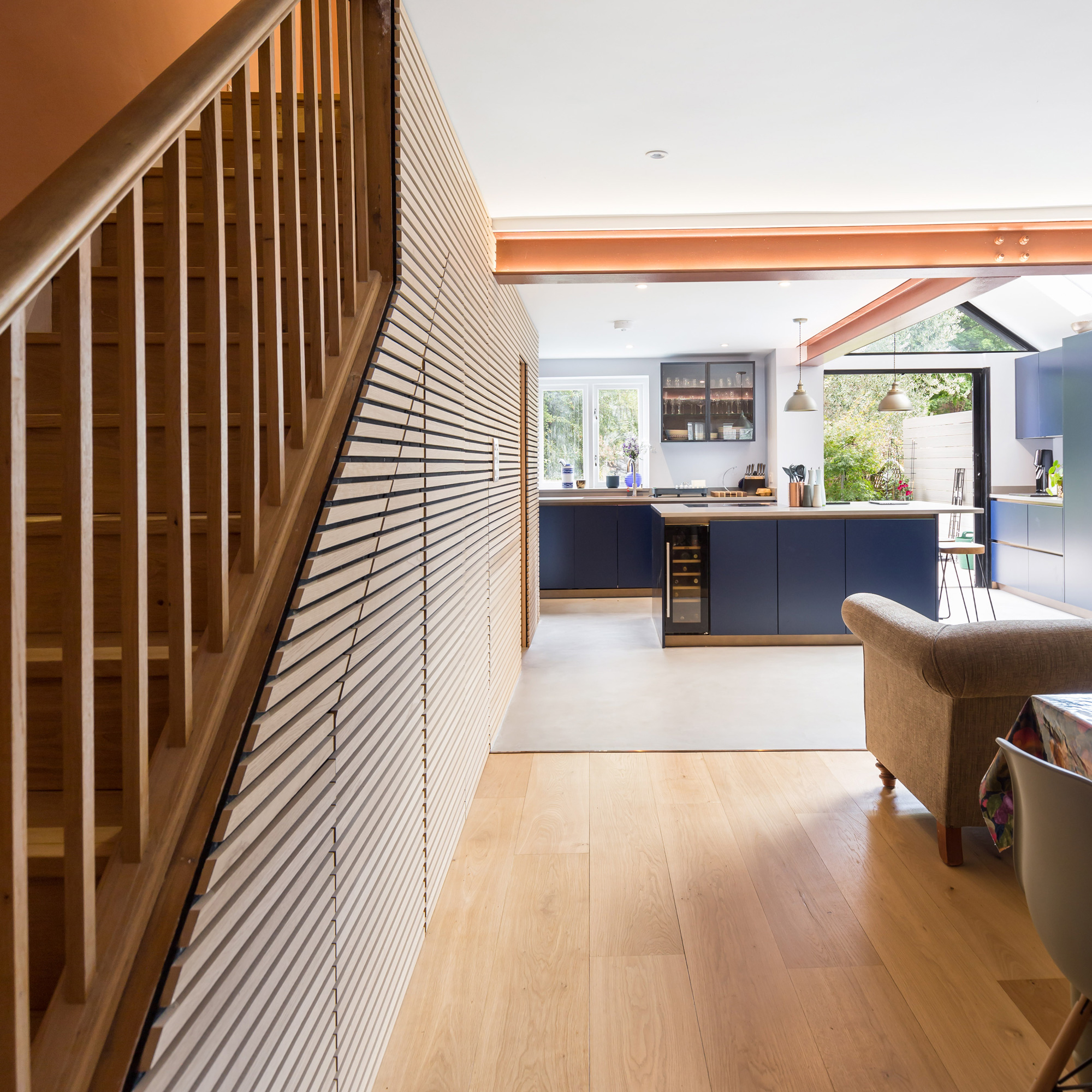
Although modern in design, the timber material helps to create a sense of warmth. The neutral shade makes for a unified finish with the bronze wall shade and wooden bannisters.
The exterior
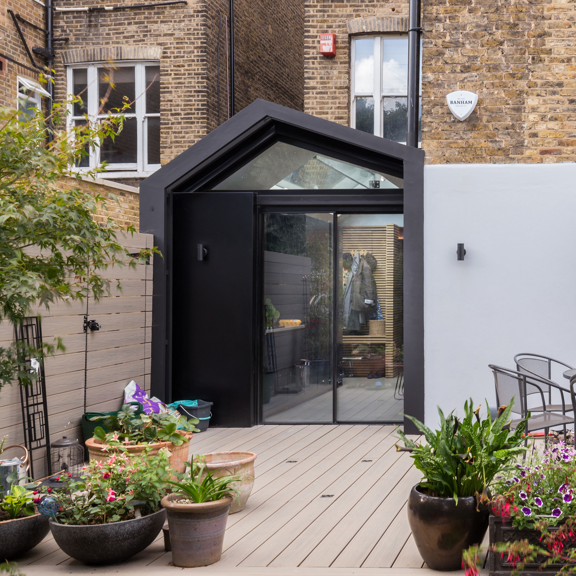
The extension is lined in London stock bricks to the flank wall and freestanding timber screens to mask the pipework serving the extension and apartment above. The screen also helps to pronounce the form of the extension.
Exterior cladding in aluminium has been applied to the rear of the extension to provide a contemporary monolithic form sitting comfortably against a more historical Victorian semi.
The property before renovations began
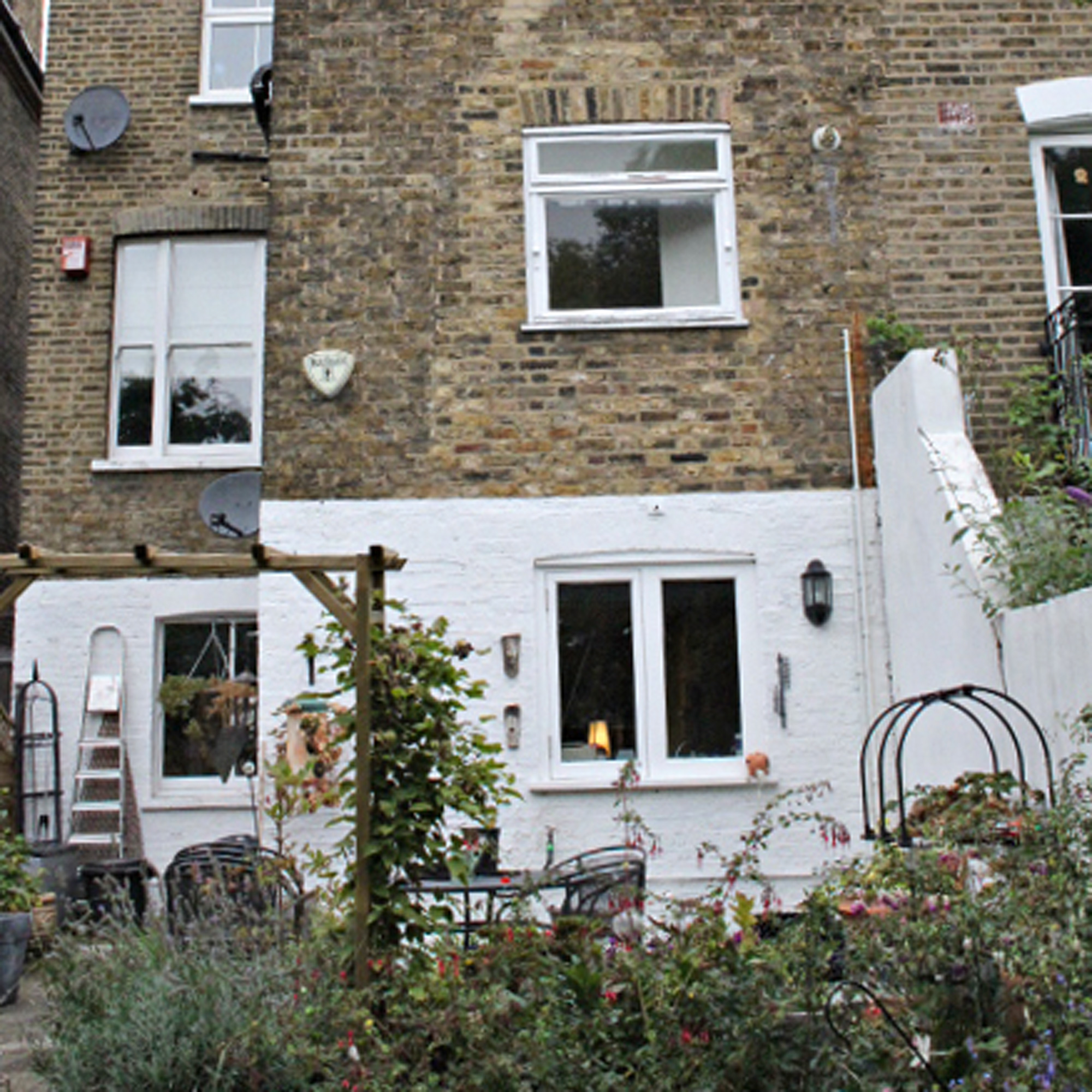
The property is a ground floor maisonette within a semi-detached four storey Victorian building.
The owners had exclusive access to the a mature garden to thr rear of the building, but there was no connection between the outdoor area and the interiors, with the latter cramped and requiring modernisation.
Outside, there was plenty of space for expansion without encroaching too much on the garden.
Focus on - Structural steel supports
Architect Lanre Falase, shares his top tips and ideas...
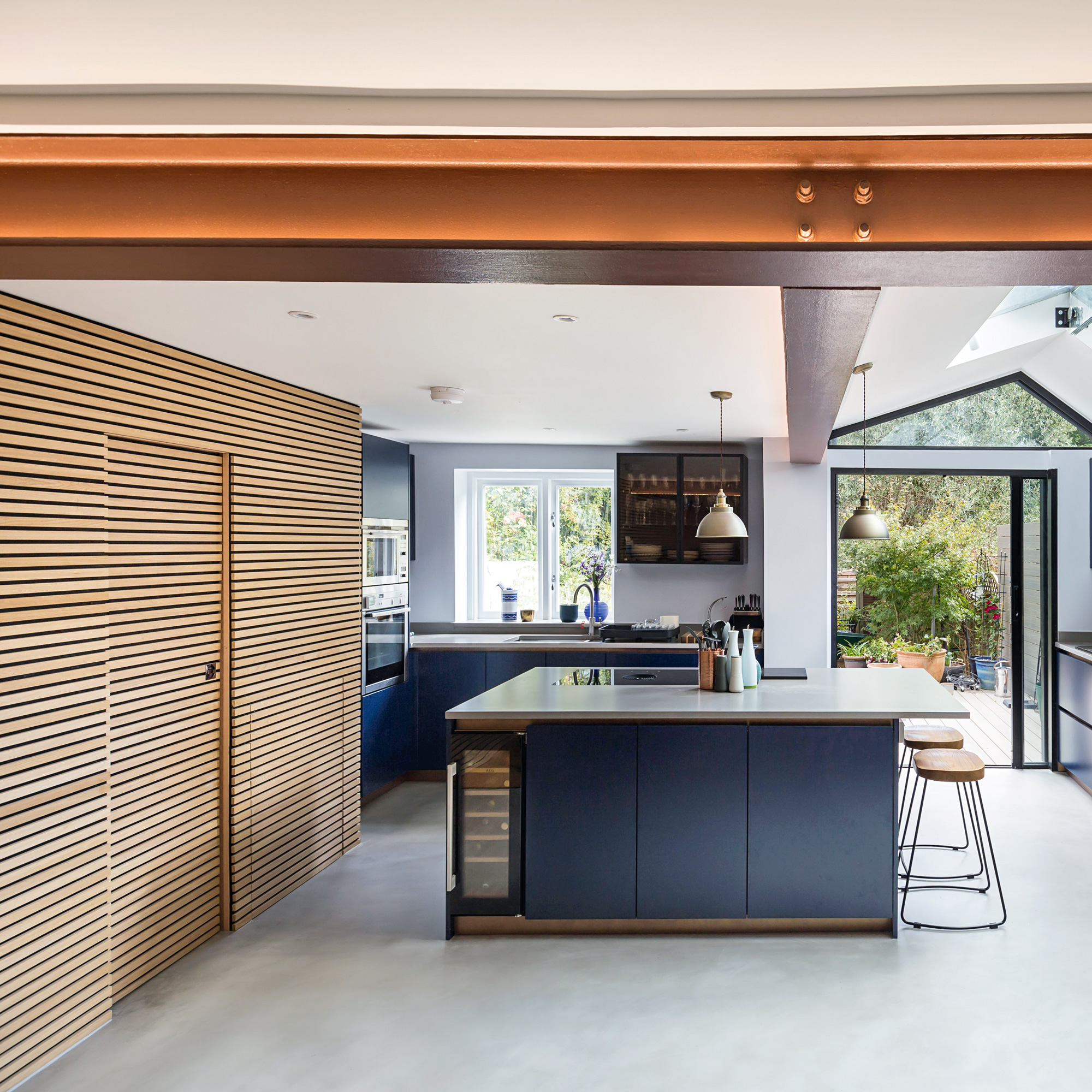
- EXPERIMENT WITH LIGHTING Exposed steel acts as a secondary light feature within a space where you often conceal LED lighting within the web of the steel to provide soft ambient lighting to the spaces they inhabit.
- LAYER THE COATINGS Steelwork should be coated with intumescent paint to provide fire protection, and then painted using your choice of colour.
- ARRANGE A SITE VISIT Ensure the fabricators visit the site first to measure and discuss the interfaces in detail with the contractors and Architects.
- ALWAYS CHECK THE PLANS Don’t be afraid to request fabrication drawings.
- IT MAY NEED TO BE CUT Steel may need to come in two separate pieces due to delivery constraints etc. The connection details for a splice (cut) will need to be understood and agreed beforehand. Openings can be designed to avoid having to splice steelwork on site to create a seamless exposed steel member.

Ginevra Benedetti has been the Deputy Editor of Ideal Home magazine since 2021. With a career in magazines spanning nearly twenty years, she has worked for the majority of the UK’s interiors magazines, both as staff and as a freelancer. She first joined the Ideal Home team in 2011, initially as the Deputy Decorating Editor and has never left! She currently oversees the publication of the brand’s magazine each month, from planning through to publication, editing, writing or commissioning the majority of the content.