'Extending into the side return has transformed this tired Victorian terrace'
We asked an architect how extending into the side return has revamped this cramped home to create a spacious new kitchen diner

Rebecca Foster
Ever wonder what extending into the side return might look and feel like in your home? It seems like a relatively small gain space-wise, but the result can be transformative.
This was certainly the case for this cramped Victorian home in Walthamstow, East London. The three bedroomed property - home to a couple and their two children - lacked a bright, social room for the young family and had no connection to the garden.
The couple got in touch with James Dale, director at James Dale Architects who helped them see how much space and light they could gain by just extending into the side return. Here, James explains the transformation.
Extending into the side return - a little goes a long way
‘Our main goal was to rejig the ground floor layout and create a series of bright, social areas that make best use of the property’s footprint,’ explains James. 'All without extending from the back of the house and eating up precious square footage in the garden.'
'It was important to keep as much of the garden as possible as the homeowners have two young children. The solution was to push out into the redundant side return, adding seven seven metres square of space.'
'Though that isn’t a huge amount of room, but it was enough for us to completely rearrange the ground floor layout.'
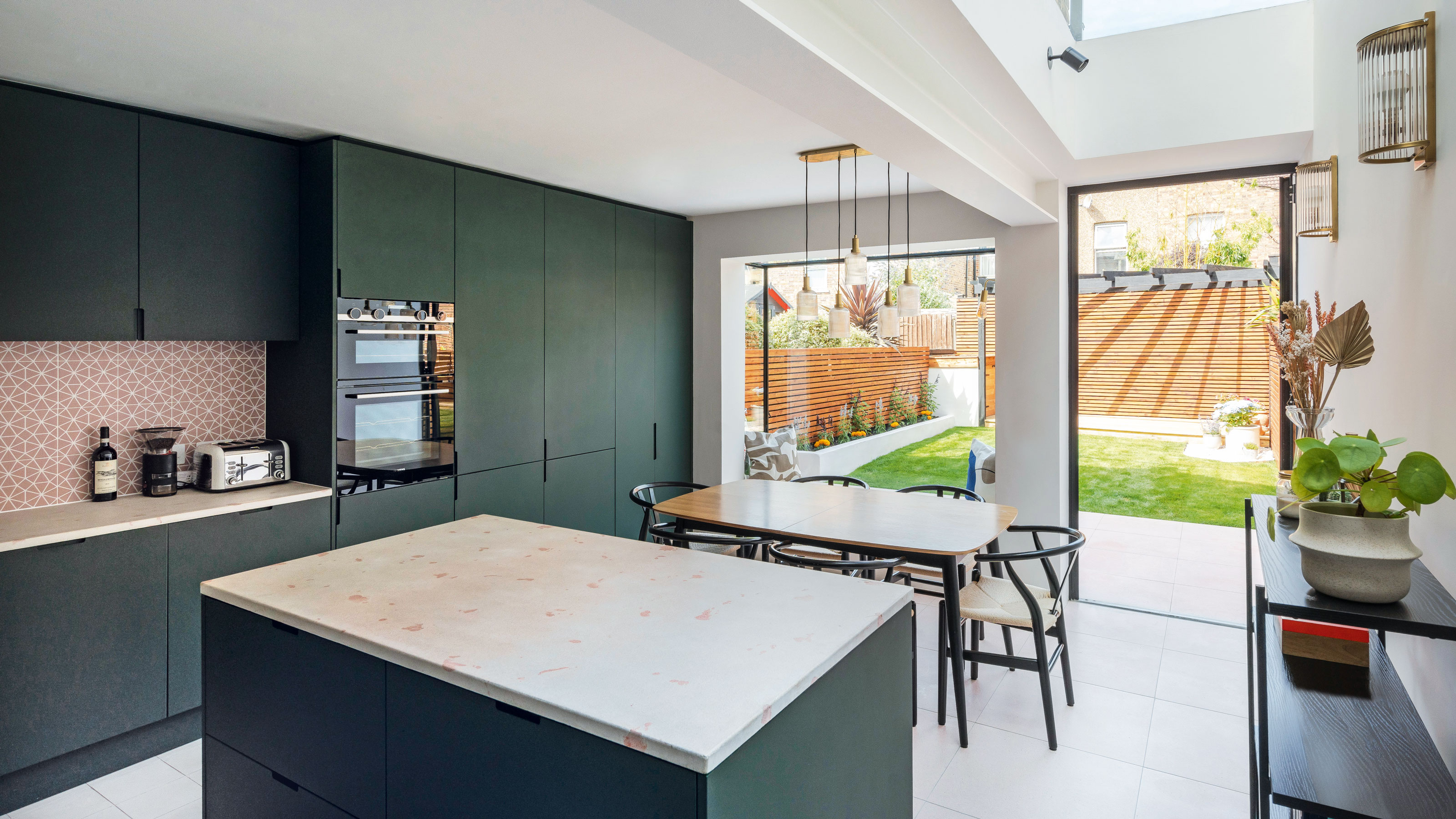
The owners are both keen cooks, so it was essential that the new, generously proportioned kitchen diner ideas were laid out in a practical, ergonomic way.
Get the Ideal Home Newsletter
Sign up to our newsletter for style and decor inspiration, house makeovers, project advice and more.
It needed to feature plenty of space to store cooking utensils, crockery and appliances, as well as a comfortable area for the family to sit and eat.
'We pulled the kitchen towards the back of the house,' says James, 'flipping the island so it faces the garden rather than running parallel to the side of the property. This created plenty of room for a sociable dining space at the back'.
Orienting the central kitchen island to face the garden helped maximise space, as well as enhancing the sense of flow from one zone to the next. It also means that whoever is prepping food can enjoy garden views, too.
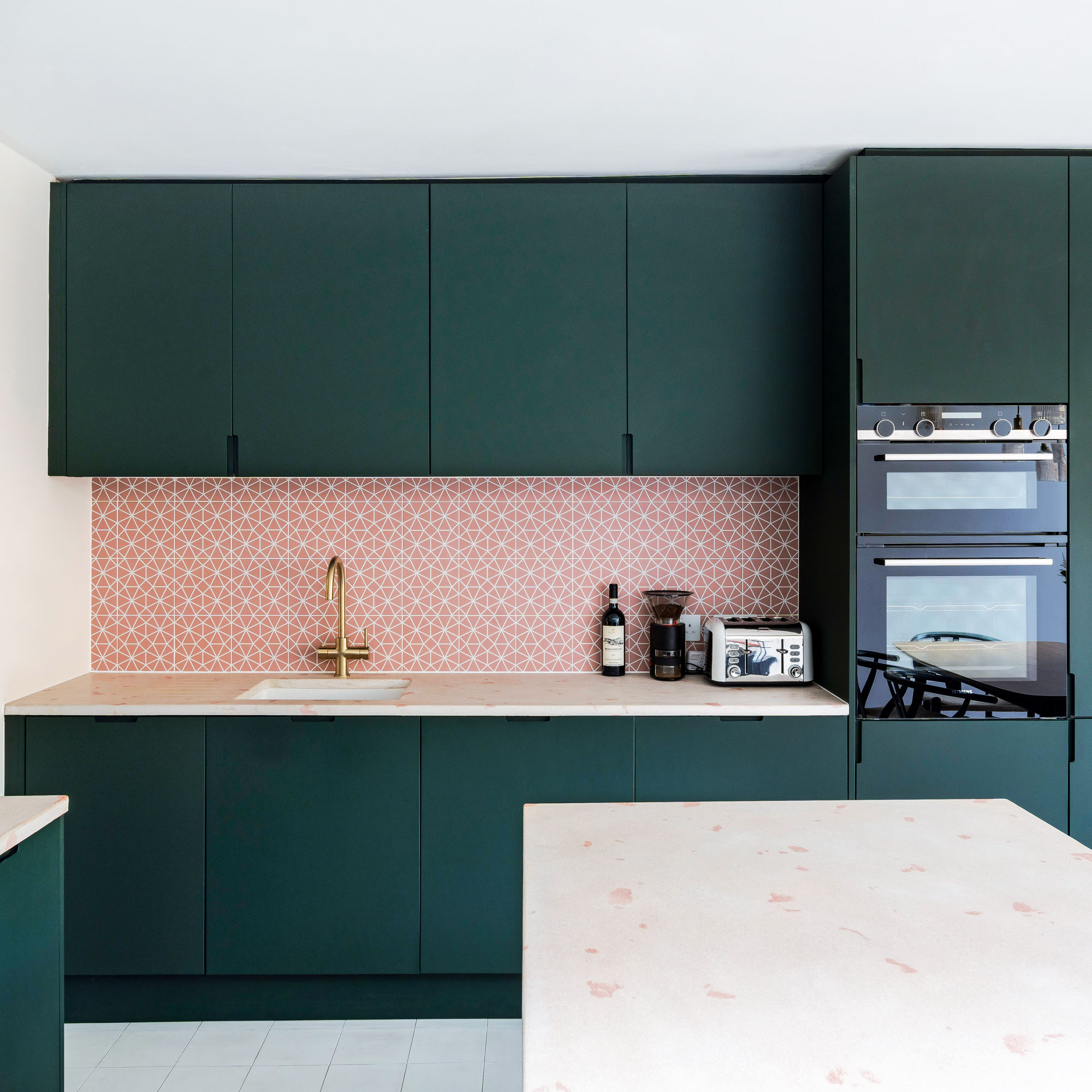
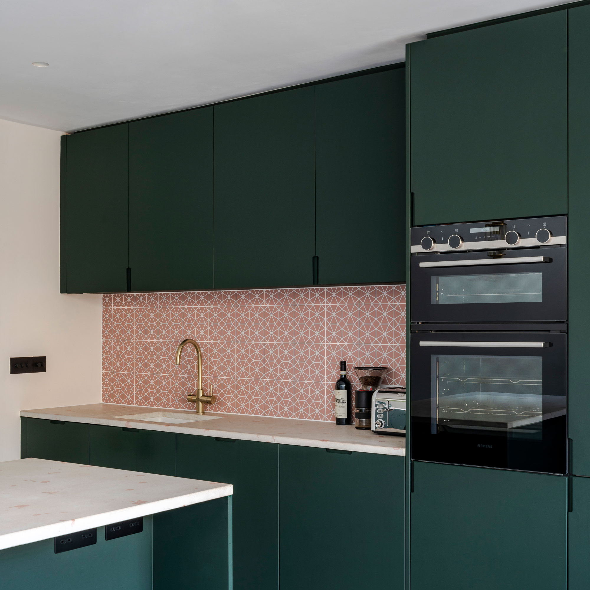
As well as adding colour and pattern to the kitchen, terrazzo provide to be one of the to most practical kitchen worktop ideas for the young family.
Terrazzo is highly resistant to stains, scratches and chips, making it a hard-wearing, low-maintenance option for the busy family space.
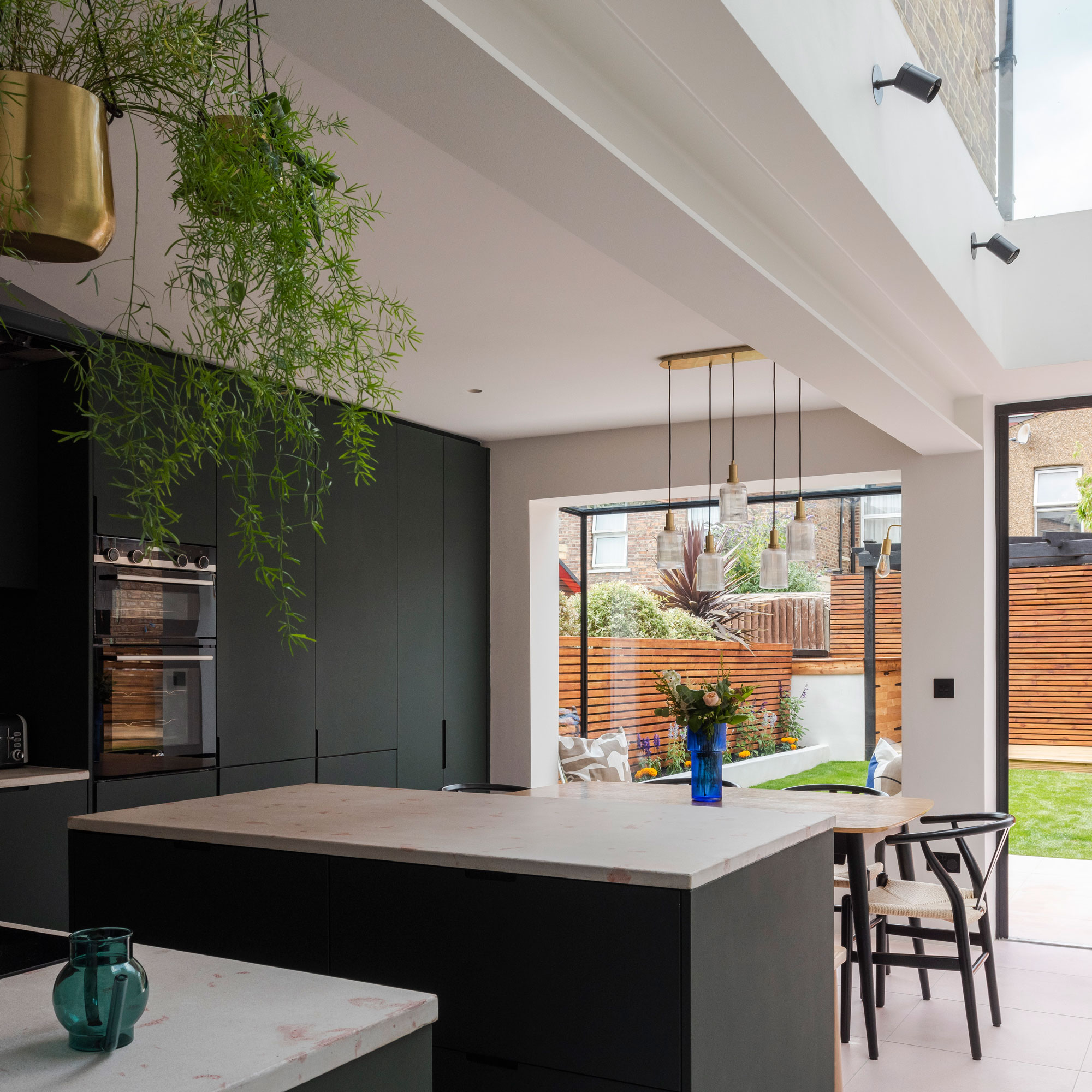
From the outset of the project, the homeowners had their hearts set on deep forest green cabinets. The desire for simple, unfussy finishes prompted the installation of handleless kitchen units in a rich shade of green, contrasting with the pink-flecked terrazzo countertops.
On the floor, white encaustic tiles are laid in the kitchen and pink terrazzo in the dining area, establishing a visual distinction between the two spaces. Water-based underfloor heating has been laid below, providing a warm feel underfoot.
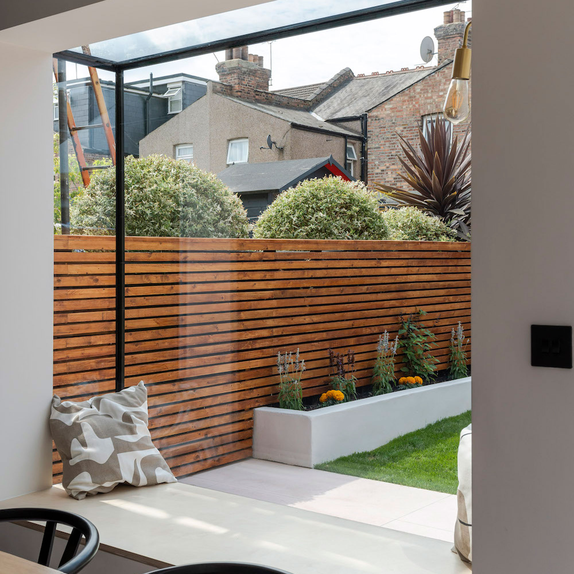
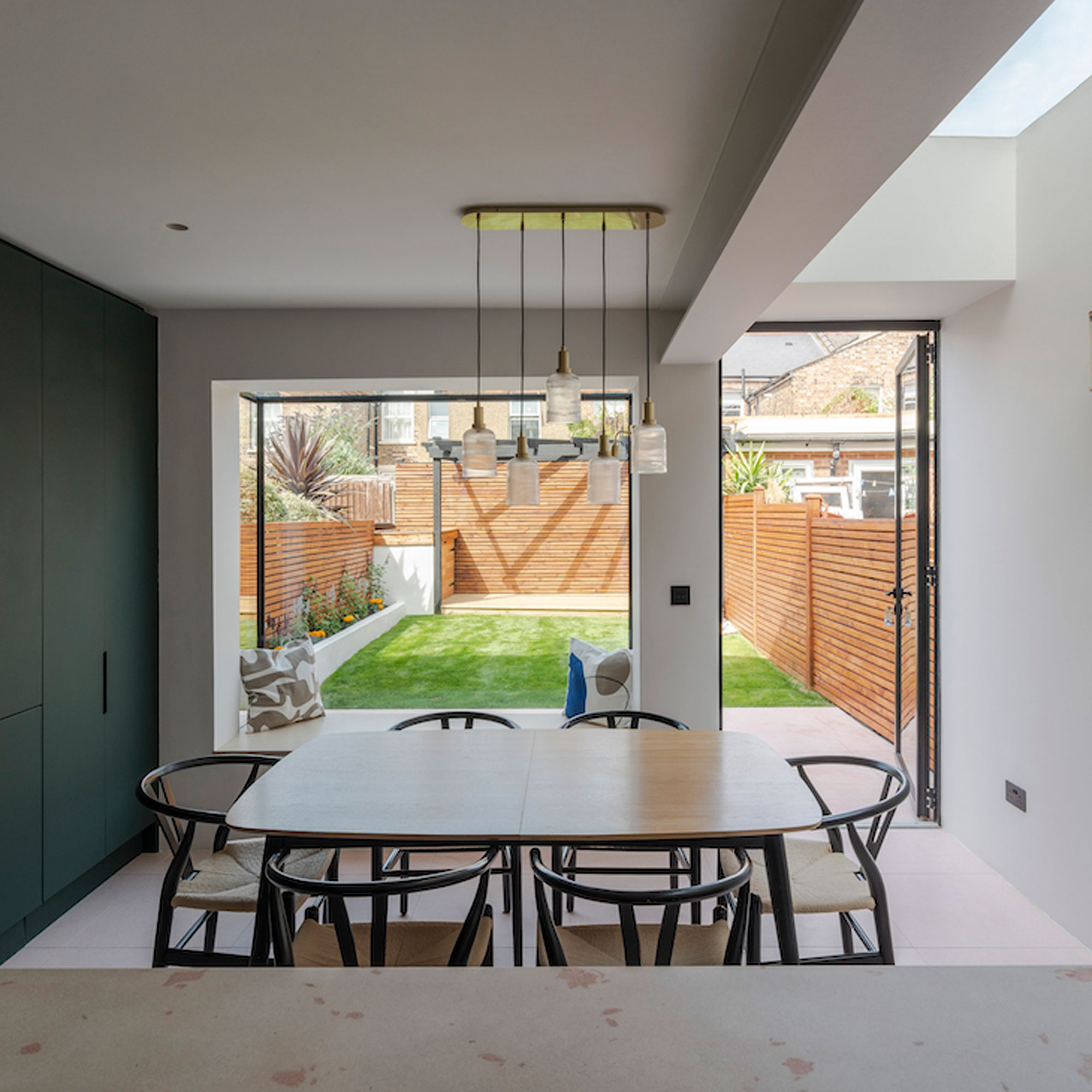
Featuring a steel frame with structural glazing, the black silicone glazing bar that lines the edges of each pane provides a neat, crisp finish. The bench within the window provides a casual space for seating or a platform for the kids to play Lego.
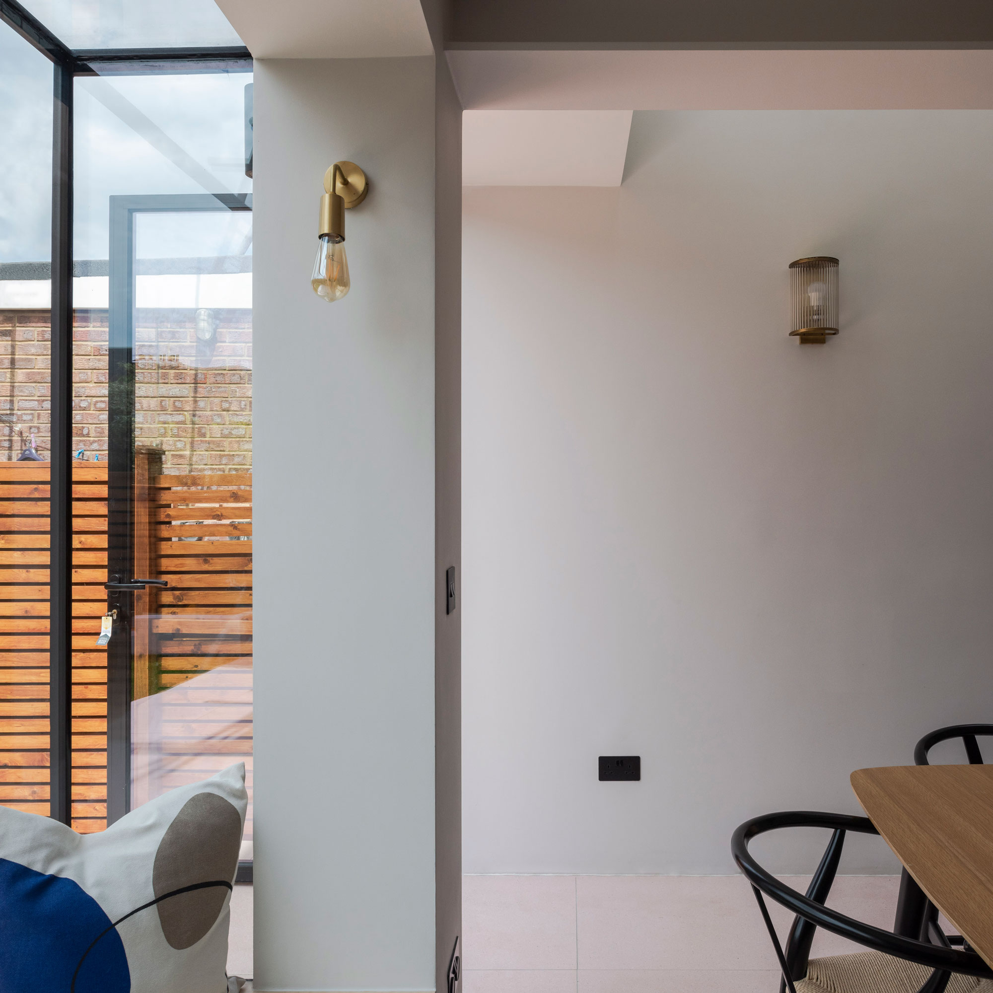
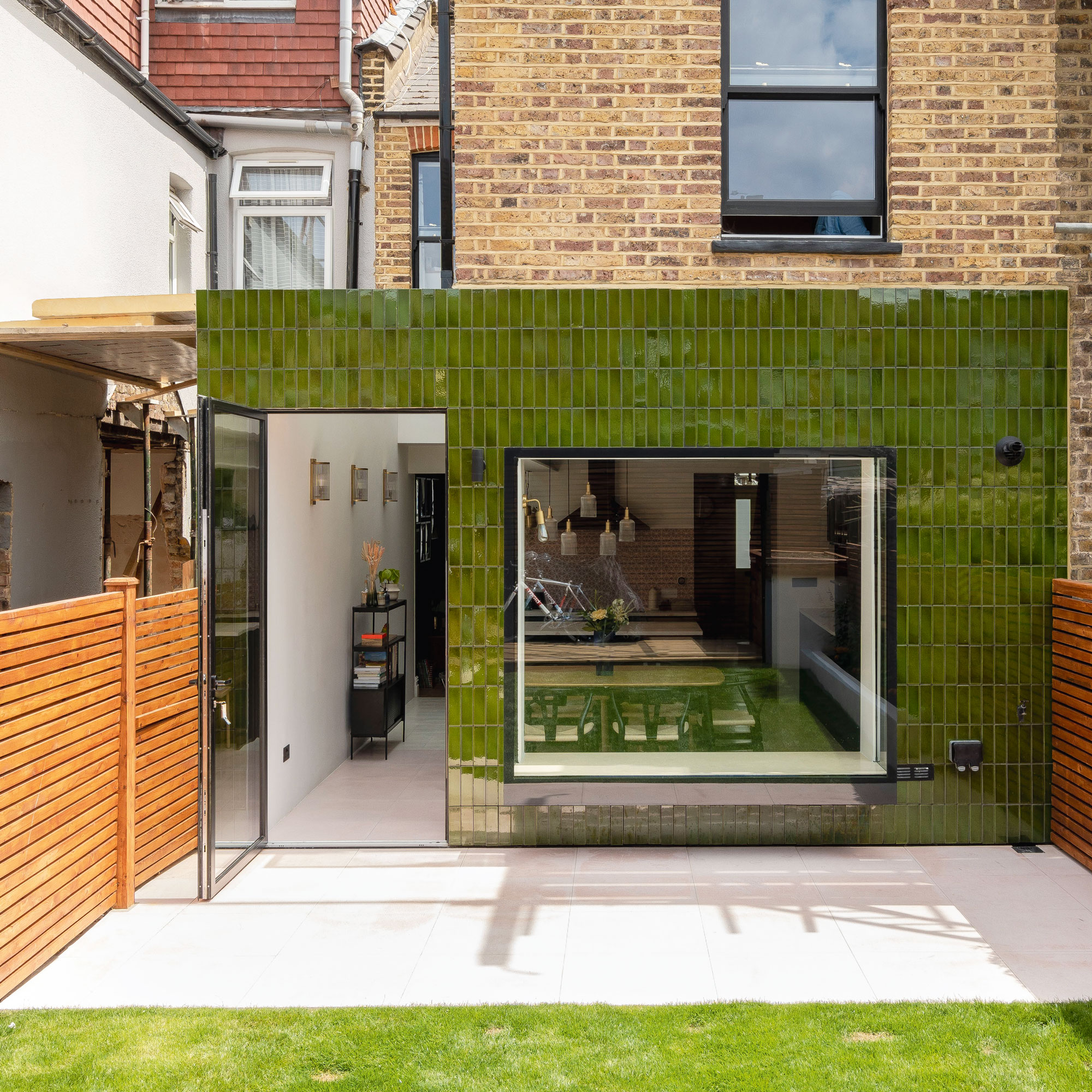
Though they investigated a variety of options for the new window at the back of the house, including bay window ideas, the homeowners soon realised that the projecting oriel window was one of their must-have design details.
'The oriel window is a design feature that the owners wanted to incorporate from the outset of the build. As well as providing a casual seating area, the projecting window provides a surface for the kids to use as a play platform and expansive garden views.'
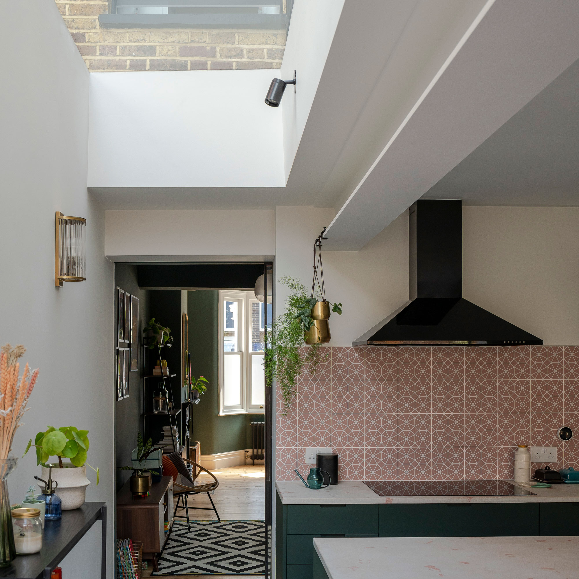
A gridded glass and aluminium pocket door separates the main living area from the kitchen-diner. Incorporating a glass partition – that slides back into the wall when required – allows light to penetrate through to the centre of the floorplan.
Maximising space was one of the key goals of the project, so incorporating the sliding pocket door rather than a hinged panel that swings open into the kitchen was a smart way to make the most of every square inch.

The long strip of overhead glazing sits above the space that once accommodated the underused side return. The glass has been angled slightly, allowing water to drain off into the concealed gutter.
The space is now drenched in sunshine thanks to the projecting oriel window, rooflight and glass casement door with an aluminium frame. The inherent strength of the metal means the amount of glass in the centre pane is maximised, inviting as much light into the house as possible.
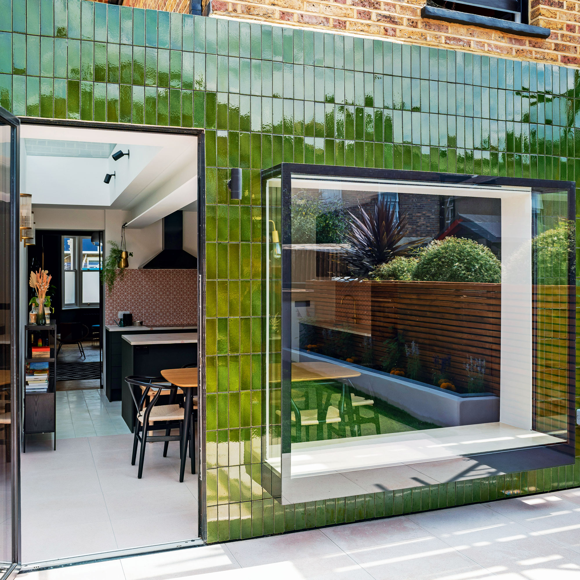
'As part of the works, the back wall of the house was taken out so we could put some steel supports in,' explains James. 'Rather than rebuilding it in brick, we decided to clad the wall in traditional green gloss tiles as a standout design feature.'
This shade of green was chosen for the handmade glazed tiles after plenty of experimentation with other colours, including blue and yellow.
This rich hue was chosen as a nod to traditional green tiles often used to clad pubs and London Underground stations during the Victorian era. The tiles are laid slightly proud of the brickwork to allow for effective water run-off.
The property before works began
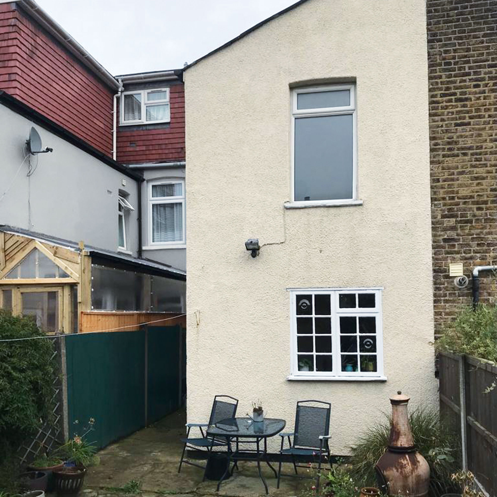
Before the build, the wasted space in the side return didn’t serve any purpose. The gloomy kitchen at the back of the house had a small window – not in keeping with the traditional style of the original property – with no view of the garden.
The interiors hadn’t been updated for many years and, with two young children, the ground floor layout didn’t have the sociable, connected feel that owners wanted.
Focus on: glazed exterior tiles
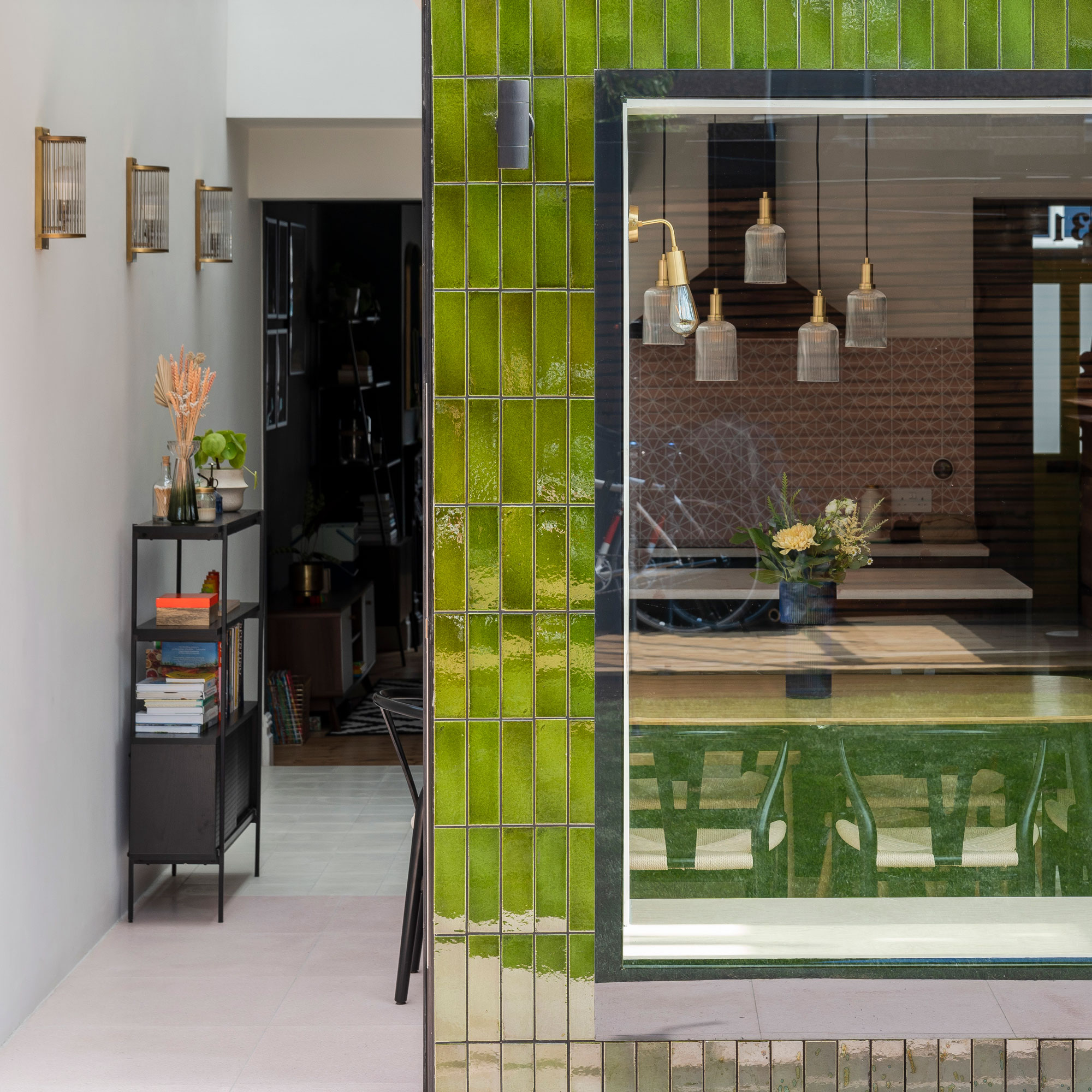
Architect James Dale gives us his top tips and ideas
- Go bold Choosing a rich colour like green, blue or yellow helps tiles stand out from the brickwork.
- Choose your material wisely Not all glazed tiles are suitable for exterior use – an important detail to double check with your supplier
- Plan ahead Handmade tiles can come with a long lead time, so it’s best to place your order early on in the project
- They're low maintenance Glazed tiles are easily cleaned. Any dirt can easily be wiped off
- Tile with care Handmade tiles are not perfectly uniform. Though minimal, the variation in size from one unit to the next means your tiler should spend plenty of time getting individual units lined up and ready to lay.

Ginevra Benedetti has been the Deputy Editor of Ideal Home magazine since 2021. With a career in magazines spanning nearly twenty years, she has worked for the majority of the UK’s interiors magazines, both as staff and as a freelancer. She first joined the Ideal Home team in 2011, initially as the Deputy Decorating Editor and has never left! She currently oversees the publication of the brand’s magazine each month, from planning through to publication, editing, writing or commissioning the majority of the content.
- Rebecca FosterContributor
-
 Will a conservatory add value to your home and how can you maximise it?
This is what the pros say
By Amy Reeves
-
 I’ve been looking for a new signature scent for my home and The White Company's new fragrance is the exact summer holiday smell I needed
Santorini smells fresh, summery and sophisticated
By Kezia Reynolds
-
 How to remove algae from garden walls in five steps – and the cleaning product experts rave about for tackling it fast
Experts share their top tips for getting garden walls algae-free
By Katie Sims