'We built a smart new loft conversion for more space'
We asked an architect how building a stylish new loft conversion for more space has added an extra two bedrooms and a bathroom with stunning views

Ifeoluwa Adedeji
When looking to expand an existing home, adding a loft conversion for more space or building an extension on a house are often the most popular solutions. The latter is usually the least intrusive, but a building upwards and converting the loft area will give you so much more space, especially if you have a growing family and you need more bedrooms.
This narrow Victorian two bedroomed property was too small for the family who lived in it - the couple had two children and they needed space for a guest room, too. They contacted Daniel Rees, founder of Rees Architects to see how they could expand their existing space to accommodate their needs.
Here, Daniel explains how the team created a considered loft extension to create a balanced family home.
Building loft conversion for more space
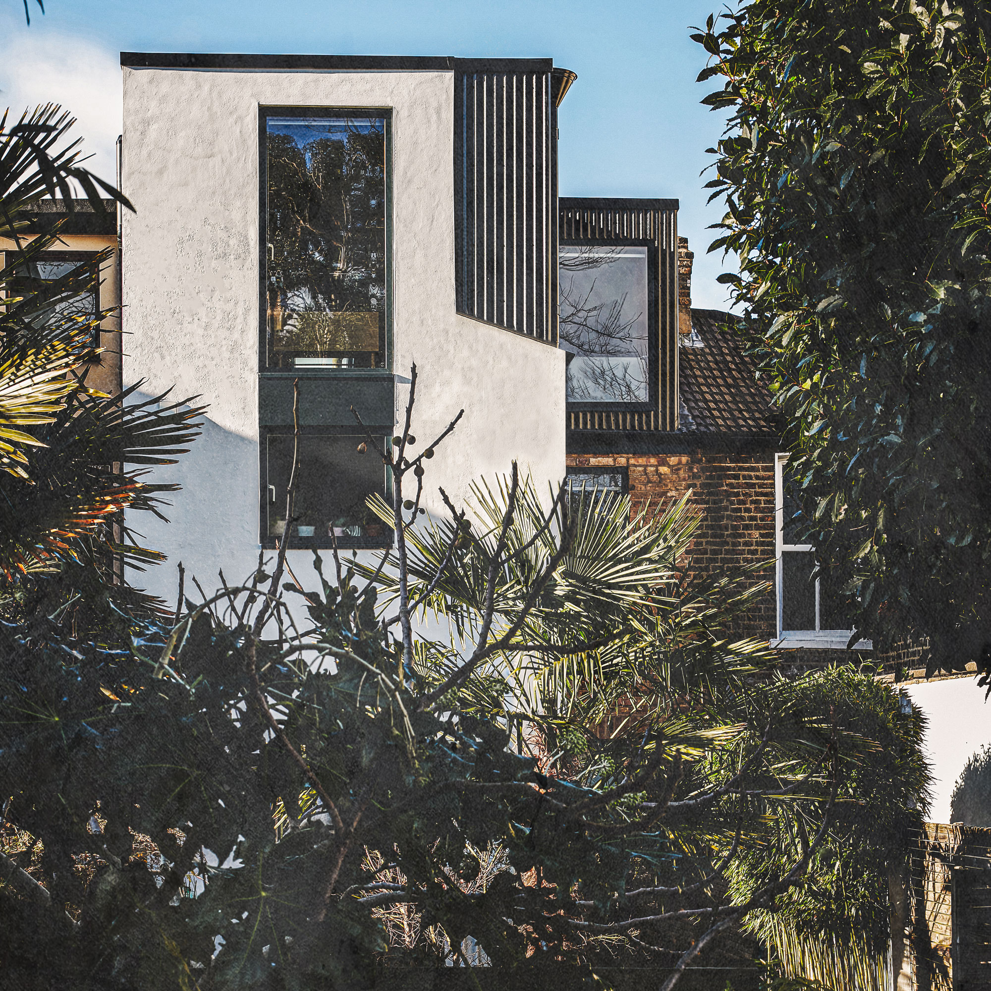
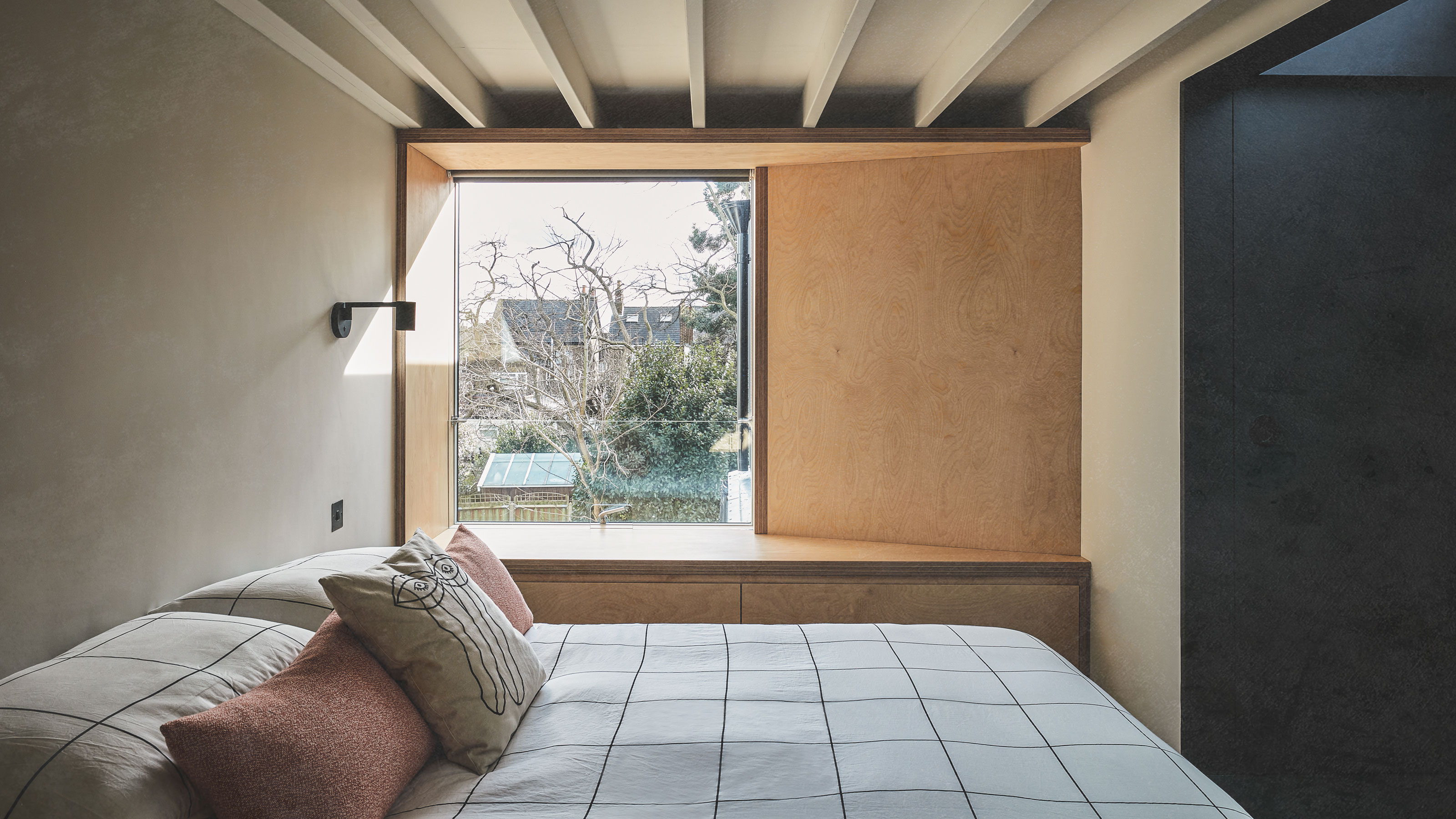
‘As a rear extension wouldn’t have helped in gaining extra bedrooms, a loft conversion was the best solution. We needed to use every inch of space purposefully and intentionally,’ explains Daniel of Rees Architects, ‘making the existing plan work hard with thoughtful design was essential. It was also important to create a space that felt warm and generous while being functional'.
'The ceiling height in the loft area was only two metres high,' continues architect Daniel, 'not considering the space that would be occupied by the structural framework for the planned main dormer and rear dormer over the outrigger.'
'We wanted to solve this in a holistic way, so we lowered the ceilings on the two floors below to achieve more height in the new loft space. By doing so, we have created three floors that feel proportionally aligned rather than one that obviously lacks height.'
Main bedroom
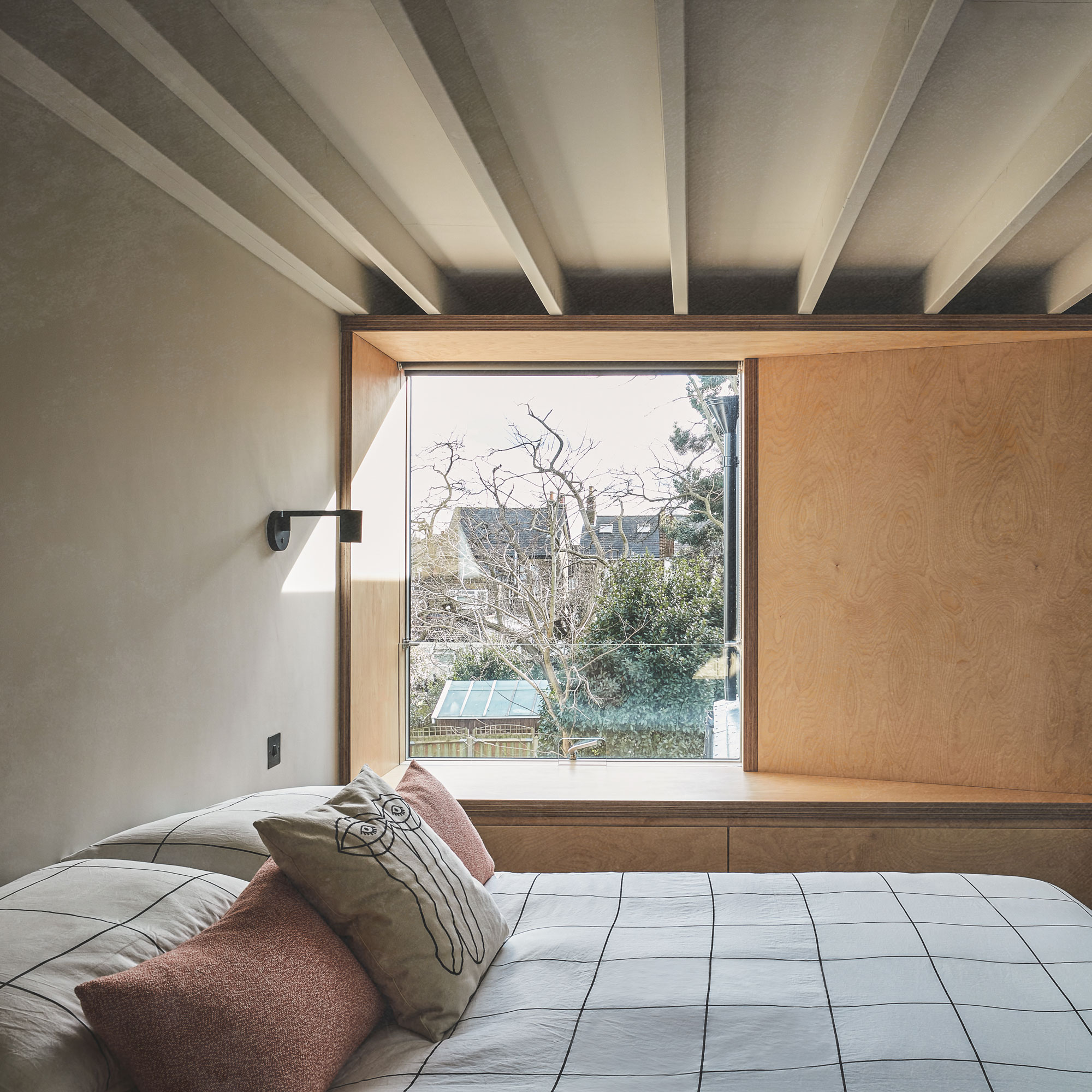
The window seat ideas in the main bedroom have been clad in plywood and offer comfortable seating so that the owners can enjoy views out into the garden.
As space is limited, this integrated solution also means that there’s no need to bring in more furniture, which would reduce the available floor area. The muted colour palette compliments the pared-back interior design helping to establish a calming retreat.
Get the Ideal Home Newsletter
Sign up to our newsletter for style and decor inspiration, house makeovers, project advice and more.
'We left the beams in the master bedroom and spare room exposed, ' continues Daniel, 'and we painted them the same colour as the walls to create a greater sense of space and depth.'
'Built-in wardrobes make the most out of the eaves,' continues Daniel, 'and we’ve also integrated hidden storage behind the clothes rails. Angled brass skirting helps create an optical illusion of more height and adds to the crisp and clean aesthetics. Glazing also plays an important role by bringing in natural light in each section of the new loft.’
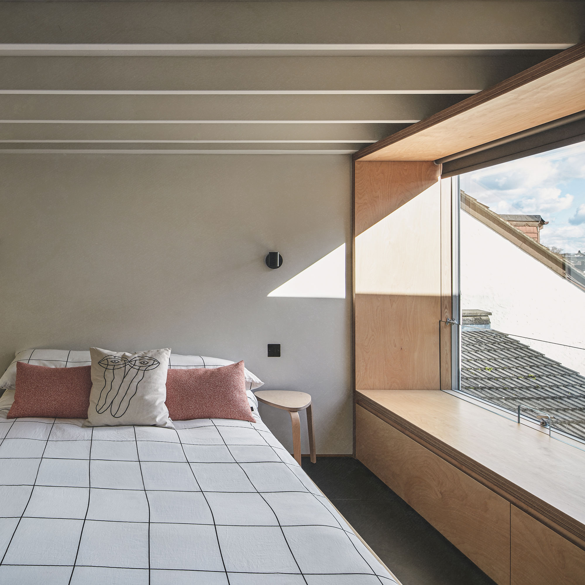
In the bedroom, the loft conversion ideas feature exposed beams have been completely modernised and painted in the same shade as the walls so that they blend in. Matt black downlights and wall-mounted lighting have been carefully positioned to create a sense of symmetry that’s replicated throughout the loft area.
The bed is almost level with the window seat so there are no obstructions of the garden views. Sections of the walls feature a layer of rubber and cork material - these both contrast against the black features, but also have a functional use, too. The material has acoustic insulation properties so it effectively absorbs sound.
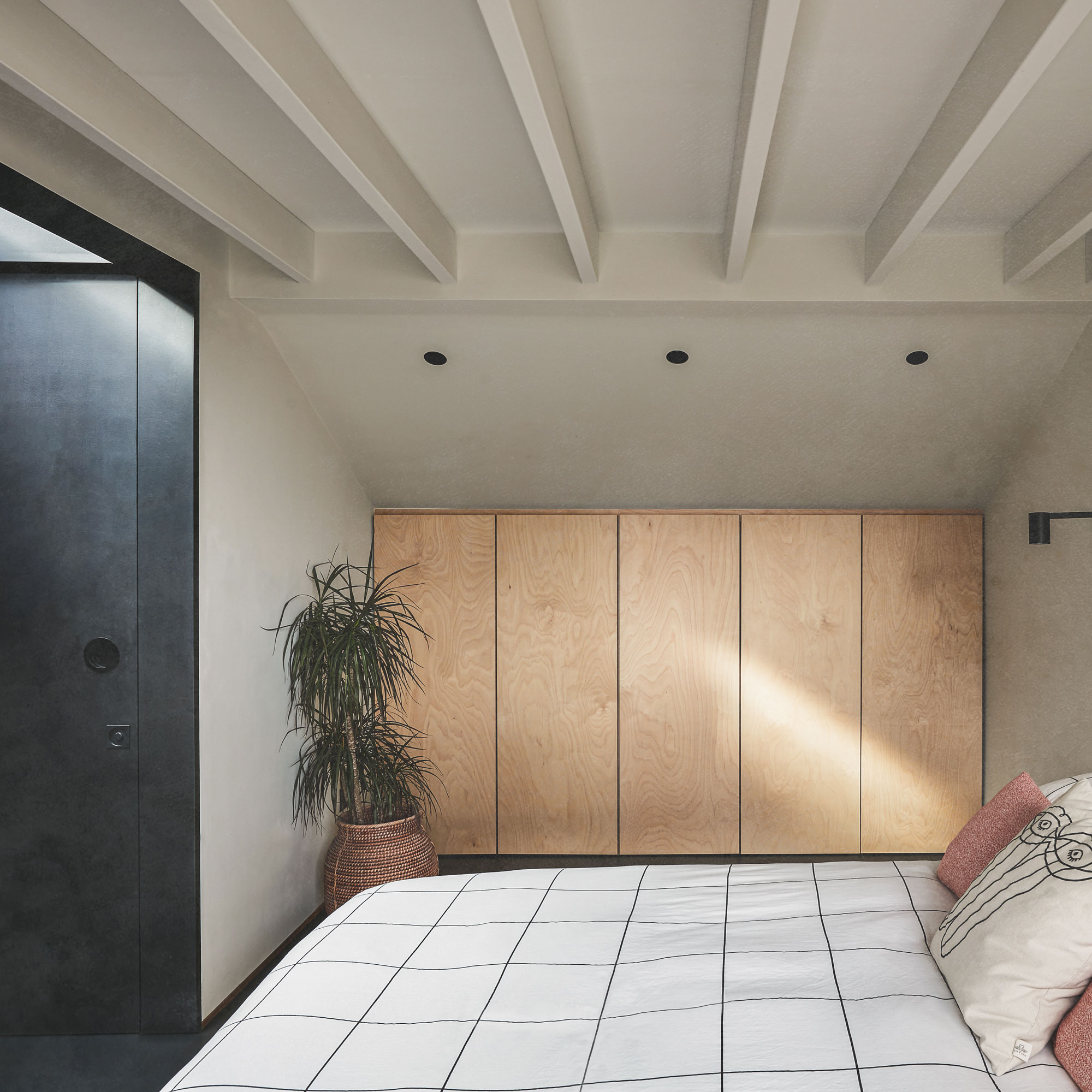
Plywood cupboards have been fitted under the eaves and reflect the same material directly opposite it surrounding the window. Storage, while essential, has been designed to blend in as much as possible so as not to create a distraction.
The minimalist handless design ensures the scheme maintains an uncluttered look, all in keeping with the idea of creating a space to unwind.
Hallway doors
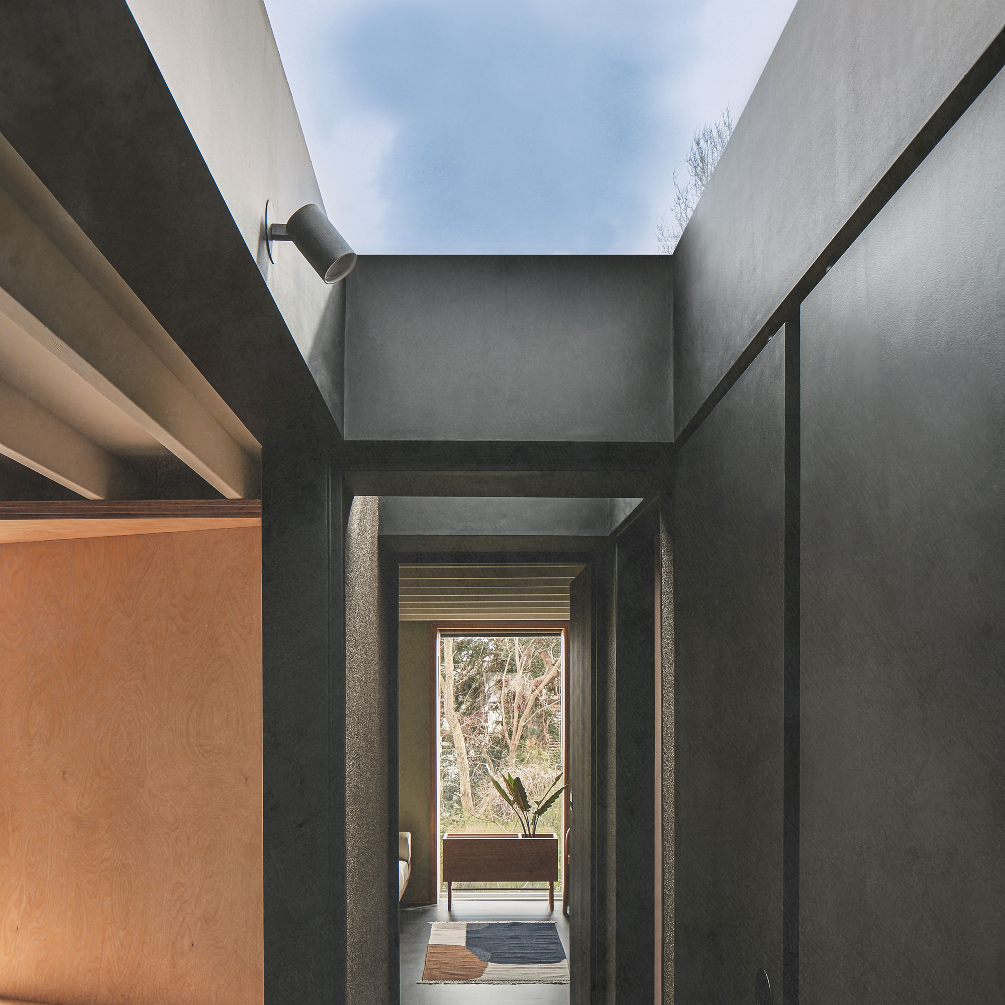
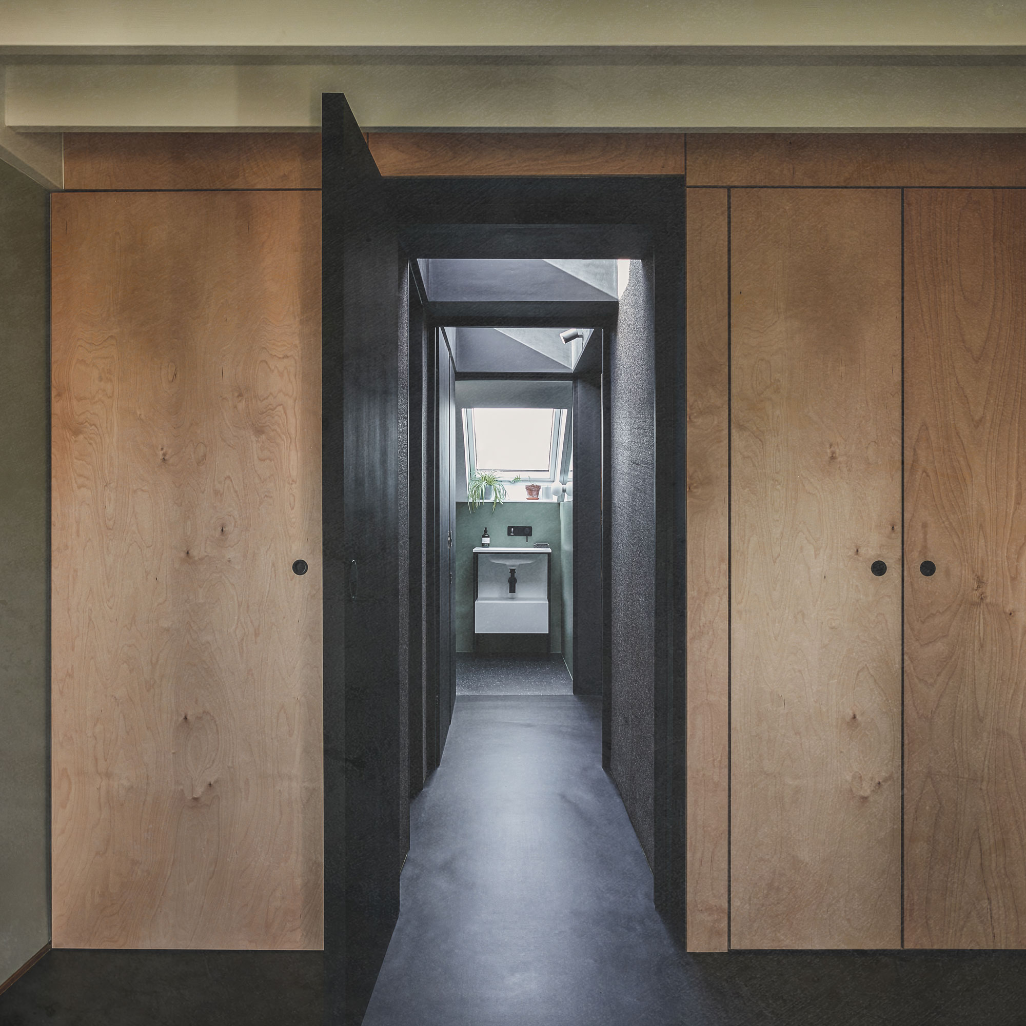
In order to maximise the available floor space in the new loft, one of the many one clever storage solutions for the small spaces that the architects created was the doors for the master bedroom and ensuite.
With both doors open, you gain access to the bedroom and en suite. Close them and that section of hallway effectively becomes an additional section of bedroom, with the ensuite closed off from the rest of the floor.
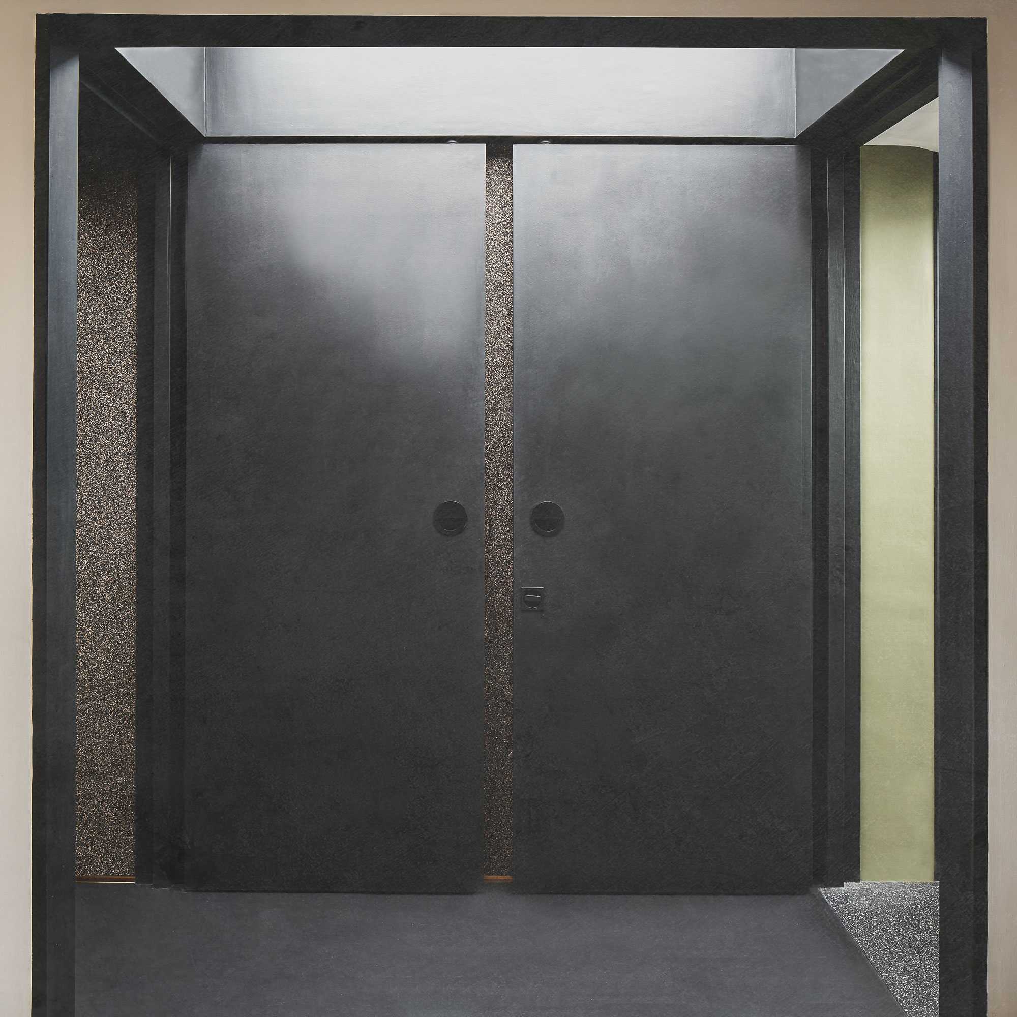
These bespoke doors feature magnets on each leaf that help keep them fully open at 90° and feature a flush finish. Here (see above) the doors are open and conceal the cork and rubber wall.
When the right door is closed (see below), it allows for privacy in the bathroom space and on the left, it helps contain the guest bedroom. The black colourways used conforms to the minimalist style that’s been adopted throughout.
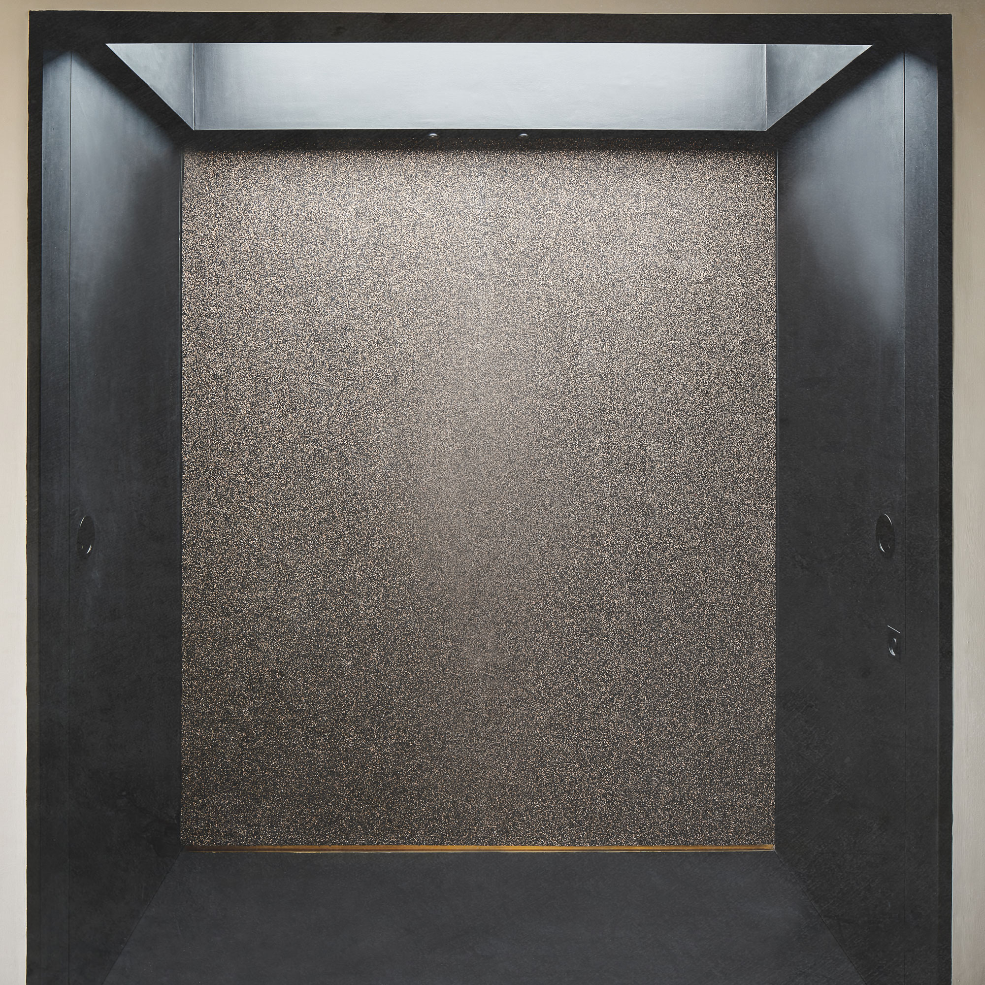
When the hallway doors are closed, a section of the corridor becomes incorporated into the master bedroom. This section of hallway also features a large rooflight with an integrated blackout blind.
The bathroom
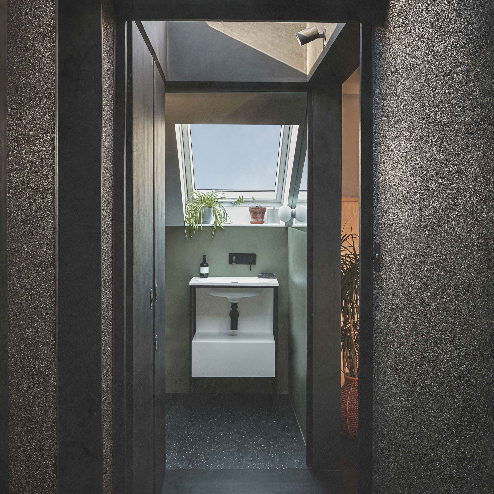
The modern bathroom ideas feature clean and uncluttered fixtures and fittings with wall-hung sanitaryware making the space feel bigger. The walls have been covered in marmoleum that’s made from 97% natural raw materials that is CO2 neutral.
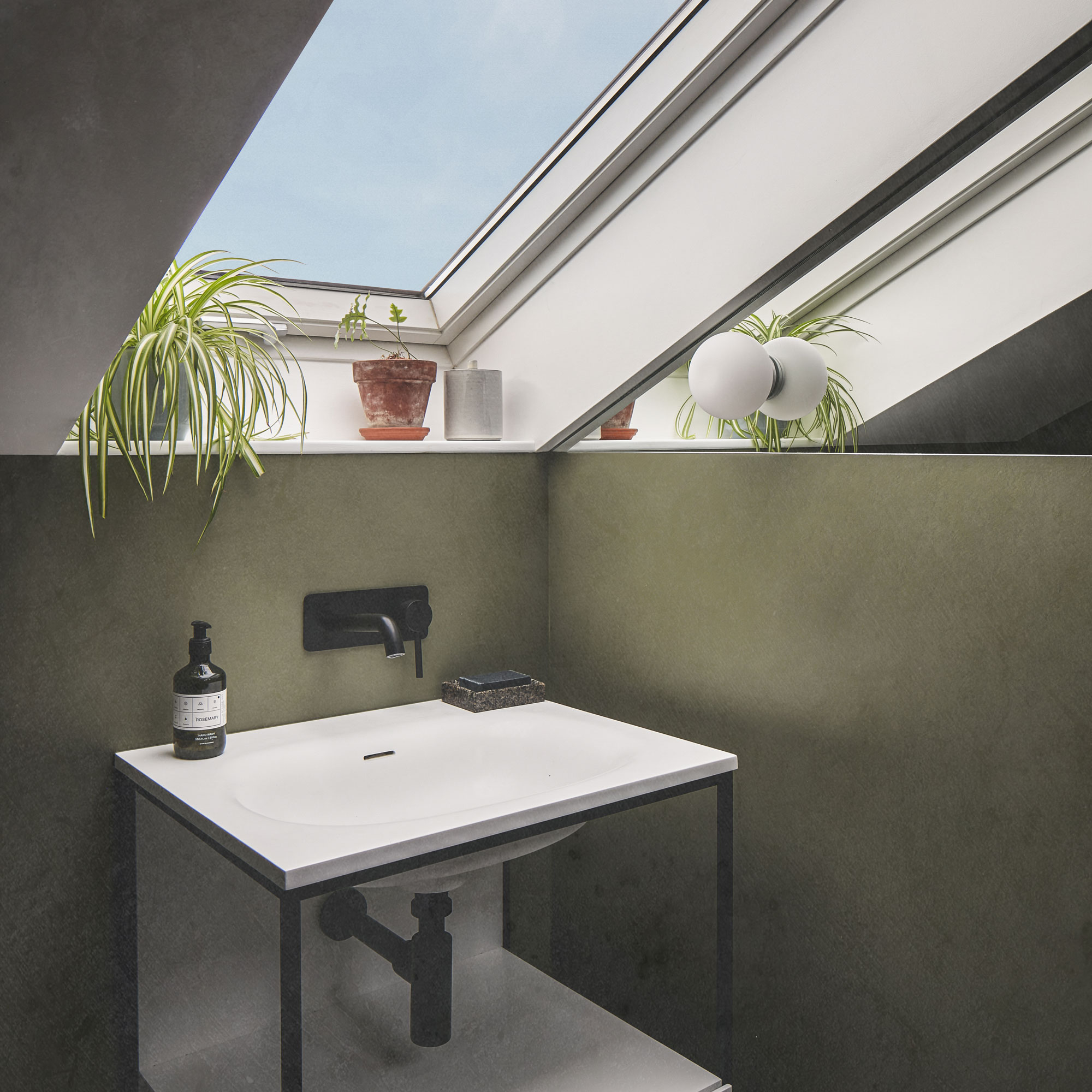
Marmoleum is a practical low maintenance surface is both durable and offers a simple, clean finish with no breaks as you would have with wall tiles.
The windows have been positioned to create a sense of more space than there actually is, giving an elongated appearance.
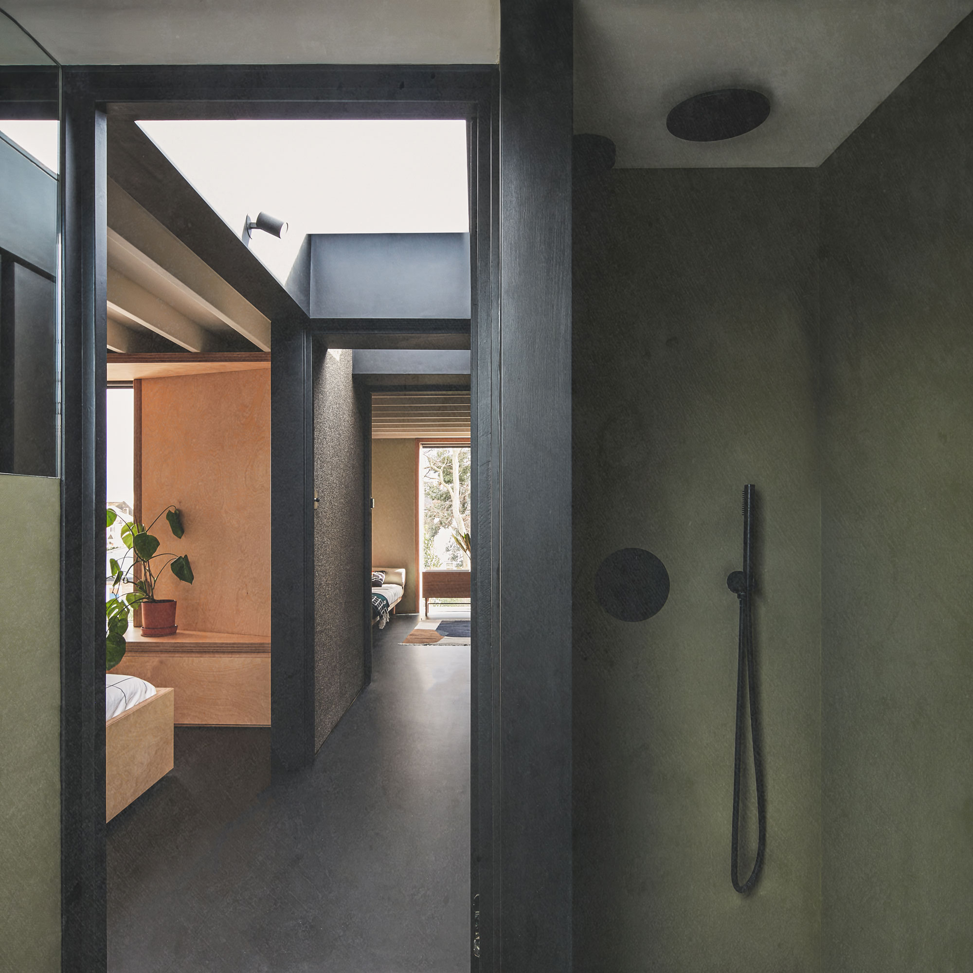
The attic bathroom ideas also feature a compact walk-in shower, there’s no glass enclosure to keep clean, but the wall helps contain the water.
The same marmoleum material has been applied onto the floors using a different pattern that reflects the texture of the cork and rubber walls nearby. Again, sleek matte black shower fittings help finish the contemporary look.
The guest bedroom
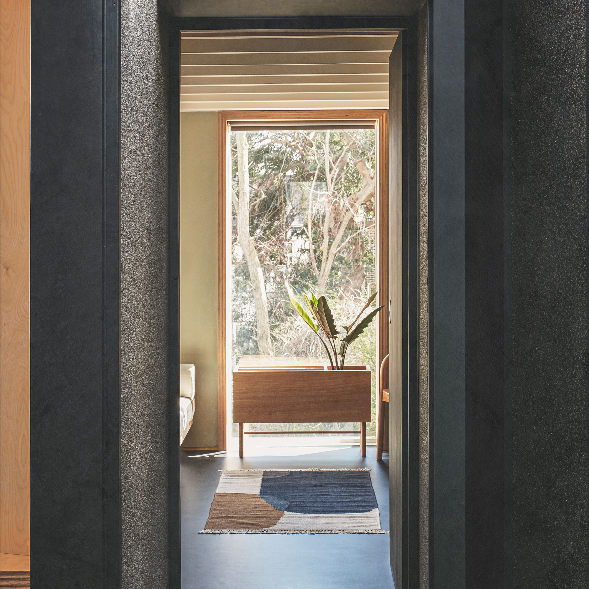
The guest bedroom can be used as a multifunctional space with moveable furniture enabling the owners to adapt it to their needs. Here, the olive green walls and dark floors present an effective contrast, while the window guides your sightline out towards the garden.
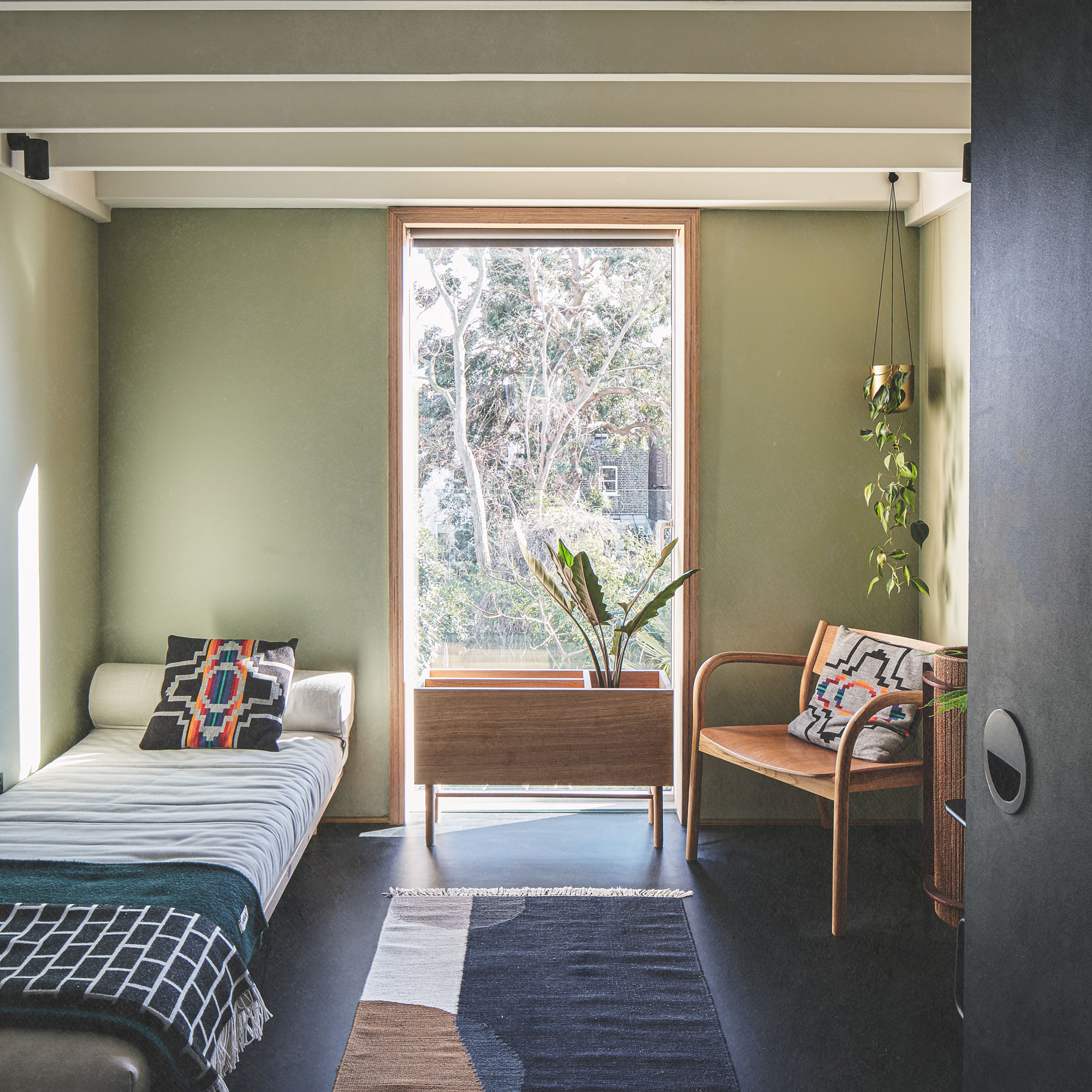
The space feels bright despite the deep hues that have been adopted, with the light-coloured furnishings and ceiling adding to the sense of airyness.
The property before works began
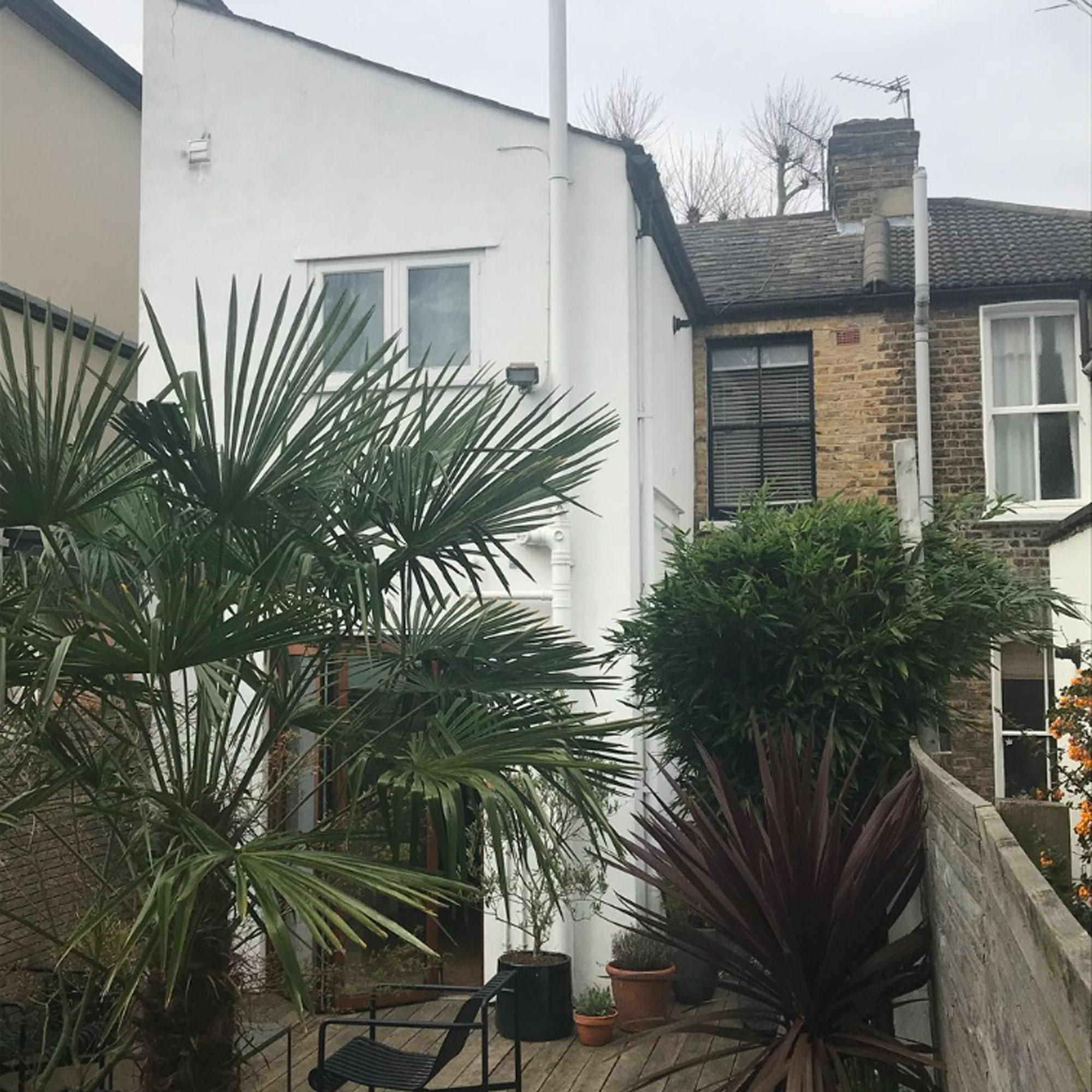
The terraced property had a standard, cramped Victorian setup which didn’t meet the needs of modern family life. The owners needed more space for their growing family, as well as a guest room to host visitors. The existing layout only had two bedrooms and didn’t maximise on the existing floor plan.
Focus on: Dormer loft extensions
Daniel Rees From Rees Architects gives us the lowdown
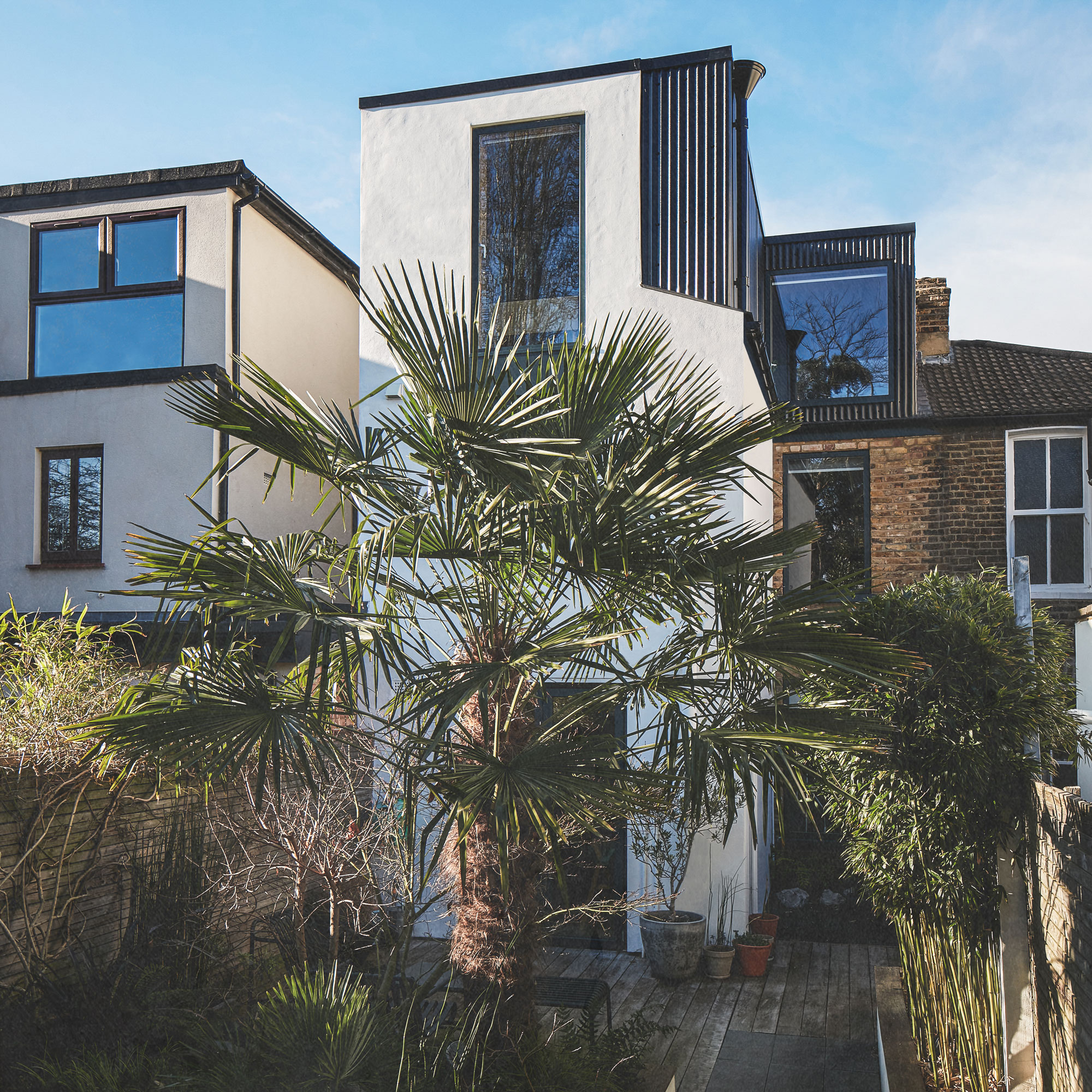
- CONSIDER CLEARANCE A minimum head height required is between 2 and 2.2m, so if your loft is currently under 2.5m then it will be difficult to make it work once the structural space is taken into account.
- ADDING LIGHT Placing a roof window directly above the staircase in a dormer extension is a smart way to bring light into the house. If the loft room is small then it’s also an idea to leave the staircase open to the room and put the entrance door to this area on the floor below.
- STICK TO THE RULES Permitted development and most planning policies do not allow you to raise the ridge of the roof, although if your neighbours have higher roofs then it might be possible, but still unlikely.
- STRETCH IT OUT Hipped roofs (those featuring three or four slopes to the roof), rather than the usual two, may allow you to extend across the entire roof line, so long as it doesn’t go above the highest ridge line.
- TOTAL SPACE Under permitted development, you can add up to 40 cubic metres to a terraced house, including an end of terrace. This goes up to 50 metres for semi-detached and detached houses.

Ginevra Benedetti has been the Deputy Editor of Ideal Home magazine since 2021. With a career in magazines spanning nearly twenty years, she has worked for the majority of the UK’s interiors magazines, both as staff and as a freelancer. She first joined the Ideal Home team in 2011, initially as the Deputy Decorating Editor and has never left! She currently oversees the publication of the brand’s magazine each month, from planning through to publication, editing, writing or commissioning the majority of the content.
-
 Crown Paint has launched new wall colours for the first time in three years, and changed how I think about neutral shades
Is terracotta the ultimate neutral?
By Rebecca Knight
-
 How to protect seedlings from birds – experts say there's a kind and clever way to stop them pecking
Yes, you can protect seedlings from birds without harming your feathered friends...
By Kayleigh Dray
-
 We tried the viral napkin bunny ears hack – it only takes five minutes and will take your Easter table to the next level
This Easter craft is not only beautiful, but really easy to do
By Kezia Reynolds