Tour this chic urban home full of pared-back perfection
For contemporary looks meets family comfort, this house is full of style to steal
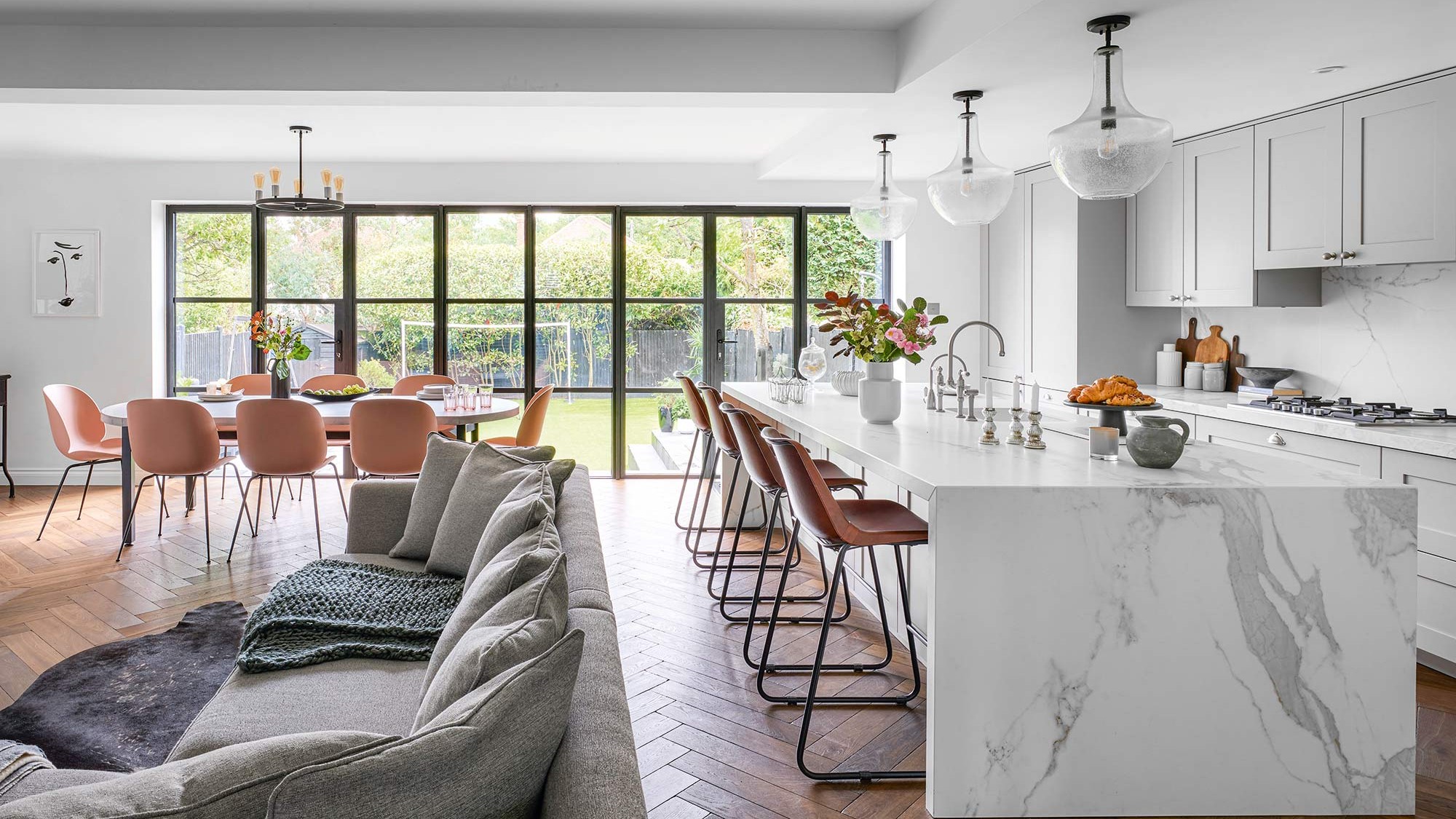

Planning a renovation takes time and lots of careful planning. The owners of this chic urban home were certainly in no rush when they first moved in six years ago. ‘It definitely needed a lot of work but we didn’t want to compromise on anything or overstretch ourselves with the budget so we made the decision to concentrate on the ground floor,' say the owners.
‘It had good structural bones to build on and it was located in the ideal road for our family,’ they say. Initially the owners just did a quick update of the 1970s decor, painting walls white and ripping up the psychedelic carpets to make it feel like a family home, then set about making detailed plans in preparation for the first part of the renovation.
Keen to use a range of local contractors and manage each one herself, the owners briefed each individually and their diligent planning meant there were no last-minute decisions to be made.
The owners relished the opportunity to take on the project management and both enjoyed the process, even though it did run over by a few months. ‘The builders did a great job, the finishes couldn’t be any better,’ they say.
The dining space
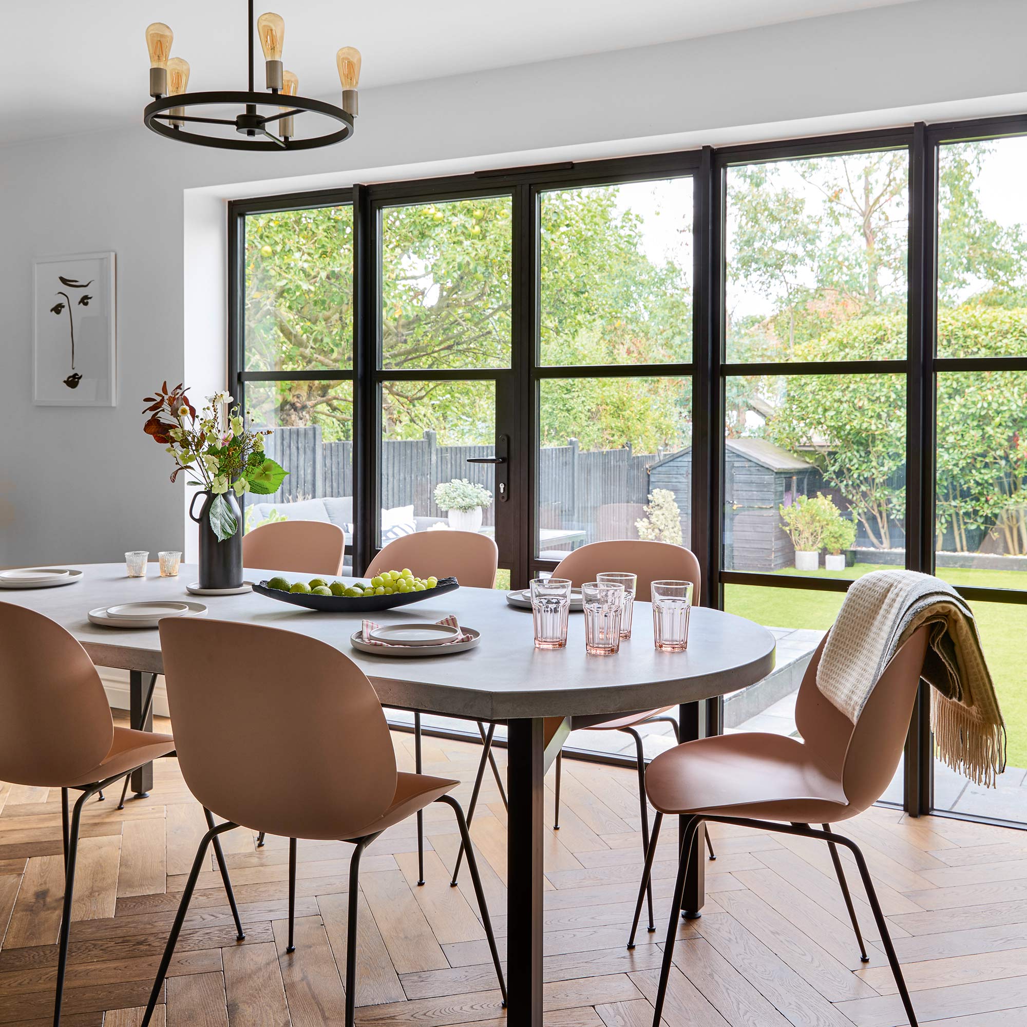
There were three must-haves for the owners in this contemporary update – a dark wooden floor throughout, metal-framed French doors across the back of the entire house and a contrasting lighter marble-effect worktop.
‘It can be overwhelming sticking to your design decisions as there are so many different styles to choose from, but I had done so much research over three years of living here and I knew I had made the right choices before we had even started the work,’ the said.
In the open-plan living space, they look towards a touch of industrial dining room ideas with a concrete dining table, adding black steel legs to match the doors.
Get the Ideal Home Newsletter
Sign up to our newsletter for style and decor inspiration, house makeovers, project advice and more.
The living-dining area

‘We were lucky that the previous owners had already built this fabulous extension,' the owners explain. 'It’s a massive eight by three metres but the configuration didn’t work for us. So we took down all the stud walls to create the open-plan kitchen, living and dining space.'
The distinct black framed doors anchor the open- plan space while drawing the eye to the garden. The marble effect wrap around island adds an elegant touch.
The living space
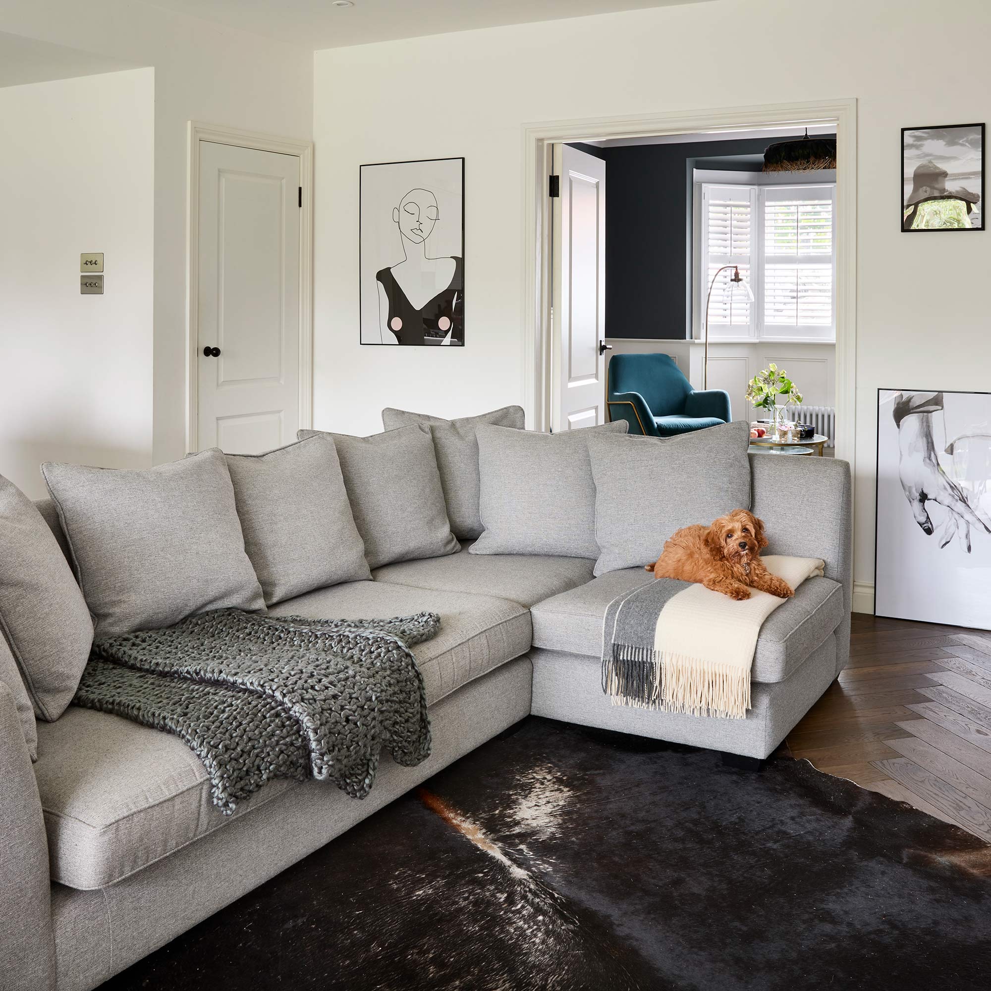
In the final section of the large open-plan space which makes up the bulk of the ground floor is the cosy family living area.
A corner sofa was chosen to separate this area from the other areas of the room. Adding a rug also helps delineate between zones in an open-plan or multi-functional space..
The sitting room
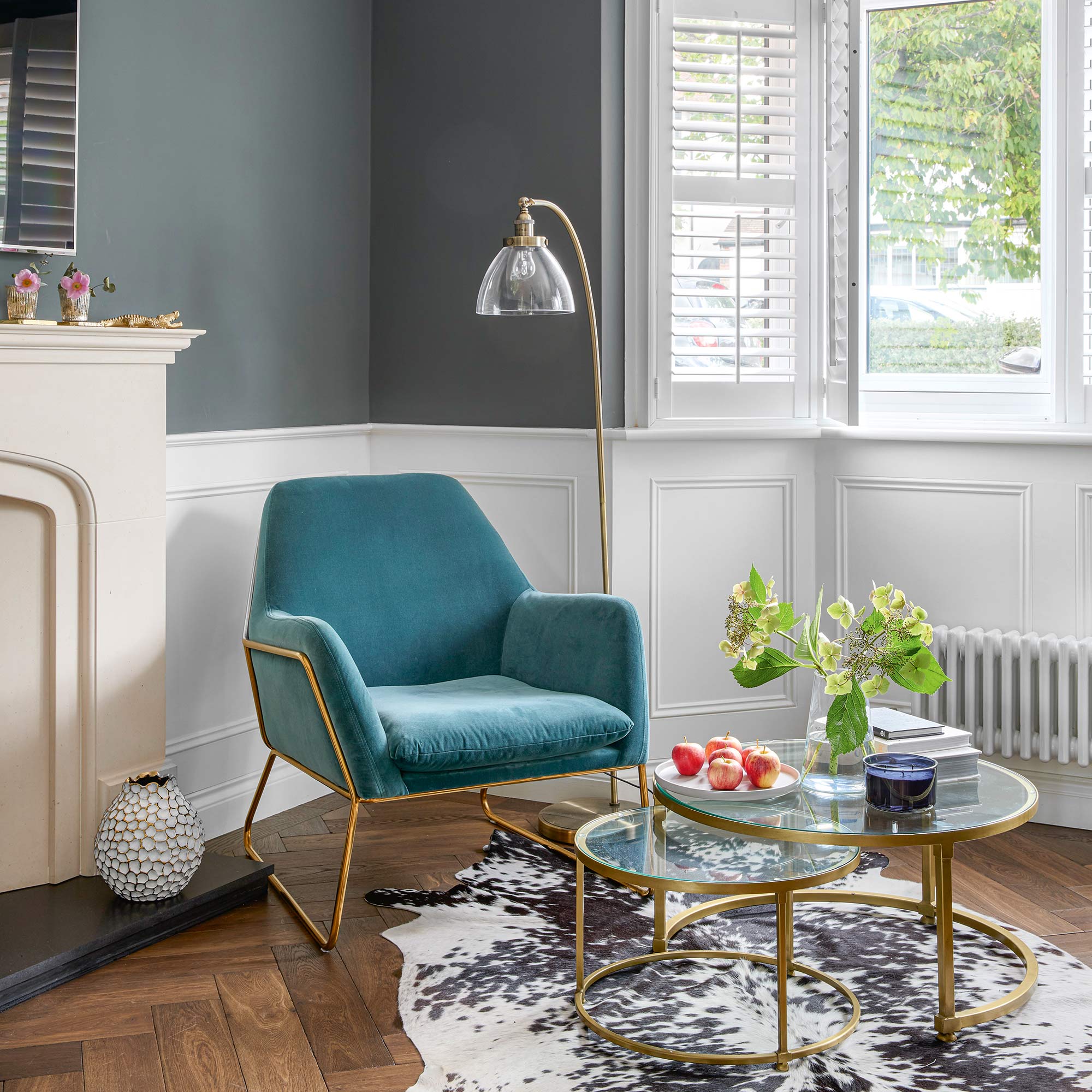
Perfect for when someone in the family needs a quieter time, whether to relax, work or entertain, a separate closed-off sitting room comes off the open-plan area.
Half-height panelling delivers delightful character and is one of the easiest small living room ideas to help add the illusion of extra height.
The hallway
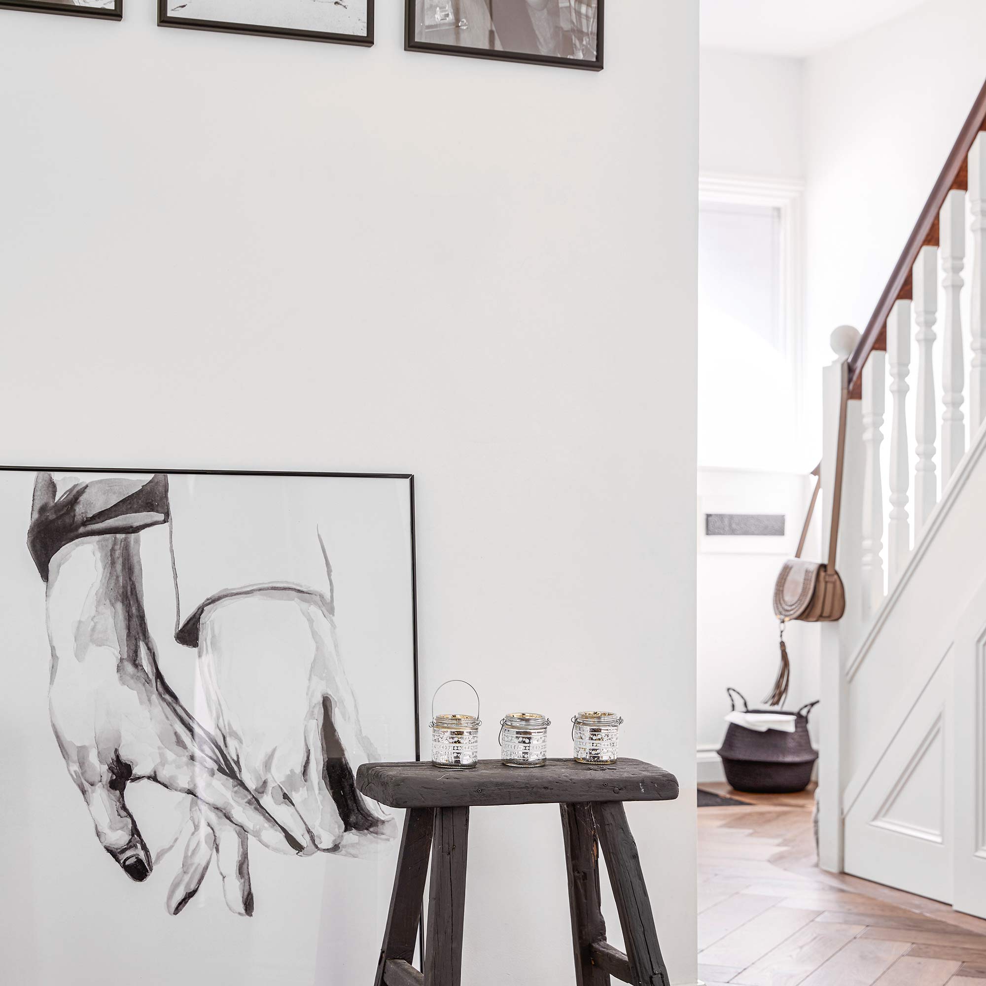
The walls are painted a Dulux off-white throughout the downstairs and black accents throughout help create a contemporary cohesion to the scheme.
Moving out of the large open-plan area, you see the home's hallway ideas. The staircase’s handrail was sanded down to match the flooring, and monochrome artwork continues the strong interior design theme.
The cloakroom
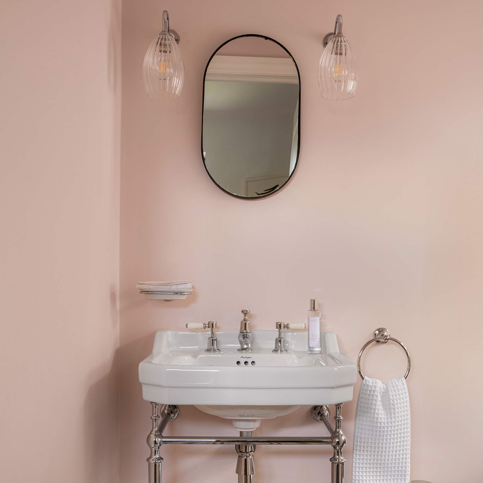
Adding a softer element to this chic urban home is the pretty downstairs cloakroom. Again, black accents continue, but a gentle feminine aspect is added with blush pink walls.
Continuing the playful vibe of their cloakroom ideas, monochrome patterned floor tiles also add a fun yet cohesive touch to this pared-back design.
The bedroom
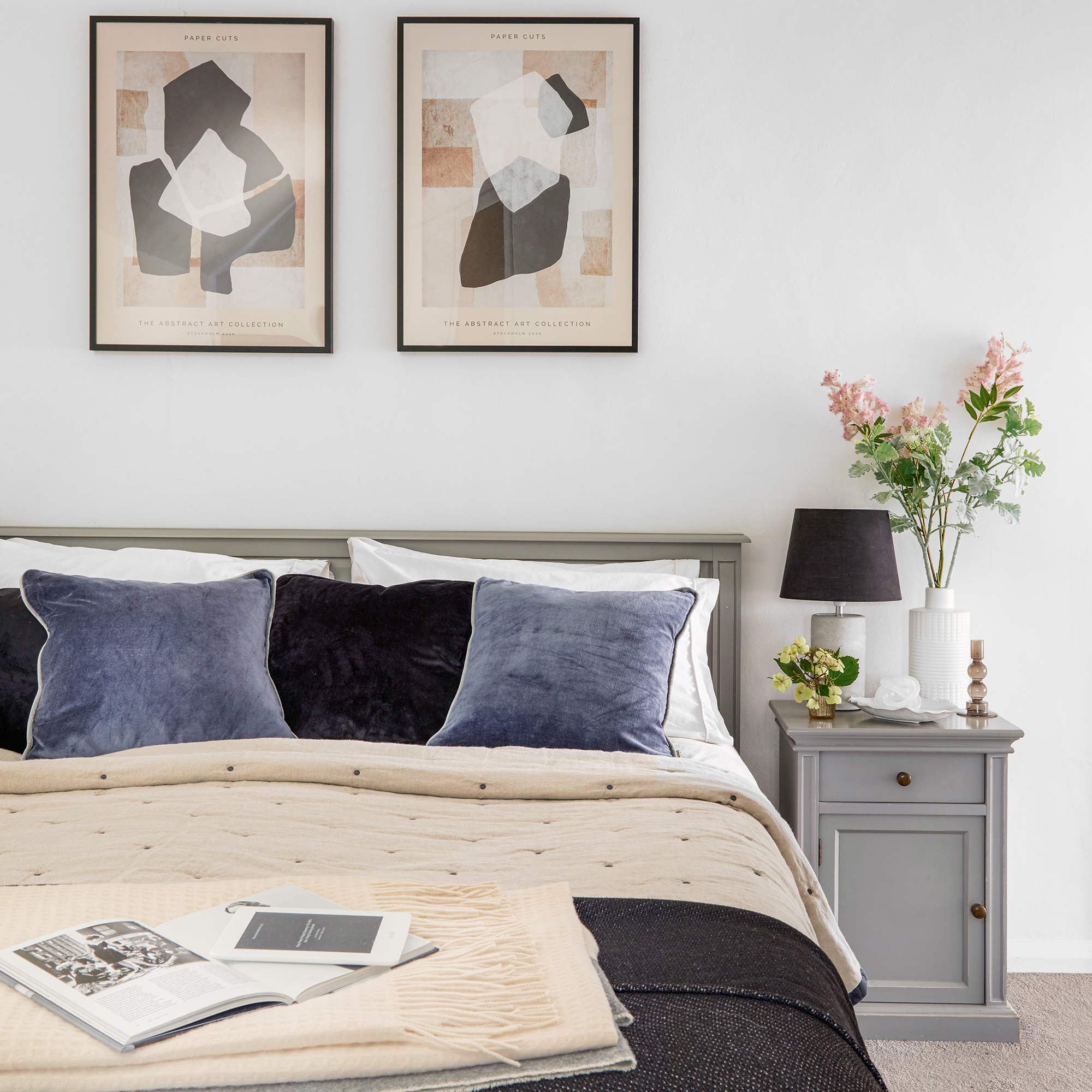
Continuing the monochrome theme in the home, the owners chose a softer approach in the bedroom. While the ever-present white and black remain, the scheme becomes more restful by painting the bedside table and headboard grey.
Touches of pale pink in the artwork also nods towards the pretty cloakroom.
The bedroom storage
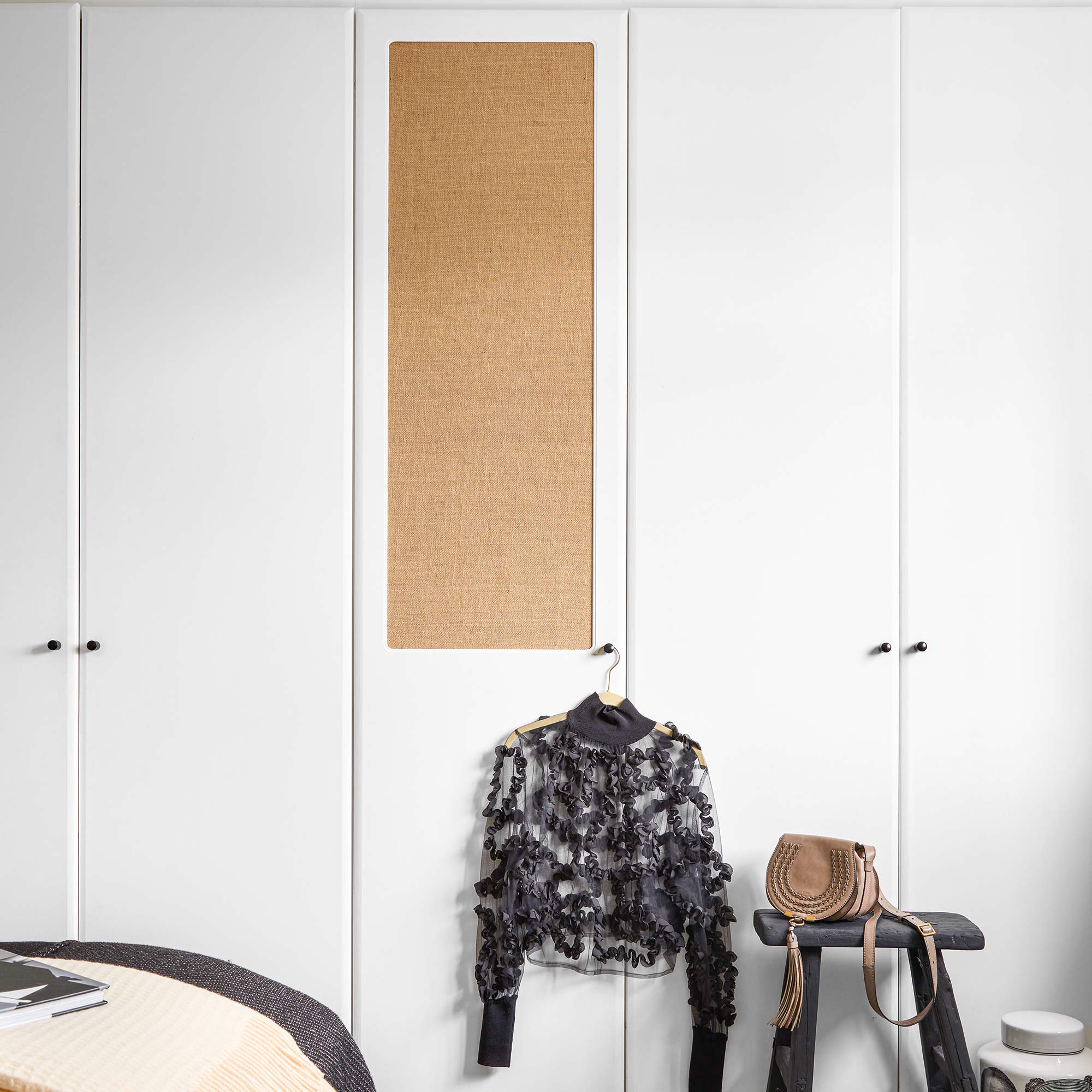
It's rare that banks of wardrobes ever look especially appealing, but these owners made it happen. Painted in the same white as most of the house, they nearly disappear from view. Interest is added using to this bedroom storage idea with the textured panel.
The garden
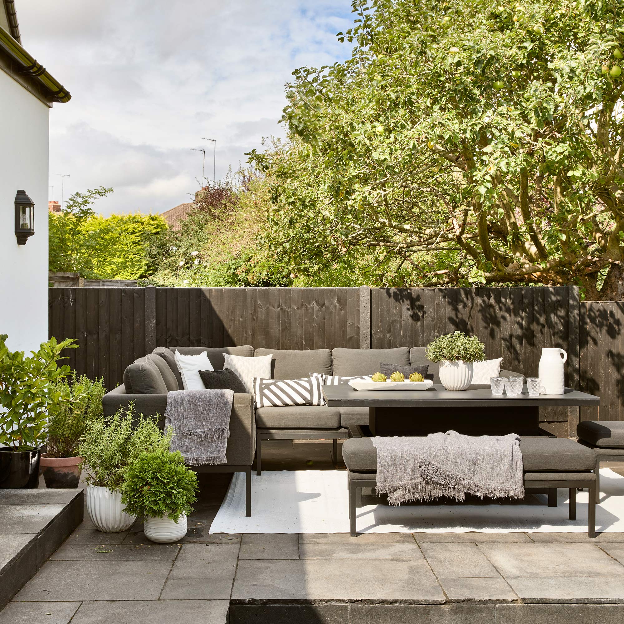
Creating a truly indoor-outdoor living space, the owners ensured they carried their chic urban home sensibilities into the garden. Monochrome garden furniture with pops of fresh greenery are invitingly cool and stylish.
Additional words by Sally Smith

Thea Babington-Stitt is the Managing Editor for Ideal Home. Thea has been working across some of the UK’s leading interiors titles since 2016.
She started working on these magazines and websites after graduating from City University London with a Masters in Magazine Journalism. Before moving to Ideal Home, Thea was News and Features Editor at Homes & Gardens, LivingEtc and Country Homes & Interiors. In addition to her role at Ideal Home, Thea is studying for a diploma in interior design with The Interior Design Institute.
-
 I tried out this neat little dehumidifier for a month – it dried my laundry in half the time
The 20L SmartAir Dry Zone dehumidifier tackled my laundry drying woes head on
By Jenny McFarlane
-
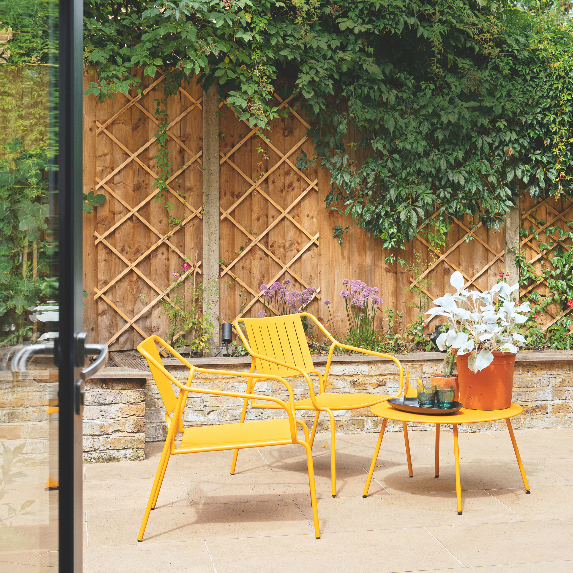 I’m seeing pastel garden furniture at all my favourite brands this spring, but QVC’s sorbet collection impressed me the most
Fresh pastel shades are a great way to liven up your outdoor space
By Kezia Reynolds
-
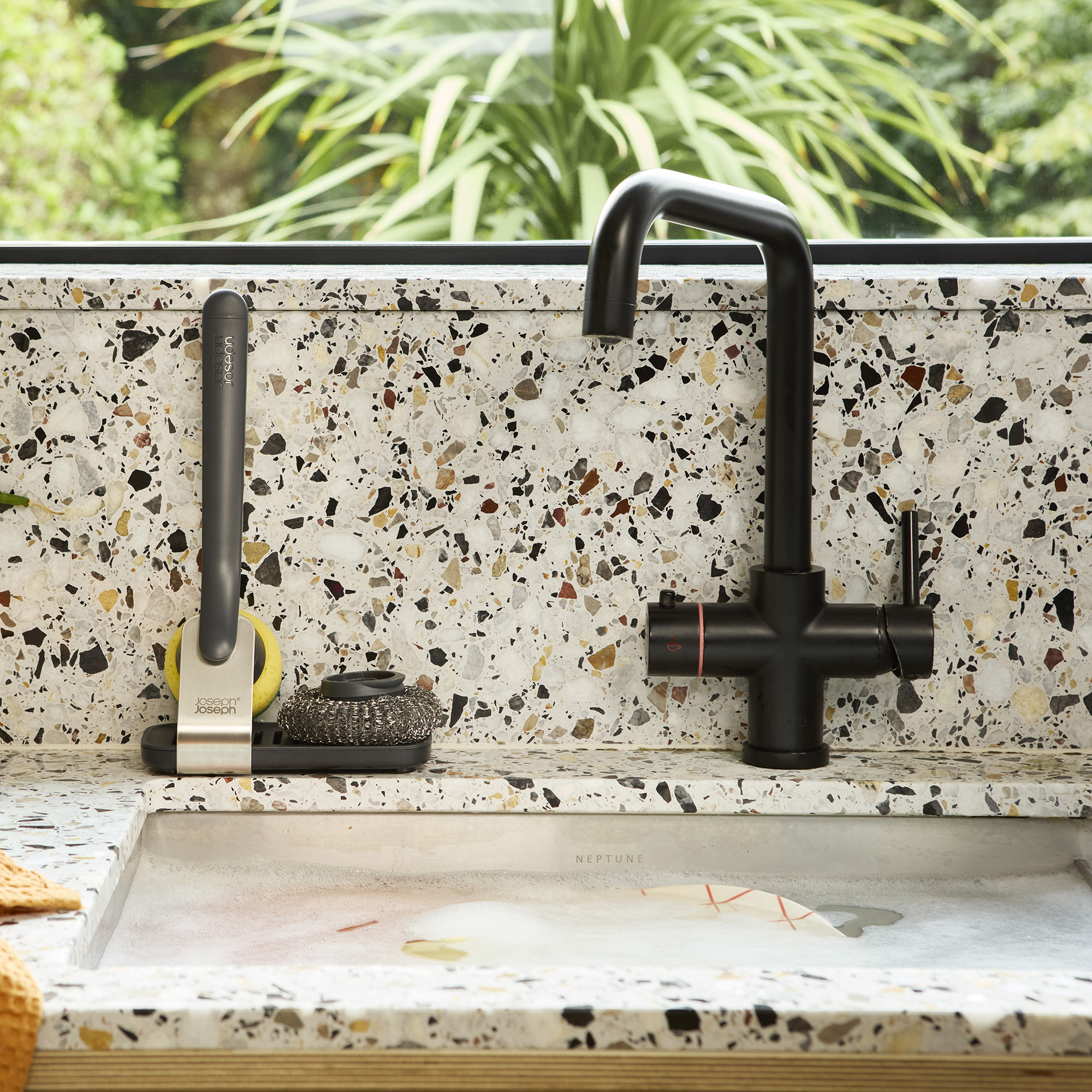 Don't tell my flatmates, but Joseph Joseph's clever new sink range finally made me enjoy washing up
I didn't know stylish washing up accessories existed until I saw this collection
By Holly Cockburn