Come and explore this smart three-bed semi in Scotland
The owner of this Edwardian house swapped bright, colourful florals for a more edgy, industrial look
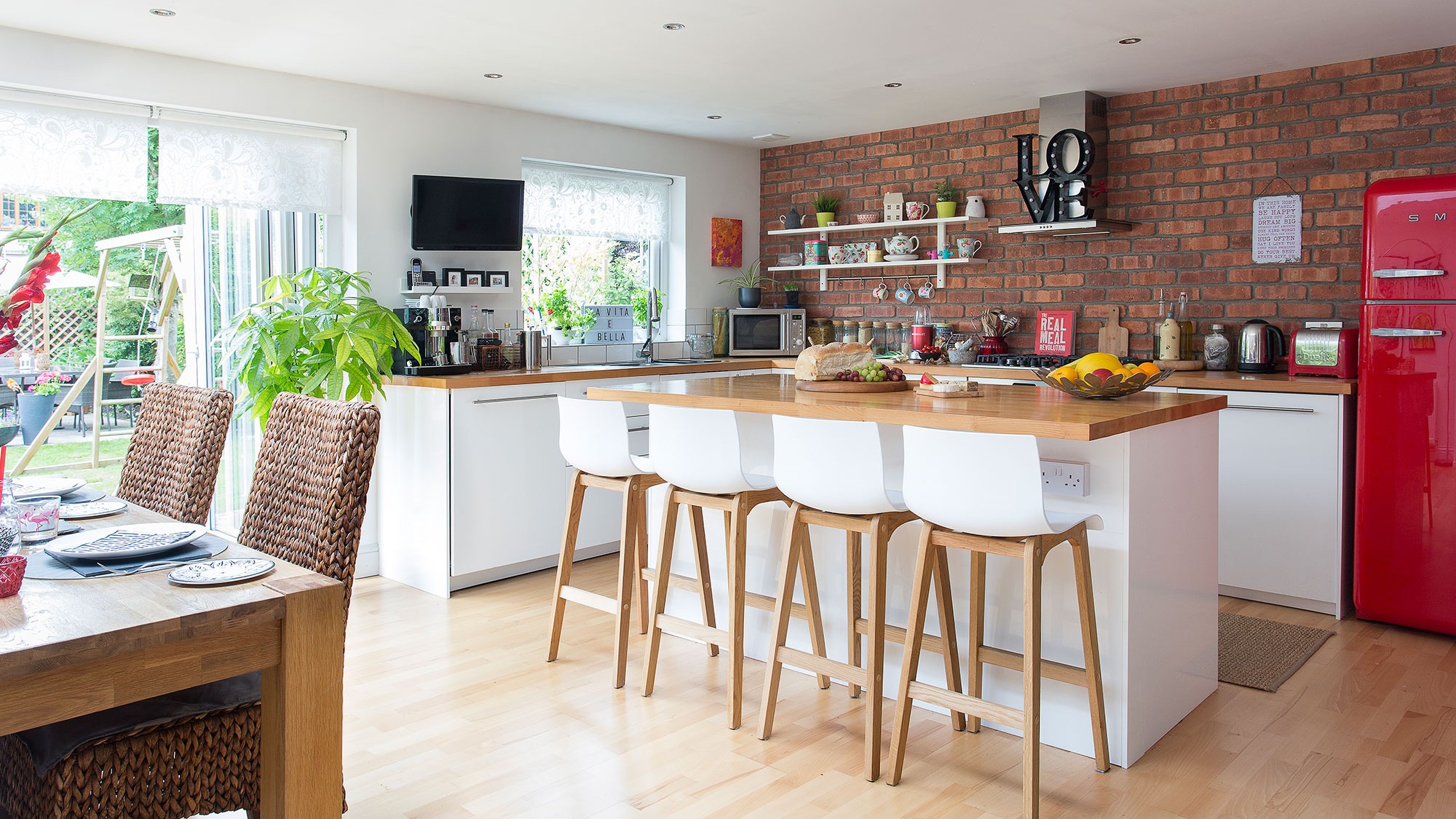
The owner's previous home was only just around the corner. 'We wanted to stay in the area when we moved, as my daughters were settled in school and we have lots of friends and family nearby,’ she says. ‘I was torn between this house and a brand-new home that didn’t need any work. I chose this and have not regretted it for a second.'
The family lived in the house for a year before they started the extension. 'One of the first things I sorted out was the hall, which you shouldn’t really do in case it gets damaged when you’re doing all the other rooms,' says the owner. 'But I just found the dated, worn blue carpet and duck egg walls far too oppressive. I really wanted the house to be cheerful the moment you stepped in through the front door.'
Love a house tour? Check out our real homes
The owner noticed her style change during the decorating process. 'When I first moved here, I bought lots of Cath Kidston bits and pieces,' she says. 'But I would describe my taste as more minimal now. When I was younger, I worked in Italy for a while. I think I was definitely influenced by the whole Alessi-industrial-design thing going on in Milan at the time.'
Exterior

The three-bedroom Edwardian semi-detached house in Stirling, Scotland was dated and in poor repair when the owner bought it in February 2013. But it had a lovely feel and lots of potential. As well as extending the kitchen across the width of the back of the house, giving the ground floor an open-plan layout, the owner has also added a downstairs loo and replaced the bathroom.
Living area
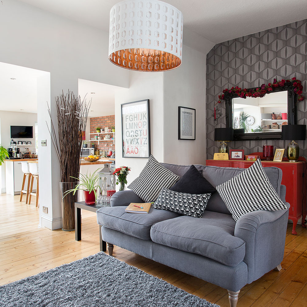
When the extension was added, the owner opened up the space to create a large open-plan living area. Large house plants soften the edges between the areas. 'You can bring so much life to your home with plants, as they connect the house to garden and will soften an edgy colour scheme,' she says.
Although the owner loves red she tries not to use it everywhere, limiting it to accents through the open-plan space.
Get the Ideal Home Newsletter
Sign up to our newsletter for style and decor inspiration, house makeovers, project advice and more.
Kitchen
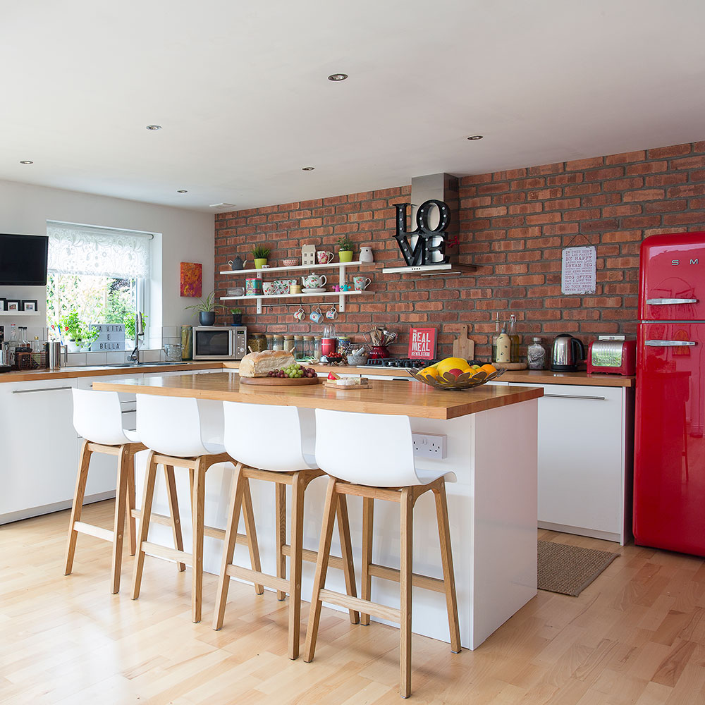
The owner asked an architectural consultant to help her draw up plans for the kitchen. She knew what she wanted – a skylight and bifold doors were top of the list. 'Opening up the downstairs space has meant there’s less storage than I would like, so I’ve had to be quite inventive,' she says. 'I’m naturally organised – I think being a teacher and a single mum reinforces that – everything has to have its own place.'
The owner collects boxes and baskets and uses them systematically. 'Unfortunately, I had to sacrifice a utility room so that I could have a downstairs loo,' she explains. 'But the washing machine is in the kitchen, which is fine as it’s well hidden behind the island unit. Everything went very smoothly and I’m delighted with the results.'
Get the look
Buy now: Drift Oak and White Bar Stool, £75 each, Atlantic Shopping
Dining room
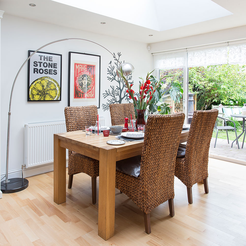
Next to do was the dining room. There was a fake brick fireplace that ran the length of a wall, complete with nooks for ornaments, which the owner and a friend ripped out. 'The original dining room felt a bit dark but knocking through to the living room has allowed light to flow in from the bay window,' she says.
'I stripped the floral wallpaper, painted the walls white to match the living room and sanded and varnished the floorboards. I gave myself a December deadline – it would be our first Christmas in the house – so with that date in mind, I was on a mission!'
Master bedroom
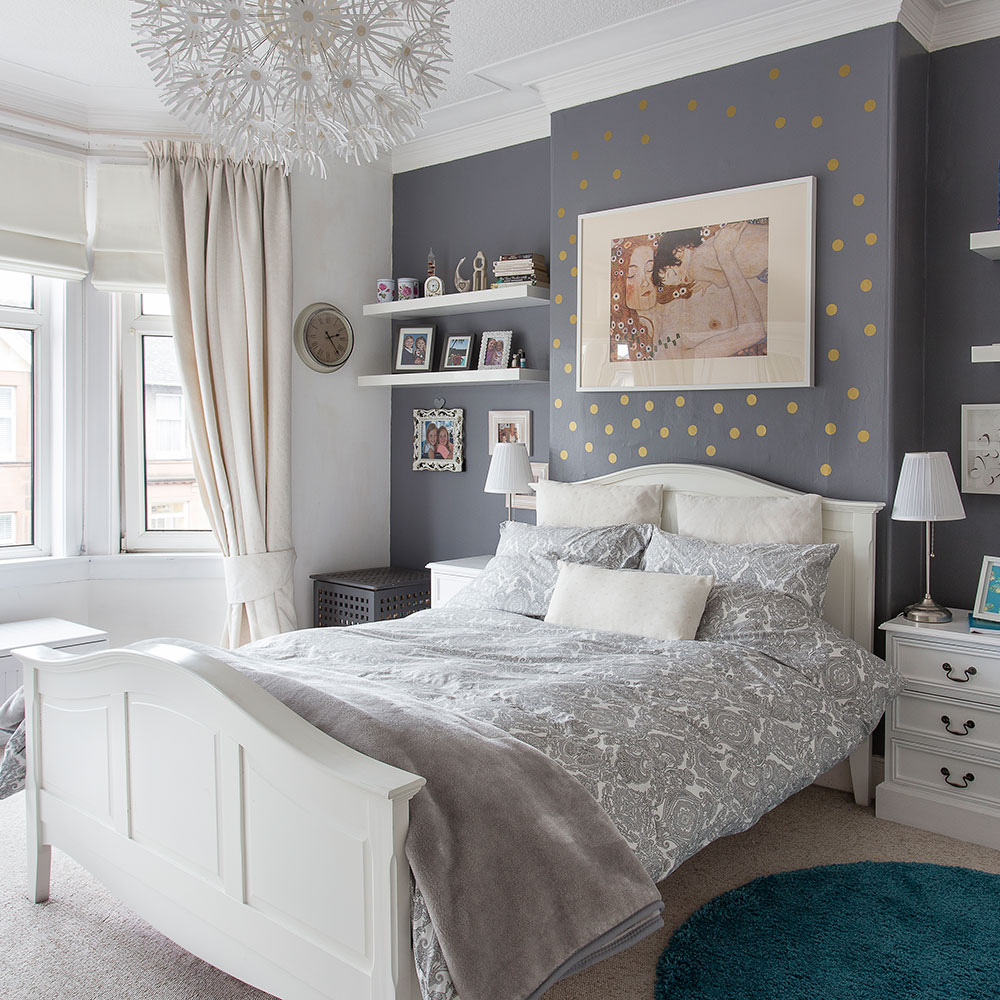
In her bedroom, the owner painted the furniture to match the bed. White linen blinds are light and bright but have a practical black-out lining. Gold dot wall stickers add create a focal point above the bed.
Get the look
Buy now: PS Maskros pendant, £90, Ikea
Kid's bedroom
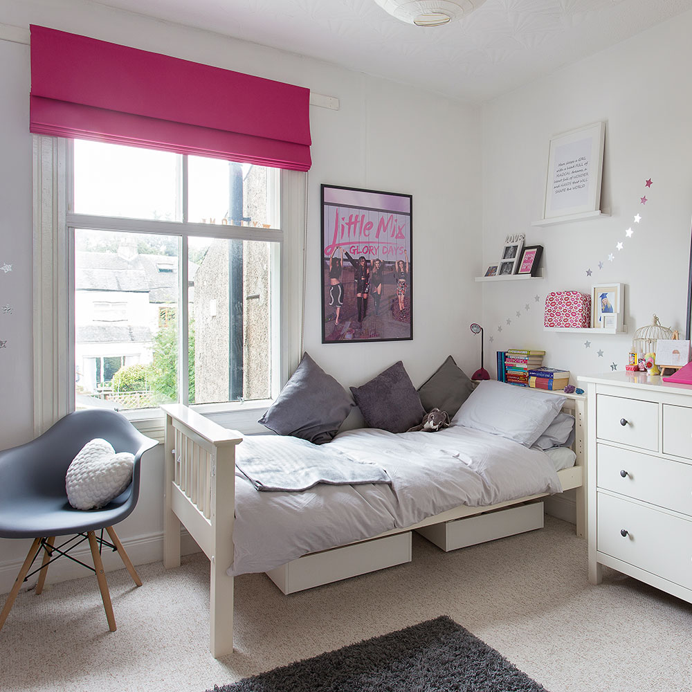
The owner tackled her daughters’ bedrooms first after the family moved into the new house. Two friends came round to help her and they stayed up all night decorating. 'The rooms were both were really dark and gloomy when we moved in,' the owner says. 'So those rooms were my utmost priority.' The transformation by the morning was stunning. 'I'm so grateful to my lovely friends who were there to help me,' she says.
Bathroom
Planning a revamp? See all our bathroom ideas
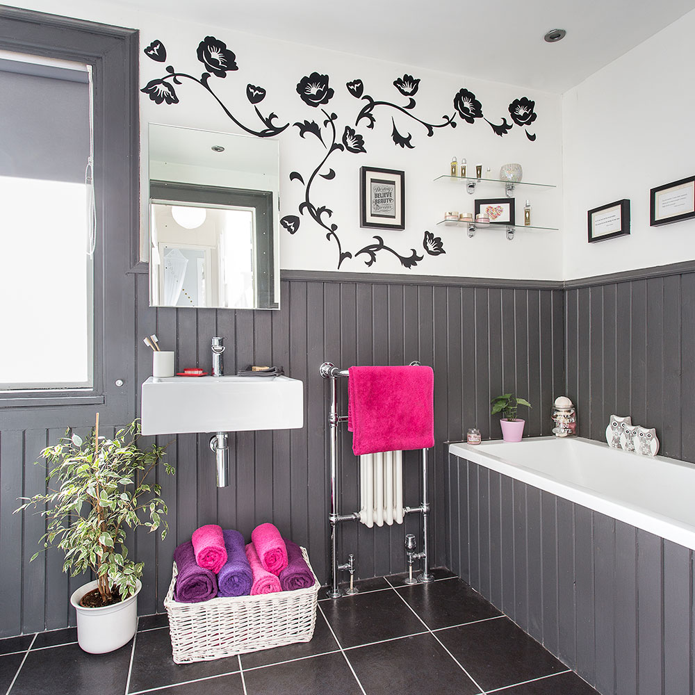
The bathroom was given a smart new look with dark grey half-height wall panelling and a striking floral wall sticker above. The owner's love of bright accents comes through in her choice of fun shades for the bathroom towels.
'My dad had a building company when I was young and I think that’s where my interest in buildings and renovations started,' says the owner. 'I guess it must be in the blood as I’m already thinking of what my next project might be – possibly converting the summerhouse to a working office.'
Doing up the house has been hard work. 'I work full time and have spent many evenings up ladders decorating, but I love how the house has turned out and we have been really happy here,' the owner says.
-
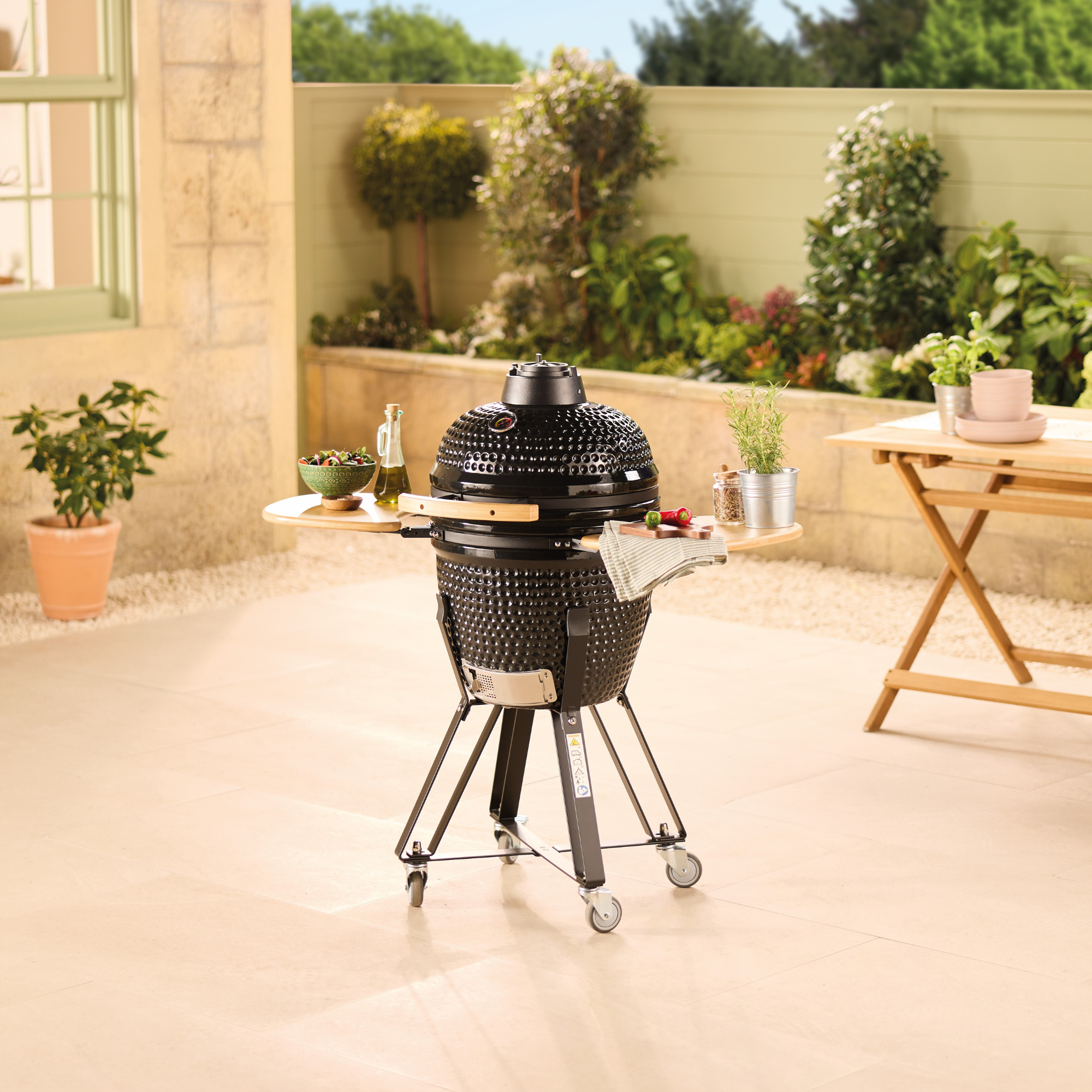 Aldi’s cult Kamado BBQ is returning to stores and it's £100 cheaper than last time
This budget BBQ is only a fraction of the price of this celebrity favourite
By Kezia Reynolds
-
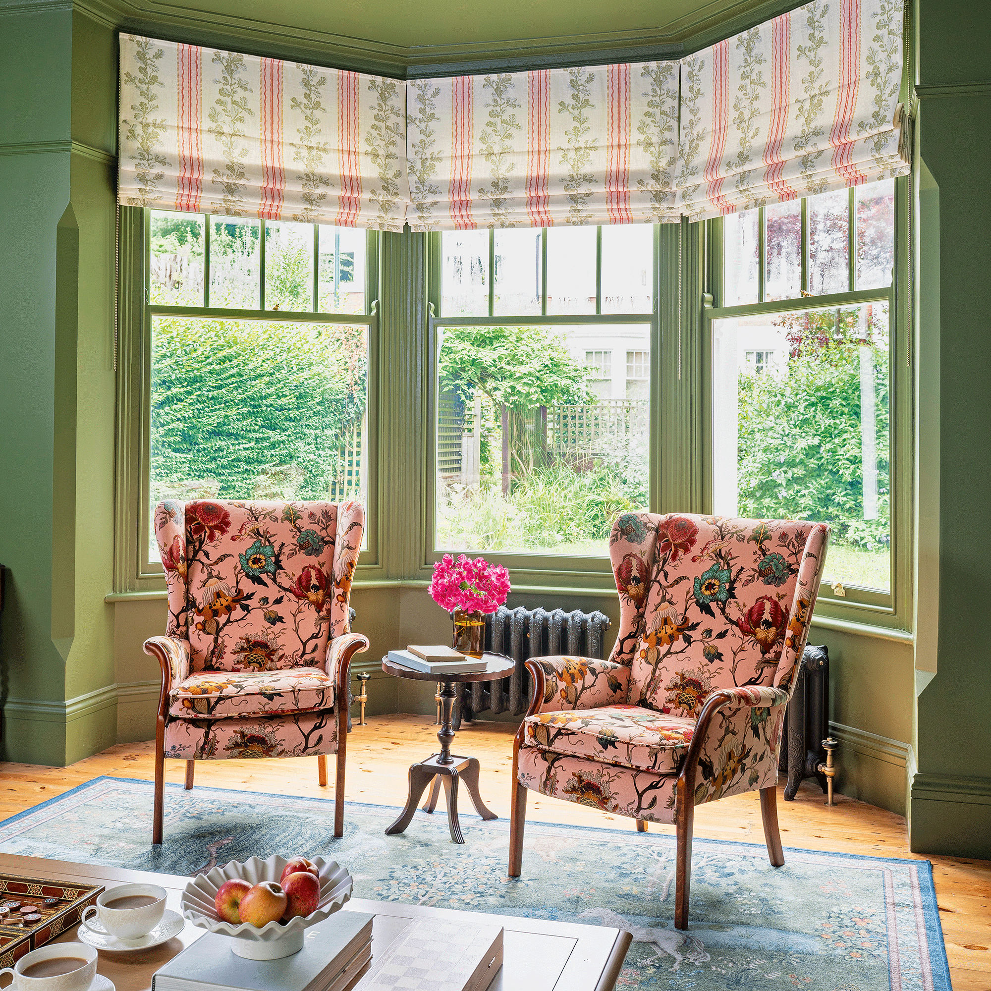 A strict colour palette and vintage finds have turned this semi-detached Edwardian house into an elegant family home
Sticking to a three-colour palette of green, pink and yellow and mixing in plenty of vintage furniture and art has created an authentic period feel
By Stephanie Smith
-
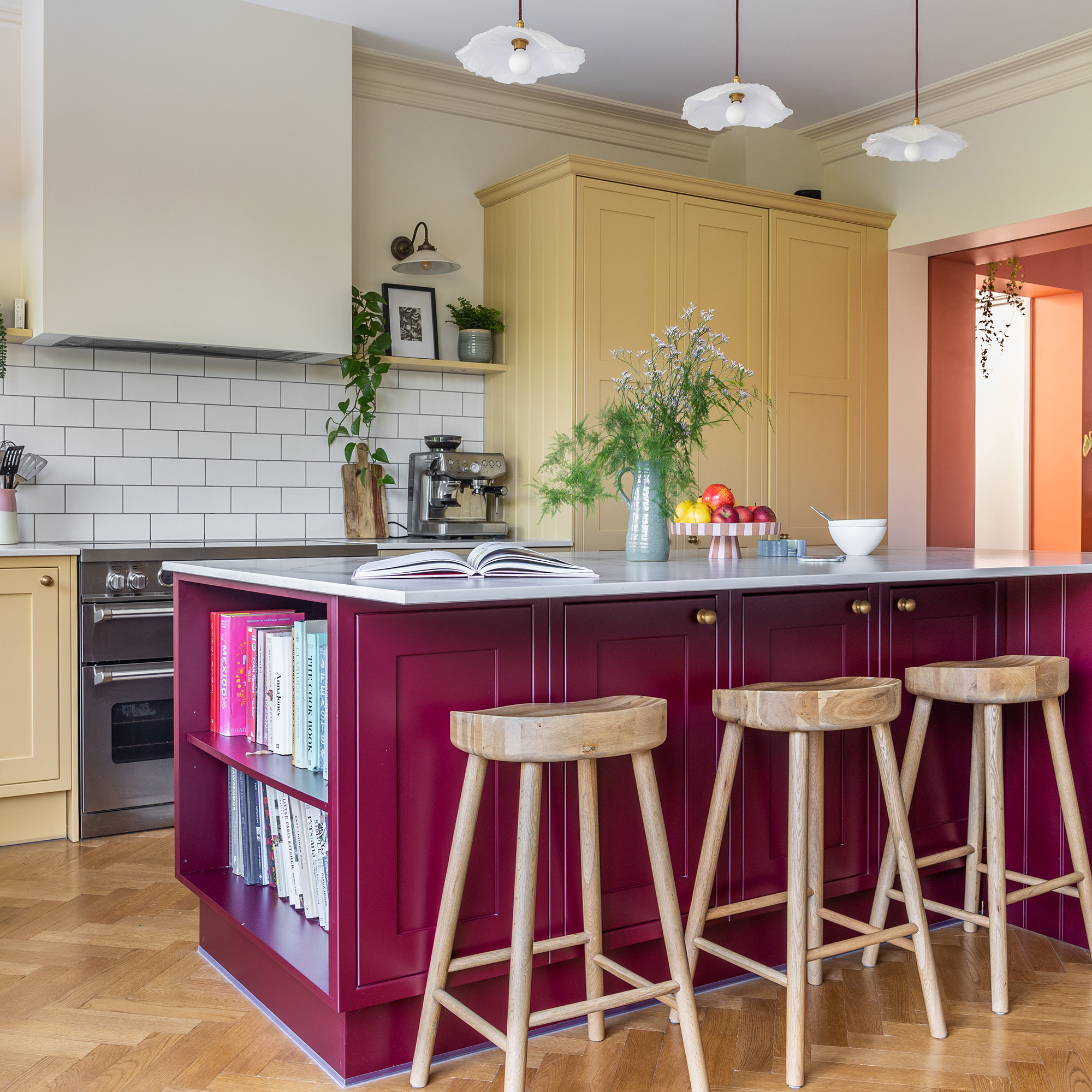 A top-to-bottom renovation has turned this Edwardian house into a lovely family home
With a few considered structural changes, this period house has been turned into a family home and has created a sanctuary for years to come
By Maxine Brady