Explore this contemporary London new build with a retro twist
Homes & Gardens explores the charm and elegance of this new mews house in London, which is packed wityh eye-catching design elements. For more house tours visit housetohome.co.uk.

‘The 1960s building that originally stood here was a bad house in a great location and, within 20 seconds of seeing it, I realised it should be demolished and rebuilt,’ says the owner of this new, architect-designed London mews home. Building the place from scratch has meant that he has been able to design every inch, from period-inspired details such as the encaustic tile-inspired floor seen here in the hallway, which was created using porcelain tiles cut to fit.
1/10 Front door with monochrome tiled floor
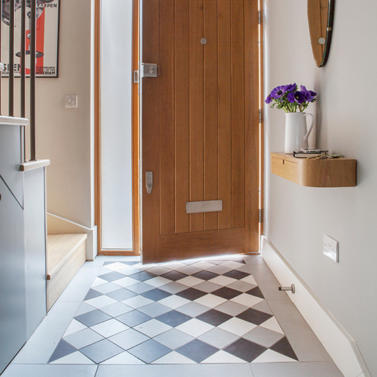
Grey Birch paint on walls
Sanderson
Similar porcelain tiles
Wickes
2/10 Living room with desk area
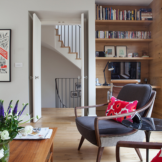
This desk area is in a corner of the open-plan living room that is located on the first floor. 'We don’t have a TV, but during the planning stage of the project, we each noted what devices we like to use, and where and when we use them, so that now, the desks and workstations are in locations that we can all use, whenever we want,' says the owner.
Pieni Unikko cushions
Marimekko
Moreau sofa
Pinch Design
3/10 Living room with contemporary artwork
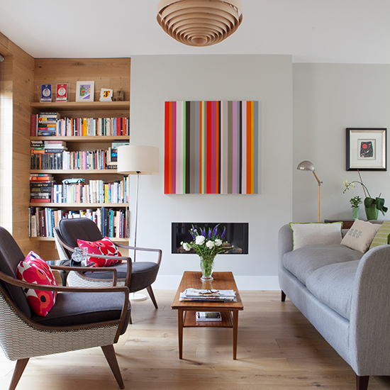
'We put the main living spaces and a garden balcony on this floor because it has more light. I painted the striped canvas myself to stop the neutral decor from looking too sterile.' To make the new building look even more homely, sections of the walls in the living room have been lined with oak to match the floor. Mid-century modern furniture adds further character to the space in this home.
Interior design
Jill Scholes
For mid-century modern furniture
Modern Shows
Get the Ideal Home Newsletter
Sign up to our newsletter for style and decor inspiration, house makeovers, project advice and more.
4/1`0 Living room wooden vent detail
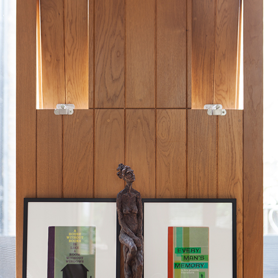
Tall, narrow vents are built into the window frames, allowing fresh air to circulate through the living room when the balcony doors are closed. The ledge below provides a perfect spot to display some of the owner’s artworks, which in turn add further splashes of colour and form to the room.
Architects
Prewett Bizley Architects
Sculpture
Margit Wittig
5/10 Bright and airy dining room
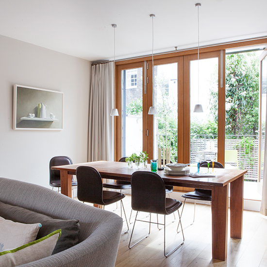
Although the layout is open-plan in nature, the first floor has been arranged into distinct areas so that the owner and family can cook, eat, relax and work in comfort. The American black walnut dining table, which came from the owner’s previous home, was cut down to fit the new space and is surrounded by metal-framed chairs that are comfortable and yet do not to overpower this dining room.
Romeo Babe S pendant lights
Flos at Made in Design
Engineered oak boards
FPS Flooring
6/10 Sleek white kitchen
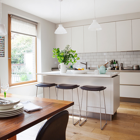
The kitchen was also designed to look as simple and unobtrusive as possible within the larger scheme. 'We chose handleless white cabinetry, and white metro tiles that don’t dominate, but still hint at texture and character.' The island unit with bar stools means breakfast and end-of-the-day conversations can be had comfortably while someone gets on with cooking the evening meal.
Optik glass pendants
Tinsmiths
Metro tiles
Fired Earth
7/10 Landing with home office
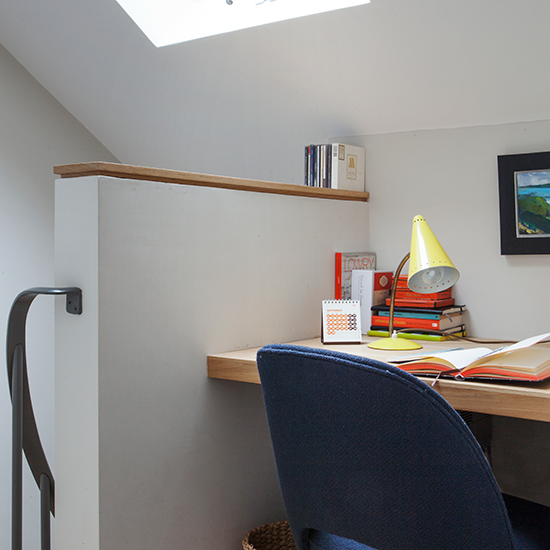
'The site of this house was not a standard one so we were able to create an entirely bespoke building and interior, with two bedrooms on the ground floor, and the main bedroom in the loft. Each one has its own bathroom and workspace.' This compact desk is cleverly worked into a small landing at the top of the stairs, with its sinuous metal handrail.
Similar light, Waterquest retro yellow table lamp
Petit Home
8/10 Main bedroom with comfortable chair
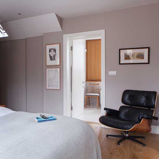
To give the owner the minimal interiors he keenly sought, storage was a priority throughout the house. Here in the main bedroom, 10.6m of cupboard space was created, with self-coloured doors that fit flush with the walls, and discreetly styled with simple finger-hole openings or sliding doors so you hardly notice they exist.
Mellow mocha paint on walls
Dulux
Charles Eames lounge chair
Vitra
9/10 Main bathroom
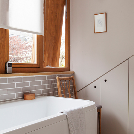
'I am slightly obsessive about ventilation and security,' says the owner, pointing to the pivoting oak panels, seen here in the bathroom, that allow air to circulate and which are small enough to be left open safely. Matching but rather smaller versions can be found in the various rooms throughout the lower floors of the house.
Form back-to-wall bath
Laufen
Skimming Stone paint on walls
Farrow & Ball
10/10 Balcony garden with yellow chairs
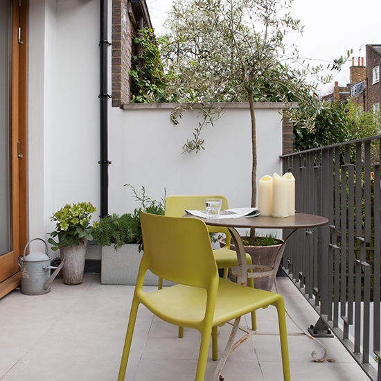
Folding doors lead out on to the first-floor balcony, providing an extension to the first-floor living space, as well as a view over another smaller garden that extends from the bedrooms below. With its creative design solutions and clean-lined styling, this house is 'an absolute joy. We have, I think, reinvented the mews house for the 21st century.'
Spark side chairs by Don Chadwick
The Conran Shop
Similar opera round garden table by Fermob
Barbed
If you liked this, find more inspiring articles on the Homes & Gardens website

Heather Young has been Ideal Home’s Editor since late 2020, and Editor-In-Chief since 2023. She is an interiors journalist and editor who’s been working for some of the UK’s leading interiors magazines for over 20 years, both in-house and as a freelancer.
-
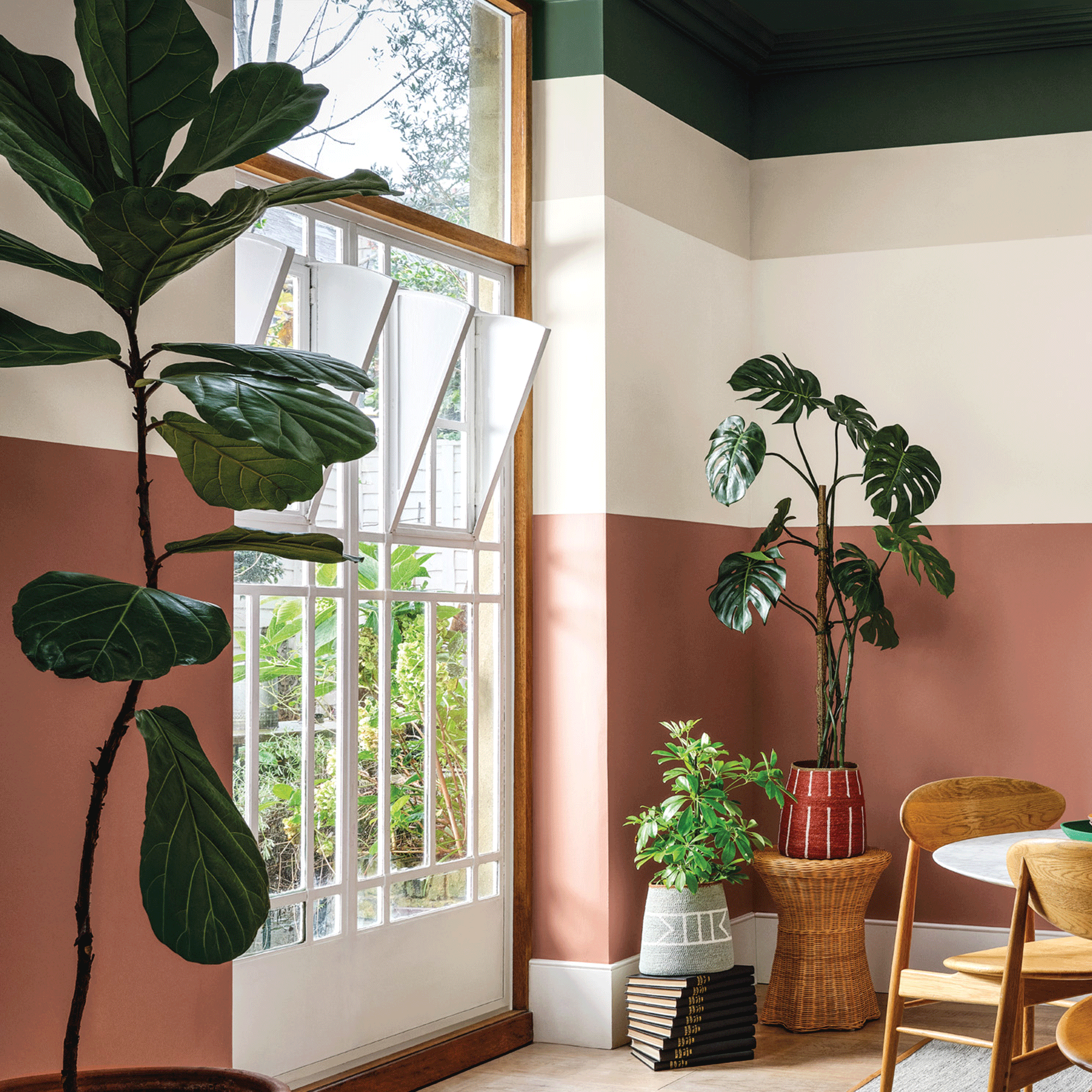 Crown Paint has launched new wall colours for the first time in three years, and changed how I think about neutral shades
Is terracotta the ultimate neutral?
By Rebecca Knight
-
 How to protect seedlings from birds – experts say there's a kind and clever way to stop them pecking
Yes, you can protect seedlings from birds without harming your feathered friends...
By Kayleigh Dray
-
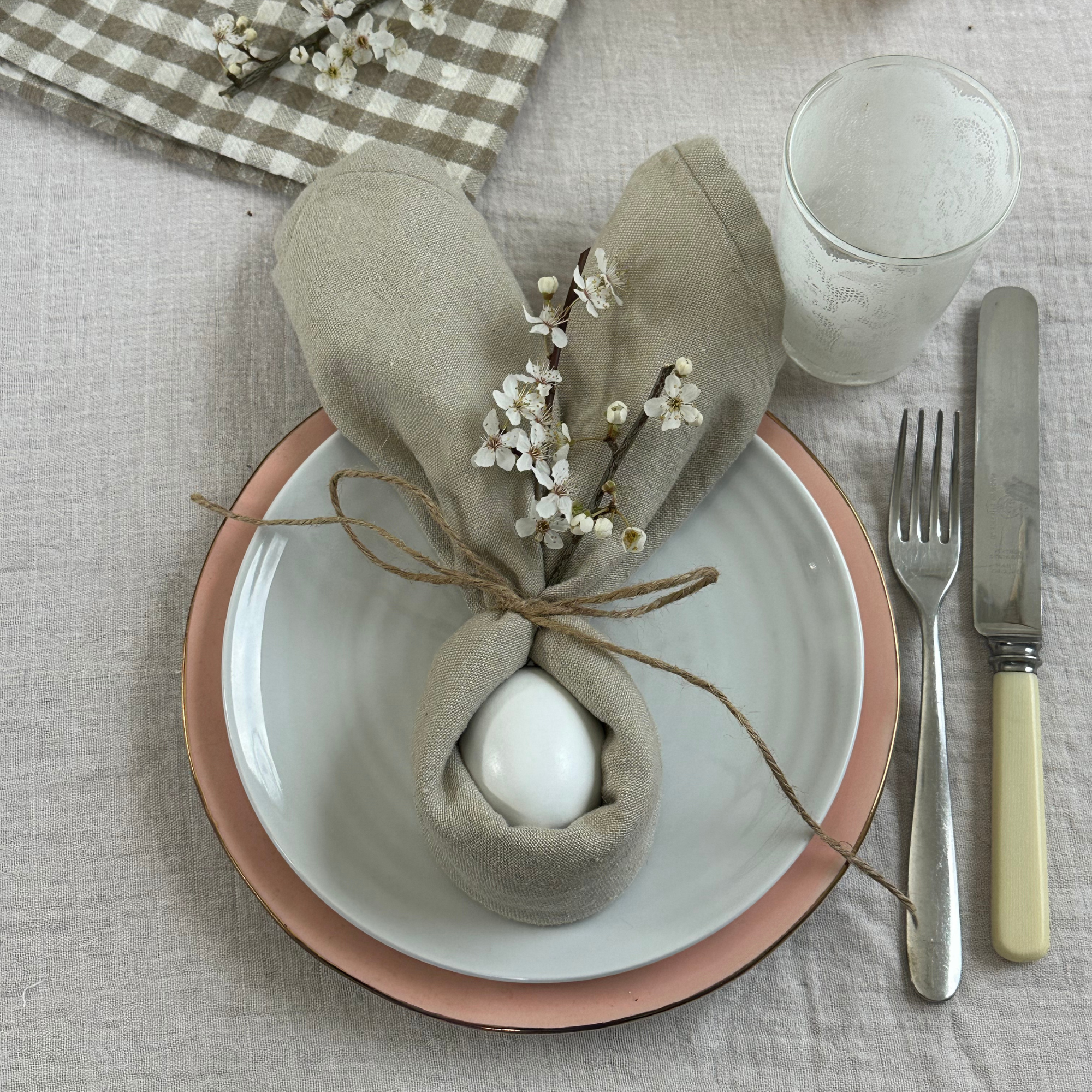 We tried the viral napkin bunny ears hack – it only takes five minutes and will take your Easter table to the next level
This Easter craft is not only beautiful, but really easy to do
By Kezia Reynolds