Take a tour of this extended contemporary home in Hertfordshire
This family took a boxy, modern brick house, extended it and replanned the internal layout to create a extended contemporary home in Hertfordshire
Plenty of people spotted the potential of a neat, detached, red-brick house, tucked away in a quiet, no-through-road. ‘The location was brilliant. Plus there was space to extend at the side and it had a gorgeous back garden,’ says the owner.
Other buyers clearly thought the same, as after house tours it went to sealed bids. 'Amazingly, we got lucky' exclaims the owner. The house had been well maintained, so the family moved in straightaway.
They lived with the dated kitchen and bathroom and wall-to-wall peach decor for five years, coming to understand how the family lived and moved around within it.
Exterior
‘We learned that we love being together, so an open-plan layout would suit us,’ says the owner. ‘We needed more living space and more natural light, as well as a fourth bedroom and en suite upstairs.’
To achieve this, the ground floor was extended and the kitchen, dining room and living room knocked into open-plan kitchen idea with big windows and skylights set into a high, vaulted ceiling.
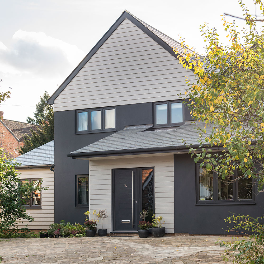
A second extension idea was built over the garage, which was also converted into a playroom. At the same time, the red-brick exterior was given a makeover with nearly black render.
Hallway
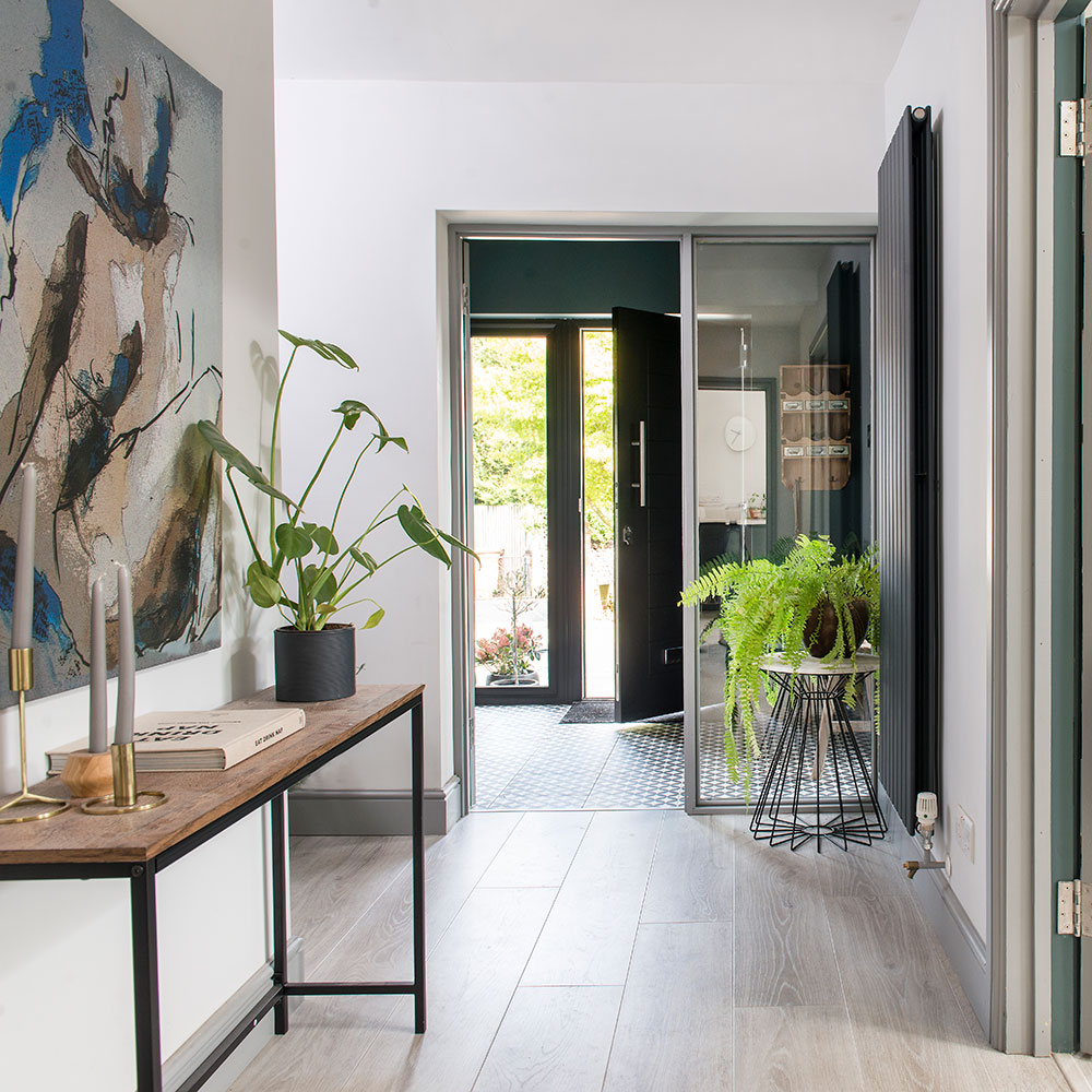
A porch was built onto the front of the house and the old front door was replaced with glass panels that let light flow into the hallway.
Get the Ideal Home Newsletter
Sign up to our newsletter for style and decor inspiration, house makeovers, project advice and more.
Living room
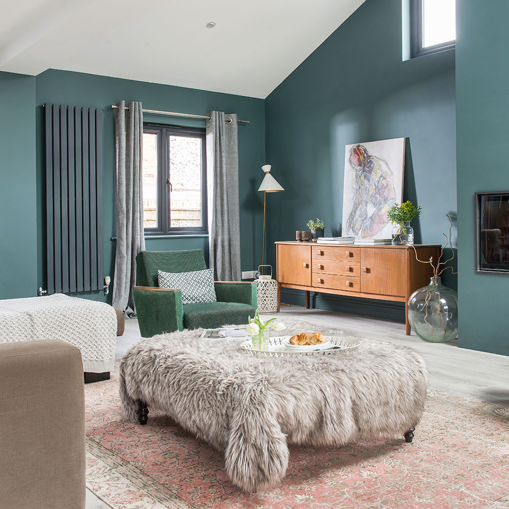
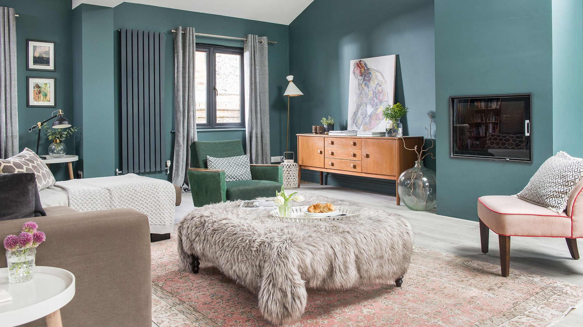
Pippa’s seating area has high ceilings and lots of windows, so the walls of the green living room idea aren’t overwhelming. ‘I chose Farrow & Ball’s Inchyra Blue, which is a super-dark blue-green, in the seating area. It’s so rich and inviting, and we loved to see how our artwork pings out against it.’
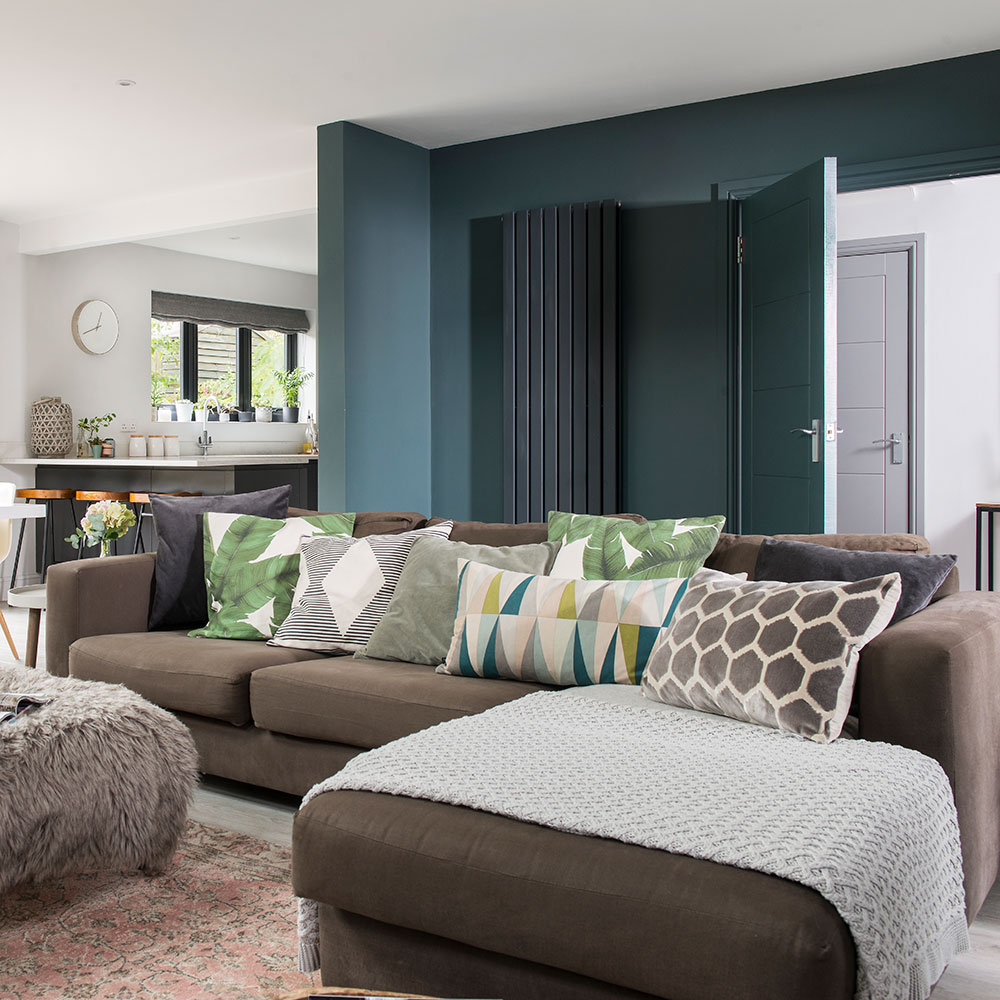
'The space felt vast and overwhelming, but the key to making it work was creating ‘zones’ to make it feel calm and ordered ,' says the owner. 'I used colour to distinguish the different areas. I’ve gone for paler shades around the dining table and kitchen to boost light and give them a more functional, active feel.’
Kitchen
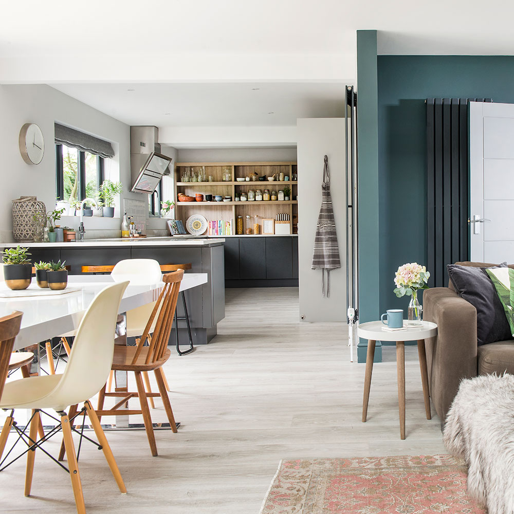
‘In an open-plan layout, you have to think about what can be seen from elsewhere in the space – so we planned the kitchen with that in mind. As we cook a lot, I factored in plenty of storage for equipment and ingredients,’ says the owner.
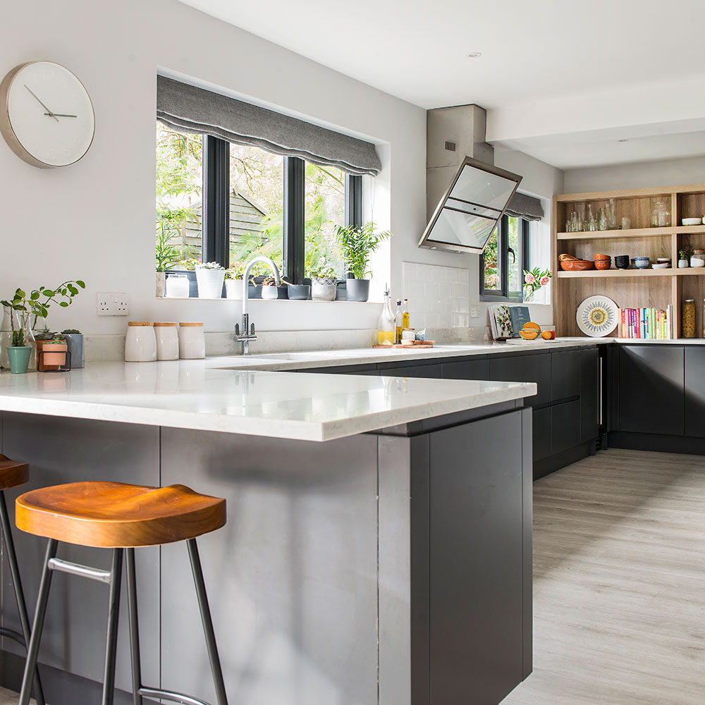
Chunky shelves in unfinished wood add warm colour to the cool, grey kitchen idea. ‘I designed the kitchen so that when we’re relaxing or at the table, we’re looking at lovely display shelves.’
Dining area
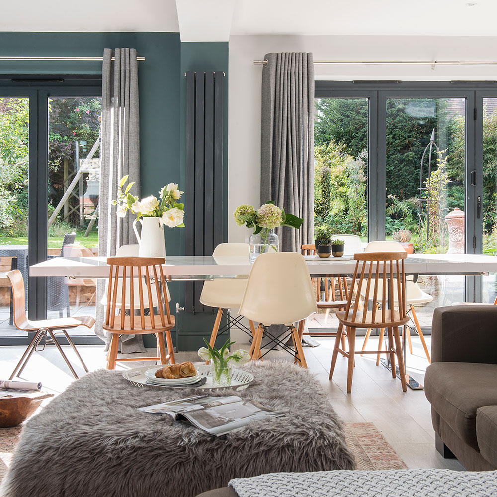
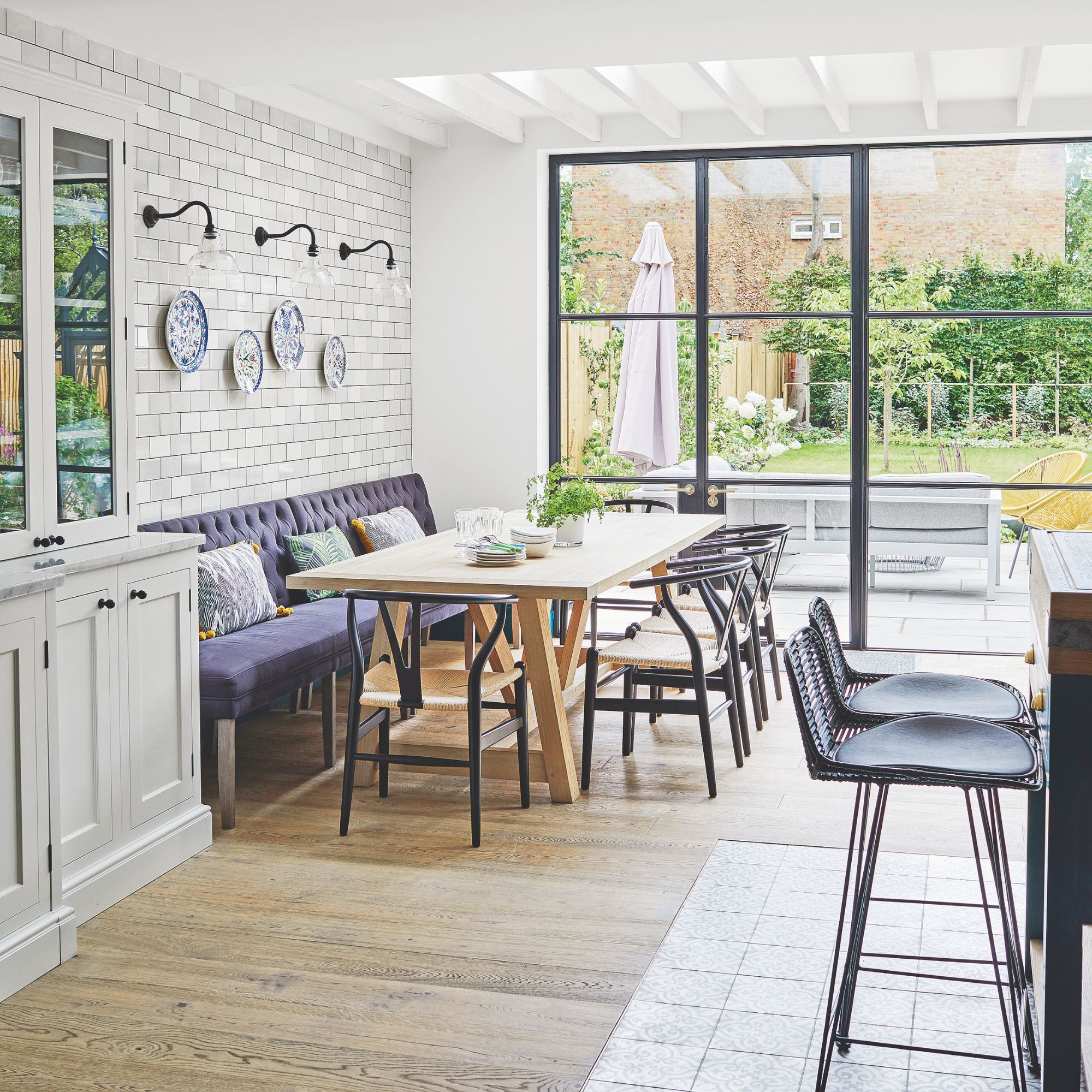
The dining area of the space looks outwards to the garden through plentiful Bifold doors across the back of the extension.
Master bedroom
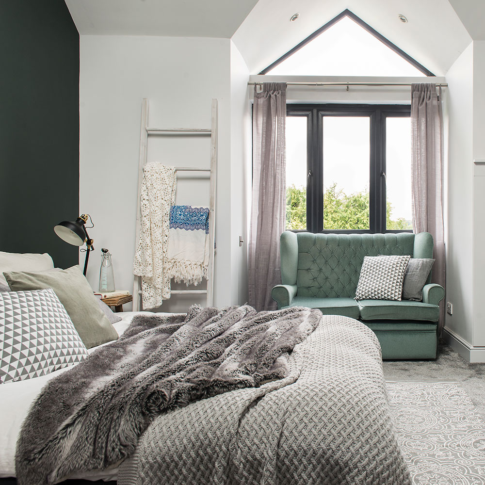
'We made sure that the new master suite is tucked away from the girls' bedrooms and bathroom, so that everyone can have privacy when they’re older,' says the owner.
The owner’s pale grey walls and carpet mean she can change her feature wall to almost any colour. 'The wall of deep, dark green makes the area around the bed feel restful and calm. But it doesn’t overwhelm the wall,' she says. 'We used a pale grey on the other walls which feels more energising and frames the green view from the window.’
Child's bedroom
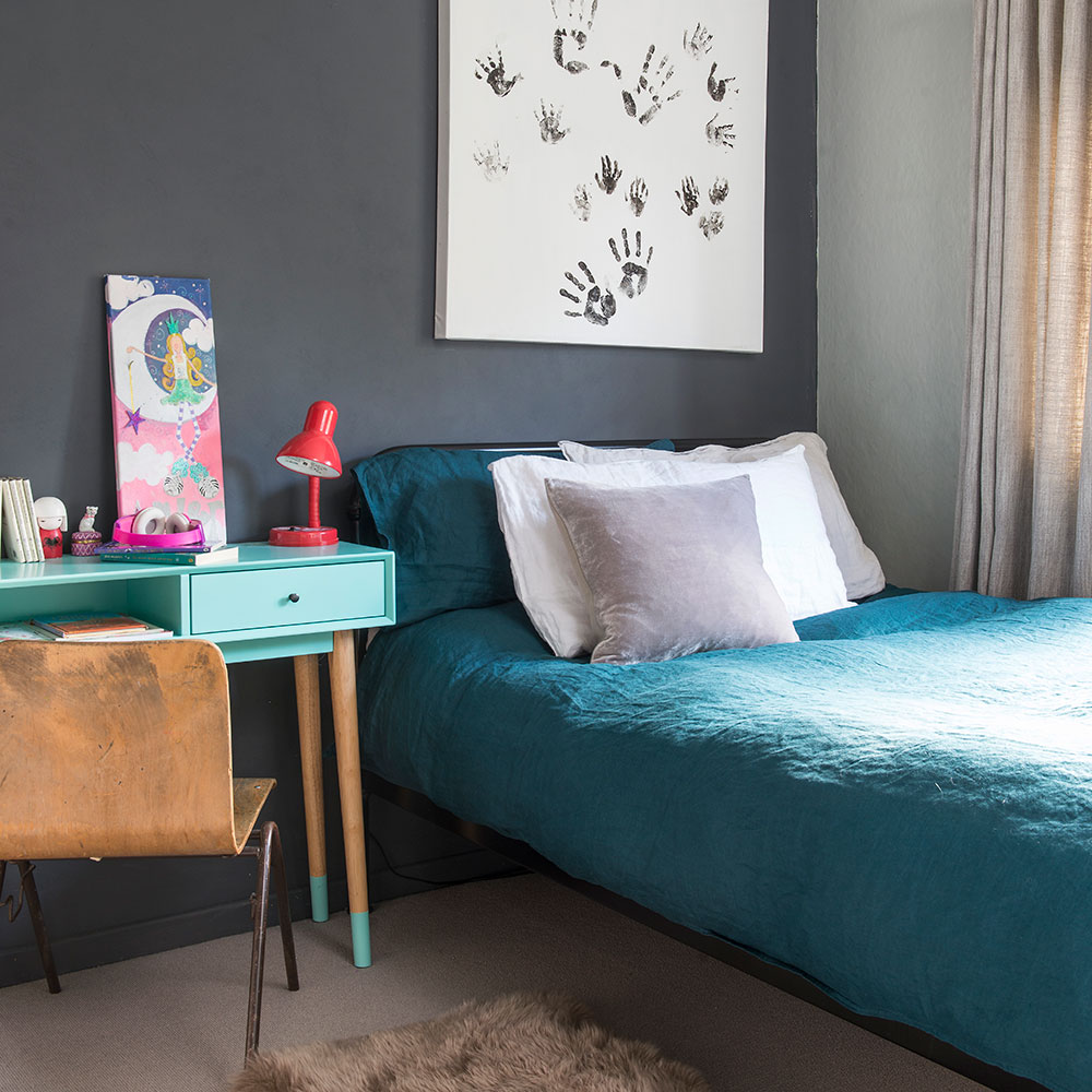
The dark palette extends into the couple's eight-year-old daughter’s cool bedroom, where it’s lifted by tonal greens from deep teal to pretty aqua. Her black metal bed and salvaged school chair echo the house’s functional, mix-and-match vibe. A cool set up for a young girl's bedroom idea.
Bathroom
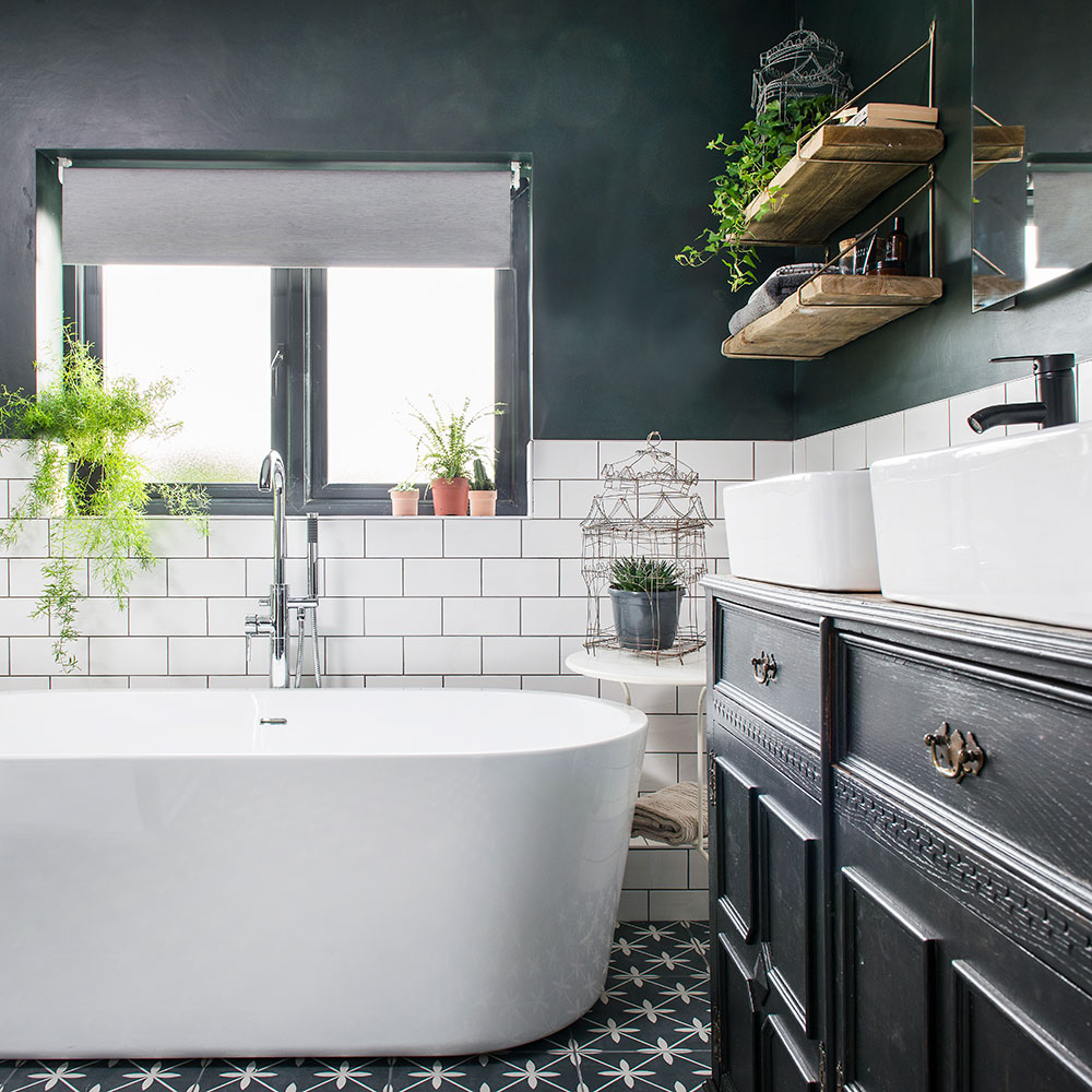
‘I wanted the same look and feel to run through the whole house, so it all feels connected,’ says the owner. ‘The bathroom’s painted in the same green as our bedroom and I’ve used similar floor tiles in the hallway.’
‘It would have been easier to buy a new washstand, but I like having something unconventional. This was an old gin cabinet I found in a charity shop and painted.’ Cheers to that great upcycled furniture idea.
'We’re proud of the home we’ve created,' she adds. 'Waiting such a long time before we started extending the house paid off. We were able to think it through carefully and we got the layout right. It’s everything we hoped it would be.’
-
 ‘Städdag’ is the Swedish cleaning method I’ve been using to clean my home for months — this is why I’ll never clean any other way
The Scandinavians (and now me) swear by it
By Lauren Bradbury
-
 Dunelm has just launched a heatwave-busting bed sheet that's only £9 – it will help eliminate hot and sweaty nights during the heatwave
Too hot and sweaty at night? Your bed sheets could be the problem, and Dunelm has a solution
By Amy Lockwood
-
 The one-year decluttering method is the key to clearing garden clutter this bank holiday – experts say it’s one of the simplest approaches
Banish garden clutter with this simple and effective method
By Kezia Reynolds