Discover how extending out and into the side return has filled this new kitchen diner with light
By extending this property by three metres and out into the otherwise redundant side return, this once dark and dingy space is now flooded with light
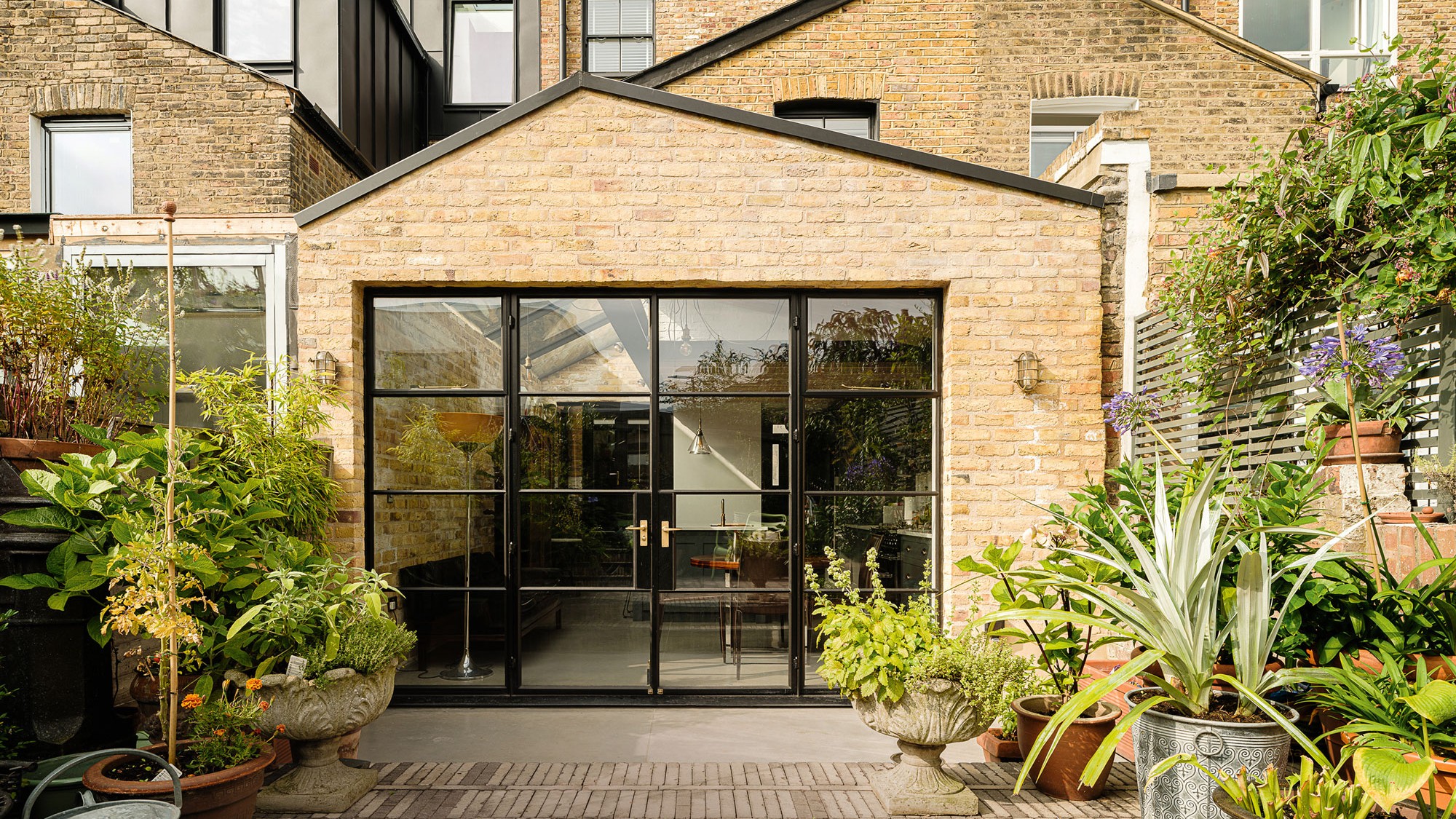

Ever wondered how much space extending out and into the side return might give you? Surprisingly for such a small surface extra, side return extension ideas can yield plenty of extra space.
Extend further outwards into your garden and you can create a brilliantly spacious new area. This is what this homeowner did when he tired of his cold, narrow kitchen. Disconnected from the garden, it lacked any natural light.
Edward Martin, director at Delve Architects who worked on the project, explains what and how they transformed the property into a light and bright new space.
The side return kitchen extension
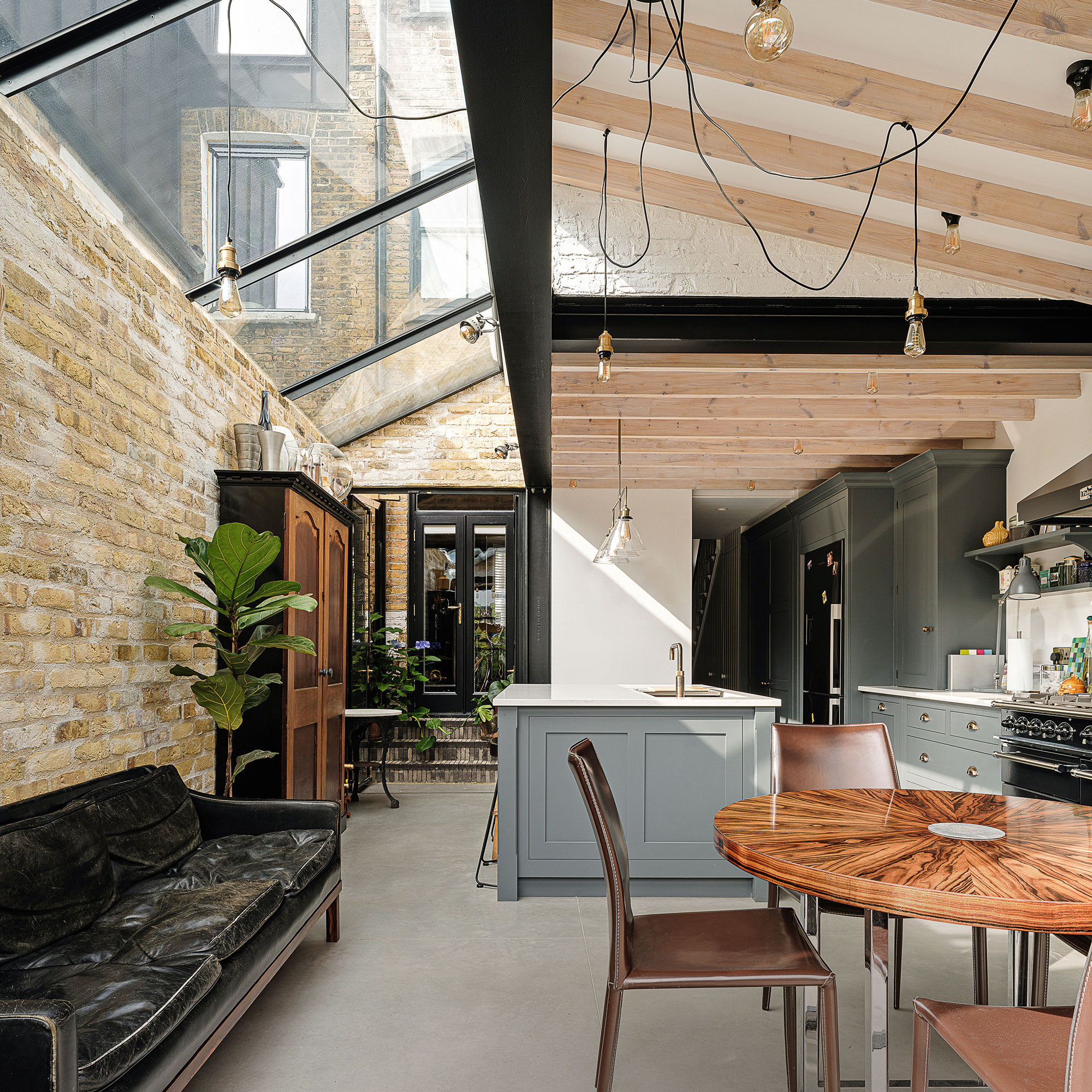
‘Our goal,’ explains Edward, ‘was to open out the ground floor layout and bring in as much sunshine as possible. To achieve this, we re-jigged the floorplan and created a wraparound rear extension to accommodate spacious new open plan kitchen ideas.'
'The extension,' continues Edward, 'pushes out from the back of the house by about three metres. But maximising the redundant space in the side return that was probably the biggest element in terms of making the project a success.'
In extending out and into the side return, structural glazing has been used overhead to maximise brightness levels. Glazed metal frame doors provide that all-important connection with the garden, as well as bringing in even more natural light.
The design details
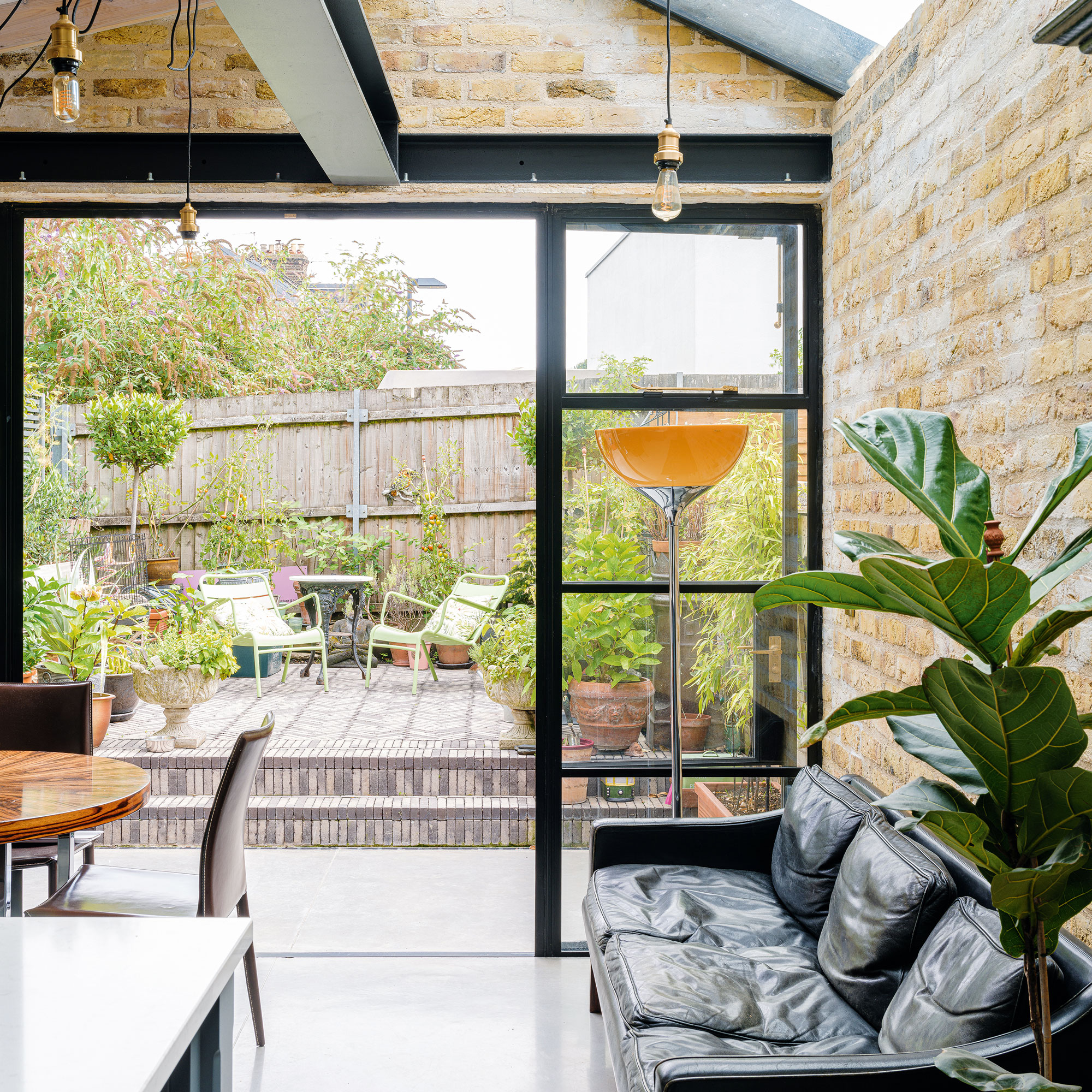
'The pitched roof of the extension,' explains Edward, 'was another key element for creating that sunny, airy space, as it offers extra headroom above. A materials palette encompassing concrete floors, exposed brick walls and steel beams infuses the space with an industrial vibe. This was something our client was keen to establish from the start.’
Get the Ideal Home Newsletter
Sign up to our newsletter for style and decor inspiration, house makeovers, project advice and more.
Steel-frame gridded doors were on the homeowner's wish list from the start of the project. Fixed glazing has been incorporated on either side of the opening panels to maximise the glazed area at the back of the house.
The same poured concrete floor finish runs seamlessly from inside to out, helping to draw the eye out into the garden and establish a seamless link between inside and out.
The kitchen diner
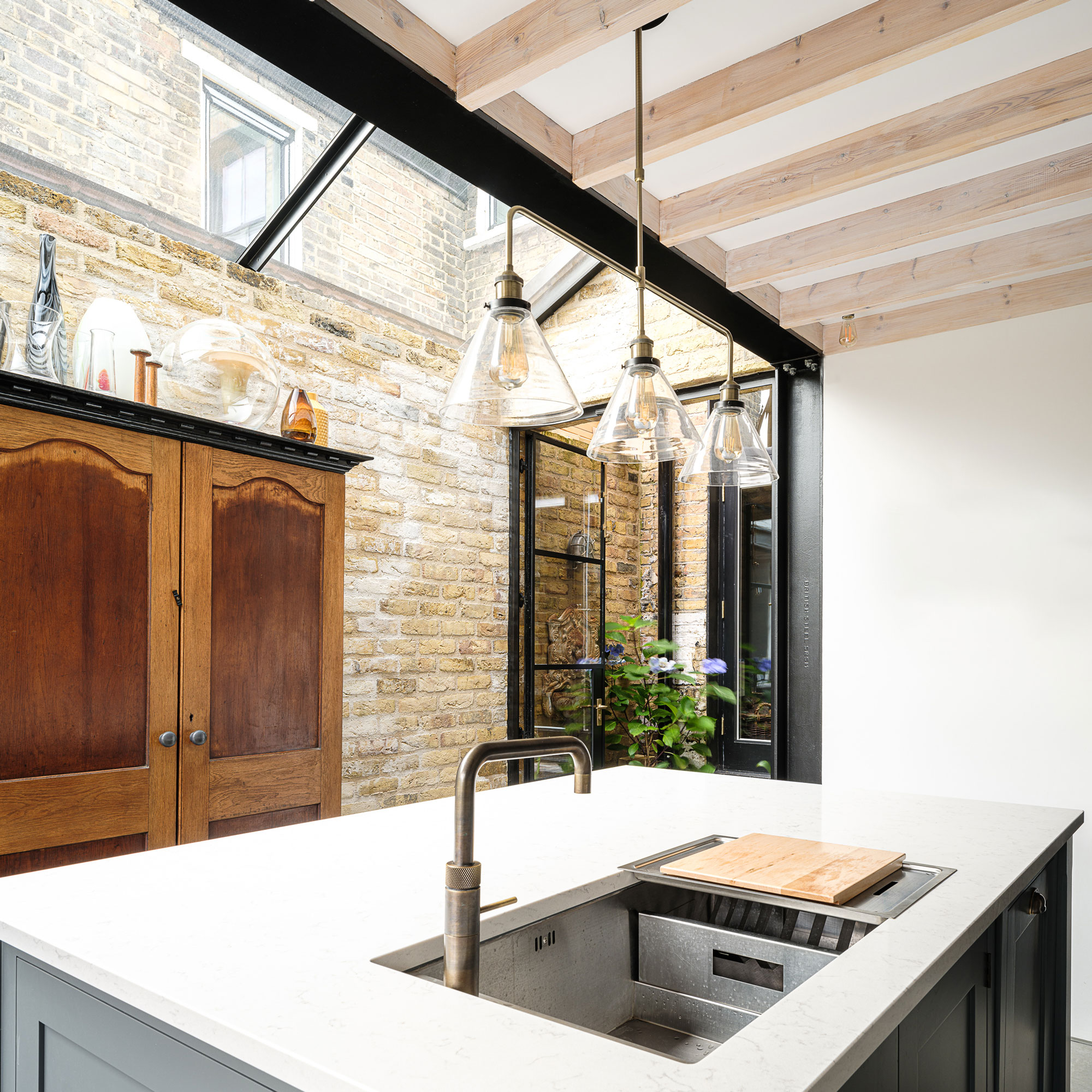
Over the years, the homeowner has amassed a collection of antique pieces of furniture, many of which he was keen to incorporate into the new extension.
For example, the timber cabinet opposite the kitchen island ideas infuses the space with character, its rich texture and warm grain contrasting with the sleek quartz worktops.
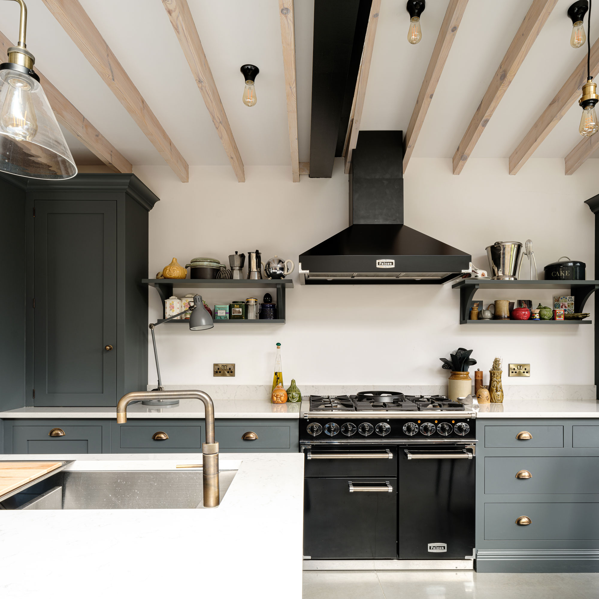
Thanks to the broad spans of glass, the extension is undoubtedly modern in its design. However, the homeowner wanted to avoid creating an ultra-sleek zone that would be at odds with the historic character and period features of the original Victorian house.
The kitchen design uses traditional and contemporary elements, including unfussy Shaker kitchen ideas with metal cap handles.
As well as providing a practical area for food prep and wash up, the kitchen island features a breakfast bar for informal dining. There’s even a television hidden inside one of the kitchen cabinets, so the homeowner can take a perch and watch TV.
A hard-wearing quartz was chosen as the material for the countertop – hot pans can be placed down onto the surface without worrying that it’ll get damaged.
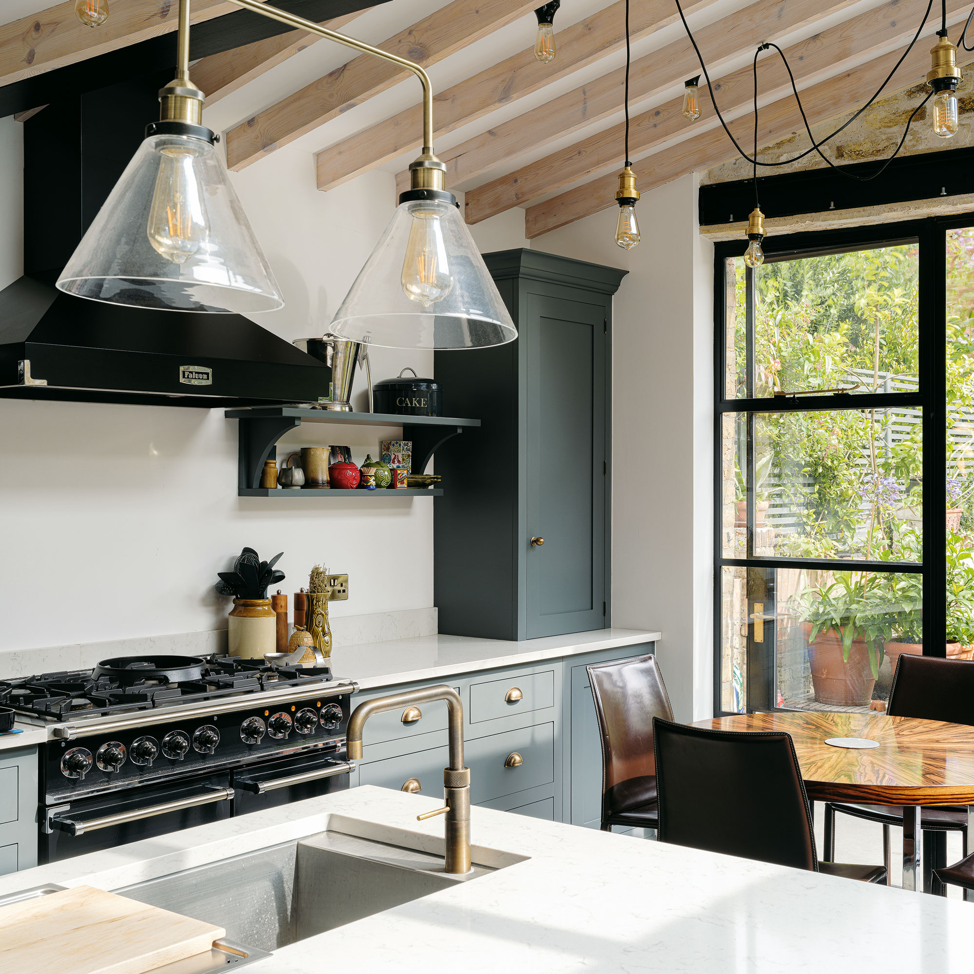
Rather than covering the rafters with a layer of plasterboard, these structural elements were left exposed. This adds an extra layer of depth and richness to the overall design of the kitchen. It also means higher ceilings that augment the bright, airy feel of the space.
The Douglas fir rafters were finished with a light oil wash. This allows the natural warmth and character of the timber to shine through.
The mini courtyard
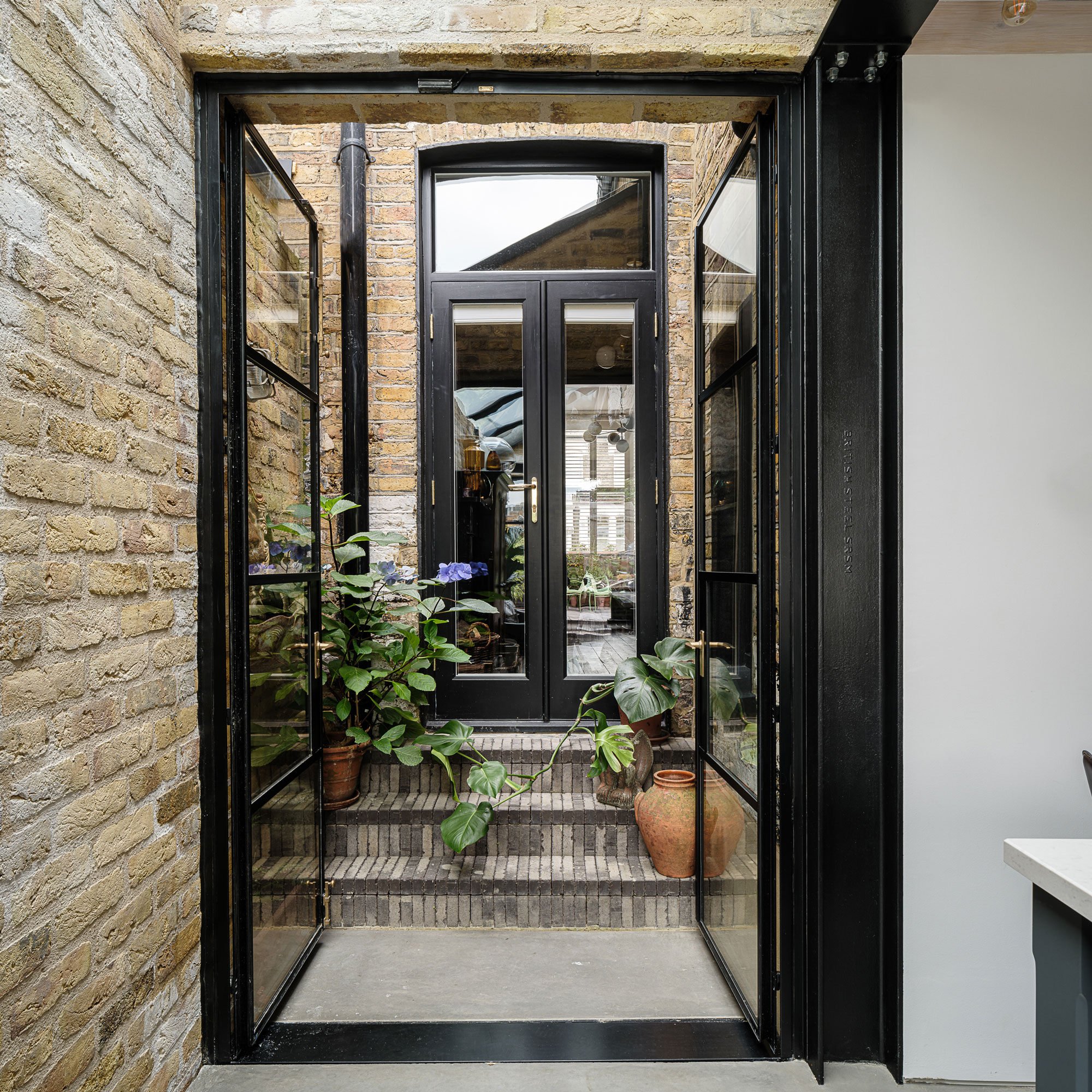
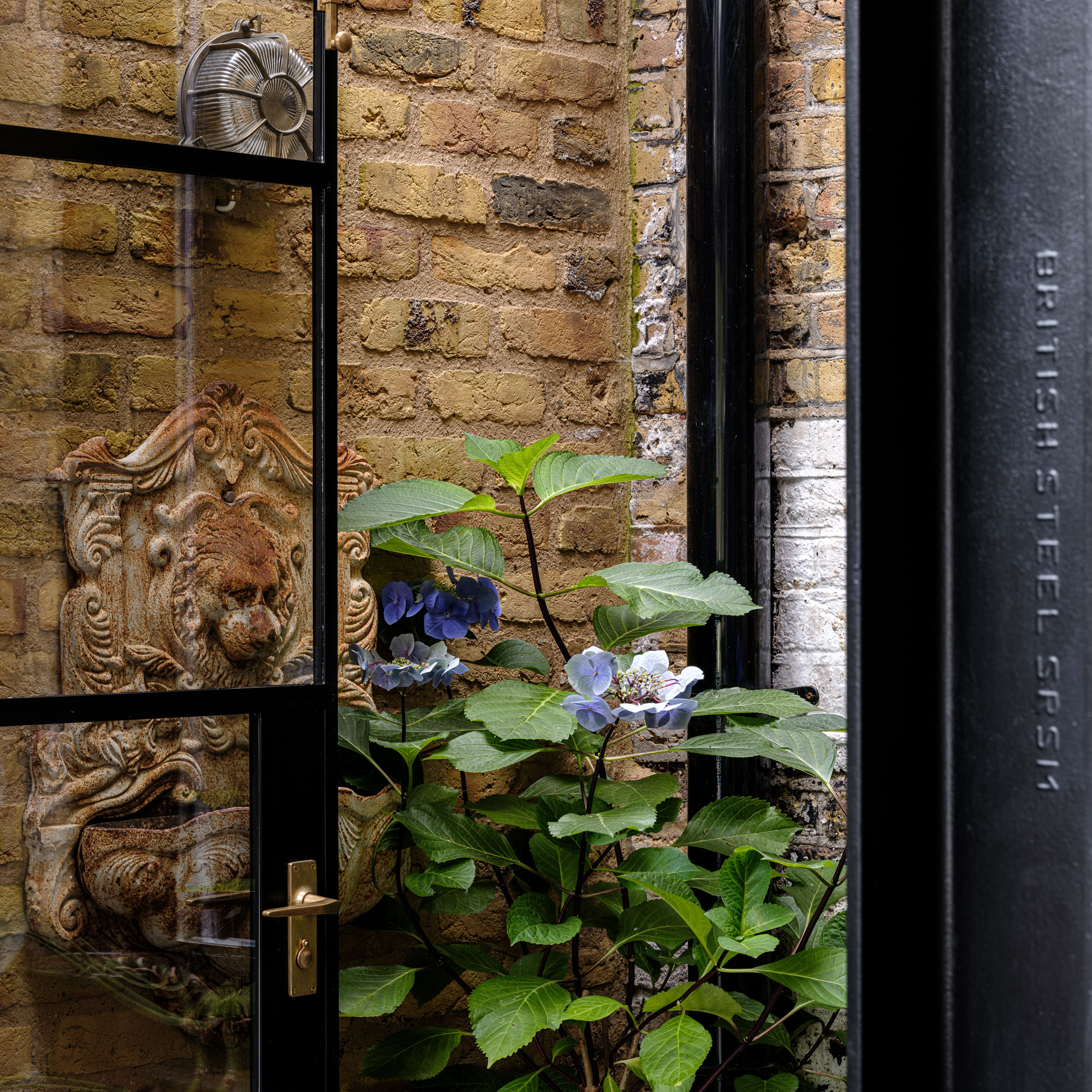
'As part of the alterations to the floorplan,' explains Edward, 'we also incorporated a central courtyard at the back of the kitchen. This means the guest WC and formal dining room on the other side of that outdoor space benefit from natural light filtering in.'
The homeowner is a keen gardener, so the courtyard also provides a sunny spot to keep plants. Reclaimed bricks were sourced for the extension, helping to make the transition between the old and new parts of the house as fluid as possible.
Getting an industrial look
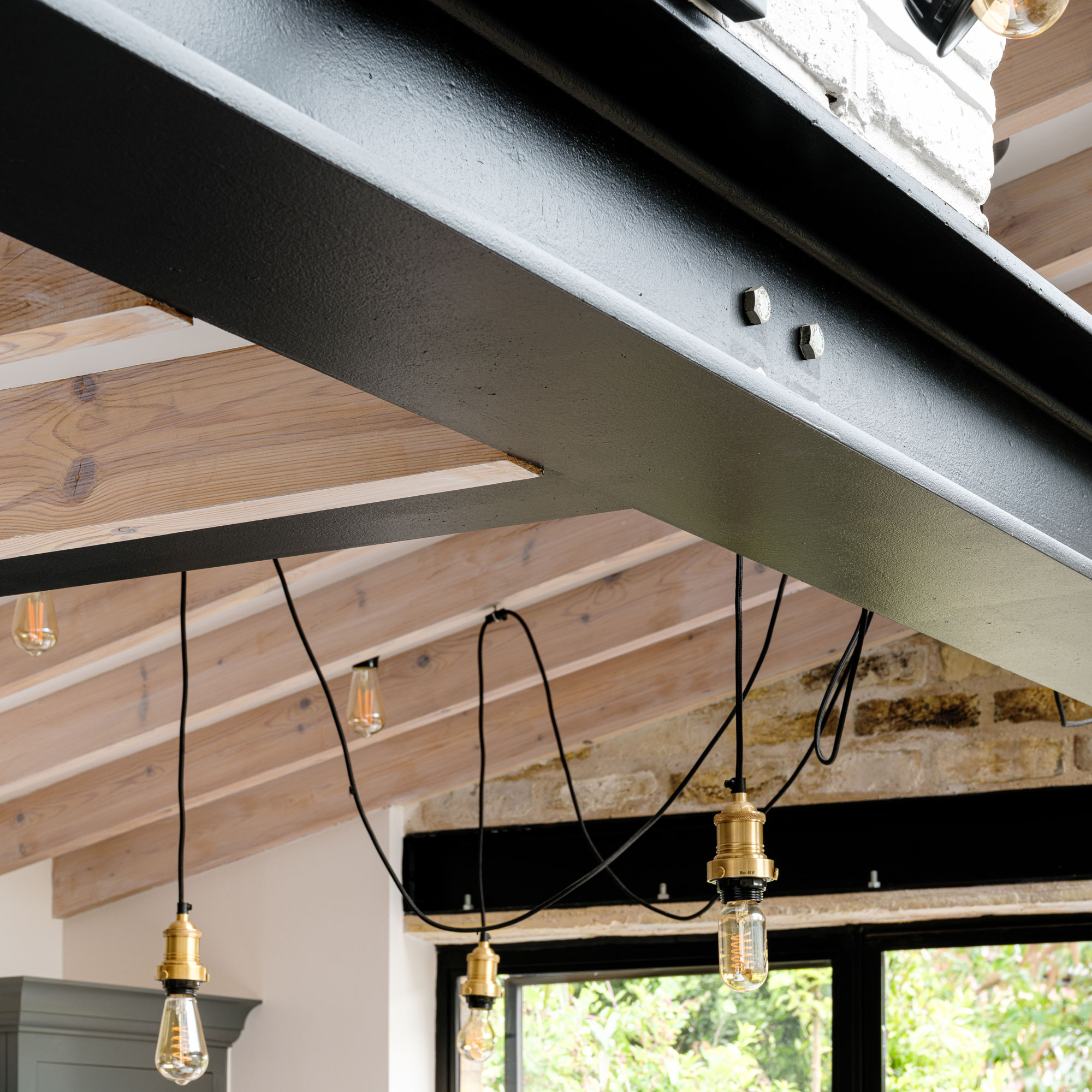
Having previously lived in New York, the homeowner was keen to bring some of the city’s industrial style to his North London kitchen.
From the start, this was one of the key design ideas the architects sought to infuse into the project. A selection of industrial flourishes was incorporated fairly early on in the design phase, including the exposed steel beams overhead.
Incorporating a pitched roof above the extension has opened up several interesting design possibilities, too. This includes the scope to install an interesting lighting scheme.
Though the house needed work initially, one benefit was that it retained many of its original period features. According to architect Edward, many Victorian homes will have had features such as cornicing, architraves and skirting stripped out.
A final piece of advice, when it comes to extending out and into the side return or indeed any extension project, Edward suggests to 'take plenty of time to consider all the possibilities for your project and determine your top priorities.'
The property before extending out and into the side return
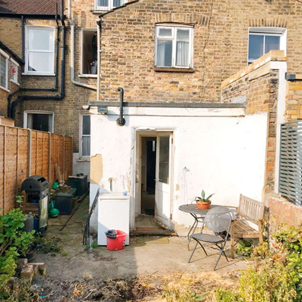
The house was cold and uninsulated, with a narrow kitchen. What's more, all the timber window frames were rotten. Access to the garden was inconvenient, too, as you had to go through a WC to get there.
Focus on: Pitched roofs
Architect Edward Martin at Delve Architects explains the essentials:
- They open an area up. They provide you with additional headroom and a greater sense of space.
- Leaving the rafters open will turn your ceiling into a rich design feature.
- You can use the angles to your benefit, especially if glazed. The angle of the roof plane has the potential to provide extra privacy.
- They're more durable as water can easily drain off. Flat roofs are more prone to issues with leaking.
- There's scope to have fun with lighting. With more clearance to the ceiling, you can play with a variety of different pendants. Here, the homeowner has suspended looped cable lighting from the exposed rafters.
Additional words by Rebecca Foster

Ginevra Benedetti has been the Deputy Editor of Ideal Home magazine since 2021. With a career in magazines spanning nearly twenty years, she has worked for the majority of the UK’s interiors magazines, both as staff and as a freelancer. She first joined the Ideal Home team in 2011, initially as the Deputy Decorating Editor and has never left! She currently oversees the publication of the brand’s magazine each month, from planning through to publication, editing, writing or commissioning the majority of the content.
-
 I tried out this neat little dehumidifier for a month – it dried my laundry in half the time
The 20L SmartAir Dry Zone dehumidifier tackled my laundry drying woes head on
By Jenny McFarlane
-
 I’m seeing pastel garden furniture at all my favourite brands this spring, but QVC’s sorbet collection impressed me the most
Fresh pastel shades are a great way to liven up your outdoor space
By Kezia Reynolds
-
 Don't tell my flatmates, but Joseph Joseph's clever new sink range finally made me enjoy washing up
I didn't know stylish washing up accessories existed until I saw this collection
By Holly Cockburn