Extending out and up created a stunning new kitchen for this family home
A considered design which maximised ceiling height and layout by extending out and up helped improve the living arrangements in this Edwardian terrace

When a family of four found they had outgrown their Edwardian home and needed an upgrade, they opted for a smart solution to make the most of there space by extending their home out and up.
When your space is at a minimum, the obvious solution is to build an extension on a house. But by extending out and up, you get more for your money, as well as a larger living space.
‘The family had outgrown the spaces and longed for an open-plan space for modern-day living, explains the lead architect Ester Corti, who is also co-founder and director of Mitchell + Corti Architects.
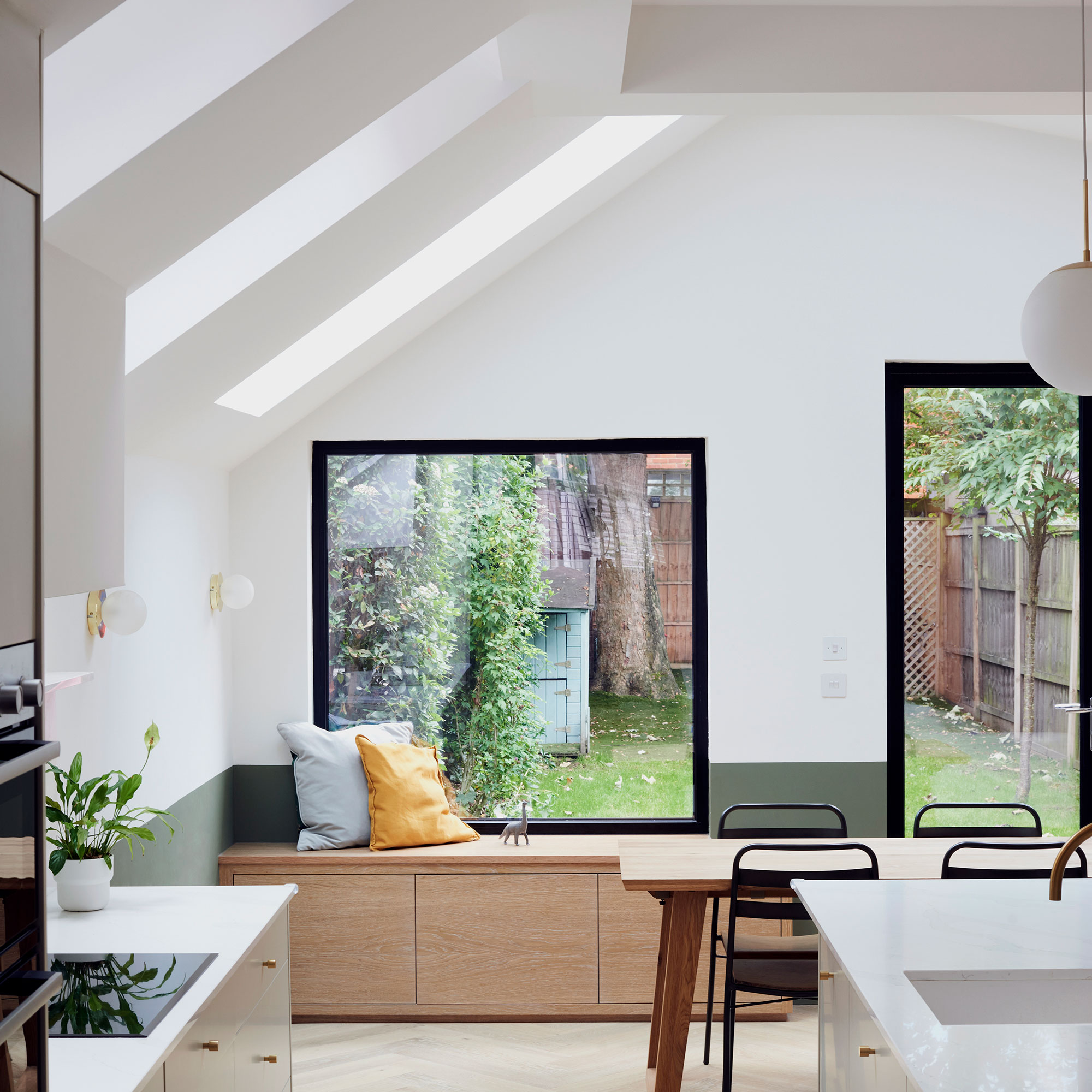
‘We needed to maximise the property’s internal headroom while incorporating the difference in level between gardens as the road is on an incline,' continues Ester.
'So we suggested adding a side and rear extension with an asymmetric pitch and skylights and rooflights to both sides. This would allow for both early morning and evening light to the new living/kitchen/dining space.'
'This new extension would add space both to the side and the rear of the property,' explains Ester. 'It would also create an open plan feel and connection to the more formal living rooms at the front of the house.'
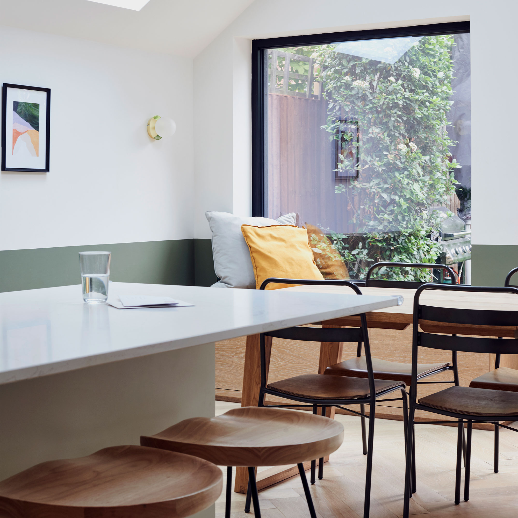
To add colour to an all-white kitchen, they painted the wall a sage green shade below dado level. The warming colour unifies the room and adds interest to the family space.
Get the Ideal Home Newsletter
Sign up to our newsletter for style and decor inspiration, house makeovers, project advice and more.
Extending out and up to create a new kitchen
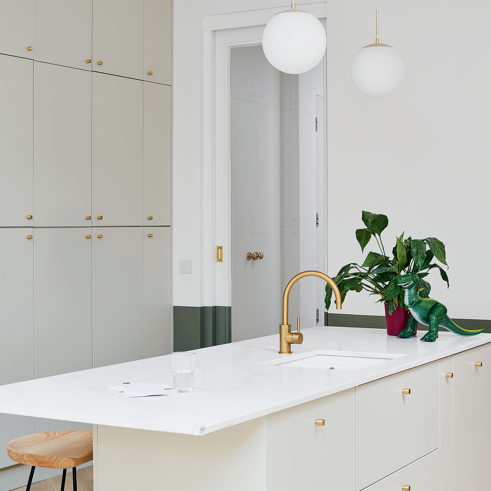
The kitchen, with its flat panel, modern style doors was sourced via DIY Kitchens. A central kitchen island brings everything together giving the family a meeting point to gather around.
By extending out and up, this afforded the family more space to introduce clever built-in storage. This ensured their home didn’t feel too cluttered with all the kids’ toys, scooters, coats and shoes etc.
The Surfaceco worktop material is composite quartz, it was chosen for its durability because it's less prone to staining and scratching, unlike marble. A bank of full height cabinetry makes great use of the available space by occupying an entire wall.
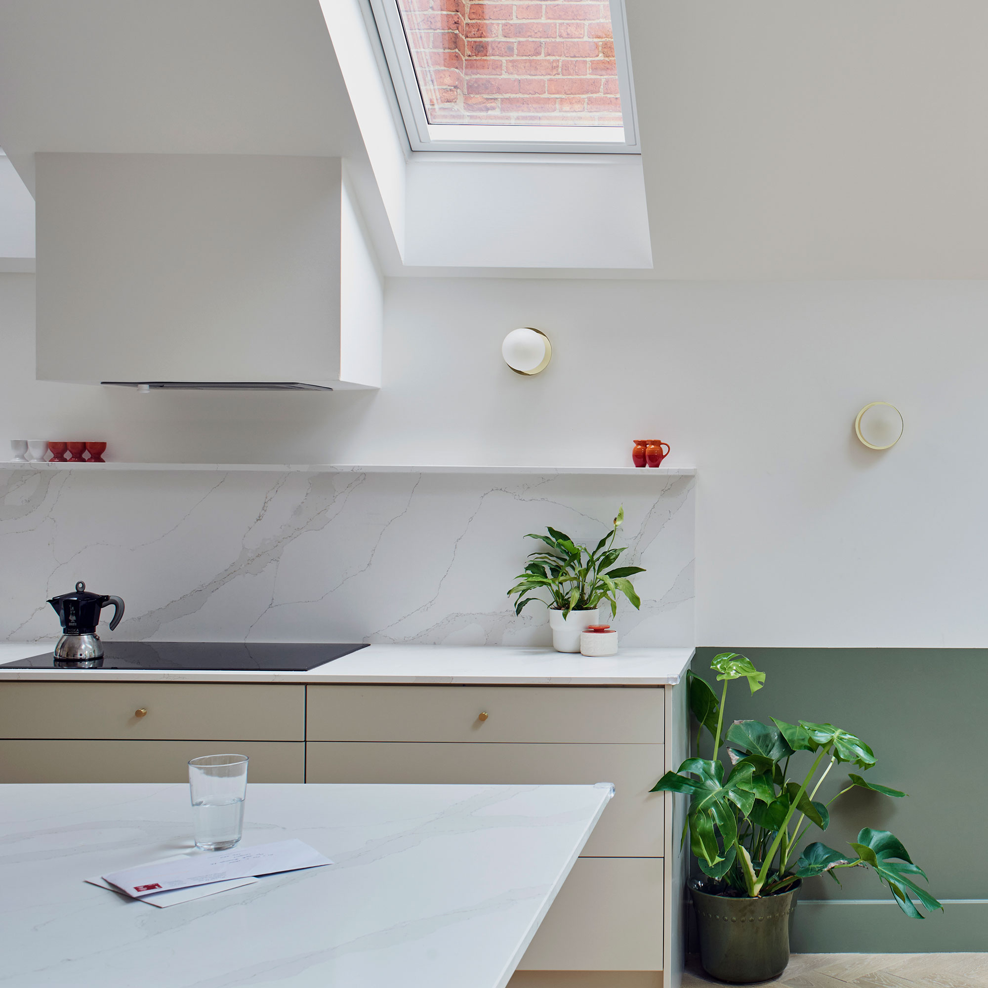
The shades that have been chosen for the space help make it feel bright yet practical. The off-white paint colour to ensure the ceilings and walls retain the ability to reflect light.
Matching wall and pendant light fittings help bring the scheme together. Their simplicity complements the muted tones within the space.
The clean lines of the modern cabinetry pairs well with the induction hob and concealed appliances, such as the cooker hood that blends into the wall. Open wall-mounted shelving offers space to display items, too.
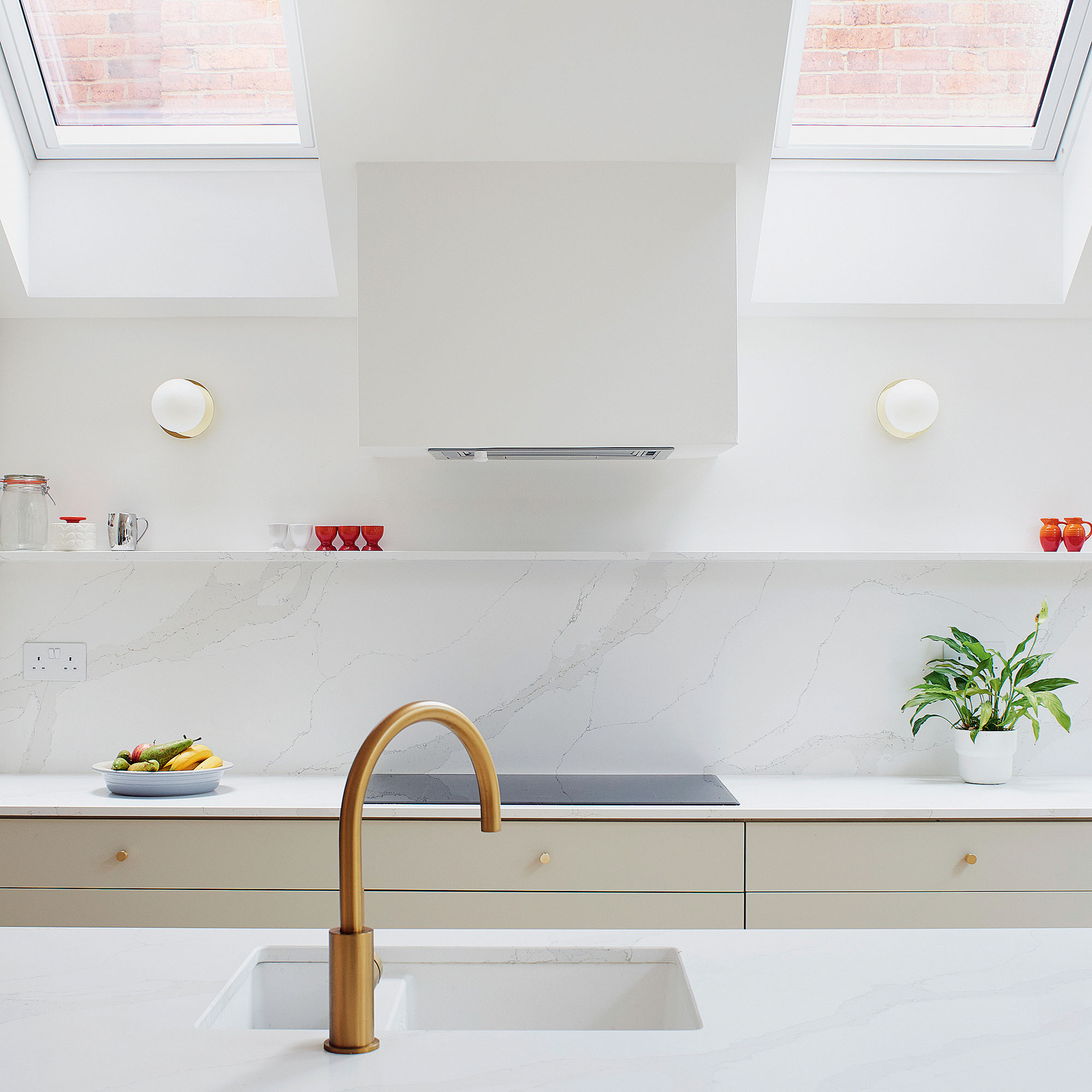
Opting for a combination of fixed and openable rooflights allows for passive ventilation and airflow without needing to open up the back doors.
Extending out and up provided larger ceiling heights within which to install roof glazing. The smaller rooflights are by Velux and the larger ones are made-to-measure designs.
The formal dining area
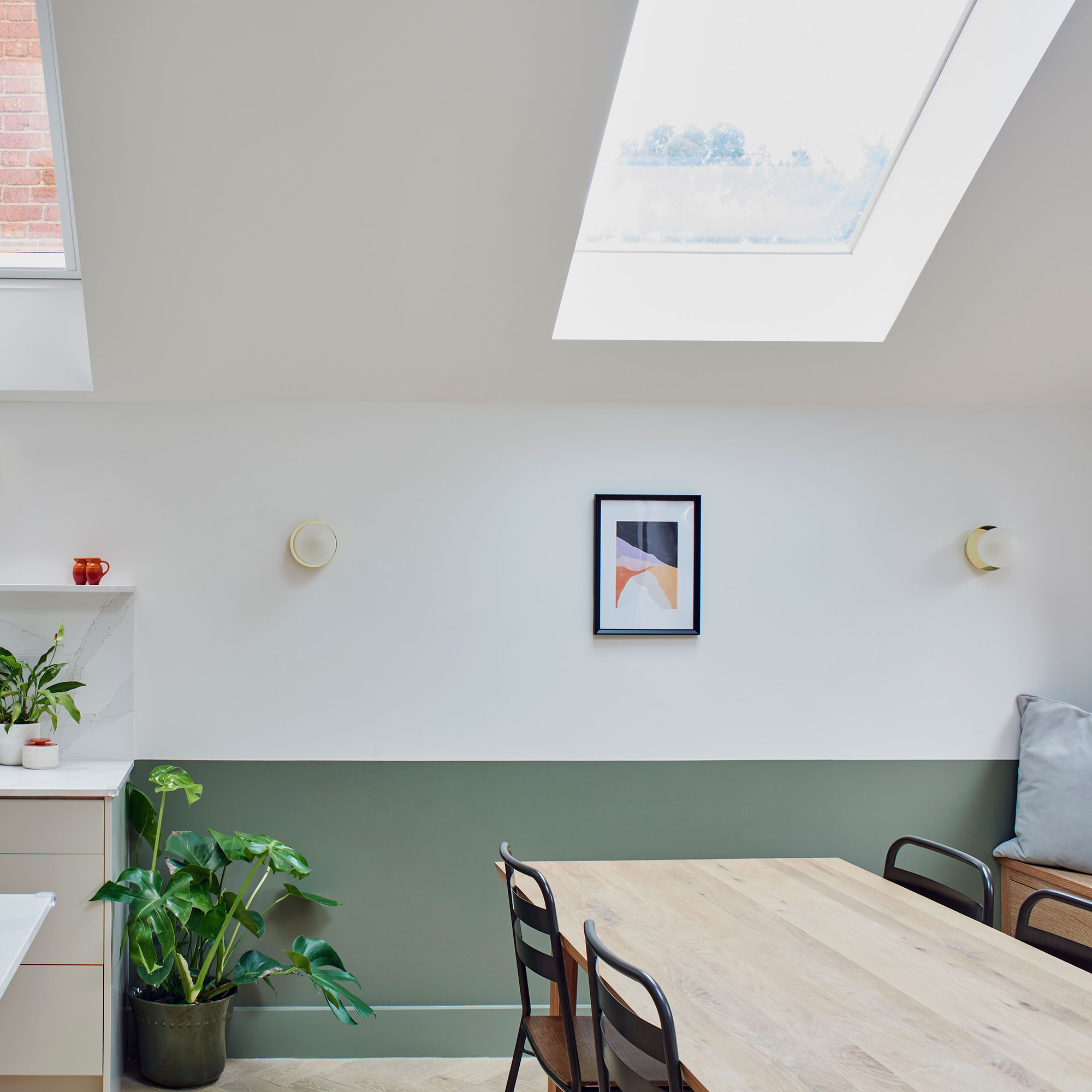
A more traditional wood dining table and chair set also brings in more warmth to the room. These provide another area to gather together, which is bathed in light that enters through the roof windows above.
The informal dining area
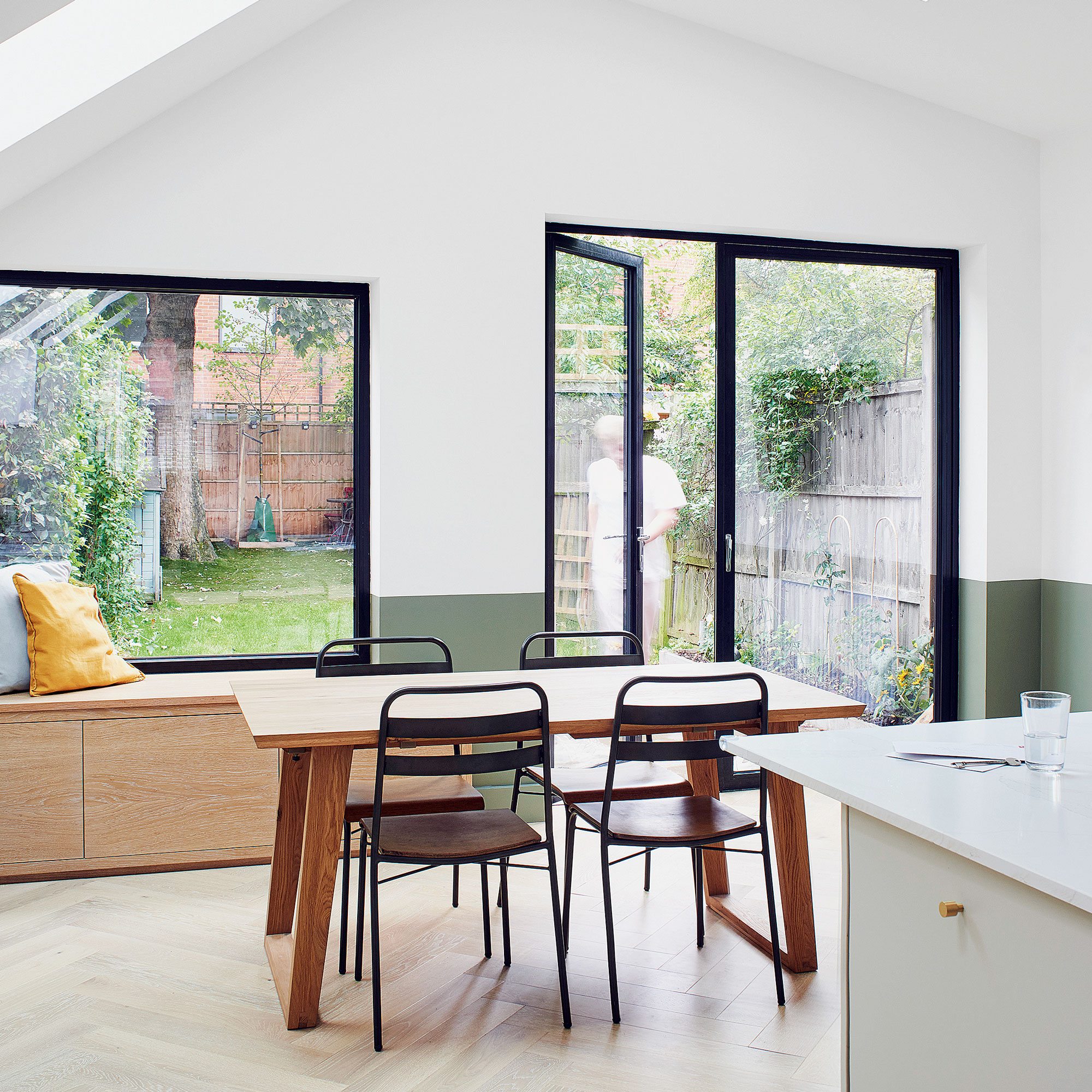
In a perfect example of a modern kitchen flooring idea, the homeowners have used engineered timber floorboards. This was a cost-effective solution that has enabled the architects to incorporate the use of a natural material internally.
The shade also works with the rest of the scheme to bounce natural light around the room, making the space feel bigger and brighter.
The window seat
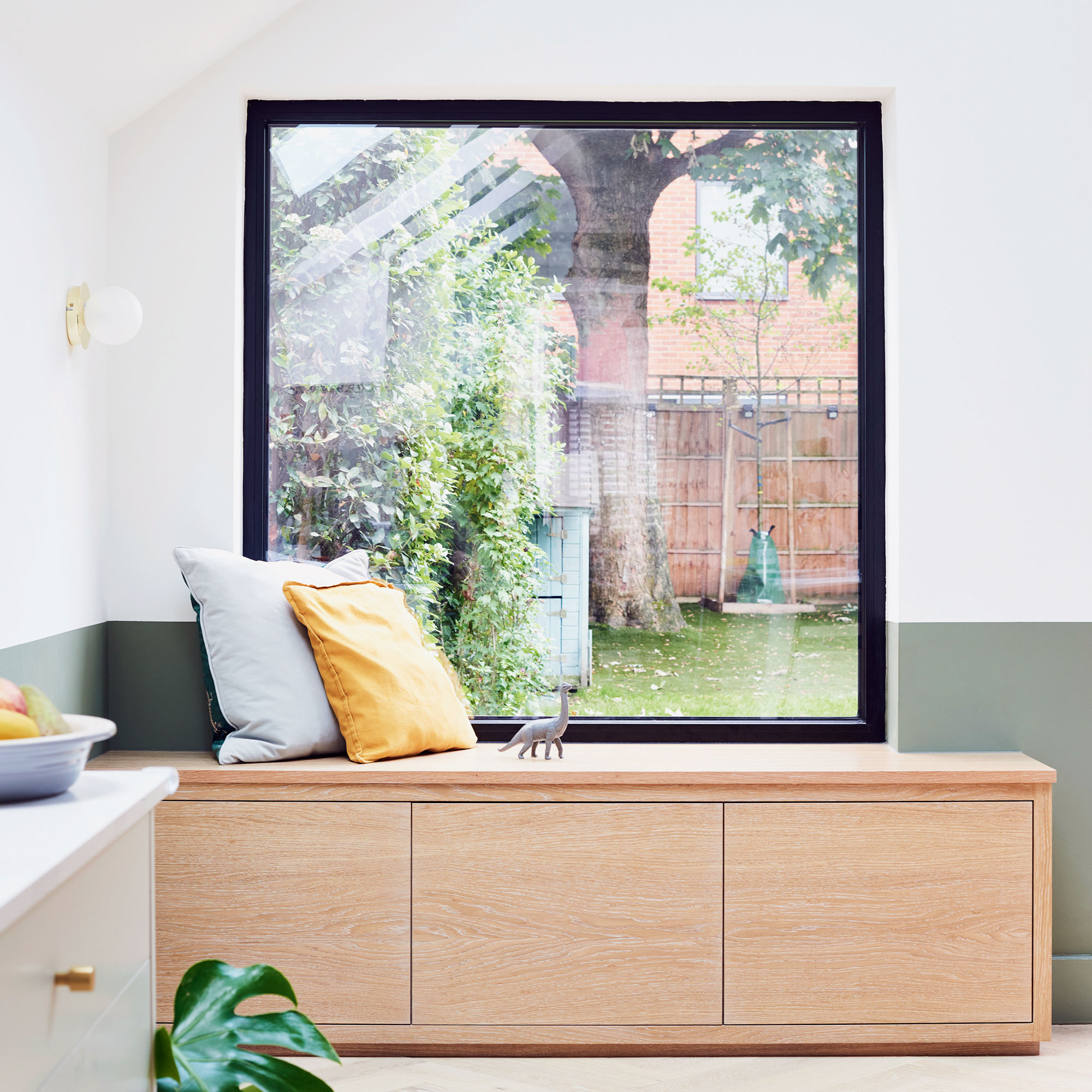
A must-have window seat idea is perfectly placed by the oversized window. Made-to-measure in pale oak, it was designed to be an informal seat/reading nook.
It offers uninterrupted views out toward the garden, and a place for people to sit and relax when not seated at the dining table. Practical built-in storage allows the owners to maximise the available space and also to keep the open-plan room free of clutter.
The extension exterior
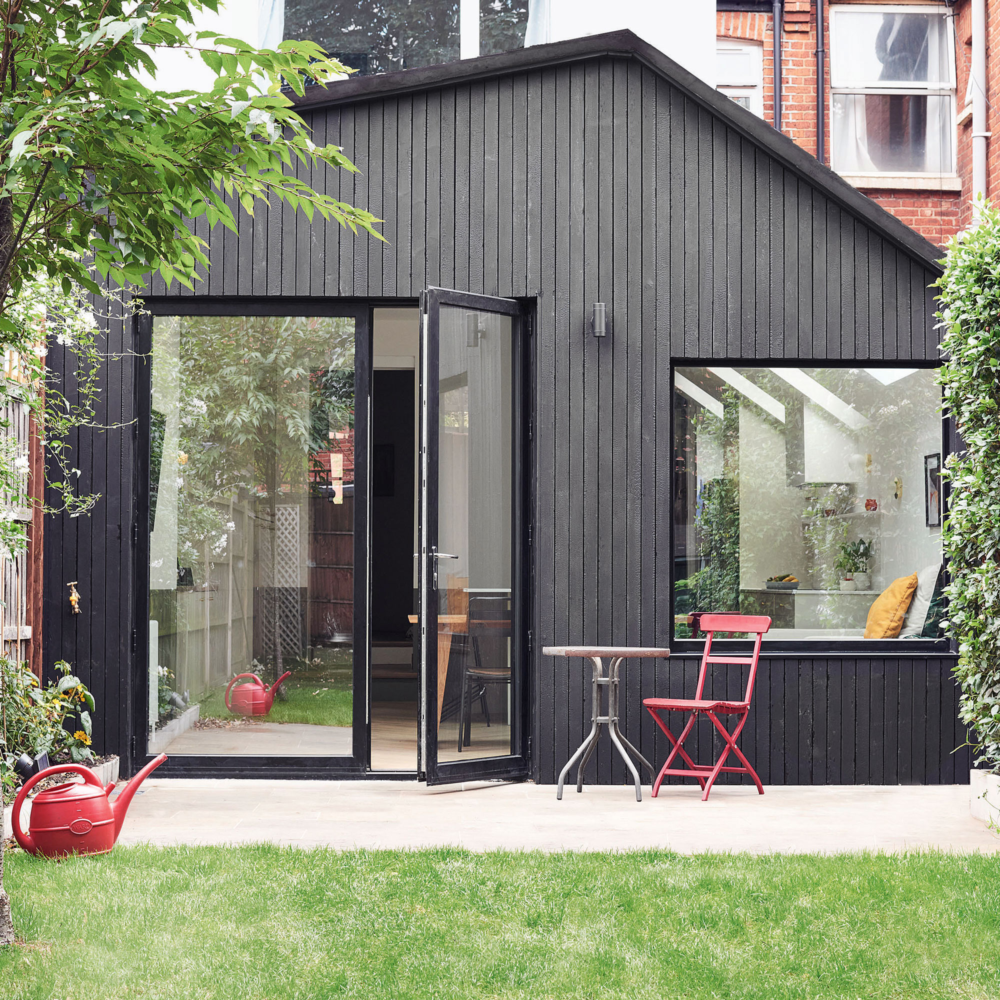
'We chose to clad the extension in dark charred timber,' explains Ester, 'in order to ensure longevity and minimal maintenance, and to avoid any issues around discolouration that can occur when using a pale timber. We also wanted to acknowledge the contemporary nature of this addition to the house by using a material distinctly different from those of the host building.’
As well as extending out and up, the exterior space now has a fresh appeal with the asymmetric roof design allowing for the strategic placement of rooflights internally. The homeowners opted for a stylish black-framed glazing that let in copious amounts of light.
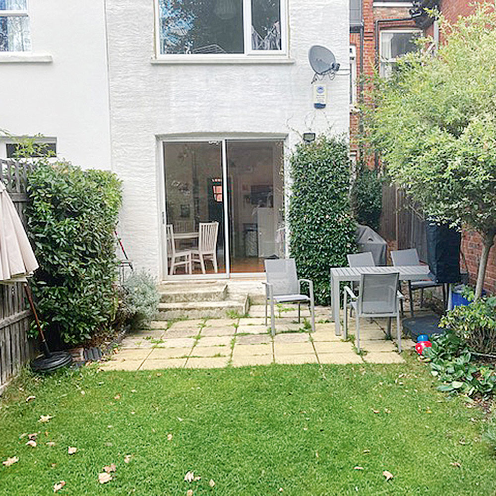
The property before
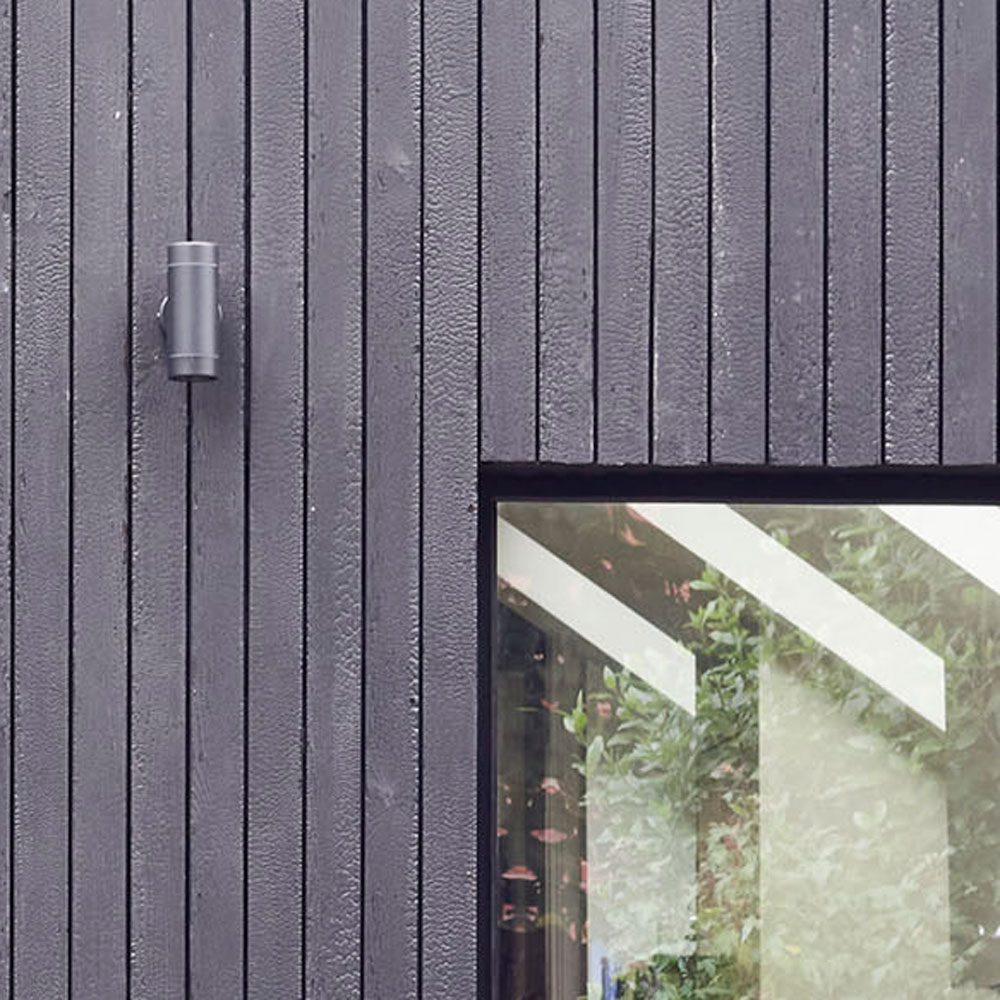
Focus on: Shou-Sugi-Ban cladding
Architect Ester Corti shares her top tips and ideas on this classic cladding:
- Shou-sugi-ban is an ancient Japanese technique of traditional wood preserving art/technique of charring timber.
- It enhances the beauty of wood by making the timber grain more prominent.
- It requires very little maintenance and doesn't need to be sealed. The carbon layer protects the wood in the same way that a stain or sealant would.
- The entire process is chemical free. There are no chemicals used in the charring process. This makes this material suitable for both indoor and outdoor use.
- It's naturally weather resistant. The charring process prevents rot, decay, infestations, and also improves levels of fire retardancy.
Additional words by Ifeoluwa Adedeji

Ginevra Benedetti has been the Deputy Editor of Ideal Home magazine since 2021. With a career in magazines spanning nearly twenty years, she has worked for the majority of the UK’s interiors magazines, both as staff and as a freelancer. She first joined the Ideal Home team in 2011, initially as the Deputy Decorating Editor and has never left! She currently oversees the publication of the brand’s magazine each month, from planning through to publication, editing, writing or commissioning the majority of the content.
-
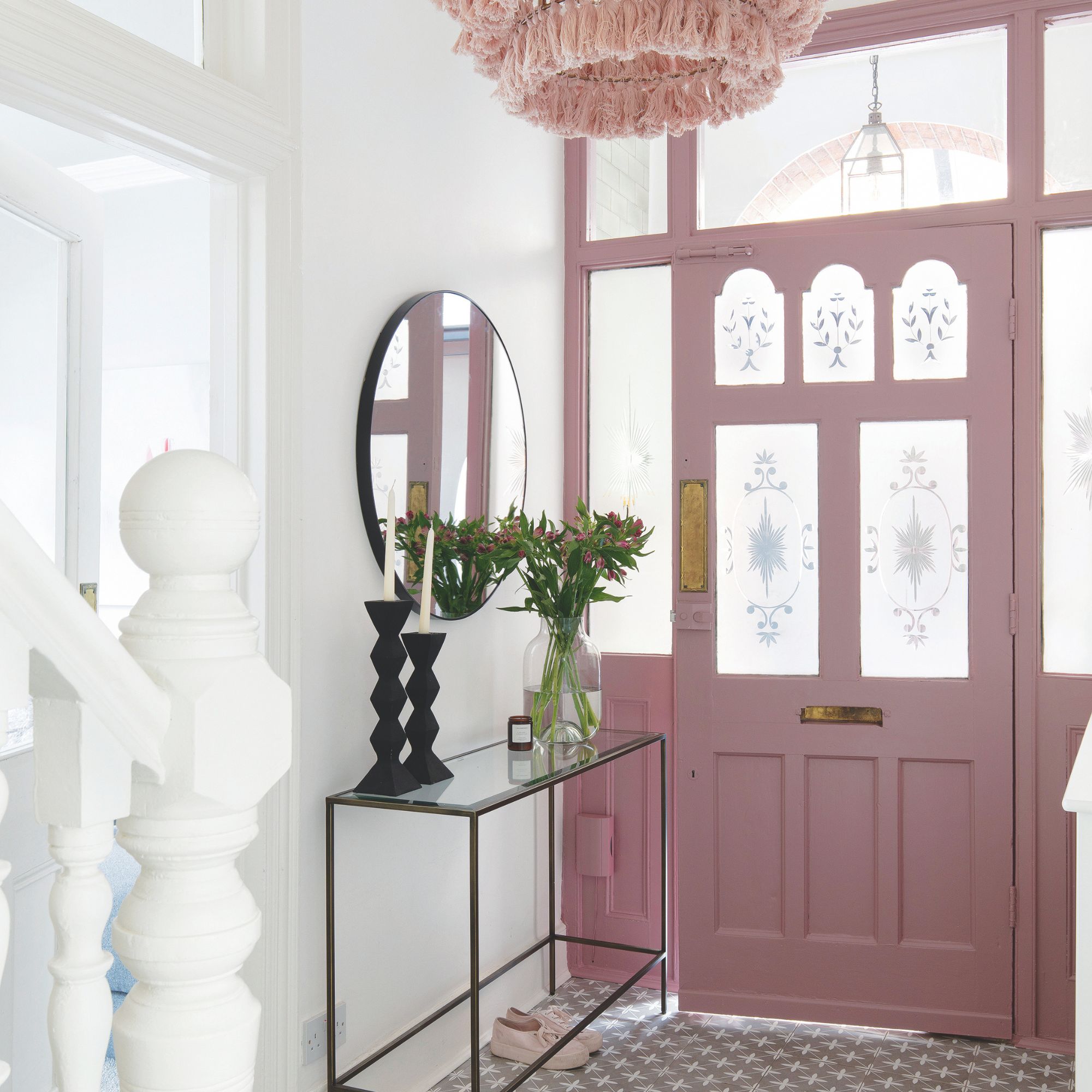 Should your front door colour match your hallway? Interior experts reveal 3 reasons why it should (and 3 reasons it shouldn't)
Are you team matching or contrasting?
By Ellis Cochrane
-
 This £200 limited-time discount makes this Dyson vacuum cheaper than I’ve ever seen it - run don’t walk to Argos for this bargain
It's the most affordable Dyson on the market right now
By Lauren Bradbury
-
 Martin and Shirlie Kemp’s pastel flower beds has given their Victorian renovation a romantic look - how you can get the look
Their pastel garden is the cottage garden inspo you've been looking for
By Kezia Reynolds