Have a wander around this contemporary Victorian renovation in south London
Clever design tricks were used to create a bright, welcoming interior, from the loft to the basement, in this expertly redesigned family property
Clever design tricks were used to create a bright, welcoming interior, from the loft to the basement, in this expertly redesigned family property. Loft and basement extensions are difficult to perfect. The former risk being all awkward angles and unusable corners, while the latter can result in a dark cavernous space. We spoke to the owners and their architect, Alex Tart, and interior designer Marilyn Johnson about how they ensured this did not happen when they redesigned this family home in south London.
This house tour originally appeared in Homes & Gardens, February 2017
1/14 Dining area
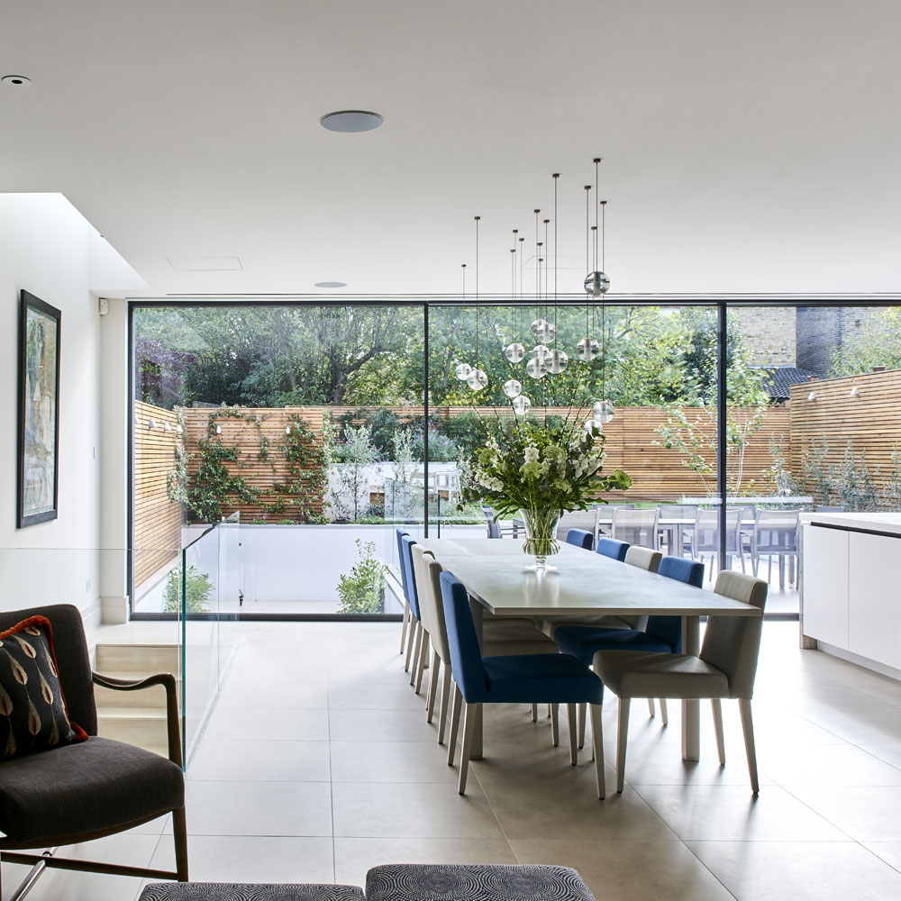
The design for this space, which includes a media and dining area, and an office, was dictated by the fact that, from here, the owners wanted to be able to easily access the kitchen-dining room, and the garden, on the floor above. They kept the original staircase within the old part of the house, but decided to install a new staircase, with a glazed side panel, between the basement and the ground floor.
Natural light floods the new open-plan living space at ground floor and basement levels, thanks to the glazed rear wall and lightwell. For artificial light, the owner opted for multiple pendants. The interior designer carefully mapped out the combination of lamps needed to light the table evenly without sacrificing the beauty of the random arrangement.
Pedants
Series 14 One Ball adjustable pendants from Bocci at Holloways of Ludlow
Armchair
Julian Chichester Chagal armchair by Zimmer + Rohde at Marlborough Interiors
2/14 Media area
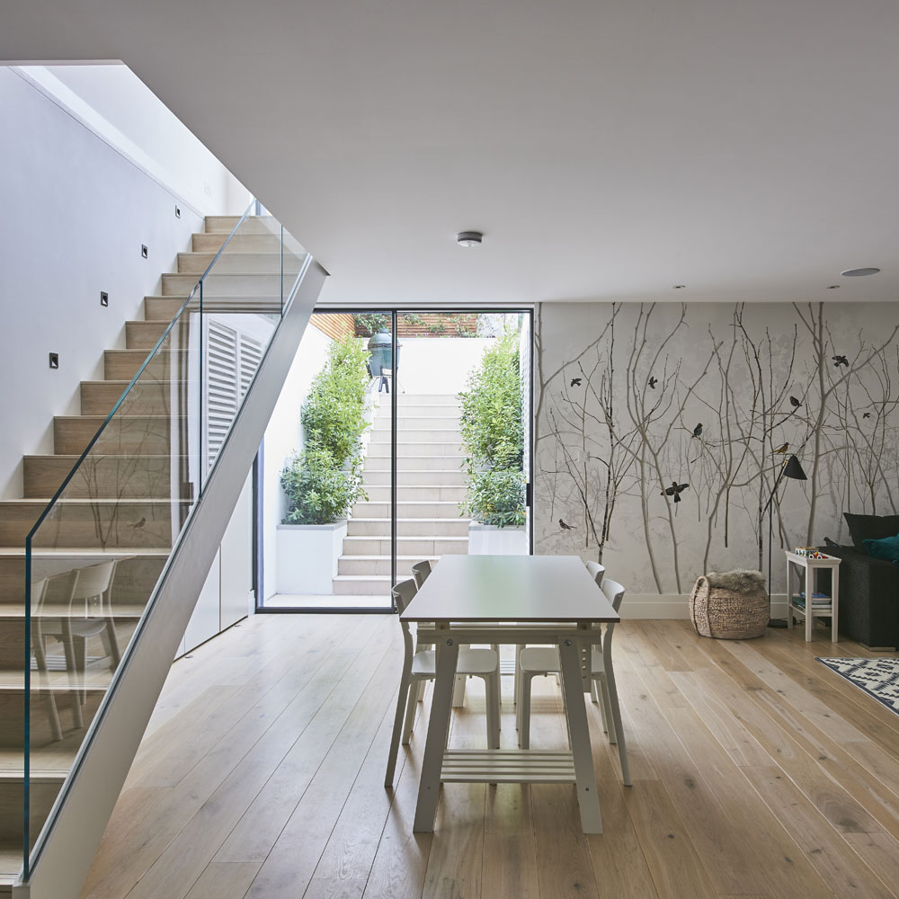
The sleek glass-sided staircase to the basement is one of the most successful features of the redesign, linking it to the kitchen upstairs. A striking contemporary wallpaper defines the living area, where paint colours were chosen with great care to customise the media unit. Alex also added steps outside, leading from the basement up to the garden terrace. Upstairs, the kitchen-dining room is separated from the terrace by sliding doors that span the back of the house. Via these doors and a lightwell in the roof above the internal staircase, the main living spaces are flooded with natural light all year round.
Architecture
Alex Tart Architects
Wallpaper
Scandinavian Surface at Photowall
Get the Ideal Home Newsletter
Sign up to our newsletter for style and decor inspiration, house makeovers, project advice and more.
3/14 Kitchen
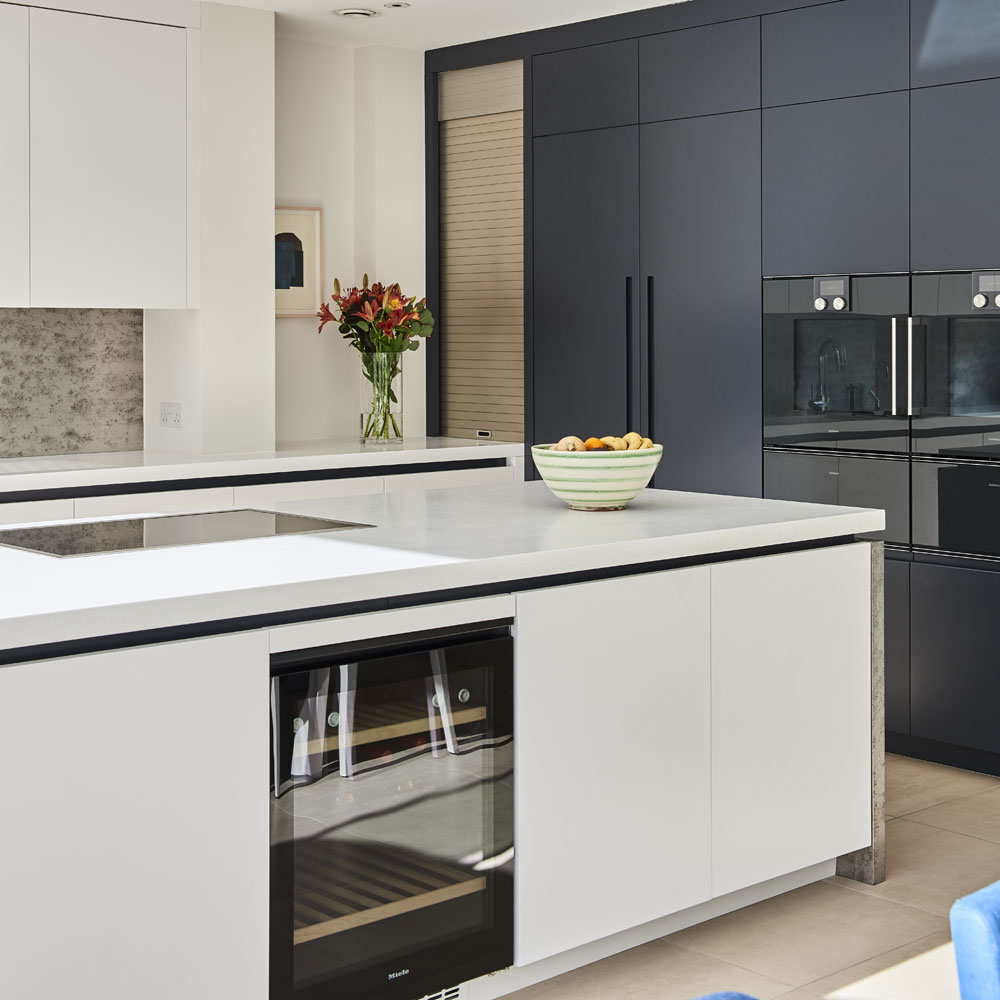
Interior designer Marilyn worked with Holloways of Ludlow to create the bespoke splashback and island unit sides. 'They are made of a metal wall covering that has been laminated onto the base construction material and then lacquered, making a washable and very durable finish.'
Bespoke kitchen
Holloways of Ludlow
Paint (on cabinetry)
Railings in Estate Eggshell from Farrow & Ball
4/14 Media room
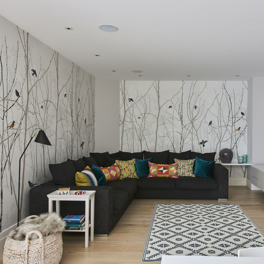
Marilyn had worked with the owners when they first renovated their home but, a year or so after they moved back in, they had asked her to make further changes. After living with the very pale shades of grey that had originally chosen, they had come to the conclusion that the rooms in the extension needed more definition. The owners had considered using art and a bright textile on the walls to add interest to the basement, but instead Marilyn suggested using a striking winter forest scene wall mural.
5/14 Home office
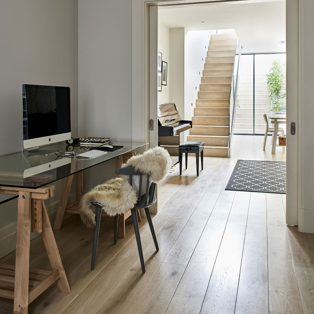
The owners kept this area for home working light and airy by opting for simple trestles and a glass top instead of a traditional desk.
Trestles
Finnvard trestles from Ikea
Table top
Glasholm table top from Ikea
6/14 Sitting room
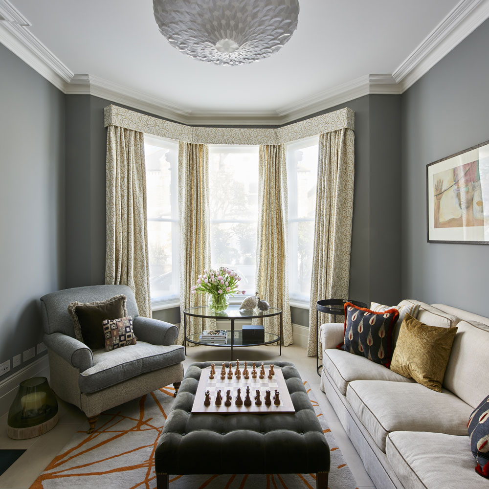
The armchair was a present from the owners mother. It was made for a larger house, so Marilyn has it reupholstered in two colourways of the same fabric, using the darker tone on the seat and back to help make it look a better size for this room.
Interior design
Marilyn Interiors and Marlborough Interiors
Fabric (on chair)
Iberia from Casamance
7/14 Study
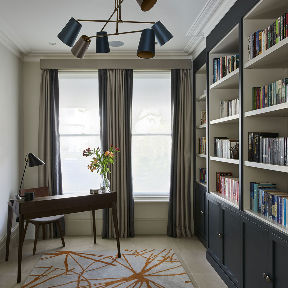
Warm metallics and orange hues add a subtle glow to the elegantly restrained scheme. A smart walnut desk provides the perfect place for a spot of quite study.
Ceiling lamp
Andromeda antique brass ceiling lamp from Heathfield & Co
8/14 Boot room
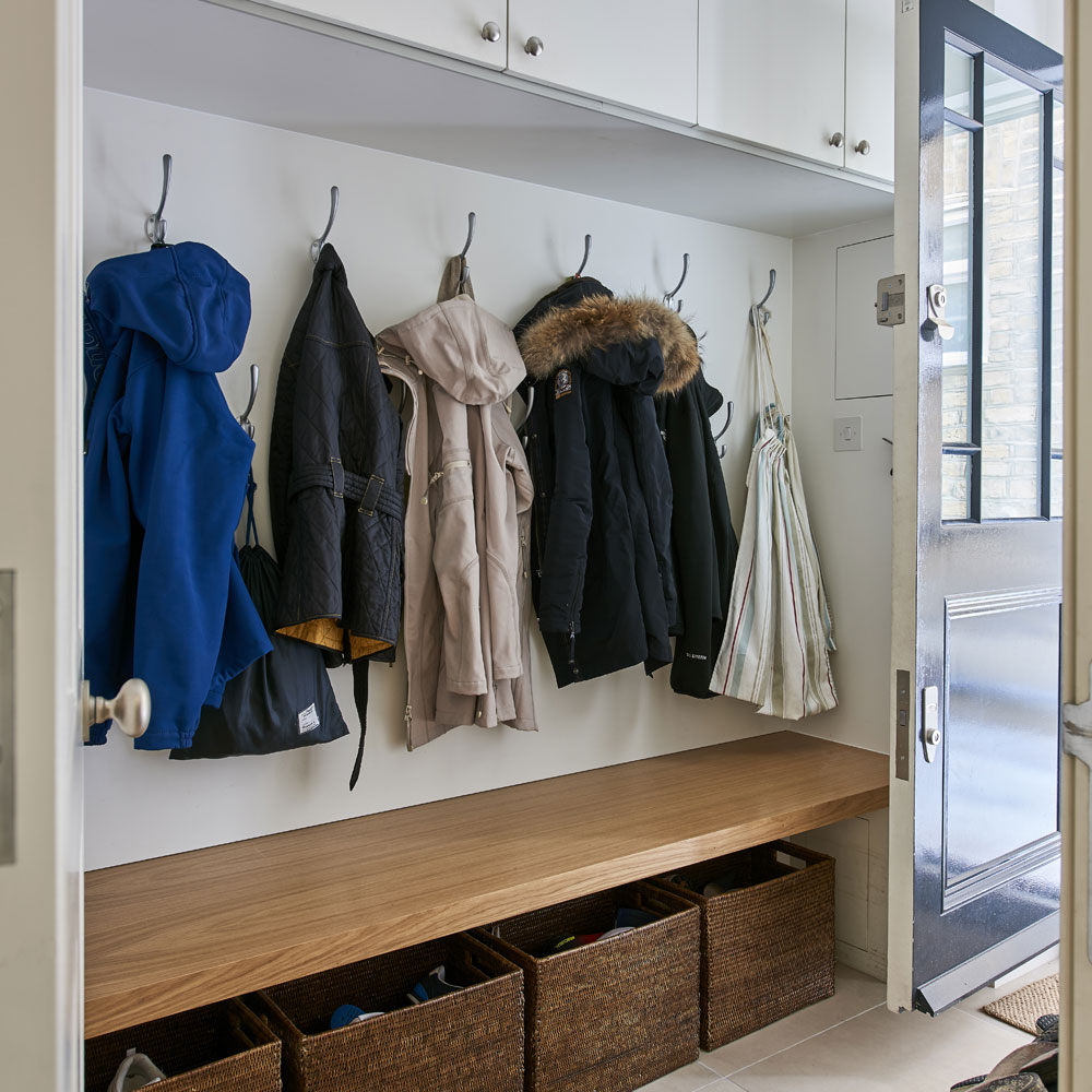
The layout on the ground floor was, in part, planned around the owners request for a boot room with access from the street. The space is perfectly positioned between the kitchen and the stairs leading to the bedrooms.
9/14 Main bedroom

Good lighting is at the forefront of the main bedroom. 'I don't like cluttering bedside tables with lamps. I intended to have pendant lights on either side of our bed, but I forgot to specify this in my brief, so the wiring wasn't suitable. I'm glad this happened, though, because I've fallen in love with these wall lights.'
Wall lights
The Urban Electric Company
10/14 Main bathroom
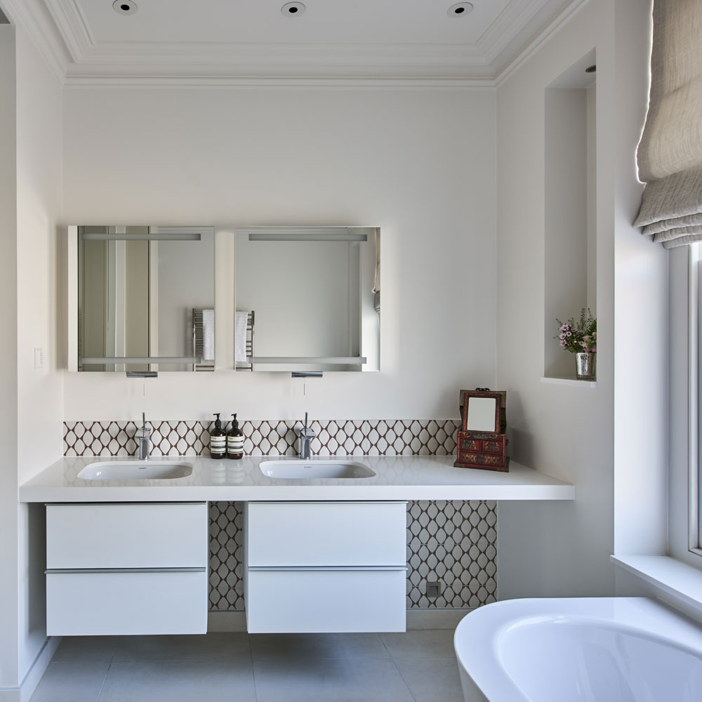
An almost invisible glass wall and pivot door separate this space from the dressing room while allowing natural light to flow through.
Vanity unit
Duravit at Fountain Direct
11/14 Boys’ bathroom
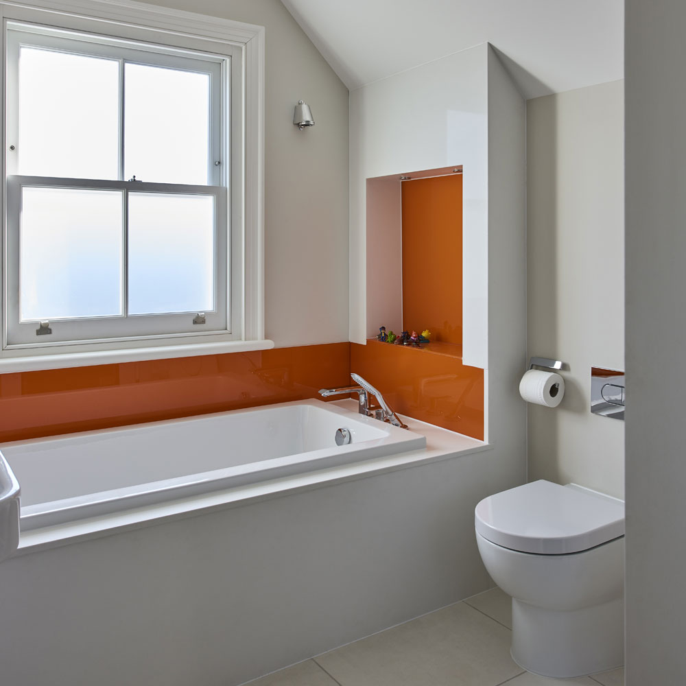
Keen to keep the look here simple yet cheerful, the owner requested that the glass splash backs be back-painted in a deep orange hue.
Bespoke back-painted glass
Opticolour
12/14 Girls’ bedroom
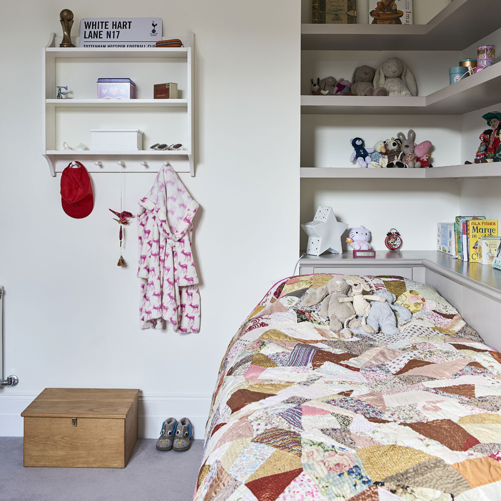
The shelving behind the bed was the owners idea, as she had had the same arrangement in her bedroom as a child and loved it.
Paint (on shelves)
Elephant's Breath Estate Eggshell from Farrow & Ball
13/14 Bedroom corner
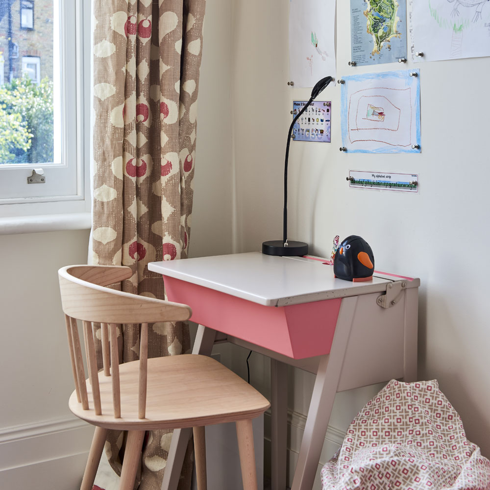
The desk was found on eBay; the legs were cut down to make it child-friendly and it was painted to suit the scheme.
Curtains
Madaket in Husk from Rapture & Wright
Beanbag
Hopscotch in Husk from Rapture & Wright
14/14 Boys’ bedrooms
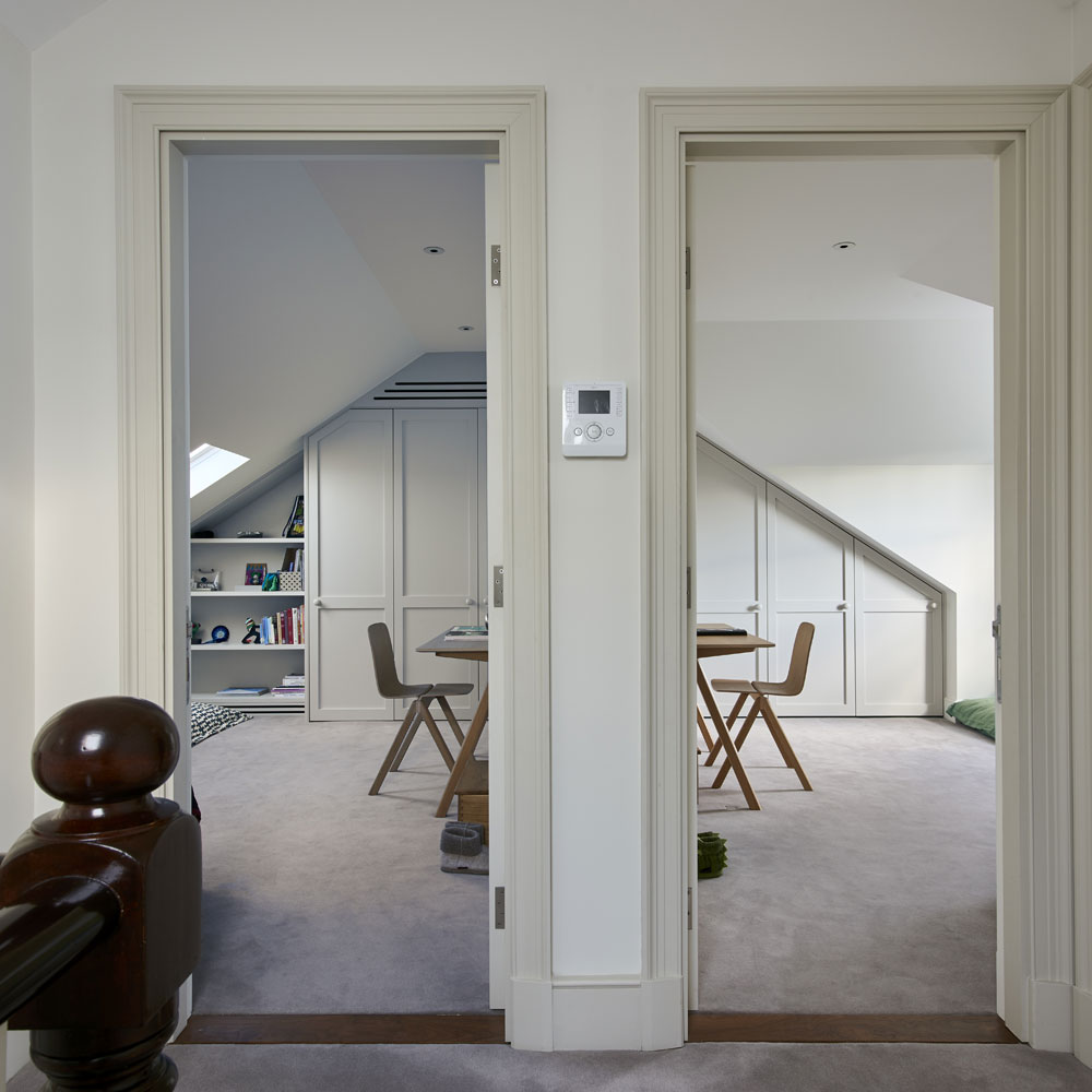
The owners wanted a bedroom each for their two sons up here, as well as a playroom and a bathroom.
To make the most of the space, they extended the roof out to the rear of the property with traditional-style dormers which, from the outside, look like those on the neighbouring houses. The two gable roofs were more expensive to install than mansards, but they are more sympathetic to the period of the house.
Jennifer is the Deputy Editor (Digital) for Homes & Gardens online. Prior to her current position, she completed various short courses a KLC Design School, and wrote across sister brands Ideal Home, LivingEtc, 25 Beautiful Homes, Country Homes & Interiors, and Style at Home.
-
 Who is responsible for repairing a party wall?
How to find out who should be organising and paying for the work
By Natasha Brinsmead
-
 Overcoming limited space and doing away with an awkward layout, this couple created a family kitchen filled with elegant touches
The symmetrical layout is full of luxurious details
By Holly Reaney
-
 Should your doormat go inside or outside the front door? According to experts I've been getting it wrong for years
Experts reveal the best spot for a a doormat based on your preferences and where you live
By Sara Hesikova