Take tips on using blue colour schemes from this pretty period farmhouse in Dorset
These homeowners lovingly restored and doubled the footprint of their idyllic country house using an appealing mix of styles
After ten moves in 20 years, these self-confessed move-a-holics knew they wanted to settle for good when they set their eyes on a perfect village period property. ‘The first time I drove past this house, I nearly crashed the car. It was just so pretty,' says the owner.
Discover more of our real homes and be inspired for your next transformation
Looking at the perfect symmetry of its charming house, it is easy to see how this stunning property would have immediately won their hearts.
Exterior
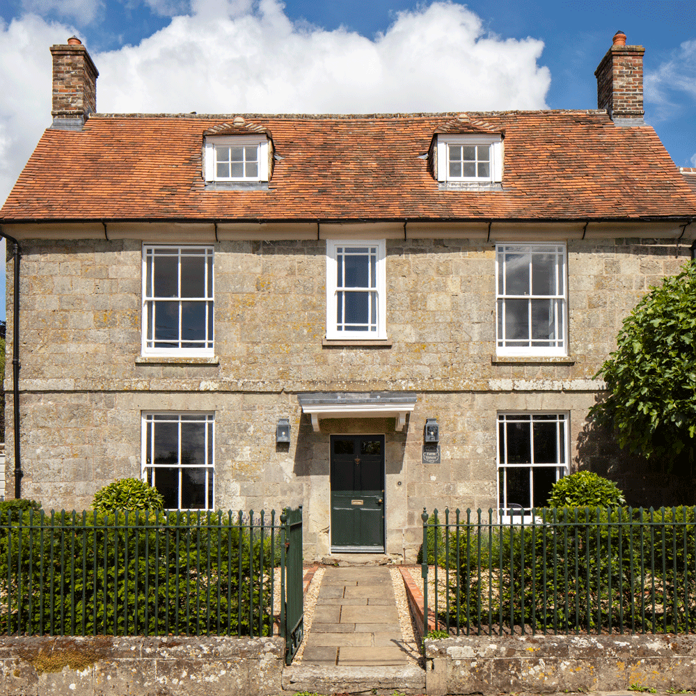
‘It had perfect Georgian proportions, some original shutters and doors, two original fireplaces, a tiny beamed attic and a wonky creaky staircase with great character,’ say the owners. But on the downside, the house had been hugely neglected and it was far too small. Only one room deep, its outward appearance looked deceptively grand.
First on board to help with the new plan to double the size of the house, was architect Tim Reeve who soon came up with a plan to create an extra first-floor bedroom and bathroom, a new dining/sitting room and a much-desired utility room.
Dining area
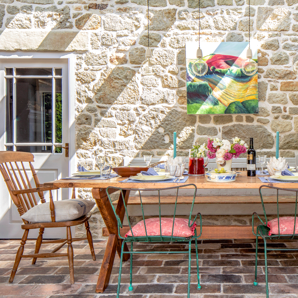
From the owner's point of view, the best design decision they made was to move the old kitchen out of what is now the sitting room and reinstate it next to the walled garden.
‘We now feel part of the outside when we eat and cook in the kitchen,’ she says. The exposed brick wall and old patio flooring maximises its rustic appeal.
Get the Ideal Home Newsletter
Sign up to our newsletter for style and decor inspiration, house makeovers, project advice and more.
Kitchen
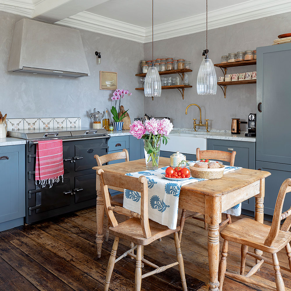
The walls of the kitchen are covered in traditional grey-pigmented, lime plaster, which add a texture in different tones. To complement the wall colour, the units were painted in Farrow & Ball's Lulworth Blue.
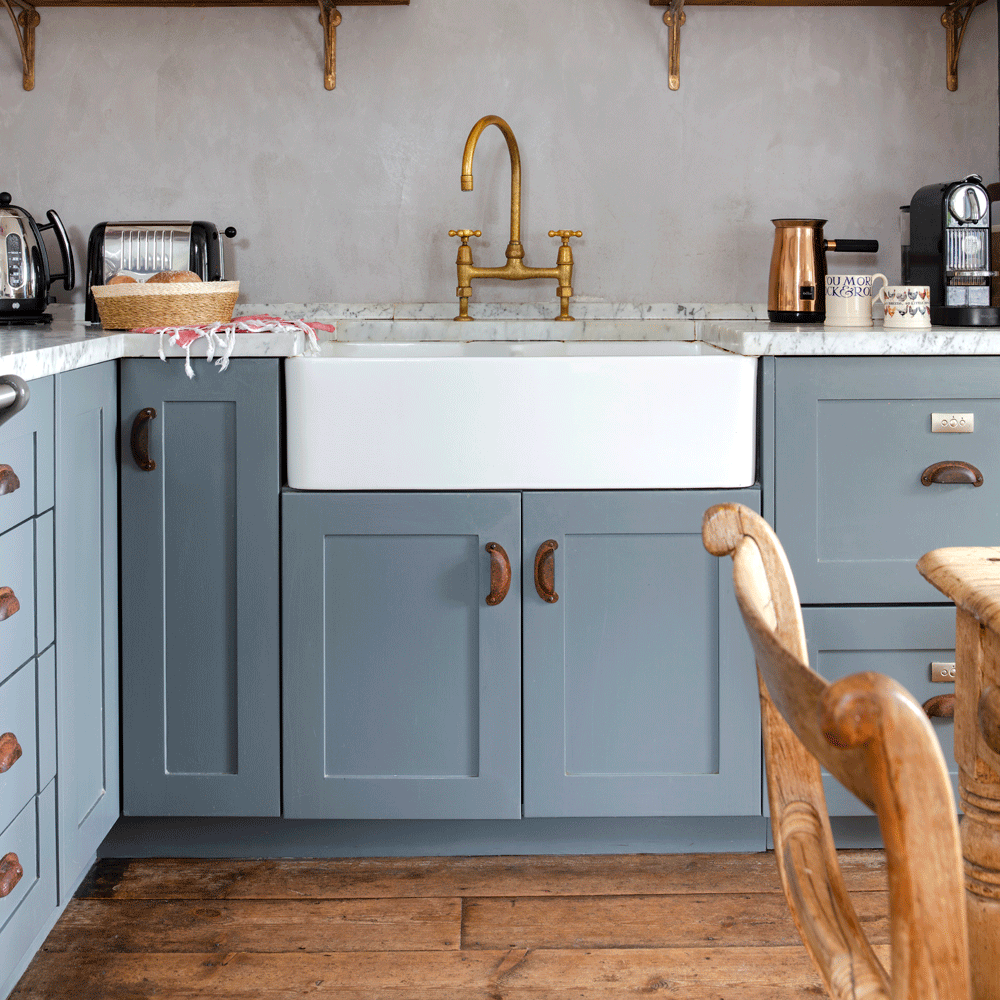
Details such as the aged brass taps and door handles help to bring out the character of this relaxed space.
Sitting room
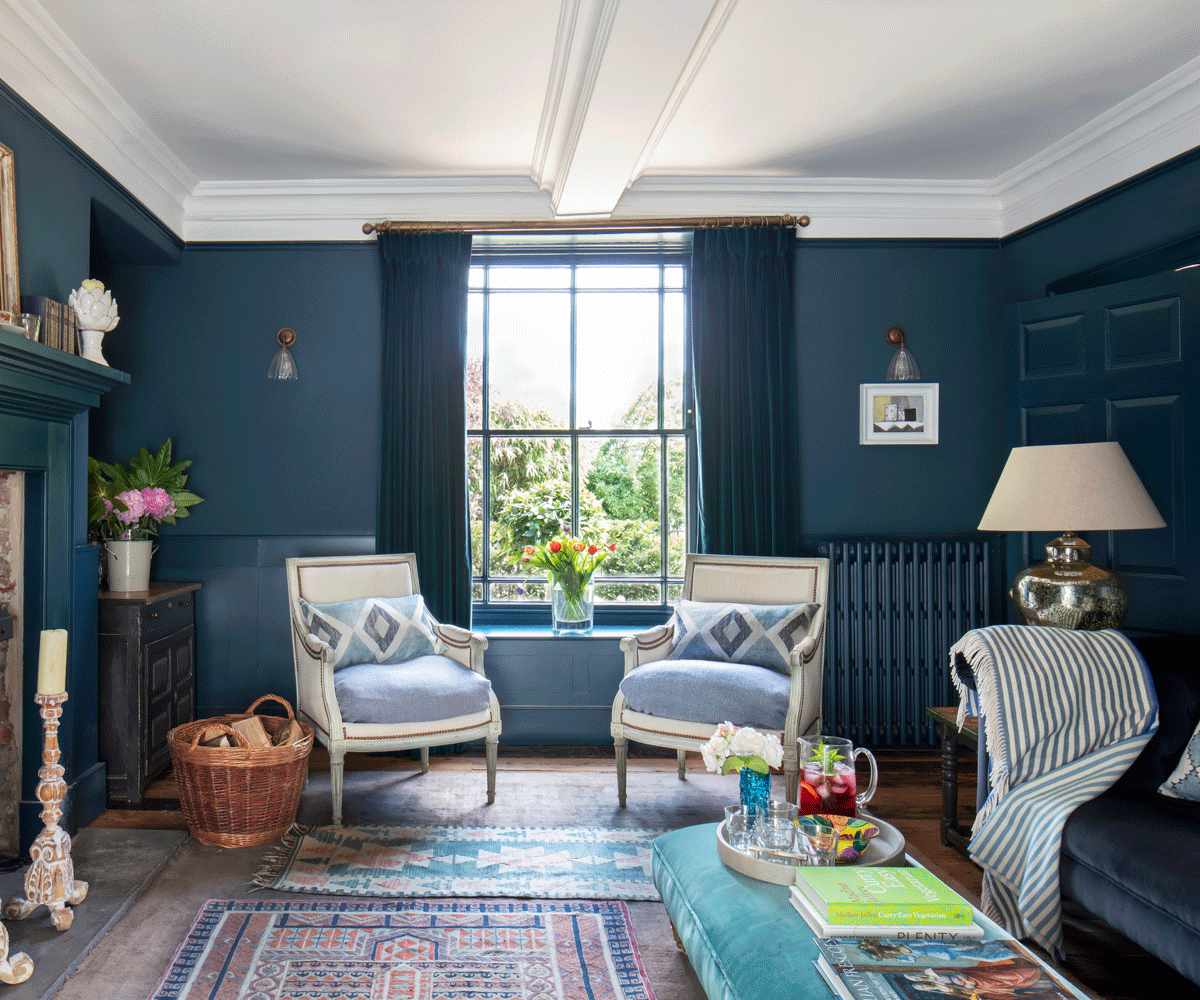
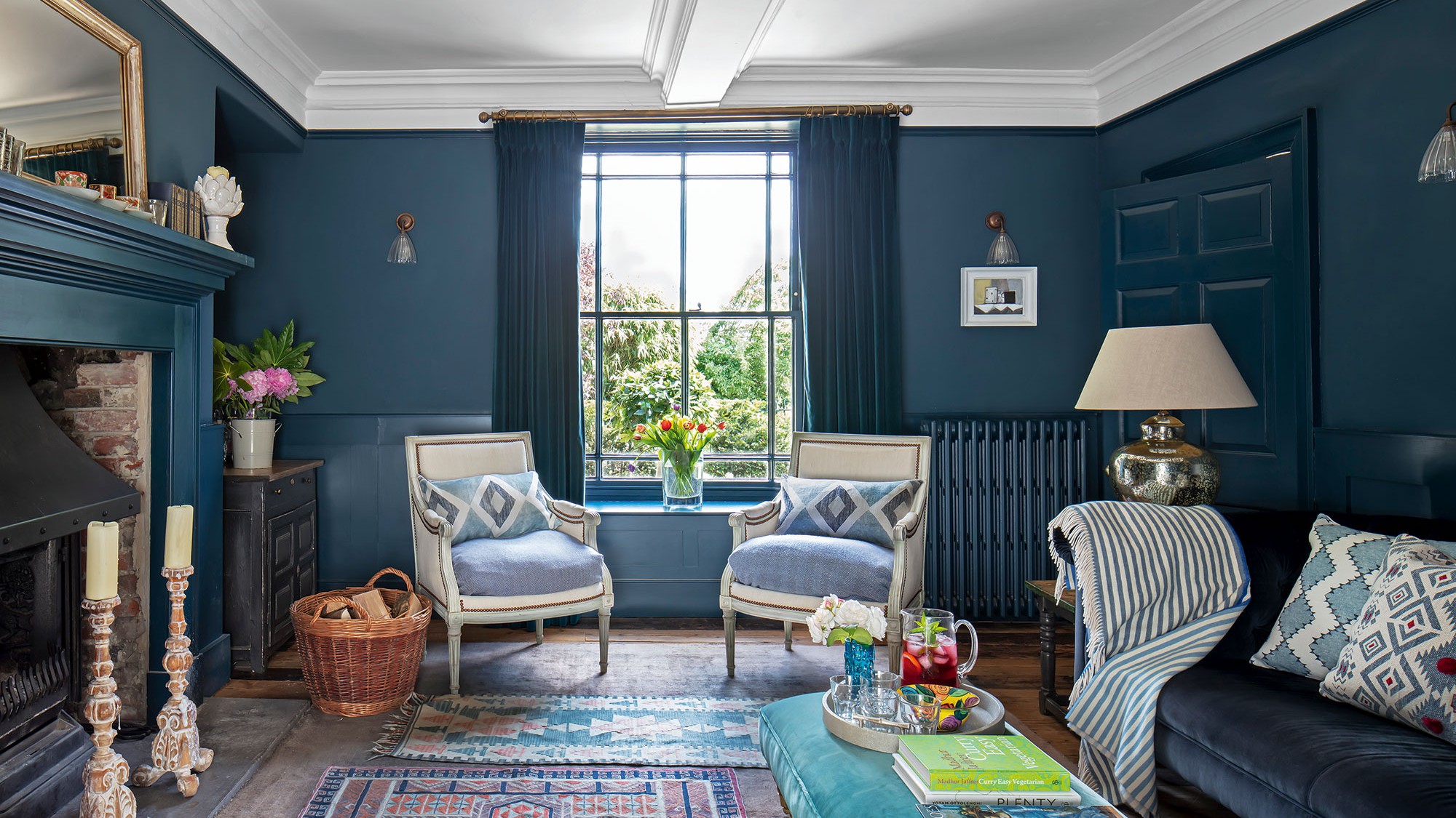
When it came to choosing the colour of the sitting room walls not everyone was in agreement. 'Dark blue was not my first choice,’ admits the owner. 'But now I really appreciate what a great relaxing night-time space this is, especially when the fire is blazing and candles lit.’
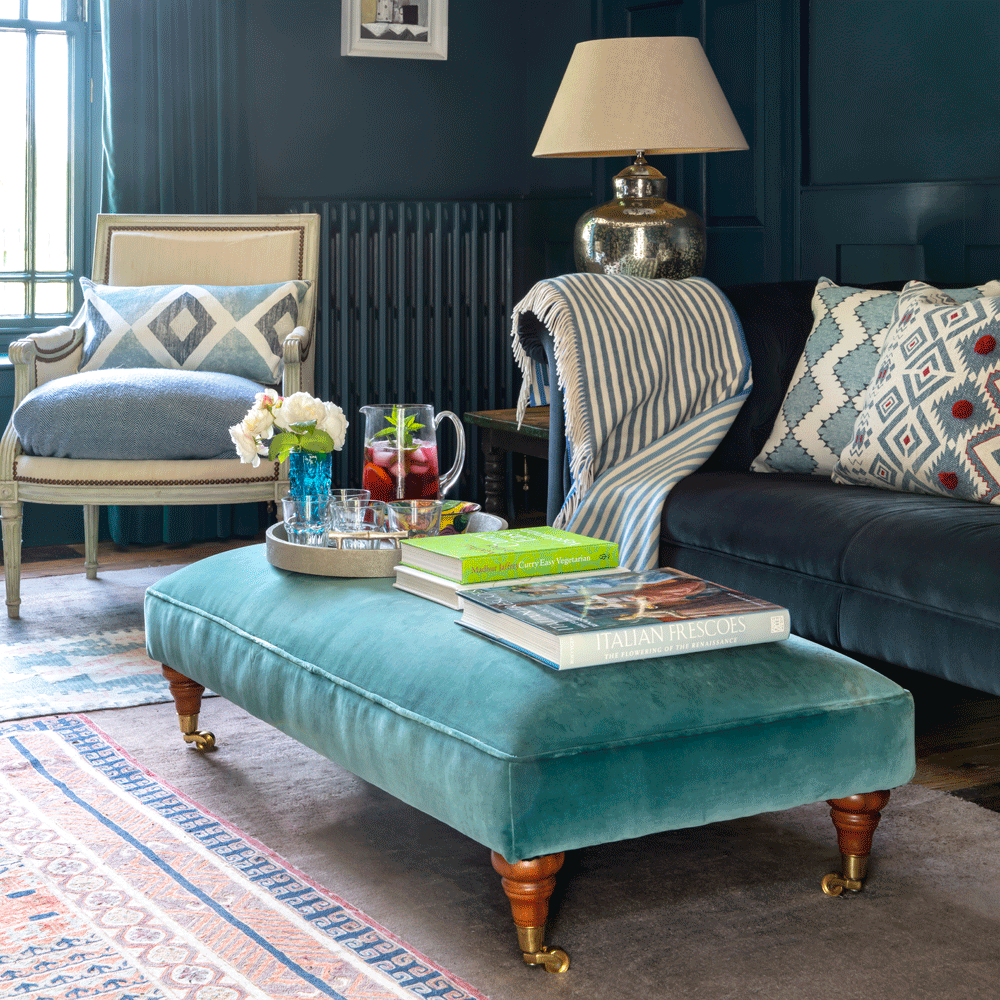
If you love this look, discover our blue living room ideas – 18 decorating schemes in shades from navy to duck egg.
Bedroom
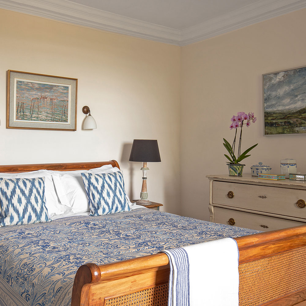
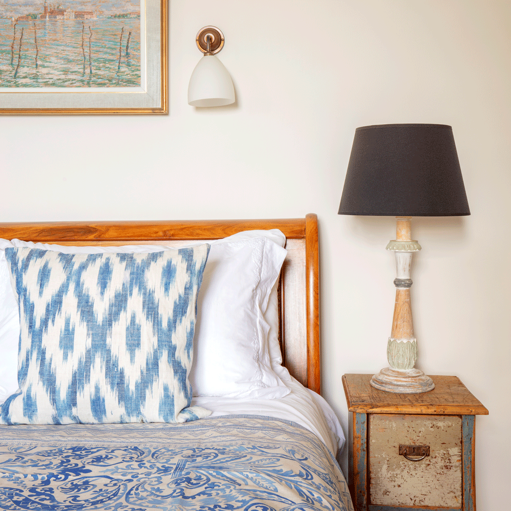
Building an extension gave the couple an extra bedroom on the first floor. Now this classic sleigh bed from Simon Horn takes centre stage, while textiles in vibrant patterns enliven the scheme.
Garden room
Next up, See the transformation of this neglected period cottage on the Norfolk coast
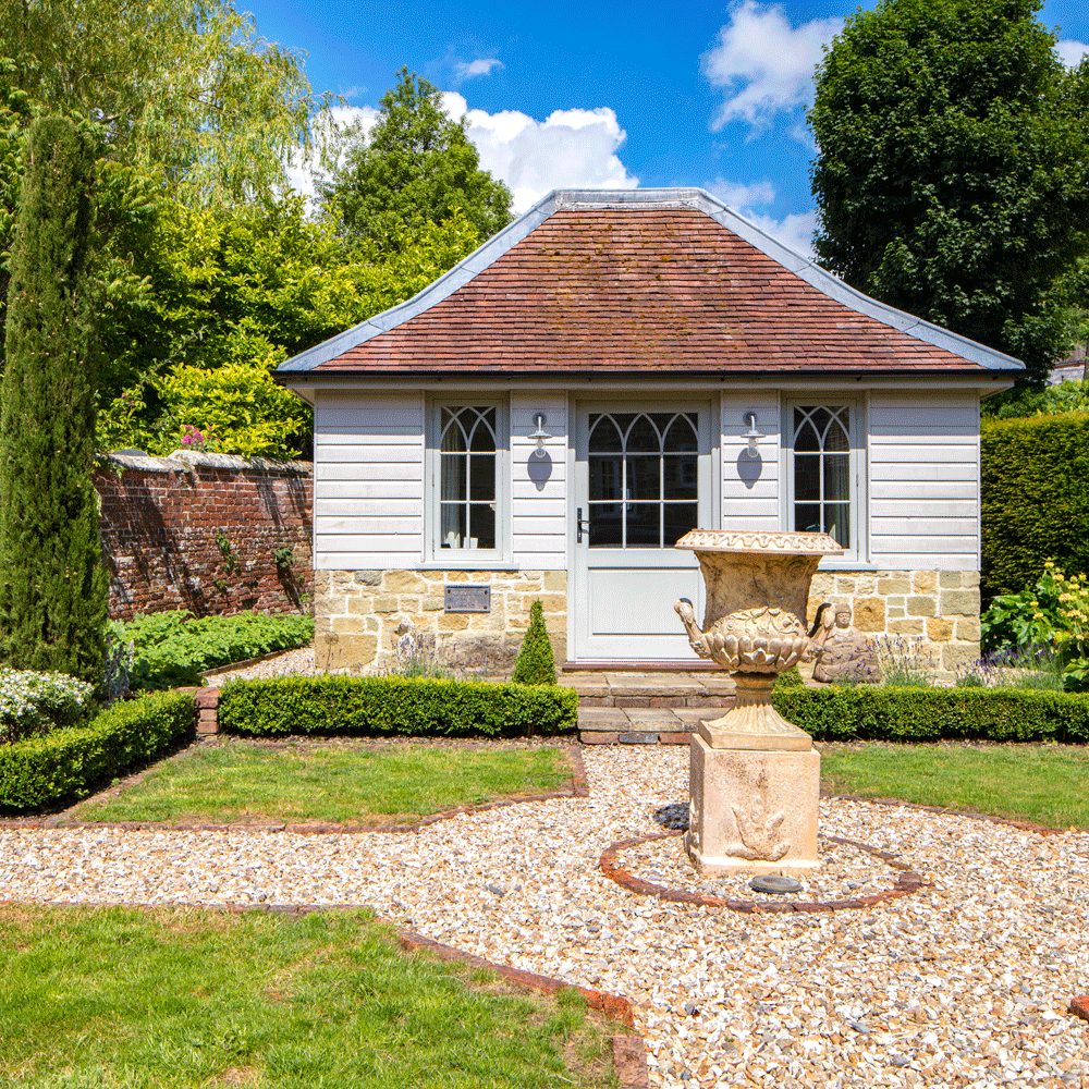
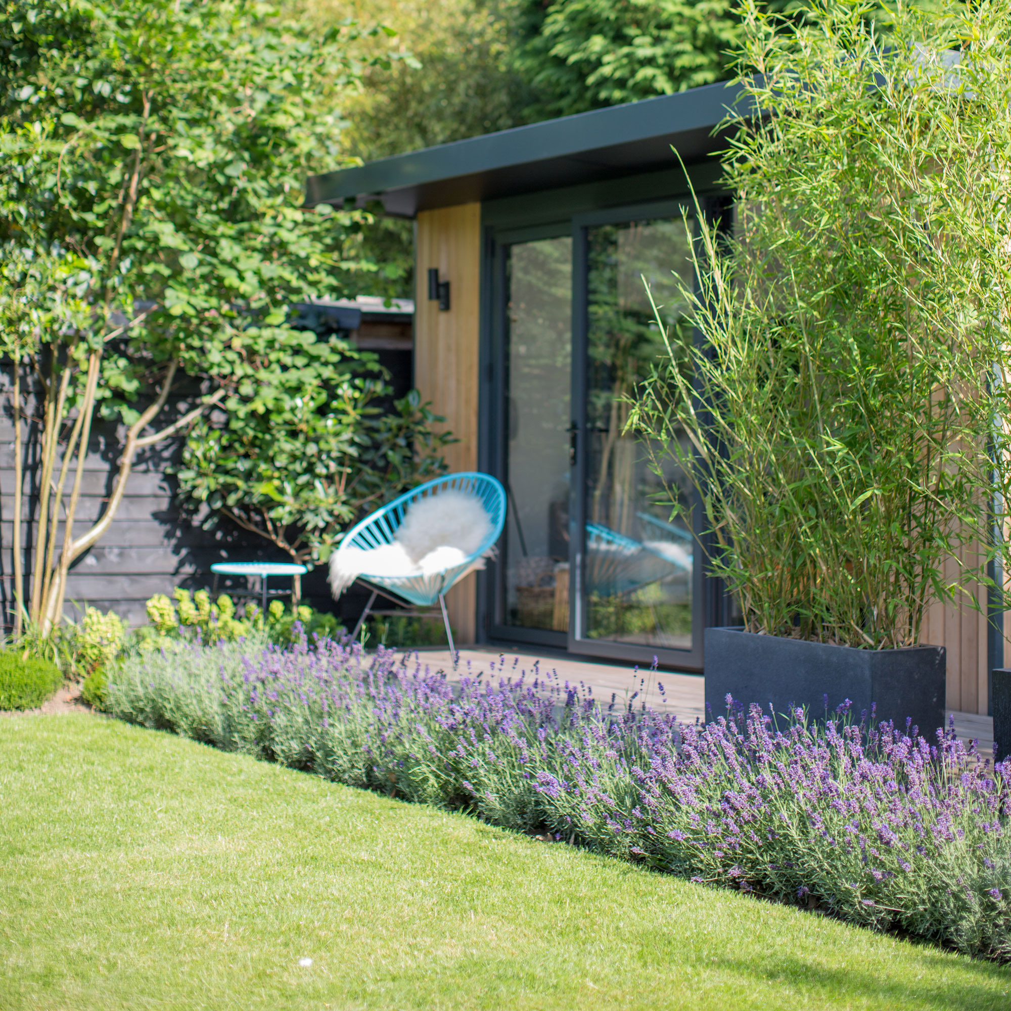
The architect had great artistic skills and came up with this distinctive gothic-style design for the garden office. 'I'll never forget how he literally drew it on the back of an envelope in seconds.’ As well as looking picture perfect, it offers a practical space for these homeowners to work.
Additional Words, Maggie Colvin
-
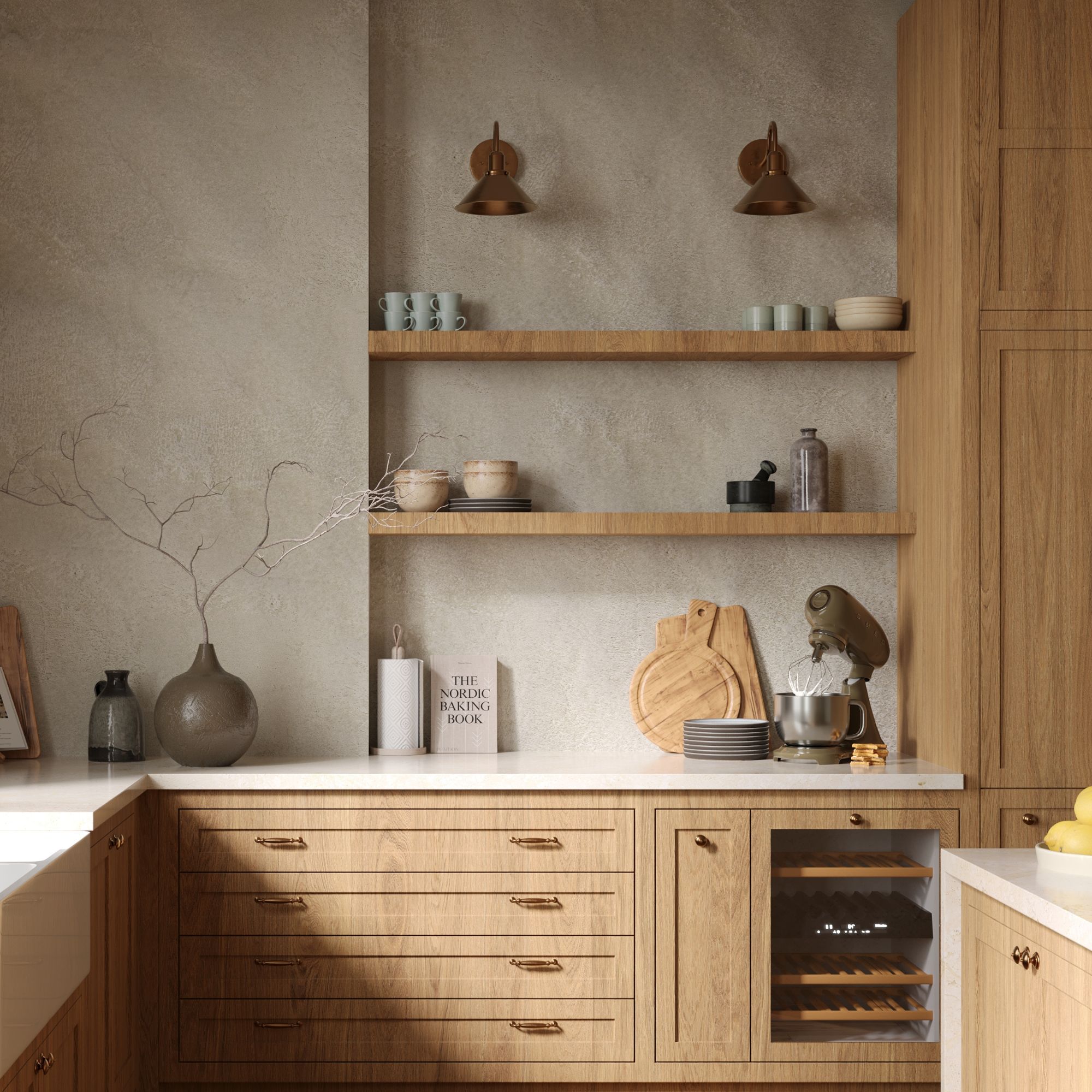 Wood drenching is the calming new twist on the colour drenching trend – here’s how to make the look work in your home
It’s easier than ever to embrace natural materials
By Maddie Balcombe
-
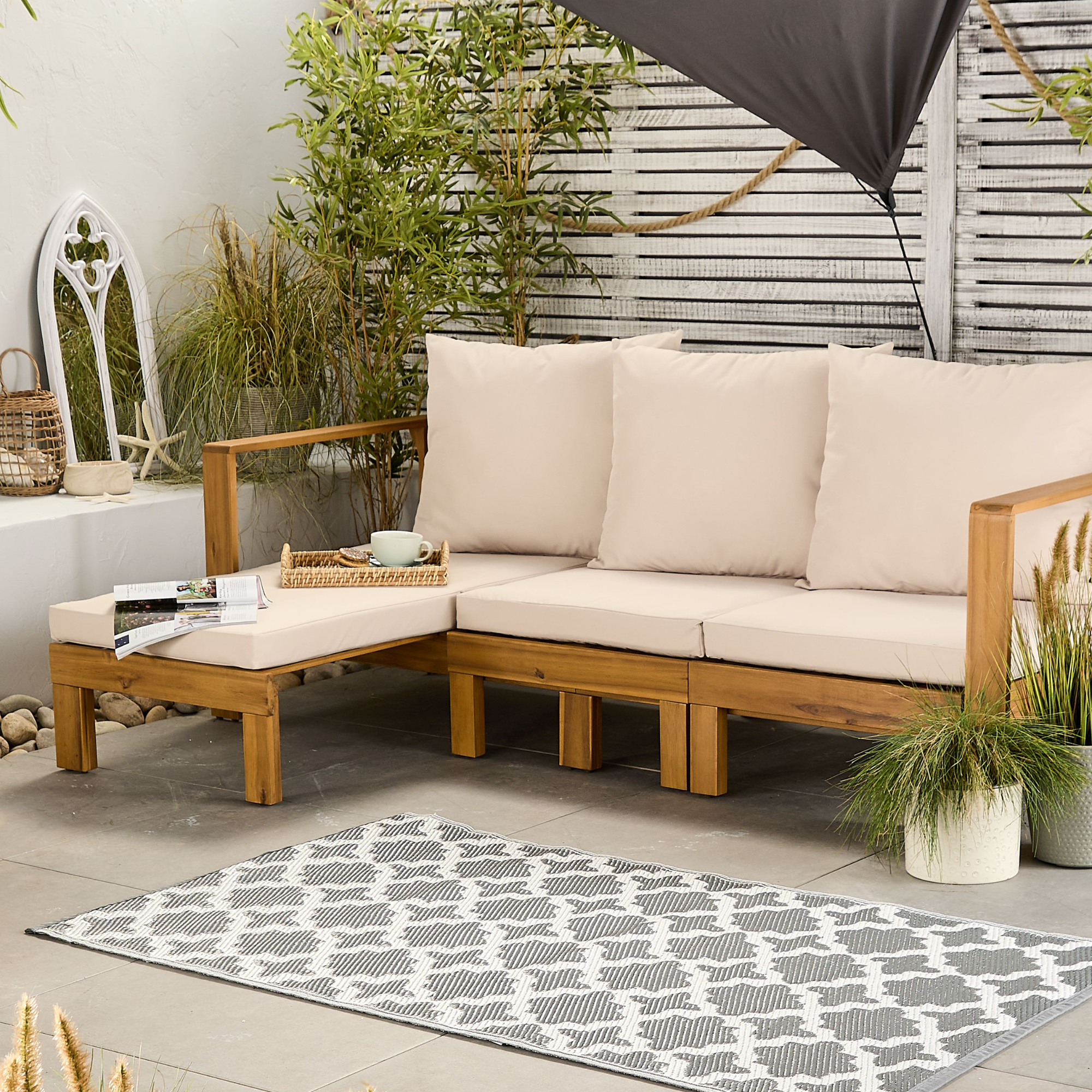 Aldi is launching a £200 day bed with four different features - its sleek design is suited to the whole family
You don't want to miss out on this Specialbuy
By Kezia Reynolds
-
 How to set up a drip watering system that saves water and a lot of effort
Keep your plants hydrated (and your water bill down) with this clever garden watering solution
By Natalie Osborn