Take a tour of this fun and vibrant Victorian end-of-terrace in Hampshire
It was dated and had a less-than-ideal layout, but this owner is glad she took a chance on her Victorian fixer-upper
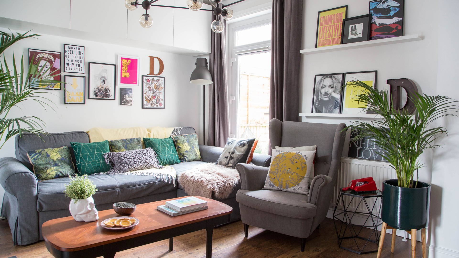

'Although incorrectly advertised by the estate agents as a “well-presented property” (it couldn’t have been further from the truth), we were still charmed,’ says the owner of this three-bed Victorian end-of-terrace. ‘And despite a builder friend advising us to walk away, we were so excited. Or, if we’re honest, desperate to buy our first house – so we went for it anyway.'
Everyone has their own unique decorating style – see for yourself with more of our real homes
The house was a generous size, particularly compared to others the owner and her husband had viewed within their budget, and they could see endless potential for it to become a happy family home. 'We weren’t ignorant to the fact that it’d take a long time – not to mention a lot of work and money – to whip it into shape and make it work for us, but we gladly accepted the challenge,' says the owner.
Exterior
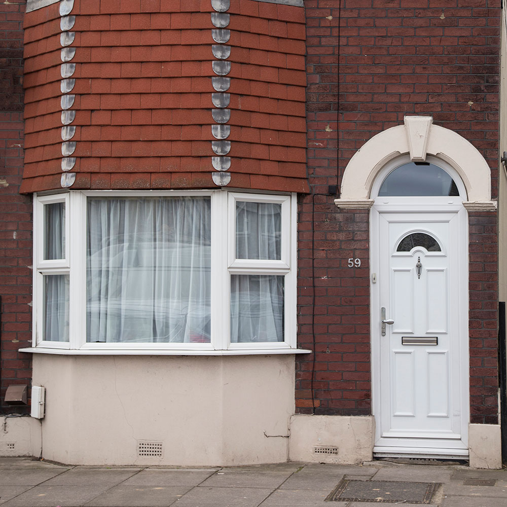
The previous owners had been letting the house out for a couple of years, so it needed a lot of love. The layout was impractical for family life, and the rooms all felt a little dark. 'As a Victorian property, it should have been bursting with character, but instead it appeared lifeless, bland and boxy,' the owner says.
'It took us eight years, but it’s finally a fun and vibrant home,' she adds. It's had many looks over this time. At one point, the dining room had a French farmhouse style with distressed furniture and toile de Jouy wallpaper, while the couple played it safe in other rooms by keeping the walls white and the scheme pared back.
'But as our tastes have evolved, so has our choice of decor. I found that, for me, colourful, fun interiors were a form of therapy. Being surrounded by cheery tones and happy spaces brightens my mood no end, and helps me to relax. Our decor has also become much more reflective of our personalities – it’s playful, welcoming and never too serious or structured.'
Living room
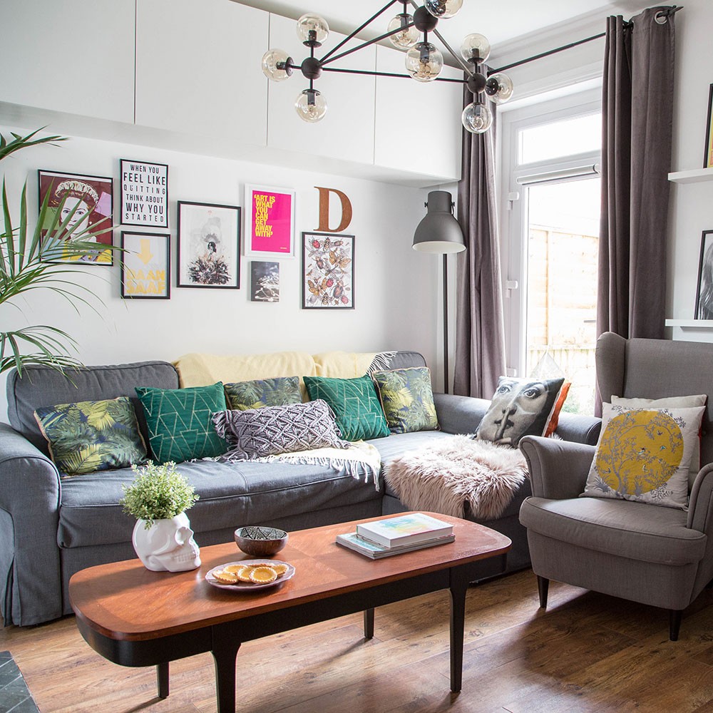
It was a couple of years before the owners could begin the biggest job: reconfiguring the downstairs layout. Originally, the house had two separate modestly sized reception rooms and a long, narrow corridor which ran down the side, connecting the two rooms to the kitchen at the end.
Get the Ideal Home Newsletter
Sign up to our newsletter for style and decor inspiration, house makeovers, project advice and more.
'This layout felt far too closed off for me, and I craved an open space full of light that would allow for easier movement between rooms,' says the owner.
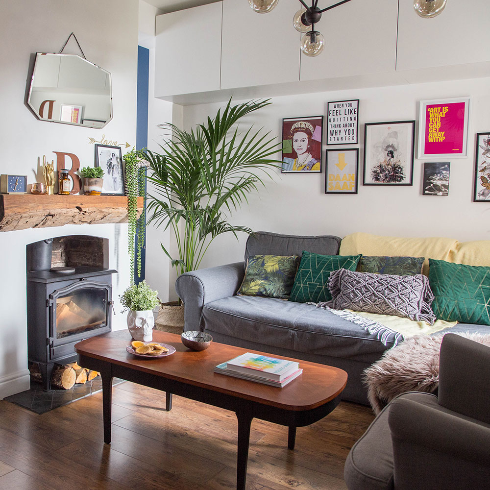
Once the couple had the money saved up, they had local builders knock down a few of the downstairs walls and replace them with steel beams. 'We chose to keep the living room chimney breast in situ to help zone the two areas and allow us to create alternate moods in each space,' the owner says.
'It also gave us a great excuse to treat ourselves to a wood burner. I’ll never forget walking in for the first time after the support posts and scaffolding had been removed. The feeling of space was overwhelming.'
Get the look
Buy now: The Ada coffee table, £349, Made is similar
Buy now: Hektar floor lamp, £45, Ikea
Buy now: The Gronlid corner sofa, £895, Ikea has a similar look
Buy now: For similar, try the Tangle chandelier, £99, Made
Kitchen
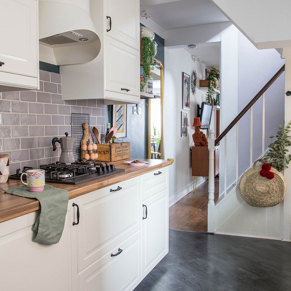
'The kitchen – our most recent big project – was only finished three years ago. I wasn’t exaggerating when I said this renovation has been a slow burner!' says the owner. 'Just like the other rooms, it was completed by my husband, who chipped away at it on evenings after work and on weekends.'
He replaced the brown, outdated units and wall tiles with cream units from Ikea and stylish grey metro tiles. 'It took a fair few months to complete and it was a nightmare trying to function without a kitchen – especially with a toddler and a baby – but it meant that we were able to afford the scheme we wanted,' the owner says.
Dining room

The dining room is full of secondhand bargains. 'We bought the display unit for £80 from a seller on Gumtree who lived 70 miles away. To save on delivery, my husband collected it himself,' says the owner.
Get the look
Buy now: The Watford dining table, £575, La Redoute is similar
Buy now: Booze, Bed & Breakfast print, from £9.99, Etsy
Bedroom
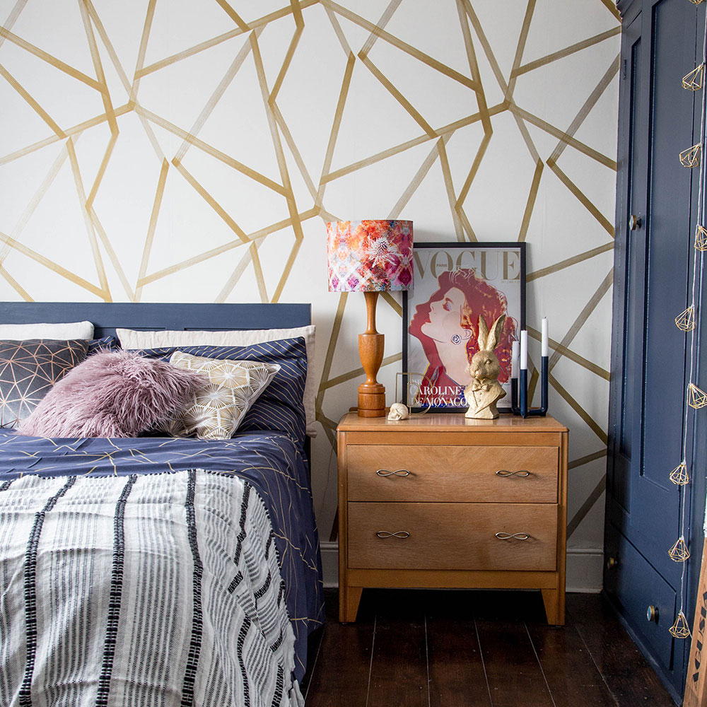
Love this look? Feature wall ideas – make a serious style statement with wallpaper, paint and more
The house renovation began almost immediately with the master bedroom. 'We set to work uncovering the original floorboards and opening up the fireplace to reinstate the room’s period features, as well as painting over the muddy brown walls with white paint,' says the owner. The couple made a feature of geometric print wallpaper on one wall.
Get the look
Buy now: For similar wallpaper try the Camden Apex Glitter Wallpaper, £20 a roll, I Love Wallpaper
Bathroom
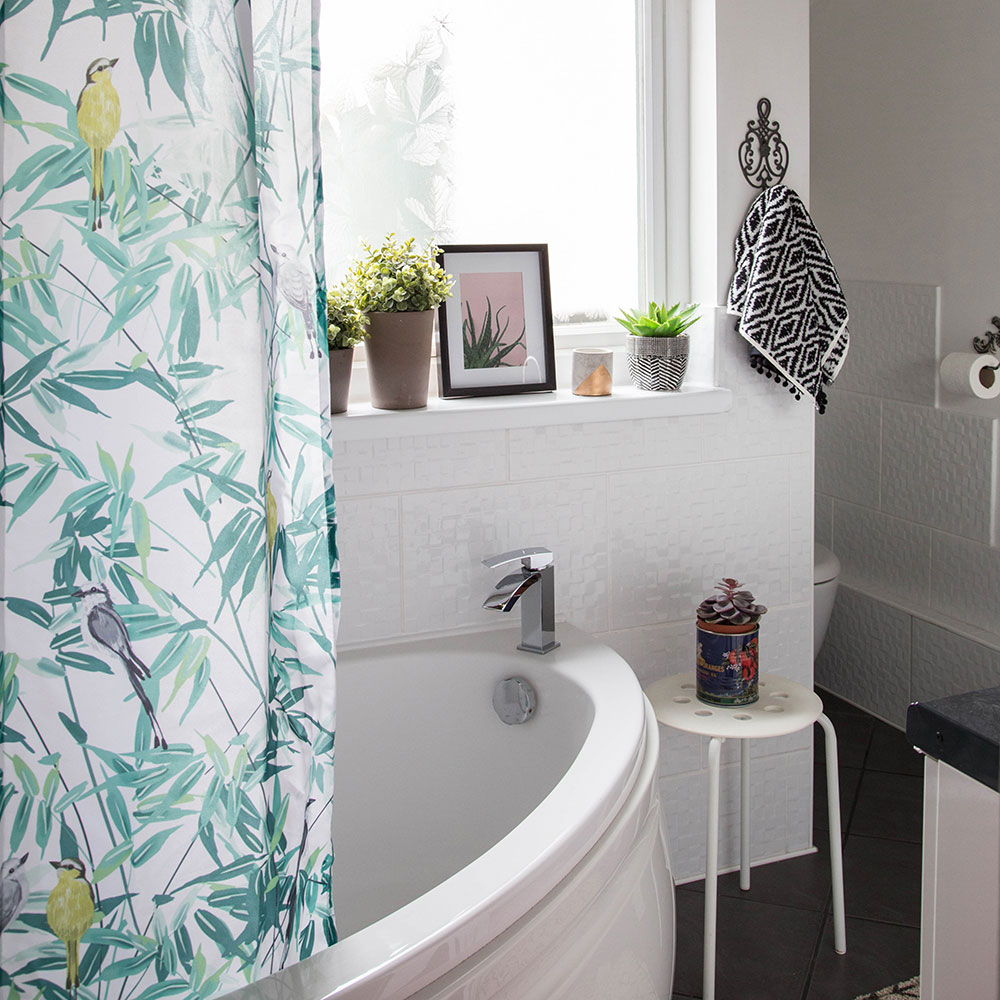
'The bathroom was a much bigger job than we’d anticipated,' the owner says. 'It’s in an extension built by the previous owners and it was in a bad way with paint flaking off the tiles (we assume they were painted in regular emulsion rather than specialist paint) and a less-than-ideal positioning of the suite.' The owner's husband took on the task himself, which meant that while they were saving money, it wasn’t a quick makeover.
Ready for another house tour? Take a tour around this cool and sophisticated four-bed Edwardian semi in London
'He knocked through the flat ceiling so the room felt more airy, ripped out the original suite and switched it for a bargain set we found on eBay. He also plastered and painted the walls and redid the tiling, too. In fact, I vividly remember Bart installing the bath every single evening so that we could shower, then disconnecting it again afterwards – for days on end – so that he could continue with the tiling or grouting the following afternoon,' says the owner.
Get the look
Buy now: The Tropical Leaf shower curtain, £8, Dunelm is similar
Buy now: For similar tiles try the Mist wall tiles, £151.07 per m sq, Topps Tiles
The couple are happy with their home as it stands, but admit it’ll never be fully finished. 'I’m always stumbling upon new ideas and inspiration on Instagram and in interiors magazines, and trying to figure out how to incorporate them into our schemes,' says the owner.
The renovation has also been a serious lesson in patience. 'I’ve learnt that projects often take much longer than anticipated, and often cost more too,' the owner says. 'But you always get there in the end.'
'My biggest regrets are not installing the freestanding roll-top bath I had my eye on eight years ago, and choosing two sinks instead of extra storage, but I’ve come to realise that the key to being happy with your home is letting go of any flaws you think it has, and just accepting it for the cheery, fun, imperfect place that it is.’

Heather Young has been Ideal Home’s Editor since late 2020, and Editor-In-Chief since 2023. She is an interiors journalist and editor who’s been working for some of the UK’s leading interiors magazines for over 20 years, both in-house and as a freelancer.
-
 My go-to Ninja coffee machine is on sale for Easter weekend
It makes coffee shop quality achievable at home
By Molly Cleary
-
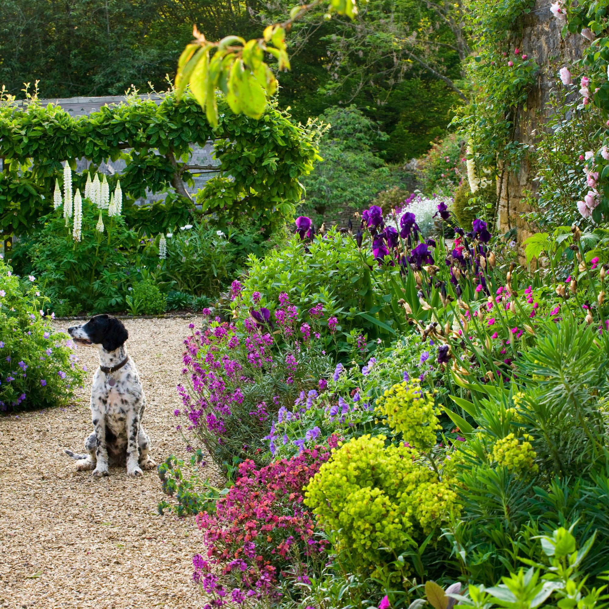 When to plant out annual flowering plants for vibrant, colourful garden borders – and give them the best start, according to experts
Not sure when to plant out annual flowering plants? We've got you covered...
By Kayleigh Dray
-
 I'm a kitchen decor editor and didn't like this tableware trend - until I saw H&M Home's designer-look plates
They made it easy to justify a new crockery set
By Holly Cockburn