Step inside this refurbed 1930s home with a calm but cool colour palette
The dreamy shades give this light-filled property an extra wow factor
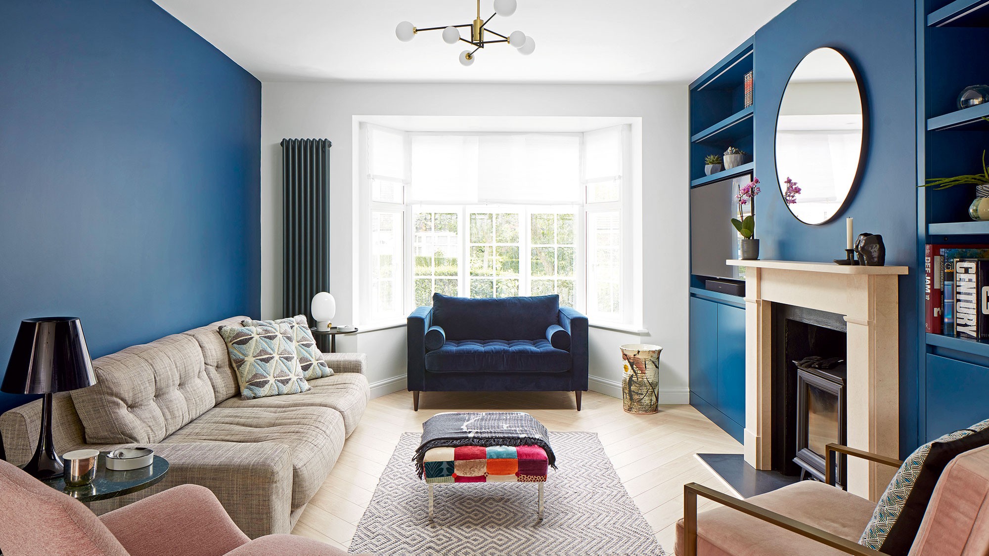

When a young family needed to refurbish their newly purchased home they enlisted expert help, and everything flowed from there.
After a year spent searching for their ideal house, the now-owners finally found a 1930s detached property quite close to where they were living, in north London. ‘It had been lived in and loved by the previous owners for 40 years but seemingly hadn’t been updated in that time,’ they say.
‘It needed some TLC in the form of a top-to-toe refurbishment so we called in XUL Architecture. They have a fantastic reputation in this area and considerable experience of working on similar houses to ours.’
In turn, Sebastian Sandler of XUL says that working with owners who were decisive and had a clear idea of what they wanted, helped the project go smoothly. ‘They told us that their aesthetic throughout the home was contemporary-traditional, with an interior that felt homely and welcoming yet modern and sophisticated,’ he says.
The kitchen
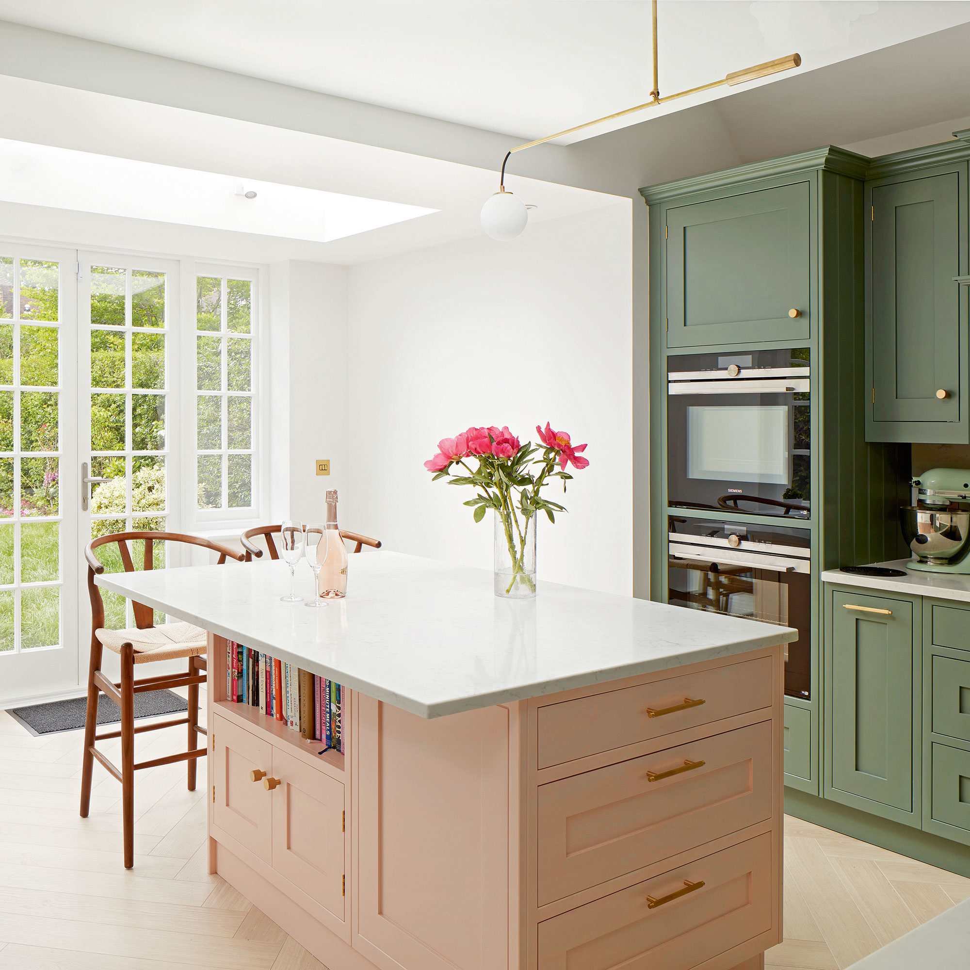
An important part of achieving that feel was enlarging and reconfiguring the building as far as the strict local building regulations would allow in the conservation area. On the ground floor, that meant extending out at the back to create a kitchen extension idea with a large skylight to fill this space with much-needed natural light.
The kitchen details
‘XUL brought more light and space into the kitchen and cleverly linked it with the living/dining area,' say the owners. The island, painted in Farrow & Ball’s Pink Ground, links to soft pinks on the sitting room furniture.
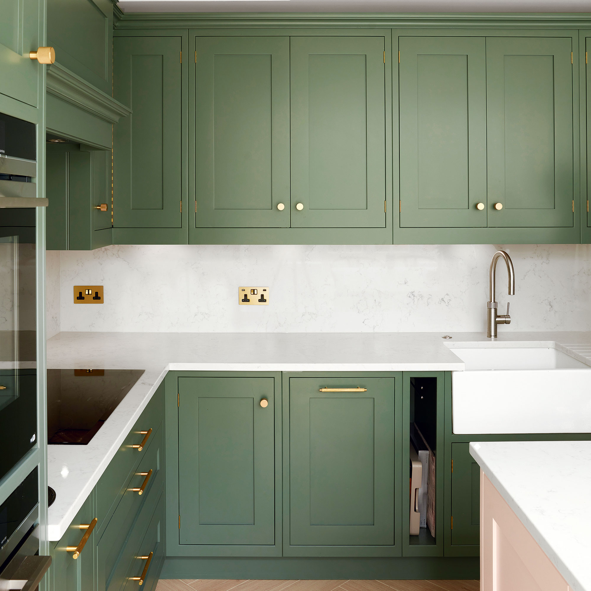
Just as XUL have created a sense of flow with light and space, the owners have achieved the same with their interior style. ‘This has been an amazing collaboration that has exceeded our expectations,’ they say. The stunning greens of the cabinetry add a grounding feel to the pastel island, and link the space with the outdoors.
Get the Ideal Home Newsletter
Sign up to our newsletter for style and decor inspiration, house makeovers, project advice and more.
The dining area
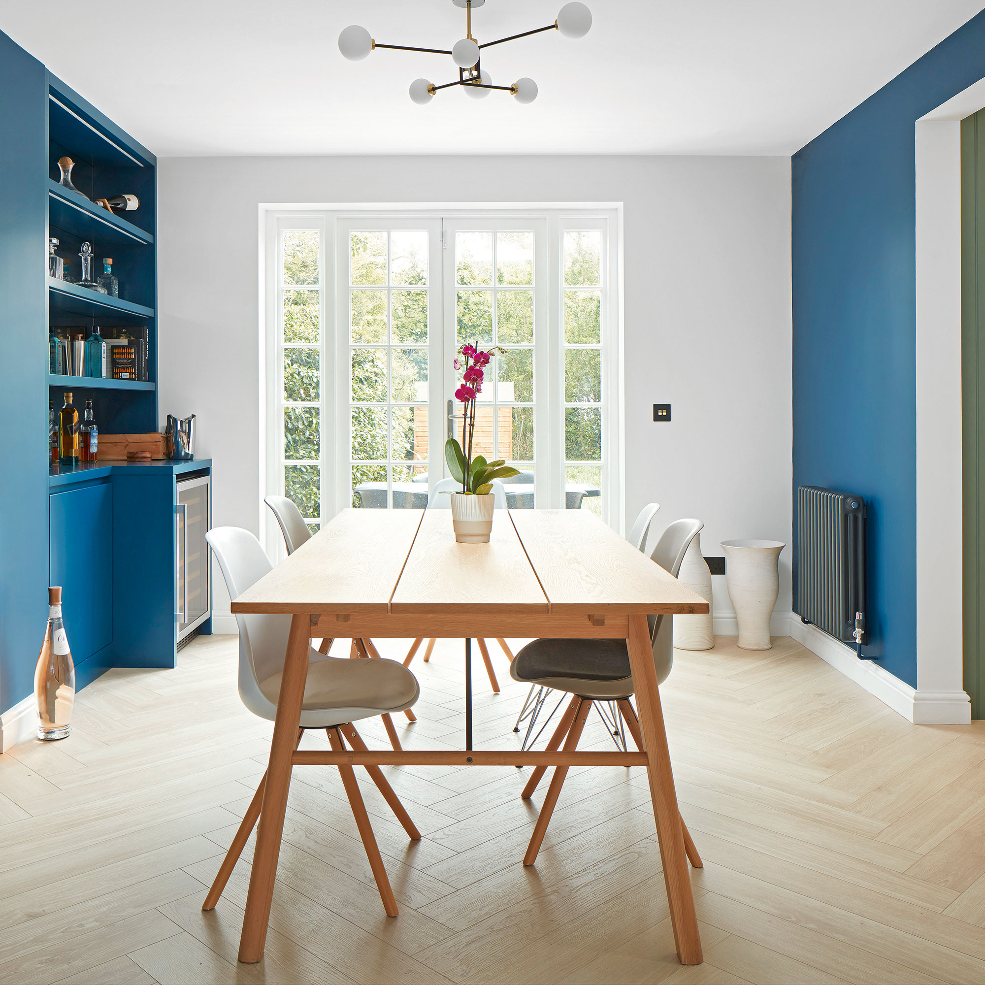
‘What was immediately apparent about this house was that it didn’t have the essential amenities of contemporary living,' says Sebastian. 'Such as a WC, utility room or, importantly, a kitchen connecting to a dining area.'
The open-plan space
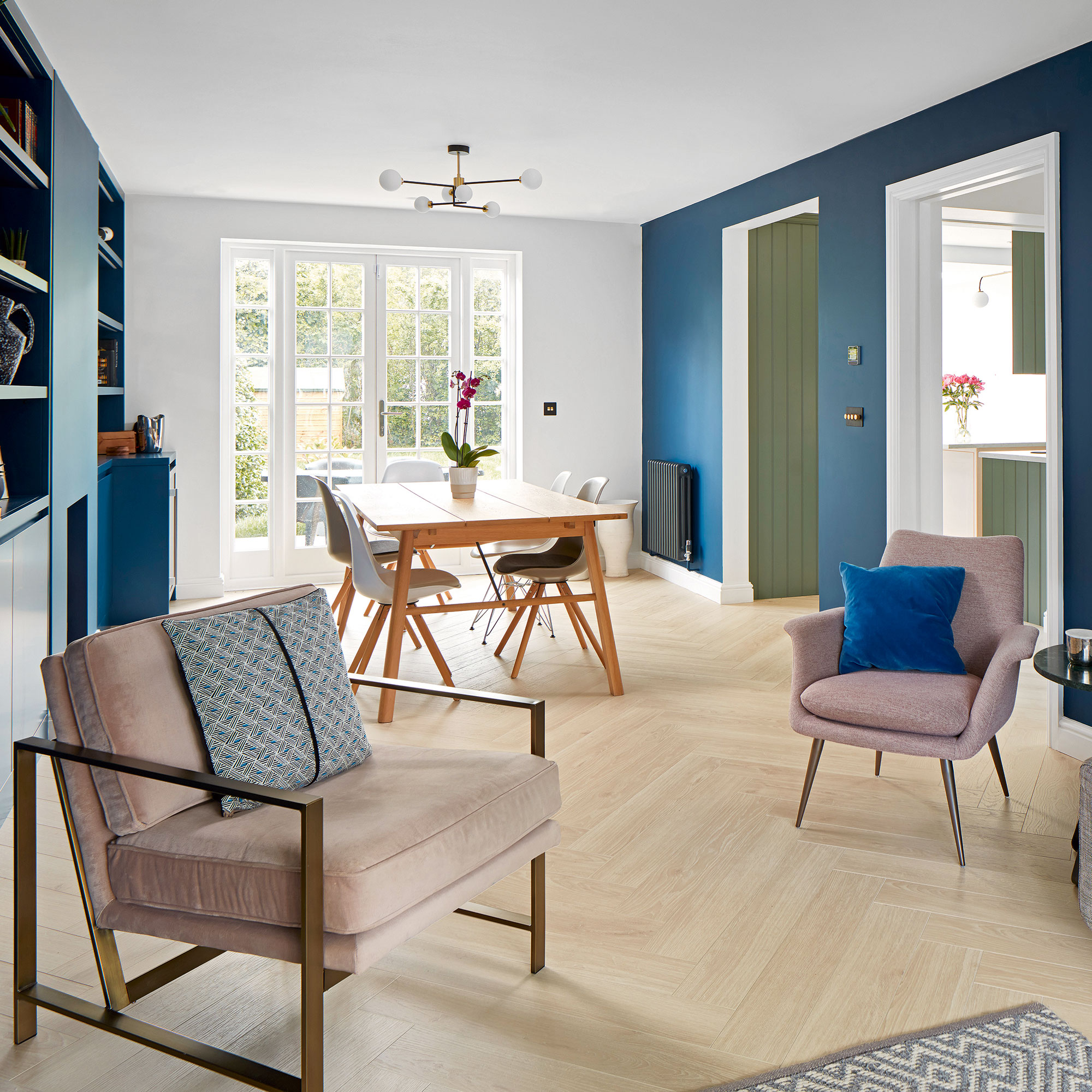
‘The house didn’t have the sense of flow that is vital in a home,' says Sebastian. 'The ground floor was a series of unconnected rooms.’
To remedy this, sightlines were improved, connecting doorways were introduced along with space-saving pocket doors.
There is still a flow of light from one space to another – a quality Sebastian believes is essential in the modern home. ‘Natural light has a positive effect on spatial quality, wellbeing, productivity and creativity,’ he says.
The living room details
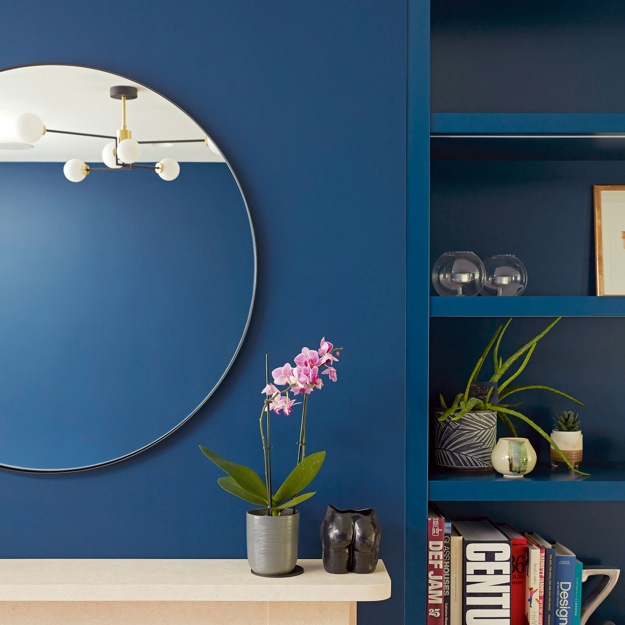
The couple have a one-year-old daughter, so it is very much a family home. A fun, lively feel was therefore essential.
So the feature wall idea of the clean-lines of the living room-cum-dining area were pepped up with a modern shade of blue.
The sitting room
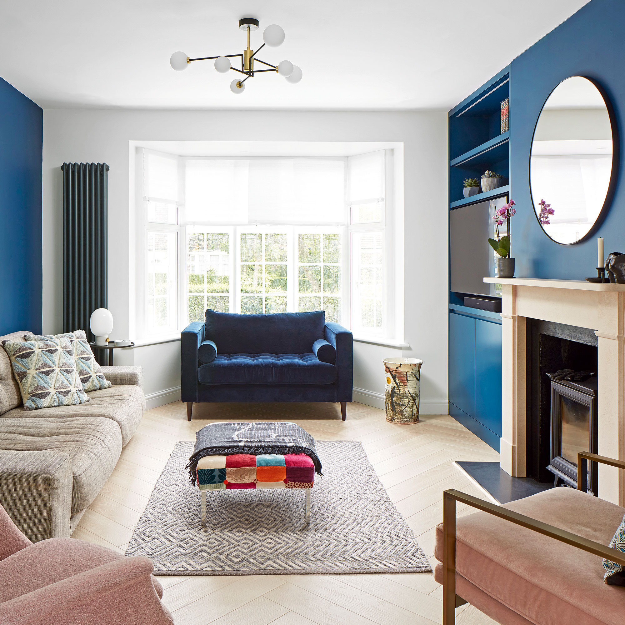
Muted but complementary colours were used for the sitting room furniture, giving it a contemporary look with a lot of warmth.
The deep blue walls provide a contrast to the rest of the subtle scheme.
The bathroom
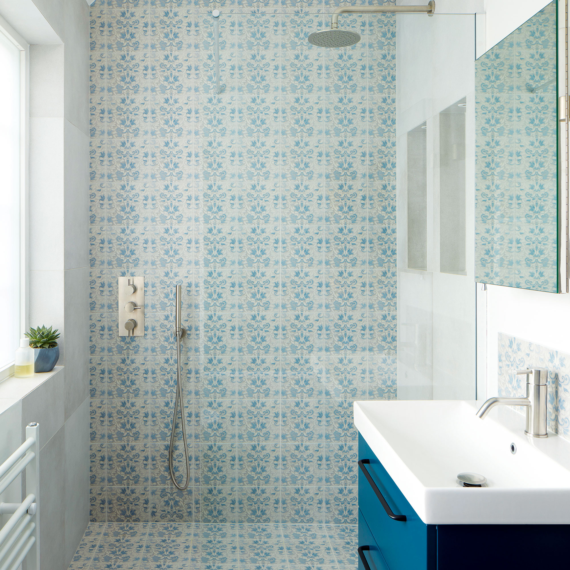
The upper floors were also opened up wherever possible. The family bathroom and main bedroom were moved to the loft space to take advantage of the generous ceiling height.
The master bedroom
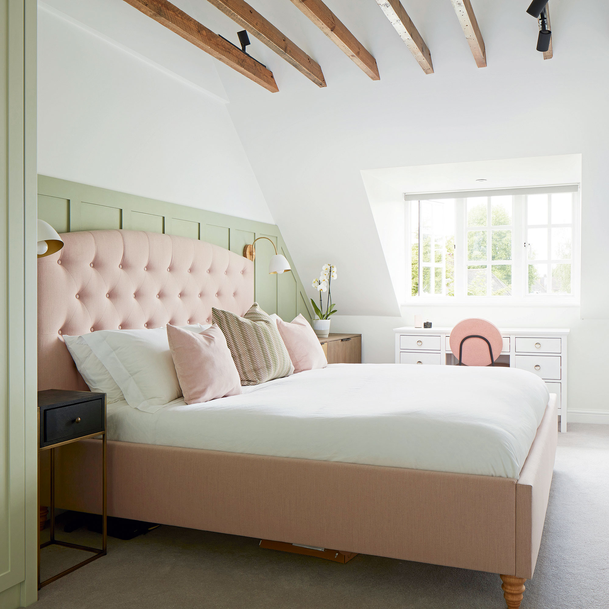
The main bedroom is the place where the owners feel the look has really come together.
‘Ripping out the ceiling and restoring the exposed beams gave the room a feeling of expansiveness,' they say. 'Which we enhanced by adding wall panelling and paintwork in a pale green to produce a countryside boutique hotel feel.'
Additional words: Sean O'Connell

Thea Babington-Stitt is the Managing Editor for Ideal Home. Thea has been working across some of the UK’s leading interiors titles since 2016.
She started working on these magazines and websites after graduating from City University London with a Masters in Magazine Journalism. Before moving to Ideal Home, Thea was News and Features Editor at Homes & Gardens, LivingEtc and Country Homes & Interiors. In addition to her role at Ideal Home, Thea is studying for a diploma in interior design with The Interior Design Institute.
-
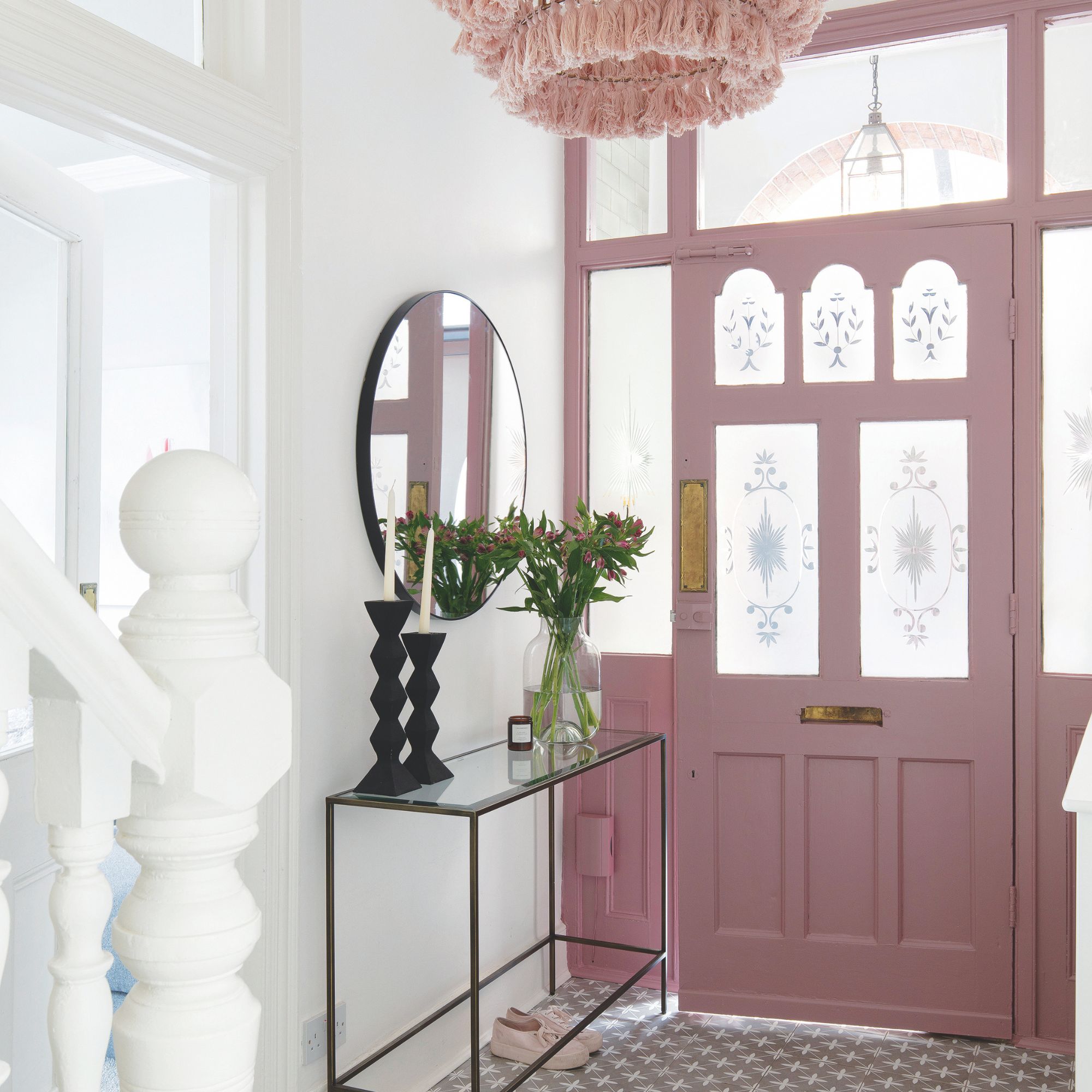 Should your front door colour match your hallway? Interior experts reveal 3 reasons why it should (and 3 reasons it shouldn't)
Are you team matching or contrasting?
By Ellis Cochrane
-
 This £200 limited-time discount makes this Dyson vacuum cheaper than I’ve ever seen it - run don’t walk to Argos for this bargain
It's the most affordable Dyson on the market right now
By Lauren Bradbury
-
 Martin and Shirlie Kemp’s pastel flower beds has given their Victorian renovation a romantic look - how you can get the look
Their pastel garden is the cottage garden inspo you've been looking for
By Kezia Reynolds