Renovated penthouse decorated in natural materials creates a calming retreat in an urban setting
This home offers a touch of nature in the city
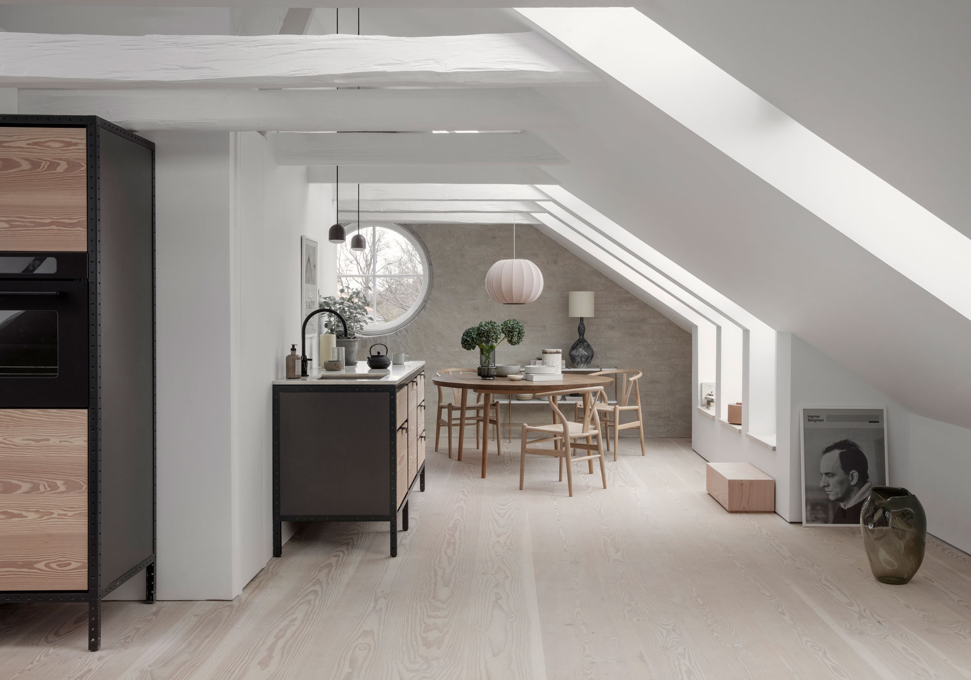
'When we first started, it was just one big open space – a gloomy, dark attic with just four windows' the couple explain. After travelling for work and living in nine places over 12 years, this couple and their three children returned to their 1920s house in Hellerup, Copenhagen – and saw it with fresh eyes.
Finding it dark and dated, they decided to radically renovate, starting with the top floor. By converting the 120sq m space into a flat, they can live in it while they tackle the rest. The property is one-bedroom renovated penthouse within a three-storey 1920s house, bought back in 2000.
See more beautiful interiors inspiration: follow our real home house tours here
‘We wanted to create a beautiful, honest space that would outlive us,’ says the owner, founder of furniture design house Søren Rose Studio. ‘We wanted to enhance the light, and each time I stood on the scaffolding I discovered a new view to the sea, the park and over beautiful gardens. So, we ended up removing the entire roof and installing 23 double-height Velux windows. The homeowner explains how this has, 'given the whole floor a completely different, more spacious feeling.’
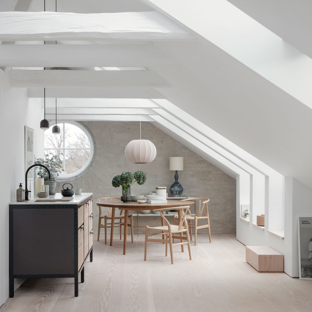
Previously one large space, the beams were raised and a wall built to split it into a kitchen-diner and seating area, plus sleeping space and bathroom.
The finish includes underfloor heating beneath bleached oak flooring, Sonos speakers in the ceilings and a lighting scheme. The renovation took six months rather than the expected three, since the couple added a roof terrace to the plans.
Inside, the backdrop is simple – plain white walls and exposed brick – with impact from designer furniture and stand-out artwork and lamps. ‘In most countries functionality is valued higher than aesthetics, but here in Denmark both need to hang together,’ explains the homeowner poetically.
Get the Ideal Home Newsletter
Sign up to our newsletter for style and decor inspiration, house makeovers, project advice and more.
Kitchen
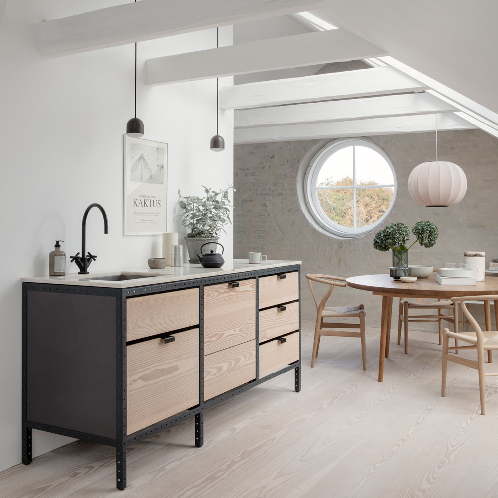
‘The kitchen is basically two wooden free-standing units, which fit seamlessly with the décor. I like the flexibility as, in future, they could be moved to the ground floor. Organised and functional are my keywords!’
‘I love the industrial look of the powder-coated metal frame of the kitchen units. It works well with the black tap' says the homeowner.
Further inspiration: Scandi kitchen ideas to transform your space Scandinavian style
Living area
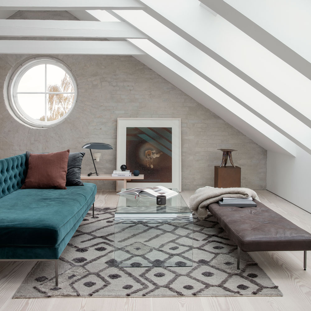
‘The round windows are the only design features remaining from the original house. They’ve been restored to ensure they meet modern standards.
I made the bench and planter to match the Douglas fir flooring.’
The homeowner goes on to explain, ‘We treated the original bricks with a natural whitewash to cover their yellow colour.' Transforming the brick finish completely.
A super-sized rug in a subtle, abstract pattern effectively defines this seating zone within the open-plan living space. For a style tip he adds, 'The artwork by Karl Troels Sandegård looks more relaxed propped against the wall rather than hung on it.’ The propped picture acts as a focal point instead of a fireplace.
Dining space
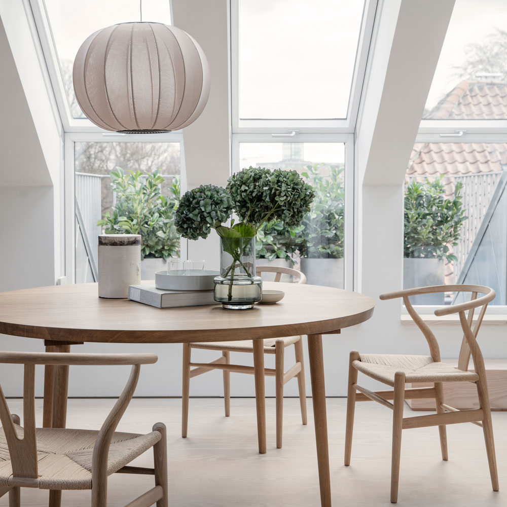
‘It’s quite a long space, but it doesn’t feel narrow at all,’ says the owner. ‘There’s enough space around the dining table that it doesn’t feel claustrophobic. By installing 5m-high statement roof windows, we’ve created a space that’s so light and open. The knitted pendant is an unusual feature as it combines traditional craft with modern design.’
‘I like original interiors with designs that are minimal, well crafted, raw but refined' explains the homeowner.
To add to the ambience he explains, 'There are layers of lighting, including wall lights, ceiling pendants and tracks with directional beams and uplighters hidden on the beams'.
Master bedroom
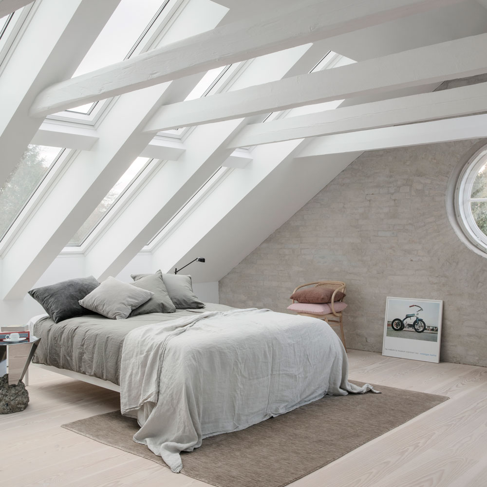
The ceiling of windows floods this master bedroom with natural light.White painted beams keeps the space feeling light and bright. The crisp white bedroom colour scheme helps to invigorate the sleep space.
'The Velux roof windows we added have a sensor system, so if it gets too hot or humid they open automatically, and they all have automated built-in blinds.’
Bathroom
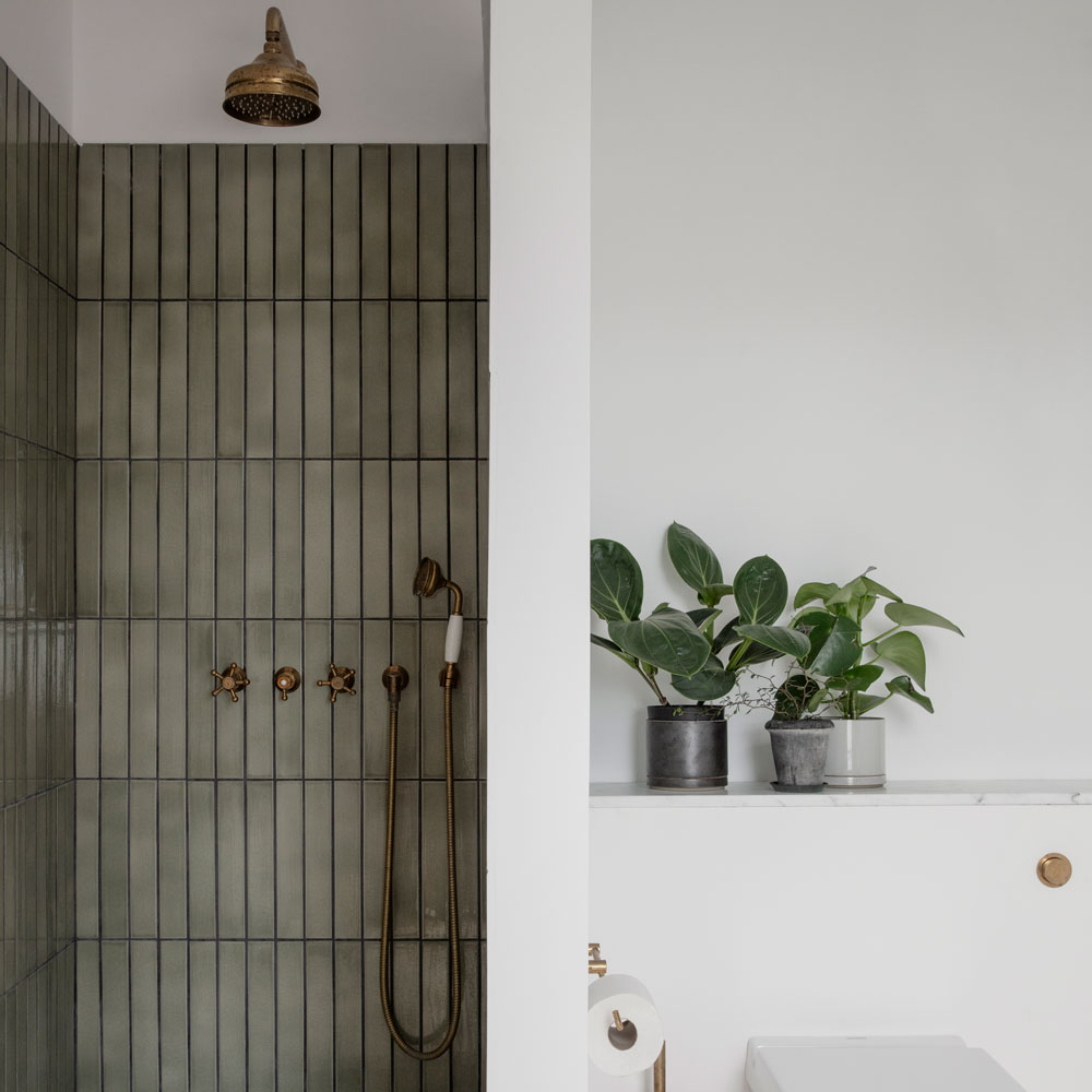
‘As it’s such a beautiful space, I didn’t want any noisy elements in it,’ the homeowner explains. ‘So we’ve gone for classic, natural, earthy colours in here.’
‘I used natural materials throughout,’ he explains. ‘As an increasingly indoor generation, our interiors need to maintain our relationship with the natural world.’
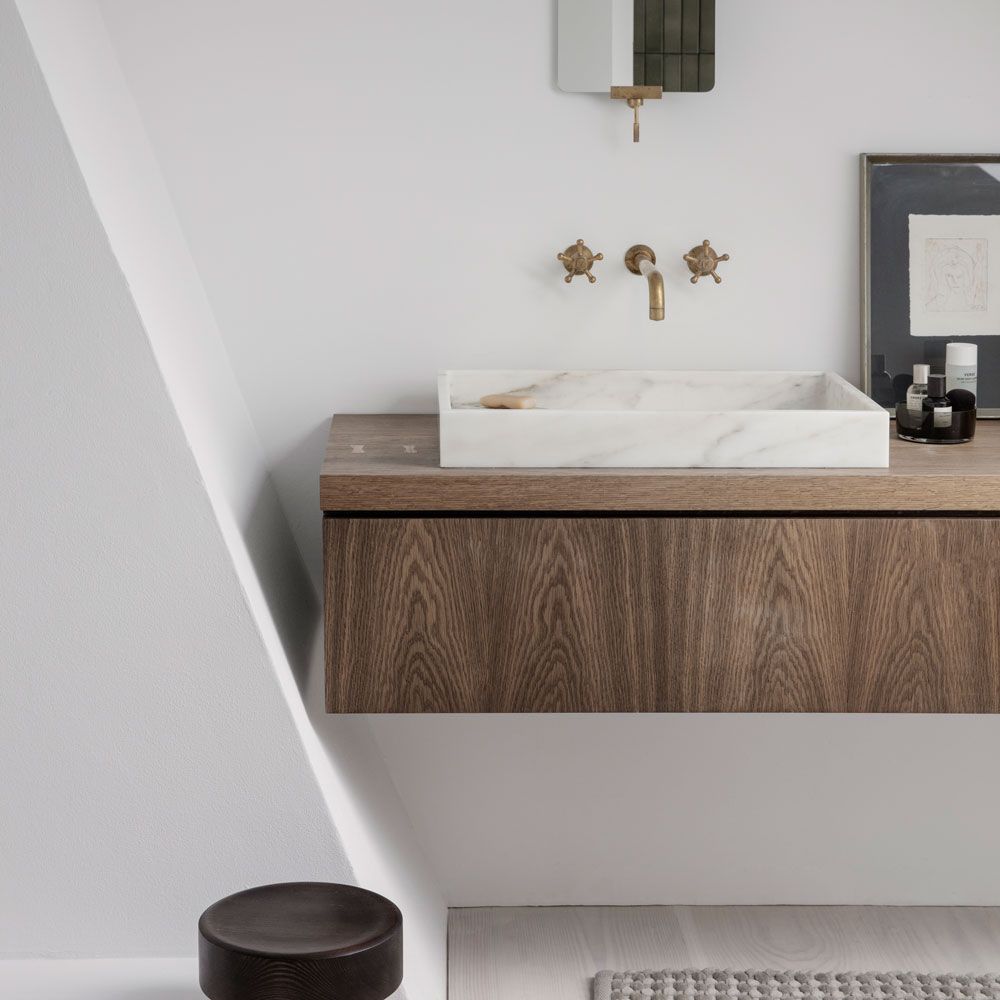
‘The vanity unit is a prototype I built for a project 10 years ago and put into storage. I realised it would look great here'.
Related: 10 ways to revamp a tired bathroom for under £50 – using everything from paint to clever furniture
Feature compiled by Karen Wilson, originally featured in the September 2020 issue of Ideal Home.
Tamara was Ideal Home's Digital Editor before joining the Woman & Home team in 2022. She has spent the last 15 years working with the style teams at Country Homes & Interiors and Ideal Home, both now at Future PLC. It’s with these award wining interiors teams that she's honed her skills and passion for shopping, styling and writing. Tamara is always ahead of the curve when it comes to interiors trends – and is great at seeking out designer dupes on the high street.
-
 Wood drenching is the calming new twist on the colour drenching trend – here’s how to make the look work in your home
It’s easier than ever to embrace natural materials
By Maddie Balcombe
-
 Aldi is launching a £200 day bed with four different features - its sleek design is suited to the whole family
You don't want to miss out on this Specialbuy
By Kezia Reynolds
-
 How to set up a drip watering system that saves water and a lot of effort
Keep your plants hydrated (and your water bill down) with this clever garden watering solution
By Natalie Osborn