See how a glazed wraparound extension adds space and light to this semi-detached basement
Subterranean floors naturally lack light but by introducing a wraparound glazed extension to their home, these homeowners transformed the look of their home into a light and bright space
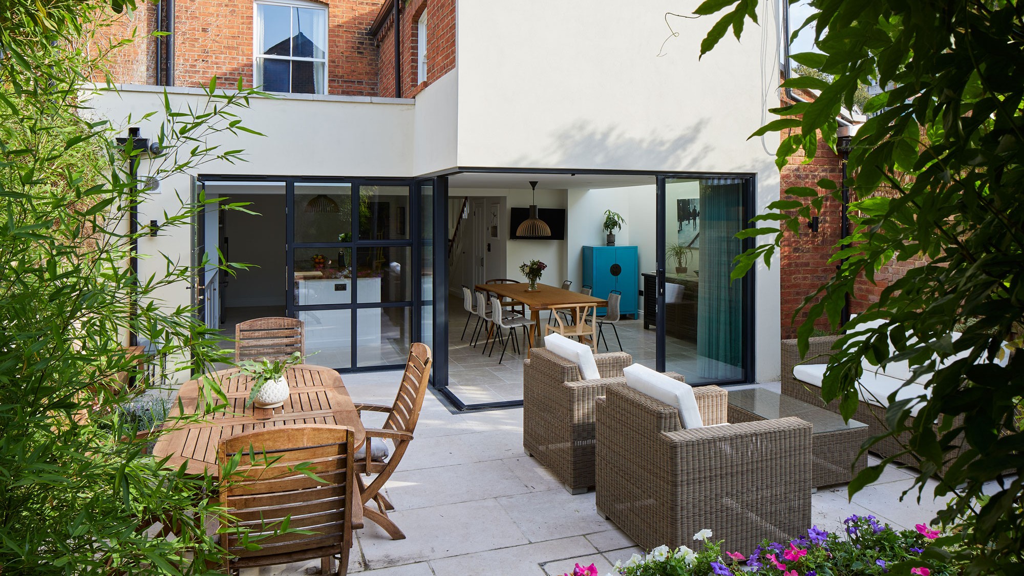

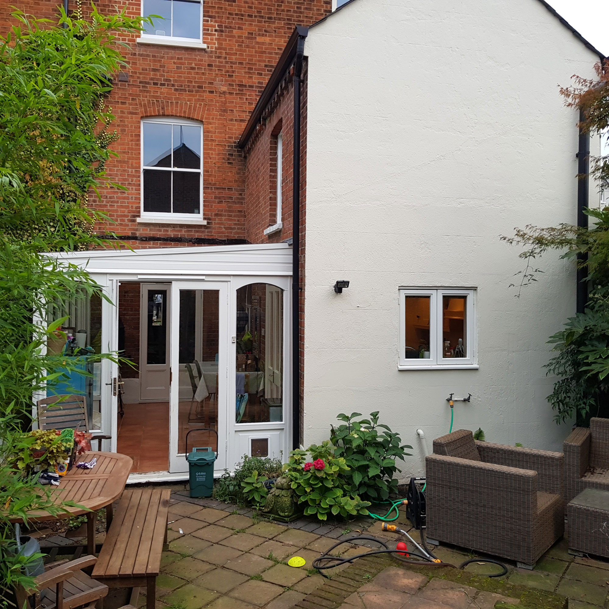
It began as a four bedroom semi detached Victorian house in Hertfordshire. Indoors, the kitchen was dark and disconnected from the living spaces and the conservatory was cold and under utilised. The homeowners enlisted the help of an architect to totally transform the space.
By their very nature of being underground, basement ideas lack light. But with the help from the professionals - and in this case, introducing a glazed wraparound extension – you can transform the dark and dingy to light and bright.
The glazed wraparound extension
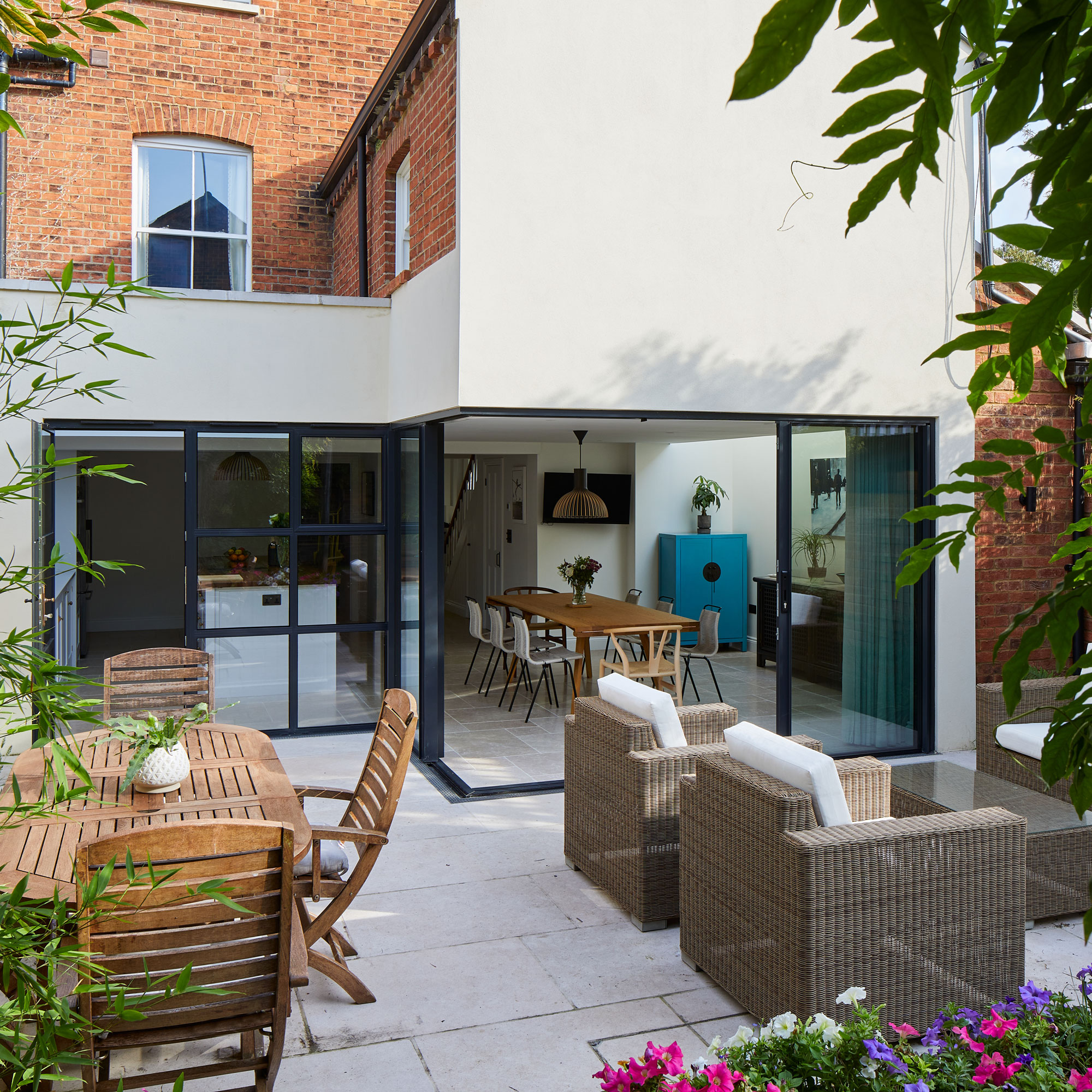
‘Bringing natural light into the property presented a great challenge,’ explains Christine Peever from Sheldon Peever Architects. ‘The south facing flank wall faces directly onto the street, so the option of adding windows was limited in order to prevent overlooking. The solution to bringing in more natural light was to install rooflights.'
'The first large rooflight,' continues Christine, 'was positioned in the side return extension following a similar footprint to the existing conservatory. It’s shielded from direct sunlight, which greatly increases light levels while reducing any potential solar gain.
A smaller extension was also added with a thin strip of frameless glass to the south elevation of the house. This arrangement gave us the opportunity to raise the ceiling height in these new extensions, enhancing the sense of space and light.'
'Smaller windows to the south elevation provide natural light to the existing stairwell and hallway,' adds Christine. 'They also frame views of the new external landscaping. The back of the house has glazing wrapped around which allows the internal spaces to fully open up onto the garden.’
The new extension
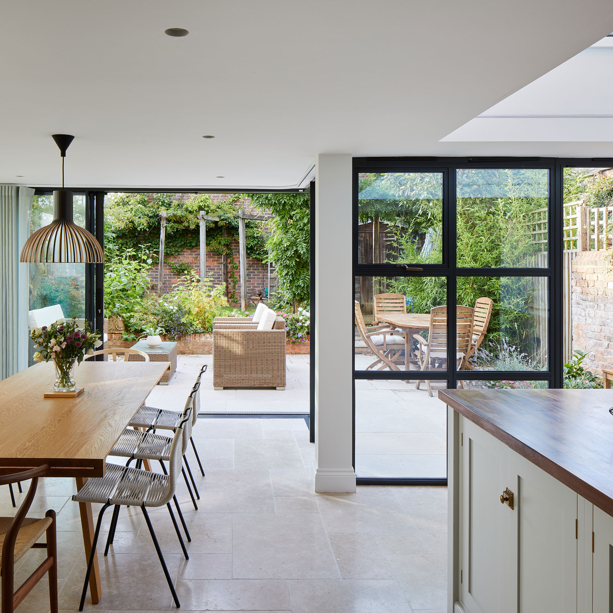
In the new wraparound glazed extension, sliding doors open up around the corner eliminating the need for bulky rails. Flush thresholds and opting for the same flooring throughout creates a seamless relationship between the indoor and outdoor zones.
Get the Ideal Home Newsletter
Sign up to our newsletter for style and decor inspiration, house makeovers, project advice and more.
Inside the property, the glazing was designed to go up to ceiling height. This maximises light coming into the space. The light coloured limestone kitchen flooring ideas reflect the light in this north facing garden and compliments the rendered finish to the external walls.
The kitchen diner
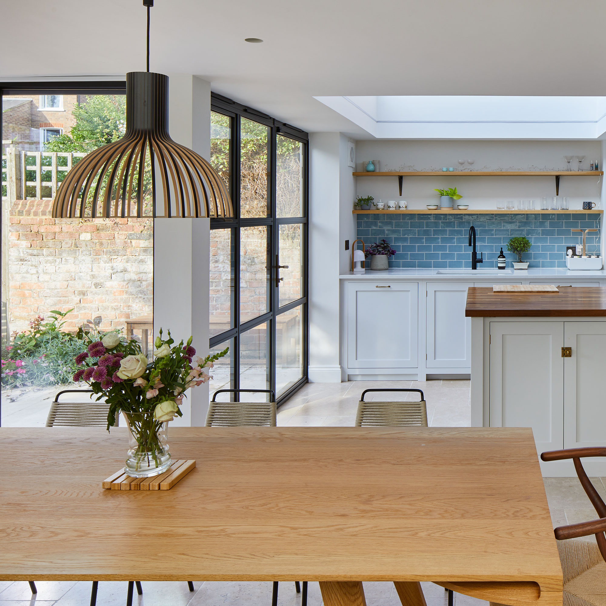
A glazed roof floods the kitchen with natural light, but being north east facing ensures the space will not overheat. The light-coloured kitchen cabinets and flooring help to bounce light around the room.
Crittall-style glazing in this area creates a different feel in the kitchen from the rest of the space. This can be useful in large open plan spaces as a tool to zone spaces.
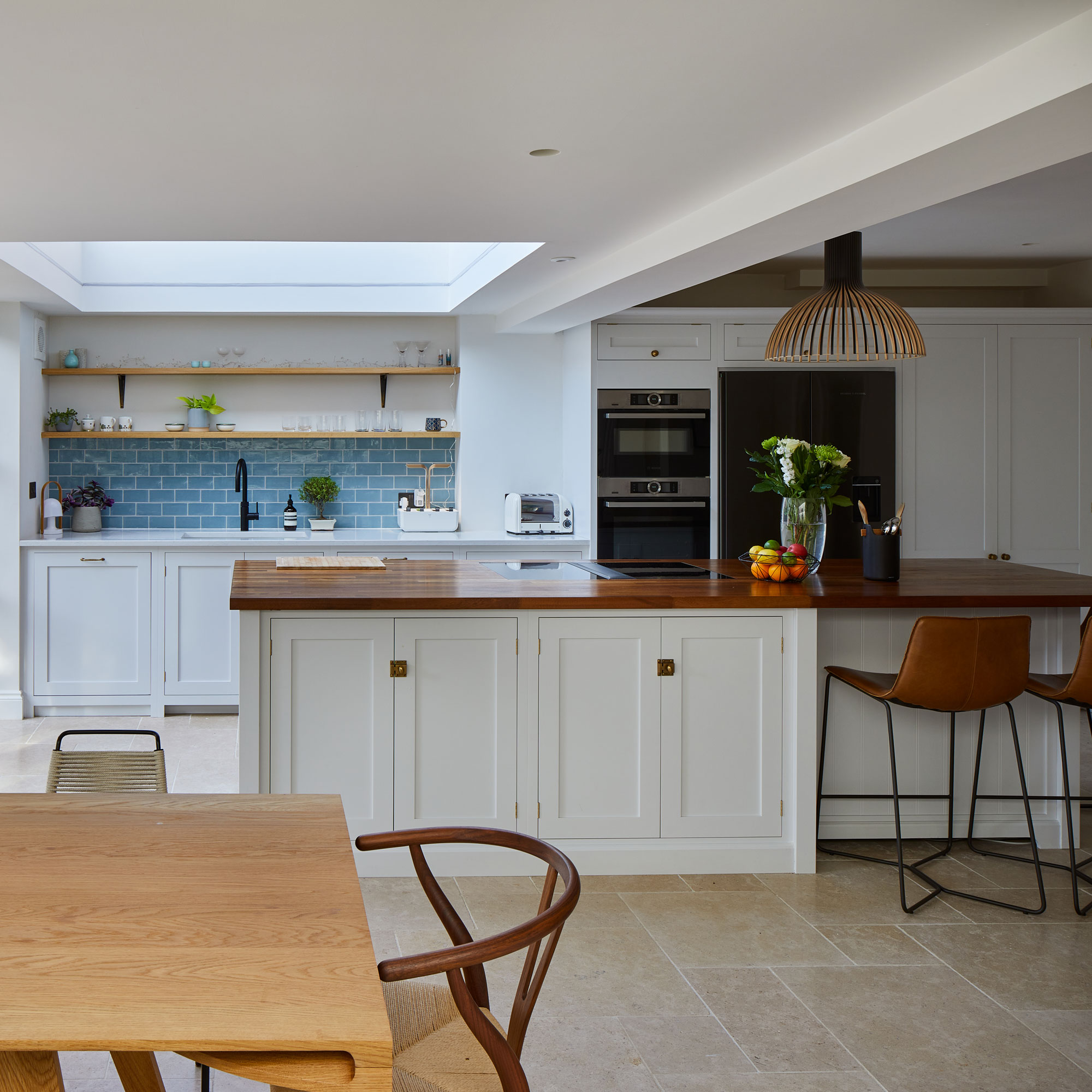
The position of the two rooflights provide a contrast to the natural lighting of the overall space. The rooflight over the kitchen adds height to the space and floods the kitchen with ambient natural light.
The glazing on the rear creates a direct visual and physical relationship with the garden that it previously lacked. The use of light coloured flooring, and kitchen cabinetry lightens this subterranean space.
The kitchen area
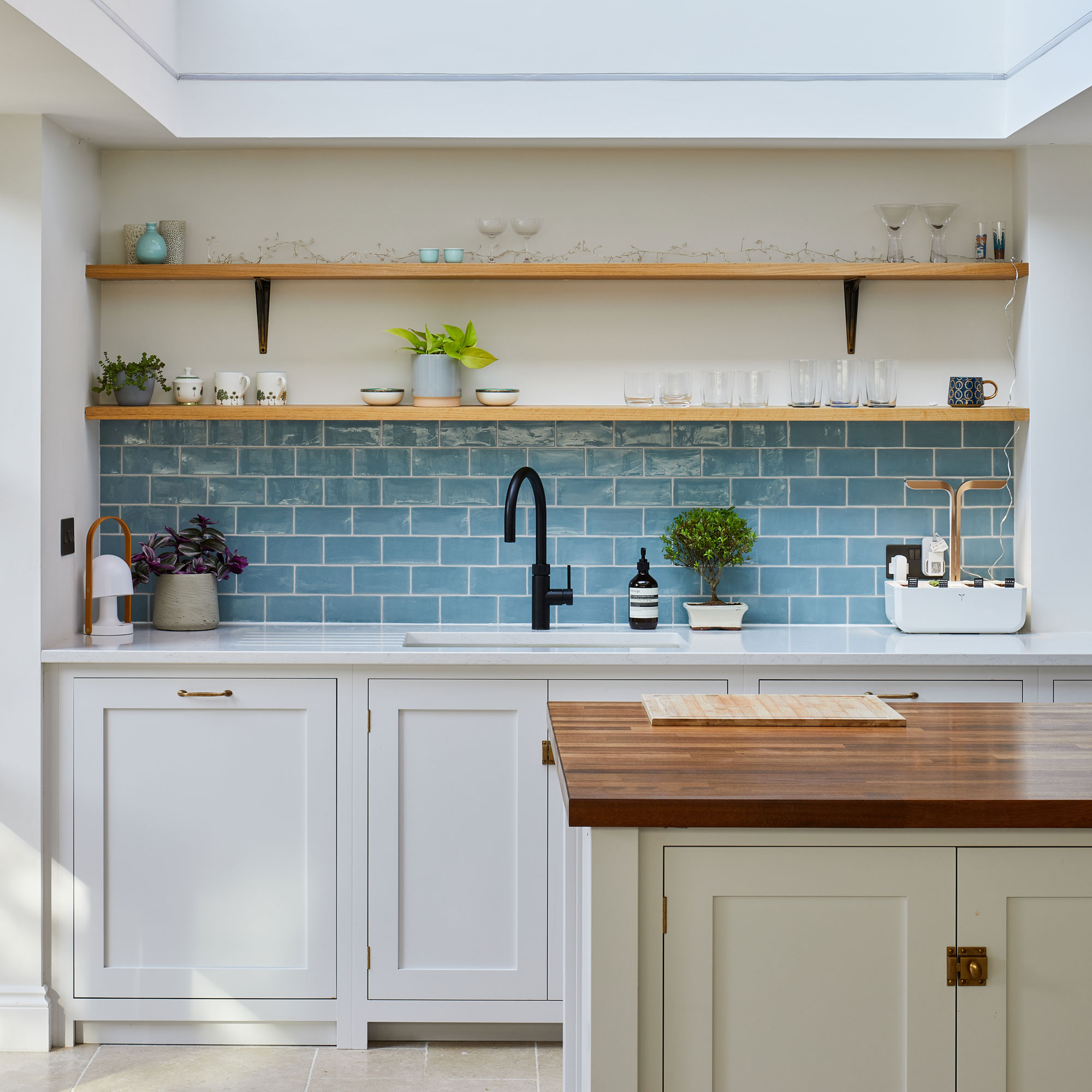
They homeowners specifically chose a frameless roof light in the kitchen. This was to introduce the largest area of glass possible to maximise the sunlight from the south elevation. The top light provides diffused lighting to this section of the room and as the roof light is positioned higher than the ceiling it is hidden from view.
By positioning this roof light higher up it protects the room from direct solar gain in the summer months but provides beautiful diffused light throughout the year. They decided against windows here due to the position of the level of the street and overlooking issues.
The coloured tiled kitchen splashback ideas provides a pop of colour to an otherwise neutral colour scheme. The timber worktop to the island gives a feeling of warmth against the neutral colours scheme. The neutral kitchen colour scheme contrasts with the sharpness of the black framed glazing.
The extension glazing
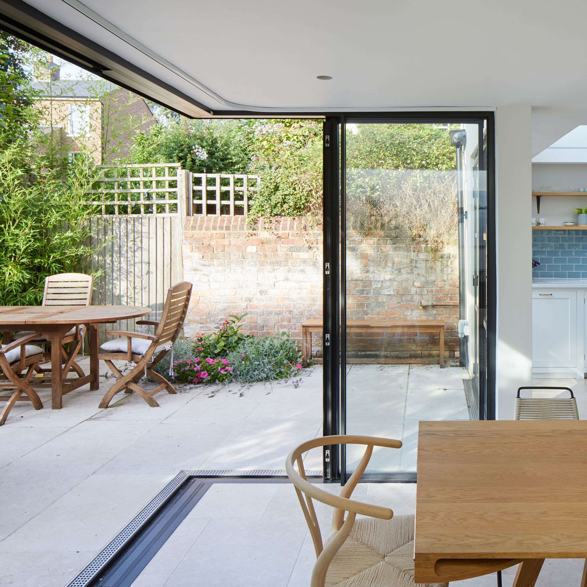
Flush thresholds create a better flow and blur the line between indoors and outdoors. They designed the glazing to open up from the corner to create a seamless relationship with the different outdoor spaces. The use of the same flooring in the outdoor spaces blurs the indoor outdoor boundary and makes the interior feel bigger.
The glazing goes all the way up to the ceiling to make the space feel bigger and reinforce the concept of blurring the boundary with the outdoors.
The property before works began
Focus on: Sliding doors
Architect Christine Peever from Sheldon Peever Studio gives us the lowdown...
- Choose your number: Consider how many doors and tracks you want to install, bearing in mind there’s always going to be a percentage of the glazing that can’t open. For example, introducing four doors sliding on two tracks means a maximum of 50% of the area can be opened.
- Stay flush: Create flush thresholds as this makes a difference to moving between the indoors and outdoors. You will need to include some drainage along the flush threshold to drain rainwater away. This drainage can also be flush and either made a feature of or minimised visually.
- Stretch it up: Taking glazing to the ceiling elongates a space, maximises views out of the internal spaces and lets more light in.
- Go for slim frames: Consider using slim frames so that when the sliding doors are closed you will have as thin as possible frames and a more uninterrupted view to the outdoors. These types of systems are not as expensive as they once were.
- Aluminium is hassle free: Apart from cleaning out tracks and the threshold drainage every once in a while, aluminium sliding doors are maintenance free.
Additional words by Caroline Foster

Ginevra Benedetti has been the Deputy Editor of Ideal Home magazine since 2021. With a career in magazines spanning nearly twenty years, she has worked for the majority of the UK’s interiors magazines, both as staff and as a freelancer. She first joined the Ideal Home team in 2011, initially as the Deputy Decorating Editor and has never left! She currently oversees the publication of the brand’s magazine each month, from planning through to publication, editing, writing or commissioning the majority of the content.
-
 I tried out this neat little dehumidifier for a month – it dried my laundry in half the time
The 20L SmartAir Dry Zone dehumidifier tackled my laundry drying woes head on
By Jenny McFarlane
-
 I’m seeing pastel garden furniture at all my favourite brands this spring, but QVC’s sorbet collection impressed me the most
Fresh pastel shades are a great way to liven up your outdoor space
By Kezia Reynolds
-
 Don't tell my flatmates, but Joseph Joseph's clever new sink range finally made me enjoy washing up
I didn't know stylish washing up accessories existed until I saw this collection
By Holly Cockburn