Step inside this personality-packed home in Hampshire
Creating a unique look on a budget can be tricky but the owner rose to the challenge of packing her home chockfull of character
This house was in a good state and had some period features when the owners bought it, but the decor wasn't quite to their taste. 'We were really lucky that when we moved into our house back in June 2014, it was in pretty good condition,' says the owner. 'The previous owners had done a lot of work to modernise it, but it still had some original features, like the open fireplace and curved ceilings – this was a real selling point for me and my husband, as we wanted a house with character. Plus, with two children and one on the way, we didn't want to have to do any major renovation work.'
Exterior
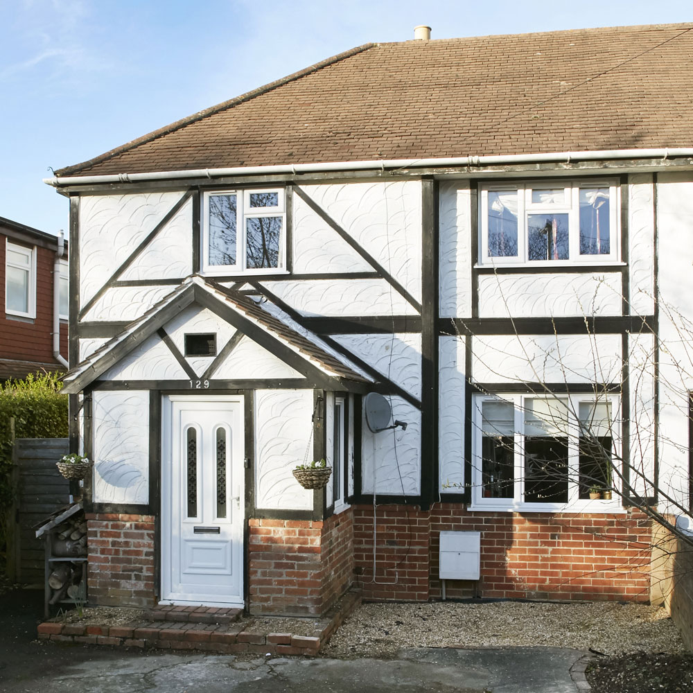
'We chose this location because it's an area that we could afford, close to good schools. It's also near the train station and shops, so it means we can manage with one car between us. We aren't far from the beach either, which is a bonus.'
Kitchen
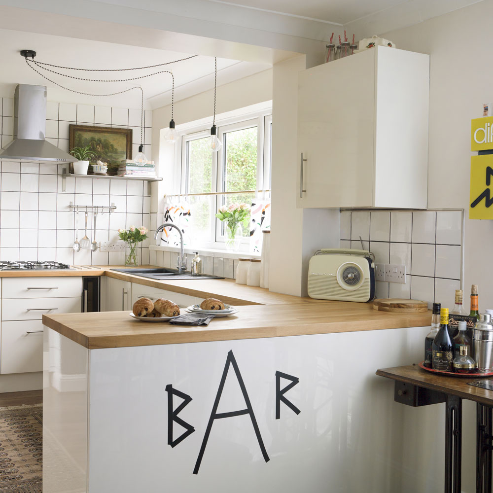
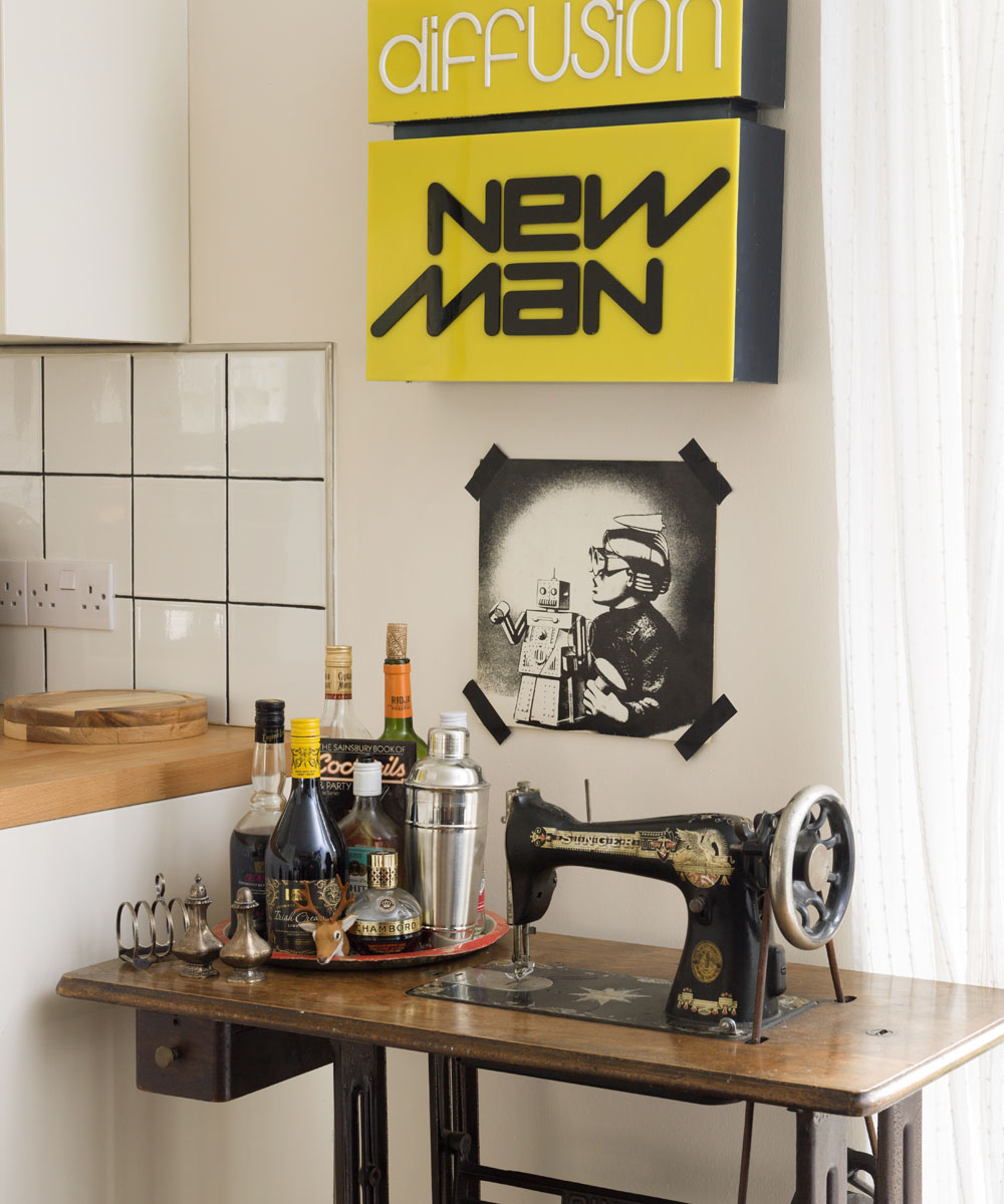
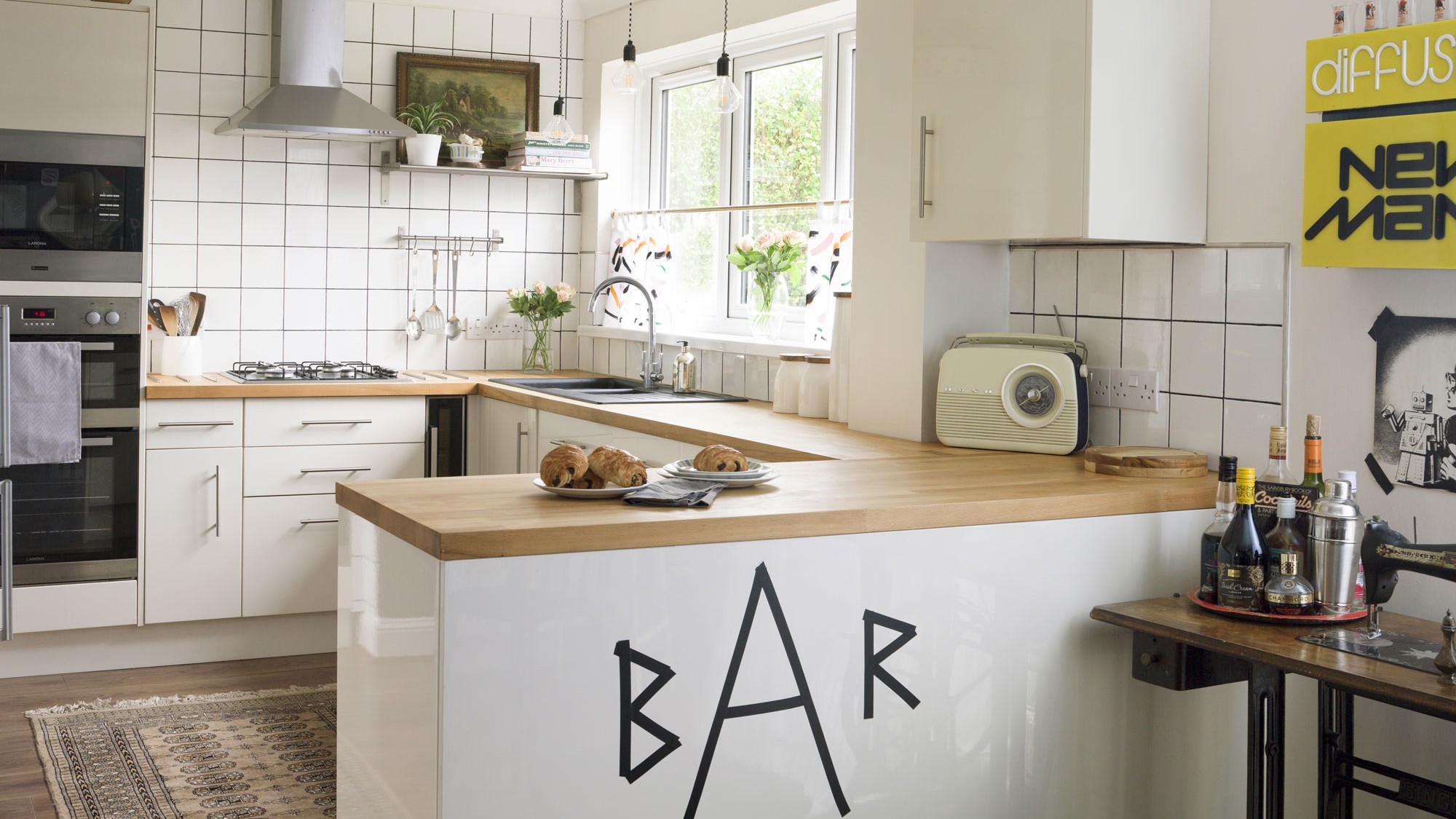
The fact that the kitchen and bathroom were in good condition helped, as they didn't have to worry about the cost of that for a whole, even if they weren't to their taste. The kitchen was already here when the owners moved in but it had more of a country feel to it. The space works really well, with the sink overlooking the garden and plenty of storage space, so they just updated it with black grout, paint, new lighting, a rug and cafe-style curtains. Electrical tape has been used to spell out the word 'Bar' on the breakfast bar for a fun and quirky touch, while the vintage sewing machine tables makes an interesting drinks station. 'It's amazing what a difference that made and I really like it now – it feels like a new kitchen.'
Get the look
Buy now: Similar sewing machine table, Etsy
Buy now: Retro DAB radio, Bush at Argos
Living room
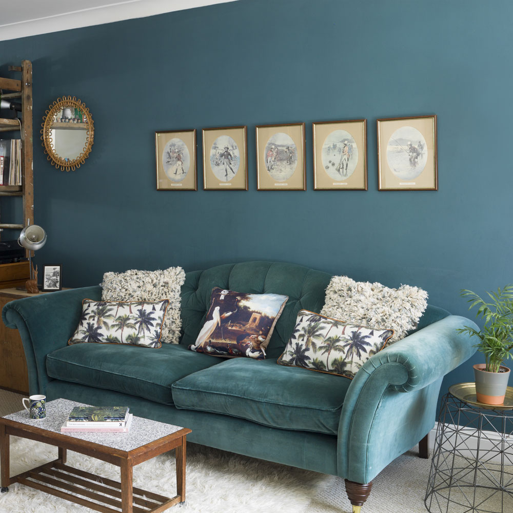
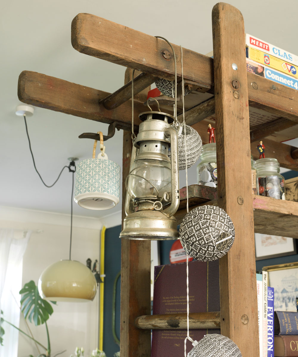
When the owners first moved in, the room felt very long and wasn't very cosy – it was tricky to work out how to decorate it. They were looking at buying some kind of industrial rack unit to partition the living and dining room, when her father-in-law found some old boards. Between them, he and her husband built the ladders around a teak unit they already had to create a storage unit. 'It works perfectly to display our knick-knacks, as well as adding warmth and character to the room. At the same time it creates a divider without taking away any light.'
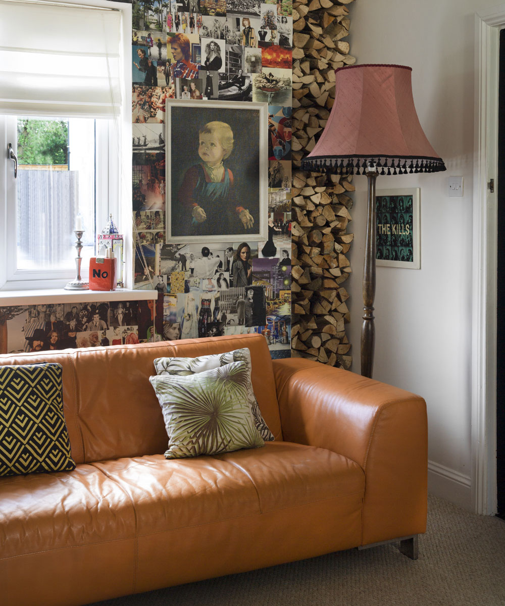
Proving that not every look has to follow a strict theme, a retro electric feel means you can merge many styles into one. A few elements of vintage, retro and country have all been mixed and matched together to create an eclectic scheme. The owners have invested in some key pieces of mid-century furniture, and haven't been afraid to mix old with new.
Dining room
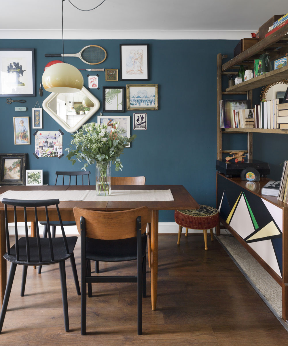
'My husband and I like a real mishmash of styles – we don't like everything too matching and prefer things to be a bit eclectic. I love having vintage pieces mixed in with some that are more modern or industrial, and my favourite look has always been 1960s. We have most of these styles in every room and yet it all seems to work together.' They bought the teak dining table on a but and sell group on Facebook – it was only £15 but in a bit of a state, so the owner sanded and polished it and brought it back to life.
Get the Ideal Home Newsletter
Sign up to our newsletter for style and decor inspiration, house makeovers, project advice and more.
Stairway
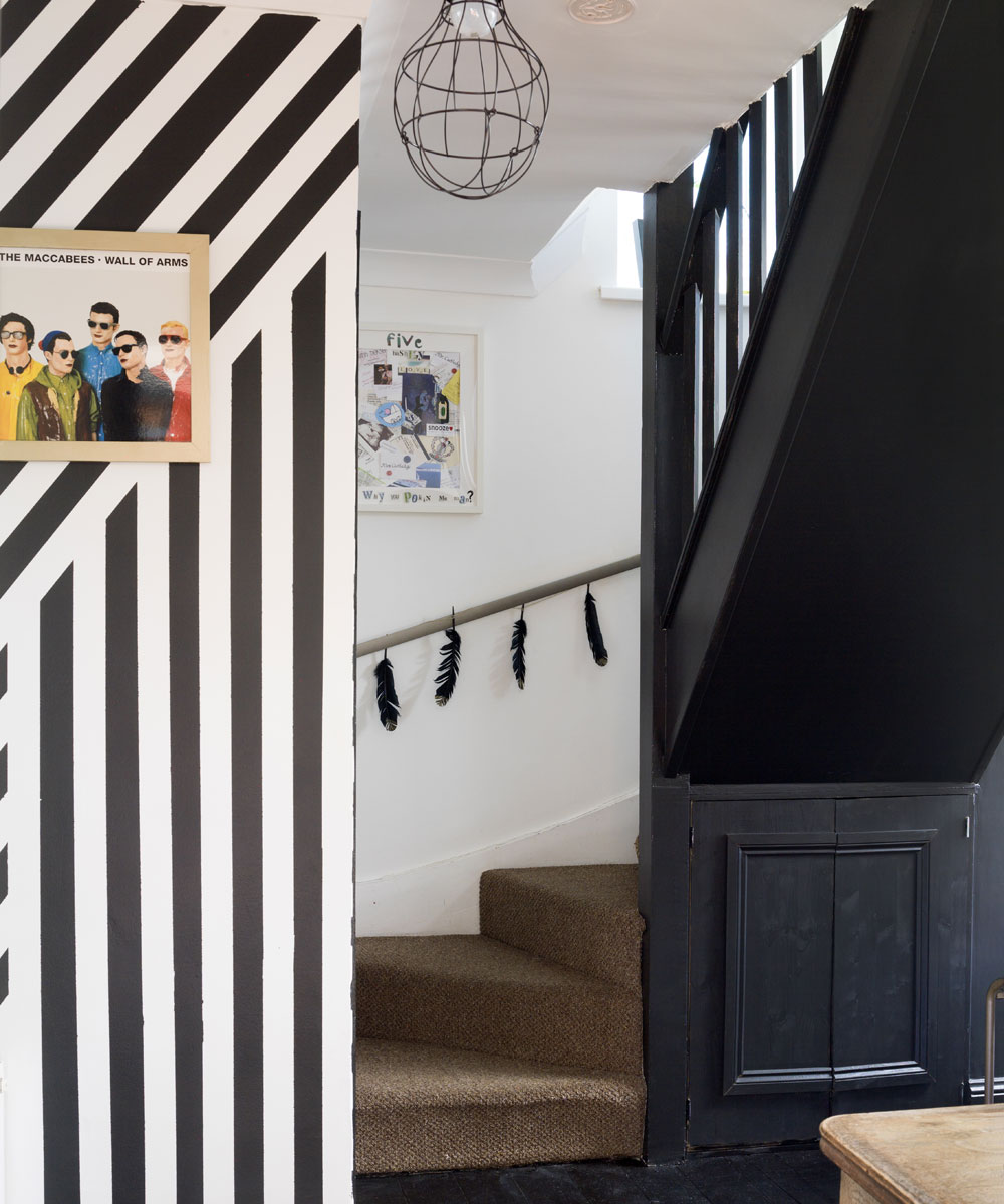
By using dark colours as accents, the owner has created depth and cosiness – but even with dark walls, the overall feel is spacious and airy, as she's kept some walls and ceilings white.
Bedroom
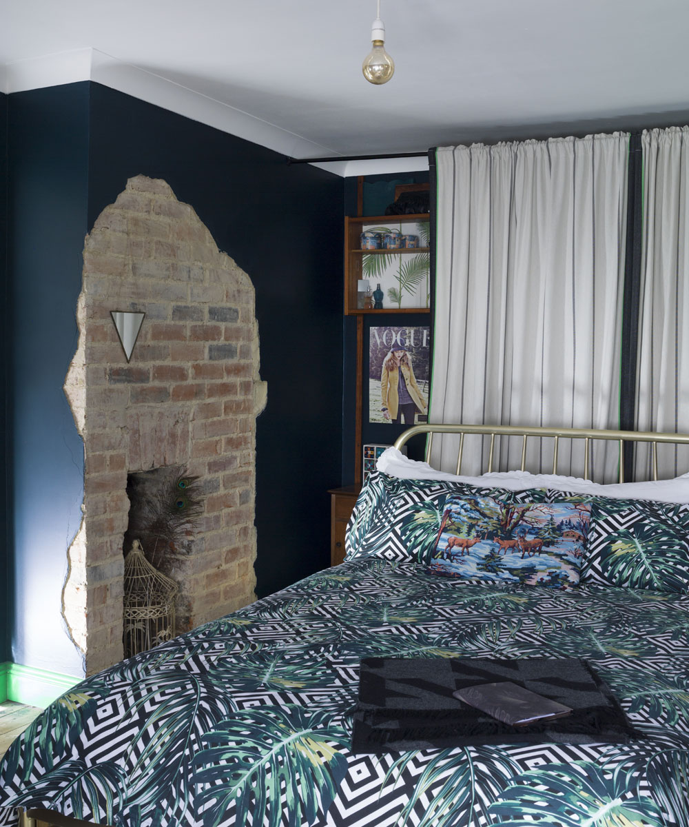
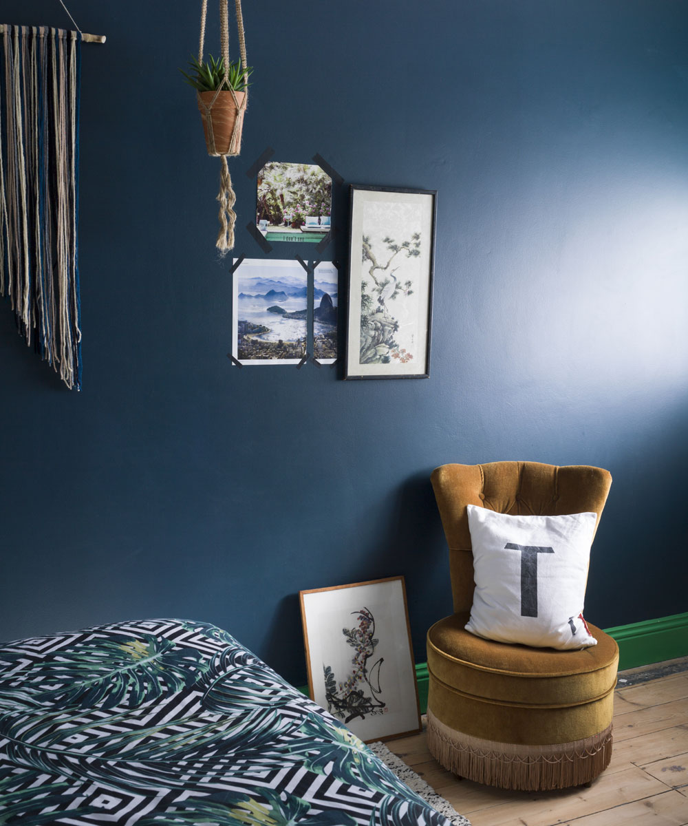
Upstairs, they painted their bedroom walls in Hague Blue by Farrow & Ball and the paintwork in contrasting Paradise Green 6 by Dulux for an edgy look. 'We spent a weekend removing some of the plaster from one of the other walls to reveal the bare brickwork underneath and discovered it still had the old fireplace, which we were really pleased about. We were going to remove the plaster from the whole wall, until we realised the back third of it was breeze blocks! It must have been where the house used to end, but has since been extended over time. We like the unfinished look the unplastered area has so we left it – it shows both the old and new elements of the house.'
Get the look
Buy now: Paint, Hague Blue, Farrow & Ball at B&Q
Buy now: Paint, Paradise Green 6, Dulux
Children's rooms
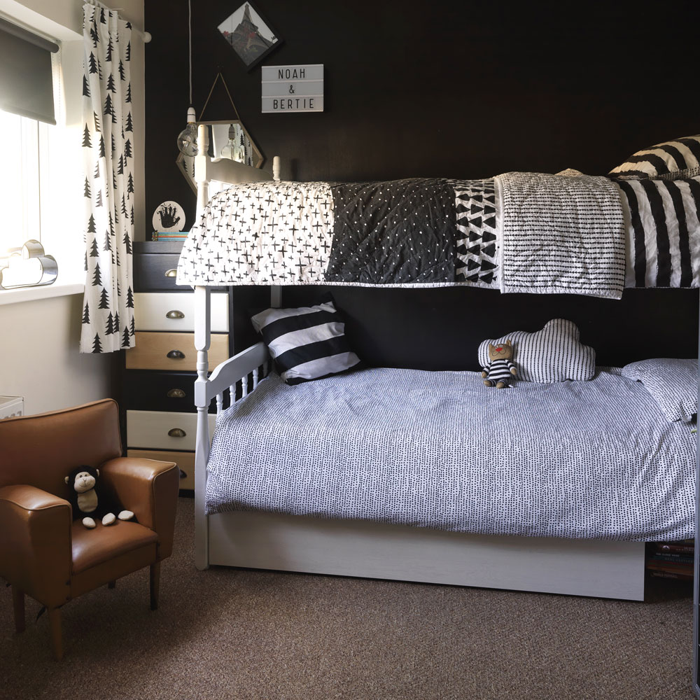
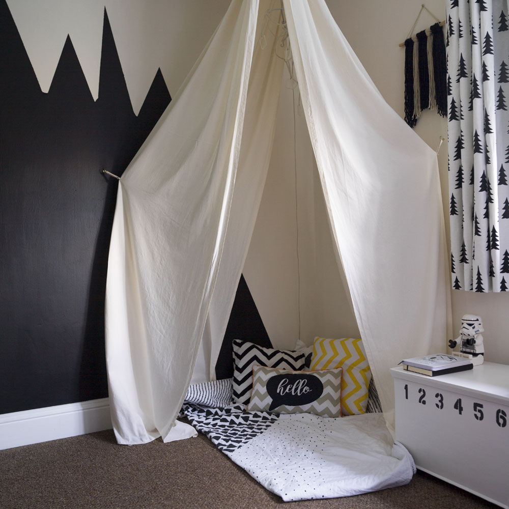
Here the couple have embraced dark hues in this space by going for a mono scheme in the boys' room – a child's bedroom doesn't always need to be pale and pretty. 'I love making things, such as the wool hangings that we have in most rooms, in various complementary colours. In the boys' room I upcycled a toy box and chest of drawers, and made them a tent from calico fabric that hangs from an old curtain pole fixed to the ceiling.'
Get the look
Buy now: Cloud cushion, Made.com
Buy now: Duvet covers, Primark
Children's room
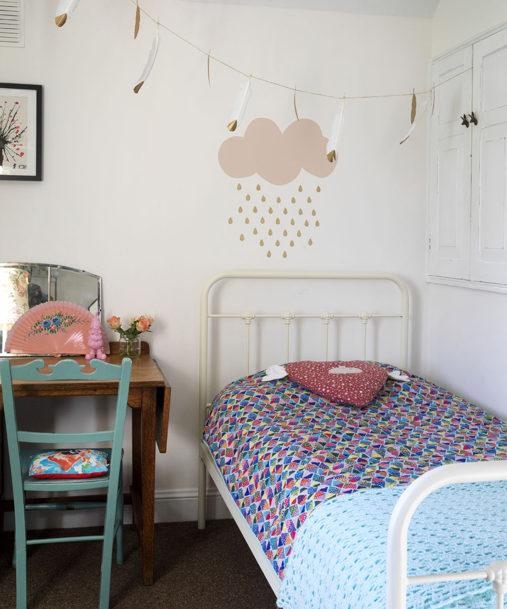
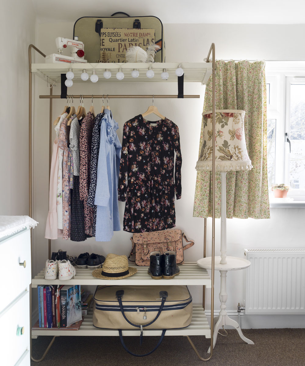
A selection of gold dipped feathers add a fun element to this bedroom, while a painted cloud motif adds plenty of personality. The owners have continued the mix and match theme in this room by confidently clashing colours and patterns.
Get the look
Buy now: Wardrobe, Bodo unit, Ikea
Buy now: Gold Dipped Feathers, Hobbycraft
Bathroom
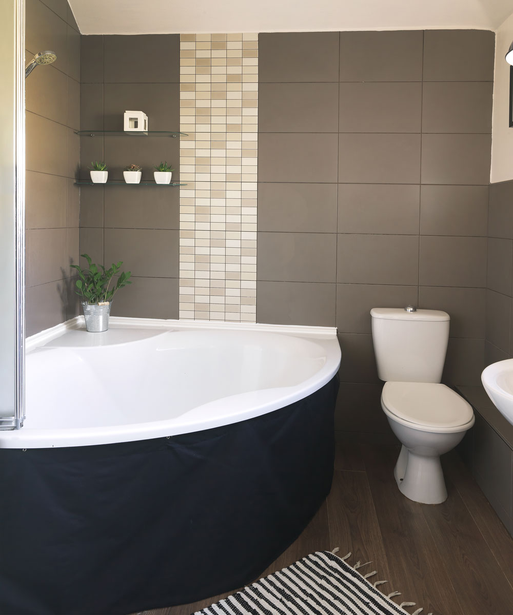
'The bathroom is the same as when we moved in, I just painted the walls and ceilings.' The corner bath gives this space a spa-like feel.
'While our house is quite open plan, we wanted each part of it to feel different to the next and I think we've managed this. I love that we have created something so unique to us on a minimal budget. It's been like having my own personal interior design challenge, making me find ways around things and source items we like for less. I've loved every minute of it and feel such a sense of achievement.'
The house tour originally features in Style at Home, October 2017
Jennifer is the Deputy Editor (Digital) for Homes & Gardens online. Prior to her current position, she completed various short courses a KLC Design School, and wrote across sister brands Ideal Home, LivingEtc, 25 Beautiful Homes, Country Homes & Interiors, and Style at Home.
-
 Will a conservatory add value to your home and how can you maximise it?
This is what the pros say
By Amy Reeves
-
 I’ve been looking for a new signature scent for my home and The White Company's new fragrance is the exact summer holiday smell I needed
Santorini smells fresh, summery and sophisticated
By Kezia Reynolds
-
 How to remove algae from garden walls in five steps – and the cleaning product experts rave about for tackling it fast
Experts share their top tips for getting garden walls algae-free
By Katie Sims