Step inside this modern Scandi family home in East Sussex
Buying our first home was an exciting time for the owner and her husband.
Buying our first home was an exciting time for the owner and her husband. 'We'd not long been married and we didn't want to waste time getting onto the property ladder. Before tying the knot we had been renting a small flat in southwest London, but knew we would have to move out of London to find a family home, as we wanted a space to grow into. My sister and her husband had recently moved to East Sussex, and we fell in love with the area. The house is in a lovely secluded spot and has a train station less than a 10-minute walk away, which is ideal for the commute into London.'
'On viewing the property, I was sold when I saw the kitchen - it has lots of surface space and plenty of storage, which was a breath of fresh air compared to the poky kitchen we'd been used to in our rented flat. The open-plan layout flowing into the dining area was perfect and I knew it would make a really sociable space, which was high on our priority list. We were also impressed with the size of the garden - coming from London it was a big selling point! We were very lucky that the house had been well looked after by its previous owners, although once we moved into the empty property, we soon discovered that there was quite a lot of cosmetic work to be done.'
This house tour originally appeared in Style at Home, April 2017
1/9 Exterior
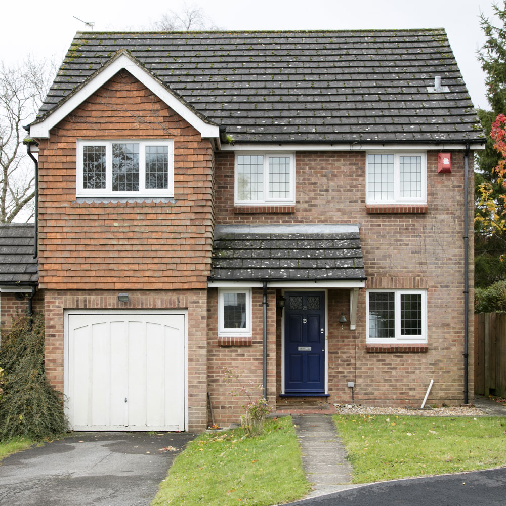
As there weren't any structural changes that they needed to make right away, it meant that they could start on redecorating almost immediately. Soon after buying the house and moving in, the owner found out that she was pregnant with her daughter, so she prioritised jobs around the house that she knew she'd struggle with later on in the pregnancy. 'I'm a big believer that if there's a job I can do myself, then I will always do it - it's all part of the fun of decorating and I like to get stuck in!'
'As I love lots of different interiors styles, I took my time decorating to make sure each room has its own unique feel, yet still works together as a whole. I tend to go for a mixture of rustic and cosy looks, but with a modern Scandi feel. Instagram is my main source of decorating ideas; I have a feed dedicated to interiors, and I follow some really creative and inspiring people. It's a lovely community t0 be part of and, despite our homes all being so different in size and style, I gather lots of brilliant nuggets of inspiration from them.'
2/9 Living room
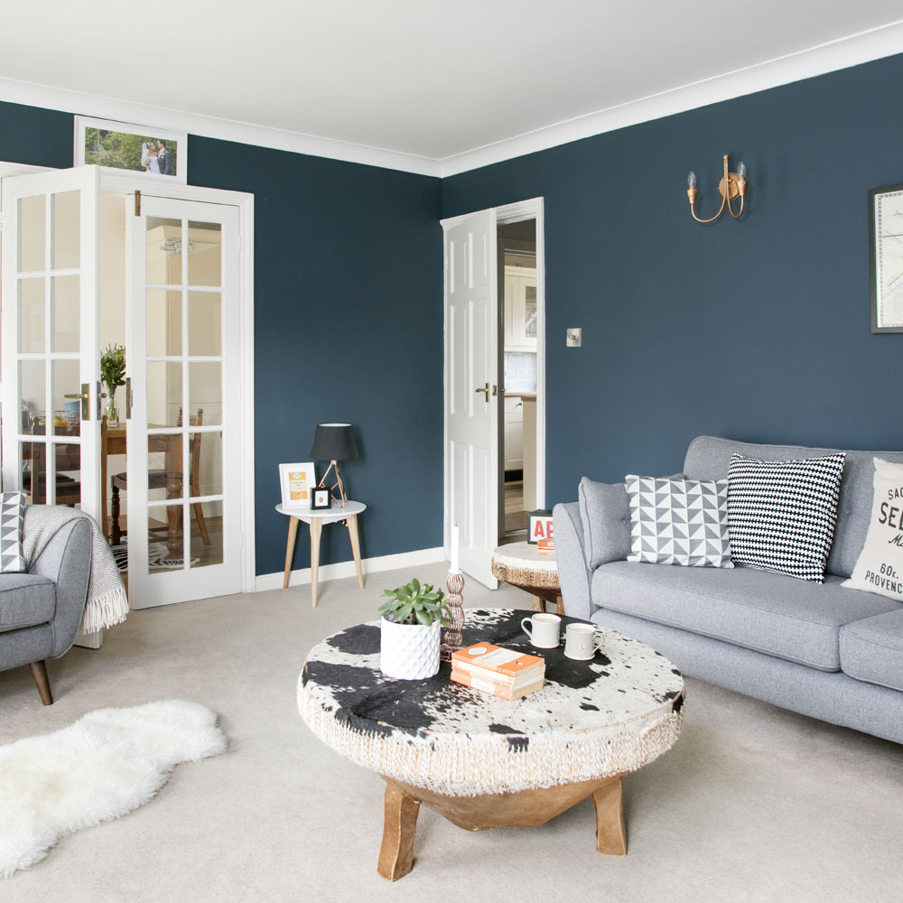
'When we moved into the house, the living room was painted magnolia, but I knew I wanted to change that. I had toyed with the idea of going for dark walls for a long time, but it wasn't until I used Instagram to reach out to other interior enthusiasts that I had the courage to go for it. My husband wasn't sure about the idea to start with, but once I painted the walls, he loved it and I haven't once regretted it. We are lucky that we have large windows in the living room and glass doors leading in from the dining area, so the space gets plenty of natural daylight, which definitely helps it carry off the moody colour. It's one of the best decorating decisions I've made so far.' The coffee table and side table are cowskin drums that were given to the owner by her parents, who met and got married in East Africa. 'They're really beautiful pieces and really make a statement in the room, and I like the fact they have a fascinating story behind them.'
'While I wouldn't say that I'm particularly crafty, I have revamped a few pieces around the house to make them work with our schemes. I spray painted the wall lights in the living room with a metallic copper to make them stand really stand out against the dark walls.'
Get the Ideal Home Newsletter
Sign up to our newsletter for style and decor inspiration, house makeovers, project advice and more.
Get the look
Buy now: Wall paint, Hague Blue estate emulsion, £43.50 for 2.5l, Farrow & Ball at B&Q
Bye now: SDining roomofa, from £899, French Connection range at DFS
3/9 Dining room
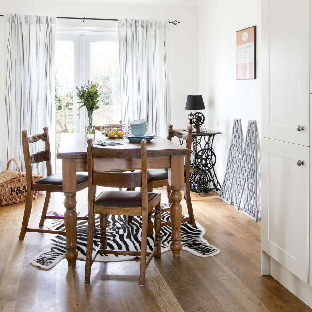
A striking mix of inherited furniture, quirky curios and contemporary furnishings give this room an eclectic feel. 'My parents gave us the antique dining chairs when they were modernising their own kitchen.'
Get the look
Buy now: Similar table and chairs, Oka
4/9 Dining room corner
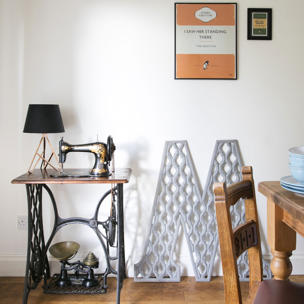
'The Victorian Singer sewing machine table was gathering dust in my parent's garage, so I've used it as a focal-point place in the dining room.' Artwork and eye-catching accessories turn this corner of the dining room into a real focal point.
5/9 Kitchen
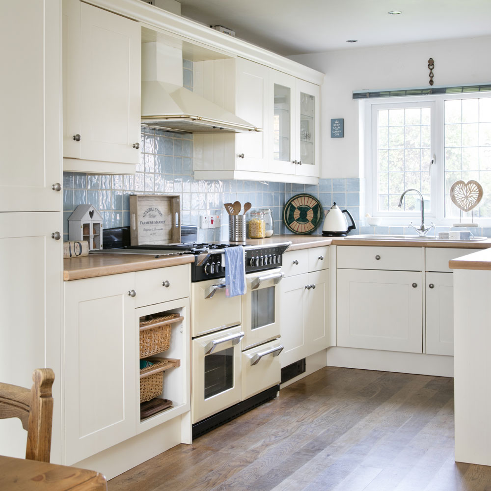
In this U-shaped kitchen, a wide window is the central anchor point of the scheme, filling the space with light and showing off classic units, and blue textured tiles in their best light. The use of wood finishes on the floor and worktops brings a warmth and cosiness to an otherwise pale decorating scheme and adds a rustic edge.
'The kitchen has plenty of cupboards and worktops, but I'd like to give it a more modern look when we come to updating it.'
Get the look
Buy now: Similar tiles, Topps Tiles
6/9 Bedroom
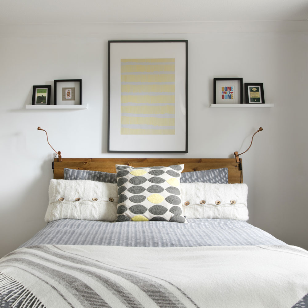
Upstairs, the monochrome and yellow bedroom used to have blue walls and blue floors, so they painted those white and grey, respectively, to give the room a refresh and make it feel more spacious. 'We had to remove some old wallpaper in one of the other bedrooms but it was tricky to get off, even with a steamer. We got there in the end, but were grateful the rest of the house was just painting jobs!'
7/9 Bedroom
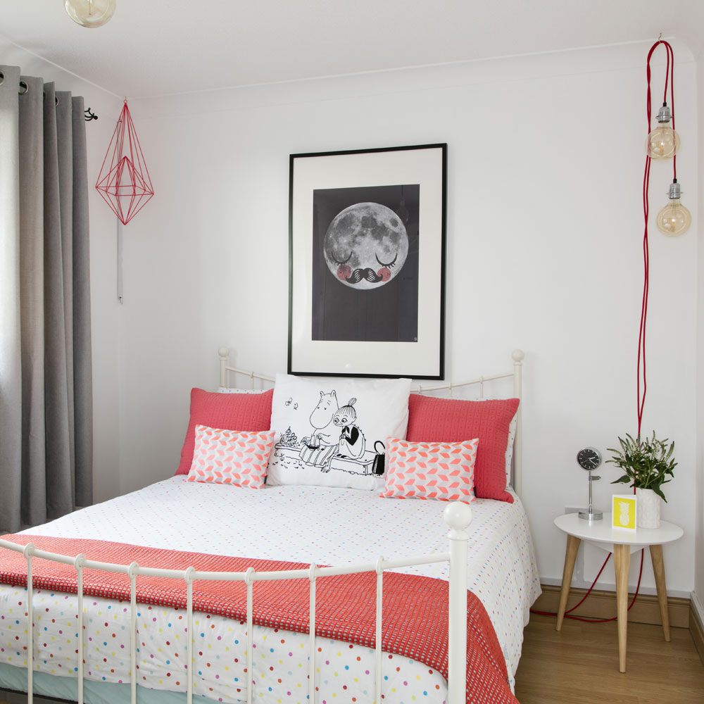
'The neon and white bedroom used to be a little girl's bedroom with a lilac feature wall, so we decided to paint the whole room white and keep it as a blank canvas for the time being. I then added in pops of neon with cushions and lighting throughout the room, so it's easy to change up the look when the time comes.'
Get the look
Buy now: Similar cushions, Habitat
Buy now: Similar lighting, Not On The High Street
8/9 Bedroom
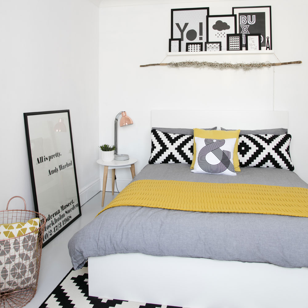
'I upcycled the wardrobes in our guest bedroom with a lick of paint, then changed the door knobs to add a quirky finishing touch. These changes instantly made a huge difference to the room, and I think the wardrobes now fit in perfectly with our look.'
Get the look
Buy now: Similar cushions, Habitat
9/9 Bathroom
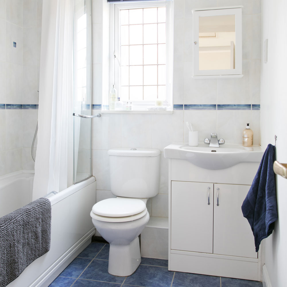
Although the bathroom is a bit dated, the classic blue-and-white colour combo still looks fresh. The owner plans to update the bathroom they inherited at some point in the future, and give the kitchen a small makeover, too. 'It's a slightly daunting prospect, though, as those are bigger tasks and, as first-time homeowner, I haven't had any experience in project managing yet. Some of the carpets throughout the house also need replacing where they have become a bit worn out and tired-looking over the years. But with my daughter growing up so quickly, I'm sure there will be plenty of little spills, so we're happy to wait a while longer to do this!'
'Although there are still jobs to be done, we're very happy with the result of all our hard work decorating the house so far. I really feel lucky to have a great family space that woks perfectly for us.'
Jennifer is the Deputy Editor (Digital) for Homes & Gardens online. Prior to her current position, she completed various short courses a KLC Design School, and wrote across sister brands Ideal Home, LivingEtc, 25 Beautiful Homes, Country Homes & Interiors, and Style at Home.
-
 I tried out this neat little dehumidifier for a month – it dried my laundry in half the time
The 20L SmartAir Dry Zone dehumidifier tackled my laundry drying woes head on
By Jenny McFarlane
-
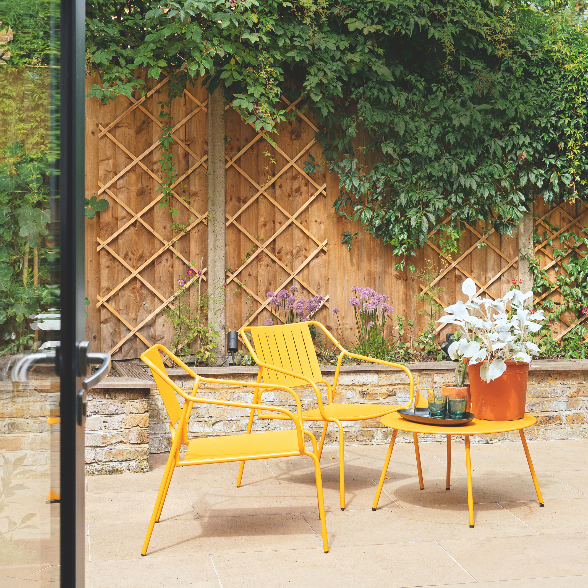 I’m seeing pastel garden furniture at all my favourite brands this spring, but QVC’s sorbet collection impressed me the most
Fresh pastel shades are a great way to liven up your outdoor space
By Kezia Reynolds
-
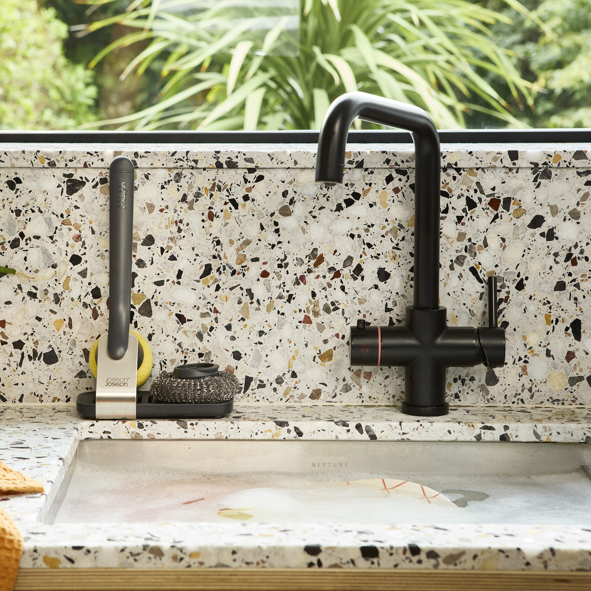 Don't tell my flatmates, but Joseph Joseph's clever new sink range finally made me enjoy washing up
I didn't know stylish washing up accessories existed until I saw this collection
By Holly Cockburn